

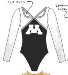
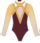
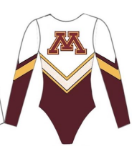
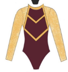
With only three new designs during week seven action, we decided to hold off on judging Florida, Auburn and Arizona State’s designs until next week and have a little fun this week instead. Recently, Minnesota’s Mary Korlin-Downs posted on her Instagram a number of leos she had designed. As we love to give our opinion on all things leotards, we thought we’d choose our favorites of the lot.
Here’s how it’ll work: Our judges for the week—Kalley, Mary Emma and Elizabeth—will choose their top 10 and rank them based on their personal preferences. Plus, you’ll get a chance to tell us your thoughts! Did we leave out your fave from the post? Let us know in the comments or on social media.
Elizabeth

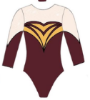
No. 1: I actually need this to be a leotard ASAP. Can you imagine matte white with the athletic thick maroon bands? It would be absolute perfection, like that Team USA leo but make it Minnesota.

No. 2: You’re going to see a lot of white in my top 10. I just think it looks so classy yet athletic. Paired with the black here and minimal gold really lets the logo (read: school spirit) shine.

No. 3: I warned you about the white. This design is a little funky, but I like that about it, and I think it would look great as a real leo, as long as the collar maroon isn’t thick like those LSU designs I hate—it just seems like that would be uncomfortable to wear.

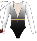
No. 4: I’m assuming that light peach color means nude. Make this design a little more sweetheart, and I’m sold. It’s a good combination of gold and maroon without going overboard.
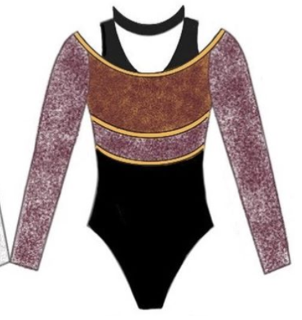
No. 5: I love a good black and white leo, and with white to black (grey?) ombre sleeves, how can you not like this one? The straps/cutouts might be a little weird, but I appreciate the added flair.
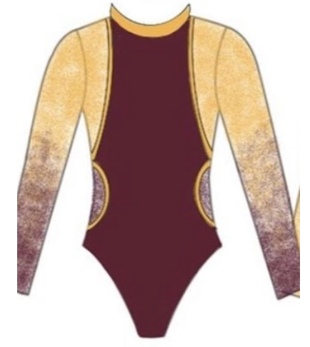
No. 6: This design actually looks like it would be a great back to my No. 8s front. Was that the intention? Either way I like the amount of yellow here and am just picturing a lovely yellow ombre sleeve and am drooling a little.
No. 7: As a sketch, this design is a little too cheerleader uniform for me, but I think as a leotard, it would be stellar. The white paired with the heavy geometric design really works for me.

No. 8: A lot of people don’t care for deep Vs, but Ilike the idea of this one with the yellow belt. The white to black ombre is especially lovely. I would like to see a touch of maroon somewhere though.
No. 9: Give me more yellow on real Minnesota leos! This design has the potential of being really really great, and I would like to see it come into the real world, thanks!
No. 10: I believe the note at the bottom says the body fabric would be like that really lovely maroon and gold shimmery fabric Iowa State uses in some of its leos—or at least that’s what I’m choosing to think—and I would love that. Add maroon mesh sleeves and some gold piping and this would be a great leo.
Kalley
No. 1: I need this to be a real Gopher leo IMMEDIATELY. Minnesota does not use white very often (in fact I’m struggling to think of a single leo where it does?), and that is tragic. I love how clean this is, I love the sporty look of it and I think it is beautiful in its simplicity. Please do this for real, Gophers.

No. 2: You are going to notice a lot of white in my favorites because I think it is such a stunning design option when it is done well. I love the shades of maroon she used here, and how she used the gold as an accent.
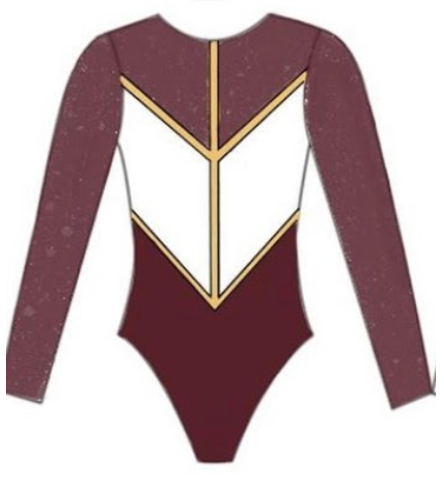
No. 3: I’m a really big fan of the athletic and retro look of this one. I especially love the maroon and gold band at the sleeves. I’ve never imagined a leo as a jersey, but this really works for me.
No. 4: More white designs! Weird. Like the other ones I’ve highlighted, I love how simple this is. This could be really stunning, and I especially love the balance of the maroon, white and gold here.
No. 5: Deep V necks can be hit or miss for me, but this looks like it would really work. I also love the gold belt and black to white ombre situation that is happening.
No. 6: I LOVE the maroon and gold ombre sleeves on this leo. I kind of wish it didn’t have a high collar—that is not my favorite leo design—but other than that, this is pretty much perfect.

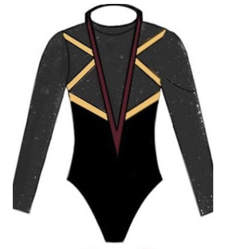
No. 7: The thing that caught my eye about this leo is the design on the neckline. I like the way she used maroon to accent but had the main color focus be black, gray and white. I also think the square neckline would be very flattering on pretty much everyone.
No. 8: I love black leos, and I absolutely adore how she used the maroon and gold as accents here. The design is unique, too. Big fan.
No. 9: This one feels like a combination of sporty and traditional. I’d be curious to know what fabric she intends for the sleeves because they look like they have some texture, which is interesting.
No. 10: This is one I’d really want to see in person before casting my final verdict, but it has the potential to be a very beautiful leo. I like the cut out design and the gold belt and sleeve accents.
Mary Emma

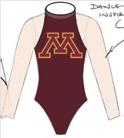
No. 1: I would love to see this design as an actual leo. Of all the leo designs, this one screamed Minnesota the most to me with the logo and the gold stripes.
No. 2: Another great design. This would probably be my No. 1, but I’m not the biggest fan of the neckline.
No. 3: This is a pretty simple design, but a great one. I really like the use of gold on the neckline.
No. 4: This isn’t normally a leo I’d gravitate toward, as I wish it had a bit more color, but I really like the design and the neckline is not something I’ve seen before.
No. 5: Again, this is a pretty standard design, but a great one. My favorite feature is definitely the sweetheart neckline.
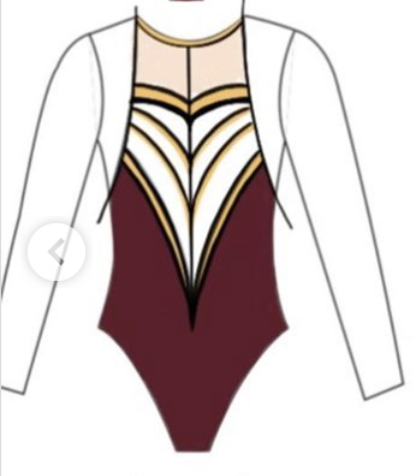
No. 6: This is a really cool design, and I love that it is dance team inspired. I would love to see how this one looks as a real leo.

No. 7: Of course I had to include a leo with (what looks like) ombre sleeves! Like my pick for No. 2, I’m not the biggest fan of the neckline, but other than that, I love the design.
No. 8: Again this is a simple design, but really nice. I love the maroon sleeves and the gold accents.
No. 9: This is an interesting design and not something I’d normally gravitate toward, but there’s something about it I really like.
No. 10: I don’t love the neckline on this one (it almost looks like a sports bra), but I like everything else about it: the colors, the band around the middle and the gold accents.
READ THIS NEXT: Leotard Rankings: Week 6
Article by Elizabeth Grimsley, Kalley Leer and Mary Emma Burton
Like what you see? Consider donating to support our efforts throughout the year! [wpedon id=”13158″]


4 comments
Comments are closed.