The criteria is the same as always: up to three points for design, two points for fabric and sparkle, two points for school spirit and three points for overall appearance. This week Christina and Emily M are joining Editor-in-Chief Elizabeth to help judge.
Texas Woman’s: 8.600

| Design | Fabric/
Sparkle |
School
Spirit |
Overall
Appearance |
Total | |
| Elizabeth | 2.8/3 | 1.8/2 | 1.6/2 | 2.9/3 | 9.1/10 |
| Christina | 2.4/3 | 1.7/2 | 1.4/2 | 2.6/3 | 8.1/10 |
| Emily M | 2.6/3 | 1.8/2 | 1.4/2 | 2.8/3 | 8.6/10 |
Elizabeth: This leo is my No. 1 for TWU now and by far my favorite of the weekend. It’s absolutely incredible. I’m obsessed with the back, the red logo really pops and the front is so classy. TWU mostly sticks to using its crimson-y color in leos, so I loved this venture to the dark side for 2020’s new design.
Christina: This is a very elegant look. The front is lovely and the symmetry between the front sparkles and the back straps is quite pleasing. But I do wish for a bit more variety or something to pop maybe? Or a different neckline? I am always a bit difficult with all-black leos. The back however is gorgeous and the logo is in a perfect spot.
Emily M: Ohhh! TWU was really due for a new stunner and this fits the bill. I love the way the front crystal pattern echoes the straps down the back. Those few subtly placed red crystals really elevate it, too, and I love that the only really colorful piece is the school logo; it really stands out.
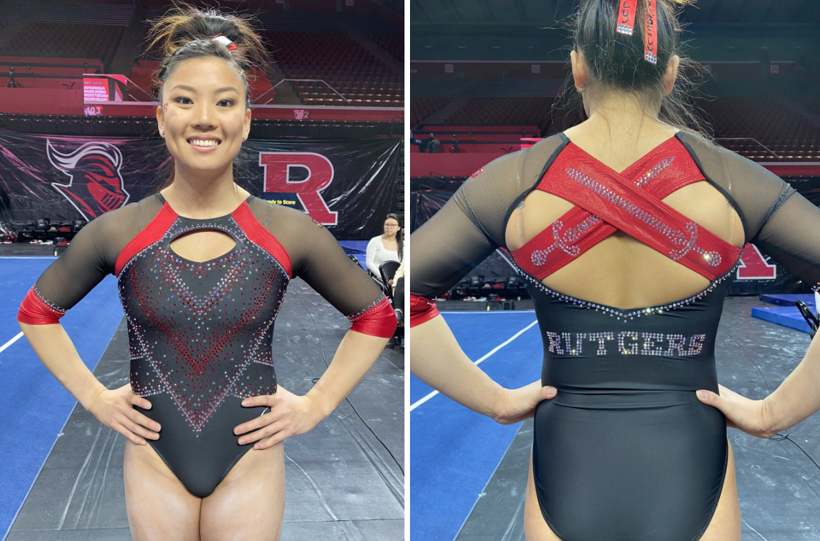
Rutgers: 8.567
Photo/@RUGymnastics, Twitter
| Design | Fabric/
Sparkle |
School
Spirit |
Overall
Appearance |
Total | |
| Elizabeth | 2.2/3 | 1.6/2 | 1.8/2 | 2.4/3 | 8.0/10 |
| Christina | 2.5/3 | 1.7/2 | 2.0/2 | 2.5/3 | 8.7/10 |
| Emily M | 2.6/3 | 1.8/2 | 2.0/2 | 2.6/3 | 9.0/10 |
Elizabeth: The back on this is fantastic. I love how the swords for Scarlet Knights were incorporated into the straps, and the mostly open back is great. I also love the front with the black design that’s elevated with sparkles. I could do without the hole, but it’s less offensive than most.
Christina: The swords on the back straps are absolutely brilliant! The back overall is just perfect. The front is lovely as well with the different shades of fabric and sparkles in black and red. I could have done without the keyhole as well, but like Elizabeth said, it doesn’t bug me as much as some other leos.
Emily M: It’s controversial around here, but I have been loving the Rutgers looks this year. The back! Is! Perfect! This thing oozes Scarlet Knight. I like the chevron pattern down the front against the matte black—it’s a very subtle nod to old school leos. Honestly I’m not mad at the keyhole because it’s really becoming a signature Rutgers thing. I really enjoy the almost patent red, too. Just a really great one overall for me.
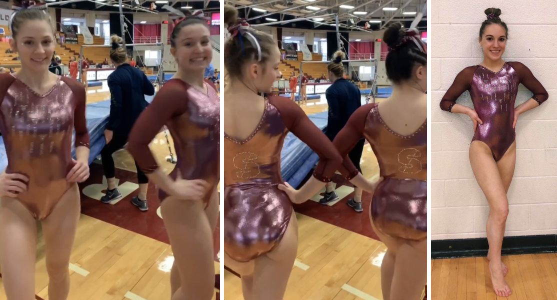
Springfield: 7.667
| Design | Fabric/
Sparkle |
School
Spirit |
Overall
Appearance |
Total | |
| Elizabeth | 2.2/3 | 1.7/2 | 1.7/2 | 2.4/3 | 8.0/10 |
| Christina | 1.8/3 | 1.5/2 | 1.6/2 | 1.9/3 | 6.8/10 |
| Emily M | 2.4/3 | 1.6/2 | 1.8/2 | 2.4/3 | 8.2/10 |
Elizabeth: I’m really digging the shade of pinkish-red used here, Springfield! The shiny quality to the body is really lovely as well, and goes great with the mesh sleeves. The design overall is pretty simple, but I feel like too much else would be too busy with such a shiny fabric used. Also, apparently the triangles incorporated with rhinestones on the body represent the school and stands for mind, body and spirit—pretty cool!
Christina: I am not sure about this pink shade. Well, I like it in theory, but I don’t think I’m a fan of it being used on the entire leo. The design itself is quite simple, but I do love the triangles incorporated into the design and what they represent.
Emily M: Oh this color is weird, and that’s a compliment. So many teams have a variation of red school colors, so really going for this rosy hue is so unique. If you’re going to do a full-on mystique body like this, this is how you pair it with mesh sleeves. The cut on that transition works really well and doesn’t take away from the design. I really like the subtle school spirit with the triangles, too! My only wish is that there were some pizzazz on the sleeves, maybe a crystal cuff or something.
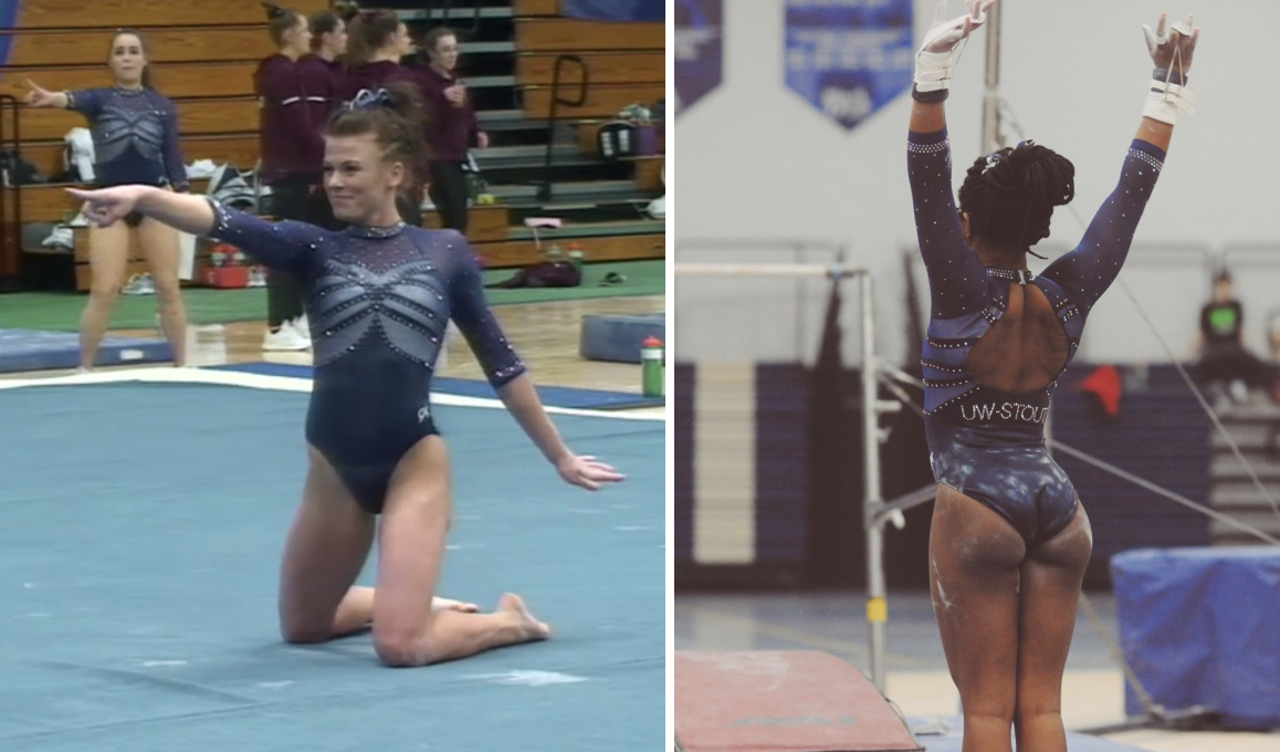
UW-Stout: 7.600
Photo/@shadae_boone, Instagram
| Design | Fabric/
Sparkle |
School
Spirit |
Overall
Appearance |
Total | |
| Elizabeth | 1.9/3 | 1.5/2 | 1.6/2 | 2.1/3 | 7.1/10 |
| Christina | 1.9/3 | 1.4/2 | 1.7/2 | 2.3/3 | 7.3/10 |
| Emily M | 2.4/3 | 1.6/2 | 1.8/2 | 2.6/3 | 8.4/10 |
Elizabeth: I LOVE the back on this. It’s not often you get a DIII team doing a fun back, but Stout went for it with this design. I also love the shades of blue incorporated, despite the front design being a bit too contrasty for my taste.
Christina: I am not sure about this one. To nobody’s surprise and just like Elizabeth, I love the back. There is maybe a bit too much happening on the front however, with the armor-like bodice and three different shades of that blue.
Emily M: STOUT! Damn DIII is really coming in hot this year. This color combo is stunning, blue with a slightly moody vibe. Here for it, especially with that sweetheart neckline. Plus the open back? Yes, please!
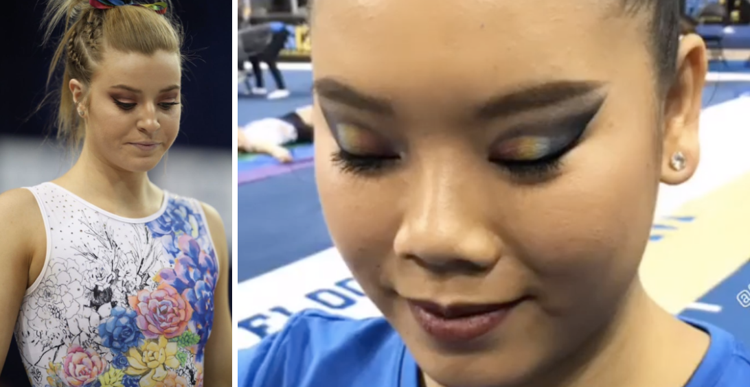
UCLA: 7.367
Photo/@uclagymnastics, Instagram Story
| Design | Fabric/
Sparkle |
School/Pride
Spirit |
Overall
Appearance |
Total | |
| Elizabeth | 2.0/3 | 1.5/2 | 1.2/2 | 2.1/3 | 6.8/10 |
| Christina | 1.8/3 | 1.7/2 | 1.4/2 | 2.0/3 | 6.9/10 |
| Emily M | 2.0/3 | 1.8/2 | 2.0/2 | 2.6/3 | 8.4/10 |
Elizabeth: You know, I was always kind of against UCLA’s “pink” leo, which was basically just a normal leo design it already had but with pink rhinestones instead of regular ones. It felt to me like UCLA was phoning in the support, so why bother at all? When I first saw that this leo would be for the pride meet, I was disappointed once again. If you’re going to hold a pride meet, go all out. It’s not like UCLA didn’t custom design six leos for its floor lineup at Meet the Bruins. However, I will say that I appreciate that this leo is subtly multi-colored while still clearly being a UCLA leo with the majority blue. I also like how it spreads from black and white to full-on color—I feel like there’s some sort of metaphor in there. And since my description for this leo is already WAY too long, I’ll wrap up by saying it’s a fine leo, but not my favorite by any stretch.
Christina: Points for using rainbow colors for the pride meet, but I don’t really know why there are flowers all over. I don’t necessarily like the black and white parts as it just looks unfinished, but clearly this was the intended look. Anyway, in theory, yes to going all in with a colorful rainbow leo, but medium execution here with the blotchy flowers.
Emily M: Most parts of this leo work really well for me. The colorstory is gorgeous. I love the play on a rainbow in florals. I love the black and white at the top shoulder. I love the emphasis on Bruin blue without overwhelming the other colors. I love the message and commitment to the pride meet, too. That said, the way the pattern cuts at the bottom is a little weird; I get not bringing the florals down into the crotch (no thank you!), but I wish the diagonal line of the top of the floral pattern held throughout the design. From far away, the florals just kind of become a splotch of color on everyone’s mid-region. I am really glad this is a fully matte look; sparkles on here would be way too much for me. It’s just so close but not quite, you know?
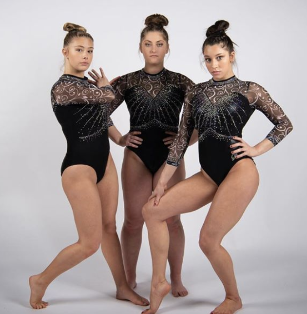
UW-Oshkosh: 7.100
Photo/@uwogymnastics, Instagram
| Design | Fabric/
Sparkle |
School
Spirit |
Overall
Appearance |
Total | |
| Elizabeth | 2.0/3 | 1.5/2 | 1.4/2 | 2.2/3 | 7.1/10 |
| Christina | 2.3/3 | 1.5/2 | 1.3/2 | 2.4/3 | 7.5/10 |
| Emily M | 1.8/3 | 1.6/2 | 1.3/2 | 2.0/3 | 6.7/10 |
Elizabeth: Oshkosh really stepped it up with this leo! I love the whole body and the rhinestone detailing. I think I would have preferred simple black mesh sleeves since there is so much going on with the body that the sleeve design makes it a bit too busy.
Christina: I quite like this one! The black bodice with the sweetheart neckline and all the sparkles is stunning. The sleeves are a bit busy, but I like the colors used. Maybe a different pattern or simply yellow-toned mesh sleeves would have been better.
Emily M: Oh wow this is a whole thing! Those sleeves are a lot, so I appreciate the simplicity of the bodice. That crystal belt is also one of the more flattering ones out there. I think I wish the sleeve swirls were something else, though—a different pattern.
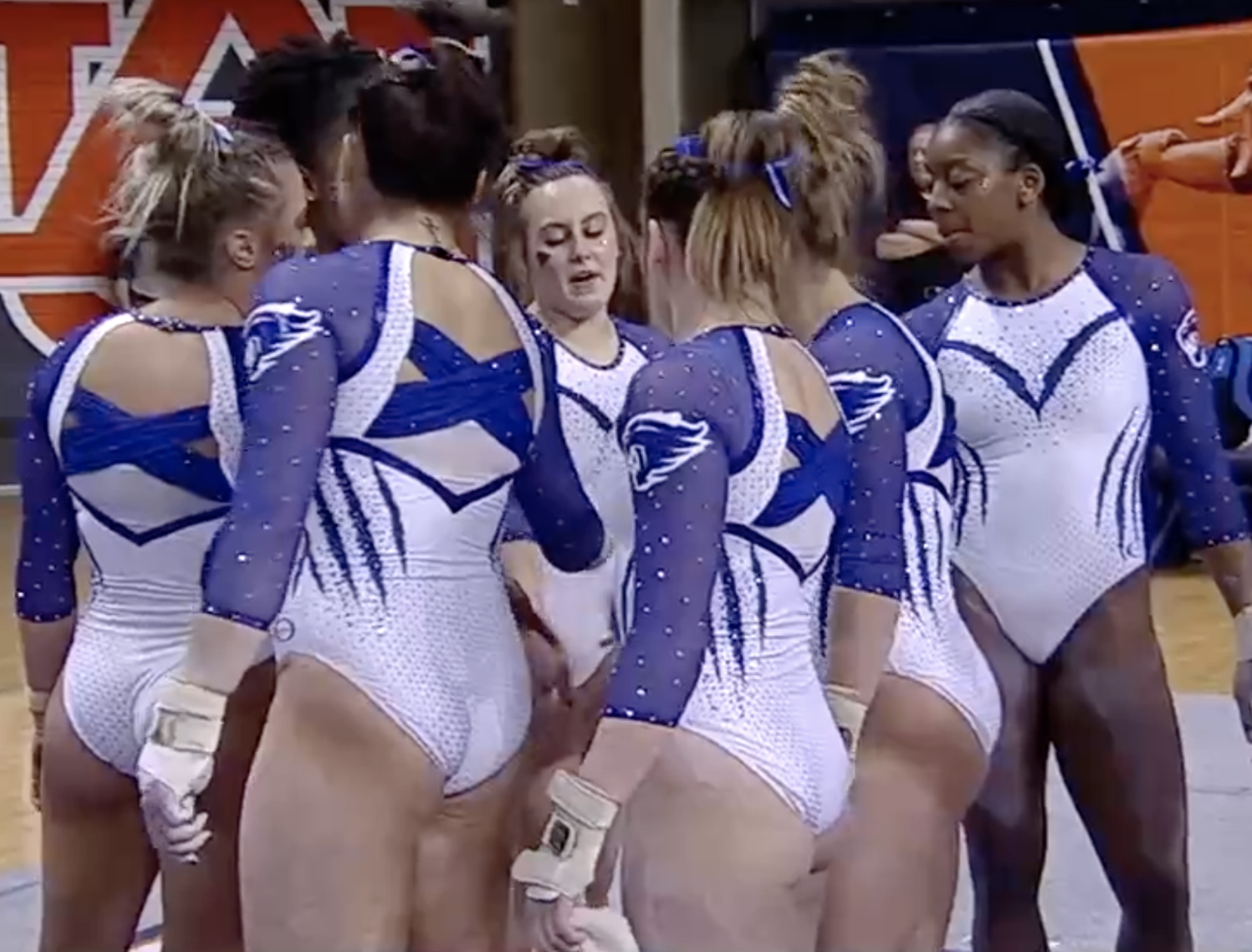
Kentucky: 7.100
| Design | Fabric/
Sparkle |
School
Spirit |
Overall
Appearance |
Total | |
| Elizabeth | 2.4/3 | 1.6/2 | 1.6/2 | 1.8/3 | 7.4/10 |
| Christina | 2.0/3 | 1.5/2 | 1.8/2 | 2.0/3 | 7.3/10 |
| Emily M | 1.6/3 | 1.4/2 | 1.8/2 | 1.8/3 | 6.6/10 |
Elizabeth: I like this for the most part, but I have a bone to pick. Why design a leo with a back like that and then wear a bra that shows?! Maybe that bra wasn’t the plan, but honestly did someone not think of this between designing it, getting the test sample, everyone trying it on, the SEC video shoot before the season… As for the design, I like it, and love the back. I think I wish the front above the sweetheart was blue as well to match the sleeves but overall this is good with the exception of my bra issues.
Christina: It’s taken me a while to figure out if I like the leo or not. I quite like the front, although I wish it had gone for the full sweetheart neckline instead of having the solid white above. In the back, I love the blue criss-cross straps, but is the white mesh underneath supposed to be there? Or is that their bra showing like Elizabeth mentioned? This would be so much prettier without it. Anyway, just like my colleagues, it’s all mixed feelings for me.
Emily M: My first reaction to this was AH! It’s a lot! The more I sit with it, the less jarring it feels, but there’s something off to me? The faux sweetheart neck, plus the almost open back—it’s just funky. Maybe Kentucky wanted to go for that open look but let gymnasts be a little more covered—and that’s great—but the execution just falls flat for me. I do appreciate the wildcat claw marks.
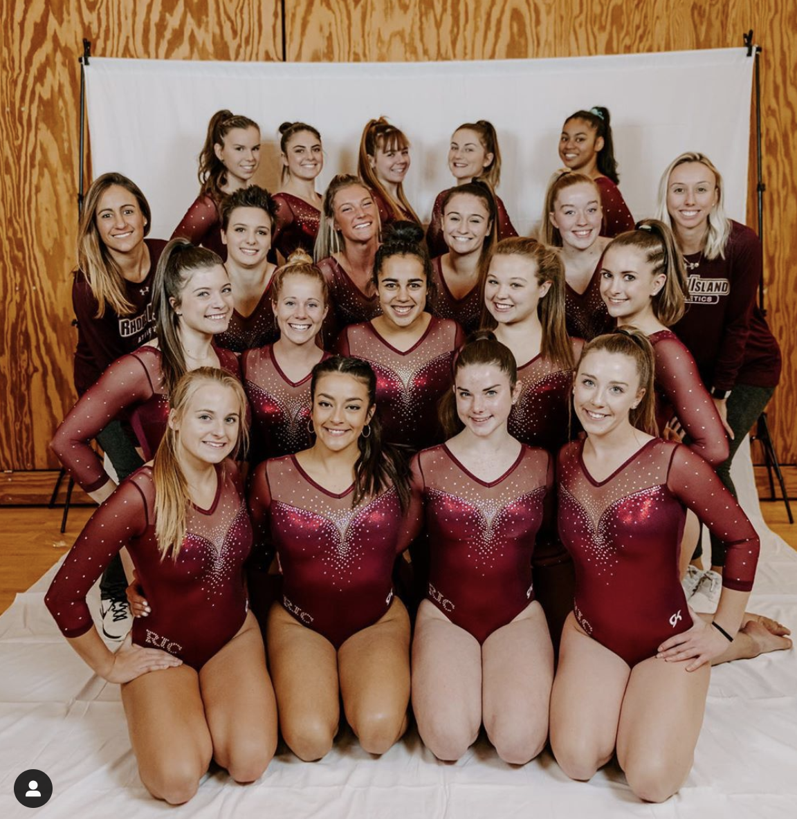
Rhode Island: 6.967
Photo/@ricgym, Instagram
| Design | Fabric/
Sparkle |
School
Spirit |
Overall
Appearance |
Total | |
| Elizabeth | 1.8/3 | 1.4/2 | 1.5/2 | 2.0/3 | 6.7/10 |
| Christina | 2.3/3 | 1.6/2 | 1.4/2 | 2.2/3 | 7.5/10 |
| Emily M | 2.0/3 | 1.6/2 | 1.3/2 | 1.8/3 | 6.7/10 |
Elizabeth: It’s simple, but I don’t have any issues with it. I love the shade of red used, and sweetheart with mesh sleeves is always a win in my book.
Christina: This is gorgeous, although very common. But I am obsessed with the solid bodice, the sweetheart neckline with the perfect amount of sparkles and the shade of red.
Emily M: A new RIC leo! I love the color, and this is an A+ sweetheart neckline and crystal combo. I wish there were an anchor on here somewhere. Maybe there’s one on the back?
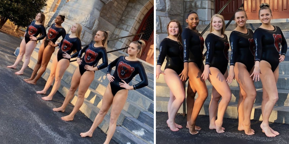
Ursinus: 6.667
Photo/@ursinusgym, Instagram
| Design | Fabric/
Sparkle |
School
Spirit |
Overall
Appearance |
Total | |
| Elizabeth | 1.4/3 | 1.2/2 | 1.8/2 | 1.6/3 | 6.0/10 |
| Christina | 1.2/3 | 1.3/2 | 2.0/2 | 1.2/3 | 5.7/10 |
| Emily M | 2.3/3 | 1.6/2 | 2.0/2 | 2.4/3 | 8.3/10 |
Elizabeth: I like this, but the fact that the bear head is off-center just throws me off so much and makes my mild-OCD self twitch a bit. I appreciate the somewhat simple design with a blast of school spirit, though.
Christina: The giant bear head being off-center bugs me so much. I do like the solid black and the Ursinus on the sleeve, but maybe this design is a bit too simple for my taste.
Emily M: You know what? I love this. It’s totally out of the realm of leos I normally go for, but something about it clicks for me. Maybe it’s the offset bear opposite the sleeve text. It hits that quirky and simple sweet spot; the bear on anything more than black would be too much, but here it’s very Goldilocks. Just right. (Sorry, I had to, I’ll see myself out.)
Towson: 6.100
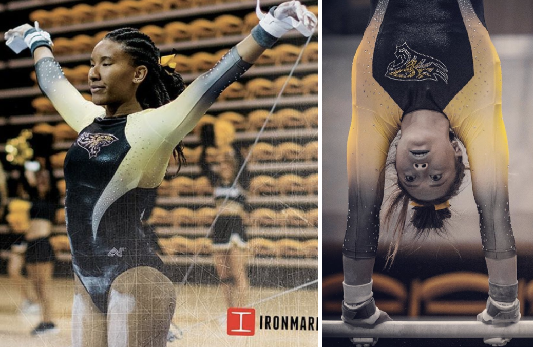
Photos/@towsongymnastics, Instagram
| Design | Fabric/
Sparkle |
School
Spirit |
Overall
Appearance |
Total | |
| Elizabeth | 1.6/3 | 1.4/2 | 1.7/2 | 1.8/3 | 6.5/10 |
| Christina | 1.1/3 | 1.3/2 | 1.8/2 | 1.7/3 | 5.9/10 |
| Emily M | 1.0/3 | 1.5/2 | 1.8/2 | 1.6/3 | 5.9/10 |
Elizabeth: This has grown on me since I first saw it during preseason. However, I don’t like how the design cuts so far in on the front. The yellow and black ombre is lovely, though.
Christina: I’m not a fan of the design on the front between the solid black and ombre sleeves. The shape created is just…not so great. I do like the yellow and black ombre, though.
Emily M: Huh. The cut just doesn’t quite work for me. I get what they’re trying to do, creating a slimming line, but the tendrils (cannot unsee) just come a little too far in and too far down. That said, I love the ombre!
BONUS! Kent State: 8.200
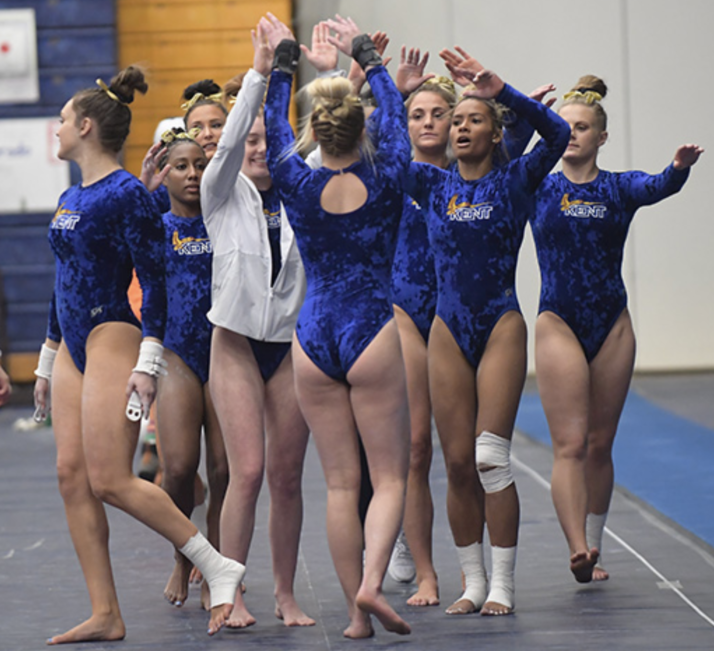
Photo/@KentStGym, Twitter
| Design | Fabric/
Sparkle |
School
Spirit |
Overall
Appearance |
Total | |
| Elizabeth | 2.3/3 | 1.8/2 | 1.8/2 | 2.5/3 | 8.4/10 |
| Christina | 2.2/3 | 2.0/2 | 1.8/2 | 2.3/3 | 8.3/10 |
| Emily M | 2.0/3 | 2.0/2 | 1.6/2 | 2.3/3 | 7.9/10 |
Elizabeth: I’m all for teams doing throwback leos for alumni night and think more teams need to get on the trend. I love the crushed velvet, I love the keyhole back and I love the old school logo. What’s not to enjoy?
Christina: Crushed velvet! Yes!! I love the shade, the logo on the front and the small keyhole in the back is so retro. What a great and fun thing to do for an alumni meet.
Emily M: Heck yes we love a throwback. Crushed blue velvet is my first love (see: the dress I wore to many a childhood birthday dinner and the 1996 Tour of Gymnastics Champions, true story). The keyhole back just adds that really retro feel. Thanks for continuing to pull this one out, Kent State!
READ THIS NEXT: Leotard Rankings: Week 5
Article by Elizabeth Grimsley, Christina Marmet and Emily Minehart
Like what you see? Consider donating to support our efforts throughout the year! [wpedon id=”13158″]



One comment
Comments are closed.