

The criteria is the same as always: up to three points for design, two points for fabric and sparkle, two points for school spirit and three points for overall appearance. This week Rebecca and Tara are joining Editor-in-Chief Elizabeth to help judge.
UCLA: 9.400
https://www.instagram.com/p/B77ET1VDS3V/?igshid=wad70c4e26xz
| Design | Fabric/
Sparkle |
School
Spirit |
Overall
Appearance |
Total | |
| Elizabeth | 2.8/3 | 1.8/2 | 1.9/2 | 2.9/3 | 9.4/10 |
| Rebecca | 3.0/3 | 1.7/2 | 2.0/2 | 2.9/3 | 9.6/10 |
| Tara | 2.8/3 | 1.7/2 | 1.8/2 | 2.9/3 | 9.2/10 |
Elizabeth: I’m obsessed. It’s the perfect mix of athletic and trendy. The ombre is excellent, I love the use of white, and the side stripes are so throwback. I do agree with Rebecca that the highlighter yellow effect under lights wasn’t my favorite, but that’s minor minor minor.
Rebecca: I have nothing to say except yes and good and thank you. My only slight concern is that under the arena glare, the gold ribbon looked greenish, but my concern level about that is fairly low.
Tara: I really, really love this. The ombre, the UCLA, the stripes on the side—it’s all lovely. I have to echo Rebecca and Elizabeth in saying that I don’t love that the yellow stripe looked green under the lights, but that’s a pretty small concern.
UW-La Crosse: 8.667
https://www.instagram.com/p/B6BgI_fJssI/?igshid=3kyrsfj5cf8s
| Design | Fabric/
Sparkle |
School
Spirit |
Overall
Appearance |
Total | |
| Elizabeth | 2.6/3 | 1.8/2 | 1.6/2 | 2.8/3 | 8.8/10 |
| Rebecca | 2.2/3 | 1.7/2 | 2.0/2 | 2.3/3 | 8.2/10 |
| Tara | 2.7/3 | 1.8/2 | 1.7/2 | 2.8/3 | 9.0/10 |
Elizabeth: This leo is a LOT, but I’m obsessed with the way the red fabric looks paired with the sparkle design on the body. The back is OK, but the front really just puts a big gold star on the overall look for me. This leo is fantastic.
Rebecca: That’s a lot of sparkles, dude. I really like this one! While the sparkle pattern is a little busy, the colors and overall structure of the leotard are great, and I LOVE the back. I believe the heart on the arm is a nod to freshman Maddie Grobmeier, who passed away over the summer.
Tara: Yet another great DIII leo! I’m in love with the ombre and the sparkle design on the body. I also think the line where the sparkles end is well done. It’s great, and I love it.
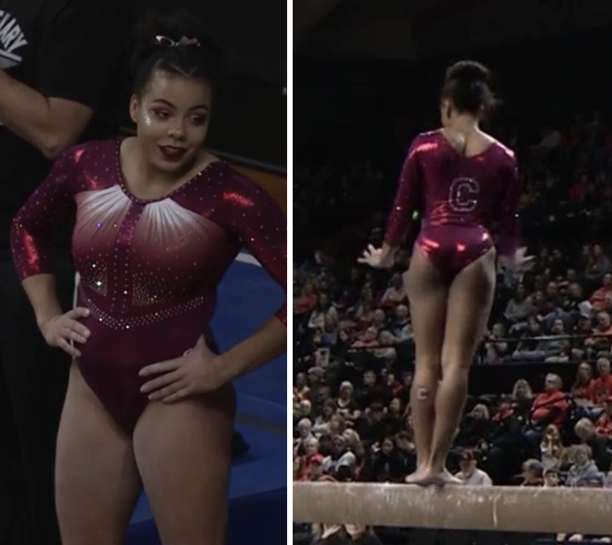
Centenary: 8.400
| Design | Fabric/
Sparkle |
School
Spirit |
Overall
Appearance |
Total | |
| Elizabeth | 2.4/3 | 1.7/2 | 1.5/2 | 2.5/3 | 8.1/10 |
| Rebecca | 2.4/3 | 2.0/2 | 1.7/2 | 2.5/3 | 8.6/10 |
| Tara | 2.5/3 | 1.8/2 | 1.7/2 | 2.5/3 | 8.5/10 |
Elizabeth: My one qualm is that I wish the back wasn’t so boring because the front is GREAT. I love the ombre and the ruching around the neckline. But if you showed me a pic of the back completely separately, I would say it wasn’t the same leo.
Rebecca: It’s a stock design and I don’t even care. It’s beautiful and it makes my life better by existing. Centenary rarely has bad leotards—whoever designs there has a knack for creating classy looks from basic designs and what I assume to be a limited budget. But this year’s two new ones are a step up. I could have gone for a bit more action on the back.
Tara: I know it’s a stock GK design, but I still love it. The color combination plays well, and ombre is always a plus. I don’t love the back, but it does get points for school spirit.
San Jose State: 8.233
| Design | Fabric/
Sparkle |
School
Spirit |
Overall
Appearance |
Total | |
| Elizabeth | 2.4/3 | 1.7/2 | 1.6/2 | 2.2/3 | 7.9/10 |
| Rebecca | 2.3/3 | 1.8/2 | 1.7/2 | 2.2/3 | 8.0/10 |
| Tara | 2.6/3 | 1.9/2 | 1.7/2 | 2.6/3 | 8.8/10 |
Elizabeth: This leo had so much potential, but the execution isn’t quite there. I love the ombre, and the back is fantastic. However, I really don’t like how the side triangles converge into a weird stomach line? Just…don’t? Ruining a perfectly good leo with nonsense.
Rebecca: When I first saw the back of this leotard, I was very excited. Then when I saw the front, I thought the royal blue ombre made it look like a Pitt leotard. Ah well. The shaping on the front isn’t the most flattering to me, but it’s still pretty.
Tara: I love this! I love the ombre, and the way they incorporated yellow in is nice. The cross back is to-die-for, and it has just the right amount of sparkle. I actually like how the lines on the front continue around to the back and how “Spartans” is in the middle of them.
Brockport: 7.767
https://www.instagram.com/p/B6_mH8shaUu/?igshid=11vjl2eh6dsjy
| Design | Fabric/
Sparkle |
School
Spirit |
Overall
Appearance |
Total | |
| Elizabeth | 2.4/3 | 1.8/2 | 1.4/2 | 2.5/3 | 8.1/10 |
| Rebecca | 2.0/3 | 1.3/2 | 1.3/2 | 2.0/3 | 6.6/10 |
| Tara | 2.7/3 | 1.8/2 | 1.4/2 | 2.7/3 | 8.6/10 |
Elizabeth: I’m absolutely in love with this leo. The green is great, the sleeve ombre is great, the use of gold sparkles is great, the continuation of the shoulder design to the front design is great… It’s all great. This is one of my favorite leos of all time, DIII or not. Good job, Brockport!
Rebecca: I’m glad that the national champs got a new leotard to celebrate their accomplishments last year. This one isn’t amazing, but it’s good. I can appreciate the ombre sleeves and how the green lines on the shoulder feed into the V pattern on the body. I wish the green were darker, and the main body design leaves a bit to be desired, to me.
Tara: LOVE. I don’t think there’s one thing I don’t like about it. The green and white ombre sleeve with the black bodice…love. The shoulder lines and how they go into the sparkle design…amazing. Overall a very lovely leo.
West Virginia: 7.600
https://twitter.com/WVUGymnastics/status/1221489037057437697
| Design | Fabric/
Sparkle |
School
Spirit |
Overall
Appearance |
Total | |
| Elizabeth | 2.3/3 | 1.6/2 | 1.5/2 | 2.4/3 | 7.8/10 |
| Rebecca | 2.2/3 | 1.8/2 | 1.4/2 | 2.3/3 | 7.7/10 |
| Tara | 2.4/3 | 1.4/2 | 1.4/2 | 2.1/3 | 7.3/10 |
Elizabeth: This leo grew on me since I first saw it, and I think having a good still image of it helped. I really like the back and the use of the more ruched fabric for the criss-cross straps. I also don’t mind the front stripes despite them being a bit circus-y.
Rebecca: There is something just slightly odd about this one. For one, I’ve struggled to figure out if the shades of blue on the front and back are actually the same. But the front looks vibrant against a primarily black leotard, and I appreciate the starburst pattern.
Tara: I like the overall concept of this one. The back is gorgeous, and I always enjoy the starburst-type front design. I don’t love the shade of blue they used on top with the black on the bottom, but this is solid nevertheless.
Temple: 7.500
https://twitter.com/TUWG/status/1223341604666314752
| Design | Fabric/
Sparkle |
School
Spirit |
Overall
Appearance |
Total | |
| Elizabeth | 1.8/3 | 1.3/2 | 1.4/2 | 2.0/3 | 6.5/10 |
| Rebecca | 2.0/3 | 2.0/2 | 1.3/2 | 2.5/3 | 7.8/10 |
| Tara | 2.3/3 | 2.0/2 | 1.4/2 | 2.5/3 | 8.2/10 |
Elizabeth: This is very stock design, but I don’t dislike it. The red used it a good one, and the design isn’t bad by any means. It’s just a little boring overall. Temple has had some much more exciting leos since.
Rebecca: Old but good. (Here’s a better view.) It’s plain, but the rich red colour is so lovely and it looks good on everyone.
Tara: It’s simple, but I like it. It reminds me of a lot of other leos, but at least it’s a good one to be reminded of. The red is gorgeous, too.
Oklahoma: 5.967
https://twitter.com/OU_WGymnastics/status/1219383939535642625
| Design | Fabric/
Sparkle |
School
Spirit |
Overall
Appearance |
Total | |
| Elizabeth | 1.8/3 | 1.4/2 | 1.7/2 | 2.0/3 | 6.9/10 |
| Rebecca | 0.8/3 | 1.2/2 | 1.2/2 | 1.5/3 | 4.7/10 |
| Tara | 1.2/3 | 1.5/2 | 1.8/2 | 1.8/3 | 6.3/10 |
Elizabeth: I probably like this leo more than most people, but can agree that the black looks a little backpack-y. I do like the use of black, though, and the sparkle arrow/stripes for the design are good.
Rebecca: I thought this looked lovely from the video when we could only see small parts, but the whole thing didn’t come together coherently. What’s with the straps? There’s something very childish about the whole thing.
Tara: I want to like this, but there’s something about it that I don’t love. All the individual elements are fine, but I think it’s just too much for one leo. I could do without the black straps. They just don’t fit well. I do love the back and the overall stripe pattern, though.
Ursinus: 5.700
https://www.instagram.com/p/B5rAPBvFODS/
| Design | Fabric/
Sparkle |
School
Spirit |
Overall
Appearance |
Total | |
| Elizabeth | 1.4/3 | 1.4/2 | 1.7/2 | 1.5/3 | 6.0/10 |
| Rebecca | 1.0/3 | 1.7/2 | 1.4/2 | 1.3/3 | 5.4/10 |
| Tara | 1.3/3 | 1.4/2 | 1.4/2 | 1.6/3 | 5.7/10 |
Elizabeth: Like Rebecca said, this leo has grown on me, and it definitely looks better in action than it does in pictures. However, it’s a little too bold in the yellow department for my taste.
Rebecca: We’ve been calling this one the landing strip leotard. It’s certainly very bold, but… it’s grown on me, honestly. It’s a little odd, but I’ve seen much worse, and I respect that the Bears aren’t afraid of yellow.
Tara: I don’t love this, but it’s not the worst I’ve seen either. It’s just a little too bold for my liking, especially when it comes to using yellow. My favorite part is the “BEARS” down the back in sparkles.
READ THIS NEXT: Leotard Rankings: Week 4
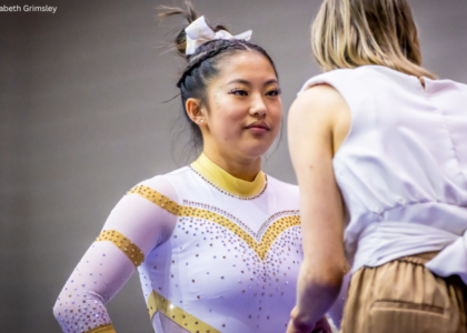
Article by Elizabeth Grimsley, Rebecca Scally and Tara Graeve
Like what you see? Consider donating to support our efforts throughout the year!
Love these ranking posts, but is there any way you could imbed images of the leos? I have to copy + paste each of the links to see the images.
Thanks 🙂