
This summer we’re trying a little something new when it comes to our throwback leotard rankings. Rather than looking at single meets, we’ve decided to take a trip down memory lane for specific teams, taking into account a wide range of leos from different eras and finding our all-time favorites from a single program, as well as illustrating how designs have changed over the years.
Here’s how it’ll work: Our judges for the week will choose their top 10 and rank them based on their personal preferences. Plus, you’ll get a chance to tell us your thoughts! Did we leave out your all-time fave from the team? Let us know in the comments or on social media.
This week, we’re taking on Auburn with Christina and Katherine joining Editor in Chief Elizabeth for the rundown.
Elizabeth
No. 1: This is Auburn’s best leo by far. The orange and blue actually work well together (I’m normally not a fan), and I love a good white accent. Fantastic overall.
No. 2: My favorite part of this leo is how the overwhelming amount of rhinestones on the blue part makes it looks more like sparkly velvet than lycra with rhinestones. Add in white and a good amount of orange, and I’m sold.

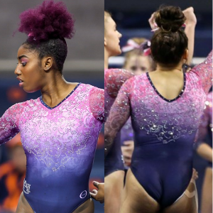
No. 3: It’s rare for us to include pink leos in these rankings, but this new one from Auburn is one of the best across teams. I love how the ombre pairs with the intricate underlying design.

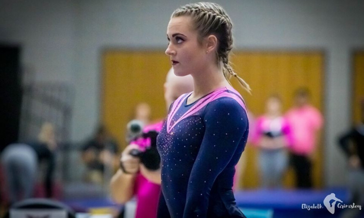
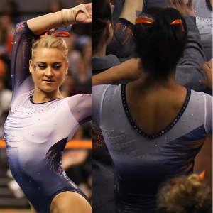
No. 4: I like how this is more of a steely blue than straight-up navy. It works well with the ombre design and shinier fabric.
No. 5: In terms of older Auburn leos, this one is solid, pairing a mostly navy design with subtle silver, orange and white accents. A win for me.

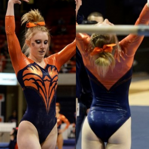
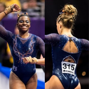
No. 6: Mostly navy: check. Orange accents: check. Sweetheart neckline with mesh: check. All I needed was a cool back and some ombre to make this design an all-time fave.
No. 7: I like this leo for the subtle incorporation of school spirit with the War Eagle feather on the side and tiger stripes design on the body.

No. 8: I’ve noticed by doing these rankings that a lot more teams than I thought have older leos with cursive school names as the main design. Some don’t work for me, but this one does.
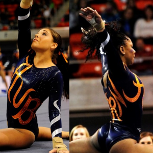
No. 9: A lot of teams have used this sleeve pattern, but I especially like it here because it really plays into the Tigers aspect of Auburn.
No. 10: A lot of older Auburn leos look similar to one another and to other teams from that time period, but I like this one for its more unique design and the addition of shiny white.
Christina

No. 1: Sorry not sorry my top pick for Auburn is a pink leo.This is my all-time favorite pink leo, and just one of my favorite leos overall in the NCAA. The ombré, the details, the sparkles—everything is absolutely perfect to me.

No. 2: Outside of the pink leo, this is my next favorite from Auburn. The subtle ombré is gorgeous, and I’m a huge fan of the tiger stripes on the side which incorporate some orange. A beautiful look with the best school spirit.

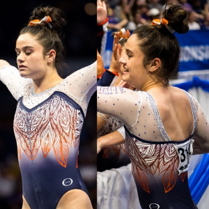
No. 3: Another beautiful one that I absolutely love from Auburn. Once again, the ombré is a gigantic win for me, and the bodice is so elegant in the front. I am a big fan of the back as well, with the open upper back. This leo just looks so great on everybody.
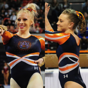
No. 4: You’ve guessed it by now: I love ombré, so this leo of course made the list. Again, it looks great on everybody, it’s very well done and all school colors, including orange, are well incorporated.
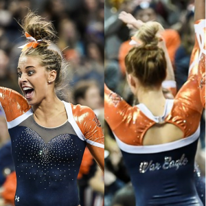
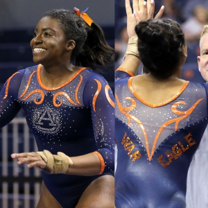
No. 5: This is such a lovely and elegant look while being “sporty” at the same time, which I love. The navy bodice itself is beautiful, particularly with the sweetheart neckline, and the orange sleeves work with the whole look. The back is also great, and the “War Eagle” is the perfect touch.

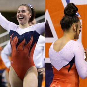
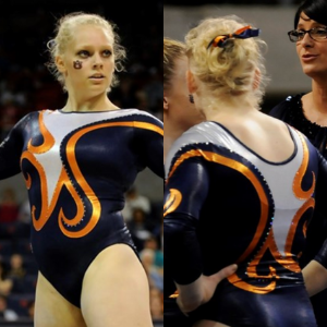
No. 6: I’m not necessarily the biggest fan of flames, but it works great here. Again, the orange looks good, and I love the sweetheart neckline with the white sleeves.

No. 7: It appears I’m a big fan of all the more recent looks from Auburn. While navy is the dominant color, once again the touches of orange are quite well done, and I really like the front on this one and the sparkly collar. That said, the back is my favorite part and is so unique.

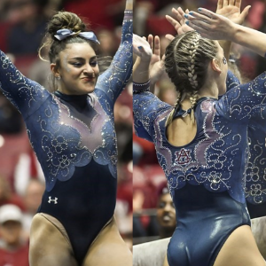
No. 8: This one grew on me, but now I really like the different shades and pastel-like colors of the bodice and the overall design. The keyhole in the back is a nice add along with the AU logo, which does make the whole look pop for the best with a bit of orange.
No. 9: I didn’t even know Auburn also had one of those cursive leos! I like this one with the text in orange, the bodice in dark navy and some sparkles and white on the sleeves. It’s fun and a nice change from some of the more generic designs from that time.
No. 10: I had a hard time picking the last leo for my ranking, but I kept going back to this one for some reason even though I’m not always a big fan of straight necklines. I just like the simplicity of it all, with the dark navy bodice, the white upper body and the orange swirls on it. The white deep-V in the back is also fun.
Honorable Mention: Please add sleeves to this one and make it into a competition leo so it becomes my new No. 1. Thanks.
Katherine
No. 4: Auburn: The original tweet calls this a “chandelier” pattern, but I see it more as Spider Woman webbing. Either way it’s campy, dynamic and really unique. It’s the best combination of glamorous and badass.
No. 2: We had a fun discourse in our Slack channel about what exactly this geometric pattern is supposed to resemble. Whatever it is, it’s unique and I really like it.
No. 3: This is another unique one. You’d think I’d be upset about the lack of orange, but the flowery beading on the sleeves and bodice make up for it. I’d wear this as a shirt or dress.
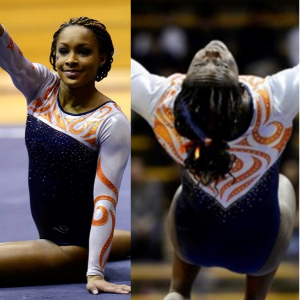
No. 4: I like that the design on the sleeves could be interpreted as tiger stripes or just an elaborate series of twisting vines. I also like how the stripes meet in the middle on the chest; it gives the illusion of a high neck.

No. 5: Lots of designs at work here, but they come together so well. My favorite part is the wispy look of the tiger stripes on the front. Auburn sure likes to interpret those stripes in different ways.
No. 15: Auburn: Never would have thought two pink leos would make it into my top 15, but here we are. I love the fact that it’s a pink leo, but it incorporates the Auburn navy blue color as well.
No. 7: This is another very regal look, but because it’s me, I think the sparkles could have gone a little harder. The mesh sleeves look pretty as always.
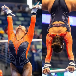
No. 8: This would be higher ranked if not for those orange tendrils. They don’t seem to fit with the rest of the design, especially against the lightness of the sparkles. But, speaking of the sparkles, I love the AU.
No. 9: I’m about to contradict myself regarding my earlier support of ALL THE SPARKLES. This is pretty basic from afar, but the understated sparkles must be really flashy under the lights. The understatement is refreshing. b
No. 10: Another leo that did more than it needed to; if not for the ribbon on the front, it would be perfect. Like the other leo where I thought the stripes unnecessary, the AU is the redeeming quality here
Article by Elizabeth Grimsley, Christina Marmet and Katherine Weaver
Like what you see? Consider donating to support our efforts throughout the year! [wpedon id=”13158″]


