
This summer we’re trying a little something new when it comes to our throwback leotard rankings. Rather than looking at single meets, we’ve decided to take a trip down memory lane for specific teams, taking into account a wide range of leos from different eras and finding our all-time favorites from a single program, as well as illustrating how designs have changed over the years.
Here’s how it’ll work: Our judges for the week will choose their top 10 and rank them based on their personal preferences. Plus, you’ll get a chance to tell us your thoughts! Did we leave out your all-time fave from the team? Let us know in the comments or on social media.
This week, we’re taking on Minnesota with Managing Editor Emily M and MAC Editor Kalley joining Editor in Chief Elizabeth for the rundown.
Elizabeth

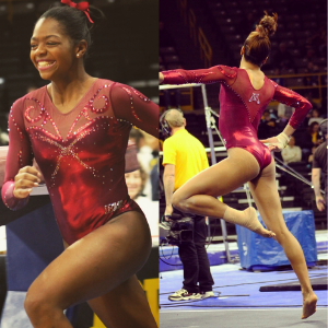
No. 1: This leo gives me life every time I see it, and the best part is, Minnesota was still wearing it as late as only a few years ago. I love the sparkly velvet but especially the high front, low open back design. It’s just perfection.
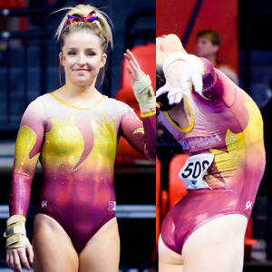
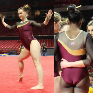
No. 2: I think this was the first design in what I’m calling Minnesota’s new era of leos with ombre and more complex designs. And that’s what I love about it: the ombre sleeves, the bold use of yellow and the nice shiny maroon.

No. 3: Like my No. 2 leo, I love the ombre on this design, as well as the use of yellow as an accent color against the mostly maroon background.
No. 4: I don’t care for the rhinestoned dog collar on this leo, but I love the back, so it made it into my top five.

No. 5: I love a great shiny, two-color ombre. That paired with the exorbitant amount of school spirit and the flames makes it a good one in my book.

No. 6: It’s pretty plain, but I like the shade of red used, paired with the mesh and minimalist design.
No. 7: Unlike my colleagues, I don’t mind nude mesh, but my favorite part of this leo is the back. It’s so unusual and looks great on.
No. 8: I’d definitely call this an old standby for Minnesota. I love the mostly red look with the thin ribbons of yellowy gold.

No. 9: I mean. Yeah. Just the fact that Minnesota had the guts to go all yellow puts this leo on my list. Bring it back, Minnesota.
No. 10: Another rather unusual leo that not only pairs shiny white with white crushed velvet but puts the velvet at the top. I’m here for it.
Emily M

No. 1: I know. It’s old school and a million teams in college and J.O. had a similar leo, but sue me. I love a maroon velvet look.

No. 2: This look is more Oklahoma than Minnesota, and I’m into it. I don’t usually love high necks, but it works here.

No. 3: It’s simple. It’s classy. It’s a look I picture when I think about Minnesota gymnastics.
No. 4:I love the idea of this leo, but the shade of yellow—a constant point of frustration for me with Minnesota—puts me off a touch.
No. 5: You know what? I’m ready for leos like this to make a comeback. They’re simple but stylish, and I’m here for it.
No. 6: I love it when Minnesota goes full maroon. More, please!
No. 7: This is a quality early-2000s look. Your favorite team had this leo in some iteration. It’s such a solid throwback, down to the small script team name.
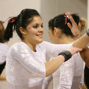
No. 8: I’m never not going to put an all black, simple leo on a favorites list.

No. 9:Minnesota has done a lot of the random swirlies over the years. I hate them all, except for this one. It’s more delicate and less chaotic than most.
No. 10: Another solid throwback look that fills me with nostalgia.
Kalley

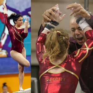
No. 1: Not only is this my favorite leo for Minnesota, it is my favorite leo for any team of all time. I love everything about it. It has ombre (with amazing colors to boot), a fun design and I LOVE the “Ski-U-Mah” in crystals on the back. My only complaint is that Minnesota doesn’t wear this leo nearly enough.
No. 2: I know this design is very simple, but I think that’s what I love most about it. It’s a beautiful shade of maroon, I like the black sleeves and the gold accent stripe adds a nice touch. This is very much a “less is more” design, and I’m a fan.
No. 3: You had me at velvet. Minnesota has worn some seriously fantastic velvet leos, and I wish they would make a comeback, especially when they are this beautiful shade of maroon paired with the black body.
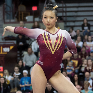
No. 4: This leo is ever-so-subtly different from a lot of the patterns that Minnesota tends to use repeatedly, and I am a fan. I love the maroon and white ombré sleeves, the deep V pattern on the front and the use of gold.
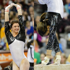
No. 5: I love how different this leo is! White isn’t a color Minnesota utilizes often, but I wish it would incorporate it into more designs. The black, almost marble pattern sleeves are also super fun.

No. 6: Well would you look at that, another velvet leo making my top 10. This is an almost identical design to the maroon one I ranked a little higher, without black. Maroon just lends itself so nicely to velvet. Seriously Gophers, let’s bring at least one of these back!
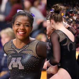
No. 7: It seems like every Big 10 team has a version of this leo, and I like them all. I’m a sucker for a black leo, and I love the simplicity of the M on the chest.

No. 8: I’ve gone back and forth on how I feel about this leo. On the one hand, I love the color and the crystal design. I just can’t decide how I feel about the high collar. It definitely makes the leo memorable, though!
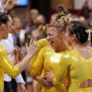
No. 9: I have a feeling I might be in the minority, but I am here for a bright yellow leotard. Most of Minnesota’s leos are similar patterns of maroon or black, and this one is just in-your-face bright and different. Plus, the cut out back is a nice touch. I love it.

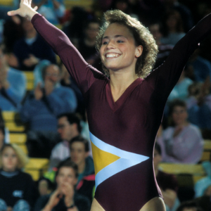
No. 10: This one is probably the most retro one we could find—and I am HERE. FOR. IT. This looks like it is straight out of the ‘90s, and since so many other ‘90s trends are making a comeback, why can’t this leo style, too?
Article by Elizabeth Grimsley, Emily Minehart and Kalley Leer
Like what you see? Consider donating to support our efforts throughout the year! [wpedon id=”13158″]


