

This summer we’re trying a little something new when it comes to our throwback leotard rankings. Rather than looking at single meets, we’ve decided to take a trip down memory lane for specific teams, taking into account a wide range of leos from different eras and finding our all-time favorites from a single program, as well as illustrating how designs have changed over the years.
Here’s how it’ll work: Our judges for the week will choose their top 10 and rank them based on their personal preferences. Plus, you’ll get a chance to tell us your thoughts! Did we leave out your all-time fave from the team? Let us know in the comments or on social media.
This week, we’re taking on Arizona State with Senior Pac-12 Editor Brandis and MPSF Editor Claire joining Editor-in-Chief Elizabeth for the rundown.
Elizabeth
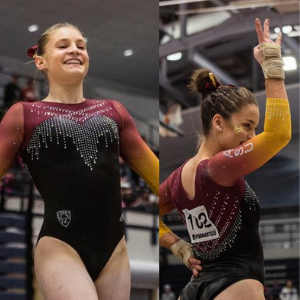
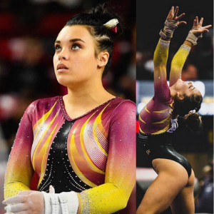
No. 1: The sunset leo is still one of my favorite leos of all time. The sleeves are just perfection, and the yellow works so well with the maroon and black. Plus, the simplicity of the rest of the design allows the sleeves and colors to really shine.
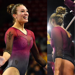
No. 2: Arizona State has really knocked it out of the park with ombre sleeves recently, and this leo is no exception. I love the white to maroon sleeves paired with the rather simple front with gold pitchfork design and more interesting back.
No. 3: I typically don’t care for this inverted V neckline, but it works here. I love the shade of gold used on the sleeves, especially how it looks with the maroon body. Add on the thick band back, and I’m sold.

No. 4: Again, ASU + school colors + ombre + sweetheart neckline = huge win for me. The only reason it’s No. 4 for me is because the leos above it are similar but even better.

No. 5: While an “older” look, I really like how this is a black leo with white sleeves that’s elevated with a neat design using the school colors on the chest.

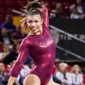
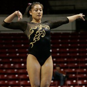
No. 6: I started to have a more difficult time choosing leos because some of the older designs are really something. However, I like this one for the simplicity, the color and the “DEVILS” on the chest.

No. 7: I typically wouldn’t choose a leo like this, but it works in ASU colors. I appreciate the darker maroon shade used here, plus the gold andbronze used to really highlight the flame effect.

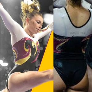
No. 8: While I’m not exactly sure what the front of this looks like, it’s on my list for the back alone. In a world of cool backs, this is still unique than I’ve seen. Who does diagonal horizontal straps? ASU does, apparently.

No. 9: A new leo that I have some issues with but couldn’t leave off my list entirely, I like this leo for the great colors used and pattern of those colors. A few tweaks and it would be even higher.
No. 10: I wish I got a better look at this leo as a whole, but I like the parts I do see—from the dark gold pitchfork to the dark maroon, sparkly sleeves.
Honorable mention: I couldn’t do an ASU leo ranking without bringing up this leotard. It’s the epitome of mid-00s Arizona State leotard design. From the fact that literally one sleeve, to the use of the pitchfork tines for straps and the devil’s tail trailing toward the butt… This leo is just something else. If you’ve never seen this one before, you’re welcome.
Brandis

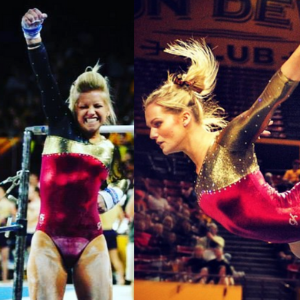
No. 1: This is exactly how yellow should be used in a leo! It contrasts so well with the dark red and black, and its incorporation into the swoopy design makes this my top pick.

No. 2: I clearly have a “thing” for the yellow and red ombre, but I can’t help that it looks so good paired with a black torso. The rhinestones on the torso are so elegant and add to the perfect simplicity of the body as well.

No. 3: Huge fan of the giant pitchfork across the front! I love the overall simplicity of this leo, but if I could change anything, I would have gone a few shades brighter with the maroon on the sleeves.
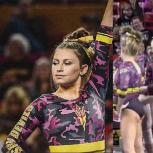
No. 4: I had never seen a camouflage inspired leo that I liked until this one. Separating the camo and maroon with the yellow belt works well, and the use of pink in the camo is a refreshing break from the traditional maroon yet still doesn’t stray too far from school spirit.

No. 5: Breaking up the white and black with the maroon and gold design looks great on this leo. The use of rhinestones is tasteful, and the design continuing onto the sleeves helps make this leo stand out!

No. 6: Not the most original design, but the way it works with Arizona State’s colors is eye-catching for me. Also, the flames are an additional nod to the Sun Devils, so it picks up some bonus points for that.
No. 7: It’s simple, but the shiny gold sleeve that continues around the chest and back is stunning. The plain red body is something we don’t see too often, but I like it here.

No. 8: Another giant pitchfork, and another thumbs up from me! I also like the use of white, but I wish there was some maroon or yellow somewhere in the design to give it a little more Arizona State flare.

No. 9: I’m such a sucker for a good ombre. Using white in the ombre is a welcome switch from the more common yellow, but I wish the rhinestone pitchfork in the center was a bit brighter because it’s beautiful and doesn’t deserve to get overshadowed amongst the rest of the rhinestones.
No. 10: Simple but beautiful. The “Sun Devils” in rhinestones across the back is eye-catching and the maroon looks great paired with the white. If I could change one thing, I would make the small strip of yellow between the maroon and white a more vibrant yellow.
Claire

No. 1: Those gorgeous ombre sleeves are sunset and flames all in one. Pairing them with a simple black bodice was a great choice and makes the colors feel that much more vibrant. The crystals cascading off the sweetheart neckline add a little glamour without overshadowing those fabulous sleeves, and the criss-cross in back keeps the design interesting from every angle.
No. 2: I am 99 percent sure I’m going to be the only who picks this one—let alone pick it as one of my top choices—but I LOVE IT! The pitchfork straps turning into the devil tail is so hilariously creative. This concept could have easily veered into eye roll territory, but since they kept the sparkle and materials relatively simple, the eye-catching elements do their job; it’s tastefully ridiculous. The gold piping around the wrist is the icing on the cake.
No. 3: I love the bolero design (reminds me of Spain’s bullfighter leo from the 2000 Olympics). Once again, the sunset ombre sleeves are a perfect touch! The white accents almost look like muscle striations which—intentional or not—is pretty cool. This is one of those rare designs that looks really great from the side, too
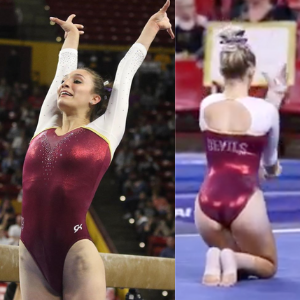
No. 4: This is another one I’m pretty sure I’m going to get side-eyed for picking, but I don’t care! I love the fabric, I love the color and I love the crystal “DEVILS” explosion. Admittedly, it’s a little too simple to be a true showstopper, but still really cool.

No. 5: This one took a little while to grow on me, but it definitely has. I love how the flame design is outlined by crystals AND two different metallic fabrics! It creates the illusion of a gradient (which is so much cooler than just using a gradient).

No. 6: I’m not crazy about the mismatched sleeves and weird band around the back, but the rhinestone use is exceptional. It looks like studded leather in the best possible way! I’m continually impressed by their restraint and willingness to lean into a single striking element.
No. 7: If you’re going to go monochromatic, mixing textures is the way to go; the black mesh keeps this leo from feeling too dark and blah. Meanwhile, the gold design adds a great little pop of color. Those kinds of abstract flames were everywhere in 2008, but this minimalistic take feels really fresh and unique.
No. 8: The bodice is really cool, especially how they integrated the design’s curves into the sweetheart neckline. I’m not a fan of the white sleeves, though… Maybe if they were mesh? As is they look a little too stark and heavy against those bold, dynamic swirls.
No. 9: While this isn’t the most cohesive look, I like so many individual elements of this leotard: the ombre fade at the shoulders instead of the elbows; the gorgeous black crystals sneaking up the sleeves; the sweetheart neckline on the bodice outlined in red rhinestones; the piping and sparkle around the shallow V neckline. The thing I really don’t like? The woefully neglected leotard back. It’s too boring, even for me.

No. 10: I can’t believe I’m going to say this, but I really like that shiny, sparkly gold sleeve! It looks so good against the red that I wish they’d made the other sleeve match.
Article by Elizabeth Grimsley, Brandis Heffner and Claire Billman
Like what you see? Consider donating to support our efforts throughout the year! [wpedon id=”13158″]


