

It’s always a treat to see what new designs teams bring out for the big dance. And this year didn’t disappoint. From Oklahoma’s title winning leo to Alabama’s unique style, there were so many great outfits over the two days of competition. The criteria is the same as always: up to three points for design; two points for fabric and sparkle; two points for school spirit; and three points for overall appearance. This week’s guest judges are managing editor Emily M, senior photographer Emily HF and administrative assistant Jenna.
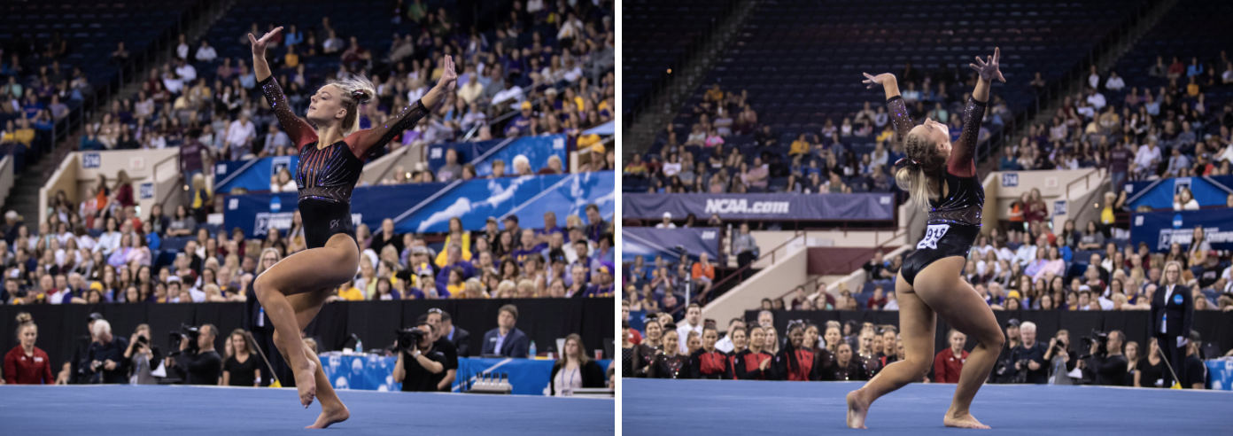
LSU: 9.100
https://twitter.com/lsugym/status/1119741847780327425?s=21
| Design | Fabric/
Sparkle |
School
Spirit |
Overall
Appearance |
Total | |
| Elizabeth | 2.4/3 | 1.9/2 | 1.7/2 | 2.5/3 | 8.5/10 |
| Emily M | 2.6/3 | 2.0/2 | 2.0/2 | 2.8/3 | 9.4/10 |
| Emily HF | 2.8/3 | 2.0/2 | 2.0/2 | 2.8/3 | 9.6/10 |
| Jenna | 2.5/3 | 2.0/2 | 1.6/2 | 2.8/3 | 8.9/10 |
Elizabeth: This is really great! I like that the fabric is pretty plain, leaving the sparkles do all the work in terms of wow factor. The low, open back is also great and I love how the sparkle design really accentuates that. My only wish is that the neckline wasn’t straight across but rather a small V or a sweetheart or something like that. Oh! Also, can you imagine if this leo used gold rhinestones rather than standard silver? *eyes emoji*
Emily M: LSU! YES! I don’t love how low the design runs down the waist, but otherwise this is near-perfection. That gorgeous back! That crystal pattern! That tube top like cut that is actually high enough to not be terrifying (you know what leo I’m talking about, UCLA)! Really lovely. Also, I’d like to request that we rate D-D’s top, please.
Emily HF: THIS. This is 100 percent my favorite leo of the weekend. It looked totally regal and photographed amazingly. It’s totally classy and exactly what I wanted.
Jenna: Purple is the color of royalty, and LSU looked like royalty in the finals. I love that the front design is almost warrior-esque, with the crystal design on the neckline and the armor-like shape of the bodice. The lower edge of the bodice design is a little strange; I’d like for it to extend straight all the way across. Otherwise, this is fantastic!
Nebraska: 8.875
| Design | Fabric/
Sparkle |
School
Spirit |
Overall
Appearance |
Total | |
| Elizabeth | 2.5/3 | 1.8/2 | 1.8/2 | 2.6/3 | 8.7/10 |
| Emily M | 2.6/3 | 1.6/2 | 1.6/2 | 2.8/3 | 8.6/10 |
| Emily HF | 2.8/3 | 2.0/2 | 1.8/2 | 2.5/3 | 9.1/10 |
| Jenna | 2.8/3 | 2.0/2 | 1.5/2 | 2.8/3 | 9.1/10 |
Elizabeth: From afar, I couldn’t tell if this was new or not. However, up close it’s not only new, but I love it. It goes without saying that the ombre is fabulous, and I really like the design on the body, as well as the mesh part in the middle. This is a good example of an instance where having that design cut off around the stomach doesn’t look weird.
Emily M: From a distance I also wasn’t sure if this was new or not, but that’s because Nebraska has a definite look and really focuses on little leo details. I really like the details in this one. The empire waist is super flattering (as opposed to the leos that cut lower on the waist), the ombre sleeves are great and I like the detailing on the chest.
Emily HF: This is all the pieces I love about Nebraska leos and none of the sometimes questionable choices—gorgeous ombre sleeves, sort of a deep v but filled in with some design elements and a unique back. A+ Nebraska.
Jenna: I LOVE this leo. I love the contrast on the chest between the red, black and crystals. I like how the empire waist continues all the way around the leo, and the ombre sleeves are gorgeous. This is a huge win for me.
LSU: 8.025
https://twitter.com/LSUgym/status/1119358826313146375
| Design | Fabric/
Sparkle |
School
Spirit |
Overall
Appearance |
Total | |
| Elizabeth | 2.2/3 | 1.7/2 | 1.9/2 | 2.3/3 | 8.1/10 |
| Emily M | 2.4/3 | 1.8/2 | 2.0/2 | 2.4/3 | 8.6/10 |
| Emily HF | 2.2/3 | 1.5/2 | 1.8/2 | 2.2/3 | 7.7/10 |
| Jenna | 2.2/3 | 1.5/2 | 2.0/2 | 2.0/3 | 7.7/10 |
Elizabeth: I’m actually really into this super clever incorporation of LSU on the design in this leotard. Plus, I love it every time LSU uses a purple body with white sleeves. Add on neat back that incorporates cold, and you have a winner from me.
Emily M: It’s super out of character for me to love a leo like this…but I love it! It’s creative, it’s bold, the colors are spot on and I’m in love with the yellow details and the back. Put it on a billboard, you know?
Emily HF: From someone who hasn’t really loved LSU’s new leos recently, it hit it out of the park this weekend. I honestly didn’t even notice that the design on the top said LSU until I was looking at stills, which is perfect. The shade of purple is gorgeous, and the gold straps on the back are amazing; my favorite part.
Jenna: I really enjoy the way LSU incorporates the big block letters into some of its leos, and this is no exception. I can’t say I’m a fan of the white sleeves, which seem a bit plain, but I do like the gold straps on the back.
Penn State: 7.900
Check out Sabrina Garcia's bars routine from yesterday's NCAA Championships! #WeAre #RestoreTheRoar pic.twitter.com/AOQIpiss6n
— Penn State Women’s Gymnastics (@PennStateWGYM) April 20, 2019
| Design | Fabric/
Sparkle |
School
Spirit |
Overall
Appearance |
Total | |
| Elizabeth | 1.7/3 | 1.8/2 | 1.7/2 | 1.8/3 | 7.0/10 |
| Emily M | 2.1/3 | 1.8/2 | 1.9/2 | 2.4/3 | 8.2/10 |
| Emily HF | 2.0/3 | 1.8/2 | 1.8/2 | 2.5/3 | 8.1/10 |
| Jenna | 2.2/3 | 1.8/2 | 1.8/2 | 2.5/3 | 8.3/10 |
Elizabeth: I love the body of this leo—I mean, duh, it’s ombre. The part where I’m a little wary is the sleeves. The solid parts of the design over the mesh really accentuates the shoulder and upper arm, which I’m not sure I love.
Emily M: I’m here for this ombre. I agree that the sleeve mesh is a little oddly distributed, but it doesn’t bother me too much. Overall, a great leo, and excuse me while I cry one more time about Garcia’s career being over.
Emily HF: Heart eyes. This ombre is gorgeous. I’ve gone back and forth on the sleeve design, but ultimately I think I’m fine with it.
Jenna: I’m in love with the sleeve design and the ombre on the body. My only complaint is that the swirl design on the sides ends abruptly on the back, presumably because of the PSU letters going down the center, but I would still like to see the design continue in some way.
Oregon State: 7.725
It was a busy day in Fort Worth, but not too busy to have some fun with the ESPN folks! #GoBeavs pic.twitter.com/3tYdVz2s4b
— Oregon State Gymnastics (@BeaverGym) April 19, 2019
| Design | Fabric/
Sparkle |
School
Spirit |
Overall
Appearance |
Total | |
| Elizabeth | 1.8/3 | 1.6/2 | 1.8/2 | 1.9/3 | 7.1/10 |
| Emily M | 1.9/3 | 1.8/2 | 1.8/2 | 2.1/3 | 7.6/10 |
| Emily HF | 2.0/3 | 1.6/2 | 1.8/2 | 2.2/3 | 7.8/10 |
| Jenna | 2.2/3 | 1.8/2 | 2.0/2 | 2.4/3 | 8.4/10 |
Elizabeth: I’m not sure where the trend came from with stopping the design at the waist, but I’m not really a fan. I like this as a whole though, and would even more if the horizontal band wasn’t there chopping everything off. However, the back is really nice, and I of course like the ombre sleeves and rhinestone beaver.
Emily M: Oh, I like this! I agree that the HERE’S MY WAIST leo trent is a bit odd, but I love the ombre sleeves and the way the orange is incorporated. Plus, the back is a big win.
Emily HF: I really liked this! Except the lower band placement isn’t ideal. I wish it had just gone with the under-the-bust-line design.
Jenna: I love how Oregon State always finds a way to incorporate orange in their leotards in a pleasing way, and that continues here. The criss-cross design is appealing and is also incorporated into the back of the leo. The ombre sleeves are really nice too. I like it a lot!
Georgia: 7.450
https://www.instagram.com/p/BwfExD5FML0/
| Design | Fabric/
Sparkle |
School
Spirit |
Overall
Appearance |
Total | |
| Elizabeth | 2.0/3 | 1.7/2 | 1.9/2 | 2.1/3 | 7.7/10 |
| Emily M | 1.9/3 | 1.4/2 | 2.0/2 | 2.2/3 | 7.5/10 |
| Emily HF | 1.8/3 | 1.6/2 | 1.8/2 | 2.2/3 | 7.4/10 |
| Jenna | 1.8/3 | 1.4/2 | 2.0/2 | 2.0/3 | 7.2/10 |
Elizabeth: The all red always looks so great on the gymnasts. Add to that a sweetheart neckline, a prominent Super G and sparkly mesh, and you have a winning design in my book. I wish it was a little…more…in terms of the design overall—this is the national championships after all—but it’s a solid one nevertheless.
Emily M: This is so classic Georgia. Pretty sure CKC ended her career in a really similar look? The red looks great, the black is a good offset, the cut is flattering and bonus school spirit points for the almost-throwback style. It is a touch boring compared to some of the other nationals looks we saw, but that’s not necessarily a bad thing.
Emily HF: Overall good, simplistic and pretty. I have a weird thing about not loving designs on the side of a leo, so the placement of the G bugs me a bit but not enough for me to actively dislike the leo.
Jenna: The design is a bit plain for what I would expect from a national championships leo, but there’s nothing to really dislike about it. I love the prominent Georgia G, but that’s the only thing that sticks out to me.
Florida: 7.375
https://twitter.com/GatorsGym/status/1119330325459558402
| Design | Fabric/
Sparkle |
School
Spirit |
Overall
Appearance |
Total | |
| Elizabeth | 1.6/3 | 1.5/2 | 1.5/2 | 1.8/3 | 6.4/10 |
| Emily M | 2.1/3 | 1.6/2 | 1.4/2 | 2.5/3 | 7.6/10 |
| Emily HF | 2.2/3 | 1.6/2 | 1.5/2 | 2.4/3 | 7.7/10 |
| Jenna | 2.4/3 | 1.8/2 | 1.0/2 | 2.6/3 | 7.8/10 |
Elizabeth: Another meet, another Florida leo where it took me a second to figure out if I’d seen it before. This is fine. It’s not bad by any means, but at this point I’m aching for something new and exciting.
Emily M: I mean, it’s a Florida leo. So it’s perfect but also the same as all the other perfect Florida leos? I love the chandelier look, and these ladies are straight queens, but come on Gators. Shock us!
Emily HF: I didn’t even know if this was new to be honest. But it’s elegant, and I like it.
Jenna: This is a very elegant design, and I love the contrast between the two shades of blue. There are splashes of orange sparkle, but it’s hard to see them unless you’re up close. I find myself aching for more orange, because this doesn’t scream Florida to me. Otherwise, I love it.
Alabama: 7.125
Gorgeous routine from start to finish for Abby Armbrecht in her final Crimson Tide turn under the lights of the #NCAAGym Championships!!!#LegacyOfChampions | #RollTide pic.twitter.com/Rw1ni178E9
— Alabama Gymnastics (@BamaGymnastics) April 20, 2019
| Design | Fabric/
Sparkle |
School
Spirit |
Overall
Appearance |
Total | |
| Elizabeth | 1.6/3 | 1.7/2 | 1.6/2 | 2.0/3 | 6.9/10 |
| Emily M | 1.8/3 | 1.4/2 | 1.6/2 | 2.5/3 | 7.3/10 |
| Emily HF | 2.0/3 | 1.8/2 | 1.5/2 | 2.5/3 | 7.8/10 |
| Jenna | 1.6/3 | 1.5/2 | 1.4/2 | 2.0/3 | 6.5/10 |
Elizabeth: When I saw this in the arena, I absolutely loved it. It looked great on and was such a nice color and a great amount of sparkle. But then I saw the collar. That’s a big no from me, but I do appreciate the originality. I can safely say that I’ve never seen one quite like it on a leotard before.
Emily M: I agree with Elizabeth about seeing this one far away versus up close. It looked absolutely stunning on TV, but I have so many questions about this clunky collar. I think I understand where it was going, for the mockneck look that’s sort of in, but it just ends up looking like a pile of fabric. I do like the twisted white and crimson straps on the back, and again this was gorgeous on TV, which really is the goal of a leo, hence the overall appearance score.
Emily HF: I don’t love the collar in these pictures. But in competition, the leo seemed to work really well and fit Armbrecht’s routine. Plus, it’s not quite so noticeable in action? It also really fits with Alabama’s “The Greatest Showman” theme this year.
Jenna: I agree that this leo was stunning from a distance at the arena, then when I saw the picture, I was a little let down. I absolutely love the body and the back, but the sleeves and the collar leave something to be desired.
Auburn: 7.050
https://twitter.com/auburngym/status/1119300077384863749?s=21
| Design | Fabric/
Sparkle |
School
Spirit |
Overall
Appearance |
Total | |
| Elizabeth | 1.7/3 | 1.5/2 | 1.9/2 | 1.8/3 | 6.9/10 |
| Emily M | 2.1/3 | 1.8/2 | 2.0/2 | 2.3/3 | 8.2/10 |
| Emily HF | 1.0/3 | 1.5/2 | 2.0/2 | 1.5/3 | 6.0/10 |
| Jenna | 1.8/3 | 1.5/2 | 2.0/2 | 1.8/3 | 7.1/10 |
Elizabeth: I’ll start with saying that I love the use of Tiger stripes here. The ombre also works for me. I don’t love lots of orange with blue to begin with, but I can’t fault the school spirit in this design.
Emily M: I LOVE the idea of this leo so much. Really the only thing I don’t like is the cut of that deep V. The orange bits flare out so wide at the shoulders that it creates a bit of an odd line. But otherwise, get it Auburn.
Emily HF: No no no. I happened to see the back of this leo first before I ever saw the front, and that dark blue piece is just weird and a total no for me. The rest of the design is fine, but there’s only so much I can do to overwrite that initial impression.
Jenna: The tiger stripes are fantastic! My main issue with this leo is the white in the ombre; I think black or a darker blue in place of the white would have made the stripes and the sparkle really pop.
Oklahoma: 6.875
| Design | Fabric/
Sparkle |
School
Spirit |
Overall
Appearance |
Total | |
| Elizabeth | 2.4/3 | 1.7/2 | 1.9/2 | 2.6/3 | 8.6/10 |
| Emily M | 1.4/3 | 1.0/2 | 2.0/2 | 1.4/3 | 5.8/10 |
| Emily HF | 1.4/3 | 1.0/2 | 1.8/2 | 1.5/3 | 5.7/10 |
| Jenna | 1.8/3 | 1.6/2 | 2.0/2 | 2.0/3 | 7.4/10 |
Elizabeth: I know this won’t be a popular opinion, just like the UCLA design, but I’m here for this leo. I love the almost tie-dye effect, the big sparkly OU on the front and the back in particular. I also really like the textured (?) black fabric that’s incorporated around the arms and back design to really make it stand out. I will say one thing: OU leotards make you talk about them when you see them, and that’s really what a main goal is in the end.
Emily M: Good grief why. I yearn for the days of simpler OU leos. They have just been too over the top. This would be great without the, what is it? Tie dye with shoulder epaulets and elbow patches? I like the black scallops that continue down the sleeves; that creates a stunning line. But ugh.
Emily HF: OU… Why? I loved the finals leo last year: simple, classy and everything I want to see in a championship leo. There may be a time and place for crazy leos, but to me that isn’t during team finals at nationals. Overall the OU leos this year have just been too over the top for me. And I shouldn’t be squinting to figure out if it’s tie-dye or camo. If they’d skipped the pattern, I might have a very different opinion on this.
Jenna: When I saw this from a distance at the arena I loved it, especially the black accents and the large OU on the front. It was super sparkly, which apparently covered up the tie-dye pattern on the shoulder and elbows that I really can’t get behind. It is just…odd, and I don’t understand the point of it. Otherwise I love it.
UCLA: 6.025
#8clap for our multiple-event All-Americans: @kyla_ross96 (1st team AA, V, BB, FX)@katelyn_ohashi (1st team BB, FX)@MadisonKocian (1st team UB, 2nd team BB)@fish_hano (2nd team V, FX) pic.twitter.com/E5SsqEBb6Z
— UCLA Gymnastics (@uclagymnastics) April 20, 2019
| Design | Fabric/
Sparkle |
School
Spirit |
Overall
Appearance |
Total | |
| Elizabeth | 2.5/3 | 1.8/2 | 1.7/2 | 2.7/3 | 8.7/10 |
| Emily M | 1.0/3 | 1.5/2 | 1.6/2 | 0.5/3 | 4.6/10 |
| Emily HF | 1.0/3 | 1.5/2 | 1.4/2 | 0.9/3 | 4.8/10 |
| Jenna | 1.4/3 | 2.0/2 | 1.4/2 | 1.2/3 | 6.0/10 |
Elizabeth: I think I might be in the minority, but I really, really like this leo. The design is wild and funky yet still so UCLA. I love how the actual neckline is rounded yet the solid navy portion makes it into more of a V. I also like the large amount of sparkle on it—something UCLA hasn’t really been known for. My only complaint would be that where the sparkles stop on the front, from a distance it looks a little drastic into the transition to non-sparkle fabric. Almost like there’s a whole leo on top and then navy briefs.
Emily M: No no nope no. No. No way. This reminds me of a paisley leo UCLA wore in the early aughts, and that’s not a good thing. Just way too busy. It was hard to look at on TV. Also, I am never about a leo that has that much going on in the crotch. I wish we lived in a world where that didn’t matter, but alas we live in a world where people’s minds are gross. Sorry, Bruins.
Emily HF: NOPE. I’m sorry I can’t. Too much. I’m always here for the understated pretty designs and this just isn’t it. Too much patterning, and I don’t even really like the pattern they used. But it was insanely sparkly in person, so props for that I guess.
Jenna: I like the idea of this leo but can’t get on board with the execution. The contrast between the white design and the navy blue background is too harsh, and the design of the sparkles doesn’t really go with the design on the fabric. This was insanely sparkly in person, so I’ll give them full points for that.
READ THIS NEXT: Leotard Rankings: Week 15
Article by Elizabeth Grimsley, Emily Minehart, Emily Howell-Forbes and Jenna King
Like what you see? Consider donating to support our efforts throughout the year! [wpedon id=”13158″]


One comment
Comments are closed.