We’re taking a fun approach to leo rankings this week, judging a mixture of new competition designs, older event final numbers, warm up tank leos and one pair of socks. The criteria is the same as always: up to three points for design; two points for fabric and sparkle; two points for school spirit; and three points for overall appearance. This week’s guest judges are Rebecca, our USAG guru, Mary Emma, our EAGL and ECAC editor and Charlene, our new research assistant.
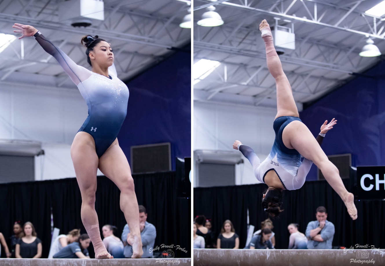
Yale: 9.725
| Design | Fabric/
Sparkle |
School
Spirit |
Overall
Appearance |
Total | |
| Elizabeth | 2.9/3 | 2.0/2 | 1.7/2 | 2.9/3 | 9.5/10 |
| Rebecca | 3.0/3 | 2.0/2 | 1.7/2 | 3.0/3 | 9.7/10 |
| Mary Emma | 3.0/3 | 2.0/2 | 1.7/2 | 3.0/3 | 9.7/10 |
| Charlene | 3.0/3 | 2.0/2 | 2.0/2 | 3.0/3 | 10/10 |
Elizabeth: I mean, yes, Yale. This is basically perfect. Add a unique back, and it’s perfect. The ombre is stunning, the blue and white shades sublime, the sweetheart neckline ideal and the sparkles just enough. A+
Rebecca: YES YES YES. The light sparkles on the front, the delicate mini-V in the back, the school name emphasized just enough, the navy neckline, the colors in the ombre—it’s very close to perfect. I’m dinging it on school spirit since the team name is so understated, but honestly I don’t like leotards that go all in on school imagery anyway.
Mary Emma: This has basically everything I want in a leotard: ombre throughout, without too much sparkle to be overpowering. Even the “Yale” on the back looks good and not too out of place. Like Rebecca said, I think it’s a bit lacking in school spirit, but I have literally no other complaints.
Charlene: This is absolutely GORGEOUS!!!! I love the colors of the ombre and the fact that it has the perfect amount of sparkles. I also really like the placement of “Yale” below the V on the back, and I think it’s the perfect amount of school representation without being too much! LOVE IT!
Bridgeport: 8.600
https://twitter.com/UBGymnastics/status/1117194961781501958
| Design | Fabric/
Sparkle |
School
Spirit |
Overall
Appearance |
Total | |
| Elizabeth | 2.0/3 | 1.7/2 | 1.6/2 | 2.1/3 | 7.4/10 |
| Rebecca | 2.7/3 | 1.9/2 | 1.7/2 | 2.7/3 | 9.0/10 |
| Mary Emma | 2.6/3 | 1.7/2 | 1.8/2 | 2.6/3 | 8.7/10 |
| Charlene | 2.8/3 | 2/2 | 1.8/2 | 2.7/3 | 9.3/10 |
Elizabeth: I pretty much agree with everyone. The purple color used here is really lovely, and I love it paired with the white sleeves. I like the understated logo as well, but I think I wish it was just the UB since this more involved logo doesn’t work quite as well at that small a size.
Rebecca: This one cracked a lot of us up because it does come straight out of the GK catalog, and we were all incredibly aware of that due to having spent most of the week leading up to USAGs playing around with the GK customization tool to design our own leotards. Stock design or not, this is GORGEOUS. The colors are just right, the design is sleek and understated and the logo is cute but neutrally placed and unassuming. I’m a really big fan.
Mary Emma: I really like this one! Obviously, it’s a stock design, but that’s not necessarily a bad thing. I love the shade of purple, and the logo on the back is a nice touch without being too overpowering. It’s simple yet elegant.
Charlene: This design was very familiar after the custom leo design tool on GK’s website had been entertaining many gymnastics fans during the week. I really love this leo. The shade of purple is beautiful, and the simplicity of the sparkle design is perfect for my anti-too-many-sparkles self! I also really love the placement and design of the UB logo. Overall, I really love it!
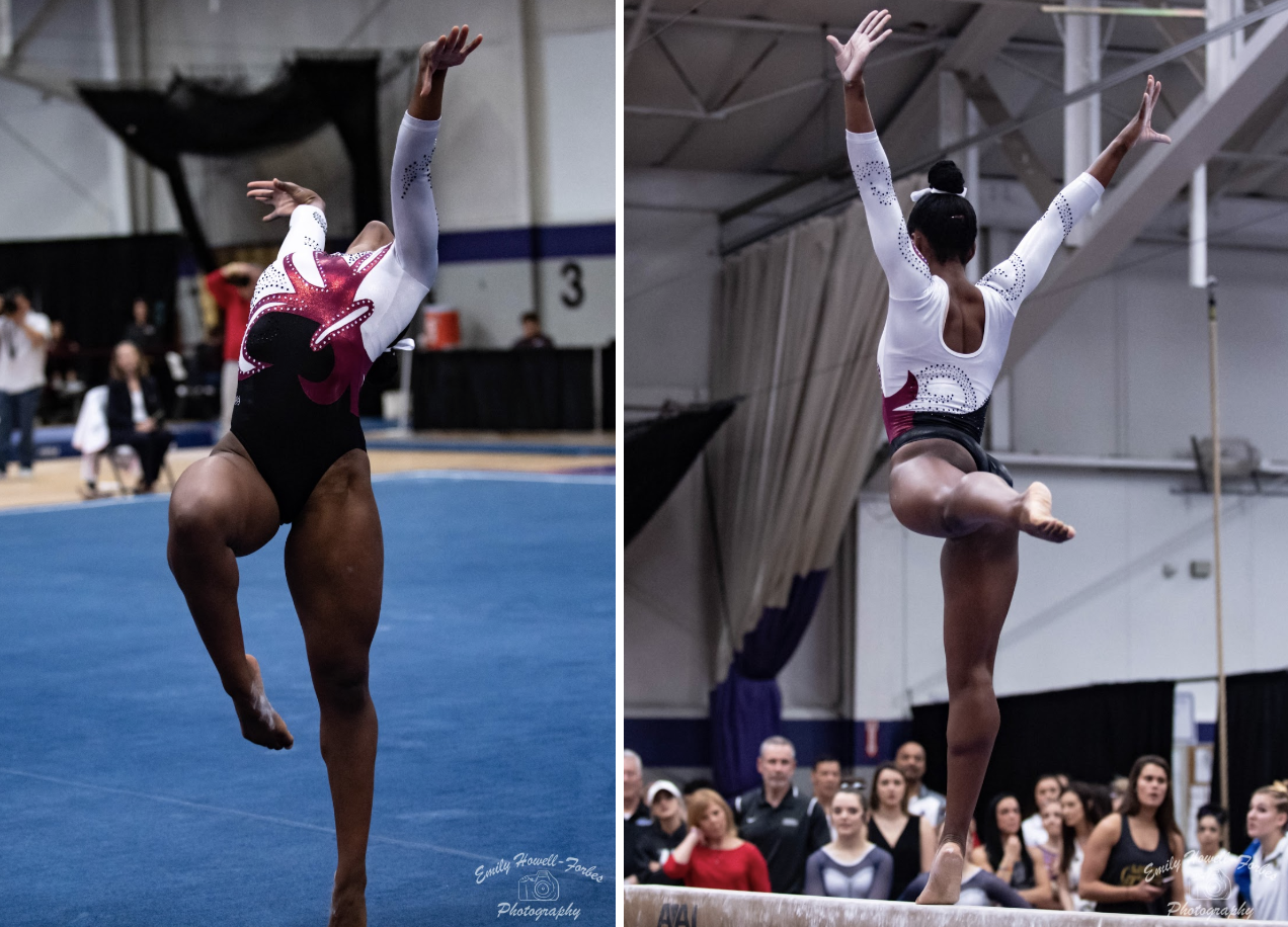
Centenary: 7.400
| Design | Fabric/
Sparkle |
School
Spirit |
Overall
Appearance |
Total | |
| Elizabeth | 2.0/3 | 1.3/2 | 1.8/2 | 2.1/3 | 7.2/10 |
| Rebecca | 2.3/3 | 1.0/2 | 2.0/2 | 2.2/3 | 7.5/10 |
| Mary Emma | 2.1/3 | 1.5/2 | 2.0/2 | 2.3/3 | 7.9/10 |
| Charlene | 2/3 | 1.3/2 | 2/2 | 1.7/3 | 7.0/10 |
Elizabeth: I love the fluer de lis nod toward Louisiana and Centenary College. Plus, the crimson color used works really well with the black and white. This is actually a really great design that just works.
Rebecca: I believe this is one of Centenary’s older leotards, and it definitely looks a touch dated compared to some of its most recent options. But everything looks good on Navia Jordan, and there’s nothing really wrong with this leo. Using the fleur de lis as a nudge to Centenary’s home state is subtle and amazing.
Mary Emma: This one is nice. I really like the white sleeves, and the fleur de lis screams school spirit since the school is in Louisiana. The red shade is also really pretty and ties the whole thing together.
Charlene: Navia’s beautiful gymnastics completely distracted me from looking at the leo during the meet. I like it, but I don’t find it to be anything special in comparison to the other Centenary leotards. I really like the deep round neck on the back and the contrast of the three colors.
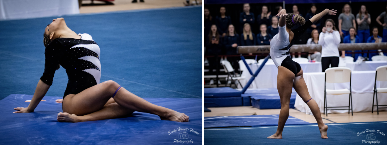
Bridgeport: 6.700
| Design | Fabric/
Sparkle |
School
Spirit |
Overall
Appearance |
Total | |
| Elizabeth | 2.1/3 | 1.6/2 | 1.2/2 | 2.2/3 | 7.1/10 |
| Rebecca | 2.5/3 | 2.0/2 | 1.0/2 | 2.6/3 | 8.1/10 |
| Mary Emma | 1.0/3 | 1.5/2 | 0.5/2 | 1.3/3 | 4.3/10 |
| Charlene | 2.2/3 | 1.7/2 | 1.0/2 | 2.4/3 | 7.3/10 |
Elizabeth: Looking at this through a throwback lens, I really like it. Velvet of course it always a win with me, and the black and white combo looks great. Normally I wouldn’t like this design, but it works here. It just needs a touch of school spirit.
Rebecca: Going to be the odd one out on this. The colors are gorgeous, the design is a little stark by 2019 standards, but I find it really elegant on Reimers anyway. Also v e l v e t.
Mary Emma: This is not my favorite design, but I do have to give it some extra points for the black velvet! I don’t really like leotards where the one side is one color and one side is another because I just don’t think it flows very well. Also, there’s nothing about it that would make me think it’s from Bridgeport.
Charlene: This leo instantly reminded me of the flag of Bahrain (for any other geography nerds out there). I really like the black velvet, and I am totally OK with velvet becoming a thing again. Although I don’t really like the contrast of the black and white in this design—I just find it a bit underwhelming.
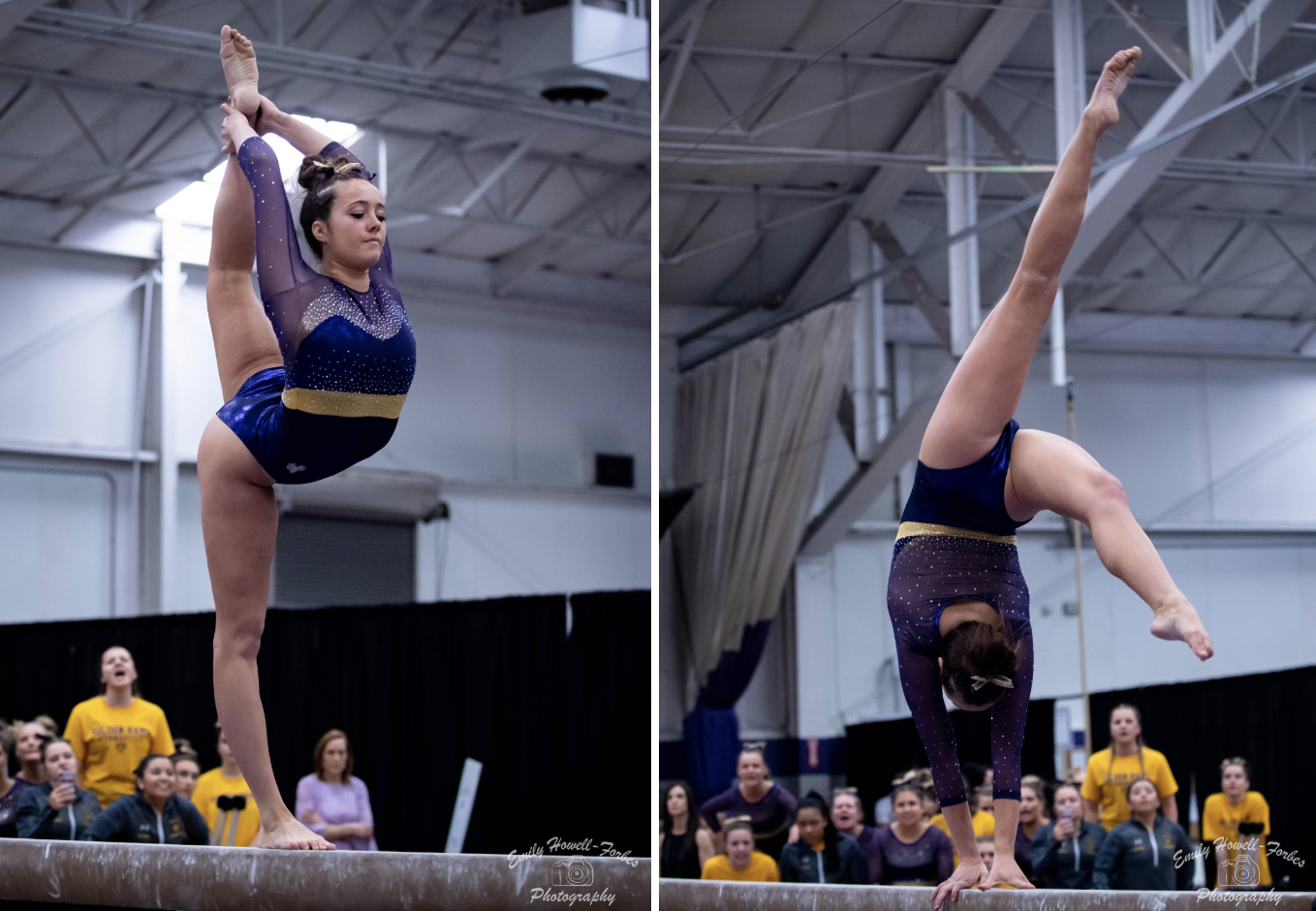
West Chester: 6.650
| Design | Fabric/
Sparkle |
School
Spirit |
Overall
Appearance |
Total | |
| Elizabeth | 1.8/3 | 1.5/2 | 1.5/2 | 1.9/3 | 6.7/10 |
| Rebecca | 2.0/3 | 2.0/2 | 1.5/2 | 1.3/3 | 6.8/10 |
| Mary Emma | 2.1/3 | 1.8/2 | 1.6/2 | 2.0/3 | 7.5/10 |
| Charlene | 1.7/3 | 1.2/2 | 1.5/2 | 1.2/3 | 5.6/10 |
Elizabeth: I like the colors used and the sweetheart neckline design. I also like the amount of sparkles accenting the neckline. The mesh over solid fabric isn’t my favorite, but overall it’s a good leo so I don’t have much else to complain about.
Rebecca: The Golden Rams busted this leotard out first for their photoshoot at the beginning of the season, and I’ve always…almost liked it. The design is really solid, and the two different shades of purple actually work together well. But the faux neckline is just a touch too low. (It’s easier to see my problem in a neutral pic like this.) I think the sparkle stripe is meant to be part of the “body” of the leotard, but it blends much more readily into the also-sparkly top, so the part that actually looks like the neckline lies unflatteringly low.
Mary Emma: This is pretty! The colors are pretty, and I love the gold belt around the waist. It reminds me of a leo that LSU has. My main complaint, like others have said, is that the sweetheart neckline is too low. I think the sparkes are supposed to be the top of the neckline, but they don’t fit in well with the purple part, which makes the neckline look really low to the point where it doesn’t look good.
Charlene: I feel like there is a lot going on in this leo. I really like the use of the two different shades of purple together. However, I find the sparkly stripe doesn’t complement the top well, and it’s almost overpowering the pretty sparkle that is already there.
Yale: 6.525
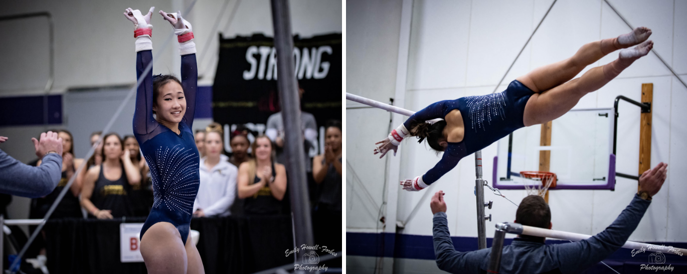
| Design | Fabric/
Sparkle |
School
Spirit |
Overall
Appearance |
Total | |
| Elizabeth | 1.3/3 | 1.2/2 | 1.3/2 | 1.4/3 | 5.2/10 |
| Rebecca | 1.5/3 | 1.5/2 | 1.0/2 | 1.7/3 | 5.7/10 |
| Mary Emma | 2.0/3 | 1.5/2 | 1.3/2 | 2.2/3 | 7.0/10 |
| Charlene | 2.4/3 | 1.7/2 | 1.7/2 | 2.4/3 | 8.2/10 |
Elizabeth: I actually agree with Rebecca—shocker, I know. This design is a bit boring and severely lacking in school spirit. I wish there was maybe a Y in the center of the sparkle burst on the side or perhaps a different color incorporated.
Rebecca: Honestly, I NEVER say this—I basically want everyone to wear plain black every day—but this one’s just a touch boring for my taste. Just one more feature would have made it great.
Mary Emma: I like that this is just a simple navy design with a sunburst pattern with rhinestones. However, I think it’s just a bit too boring for my taste. Also, there’s nothing about it that screams school spirit.
Charlene: I really like this. I love simple leos, so it’s right up my alley as I am partial to navy/dark blue leos. The light sparkles on the sleeves are really pretty, and I also like how the sparkles on the body wrap around the back—it’s simple but really pretty! My only complaint would be the square neckline on the back of the leo simply because it’s not my taste.
Cornell: 6.125
| Design | Fabric/
Sparkle |
School
Spirit |
Overall
Appearance |
Total | |
| Elizabeth | 0.8/3 | 1.1/2 | 1.4/2 | 0.9/3 | 4.2/10 |
| Rebecca | 2.7/3 | 1.4/2 | 1.4/2 | 2.7/3 | 8.2/10 |
| Mary Emma | 1.0/3 | 1.3/2 | 1.4/2 | 1.5/3 | 5.2/10 |
| Charlene | 2.1/3 | 1.2/2 | 1.6/2 | 2/3 | 6.9/10 |
Elizabeth: Umm no. The design on the front kind of looks like a bandeau bathing suit with the straps hanging down on the sides over another strapless black bathing suit. Not for me. I do appreciate the fact that apparently Cornell calls this the “Cleavatard.”
Rebecca: Let’s get the obvious out of the way: There’s a lot going on in this training leotard, and it might not be the world’s most practical athletic gear. That said, I absolutely do not care at all. I love it because it reminds me of a ballet leotard, which often push the limits of cut and style quite a lot further than gymnastics designers are willing to go. I’m also giving this serious bonus points for its absolutely iconic nickname.
Mary Emma: The leotard itself is nice…if it were part of a dress or a top, but I can’t get behind it as a piece of athletic wear. I know if I were a gymnast, I would be so distracted from what I was doing because I’d be worried about flashing someone whenever I did anything. For that, I have to dock major points from design. Other than that, the red shade is pretty, though I don’t really like the random red patches down the side. I appreciate that the back allows for a sports bra too.
Charlene: To start off with the positives, I do really enjoy this leo’s nickname. I definitely think it’s quite an erratic design and quite extra and perhaps impractical for a training leo, that aside the racerback is really pretty. and I also like the grey hem!
BONUS Kaitlin Green’s Socks: 10.050
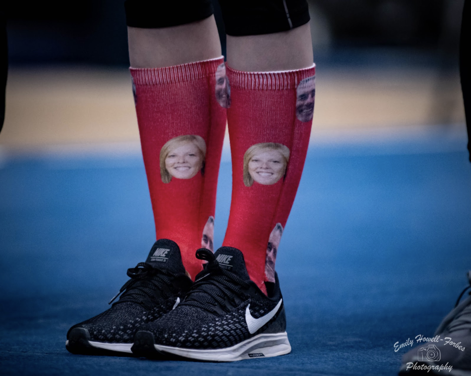
| Design | Fabric/
Sparkle |
School
Spirit |
Overall
Appearance |
Total | |
| Elizabeth | 3.0/3 | 1.5/2 | 3.0/2 | 3.0/3 | 10.5/10 |
| Rebecca | 3.0/3 | 1.7/2 | 3.0/2 | 3.0/3 | 10.7/10 |
| Mary Emma | 3.0/3 | 1.5/2 | 2.0/2 | 3.0/3 | 9.5/10 |
| Charlene | 3.0/3 | 1.5/2 | 2.0/2 | 3.0/3 | 9.5/10 |
Elizabeth: Can these get any more brilliant? Wearing your coaches’ faces on socks at nationals—as a national champion no less—is an automatic win.
Rebecca: Yes, those are the faces of head coach Paul Beckwith and assistant coach Melanie Hall. Yes, this is right in line with everything I know about the Big Red’s team character. It’s pretty much perfect and so are these socks.
Mary Emma: This is one of the greatest things I’ve ever seen! You can really get much more school spirit than literally putting the faces of your coaches on your socks. I’m in complete agreement with Charlene; I want more schools to do stuff like this!
Charlene: Well this is a unique sight and definitely receives a perfect 10 for school spirit! Additionally, now I want more teams to adopt this idea into their apparel.
READ THIS NEXT: Leotard Rankings: Week 14
Article by Elizabeth Grimsley, Rebecca Scally, Mary Emma Burton and Charlene Doheny
Like what you see? Consider donating to support our efforts throughout the year! [wpedon id=”13158″]



Why aren’t LSU’s leotards ever featured?
Hi Casey, this leotard ranking featured teams and leotards from the USAG national championships. LSU did not compete at that meet. For other weeks, we feature only new designs. LSU wore a new leo for the SEC championship and was featured in that week’s leotard rankings. Thanks for reading!