

The pink meets kept rolling while some teams that haven’t debuted new designs yet did. And we’re excited to judge them all. The criteria is the same as always: up to three points for design; two points for fabric and sparkle; two points for school spirit; and three points for overall appearance. This week’s guest judges are Mary Emma, our EAGL and ECAC editor, and Rachel, our DIII editor.
Temple: 8.867
https://twitter.com/TUWG/status/1099046418206076929
| Design | Fabric/
Sparkle |
School
Spirit |
Overall
Appearance |
Total | |
| Elizabeth | 2.6/3 | 1.7/2 | 2.0/2 | 2.8/3 | 9.1/10 |
| Rachel | 2.1/3 | 2.0/2 | 2.0/2 | 2.4/3 | 8.5/10 |
| Mary Emma | 2.7/3 | 1.8/2 | 2.0/2 | 2.5/3 | 9.0/10 |
Elizabeth: Temple’s leo game these past few seasons has been on point. I was worried they’d go back down hill again when Umme left for Rutgers but that doesn’t seem to be the case. I love everything about this leo—from the ombre and the front rhinestone design to the Owls on the back and the pointed sleeves. The only thing I would tweak would be the transition from the sleeves to the solid white part of the top of the leo.
Rachel: This is really, really beautiful! The ombre is fantastic, and I love the pointed sleeves—a nice little detail. There’s clearly plenty of school spirit with the Owls on the back and the T on the arm—the only thing I’m somewhat confused about is the design on the front?? I’m not that familiar with Temple so maybe I’m missing something here, but it just seems a little random to me…
Mary Emma: I really love this! The ombre is gorgeous, and I appreciate that they incorporated the “T” logo and “Owls” in a way that works with the overall design. My only minor complaint is that I don’t love the design in the front. I’m not sure what it’s supposed to be, and it just seems a little out of place.
Utah: 8.633
https://www.instagram.com/p/BuPrOnbn3M3/
| Design | Fabric/
Sparkle |
School
Spirit |
Overall
Appearance |
Total | |
| Elizabeth | 2.6/3 | 1.6/2 | 1.6/2 | 2.7/3 | 8.5/10 |
| Rachel | 3.0/3 | 2.0/2 | 1.0/2 | 3.0/3 | 9.0/10 |
| Mary Emma | 2.5/3 | 1.7/2 | 1.5/2 | 2.7/3 | 8.4/10 |
Elizabeth: This is SO out of character for Utah, but I love it taking risks and mixing things up as a lot of its other leos look pretty similar. I love the mostly black design, the red accents in rhinestones, the open back but with hella-sparkly straps and the block U on the sleeve. Love love love.
Rachel: I love love love this! It is so beautiful and sparkly and so not typical Utah. Because it’s so out of character for the Utes, I think they needed something a bit more than the U on the arm to give this more school spirit. Otherwise, it’s perfect.
Mary Emma: This is definitely my favorite of the three black leos this week. The silver and red rhinestones are really pretty, and I like the red U on the sleeve. This is different than most of Utah’s other leos, and I really like that!
Iowa: 8.167
https://twitter.com/collegegymnews_/status/1099330851723231232
| Design | Fabric/
Sparkle |
School
Spirit |
Overall
Appearance |
Total | |
| Elizabeth | 2.7/3 | 1.8/2 | 1.7/2 | 2.8/3 | 9.0/10 |
| Rachel | 2.6/3 | 1.7/2 | 1.5/2 | 2.6/3 | 8.4/10 |
| Mary Emma | 2.0/3 | 1.3/2 | 1.5/2 | 2.3/3 | 7.1/10 |
Elizabeth: LOVE. THIS. It’s so Iowa yet I love it more than any other Iowa leo I’ve ever seen. I love the nude mesh giving the appearance of it being low and semi-off the shoulder. I also love the sparkle placement and Iowa on the sleeve. This leo is simple overall but so elegant and stunning.
Rachel: I usually don’t like the use of nude mesh to give the effect of a deep V neck… However, in this case because the rest of the leotard is simple, it comes off as very elegant. The Iowa and the burst of sparkles at the bottom of the sleeves are nice touches as well.
Mary Emma: I know I’m in the minority here, but this one is just OK. I feel about the same for this one as I do for UNC’s. I HATE nude mesh faux deep V necklines, and overall I find it a bit boring. I do love the rhinestones though!
Penn State: 7.933
https://twitter.com/collegegymnews_/status/1099331062747090946
| Design | Fabric/
Sparkle |
School
Spirit |
Overall
Appearance |
Total | |
| Elizabeth | 2.5/3 | 1.7/2 | 1.8/2 | 2.6/3 | 8.6/10 |
| Rachel | 2.0/3 | 1.2/2 | 1.8/2 | 1.7/3 | 6.7/10 |
| Mary Emma | 2.3/3 | 1.7/2 | 2.0/2 | 2.5/3 | 8.5/10 |
Elizabeth: The front of this leo looks very similar to a lot of other Penn State leos, but the back is lovely. It’s very figure skater. There’s something I don’t love about the transition of the open back to the solid navy on the bottom, but I can’t figure out exactly what. Maybe it’s too harsh from delicate and open to solid and solid. But overall I love this.
Rachel: I really love the back of this leotard! It’s very fun and different. The front, however, is just a little too boring for my taste and feels like a million other Penn State leos. And in general, I’m not a huge fan of the use of school mascots as a featured piece of a leotard.
Mary Emma: This is really pretty! I love the ombre sleeves (are we surprised?), and while I don’t always love open back leos, I don’t mind it here. The front definitely looks a lot like other Penn State leos, and I don’t love the abrupt cut from the back to the front, but overall this is a win!
Arkansas: 7.667
https://twitter.com/RazorbackGym/status/1099115915961094144
| Design | Fabric/
Sparkle |
School
Spirit |
Overall
Appearance |
Total | |
| Elizabeth | 2.3/3 | 1.5/2 | 1.5/2 | 2.4/3 | 7.7/10 |
| Rachel | 2.5/3 | 2.0/2 | 0.7/2 | 2.6/3 | 7.8/10 |
| Mary Emma | 2.5/3 | 1.5/2 | 1.2/2 | 2.3/3 | 7.5/10 |
Elizabeth: I really like this with a few minor exceptions. Overall it looks like armor with all the silver around the shoulders. I really love the arms and how they’re kind of ombre kind of patterned. I also love the use of silver all over. However, the transition between the arms and the more solid fabric on the top is very abrupt. If it was smoother, this would have been an overall win for me.
Rachel: Last time I judged leos, Arkansas got a Perfect 10 from me! As much as I’d like to give it another one, there’s just some little things about this leotard that feel odd… Like the fact that the rhinestones don’t go all the way down to the waist band, the transition between the arms and body, and something about the neckline. But overall, I still really like this one (especially the back) but would need a little more school spirit to give it higher marks.
Mary Emma: I rather like this one. It’s different from most of Arkansas’ other leos, so yay for that! The sleeves are nice, and the main part is lovely, but I don’t feel like they go together super well. I think it’s because of the slightly odd transition between the two. Overall though, it’s a solid leo!
UNC: 7.533
We're loving @uncgymnastics' leo tonight! #NCAAgym pic.twitter.com/Y0huM2Tuyg
— College Gym News (@collegegymnews_) February 23, 2019
| Design | Fabric/
Sparkle |
School
Spirit |
Overall
Appearance |
Total | |
| Elizabeth | 2.1/3 | 1.5/2 | 1.4/2 | 2.2/3 | 7.2/10 |
| Rachel | 2.7/3 | 1.8/2 | 1.0/2 | 2.8/3 | 8.3/10 |
| Mary Emma | 2.0/3 | 1.5/2 | 1.3/2 | 2.3/3 | 7.1/10 |
Elizabeth: This looked really great on all the gymnasts. I like the mostly black look with subtle Carolina blue accents. I also like the simple V design where the main features come from rhinestone placement. Overall a good one from the Tar Heels.
Rachel: I think this is so elegant and different from other UNC leos I’ve seen. There really isn’t much to complain about other than it’s lacking a bit of school spirit… I would have liked to see a bit more blue incorporated.
Mary Emma: This one is fine but not my favorite. I just find it kind of boring, and I’m not the biggest fan of mesh faux deep V necklines (or just mesh in general). I do appreciate that the rhinestones are Carolina Blue, which I didn’t notice at first, so points for school spirit!
Rutgers: 7.500
https://twitter.com/RUGymnastics/status/1099457801452175361
| Design | Fabric/
Sparkle |
School
Spirit |
Overall
Appearance |
Total | |
| Elizabeth | 2.5/3 | 1.6/2 | 2.0/2 | 2.7/3 | 8.8/10 |
| Rachel | 1.5/3 | 0.7/2 | 2.0/2 | 1.0/3 | 5.2/10 |
| Mary Emma | 2.5/3 | 1.5/2 | 2.0/2 | 2.5/3 | 8.5/10 |
Elizabeth: If someone told you Rutgers has a leo with the state of New jersey on the chest, you’d probably be like, “Umm OK?” But it works! I love this. I also am in love with the white to black ombre, the sparkly block R and the Scarlet Knight logo on the back. I could take or leave the lower back hole but otherwise love this one.
Rachel: I feel like my score looks more harsh than how I actually feel about this leotard. In fact, I quite like the ombre and the simplicity of the rhinestones around the neck and sleeves. However, there’s something about putting the state right on the front that looks strange to me. I think if it was a detail on the arm, hip or even on the back instead of the Scarlet Knight, it might have worked better.
Mary Emma: I actually like this! The ombre effect is cool, and if you are going to put the outline of a state on your leotard, this is how you do it. Full points for school spirit! I don’t love the cutout on the back, but that’s really my only complaint.
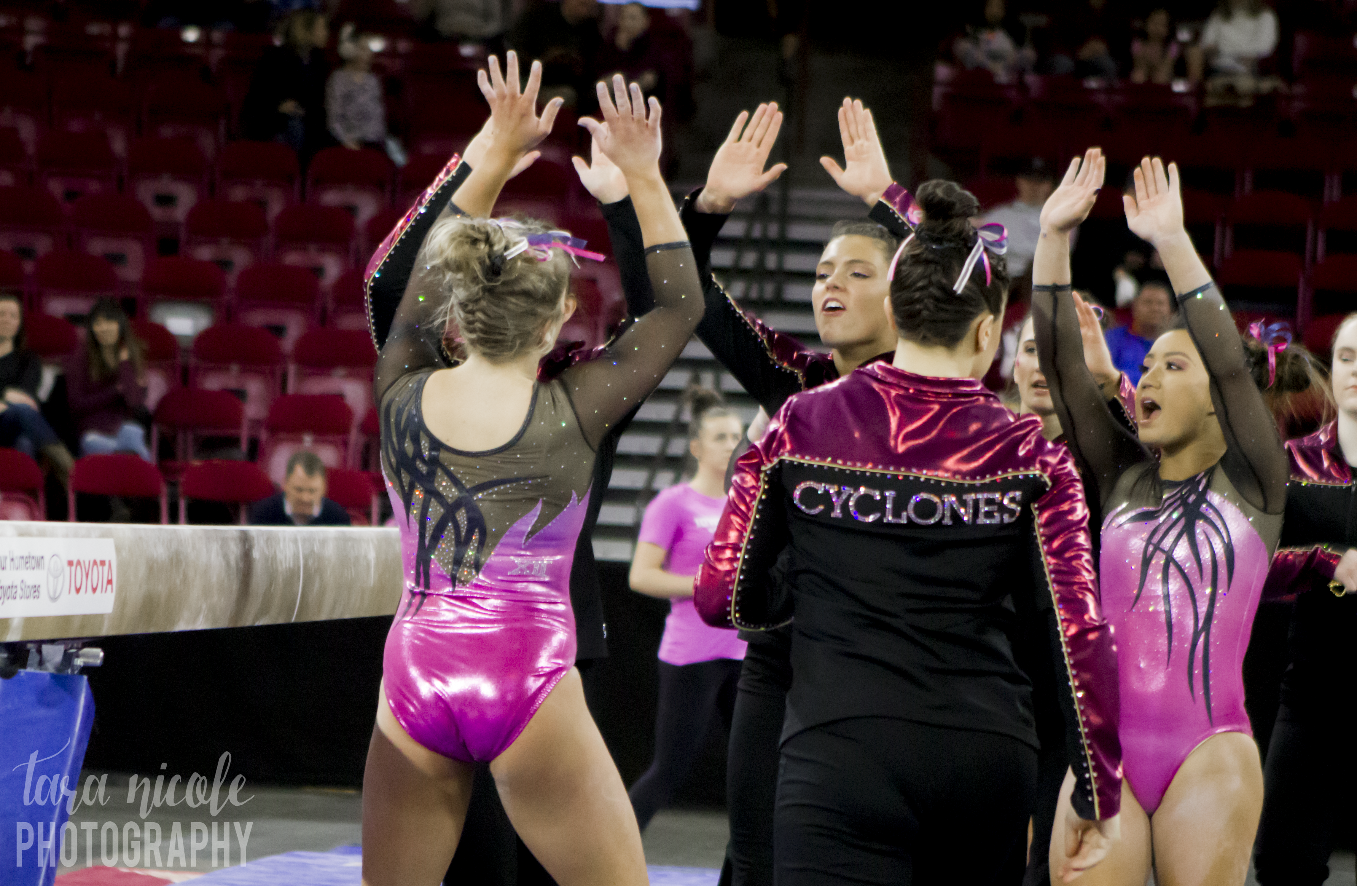
Iowa State: 7.467
| Design | Fabric/
Sparkle |
Pink Meet
Spirit |
Overall
Appearance |
Total | |
| Elizabeth | 1.8/3 | 1.5/2 | 1.4/2 | 2.0/3 | 6.7/10 |
| Rachel | 2.0/3 | 1.7/2 | 1.5/2 | 2.5/3 | 7.7/10 |
| Mary Emma | 2.3/3 | 1.8/2 | 1.5/2 | 2.4/3 | 8.0/10 |
Elizabeth: This isn’t bad at all when it comes to pink leos (there are much worse ones out there). I actually like the pink shimmery color/fabric used here, and the black and mesh goes well with the design as a whole. Also, I just noticed the XII on the back, which is a nice touch of conference spirit too.
Rachel: Oooh the pink they chose is really nice and shimmery, and it pairs nicely with the black mesh sleeves. I also like the XII on the back. Definitely one of the better pink meet leos.
Mary Emma: I really like the shade of pink they chose for this leo. It looks nice with the black sleeves and isn’t too overboard. I’m not a huge fan of the black criss-cross stripe things though.
Cornell: 7.433
Photographed @CU_Gymnastics at the Ivy Classic today at UPenn's Palestra. It was super fun and super challenging! I hadn't shot sports seriously in months, and it felt *so* good to shake the rust off. #cornell #cornellsports #gymnastics pic.twitter.com/z8yr1MRhAw
— Cameron Pollack (@kcallop) February 24, 2019
| Design | Fabric/
Sparkle |
School
Spirit |
Overall
Appearance |
Total | |
| Elizabeth | 2.0/3 | 1.4/2 | 1.6/2 | 2.1/3 | 7.1/10 |
| Rachel | 2.3/3 | 1.0/2 | 1.5/2 | 2.0/3 | 6.8/10 |
| Mary Emma | 2.5/3 | 1.8/2 | 1.6/2 | 2.5/3 | 8.4/10 |
Elizabeth: I like this! It’s a step up from a lot of Cornell’s leos. I love the mesh sleeves and the shade of red used. I also love the unique back with “Cornell.” I don’t love the neckline design, but I do like the sparkle design.
Rachel: Is it weird that I love how red this red is? It really pops against the black body. Overall, this is a nice leo, and I like the Cornell on the back.
Mary Emma: These are nice! I love the shade of red on the sleeves, and the script “Cornell” in rhinestones is a nice touch. I don’t love the oval on the front, but that’s really my only big complaint.
Boise State: 7.200
Since it was hard to tune into the Denver tri meet stream this weekend, here's another look at @BroncoSportsGYM's new leo! #NCAAgym pic.twitter.com/JTenF7Erk5
— College Gym News (@collegegymnews_) February 25, 2019
| Design | Fabric/
Sparkle |
School
Spirit |
Overall
Appearance |
Total | |
| Elizabeth | 2.1/3 | 1.4/2 | 1.6/2 | 2.2/3 | 7.3/10 |
| Rachel | 1.5/3 | 1.5/2 | 1.7/2 | 1.7/3 | 6.4/10 |
| Mary Emma | 2.2/3 | 1.6/2 | 1.7/2 | 2.4/3 | 7.9/10 |
Elizabeth: I really like this one from Boise! It uses its sometimes unfortunate school colors well, and doesn’t go overboard with any one element. I also appreciate the Broncos on the chest, and the mesh sleeves add another element of depth. And, the back design is unusual but flattering.
Rachel: This is fine. I actually think I’d like it a lot if they didn’t use those fake cut-outs on the side because the back is unique and the incorporation of the Broncos on the front is nice. Overall, it’s a solid leo minus the sides!
Mary Emma: I like this one! The shade of blue is really pretty, and I love the rhinestone pattern (especially the subtle “Broncos” on the chest. The one thing I don’t really like are the orange cutouts. They are too light and remind me of nude mesh (and we all know how I feel about nude mesh).
Oklahoma: 5.433
https://twitter.com/OU_WGymnastics/status/1099744040331939842
| Design | Fabric/
Sparkle |
School
Spirit |
Overall
Appearance |
Total | |
| Elizabeth | 1.6/3 | 1.3/2 | 1.7/2 | 1.9/3 | 6.5/10 |
| Rachel | 0.5/3 | 0.5/2 | 1.5/2 | 0.5/3 | 3.0/10 |
| Mary Emma | 1.8/3 | 1.2/2 | 1.5/2 | 2.3/3 | 6.8/10 |
Elizabeth: Woof. OK. Let me break down my feelings on this. I don’t hate this like a lot of people. It’s the exact funkiness and off-the-wall design that Oklahoma has come to be known for. I actually love that it’s mixing things up and not just doing another crimson with white sleeves or solid crimson with open back leo. Looking at just the body, I really like it. The black accents are nice and the design is flattering. I also like the school spirit on display. I could do without the criss-cross design on the sleeves, and the additional black stripe down the arms is overkill, but overall this isn’t bad.
Rachel: Usually, the more I look at a leo, the more I can convince myself I like it. In this situation, I think the opposite is happening… So we’ll just leave it at that.
Mary Emma: I’m going to play the “this looked much better in person” card because this definitely would have gotten a lower rating from me if I had just seen the picture, but it looks better in real life. I don’t like the black mesh cutouts on the side at all, but I love the red part of the leo. And like I said, the sleeves look better in motion than they do in this picture.
BONUS! Cal Head Coaches Liz Crandall-Howell and Justin Howell: 10.0
| Design | Fabric/
Sparkle |
Pink Meet
Spirit |
Overall
Appearance |
Total | |
| Elizabeth | 3.0/3 | 2.0/2 | 2.0/2 | 3.0/3 | 10.0/10 |
| Rachel | 3.0/3 | 2.0/2 | 2.0/2 | 3.0/3 | 10.0/10 |
| Mary Emma | 3.0/3 | 2.0/2 | 2.0/2 | 3.0/3 | 10.0/10 |
Elizabeth: Liz and Justin always look fresh, and this meet was no exception. The blazer is on point, the necklace shining bright and the best part is they’re basically matching with the pink collared shirts. I love it.
Rachel: OK, this is super cute!! I love the Pink Meet spirit.
Mary Emma: I love it when coaches get into the spirit of the pink meets too! And I love that they matched; it’s super cute!
READ THIS NEXT: Leotard Rankings: Week Seven
Article by Elizabeth Grimsley, Mary Emma Burton and Rachel Riesterer
Like what you see? Consider donating to support our efforts throughout the year! [wpedon id=”13158″]


One comment
Comments are closed.