We’re deep in pink meet season with a large number of teams donning pink leos this weekend, including two featured in these rankings. Other teams also debuted new numbers in their own school colors, some of which we loved very much. The criteria is the same as always: up to three points for design; two points for fabric and sparkle; two points for school spirit; and three points for overall appearance. This week’s guest judges are managing editor Emily M and SEC editor Katherine.
Arizona: 9.167
https://www.instagram.com/p/Bt9b5nDBhNu/
| Design | Fabric/
Sparkle |
School
Spirit |
Overall
Appearance |
Total | |
| Elizabeth | 2.7/3 | 1.8/2 | 1.9/2 | 2.8/3 | 9.2/10 |
| Emily M | 2.8/3 | 1.9/2 | 1.9/2 | 2.9/3 | 9.5/10 |
| Katherine | 2.6/3 | 1.8/2 | 1.6/2 | 2.8/3 | 8.8/10 |
Elizabeth: This is great. My favorite part is actually the back. The design leading into the low back with the A at the apex is creative and so lovely. As for the front, it was very superhero, and I’m not complaining about it.
Emily M: I love this. The solid matte royal blue is perfection, and I love the use of crystals to continue the starburst feel into the bottom half of the leo. It’s also very flattering and makes red, white and blue not vomit inducing. Team USA, you should borrow this design.
Katherine: By far my favorite of the weekend! Something about the white part softens the red and blue parts, and it makes for a very pretty effect. And I love the incorporation of the A on the back. If I was a leo designer, I would have upped the Arizona spirit by changing the colors to those of the state flag, which has a very similar pattern to this (Ozone, did you hear that?).
Minnesota: 7.733
.@ivylu98 shines with this 9.900 beam routine. ✨ pic.twitter.com/iA4XdLsw3g
— Minnesota Women’s Gym (@GopherWGym) February 16, 2019
| Design | Fabric/
Sparkle |
Pink Meet
Spirit |
Overall
Appearance |
Total | |
| Elizabeth | 2.2/3 | 1.1/2 | 1.7/2 | 1.6/3 | 6.6/10 |
| Emily M | 2.3/3 | 1.5/2 | 1.9/2 | 2.4/3 | 8.1/10 |
| Katherine | 2.7/3 | 1.6/2 | 1.8/2 | 2.5/3 | 8.5/10 |
Elizabeth: Meh. I wish this design was opposite with a black both and pink arms, then I would have actually loved it. But this has too much pepto pink. I do like the sweetheart neckline though.
Emily M: New pink leos are all SO pink this year. I’m not a fan of the bubble gum shade, but I do love the sweetheart neckline and black mesh sleeves. Plus, I appreciate the classic Minnesota M on the sleeve.
Katherine: Very pretty take on the pink theme. The sparkles are perfectly distributed throughout the leo, and I really like the back as well. But my favorite part has to be the neckline; so elegant, and I love the shape of it. It might not be as unique as some of the other pink ones we’ve seen, but I’d say this is my favorite of them all.
Alaska: 7.600
https://www.instagram.com/p/Bt7slaon88B/
| Design | Fabric/
Sparkle |
School
Spirit |
Overall
Appearance |
Total | |
| Elizabeth | 2.6/3 | 1.6/2 | 1.6/2 | 2.7/3 | 8.5/10 |
| Emily M | 2.7/3 | 1.5/2 | 1.0/2 | 2.6/3 | 7.8/10 |
| Katherine | 2.1/3 | 1.2/2 | 1.2/2 | 2/3 | 6.5/10 |
Elizabeth: This emerald color is one of my favorites, so I automatically love this leo. I could have done without the slightly weird gold necklace thing around the collar, but it’s not horrible, and at least it’s not yellow or some other odd shade. I also really like the back even though it’s basically a simple keyhole design.
Emily M: I love a great green leo, and this emerald shade is perfect. The shimer is enough to keep it from being too boring, and I love the use of crystals on the neckline. Simplicity at its best. Kudos, Alaska!
Katherine: I really like the neckline of this with the sparkles, and the color scheme is very regal (anyone else getting major Slytherin vibes?). Overall, though, it’s just a bit simple for my liking; that’s what’s keeping the scores down for me.
LSU: 7.433
| Design | Fabric/
Sparkle |
School
Spirit |
Overall
Appearance |
Total | |
| Elizabeth | 2.0/3 | 1.6/2 | 1.9/2 | 2.2/3 | 7.7/10 |
| Emily M | 2.8/3 | 1.6/2 | 2.0/2 | 2.7/3 | 9.1/10 |
| Katherine | 1.4/3 | 1.1/2 | 1.4/2 | 1.6/3 | 5.5/10 |
Elizabeth: I like the tiger-stripe theme. The mostly purple leo is great and elegant and the sparkles make the design without being too over the top. This is different than what LSU has had recently, and I like the subtle change.
Emily M: I love it when a team does tiger claw stripes (see: Missouri’s new leo last year), and this is no exception. The shade of purple is classic, and I like the use of gold crystals to create the claw marks.
Katherine: I like that they went for spirit with the tiger stripes, but something about them doesn’t look right to me; they’re almost too costumey in a way? And they don’t exactly work with the lettering of “LSU” on the sleeve, either. Not my fave from LSU.
Winona State: 6.967
| Design | Fabric/
Sparkle |
School
Spirit |
Overall
Appearance |
Total | |
| Elizabeth | 1.7/3 | 1.5/2 | 1.7/2 | 1.8/3 | 6.7/10 |
| Emily M | 1.8/3 | 1.7/2 | 1.7/2 | 1.9/3 | 7.1/10 |
| Katherine | 2.1/3 | 1.2/2 | 1.6/2 | 2.2/3 | 7.1/10 |
Elizabeth: When I first saw the design on the front, I wondered why there was a zesty arrow design. But now I think it’s a W for Winona? Either way, I kind of like how it’s executed with the over-the-top amount of silver sequins paired with the subtle use of purple. The leo overall isn’t my very favorite, but it’s not bad either.
Emily M: I just don’t know. Is that a W? Or a random shape? I don’t like that I can’t tell. I do like the combination of silver and purple crystals to give the design a sort of glowing look.
Katherine: I wasn’t a fan at first glance, but the more I look at it, I appreciate the intricacy of the design on the front. It doesn’t look tacky, and I love the arrangement of the sparkles around it. Would have liked to see a little more creativity with the sleeves, but overall it isn’t bad at all!
California: 6.700
A career-best 9.875 for @Milan_Clausi on beam! pic.twitter.com/MqoS8w93lp
— Cal Gymnastics (@CalWGym) February 17, 2019
| Design | Fabric/
Sparkle |
Throwback
School Spirit |
Overall
Appearance |
Total | |
| Elizabeth | 1.7/3 | 1.3/2 | 1.4/2 | 1.8/3 | 6.2/10 |
| Emily M | 2.0/3 | 1.6/2 | 1.0/2 | 2.3/3 | 6.9/10 |
| Katherine | 2.2/3 | 1.5/2 | 1.1/2 | 2.2/3 | 7.0/10 |
Elizabeth: This isn’t bad, but there are plenty of new Cal leos I like way better. It’s just kind of boring to me. The sweetheart neckline is nice, and the color is also fine. But again, it’s just boring.
Emily M: I love this shade of blue and the all-over sparkle of this leo. I also enjoy a good sweetheart neckline. I just want something more! I love a simple, classy leo, but this one is a touch too boring for me.
Katherine: I really like the slight difference in shades between the body and the sleeves. The sparkles are also well-distributed. But I agree with Emily that it is pretty boring otherwise.
Alabama: 6.533
| Design | Fabric/
Sparkle |
Pink Meet
Spirit |
Overall
Appearance |
Total | |
| Elizabeth | 1.4/3 | 1.3/2 | 2.0/2 | 1.5/3 | 6.2/10 |
| Emily M | 1.0/3 | 0.8/2 | 1.9/2 | 1.6/3 | 5.3/10 |
| Katherine | 2.2/3 | 1.4/2 | 1.8/2 | 2.3/3 | 8.1/10 |
Elizabeth: Well this definitely screams I’M WEARING THIS AT A PINK MEET TO SUPPORT CANCER AWARENESS. I think it needed six less design features for me to like it. But the three large pink ribbons plus the small rhinestone ribbons plus the Alabama on the back plus the mesh and pink accents was just too much. It almost looked busier on the gymnasts than in this pic?
Emily M: Ugh. So many pink leos incorporate the pink ribbon. I’m not mad about it, but I don’t think you need a million tiny pink ribbons everywhere. Also, I’m seeing velvet body/sleeves, but a mesh chest/back inset? Why? The mix of blacks is unappealing to me. Not my favorite.
Katherine: Every picture I see of this leo shows me something I didn’t see before. There is a looooooot going on here, but for me it works? The ribbon design being flipped on the back is a nice touch that works well. I also like the scattered design of the ribbons better than when they did the same design with the “A” for Alabama. I would say this leo was a risk that paid off!
Towson: 6.367

| Design | Fabric/
Sparkle |
Throwback School
Spirit |
Overall
Appearance |
Total | |
| Elizabeth | 1.5/3 | 1.2/2 | 1.5/2 | 1.6/3 | 5.8/10 |
| Emily M | 1.6/3 | 1.7/2 | 1.7/2 | 1.9/3 | 6.9/10 |
| Katherine | 1.8/3 | 1.4/2 | 1.1/2 | 2.0/3 | 6.4/10 |
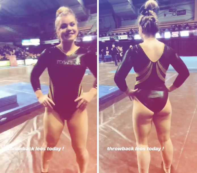
Elizabeth: Another throwback, but to be honest it almost looks “modern.” I’m going to pretend the stripes are supposed to be like Tiger stripes and like the cleverness because of that. I also like the simple block “Towson” on the chest.
Emily M: A MUCH better throwback option. I love a black leo, and having your team across the chest is very early 2000s in a hilarious way. This is a much better use of gold than we saw on one other throwback leo this week.
Katherine: Alright…maybe I was a touch too aggressive earlier about the throwback leos because this one isn’t too awful. It has some good spirit, but I’d say if you’re going to do sparkly letters, go big or go home; I’d love to see a bigger font. The stripes are also a subtle way of showing spirit because it almost creates an image of tiger stripes when you look at it from the front.
Denver: 3.800
How about a little throwback for tonight's leo! #PioneerTogether pic.twitter.com/URqDBp9PIj
— Denver Gymnastics (@DU_Gymnastics) February 17, 2019
| Design | Fabric/
Sparkle |
School
Spirit |
Overall
Appearance |
Total | |
| Elizabeth | 0.9/3 | 0.8/2 | 1.5/2 | 1.0/3 | 4.2/10 |
| Emily M | 1.0/3 | 0.5/2 | 1.0/2 | 0.9/3 | 3.4/10 |
| Katherine | 1.1/3 | 0.4/2 | 1.0/2 | 1.3/3 | 3.8/10 |
Elizabeth: You know how much I love when teams wear throwbacks, but maybe pic a different one next time, Denver? However, I can’t fault the awesomeness of this ugly throwback color combo. Denver learned its lesson in present day about pairing gold and crimson and black together. That’s all I’ll say.
Emily M: ACK. WHY. This looks like a stock J.O. leo design. The gold is a very terrible shade, and the neckline is blah. Denver, you did so well last week. What happened!? I appreciate that it’s a throwback leo, but you must have a better one lying around somewhere.
Katherine: Unpopular opinion, but throwback leos are called “throwback” for a reason…they’re from the past and (MOST) should stay there. Not a fan of this at all. The colors are so dull, and they picked the most basic fabric there could be.
BONUS! Bryan Raschilla’s Pants: 9.233

| Design | Fabric/
Sparkle |
School
Spirit |
Overall
Appearance |
Total | |
| Elizabeth | 2.8/3 | 1.5/2 | 2.5/2 | 2.8/3 | 9.6/10 |
| Emily M | 2.8/3 | 1.5/2 | 2.0/2 | 2.9/3 | 9.2/10 |
| Katherine | 2.6/3 | 1.6/2 | 2.0/2 | 2.7/3 | 8.9/10 |
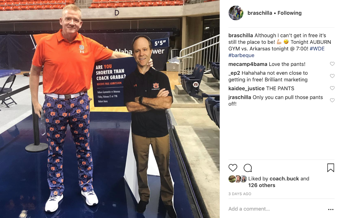
Elizabeth: There are so many subtleties to this pant design that I can’t get enough of them.The Auburn logo all over, the actual tiger faces, the school colors. You know what? I’m going to do something unprecedented with leo rankings and give these a 2.5 for school spirit. Call me Carol or something.
Emily M: OH MY GOSH. You know what my favorite part about this is? 100 percent that he was previously at Alabama and is now wearing these spectacular Auburn pants. Just think about it! The Alabama/Auburn Elevate meet this year is going to be SOMETHING. Especially because Ashley Priess-Johnston is also an assistant. I expect these pants to reappear and for APJ to be in a matching dress, please and thank you.
Katherine: So incredible. I love the mixed patterns, especially the tiger face background because you don’t really notice it at first glance. They sort of look like pajama pants, but I don’t even care. Go off, Bryan!
READ THIS NEXT: Leotard Rankings: Week Six
Article by Elizabeth Grimsley, Emily Minehart and Katherine Weaver
Like what you see? Consider donating to support our efforts throughout the year! [wpedon id=”13158″]


