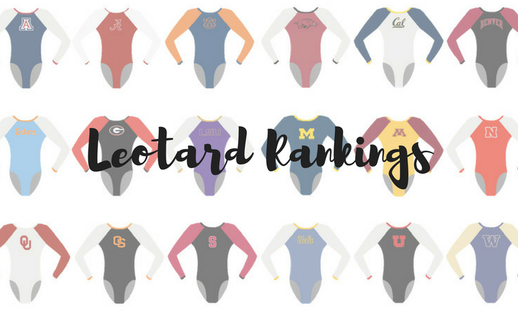
Theme meets brought some very, um, interesting designs this week. We also got some stunners around the country. The criteria is the same as always: up to three points for design; two points for fabric and sparkle; two points for school spirit; and three points for overall appearance. This week’s guest judges are Christina, our Pac-12 senior editor, and Emily HF, our senior photographer.
Ursinus: 8.800
Competition leos for this weekend at Cortland! • #ThisIsUS #Ursinus #gkelite pic.twitter.com/idBvMYRZEh
— Ursinus Gymnastics (@UrsinusGym) February 8, 2019
| Design | Fabric/
Sparkle |
School
Spirit |
Overall
Appearance |
Total | |
| Elizabeth | 2.7/3 | 1.7/2 | 1.5/2 | 2.6/3 | 8.5/10 |
| Christina | 2.6/3 | 2.0/2 | 1.6/2 | 2.8/3 | 9.0/10 |
| Emily HF | 2.7/3 | 1.8/2 | 1.7/2 | 2.7/3 | 8.9/10 |
Elizabeth: This leo is GREAT. It has all my favorite elements: ombre, sweetheart neckline and just enough sparkle. A huge win for Ursinus here.
Christina: LOVE this one. This shade of ombré is absolutely gorgeous. The sweetheart neckline covered in sparkles is to die for.
Emily HF: Oooooo yes! This reminds me of the Stanford one that I love. Red to black ombre is always a win, and this has it on both the sleeves and the body!
Nebraska: 8.100
https://twitter.com/huskerswgym/status/1094362154680111104?s=12
| Design | Fabric/
Sparkle |
School
Spirit |
Overall
Appearance |
Total | |
| Elizabeth | 2.4/3 | 1.9/2 | 1.8/2 | 2.7/3 | 8.8/10 |
| Christina | 2.0/3 | 1.3/2 | 1.5/2 | 2.2/3 | 7.0/10 |
| Emily HF | 2.3/3 | 2.0/2 | 1.7/2 | 2.5/3 | 8.5/10 |
Elizabeth: I really loved this on the gymnasts. The red popped phenomenally on TV, and the design looked amazing—so much more so than in this still image. I don’t love the back; I feel like it could have been more creative, and the closure system looks a bit cheap. However, The front is gorgeous, and I don’t mind the black column going up to the neck.
Christina: At first, I really did not like the mesh open back, but I have to admit it grew on me. The solid front balances it all nicely. I like the neckline and the sparkles. That random vertical band between the collar and the neckline is a bit strange, but it doesn’t bother me so much.
Emily HF: I hate to play the “this was stunning in person” card. But this was STUNNING in person. Especially in the red of Devaney. There’s so much sparkle, and it definitely stood out!
Denver: 8.100
New leo alert! #PioneerTogether #NCAAGym pic.twitter.com/Hly7h7Yn2X
— Denver Gymnastics (@DU_Gymnastics) February 10, 2019
Lynnzee Brown earned the first perfect 10.0 of her career on floor today in front of our largest-ever crowd! #PioneerTogether pic.twitter.com/ndwUpJLaVZ
— Denver Gymnastics (@DU_Gymnastics) February 11, 2019
| Design | Fabric/
Sparkle |
School
Spirit |
Overall
Appearance |
Total | |
| Elizabeth | 2.3/3 | 1.6/2 | 1.6/2 | 2.4/3 | 7.9/10 |
| Christina | 2.4/3 | 1.7/2 | 1.7/2 | 2.5/3 | 8.3/10 |
| Emily HF | 2.3/3 | 1.7/2 | 1.6/2 | 2.5/3 | 8.1/10 |
Elizabeth: Like Christina, I love this leo way more in motion when you can’t really see all the (weird) details. That being said, I do love this leo. It’s a bit of a step away from what Denver does, and that’s not a bad thing. I like the mostly black look with crimson accents, and the top design is nice too. I also like the subtle school spirit. In fact, this leo is very Oklahoma, which is funny since that was Denver’s opponent. I wonder if that was done on purpose.
Christina: This leo looks way better in motion. I’m getting some serious OU vibes out of this one, with the patterned top and sparkles all over. I think I like it, in motion. The pattern itself is alright, and I’m not a fan of the rectangle hole on the front. I however do love the back and how shiny it is.
Emily HF: I hate this in the still and love it in motion, so I’m not sure what to do with that. The sleeves and bodice look much more black than grey in the video, and I prefer that. Plus, the sparkles are INTENSE; from a distance the amount of detail on the bodice isn’t too much at all.
Michigan State: 7.933
| Design | Fabric/
Sparkle |
School
Spirit |
Overall
Appearance |
Total | |
| Elizabeth | 2.4/3 | 1.4/2 | 1.6/2 | 2.5/3 | 7.9/10 |
| Christina | 2.5/3 | 1.3/2 | 1.5/2 | 2.4/3 | 7.7/10 |
| Emily HF | 2.5/3 | 1.5/2 | 1.7/2 | 2.5/3 | 8.2/10 |
Elizabeth: I really love the low back on this. It looks great on the gymnasts. I also love the emerald green. I’m never really a fan of lace, but the black lace utilized here it actually pretty nice because in motion it doesn’t really look lace-y. This is an older leo for the Spartans but a good one.
Christina: This is what a Slytherin gymnast would wear, probably. I love the lace on the top, but I wish it didn’t go as far down the bodice as it does. The touch of green is nice, but overall this might be a bit too dark for my liking. I am obsessed with the open back, unsurprisingly.
Emily HF: Ooooo pretty. I love the black lace and the open back. Dark leos are almost always a winner for me. Very classy.
Utah State: 7.600
We are debuting these new leos against No. 9 Boise State tonight.#LeoWatch #AggiesAllTheWay #MeetTheChallenge #BurnTheBoats pic.twitter.com/wCcUiMWQaL
— USU Gymnastics (@USUGymnastics) February 9, 2019
| Design | Fabric/
Sparkle |
School
Spirit |
Overall
Appearance |
Total | |
| Elizabeth | 2.0/3 | 1.6/2 | 1.7/2 | 2.1/3 | 7.4/10 |
| Christina | 2.5/3 | 1.3/2 | 1.9/2 | 2.5/3 | 8.2/10 |
| Emily HF | 2.0/3 | 1.5/2 | 1.7/2 | 2.0/3 | 7.2/10 |
Elizabeth: I actually really like this. The small grey-blue swatch on the upper chest is actually pretty flattering and the top design with the white sleeves and silver piping is also nice. I also like the small and subtle Utah State on the back. Overally, this is definitely one of Utah State’s best leos.
Christina: I quite like this one. The front almost looks like an armour, yet it’s elegant at the same time. I love how all school colors are incorporated, and I’m a big fan of the grey straps on the upper body and on the sleeves. I do wish there was maybe a little more “pop” to it—maybe more sparkles—but all in all it’s a super nice look.
Emily HF: I didn’t like this on first look, but it’s grown on me. I like the blue/grey pieces and the placement is flattering. I’m not in love with the angle of the silver piping lines, but I like the idea of them.
Stanford: 7.367
Sophomore Kyla Bryant nails bars routine and matches career-high with 9.900.#GoStanford pic.twitter.com/erQIu072dr
— Stanford Gymnastics (@StanfordWGym) February 10, 2019
| Design | Fabric/
Sparkle |
School
Spirit |
Overall
Appearance |
Total | |
| Elizabeth | 2.0/3 | 1.5/2 | 1.7/2 | 2.1/3 | 7.3/10 |
| Christina | 2.0/3 | 1.3/2 | 1.8/2 | 2.2/3 | 7.3/10 |
| Emily HF | 2.0/3 | 1.5/2 | 1.8/2 | 2.2/3 | 7.5/10 |
Elizabeth: The silver design on the sleeves really made the arms pop in motion, so that’s a win for me. I also really like the red body, and the school spirit on the upper arm with the Stanford logo. I could take or leave the neckline design. There’s nothing overly special about it.
Christina: This is nice, although it’s not my favorite Stanford look. I guess maybe for me there is a bit too much red on the bodice, and the silver bands around the armpits are a bit random. I do like the back, and the logo with the tree on the sleeve is a nice touch.
Emily HF: This reminds me a bit of an older Stanford design, but I like this one a lot better. The silver on the sleeves is pretty, especially in motion, and I love that bright shade of red.
Illinois: 7.233
https://twitter.com/IlliniWGym/status/1094036299080716290
| Design | Fabric/
Sparkle |
School
Spirit |
Overall
Appearance |
Total | |
| Elizabeth | 1.6/3 | 1.4/2 | 1.8/2 | 2.2/3 | 7.0/10 |
| Christina | 1.8/3 | 1.6/2 | 1.7/2 | 2.2/3 | 7.3/10 |
| Emily HF | 1.8/3 | 1.5/2 | 1.8/2 | 2.3/3 | 7.4/10 |
Elizabeth: Take away the front ruching/ribbon/straps, and I would love this. However, with it there, it’s not my favorite. Also, if I’m being picky, I’d also take away the back “straps” and just have a plain open back, but overall it’s good except for those small details. Plus, the orange and blue combo is done well here, which isn’t easy.
Christina: The open back is gorgeous, and I love the thick straps going across it. The front is a bit too solid for my taste, and I wish the neckline had been different. As gorgeous as the straps look on the back, they look a bit out of place on the front. The ombré from orange to navy on the sleeves, however, is lovely. A great way to use orange on a leo, which is not something easily done.
Emily HF: I wish the straps didn’t cross in the front like the and it was just the ombre. I like the colors and the straps in back. Overall it’s a good leo, just the cross of the straps in front randomly draws my eye.
Oregon State: 6.367
Since I’ve been asked a few times, here is the Beavs’ new pink leo! Come see it next Sunday in Corvallis when we take on CAL! #GoBeavs pic.twitter.com/qgjJmQZTJE
— Oregon State Gymnastics (@BeaverGym) February 9, 2019
| Design | Fabric/
Sparkle |
Pink Meet
Spirit |
Overall
Appearance |
Total | |
| Elizabeth | 1.7/3 | 1.3/2 | 1.8/2 | 1.8/3 | 6.6/10 |
| Christina | 1.2/3 | 1.4/2 | 1.7/2 | 1.4/3 | 5.7/10 |
| Emily HF | 1.5/3 | 1.5/2 | 1.8/2 | 2.0/3 | 6.8/10 |
Elizabeth: I simultaneously think it’s fun that Oregon State took a leo it already had and turned it into a pink leo and lazy that it did this. Although OSU’s old pink leo was the exact same one Minnesota has/had, so that’s kind of the name of the game for the Beavrs.
Christina: OSU already has this leo but with white instead of the pink. I’m for sure not here for the hot pink shades, as usual. The rest of the leo is alright; I’m not a big fan of the neckline and the simple front, but I do like all the sparkles.
Emily HF: I’ve seen other photos of this leo where the shade of pink looks better than this. It looks very highlighter pink here, and I don’t think it necessarily is. I like the white version of this leo well enough though, and this is better than the old pink leo.
Air Force: 6.333
https://www.instagram.com/p/BtrvlbcHOv3/
| Design | Fabric/
Sparkle |
School
Spirit |
Overall
Appearance |
Total | |
| Elizabeth | 2.2/3 | 1.5/2 | 1.7/2 | 2.3/3 | 7.7/10 |
| Christina | 1.6/3 | 1.0/2 | 1.4/2 | 1.8/3 | 5.8/10 |
| Emily HF | 1.5/3 | 1.0/2 | 1.5/2 | 1.5/3 | 5.5/10 |
Elizabeth: I like this! Air Force has really stepped up its leotard game over the last season or so. The silver is an underutilized color, and I like it here in combination with the blue to silver ombre sleeves. I also like the unique back, the sparkle flag on the sleeve (WAY better than the slap on patch it has on some of its leos) and the white “stripes” on the front to back and how they sort of resemble the logo.
Christina: I’m torn here. The back is interesting, and I like the open upper back, but I don’t understand why those two white strips just randomly end and leave a tiny space in the middle of the back? It bugs me. The front is also fine, but I’m having the same issue with those white strips, except they went too far this time. The grey bodice is a bit dull, but the ombré sleeves are lovely.
Emily HF: Hmm. I wasn’t sure what was bugging me about this, but I think it’s just that I don’t love the combination of blue and grey together, which is just a personal preference thing? Also one of the white stripes touching the the front and the other not is odd to me?
Kent State: 5.767
https://twitter.com/KentStGym/status/1094740221734854663
| Design | Fabric/
Sparkle |
School
Spirit |
Overall
Appearance |
Total | |
| Elizabeth | 1.8/3 | 1.3/2 | 1.7/2 | 2.0/3 | 6.8/10 |
| Christina | 1.0/3 | 0.7/2 | 0.6/2 | 1.2/3 | 3.5/10 |
| Emily HF | 2.0/3 | 1.5/2 | 1.5/2 | 2.0/3 | 7.0/10 |
Elizabeth: I like this better than a lot of its leos. The design as a whole definitely screams Kent State. I don’t love high necklines and wish the sparkles on the front stood out a bit better, but overall this is a good one.
Christina: Meh. This one doesn’t have enough contrast for my taste and is a bit too dark. I barely noticed the royal blue sparkles on the front at first. The flames design is overdone and I’m not a fan of the neckline and collar to be honest.
Emily HF: Very pretty! And subtle! I like subtle. The slight ombre to white on the sleeves is very nice.
Florida: 5.233
https://twitter.com/GatorsGym/status/1093914107932262400
| Design | Fabric/
Sparkle |
Pink Meet
Spirit |
Overall
Appearance |
Total | |
| Elizabeth | 1.3/3 | 1.2/2 | 1.4/2 | 1.4/3 | 5.3/10 |
| Christina | 1.0/3 | 0.6/2 | 1.3/2 | 1.5/3 | 4.4/10 |
| Emily HF | 1.5/3 | 1.2/2 | 1.5/2 | 1.8/3 | 6.0/10 |
Elizabeth: Why does Florida feel the need to get a new pink leo every year? Stick with last year’s. It was very, very nice. That being said, I don’t really like this design. I think I would if the neck pink wasn’t there and we just had the side boob pink.
Christina: First of all, no to the hot pink. Then, the design on the front really is something. It looks like a huge arrow pointing down. The back is alright, but I feel like this is just another solid black leo with hot pink at the top. Overall this is alright, but definitely a far cry from a nice pink leo or from my favorite UF leo.
Emily HF: I actually don’t mind this, but I second that Florida has too many pink leos. Plus, last year was one of my all time favorites, so I was sad to not see it again. The front design is fine and actually rather flattering when paired with the black.
Arizona State: 2.967
https://twitter.com/SunDevilGym/status/1092893870377947137
| Design | Fabric/
Sparkle |
School/Theme
Spirit |
Overall
Appearance |
Total | |
| Elizabeth | 0.7/3 | 0.3/2 | 2.0/2 | 0.7/3 | 3.7/10 |
| Christina | 0.3/3 | 0.0/2 | 2.0/2 | 0.1/3 | 2.4/10 |
| Emily HF | 0.5/3 | 0.0/2 | 2.0/2 | 0.3/3 | 2.8/10 |
Elizabeth: Camo should never be on a leotard. I don’t care that it was a salute to service meet—speaking of, don’t put “Salute to Service” on the leo either. The design actually isn’t half bad. I do with the yellow stripe/cuff was on both sleeves, and I like the sparkly Sun Devils. However, the rest is just a huge no for me…
Christina: Oh, ASU, I’ve come to expect better things from you. What happened to the trend of beautiful sunset colors and lovely ombré? This is just too much. I’ll be honest, I hate camo pattern to start with. If it had just been camo by itself, mayyyyyybe I’d feel better about this one. But camo AND maroon? No. Add to that the gigantic “Sun Devils” on the sleeve, the pitchfork smack in the middle of the chest, and bright yellow bands across the bodice… I can’t deny the school and theme spirit, but this is definitely too much.
Emily HF: Oh no. ASU.. You know I generally love your leos. But I can’t with this one. I have a thing about too many design elements, and this has like 10. Please don’t get me wrong—nothing against the theme of the meet, but I cannot with this leo. I like the gold Sun Devil on the sleeve and the pitchfork though, to be fair.
George Washington: 1.233
https://twitter.com/GW_Gymnastics/status/1094074852921753600
| Design | Fabric/
Sparkle |
Pink Meet
Spirit |
Overall
Appearance |
Total | |
| Elizabeth | 0.0/3 | 0.0/2 | 1.2/2 | 0.0/3 | 1.2/10 |
| Christina | 0.2/3 | 0.0/2 | 0.3/2 | 0.0/3 | 0.5/10 |
| Emily HF | 0.1/3 | 0.5/2 | 1.2/2 | 0.2/3 | 2.0/10 |
Elizabeth: I am so sorry GW fans, gymnasts and other supporters. I am about to be really mean about this leo, but it is no reflection on my love for the program. This leo is literally, literally the ugliest thing I’ve ever seen. The pink camo is awful on its own, but the design is absolutely horrible. I can’t think of one redeeming quality. Plus, “never give up” on the sleeve? That’s a feature for a T-shirt, not the sleeve of a leotard with rhinestones.
Christina: I thought ASU would be my worst leo this week and GWU was like “hold my beer.” They look like birthday clowns in huge pink costumes with suspenders. And is it pink camo? I don’t even know. This is terrible, but also of course GW coming up with this insane and abnormal looks. Points also because it’s a pink meet, and they are wearing pink. But there is really isn’t much to salvage this look.
Emily HF: Um. Hmm. I think there’s an old saying about how if you don’t have anything nice to say, don’t say anything at all? So, the sparkles are pretty?
READ THIS NEXT: Leotard Rankings: Week Five
Article by Elizabeth Grimsley, Christina Marmet and Emily Howell-Forbes
Like what you see? Consider donating to support our efforts throughout the year!


One comment