We’re bringing back throwback leo rankings this offseason to tide you over until 2019 arrives! The criteria is the same as always: up to three points for design; two points for fabric, sparkle, etc.; and two points for school spirit; three points for overall appearance. Guest judges this week will be Rebecca, our MPSF, DII, DIII, recruiting and elite in the NCAA senior editor, and Tara Graeve, our Big 12 and MRGC editor. The meet? The 1995 SEC championship.
Florida: 7.767

| Design | Fabric/
Sparkle |
School
Spirit |
Overall
Appearance |
Total | |
| Elizabeth | 2.1/3 | 1.6/2 | 1.7/2 | 2.2/3 | 7.6/10 |
| Rebecca | 2.2/3 | 1.5/2 | 1.8/2 | 2.3/3 | 7.8/10 |
| Tara | 2.2/3 | 1.7/2 | 1.6/2 | 2.4/3 | 7.9/10 |
Elizabeth: Best leo of the day no contest. I love the almost, what looks like from a distance, ahead-of-its-time white to blue ombre. The matching cuffs and keyhole back just add to the design. The orange is a nice touch, but I would have liked it to not look like birthday confetti. Still a fave of the meet, though.
Rebecca: I’m not sure exactly what the silver/maybe orange situation is on the top. That said, they nailed the color, and wearing an orange scrunchie with a predominantly blue leotard is a stroke of genius that modern UF should adopt.
Tara: Oooh! I like this! It’s so ‘90s, yet Florida somehow saw into the future of leotard trends with this one. “Ombre” AND a touch of a swirly design WITH a hint of orange.
LSU: 6.900

| Design | Fabric/
Sparkle |
School
Spirit |
Overall
Appearance |
Total | |
| Elizabeth | 1.3/3 | 1.4/2 | 1.8/2 | 1.4/3 | 5.9/10 |
| Rebecca | 2.0/3 | 1.9/2 | 1.9/2 | 2.3/3 | 8.1/10 |
| Tara | 1.5/3 | 1.6/2 | 1.7/2 | 1.9/3 | 6.7/10 |
Elizabeth: I like this leo MUCH more when the gymnast’s arms are up than when they’re down. The color combo is nice, especially the purple. The design on the shoulders, though, isn’t flattering at all. I also don’t love the half-an-arm cuff things but don’t hate them either. Also, after watching again, the silver dots on black material kind of looks like tiger print from afar. Yes, really.
Rebecca: This dusty aubergine-y shade of purple is soooo beautiful. I agree with Elizabeth that the V pattern would be fine if it didn’t also exist on the arms… But despite the overall Too Much of that, I think this is my favorite.
Tara: I don’t mind this! The contrasting colors are nice, and I’m a fan of geometric designs in general. But LSU really needs to stop making deep Vs a thing. I like this better than its 2018 deep V leo, though.
Alabama: 5.867

| Design | Fabric/
Sparkle |
School
Spirit |
Overall
Appearance |
Total | |
| Elizabeth | 1.2/3 | 1.3/2 | 1.7/2 | 1.3/3 | 5.5/10 |
| Rebecca | 1.4/3 | 1.7/2 | 1.5/2 | 1.8/3 | 6.4/10 |
| Tara | 1.3/3 | 1.3/2 | 1.5/2 | 1.6/3 | 5.7/10 |
Elizabeth: There is so much awful going on here. The huge ribbon, the mixture of white crushed velvet and crimson lycra, the giant scrunchie… It’s very “Alabama in the ‘90s” though.
Rebecca: I miss all of the ‘90s matte so MUCH. (Have millennials killed the matte industry???) This one looks great from the back and insane from the front, and the scrunchy is bizarre, but I love the color so points there.
Tara: I actually don’t mind this for a throwback leo? I like how the ribbon extends to the back, and the general principle is nice. I just wish it was a little less over the top and a smaller design on front. The ribbons are just too big and distracting for me.
Kentucky: 5.433

| Design | Fabric/
Sparkle |
School
Spirit |
Overall
Appearance |
Total | |
| Elizabeth | 1.5/3 | 1.3/2 | 1.6/2 | 1.6/3 | 6.0/10 |
| Rebecca | 1.1/3 | 0.9/2 | 1.3/2 | 1.2/3 | 4.5/10 |
| Tara | 1.4/3 | 1.2/2 | 1.5/2 | 1.7/3 | 5.8/10 |
Elizabeth: I’ve always thought it was clever when leos have a pattern that matches up from arm to body, like this one does with the star. I like the blue color used and am not offended too horribly by those large stars. It doesn’t scream Kentucky to me besides the blue, but it’s also likely one of the best leos at this meet.
Rebecca: Not a big fan of this one. The pattern is clunky, even for the ‘90s, and the cornflower blue to my eye is over the line into just plain purple.
Tara: I didn’t expect to like this as much as I did. The colors are nice, and the design is somehow not overbearing for being giant stars. The designer obviously had a knowledge of visual composition—how the three stars are laid out and the fact that there’s three of them makes it actually appealing to look at.
Auburn: 5.367

| Design | Fabric/
Sparkle |
School
Spirit |
Overall
Appearance |
Total | |
| Elizabeth | 1.3/3 | 0.9/2 | 1.7/2 | 1.4/3 | 5.3/10 |
| Rebecca | 1.2/3 | 1.5/2 | 1.7/2 | 1.3/3 | 5.7/10 |
| Tara | 1.1/3 | 1.0/2 | 1.7/2 | 1.3/3 | 5.1/10 |
Elizabeth: Well this does not scream Auburn to me. The huge random logo on the front reminds me more of something Florida might do than Auburn? The write and colors used are OK, but I just am really confused about that logo. Also can we talk about how it’s in the middle of her body and not on the chest like a normal logo?
Rebecca: The whole logo situation is obviously ridiculous, but I still love matte white so much that I can’t complain. My bigger problem is that something about the cut is profoundly unflattering to the athletes’ (presumably) completely normal arms and shoulders.
Tara: Well, this is something else. It’s got the school spirit, but it’s not hitting it at all for me design wise. It’s almost like someone just slapped the logo on in some random place on front while also doing nothing else to the leo. Not my favorite, Auburn.
Georgia: 5.033

| Design | Fabric/
Sparkle |
School
Spirit |
Overall
Appearance |
Total | |
| Elizabeth | 1.1/3 | 1.3/2 | 1.4/2 | 1.2/3 | 5.0/10 |
| Rebecca | 1.0/3 | 1.7/2 | 1.3/2 | 1.1/3 | 5.1/10 |
| Tara | 1.2/3 | 1.3/2 | 1.2/2 | 1.3/3 | 5.0/10 |
Elizabeth: Umm… I don’t even know where to begin with this. I can certainly say I’ve never seen a back keyhole extend to also be a front keyhole. The all white is nice, as well as the script Georgia on the front near the hole but I wish that lettering was bigger. The arm ribbons are a little weird but still the most normal part of this leo, which is saying something.
Rebecca: That’s quite something. I was ready to like it based on matte white being such a rarity these days, but then I was hit by everything else about it. At least the “Georgia” is small. It’s not exactly a nice touch, but it’s some kind of touch.
Tara: Oh man… I really like the arms, but the rest is just something else. I actually like the back keyhole, but I really don’t know why they had to extend it to the front. I guess it is a good leading line to the script Georgia, but even that I wish was more noticeable than it is.
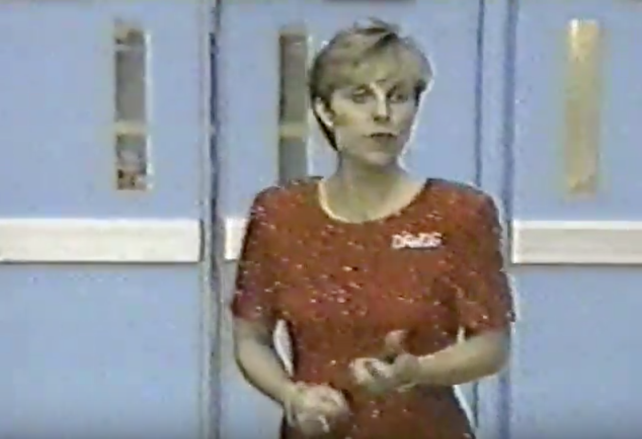
BONUS! Suzanne Yoculan: 8.067

| Design | Fabric/
Sparkle |
School
Spirit |
Overall
Appearance |
Total | |
| Elizabeth | 2.3/3 | 1.9/2 | 1.8/2 | 2.4/3 | 8.4/10 |
| Rebecca | 2.1/3 | 1.8/2 | 1.7/2 | 2.5/3 | 8.1/10 |
| Tara | 2.0/3 | 1.8/2 | 1.7/2 | 2.2/3 | 7.7/10 |
Elizabeth: Gotta always hand it to Suzanne to bring the flash and school spirit. The “Dawgs” on the side is very festive and the full-on red sparkly dress is just what this championship needed.
Rebecca: Did she deliberately dress her gymnasts in something plain and wacky to make herself look good? If she did, it worked.
Tara: Suzanne, bringing all the pizazz that the actual leotard lacks. Way to go, Suzanne!
READ THIS NEXT: Throwback Leotard Rankings: 2008 Big Tens
Article by Elizabeth Grimsley, Rebecca Scally and Tara Graeve
Like what you see? Consider donating to support out efforts throughout the year! [wpedon id=”13158″]


One comment