
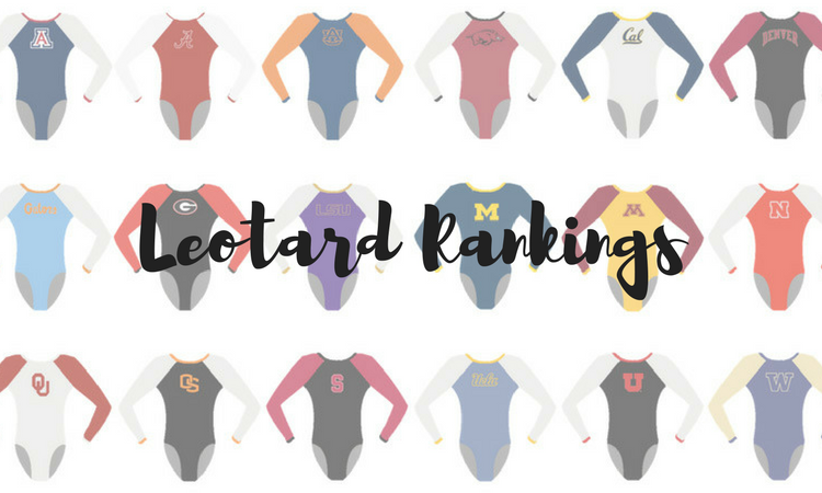
In the final opportunity for new leos of the season, teams went out with a bang, debuting their best, most sparkly designs on the national stage. The criteria is the same as always: up to three points for design; two points for fabric, sparkle, etc.; and two points for school spirit; three points for overall appearance. Once again, all of our editors will be judging the leos from this week. And keep an eye out next week for a special roundup of the best leos of the 2018 season.
Oklahoma: 7.5250
https://www.instagram.com/p/Bh2arqeh8d1/
| Design | Fabric/
Sparkle |
School
Spirit |
Overall
Appearance |
Total | |
| Caroline | 1.7/3 | 1.6/2 | 1.6/2 | 2.4/3 | 7.3/10 |
| Christina | 2.4/3 | 1.5/2 | 1.7/2 | 2.3/3 | 7.9/10 |
| Elizabeth | 2.1/3 | 1.6/2 | 1.7/2 | 2.2/3 | 7.6/10 |
| Alicia | 2.1/3 | 1.7/2 | 1.7/2 | 2.3/3 | 7.8/10 |
| Emily HF | 2.9/3 | 2.0/2 | 1.8/2 | 3.0/3 | 9.7/10 |
| Emily M | 2.3/3 | 1.8/2 | 1.6/2 | 2.4/3 | 8.1/10 |
| Rebecca | 0.5/3 | 1.0/2 | 1.0/2 | 0.8/3 | 3.3/10 |
| Tara | 2.4/3 | 1.8/2 | 1.7/2 | 2.6/3 | 8.5/10 |
Caroline: I liked this way better in person from a distance and in motion rather than still and close up like this. The off-the-shoulder look created by the mesh isn’t my favorite, but the sparkle makes up for a lot of that.
Christina: This one looked fantastic in motion. It’s very reminiscent of these long strapless gown dresses that one would wear for a debutante ball. I love the amount of sparkles, but I do wish there was more variation in the colors used.
Elizabeth: I liked this more in motion than in the pictures. It looked like a strapless dress with a statement necklace, which I’m definitely OK with. I just wish it wasn’t all crimson.
Alicia: I didn’t love this leo when I first saw it on Instagram, but in motion it’s stunning. I’m not the biggest fan of how the mesh works on this; I feel like it cuts off really strangely, but oooh boy those rhinestones are beautiful. I feel like it could be overwhelming, but I think it works for this.
Emily HF: It may be because I got to see this in person but LOVE LOVE LOVE! Really all the hearts. This looked amazing on everybody (always a plus), the color is GORGEOUS, sparkles were crazy amazing in person. It is 100 percent my favorite OU leo. The solid color with sparkles just looked classy to me and was perfect for national finals.
Emily M: This reminds me of That One UCLA leo (you know the one), but executed better. It’s like an off the shoulder top. Like Elizabeth, I think it was better in action; the over-the-top sparkles really sell it in motion.
Rebecca: This is so confusing to me. I like the off-shoulder concept, but the sparkles on the mesh are a serious no. I don’t know why it bothers me so much, but I can’t look straight at it; I have a visceral response to the upper chest sparkle chunk.
Tara: Ahh! This is lovely. It’s definitely reminiscent of an off the shoulder top, and I think it’s well executed. The sparkles are gorgeous, and the back hole with the OU is a great touch. It was even better in motion, too.
LSU (Super Six): 7.1375
https://twitter.com/NCAAGymNews/status/988121583217790977
| Design | Fabric/
Sparkle |
School
Spirit |
Overall
Appearance |
Total | |
| Caroline | 2.3/3 | 1.4/2 | 1.4/2 | 2.4/3 | 7.5/10 |
| Christina | 1.7/3 | 1.5/2 | 1.6/2 | 1.8/3 | 6.6/10 |
| Elizabeth | 2.0/3 | 1.6/2 | 1.5/2 | 2.1/3 | 7.2/10 |
| Alicia | 2.0/3 | 1.6/2 | 1.6/2 | 2.2/3 | 7.4/10 |
| Emily HF | 1.7/3 | 1.7/2 | 1.6/2 | 2.3/3 | 7.3/10 |
| Emily M | 2.0/3 | 1.4/2 | 1.6/2 | 2.0/3 | 7.0/10 |
| Rebecca | 2.4/3 | 1.5/2 | 1.2/2 | 2.3/3 | 7.4/10 |
| Tara | 2.0/3 | 1.2/2 | 1.5/2 | 2.0/3 | 6.7/10 |
Caroline: The rich purple color and the high collar really work together for a royal look here; I love it. The back straps are gorgeous, and I love that they’re sparkly too! I just wish the sparkle cascade was more prominent. Also, why does it not say Tigers somewhere? Surprisingly un-spirity for LSU.
Christina: This one was very underwhelming for a Super Six leo. I hate the keyhole on the front with the choker around the neck. The back, however, is lovely, and I really loved the open back with these straps. I do wish we had some hint of gold in there or a variation in colors or fabric maybe.
Elizabeth: Like the Stanford leo, I like the back of this one a lot but don’t care for the front. The cleavage hole is a no but I’m obsessed with the open back with rhinestone-studded straps. I just wish it wasn’t all purple.
Alicia: I keep going back and forth on this leo. In motion I think it’s beautiful. It kind of reminds me of Brazil’s purple leo in Rio and I adore the shade of purple, but the random patch in the center is very awkward. I wish there was just a smidge more pizazz with the rhinestones, as it looks flat.
Emily HF: I don’t share a lot of people’s issue with solid colored leos—done right they can look really classy. I do prefer the execution of the OU solid color one from super six, but really enjoy this solid shade of deep purple. I share the opinion of LOVING the back design of this but not loving the front as much. That high collar also has a tendency in motion to make a gymnast’s neck look a look shorter than it is.
Emily M: I LOVE the back; it reminds me of a Nebraska leo. The front, however, is bland in comparison. The shade of purple is lovely, but the high neckline with the keyhole opening is not enough WHAM for Super Six in my opinion. I would’ve loved to see some white in there; LSU’s various white and purple leos are some of my favorites.
Rebecca: I kind of love the design of this one, and I appreciate that it’s not Way Too Much as LSU leotards can tend to be. I think a little bit of gold could have worked, and the closure in the back wasn’t very smooth, I kept noticing that in the meet.
Tara: The back is super pretty and the high neck is lovely! I like the concept of the front but my issue is the contrast of the sparkle design with the purple fabric chosen. I love the design, but it’s barely noticeable. Either a different kind of fabric or a lighter shade of purple, maybe?
LSU (Semifinals): 7.1375
https://twitter.com/LSUgym/status/987376083577303045
| Design | Fabric/
Sparkle |
School
Spirit |
Overall
Appearance |
Total | |
| Caroline | 1.9/3 | 1.7/2 | 1.7/2 | 2.1/3 | 7.4/10 |
| Christina | 1.6/3 | 1.5/2 | 1.7/2 | 1.5/3 | 6.3/10 |
| Elizabeth | 1.7/3 | 1.6/2 | 1.8/2 | 1.7/3 | 6.8/10 |
| Alicia | 1.8/3 | 1.6/2 | 1.9/2 | 1.9/3 | 7.2/10 |
| Emily HF | 1.9/3 | 1.7/2 | 1.9/2 | 2.0/3 | 7.5/10 |
| Emily M | 1.3/3 | 1.7/2 | 1.7/2 | 1.9/3 | 6.6/10 |
| Rebecca | 2.0/3 | 1.8/2 | 1.7/2 | 2.0/3 | 7.5/10 |
| Tara | 2.2/3 | 1.7/2 | 1.7/2 | 2.2/3 | 7.8/10 |
Caroline: The inverted V neck is normally a kiss of death for any leo for me, but somehow this manages to be not atrocious? It might be the fabric differences. But I love the back with the logo and sparkles and mesh. Very nice.
Christina: I don’t find the triangle on the front flattering at all. I do like the golden band with “LSU” in the back and the shades of purple used, but that front really doesn’t do it for me.
Elizabeth: The design is all wrong for me. It’s almost like they’re wearing one of those high-neck bathing suit tops. I do like the fabric used for the gold, though.
Alicia: The more I look at it, the more I don’t hate it—but I also don’t love it. I love the shades of purple and the back is by far my favorite part of the leo. The band with “LSU” on it seems very natural rather than a “band aid,” but the yellow band in the front is not my favorite.
Emily HF: I usually am not a fan of upside down v necklines, but for some reason it didn’t stick out to me on this—maybe because I’m seeing the gold triangle more than the neckline. I actually really liked this.
Emily M: I love the purple color LSU used here, and I love the sparkles. But I’m not a fan of the triangle shape. Something about the way it cuts across the bust is creating a real uniboob situation. Otherwise, I like this one a lot.
Rebecca: I kind of don’t hate this as much as most people. The triangle isn’t the most flattering and the sleeve design confuses me, but I really like the band at the back and the mesh stripe below.
Tara: Unlike most of our editors, I actually enjoy this. I like the purple and the sparkle designs (geometric lines are usually a win for me), and I really don’t mind the gold triangle that much—I actually kind of like it. And of course the gold band with “LSU” on the back is lovely.
Stanford: 7.1250
https://twitter.com/NCAAGymNews/status/987531717622804480
| Design | Fabric/
Sparkle |
School
Spirit |
Overall
Appearance |
Total | |
| Caroline | 2.1/3 | 1.4/2 | 1.4/2 | 2.3/3 | 7.2/10 |
| Christina | 2.0/3 | 1.4/2 | 1.5/2 | 2.2/3 | 7.1/10 |
| Elizabeth | 2.0/3 | 1.5/2 | 1.7/2 | 2.3/3 | 7.5/10 |
| Alicia | 2.0/3 | 1.5/2 | 1.3/2 | 2.0/3 | 6.8/10 |
| Emily HF | 2.2/3 | 1.7/2 | 1.8/2 | 2.4/3 | 8.1/10 |
| Emily M | 2.1/3 | 1.3/2 | 1.4/2 | 2.4/3 | 7.2/10 |
| Rebecca | 1.8/3 | 1.4/2 | 1.3/2 | 1.8/3 | 6.3/10 |
| Tara | 2.2/3 | 1.4/2 | 1.3/2 | 1.9/3 | 6.8/10 |
Caroline: This back is killer! I love the criss-cross, and the cut makes it look like she has armor on. The front is a little simple; I would’ve loved to see some kind of embellishment—maybe a V neck—but altogether nice.
Christina: The back is awesome and almost looks like she’s wearing those gladiator shoulder pads. The front is so boring however. Boring neckline, no design, no school spirit… We have seen better from Stanford this season.
Elizabeth: I adore the back of this but wish the front was different. The way the front was cut isn’t super flattering on Ebee and wish it had more of a sweetheart neckline maybe. The back, however, is fantastic.
Alicia: Not my favorite leo Stanford has, but the back is AMAZING. I feel like that type of back is so risky, but Stanford pulled it off really well. The shade of red is beautiful, but I don’t love the neckline on the front.
Emily HF: Haha… I’m going to be the odd man out here. I actually love this. The shade of red is gorgeous, I love the sparkles, the back is great, it’s great in motion and it has the Stanford S on the sleeve.
Emily M: This is very underwhelming. I love the back straps! But there’s just nothing happening on the front.
Rebecca: This one’s a little boring, but points for having a crisscross back, even if it’s slightly puzzlingly constructed.
Tara: Alright, so I really love the back of this and how it criss crosses! But the front is so underwhelming; it’s too simple for my taste and needs something else there.
Georgia: 7.0500
https://twitter.com/NCAAGymNews/status/987445763063074817
| Design | Fabric/
Sparkle |
School
Spirit |
Overall
Appearance |
Total | |
| Caroline | 2.1/3 | 1.3/2 | 1.4/2 | 2.3/3 | 7.1/10 |
| Christina | 1.5/3 | 1.3/2 | 1.5/2 | 1.4/3 | 5.7/10 |
| Elizabeth | 2.0/3 | 1.4/2 | 1.6/2 | 2.1/3 | 7.1/10 |
| Alicia | 2.4/3 | 2.0/2 | 1.5/2 | 2.4/3 | 8.3/10 |
| Emily HF | 2.0/3 | 1.4/2 | 1.6/2 | 2.3/3 | 7.3/10 |
| Emily M | 1.9/3 | 1.2/2 | 0.9/2 | 2.0/3 | 6.0/10 |
| Rebecca | 2.5/3 | 1.9/2 | 1.6/2 | 2.6/3 | 8.6/10 |
| Tara | 1.7/3 | 1.3/2 | 1.2/2 | 2.1/3 | 6.3/10 |
Caroline: I’m not usually a fan of all-black leos but wow, this one really popped in the arena and flattered every single gymnast. I also love the Super G and how it actually goes with the back design, almost mirroring the keyhole. Random swirlies are also not a favorite for me, but these are some of the best I’ve seen.
Christina: I really do not like this one. The sparkles on the collar look elegant, but I am just not a fan of this all black and random sparkly squiggles design look. I also wish it incorporated a hint of red somewhere.
Elizabeth: Another leo I merely like but don’t love. The black with silver rhinestone detailing is definitely elegant and the sparkly collar actually looked nice. Maybe throw some red rhinestones in, too?
Alicia: Um, I love this? I’m a big fan of black leos, especially when they aren’t flat, and this is delivering. I actually love the design on the front; it reminds me of a chandelier and isn’t unflattering. Also, the “G” hidden in the back is AMAZING—so nicely incorporated into the design.
Emily HF: I really thought I was going to love it, but as much as I like solid color leos, this is a LOT of black and I find myself wishing for mesh sleeves or something. I don’t mind this pattern; it’s much more flattering in shape than some of the other recent front patterns.
Emily M: This was really pretty in motion, but I’m just not sure about the random sparkle pattern. Like Alabama’s recent sparkle pattern leo, the over the top sparkle symmetry just doesn’t sit well with me. This is just nice, but not my favorite of the weekend.
Rebecca: I love thisss. Black, elegant and understated on the school spirit things are all big pluses for me, and I love the keyhole back. Only objection is that the front design could be less bulky.
Tara: This just isn’t doing it for me. Like Emily, the symmetric swirly sparkles aren’t my favorite—my first reaction was “am I seeing a dragon mouth on the front?” I do like the back, though, and how the “G” is incorporated.
Michigan: 7.0000
We are super excited to watch Brianna on bars. She had a 9.950 to win both the Big Ten and NCAA Regional title. #GoBlue pic.twitter.com/tAVmQ5kzB0
— Michigan Women’s Gymnastics (@UMichWGym) April 20, 2018
| Design | Fabric/
Sparkle |
School
Spirit |
Overall
Appearance |
Total | |
| Caroline | 2.2/3 | 1.7/2 | 1.9/2 | 2.5/3 | 8.3/10 |
| Christina | 1.7/3 | 1.0/2 | 1.8/2 | 2.0/3 | 6.5/10 |
| Elizabeth | 1.8/3 | 1.3/2 | 1.8/2 | 1.9/3 | 6.8/10 |
| Alicia | 1.4/3 | 1.3/2 | 1.8/2 | 1.8/3 | 6.3/10 |
| Emily HF | 2.0/3 | 1.5/2 | 1.9/2 | 2.3/3 | 7.8/10 |
| Emily M | 2.4/3 | 1.3/2 | 1.9/2 | 2.3/3 | 7.9/10 |
| Rebecca | 0.7/3 | 0.8/2 | 1.7/2 | 0.9/3 | 4.1/10 |
| Tara | 2.4/3 | 1.5/2 | 1.9/2 | 2.5/3 | 8.3/10 |
Caroline: In person, this was gorgeous. The starburst really catches the eye with the color contrast, and the placement is great as far as flattering the lines of the gymnasts (not that Brown needs any help!) and is very aesthetically pleasing.
Christina: The starburst design isn’t new, but I really loved the colors used on this one. I wasn’t a fan of the neckline on the front and the different fabrics used between the sleeves and the bodice.
Elizabeth: I like this fine, but nothing about it makes me love it. There’s no lack of school spirit and I like how the maize and blue were incorporated, but the side starburst just says JO to me not college.
Alicia: OK, I loved Michigan’s regionals leo and was really looking forward to some more stellar designs, but this is so underwhelming. In theory, the starburst with the “M” is very cool and I love the colors used, but I agree with Elizabeth in that it feels a lot more J.O. than college.
Emily HF: I think the high contrast on this photo is making the difference between the sleeves and the leo a LOT more noticeable than it was in person. Honestly, I didn’t notice it at all in person and really liked it.
Emily M: I love this. Like Christina, I’m not a big fan of the different sleeve fabric (the blacks were different, and it cut off the whole effect). But I like the use of the Block M and the blue and maize work well in sunburst form. I also appreciate that this is much less busy than most of Michigan’s leos.
Rebecca: I usually like UM but this is a no for me. The M is really oddly placed and the starburst just kind of looks like something that was drawn on in MS Paint?
Tara: Yes, Michigan! I really love this. I love how the block M is accented by the starburst design. There’s just the right amount of yellow to make it look like Michigan, but not too much to make it overbearing.
Florida: 6.9625
https://twitter.com/NCAAGymNews/status/988121577098182657
| Design | Fabric/
Sparkle |
School
Spirit |
Overall
Appearance |
Total | |
| Caroline | 2.1/3 | 1.7/2 | 1.6/2 | 2.2/3 | 7.6/10 |
| Christina | 1.7/3 | 1.5/2 | 1.8/2 | 1.8/3 | 6.8/10 |
| Elizabeth | 2.0/3 | 1.6/2 | 1.7/2 | 2.1/3 | 7.4/10 |
| Alicia | 1.5/3 | 1.5/2 | 1.7/2 | 1.8/3 | 6.5/10 |
| Emily HF | 1.7/3 | 1.7/2 | 1.6/2 | 2.0/3 | 7.0/10 |
| Emily M | 2.1/3 | 1.6/2 | 1.3/2 | 2.1/3 | 7.1/10 |
| Rebecca | 1.7/3 | 1.6/2 | 1.5/2 | 1.7/3 | 6.5/10 |
| Tara | 1.7/3 | 1.5/2 | 1.7/2 | 1.9/3 | 6.8/10 |
Caroline: We finally got some nice-looking orange! I love the orange sparkle, the diamond pattern and the sparkle around the neckline and the back too. I wish there was actually a specific pattern to the sparkle thread throughout the diamonds, but now I’m just nitpicking.
Christina: This is alright. The bodice itself has nothing spectacular happening, and I’m not a fan of the straight neckline. I do like the designs with the sparkles, but the orange is so random and I’m still trying to figure out what it’s doing. The back is nice, but there’s nothing outstanding about this leo overall.
Elizabeth: I remember seeing this in the background of an Instagram story from Florida’s promo day during preseason and liking it. I like the incorporation of orange in there, but where it is incorporated is a little random. Plus, as a whole, this looks like any other Florida leo.
Alicia: I want to like it, and there’s a lot I do love. The orange around the neckline and arms is a really nice pop of color, and I love how it incorporates the orange. But I HATE where the white mesh and blue meet. It’s been prevalent in leos this year, and I really dislike how it cuts off a gymnast!
Emily HF: As you all know by now I greatly approve of the different colored crystals as accents. I’m not, however, the biggest fan of this… circular? design trend on the bodice of leos (Alabama’s new one does this too) I feel like it does funky things to the flow and isn’t super flattering.
Emily M: I love the bit of orange around the cuffs and neckline and down the back, but what is happening down the front? It looks like someone dropped the orange glitter on the leos and shrugged and walked away. This one is halfway to being amazing but just doesn’t take it all the way there. Still waiting for a white and orange leo from the Gators.
Rebecca: I like the way the orange is worked into this one—it’s just enough to not be HELLO IT’S ORANGE but still be present. But the raglan situation on the front is a bit odd, and the straight cut to blue bothers me.
Tara: I’m not a huge fan of this, but it’s not terrible either. The front design is almost too much for me and doesn’t seem to flow well, but I do appreciate how Florida incorporated orange. It’s hard to do blue and orange well, and this has a nice balance. And I think the back is lovely.
UCLA: 6.6250
Gracie and Maddie show off our new leotards for tonight. #LeoWatch #NCAAGym | #GoBruins pic.twitter.com/1jOTRq5pN2
— UCLA Gymnastics (@uclagymnastics) April 21, 2018
| Design | Fabric/
Sparkle |
School
Spirit |
Overall
Appearance |
Total | |
| Caroline | 2.5/3 | 1.1/2 | 1.3/2 | 2.2/3 | 7.1/10 |
| Christina | 1.7/3 | 1.2/2 | 1.5/2 | 1.7/3 | 6.1/10 |
| Elizabeth | 1.7/3 | 1.3/2 | 1.7/2 | 1.8/3 | 6.5/10 |
| Alicia | 1.3/3 | 1.3/2 | 1.3/2 | 1.3/3 | 5.2/10 |
| Emily HF | 1.5/3 | 1.5/2 | 1.7/2 | 1.3/3 | 6.0/10 |
| Emily M | 1.0/3 | 1.3/2 | 1.5/2 | 1.2/3 | 5.0/10 |
| Rebecca | 2.9/3 | 2.0/2 | 1.9/2 | 3.0/3 | 9.8/10 |
| Tara | 2.2/3 | 1.4/2 | 1.4/2 | 2.3/3 | 7.3/10 |
Caroline: The little fabric piece is off on most of the girls, probably because they cut the rest of it out? It just makes it look a little cheap. I LOVE the strap concept—it’s just poor execution. Also, show me a logo! Please!
Christina: The front really bugs me, especially with that random bit of fabric in the ‘hole’ between the criss-crossed straps. That didn’t look consistent on everybody. The back is alright, and for once I do like the shade of gray used—it works well here. But yeah, that front is a nope.
Elizabeth: I wish this wasn’t the leo we’d all remember UCLA winning the title in. I like the silver fabric used, and the way the back straps criss-cross, but the front with the weird non-hole thing that was once a bandeau that they cut out is meh.
Alicia: I mean, the leo clearly has some luck in it, but oy… I do not like it. The straps are really awkward in the front but are alright in the back, but what’s with the little piece of fabric? So random. The color is beautiful though.
Emily HF: I really like the back of this and there are parts of the front I like but… I’m still waiting for that UCLA leo that has the “WOW” factor for me. Excited to see what UA can bring next year.
Emily M: Ugh. No thank you. The straps are nice in theory, but the keyhole of grey fabric underneath is confusing to me. On the bigger-busted girls, the leo straps were pulling the fabric on the front. I like the back, but this looks like every other UCLA leo with some funky straps added. Ready to see what Under Armour is going to bring next year.
Rebecca: This is literally my favorite leotard in NCAA history. I’ve been freaking out about it since it popped up in Peng-Peng’s vlog a few weeks ago and the others are now all sick of me. I’d rather if they cut the lining out of the front altogether—the original iteration was very bizarre—but for decency reasons, I get why they didn’t. But everything else is PERFECT. I love navy and silver, I love the sparkle distribution and the strappiness and found it really flattering on everyone.
Tara: Overall, I like this. There are some flaws in its execution, like the grey fabric under the criss cross that others have mentioned. I know they modified this leo after they had it made, but I think it would look better if that fabric matched the rest of the silver and looked like one entity. Other than that, it’s a really nice leo! The criss cross front and back are lovely, and it has just the right amount of sparkle.
Want to receive the latest collegiate gymnastics news in your inbox? Sign up for the NCAA Gym NewsLetter here.
Article by the editors of NCAA Gym News

BTW, the pattern on the front of Florida’s leo is supposed to be alligator skin, which, whether you like the execution of it or not, I think is a pretty cool concept!
Genuine curiosity question, what happens to all these leos after the fact? A lot of them have a new one at every meet plus warmup leos. That adds up to a lot of leos that seem to never see the light of day again.
Most teams only have two to three new leotards a season and with upwards of 14 to 15 meets a year, many get reworn for years to come. Some teams this year had more new leotards due to changing in contracts for athletic companies, such as California with Under Armor.