Sooooo many gorgeous leos debuted at conference championships yet so little time. So let’s get to it! The criteria is the same as always: up to three points for design; two points for fabric, sparkle, etc.; and two points for school spirit; three points for overall appearance. We’ve got multiple guests this week, including our Big 12 associate editor Tara, Big 10 editor Emily M and our DII/DIII editor Rebecca!
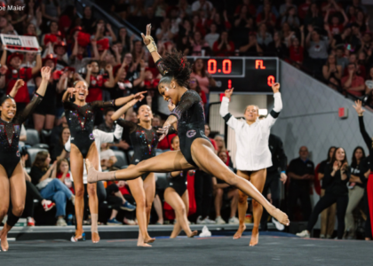
Michigan: 8.750
https://twitter.com/NCAAGymNews/status/977703517275197440
| Design | Fabric/
Sparkle |
School
Spirit |
Overall
Appearance |
Total | |
| Caroline | 2.6/3 | 1.6/2 | 1.9/2 | 2.3/3 | 8.4/10 |
| Christina | 2.5/3 | 1.1/2 | 1.9/2 | 2.0/3 | 7.5/10 |
| Elizabeth | 2.7/3 | 1.7/2 | 1.9/2 | 2.8/3 | 9.1/10 |
| Tara | 2.7/3 | 1.8/2 | 1.9/2 | 2.7/3 | 9.1/10 |
| Emily M | 2.8/3 | 1.7/2 | 2.0/2 | 2.8/3 | 9.3/10 |
| Rebecca | 2.5/3 | 1.9/2 | 2.0/2 | 2.7/3 | 9.1/10 |
Caroline: I actually love how the front is all defined colors and the back is ombré. The front is a super classic look with the sparkle on the faux neckline, though I would’ve loved it more if the sparkle continued somehow through the rest of the bodice. I also like how the back looks almost like it opens up at the V to reveal the ombré and the Michigan logo—very cool concept.
Christina: There is a lot happening here. I really like the bodice design on the front and the way the sparkles drape over the soft V neckline… But man is that yellow brutal. I wish its shade was more subdued or that the ombre had started right there instead of very low on the sleeves. I really like the design of the back as well, but again that yellow!
Elizabeth: This is by far my favorite Michigan leo, and for once it’s not overly busy. Good job! The yellow might be a little bright, but it works well with the shimmery sleeve fabric and the navy blue so I’m OK with it. I also love the ombre (duh), the sparkle design on the front and back, the simple “Michigan” on the back and the fact that the sleeves give off a gold shimmer.
Tara: THIS is how you do yellow in a leo. The ombre to white with the blue bodice is the perfect balance. I love the Michigan on the back, and it has a good amount of sparkles. The front sparkles could be designed better, but overall I love it!
Emily M: This leo is a lot, but it worked in person! In a field of many blue teams (hi Big Ten), the yellow really stood out in the arena: You couldn’t NOT watch Michigan, which is one thing a good leo should do. I like the sleeve ombre and the “MICHIGAN” on the back, and the sparkle pattern is very flattering.
Rebecca: Very very pretty! I like a good three-quarter sleeve, and the yellow isn’t too glaring, which it can be sometimes. The sparkle stripes are a little much for me, and I might have liked if they faded out through the bodice instead of cutting off so abruptly, but it’s still really fun.
Missouri: 8.317
https://twitter.com/NCAAGymNews/status/977628328365568000
| Design | Fabric/
Sparkle |
School
Spirit |
Overall
Appearance |
Total | |
| Caroline | 2.4/3 | 1.4/2 | 2.0/2 | 2.2/3 | 8.0/10 |
| Christina | 2.8/3 | 1.8/2 | 2.0/2 | 2.7/3 | 9.3/10 |
| Elizabeth | 2.8/3 | 1.8/2 | 2.0/2 | 2.9/3 | 9.5/10 |
| Tara | 2/3 | 1.3/2 | 1.9/2 | 1.8/3 | 7.0/10 |
| Emily M | 2.6/3 | 1.9/2 | 2.0/2 | 2.8/3 | 9.3/10 |
| Rebecca | 1.4/3 | 1.7/2 | 2.0/2 | 1.7/3 | 6.8/10 |
Caroline: This is actually really nice when you look at each of the individual pieces, but altogether I don’t feel like it broadcast very well during the meet? I love the claw marks, the back is gorgeous and I’m a fan of the shiny ombre, but compared to the arena and the rest of the leos present, it didn’t really pop in the moment.
Christina: I am OBSESSED with the back. I love an original back, so I’m so here for this one. I would have liked it even more without the logo smack in the middle of the straps, but it still is awesome. The grey ombre is great as well (yes, grey and great in the same sentence from me!), and I love the tiger claw marks. A win on this one, Mizzou!
Elizabeth: LOVE THIS. Everything about it is a win for me—from the white to black ombre to the yellow accents to the claw marks to the script “Tigers” to the amazingly creative back with the Tiger logo. If Missouri wore only this leo from now on, I wouldn’t be mad.
Tara: This…just…isn’t resonating with me very much. I like the back, but the front i just a no from me. I wish the “Tigers” was smaller, maybe across the hip or something? I do like the ombre, though.
Emily M: Missouri is ON IT this year when integrating Tiger details in unique ways. Like Christina, I love the back, and I am here for the ombre. I’d like to see the “Tigers” on the front from a different angle, but I think it works. The claw marks are so unique. Overall it’s a win for me.
Rebecca: Ooooh, I love the crisscross back, and the ombre is really nice. I’m not a big “large words” person and the claw marks are…something… But it still looks really good in action.
Bridgeport: 8.250
https://twitter.com/UBGymnastics/status/977589402678460417
| Design | Fabric/
Sparkle |
School
Spirit |
Overall
Appearance |
Total | |
| Caroline | 2.2/3 | 1.6/2 | 1.8/2 | 2.2/3 | 7.8/10 |
| Christina | 2.3/3 | 1.8/2 | 2.0/2 | 2.4/3 | 8.5/10 |
| Elizabeth | 2.2/3 | 1.6/2 | 1.8/2 | 2.4/3 | 8.0/10 |
| Tara | 2.4/3 | 1.7/2 | 1.9/2 | 2.6/3 | 8.6/10 |
| Emily M | 2.5/3 | 1.6/2 | 2.0/2 | 2.7/3 | 8.8/10 |
| Rebecca | 2.2/3 | 1.2/2 | 2.0/2 | 2.4/3 | 7.8/10 |
Caroline: This is a lovely purple color, and I love the ombre to blue. The sparkle is a little sparse on the sleeve and looks like an afterthought, and while I appreciate the focus on the school spirit, the design itself is a bit plain. I do like the UB sleeve detail though!
Christina: Gah that purple ombre is gorgeous! The purple mesh on the sleeves is lovely, and the “Bridgeport” on the front and the “UB” on the sleeve cuffs are great. Honestly, I love this leo except for this particular shape of neckline, which I’ve never found flattering on anybody. That’d be my only criticism here.
Elizabeth: I love almost everything about this. The ombre is lovely, the colors gorgeous and the UB on the cuff a neat idea. I just don’t love the neckline. But overall, this is a winner.
Tara: I wish I could seen the back because I love the rest of it! Ombre is almost always a win for me, and I love how “Bridgeport” is shown in rhinestones on the front and the “UB” on the side. School spirit galore! Overall, love this leo.
Emily M: Ooooh this is pretty. I love that the ombre of the body continues on the sleeves, and I like the way the neckline is echoed in the cut of sleeves.
Rebecca: I like a lot about this. Ombre sleeves are the best, and the little UB on the cuff is really classy. My only complaints are that the random stripe of blue is a little weird—plain lavender to black works fine—and the “BRIDGEPORT” on the front gets cut off a bit at the sides.
Arkansas: 7.900
@ayybraiebraie with another huge vault! 9.850!
Watch ➡️ https://t.co/1WX1hQ6Wk2 pic.twitter.com/ct6o6itvrG
— Razorback Gymnastics (@RazorbackGym) March 24, 2018
| Design | Fabric/
Sparkle |
School
Spirit |
Overall
Appearance |
Total | |
| Caroline | 2.3/3 | 1.5/2 | 1.6/2 | 2.4/3 | 7.8/10 |
| Christina | 2.2/3 | 1.6/2 | 1.6/2 | 2.3/3 | 7.7/10 |
| Elizabeth | 1.9/3 | 1.5/2 | 1.6/2 | 2.0/3 | 7.0/10 |
| Tara | 2.3/3 | 1.8/2 | 1.7/2 | 2.6/3 | 8.4/10 |
| Emily M | 2.5/3 | 1.8/2 | 1.5/2 | 2.7/3 | 8.5/10 |
| Rebecca | 2.4/3 | 1.9/2 | 1.6/2 | 2.1/3 | 8.0/10 |
Caroline: This is such a classy design, and surprisingly, I kinda like the band down the back, even though it’s not necessarily the best design to show off the natural body line. I love all the sparkle and the bright pop of red, but I could’ve used a little contrast color in there.
Christina: I quite like the back with the small hole and straight sparkly band going down the spine. The front is alright; it’s pretty, but it’s nothing special. I do like how shiny it is, though.
Elizabeth: This is fine. But it’s nothing special. Maybe I’m tired of Arkansas and all-red leos or maybe I like some of its other all-red leos better. The Arkansas on the sleeve is nice, and the back design is interesting, though.
Tara: I really like this! The all-red bodice really complements the pretty sparkles on the front, and I like the touches of school spirit on the arms! I don’t love the back, but the front makes up for it for me.
Emily M: Oo this is one of the better all-red leos. I love the details on the back, and the crystal pattern on the front is pretty. It’s a little simple, but with a red that bright, I think simple works.
Rebecca: Simple but elegant! I love the back with the keyhole. The underarm points are a little weird… Does it say Arkansas on the sleeve? But I still really like it.
Penn State: 7.833
Loving @PennStateWGYM leos today! pic.twitter.com/6ZQTkeZCNG
— Emily Minehart (@emilym90) March 24, 2018
| Design | Fabric/
Sparkle |
School
Spirit |
Overall
Appearance |
Total | |
| Caroline | 2.2/3 | 1.5/2 | 1.7/2 | 2.1/3 | 7.5/10 |
| Christina | 2.2/3 | 1.4/2 | 1.8/2 | 2.3/3 | 7.7/10 |
| Elizabeth | 1.5/3 | 1.3/2 | 1.7/2 | 1.7/3 | 6.2/10 |
| Tara | 2.7/3 | 1.8/2 | 1.9/2 | 2.8/3 | 9.2/10 |
| Emily M | 2.4/3 | 1.6/2 | 1.8/2 | 2.6/3 | 8.4/10 |
| Rebecca | 2.4/3 | 1.7/2 | 1.4/2 | 2.5/3 | 8.0/10 |
Caroline: The sparkle belt is really nice here, and I love the keyhole back with the Nittany Lions script. But the white shoulder straps totally cut off the gymnasts’ arm lines; I would have much preferred if they’d just kept the white as trim along the neckline rather than giving it faux straps.
Christina: This is a nice one, although there is nothing “wow” about it. I love how sparkly it is, and I don’t mind the white bands separating the sleeves from the bodice as much as I usually would. I like the hole in the back and the ‘Nittany Lions’ as well.
Elizabeth: Meh. I know a lot of people love this one—and there’s elements that are great—but I’m never a fan of the crop top sweater look. The thick white bands here are pretty terrible and ruin the whole design. Also, the front pattern belt is kind of weird and using “Nittany Lions” on the back is too much of a mouthful. Shorten it, or don’t use it. I love the shimmery sleeves, though…
Tara: Love! It’s super flattering on the girls, and I love the sparkly design on the front. The addition of “Nittany Lions” on the back is a nice touch. The design on the back is a little odd for me, but overall I like it!
Emily M: These were lovely in person. They really stood out in the arena, especially because of the use of the two different blues. The band of sparkles on the front and “Nittany Lions” on the back were lovely. My only complaint is that the white straps on the shoulders cut off lines in some cases.
Rebecca: I really like this one – the white band is awesome, and the sleeves are pretty. The “Nittany Lions” on the back is a bit odd, and I’m always puzzled by under-boob sparkle clumps, but it’s still really elegant and I love it.
Oklahoma: 7.567
https://www.instagram.com/p/BgtzPbYh5cQ/?taken-by=ou_wgymnastics
| Design | Fabric/
Sparkle |
School
Spirit |
Overall
Appearance |
Total | |
| Caroline | 2.3/3 | 1.6/2 | 1.7/2 | 2.4/3 | 8.0/10 |
| Christina | 2.4/3 | 1.6/2 | 1.9/2 | 2.4/3 | 8.3/10 |
| Elizabeth | 2.2/3 | 1.6/2 | 1.9/2 | 2.3/3 | 8.0/10 |
| Tara | 2.3/3 | 1.7/2 | 1.9/2 | 2.7/3 | 8.6/10 |
| Emily M | 2.1/3 | 1.6/2 | 2.0/2 | 2.3/3 | 8.0/10 |
| Rebecca | 0.5/3 | 1.6/2 | 1.6/2 | 0.8/3 | 4.5/10 |
Caroline: I feel like this is OU’s answer to UCLA’s Christmas-sweater-embroidery leo that we’ve judged before, especially with the shots in the snow, ha. The sparkle broadcast really nicely, and the big OU on the back is a nice touch. Do the sleeves say yes on them? I don’t really get that part.
Christina: I love the intricacy of the layout of the sparkles on the front, but this overall vest-like design reminded me a little bit of a few other OU leos (this one, in particular). The back is alright, although I wish it replicated the front more and I find the “OU” too big. The “yes” on the sleeves are a bit puzzling although funny… “Yessss we are going to do gymnastics!?”
Elizabeth: I’m disappointed when comparing this new leo to OU’s other recent new designs. I like the front and how intricate the sparkle design is, but the back is a big no for me. The logo is way too big, and I don’t understand the “yes” on the sleeves. I’m sure it’s some sort of inside joke, but to us outsiders, it’s confusing.
Tara: So I literally do not understand why there is a “yes” on both sleeves?!? But other than that, I really like the design! It’s super intricate without being too much and all over the place. The “OU” on the back adds a nice compliment to the “Sooners” on the sleeve, which I also like.
Emily M: Wow this is a lot. Agree with everyone here: Why do the sleeves say “yes”? The front design is so intricate (classic OU), so I’m glad the sparkles are contained to just the top of the leo. For me, this is nice but not my favorite from OU.
Rebecca: Ooooh this hits all of my Too Much buttons. The three separate patterns on the front make literally no sense, the “yes” is just bizarre and again with the large words this week… not a fan. What’s up with the under-bra mesh line? The large Y? The partial necklace thing that cuts off at the collarbones? The bikini top pentagons? We’ll never know.
Florida: 7.433
Aaaand Florida leos! #LeoWatch #NCAAgym pic.twitter.com/DskQXv1Lff
— NCAA Gym News (@NCAAGymNews) March 25, 2018
| Design | Fabric/
Sparkle |
School
Spirit |
Overall
Appearance |
Total | |
| Caroline | 2.3/3 | 1.4/2 | 1.1/2 | 2.5/3 | 7.3/10 |
| Christina | 2.1/3 | 1.6/2 | 1.0/2 | 2.2/3 | 6.9/10 |
| Elizabeth | 1.8/3 | 1.4/2 | 1.3/2 | 1.9/3 | 6.4/10 |
| Tara | 2.6/3 | 1.7/2 | 1.3/2 | 2.4/3 | 8.0/10 |
| Emily M | 2.1/3 | 1.8/2 | 1.0/2 | 2.1/3 | 7.0/10 |
| Rebecca | 2.7/3 | 2.0/2 | 1.4/2 | 2.9/3 | 9.0/10 |
Caroline: I love the contrast between the dark blue bodice and the lighter blue ombré sleeves here! I’m not really a fan of the sparkle faux halter/collar, though it’s better than some we’ve seen. And as with many Florida leos, I find it sorely lacking in school spirit.
Christina: For some reason this reminds me of scarab Egyptian symbol. I’m not crazy over this leo, but I guess it’s fine. The two shades of blue are nice, but what I love most are the ombre sleeves. I just wish it had more school spirit—something that screamed Florida a little more.
Elizabeth: These are fine but nothing special. In fact, they’re the same design as the Towson leo but with different fabric and sparkle pattern. The keyhole is still weird, and I think the sparkles are a bit overwhelming. I like the ombre sleeves, but where’s the school spirit?
Tara: Overall, I like this! The ombre is gorgeous, and the point where it stops actually flows with the design so it looks natural! It’s such an elegant leo and looks great on all the girls. I like the faux hole on the back, too! I do wish it had something that screamed Gators, but it’s such a nice leo that I don’t mind much.
Emily M: Oh, interesting Florida. I like the two shades of blue, but the cut in on the neckline is odd to me, and unlike Tara I’m not a fan of the faux hole in the back. I’d love a little more school spirit, too.
Rebecca: I reaaally really love this one. The keyhole in the back is amazing, and I kind of love the weird neckline thing! The blue on the ombre sleeves is gorgeous. My only objection is the oval non-keyhole in the front, but it’s fine.
Maryland: 7.400
Up close and personal with newest Maryland bling✨ pic.twitter.com/GtMLCdt24D
— Maryland Gymnastics (@TerpsGymnastics) March 24, 2018
| Design | Fabric/
Sparkle |
School
Spirit |
Overall
Appearance |
Total | |
| Caroline | 1.5/3 | 1.1/2 | 2.0/2 | 1.9/3 | 6.5/10 |
| Christina | 1.8/3 | 1.4/2 | 2.0/2 | 2.1/3 | 7.3/10 |
| Elizabeth | 2.3/3 | 1.6/2 | 2.0/2 | 2.4/3 | 8.3/10 |
| Tara | 2.3/3 | 1.5/2 | 1.9/2 | 2.2/3 | 7.9/10 |
| Emily M | 2.4/3 | 1.2/2 | 2.0/2 | 2.4/3 | 8.0/10 |
| Rebecca | 1.9/3 | 1.2/2 | 1.8/2 | 1.5/3 | 6.4/10 |
Caroline: The bandage back is not a good look on anyone, it breaks the lines and it looks like you’re trying to cover something up. That being said, I love that they did something different with it and used the Maryland flag pattern instead of the usual tan with the school name. The front is meh for me, and the red color without more design on it is almost too much.
Christina: I love the back! Maryland has been great this season at incorporating the state flag’s pattern onto its leo in a neat way. The front is elegant although a bit too simple. I like the “Maryland” with all the sparkles, but really I am obsessed with the band on the back.
Elizabeth: I’m obsessed with how Maryland is incorporating the flag design into its leos this season. The all red works in this case and is offset by the sparkly “Maryland” on the front. A huge win for me here.
Tara: I really like the concept of it! I’m not sure the front and the back are quite coherent with each other, but I like how the back incorporates the Maryland flag. The “Maryland” on the front is a nice touch, but it almost needs something else to balance the whole leo out and make it fit together.
Emily M: This leo was RED in person, and it really stood out. The simplicity was really elegant, and the cut of the back is super flattering. I love the detail of the Maryland flag strap across the back, which makes up for the simplicity of the front.
Rebecca: This is super red. I adore the Maryland flag back band and the sparkle fade down the sleeves is awesome. But the “Maryland” loses me a bit for reasons everyone knows by now.
Ball State: 7.267
We are so close to showtime!!! Tune into espn3 to follow all the #maction !! Your Cardinals will be sporting this new ombré leotard for the Championships! #chirpchirp #wefly pic.twitter.com/jVqfRlySi7
— BallState Gymnastics (@BallStateGYM) March 24, 2018
| Design | Fabric/
Sparkle |
School
Spirit |
Overall
Appearance |
Total | |
| Caroline | 2.0/3 | 1.3/2 | 1.6/2 | 1.9/3 | 6.8/10 |
| Christina | 1.7/3 | 1.4/2 | 1.7/2 | 2.0/3 | 6.8/10 |
| Elizabeth | 2.1/3 | 1.4/2 | 1.6/2 | 2.2/3 | 7.3/10 |
| Tara | 2.7/3 | 1.7/2 | 1.8/2 | 2.6/3 | 8.8/10 |
| Emily M | 2.3/3 | 1.3/2 | 1.5/2 | 2.5/3 | 7.6/10 |
| Rebecca | 1.5/3 | 1.7/2 | 1.2/2 | 1.9/3 | 6.3/10 |
Caroline: The sparkle cascade is a classic design, but there’s not enough contrast between the sparkle color and the silvery-white in the middle of the ombre and it kinda gets lost halfway down. I appreciate the inclusion of the school name, but at the same time, it definitely doesn’t go with the rest of the design.
Christina: I love the ombre with all the school colors and the rain of sparkles on the front. The back is a bit simple with not enough sparkles and the “Ball State” looks like it was added on there last minute.
Elizabeth: I really like this one, and it actually looks even better in motion. The ombre is done well and the sparkles aren’t too overwhelming, especially since the fabric is also shiny. I do wish the back had a little more too it, though.
Tara: Ahhh I love this! I love the ombre combined with the simple yet elegant sparkle pattern! I actually like the Ball State on the back, too. It adds a touch more school spirit without being overbearing and distracting from the rest of the leo. It’s a win for me!
Emily M: Ok Ball State! I like the full body ombre a lot, especially because it uses all of the school colors. The crystal pattern is flattering, though it continues a touch low, and like Christina the “Ball State” on the back seems like an afterthought—doesn’t really fit with the rest of the leo.
Rebecca: I find this a little… shapeless? There’s nothing wrong with a high neckline, but there has to be something else to give it personality. The ombre is great, though I wish there was a little fabric variation.
Washington: 7.250
Our look for #Pac12Gym! The meet starts in less than 10 minutes on the @Pac12Network! #GymDawgs pic.twitter.com/SeYgFDY7Ye
— Washington Gymnastics (@UWGymnastics) March 25, 2018
| Design | Fabric/
Sparkle |
School
Spirit |
Overall
Appearance |
Total | |
| Caroline | 2.1/3 | 1.3/2 | 1.5/2 | 2.0/3 | 6.9/10 |
| Christina | 1.6/3 | 1.1/2 | 1.3/2 | 1.7/3 | 5.7/10 |
| Elizabeth | 2.8/3 | 1.7/2 | 1.6/2 | 2.7/3 | 8.8/10 |
| Tara | 1.7/3 | 1.3/2 | 1.3/2 | 2.0/3 | 6.3/10 |
| Emily M | 2.3/3 | 1.4/2 | 1.2/2 | 2.5/3 | 7.4/10 |
| Rebecca | 2.4/3 | 1.9/2 | 1.4/2 | 2.7/3 | 8.4/10 |
Caroline: I love the ombré, but I’m not sure what the idea behind the bodice was supposed to be. It’s kind of artsy-cool, but it also feels a bit sloppy. I do really like the back though, with the deep V and the attaching bands on the sides. And I appreciate the W on the hip, stealthy as it is. Not my favorite, but there are good things here.
Christina: I am not sure what the front with the black bands is supposed to look like, but to me, it looks a child painted and filled in the gaps between the sparkles… Meh. I do, however, like the shade of purple; I can tolerate this purple to grey ombre, but it’s not my favorite.
Elizabeth: This is without a doubt my favorite Washington leo. It always amazed me that the Huskies had such great colors to work with but always came up short in the leo department. The black to purple ombre is GORG, and the design on the front flattering. I also love the neckline and the mesh—everything about this leo is to die for. My only comment is that I wish the W on the hip and the Pac-12 logo on the back switched places.
Tara: I want to like this, but I just can’t. I do love the ombre, but the front just isn’t doing it for me. I think it’s just how the design is laid out. It would be cute blended with one of the pretty OU symmetrical line leos, but I just don’t love the layout of the squiggles. The back is nice, albeit simple, and it would be nice to have school spirit besides the purple. It’s saying something that I didn’t even notice the W on the hip until Elizabeth found it. I’m with her there; I wish they either switched the Pac-12 and the W or made the W more noticeable on the hip. It’s one of the better UW leos but not my favorite.
Emily M: Oh, this is definitely one of the better UW leos. I like the shade of purple against the black, and the black straps on the back are nice. I’m not sure about the black bits across the front, though? And I’d love to see some school spirit.
Rebecca: The pattern on the front is a little MS Paint, and I think I would like it slightly more if not for the waistband, but that’s my only concern here. The colors are the best (more black for everyone please!), the hex neckline is amaaaazing, and I love the open back with the sneaky little Pac-12 logo.
Central Michigan: 6.783
Finally! The elusive CMU flame leos! #LeoWatch #NCAAgym pic.twitter.com/ynvZqrw68r
— NCAA Gym News (@NCAAGymNews) March 24, 2018
| Design | Fabric/
Sparkle |
School
Spirit |
Overall
Appearance |
Total | |
| Caroline | 2.0/3 | 1.3/2 | 1.5/2 | 2.2/3 | 7.0/10 |
| Christina | 1.2/3 | 1.0/2 | 1.4/2 | 1.5/3 | 5.1/10 |
| Elizabeth | 1.6/3 | 1.4/2 | 1.7/2 | 1.7/3 | 6.4/10 |
| Tara | 2.2/3 | 1.4/2 | 1.5/2 | 2.4/3 | 7.5/10 |
| Emily M | 2.0/3 | 1.4/2 | 1.1/2 | 2.1/3 | 6.6/10 |
| Rebecca | 2.4/3 | 1.8/2 | 1.5/2 | 2.4/3 | 8.1/10 |
Caroline: This is one of the better flame designs I’ve seen, but that’s not to say flame designs are suddenly acceptable. I appreciate the depth of color here, using many different shades in the flames and lots of sparkle. But overall, it’s a dated, cliche concept, and I expect better.
Christina: Oy, it’s a no for me. I dislike the flames design, which makes it look like an out-of-style leo, and this mustard shade of yellow is nope. The ombre on the bodice is nice, but I can’t get past the flames and the colors.
Elizabeth: If you described this leo to me, I would have liked it. But in execution, it failed to deliver. I love the almost pale yellow on the upper and think it works well with the red. But the flame design is too in your face. Maybe if it was subtler?
Tara: I like this! The flames are perfectly accented by the sparkles and the C logo on the upper back is a nice touch. And ombre is always a win for me as well. Solid leo for CMU!
Emily M: Hmmm I usually don’t go for the flame leos, but when your school colors look like fire, it works! The flames get a little too random swirly for it to be a huge win for me, but definitely a solid leo.
Rebecca: Oooooh fiiiiireeeee. The black to red ombre is amazing, and I really enjoy flame patterns. I’d have picked a different shade of yellow, but that’s really my only problem here.
Eastern Michigan: 6.733
EMU leos! #LeoWatch #NCAAgym pic.twitter.com/HL8bjaPyw9
— NCAA Gym News (@NCAAGymNews) March 24, 2018
| Design | Fabric/
Sparkle |
School
Spirit |
Overall
Appearance |
Total | |
| Caroline | 1.7/3 | 1.5/2 | 1.5/2 | 1.8/3 | 6.5/10 |
| Christina | 1.6/3 | 1.2/2 | 1.5/2 | 1.7/3 | 6.0/10 |
| Elizabeth | 1.8/3 | 1.3/2 | 1.7/2 | 1.8/3 | 6.6/10 |
| Tara | 2.0/3 | 1.4/2 | 1.6/2 | 2.3/3 | 7.3/10 |
| Emily M | 2.3/3 | 1.0/2 | 1.4/2 | 2.6/3 | 7.3/10 |
| Rebecca | 1.9/3 | 1.3/2 | 1.5/2 | 2.0/3 | 6.7/10 |
Caroline: I actually kinda like the green/silver contrast, but what I can’t figure out is the faux neckline created by the green over the grey in front. It’s an odd shape and creates a bizarre break in the lines of the design and the gymnasts. And I almost missed the block E on the front—it needed to be a couple shades darker.
Christina: Love the shade of green, but it’s a no on the silver for me as usual. I am also not convinced by that neckline with the mesh hole on the front. I do like the very sparkly outline though, but other than that I’m just meh on this one.
Elizabeth: This started out so well, but then I saw the random rectangle hole on the neckline. Why was that thought of as a good thing? I like the shininess of the silver, and it pairs with the green well. I might have made the block E a bit smaller though and maybe had it stand out more—you can barely see it unless the gymnast stands still.
Tara: EMU has some of the better green leos in my opinion. I’m typically not a fan of green, but I always seem to like its. It’s a little too simple for me, but other than that, I like it!
Emily M: I love green leos and I think it’s a really underutilized color, so props to EMU for always embracing it. I like the scooping back, and the negative space “E” on the front. I just wish it had a little bit more.
Rebecca: So I’m a bit concerned about the random splotch of black on the upper chest? I’d have gone for mesh sleeves too, and I’m never a proponent of large school letters. But the green is gorgeous, and I really appreciate that it’s not too busy.
Alabama: 6.700
Alabama leos! #LeoWatch #NCAAgym pic.twitter.com/6BB2w0Gi2m
— NCAA Gym News (@NCAAGymNews) March 25, 2018
| Design | Fabric/
Sparkle |
School
Spirit |
Overall
Appearance |
Total | |
| Caroline | 2.1/3 | 1.3/2 | 1.4/2 | 2.2/3 | 7.0/10 |
| Christina | 2.3/3 | 1.1/2 | 1.2/2 | 2.0/3 | 6.6/10 |
| Elizabeth | 2.5/3 | 1.7/2 | 1.5/2 | 2.6/3 | 8.3/10 |
| Tara | 2.2/3 | 1.1/2 | 1/2 | 2.0/3 | 6.3/10 |
| Emily M | 2.1/3 | 1.2/2 | 0.8/2 | 2.1/3 | 6.2/10 |
| Rebecca | 1.8/3 | 1.4/2 | 1.0/2 | 1.6/3 | 5.8/10 |
Caroline: The symmetry with the front design is soooo satisfying, though I don’t quite understand why they used that design in particular. The rest of the design is very plain, though I like the keyhole back as well.
Christina: The front looks like a mandala, and I love it. The symmetry and pattern are very pleasing to the eye, and I like how shiny it is. However, the rest of the leo falls flat to me. I wish it had more differences in shades or maybe some ombre happening. It is all a bit bland. I do, however, like the back with the hole and the thin band on the neck, but again I wish for something more.
Elizabeth: I really like this one, and I think it’s because of the simple, mostly solid crimson color used with a unique back. The front design is far from overwhelming and allows the back and color to shine, which I love.
Tara: I’m just not digging the pattern on the front here. I get the symmetry, but it’s not working for me. It’s just kind of boring and all the same to me, but I am also more akin to linear patterns and more randomized ones. The back is better, and the “A” is a nice touch, but overall it’s not my favorite.
Emily M: Hmm. I WANT to like this one, but I just…don’t understand? I like the back, but the pattern on the front is not my favorite. And I’m not a fan of the studded sleeves when anyone does them.
Rebecca: I really like the back and the sleeves, and the pattern is pretty but it just looks sort of misplaced it on the front of a person? Plus, the color mismatch between the body and sleeves is just a bit annoying.
Northern Illinois: 6.667
Northern Illinois leos! #LeoWatch #NCAAgym pic.twitter.com/pcTAwbC1ED
— NCAA Gym News (@NCAAGymNews) March 24, 2018
| Design | Fabric/
Sparkle |
School
Spirit |
Overall
Appearance |
Total | |
| Caroline | 2.0/3 | 1.2/2 | 1.2/2 | 2.2/3 | 6.6/10 |
| Christina | 2.2/3 | 1.3/2 | 0.7/2 | 2.4/3 | 6.6/10 |
| Elizabeth | 2.0/3 | 1.3/2 | 1.2/2 | 2.1/3 | 6.6/10 |
| Tara | 1.3/3 | 1.4/2 | 0.8/2 | 2/3 | 5.5/10 |
| Emily M | 2.4/3 | 1.2/2 | 1.0/2 | 2.7/3 | 7.3/10 |
| Rebecca | 2.3/3 | 1.6/2 | 1.0/2 | 2.5/3 | 7.4/10 |
Caroline: So the concept of a bandeau is not my favorite. However, if you’re gonna do it, do it like this. The twist in the center, the way it wraps in the back and the sparkle really make its case nicely. I could’ve used a logo somewhere and maybe some more sparkle on the background black, but overall it’s nice.
Christina: Oooh this is lovely. I love the faux twisted bandeau look and all the sparkles. The squared neckline works great too. I do wish the leo had something more to it, especially since the rest of the bodice is all black, but I find it very elegant overall.
Elizabeth: Like Christina, I really enjoy the faux bandeau design with the red, but I wish it stood out more. I had to watch the stream for a long time to figure out that’s what it was going for. I also wish there was a touch more school spirit.
Tara: I’m just not digging this. It seems kind of incomplete to me. It needs something else. I like the overall idea, but it’s not executed as good as it could have been.
Emily M: OH LOVE. I love the square neckline that is also squared on the back, and the red bandeau compliments it nicely. I would love to see a little more school spirit, like a script “NIU” somewhere.
Rebecca: I think I love it. The neckline and square back are awesome, and I love the twisty red top. The sparkle distribution at the top is a little odd, but I love the colors and fabric. As far as I can see, there are no large words, which is a WIN this week. (Broken record, I know…)
Western Michigan: 6.483
So many nice leos! Here's Western Michigan's #LeoWatch #NCAAgym pic.twitter.com/K1QjQHFuhE
— NCAA Gym News (@NCAAGymNews) March 24, 2018
| Design | Fabric/
Sparkle |
School
Spirit |
Overall
Appearance |
Total | |
| Caroline | 2.0/3 | 1.1/2 | 1.1/2 | 1.9/3 | 6.1/10 |
| Christina | 2.0/3 | 1.3/2 | 1.3/2 | 2.1/3 | 6.7/10 |
| Elizabeth | 1.7/3 | 1.2/2 | 1.2/2 | 1.8/3 | 5.9/10 |
| Tara | 2.2/3 | 1.4/2 | 1.3/2 | 2.4/3 | 7.3/10 |
| Emily M | 1.4/3 | 1.0/2 | 0.6/2 | 1.9/3 | 4.9/10 |
| Rebecca | 2.4/3 | 1.9/2 | 1.2/2 | 2.5/3 | 8.0/10 |
Caroline: It’s a little bit dark and plain for me to really get excited about it, though I do love the use of gold and the deep V. I do wish it had some kind of school marking though—a WMU logo somewhere or something. That would’ve done wonders for it, even just a small one on the hip.
Christina: This is too dark for my taste, and I really wish there was a lot less black and more sparkles and shades to the leo. The design with the yellow on the front is alright, although simple, but I am not a fan of the yellow flames on the sides.
Elizabeth: Western Michigan has hard colors to work with, but I feel like this leo is living in the past in terms of trends these days. The gold used is nice though, as we all know gold can go very wrong.
Tara: I like this, but the only thing I wish it had was some kind of WMU logo somewhere. I think the dark bodice really goes well with the yellow because yellow can be an overbearing color otherwise. Overall a solid leo!
Emily M: Oh, um? I am not a fan. The side cutouts and the small bits of yellow on the back… This is just not to my taste.
Rebecca: Ooooh preeeeetty! I love the gold V, and the flames on the sleeves are gorgeous. I’m not certain about the side cutouts or the random patches on the back, but overall this is gorgeous and it’s not brown which is always a win for WMU.
Towson: 6.267
Towson leos! #LeoWatch #NCAAgym pic.twitter.com/xlVtI6vx2Y
— NCAA Gym News (@NCAAGymNews) March 24, 2018
| Design | Fabric/
Sparkle |
School
Spirit |
Overall
Appearance |
Total | |
| Caroline | 1.7/3 | 1.2/2 | 1.9/2 | 1.8/3 | 6.6/10 |
| Christina | 1.6/3 | 1.3/2 | 1.8/2 | 1.7/3 | 6.4/10 |
| Elizabeth | 1.8/3 | 1.4/2 | 1.8/2 | 2.0/3 | 7.0/10 |
| Tara | 1.3/3 | 0.6/2 | 1.7/2 | 1.7/3 | 5.3/10 |
| Emily M | 1.0/3 | 1.2/2 | 2.0/2 | 1.4/3 | 5.6/10 |
| Rebecca | 1.5/3 | 1.5/2 | 1.9/2 | 1.8/3 | 6.7/10 |
Caroline: I like a mascot from time to time, but the big Tiger head here overwhelms the design for me. I’m also not a fan of the cut on the faux halter neckline, and the ombre isn’t consistent front to back. I appreciate the innovation, but I’d rather see a commitment to one or two trends rather than throwing them all in haphazardly.
Christina: I am torn on this one. I of course love the ombre with the school colors, but that neckline with the random small black keyhole right in the middle doesn’t work for me. The gigantic Tiger head on the side is also meh, and I would have liked to see more sparkles on the back.
Elizabeth: Most of this is good. I like the ombre and the colors used—yes, even the yellow—and the Tiger on the side isn’t overwhelming to me. I also like how sparkly the sleeves are. But I could do without the keyhole.
Tara: Honestly, this leo would be better if the design on the neckline were better. That’s just a no for me. And what is that random black dot in the middle of the chest? Just no. I like the ombre and addition of the mascot, but I can’t get over the top half of the leo.
Emily M: Hmm. I like the ombre, and that’s about it. The faux keyhole neckline doesn’t work for me. It really cuts off lines! And the Tiger is a little much on a leo that already has a lot going on.
Rebecca: So I’m kind of into the neckline and even the keyhole thing. Large mascot drawings are never a win, though—we’re not scrapbooking—but yellow to black ombre is a nice combination.
LSU: 6.167
That's. Our. Beam. Anchor. @sfinnegan37 closes out the rotation with a 9.925! https://t.co/b9gxDQEXf3 pic.twitter.com/ySm1Z1xdnd
— LSU Gymnastics (@LSUgym) March 25, 2018
| Design | Fabric/
Sparkle |
School
Spirit |
Overall
Appearance |
Total | |
| Caroline | 2.0/3 | 1.8/2 | 1.6/2 | 1.9/3 | 7.3/10 |
| Christina | 1.3/3 | 1.7/2 | 1.6/2 | 1.8/3 | 6.4/10 |
| Elizabeth | 1.2/3 | 1.2/2 | 1.6/2 | 1.4/3 | 5.4/10 |
| Tara | 2.2/3 | 1.8/2 | 1.0/2 | 2.5/3 | 7.5/10 |
| Emily M | 1.4/3 | 1.5/2 | 1.0/2 | 2.3/3 | 6.2/10 |
| Rebecca | 0.8/3 | 1.1/2 | 1.0/2 | 1.3/3 | 4.2/10 |
Caroline: I love the rich colors and all the sparkle here, but there’s something I can’t quite put my finger on that is off about this design. I think it’s the mesh cutouts on the sides; the placement is just deep enough to look a little bit awkward. I’m not sure.
Christina: Hmmm… I want to like this because I love those colors, but I can’t get past the design. The tie-front crop top style doesn’t work for me, and I don’t find the look flattering at all—nor does it create a nice figure. There is just too much mesh, especially on the front.
Elizabeth: No. The colors are nice and I appreciate LSU’s recent trend of incorporating more yellow/gold, but the weirdly placed mesh areas are not great. Remember that UCLA leo with the twisted sweater top design? This is kind of like that.
Tara: I actually like this one! I’m all for designs that are geometric. I usually don’t like deep Vs, but it works with the mesh here. The touch of gold with the lines works well. Overall a solid leo!
Emily M: Oh no that V is way too deep. The lines created with the golden straps are nice, but I don’t know about the mesh back, either. The shade of purple is nice, but that’s all I’ve got.
Rebecca: What? What is this supposed to be? I like gold bands, but the random bikini-ish pattern… and the weird neutral gurple color… and the back looking like a zigzag… I dunno where they were going here.
Georgia: 6.067
Georgia's leo! #LeoWatch #NCAAgym pic.twitter.com/9w6zxg2Fmb
— NCAA Gym News (@NCAAGymNews) March 24, 2018
| Design | Fabric/
Sparkle |
School
Spirit |
Overall
Appearance |
Total | |
| Caroline | 1.3/3 | 1.1/2 | 1.8/2 | 1.2/3 | 5.4/10 |
| Christina | 1.5/3 | 1.2/2 | 1.7/2 | 1.6/3 | 6.0/10 |
| Elizabeth | 1.2/3 | 0.7/2 | 1.8/2 | 1.3/3 | 5.0/10 |
| Tara | 2.2/3 | 1.3/2 | 1.6/2 | 1.7/3 | 6.8/10 |
| Emily M | 1.4/3 | 1.2/2 | 1.8/2 | 1.3/3 | 5.7/10 |
| Rebecca | 2.1/3 | 1.8/2 | 1.6/2 | 2.0/3 | 7.5/10 |
Caroline: The only thing that saves this design is the back, otherwise most of my marks would be a few tenths lower. I like a small mascot here and there, but with some mascots, you just can’t put them front and center or you risk looking juvenile. Case in point.
Christina: This is like a children’s leo with that gigantic dog head. The back is blah, too. I would usually like this corset-like strap design, but it doesn’t match the front very much. Just… Come on Georgia; you can do better than this for a conference championship.
Elizabeth: This looks like a child’s leo in the front and a mature adult’s in the back—like a weird version of a mullet. If I was just judging this leo by the back, it would get high marks, but I’m not soooo…
Tara: Ok so I really really like the back of this! The front is less exciting, but not terrible. The dog adds school spirit without being too huge and overbearing, but it’s still not my favorite.
Emily M: This is one I half like. The back is great! But the dog head! Just, no. I realize that the gymnastics team has no control over the current iteration of the Georgia dog, but oof. If it looks like this, don’t put it on a leo.
Rebecca: The back is really pretty, but I just don’t like large mascot pictures—I’M SORRY. Really everything else about this is good—I like the mesh sleeves, neckline, not having a billion different design features—just not the angry puppy face. But it does OK anyway because everything else is really great.
Want to receive the latest collegiate gymnastics news in your inbox? Sign up for the NCAA Gym NewsLetter here.
Article by Elizabeth Grimsley, Caroline Medley, Christina Marmet, Tara Graeve, Emily Minehart and Rebecca Scally