Continuing with the throwback leotard theme, this week we’re taking a look back at the fashion at the 2005 SEC Championship. The leotards showed a mix between older designs and newer fashion trends. Prepare yourself.
The criteria is the same as during the season. But to refresh your memory: up to three points for design; two points for fabric, sparkle, etc.; and two points for school spirit; three points for overall appearance.
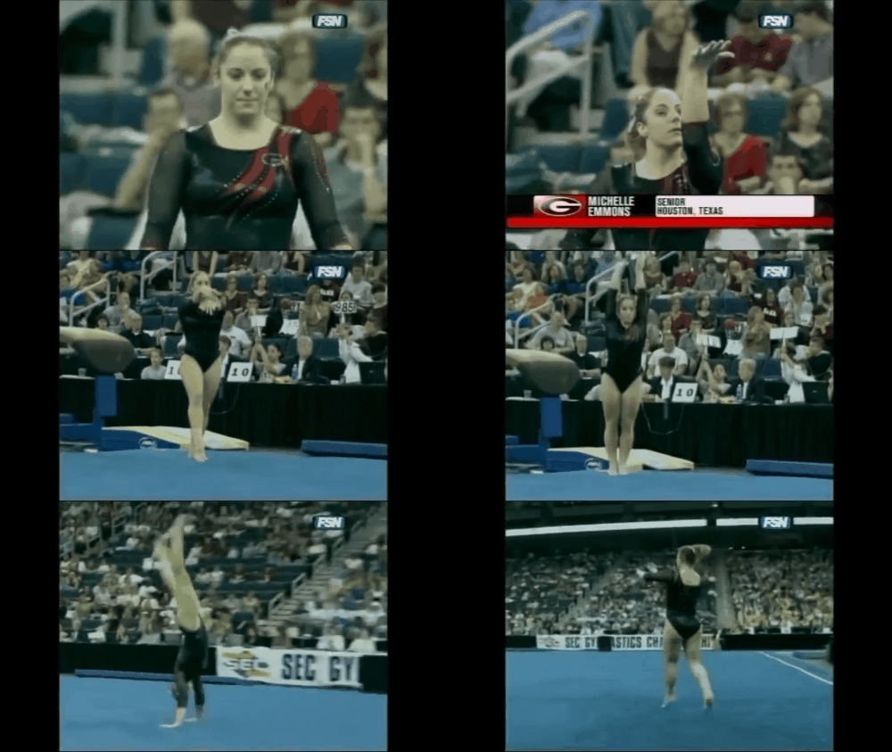
Georgia: 6.767
Caroline
- Design: 2.1/3
- Fabric/Sparkle: 1.2/2
- School Spirit: 1.6/2
- Overall Appearance: 2.2/3
- Total: 7.1/10
I actually kind of love the shoulder detail on this one? The Super G is small enough to not be obnoxious, but big enough to be seen, and the red stripes down are a nice contrasting touch. I could do with more sparkle, and the mesh sleeves with the solid black bodice is kind of a disjointed look. Overall, not mad at it!
Christina
- Design: 1.8/3
- Fabric/Sparkle: 1.3/2
- School Spirit: 1.5/2
- Overall Appearance: 1.8/3
- Total: 6.4/10
Eh, this is alright although a bit too plain for me. I’m used to judging fairly nice UGA leos in this throwback series, so I’m slightly disappointed in this one. There is way too much black for me, and I could barely see the sparkly ‘G’ at first. Anyways, this is just fine.
Elizabeth
- Design: 1.8/3
- Fabric/Sparkle: 1.4/2
- School Spirit: 1.6/2
- Overall Appearance: 2.0/3
- Total: 6.8/10
This leo is fine. I like the asymmetrical neckline but the rest is kind of plain. The touch of red is nice, as well as the small Super G, but I need more red overall. I do like the mesh sleeves, though as they break up the rather one-dimensional look of the leo.
LSU: 6.667

Caroline
- Design: 2.2/3
- Fabric/Sparkle: 1.3/2
- School Spirit: 1.4/2
- Overall Appearance: 2/3
- Total: 6.9/10
Up close I love this sunburst design. The contrasting yellow and purple colors really pop. However, from far away, the sunburst looks almost more like an hourglass, and it’s hard to tell the black sleeve from the purple bodice, so it starts to look a little bizarre. I’m also missing the sparkle! There looks to be some on the black sleeve but it’s not enough to see in the lower-quality footage.
Christina
- Design: 1.3/3
- Fabric/Sparkle: 1.5/2
- School Spirit: 1.5/2
- Overall Appearance: 1.4/3
- Total: 5.7/10
Hmmmm no. There is literally an explosion on your boob. This is also a very used design although I’m guessing back then it wasn’t. I do like the contrast between the gold and the solid purple fabric, but I can’t get past the shoulder-boob explosion.
Elizabeth
- Design: 2.2/3
- Fabric/Sparkle: 1.5/2
- School Spirit: 1.5/2
- Overall Appearance: 2.2/3
- Total: 7.4/10
It’s the design every single person in the world had in, like, 2010, so LSU was ahead of its time. I like how the black arm is sparkly and not solid. However the way the design is makes it kind of look like the gold is a shark and the girl’s arm is being eaten by the shark? Overall it’s not too bad, but I don’t love it either.
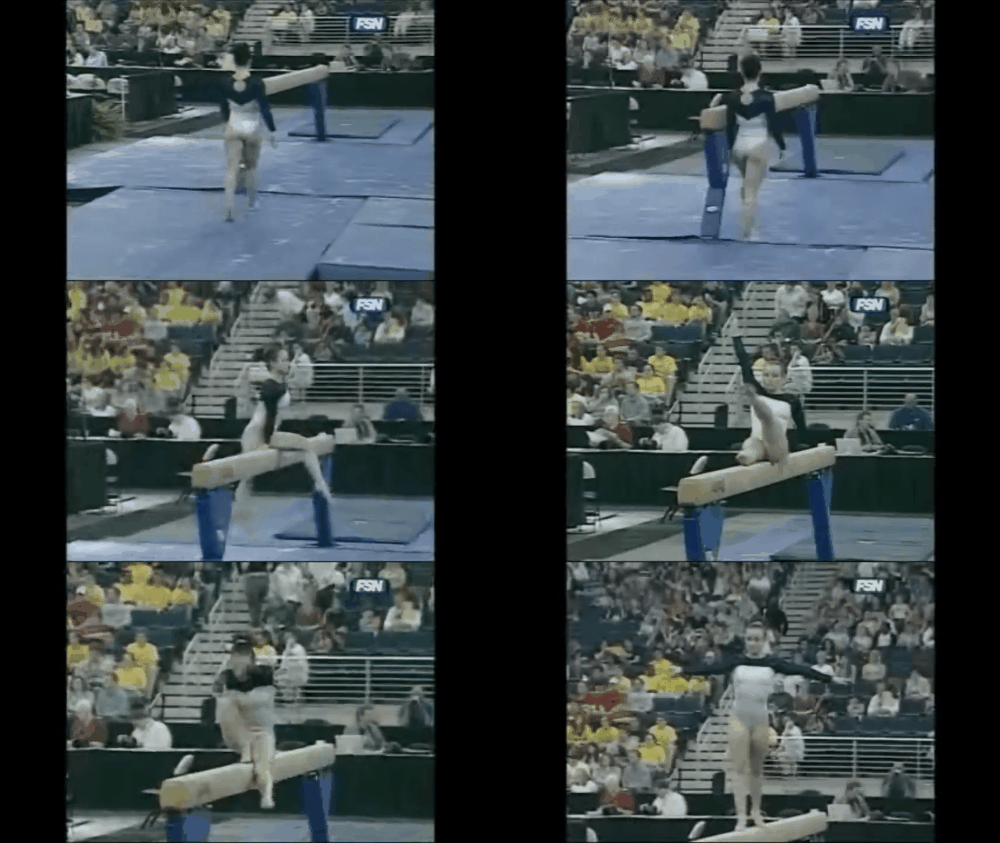
Auburn: 6.667
Caroline
- Design: 2/3
- Fabric/Sparkle: 1.2/2
- School Spirit: 1.2/2
- Overall Appearance: 2/3
- Total: 6.4/10
This feels very average to me—sort of middle of the road. The all-white bodice is unique, we don’t see many of those, and I’m assuming the sleeves are navy blue rather than black? I like the back keyhole and the little bit of sparkle, but I wish there were more to this! It’s a good base, but I need something else.
Christina
- Design: 1.9/3
- Fabric/Sparkle: 1.3/2
- School Spirit: 1.2/2
- Overall Appearance: 1.9/3
- Total: 6.3/10
Hate the front (you get it, I really dislike straight necklines), love the back. The keyhole and V design are lovely. This leo definitely needs something else overall, especially in the front that’s quite average. I like the white bodice, but I need some more school spirit in there for sure.
Elizabeth
- Design: 2.3/3
- Fabric/Sparkle: 1.4/2
- School Spirit: 1.4/2
- Overall Appearance: 2.2/3
- Total: 7.3/10
I like this design. It’s simple yet has some depth, making it not boring. However, I wish there was some orange incorporated in (at least from what I can tell there’s not any). Maybe the neckline or some orange sparkles on it? I like the back hole and the triangular design, as well as the mostly white body. It makes the gymnasts look athletic.
Arkansas: 6.567

Caroline
- Design: 2/3
- Fabric/Sparkle: 1.1/2
- School Spirit: 1.5/2
- Overall Appearance: 1.9/3
- Total: 6.5/10
I really like the black and silver combination—it’s very 2000s. The swirlies aren’t my favorite, but these are far from the worst I’ve seen. These actually do something to kind of define the gymnast’s shape, which I really appreciate. The hog on the back is a different route than Arkansas normally takes, and I can’t really decide how I feel about it. On one hand, it’s less aggressive than blowing it up and plastering it on the front, but at the same time, it feels a bit out of place? I do like it in silver though and in the classic Arkansas logo look.
Christina
- Design: 1.6/3
- Fabric/Sparkle: 1.3/2
- School Spirit: 1.7/2
- Overall Appearance: 1.7/3
- Total: 6.3/10
At first I was like “OK this is a nice look” and then here comes the gigantic sparkly hog in the back… I guess Arkansas actually had found its signature look already. All the points for school spirit, which has severely lacked at this meet in general. Anyway, I do kind of like the whole velvet bodice and silver sparkly swirls. I do wish this leo had some red somewhere, but overall it’s a decent look for the early 2000s.
Elizabeth
- Design: 2.0/3
- Fabric/Sparkle: 1.3/2
- School Spirit: 1.7/2
- Overall Appearance: 1.9/3
- Total: 6.9/10
So I thought this was relatively normal, but then she turns and there’s a huge hog on the back. I think the body is velvet, which I obviously love. And I also like the silver but wish there was red incorporated in. The hog is fine I guess but any lower and it’s in tramp stamp territory. But overall, not bad.
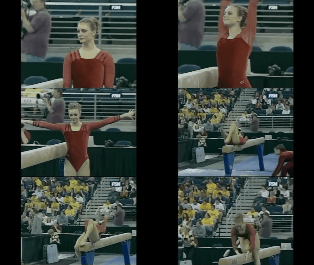
Alabama: 6.033
Caroline
- Design: 1.8/3
- Fabric/Sparkle: 1/2
- School Spirit: 1.2/2
- Overall Appearance: 1.6/3
- Total: 5.6/10
This is a classic case of hate the front, love the back. We all know how I love criss-cross straps in the back, and this is a perfect example. But the front is odd, with the mesh sleeves with faux spaghetti straps, and the velvet bodice. Kind of a mixed bag for me.
Christina
- Design: 1.9/3
- Fabric/Sparkle: 1.5/2
- School Spirit: 1.2/2
- Overall Appearance: 1.9/3
- Total: 6.5/10
I actually kind of like this one, although I do agree the front is blah and the back is nice. The front is very plain and I’m not a fan of the faux straps, but I do like the mesh sleeves. The back is lovely with the criss-cross straps. But overall, I feel quite mixed on this one. The red is also very red, and this is more of an Arkansas leo than an Alabama one to me.
Elizabeth
- Design: 1.6/3
- Fabric/Sparkle: 1.2/2
- School Spirit: 1.4/2
- Overall Appearance: 1.8/3
- Total: 6.0/10
So I saw the front first and was like sure, this is quite average. Nothing too special and nothing overly Alabama. But then I saw the back, and I liked it more. However, I do think the red is too red and needs to be more crimson. But I do like the shoulder and back design, as well as how the mesh is incorporated.
Kentucky: 6.033

Caroline
- Design: 1.8/3
- Fabric/Sparkle: 1.3/2
- School Spirit: 1.3/2
- Overall Appearance: 1.7/3
- Total: 6.1/10
This one doesn’t really televise well, especially with the lower-quality video, but later in the video you can kind of see the blue sparkles cascading in… some kind of pattern? On the front? I’m not digging the open back with sports bra concept; that seems rather poorly thought out to me. I do like the black and blue contrast though, that’s nice, I just wish it were more visible on the broadcast.
Christina
- Design: 1.6/3
- Fabric/Sparkle: 1/2
- School Spirit: 1.3/2
- Overall Appearance: 1.7/3
- Total: 5.6/10
Hmmmmmm… I don’t dislike it, but I really don’t know what to think of this one. It’s very black, especially for the SEC Championship which should be all about school spirit in my mind. I am not a fan of the very open back and the sports bra look. Either you go full UCLA and go bra-less or you don’t do such a big open back, so I am not a fan of this in-between look. The design on the front is hard to make out, and I’m still not sure what it’s supposed to be. A “could be better” on this one for me.
Elizabeth
- Design: 1.7/3
- Fabric/Sparkle: 1.3/2
- School Spirit: 1.5/2
- Overall Appearance: 1.9/3
- Total: 6.4/10
OK, so I think the actual leo’s back is open and the girls are all just wearing the same sports bra (it’s allowed)… I would have much preferred this without the weird sports bra back. I did like the sparkles around the big back hole and the small amount of detailing on the front. However, I wish the front stuck out better. I couldn’t really tell what design it was making.
Florida: 5.433
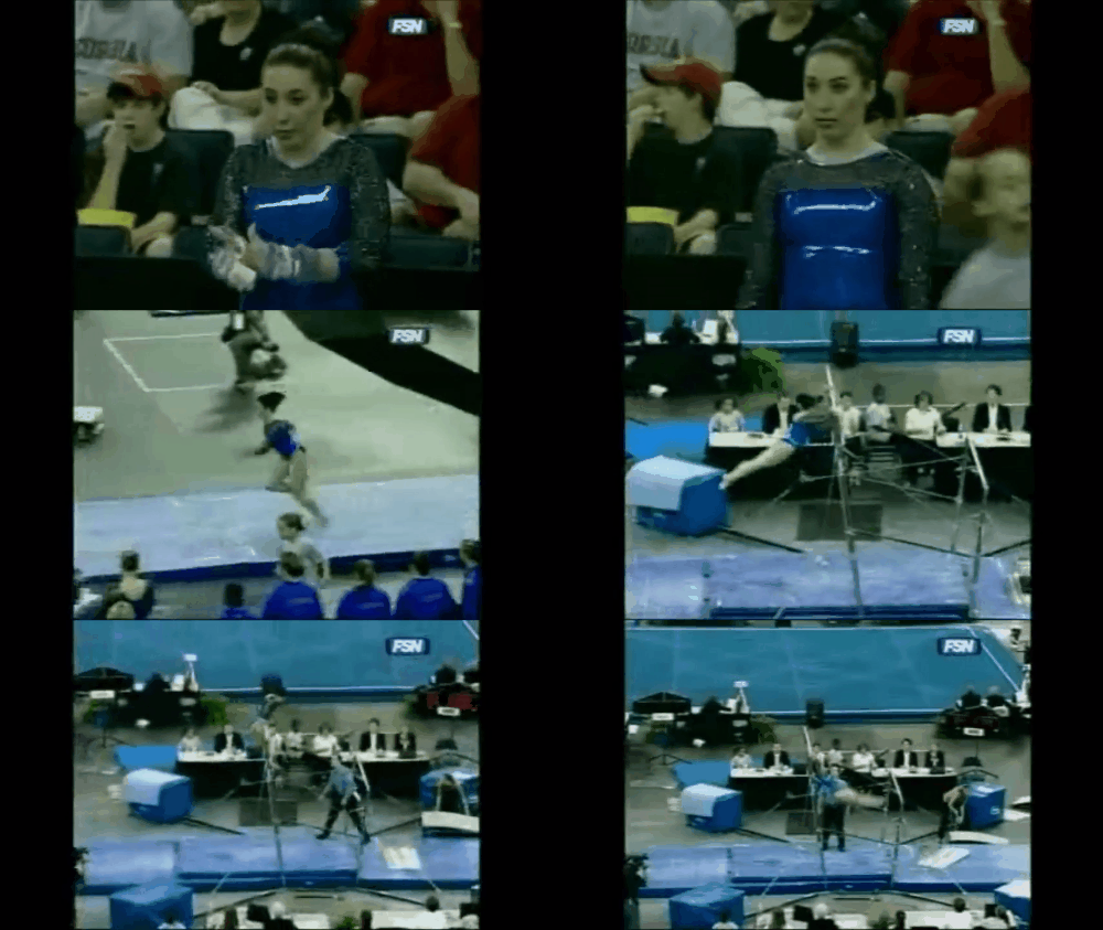
Caroline
- Design: 1.6/3
- Fabric/Sparkle: 0.8/2
- School Spirit: 1/2
- Overall Appearance: 1.4/3
- Total: 4.8/10
This looks like Florida was trying too hard to be UCLA? The blue fabric shines almost like pleather, which is just atrocious, and the black up top looks so out of place. I like the sparkle but I can’t get over the fabric choices. There’s also no indication of what team this is other than the obnoxious blue color, so low school spirit points too. Just not a fan of this from all angles.
Christina
- Design: 1.1/3
- Fabric/Sparkle: 0.8/2
- School Spirit: 1/2
- Overall Appearance: 1.2/3
- Total: 4.1/10
Noooo make it stop with these straight necklines and a mesh top… Just like with every other leo that looks like this, I dislike this design. On top of this, the colors are ridiculous. The blue is basically a way too shiny, and the black mesh doesn’t work for me. Kinda glad UF never decided to bring this one back.
Elizabeth
- Design: 2.0/3
- Fabric/Sparkle: 1.6/2
- School Spirit: 1.5/2
- Overall Appearance: 2.3/3
- Total: 7.4/10
This leo is very shiny. I like the blue fabric and the black sparkly but I can leave the neckline behind—not my favorite. I also with there was a little more to the design as a whole, but maybe the fabric speaks for itself.
Have a throwback meet you want us to judge? Stick it in the comments or hit us up on Twitter, and we’ll try to get to it in the coming weeks!
Article by Elizabeth Grimsley, Christina Marmet and Caroline Medley

