By Elizabeth Grimsley, Caroline Medley and Christina Marmet
Continuing with the throwback leotard theme, this week we’re taking a look back at the fashion at the 2000 national championship Super Six. There was lots of… not exactly attractive designs.
The criteria is the same as during the season. But to refresh your memory: up to three points for design; two points for fabric, sparkle, etc.; and two points for school spirit; three points for overall appearance. But we want to know your thoughts too! Make sure to vote in our poll at the bottom of the page.
Georgia: 7.866

Caroline
Design: 2.2/3
Fabric/Sparkle: 1.5/2
School Spirit: 1.7/2
Overall Appearance: 2.1/3
Total: 7.5/10
The black and red contrast really makes this design pop. Fishnet pattern was obviously a trend here, and it works in Georgia’s favor, really accentuating the arms of their gymnasts and giving the leo almost an ombre effect from far away. It shows really well on the broadcast, it sparkles nicely, and the Georgia logo is just the right size for the rest of the bodice! All great points. Could have used a little more sparkle or a more creative back, that’s about all that could’ve scored it higher.
Christina
Design: 2.5/3
Fabric/Sparkle: 1.6/2
School Spirit: 1.8/2
Overall Appearance: 2.6/3
Total: 8.5/10
Ooooh I really like this one! I love the shade of red, and the sleeves are almost ombre-like with the red shading through the black, tight fishnet design. I don’t mind this fishnet as much as Alabama’s thanks to this color shading combo. It looks great in motion. Besides, this leo has just the right amount of sparkles, and a nice touch of school spirit with the ‘Georgia’ on the chest. Definitely my favorite from this meet!
Elizabeth
Design: 2.2/3
Fabric/Sparkle: 1.5/2
School Spirit: 1.6/2
Overall Appearance: 2.3/3
Total: 7.6/10
Ok, so Georgia went with the weird faux fishnet too, but I don’t hate it? And this isn’t some biased opinion since I went to Georgia, trust me. But the solid red body pairs well with the kind of reddish-black arms and the subtle sparkle is nice as well. Plus the script Georgia on the chest is a nice final addition to complete the look. Probably my favorite of the bunch.
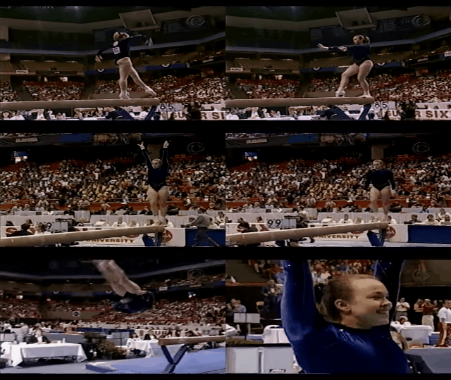
Michigan: 6.433
Caroline
Design: 2/3
Fabric/Sparkle: 1.7/2
School Spirit: 1.5/2
Overall Appearance: 2.2/3
Total: 7.4/10
Oooh shiny. I love the crisscross sparkle pattern on this, and combined with the high-necked velvet, it makes for a very elegant (albeit dated) look for these girls. The back keyhole is nice too, and the school spirit is just noticeable enough to get some good points. Also that navy color is gorgeous!
Christina
Design: 2/3
Fabric/Sparkle: 1.6/2
School Spirit: 1.7/2
Overall Appearance: 2.3/3
Total: 7.6/10
Velvet AND sparkles? You win Michigan, you win. I quite like the shade of blue used it for the velvet, and I really am a fan of the sparkly sleeves. Plus, it does look like they have “Michigan” written on the left hip, and I’m all for it. Overall, I like the uniformity of the look and the simple design makes it elegant. A solid choice for the Wolverines in these velvety days.
Elizabeth
Design: 0.7/3
Fabric/Sparkle: 1.0/2
School Spirit: 1.4/2
Overall Appearance: 1.2/3
Total: 4.3/10
Uhh… WHAT is that design on their BLADDER? Is it a cursive M or something? That’s a big nope for me because the second I noticed, I couldn’t look away because I was trying to figure out what the heck it was! Probably not what you want fans doing, Michigan. I mean I guess good job for pairing some nice sparkles with the blue velvet but the bladder script is just not working for me.
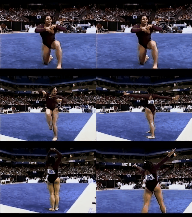
Alabama: 6.033
Caroline
Design: 2/3
Fabric/Sparkle: 1.4/2
School Spirit: 1/2
Overall Appearance: 2.1/3
Total: 6.5/10
This is a lovely leo, but it just doesn’t look like Alabama to me? The color is more purple than Crimson Tide red, there’s no distinguishing school markings from what I can see, but I actually kinda like the fishnet-style crisscross on the arms, and the velvet is nice. I can’t tell what the design is on the chest, but it doesn’t look like a school logo? It’s pretty but I feel like it’s kind of extraneous.
Christina
Design: 1.8/3
Fabric/Sparkle: 1.2/2
School Spirit: 1.4/2
Overall Appearance: 1.7/3
Total: 6.1/10
Just as I was contemplating how bad Utah’s leo is, Alabama comes in like “hold my beer.” Crushed velvet and fishnets design on the sleeves? Why? To be honest, this leo isn’t as bad to me, but I really can’t get over the sleeves. I am obsessed with this shade of burgundy, and I also like the neckline cut and the logo on the chest. In motion, I can’t see the fishnets sleeves so it works for me. But when they zoom in, I can’t help but laugh. All that to say, I’m pretty torn.
Elizabeth
Design: 1.3/3
Fabric/Sparkle: 1.3/2
School Spirit: 1.3/2
Overall Appearance: 1.6/3
Total: 5.5/10
Oh Alabama… I like the purply color that I’m assuming is supposed to be crimson—and maybe it was in person. But that faux fishnet had me actually thinking how much I like UCLA’s current day fishnet in comparison, which is a bad sign. I do like the back hole as it makes her shoulders look really muscular and athletic, but the weird arm design is something I can’t get past.
UCLA: 5.6
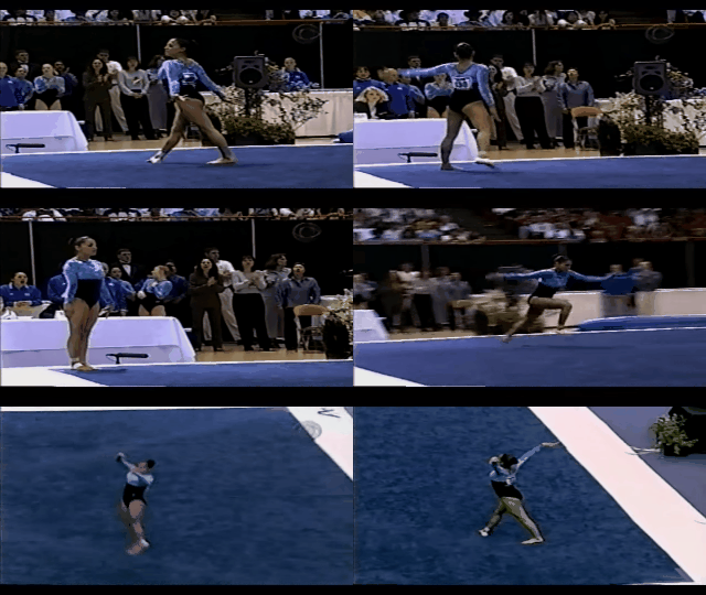
Caroline
Design: 1.4/3
Fabric/Sparkle: 1/2
School Spirit: 1.3/2
Overall Appearance: 1.6/3
Total: 5.3/10
This electric blue crushed velvet is SO turn of the century, and normally I would love it, but the empire waist and the completely different black fabric on the bottom half just make it feel so disjointed, I’m a bit baffled. I appreciate the UCLA on the chest, but again, it feels a bit small and out of place. Also, no sparkle? I’m disappointed. Overall a mixed bag for me.
Christina
Design: 1.8/3
Fabric/Sparkle: 1.4/2
School Spirit: 1.8/2
Overall Appearance: 2/3
Total: 7.0/10
Hello blue velvet! At first sight I was like “wowza, nope” but it sort of grew on me and I got used to it. I don’t really like the overall design of the leo that makes it look like the blue velvet part is one of those modern times fashionable cropped dress jackets. I mean… of course UCLA would be ahead of its times. But I feel like a lot of UCLA leos have this weird cut right under or in the middle of the chest and it never works for me. I like the small ‘UCLA’ on the chest. I always want more sparkles, especially since other teams had it at this meet so it’s not like sparkles and velvet was a never-seen-before fashion decision. All in all, a pretty bold leo but I think it worked well for its times.
Elizabeth
Design: 0.5/3
Fabric/Sparkle: 1.3/2
School Spirit: 1.4/2
Overall Appearance: 1.3/3
Total: 4.5/10
I like that color of blue and the velvet texture makes it look nice but the way it cuts to black right under the bust is not cute. And I didn’t even see the small UCLA on the chest until I read Christina’s description and went back and looked more closely. Nice color, UCLA, but the design needs help.
Nebraska: 5.133
Caroline
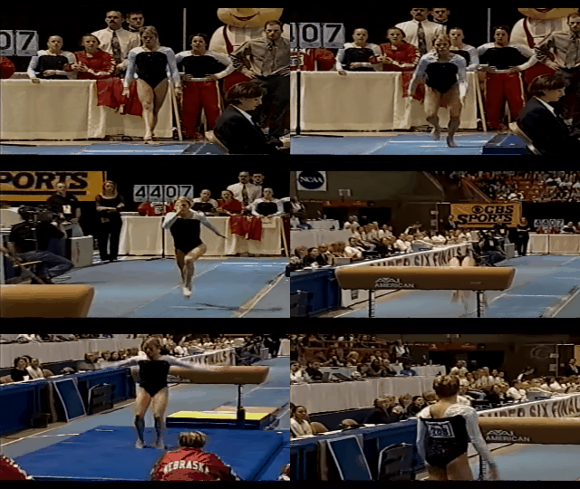
Design: 1.6/3
Fabric/Sparkle: 1.4/2
School Spirit: 0.4/2
Overall Appearance: 1.4/3
Total: 4.8/10
Nothing special here, awful neckline and not a great fit on any of the girls. No school spirit to speak of, but I do appreciate the full on sparkle! Just need more here. Nebraska has definitely done better, and their “better” usually involves some pops of color!
Christina
Design: 1.5/3
Fabric/Sparkle: 1/2
School Spirit: 0.5/2
Overall Appearance: 1.7/3
Total: 4.7/10
This is nothing really memorable, and the fit is actually quite terrible on all the girls. The leo looks way too big for them especially in the shoulders area. Other than that, yeah, just super bland. I don’t particularly like the straight neckline, and the black and white color combo with sparkles is simple (although I do appreciate the amount of sparkles). Anyways, I don’t hate it, but it doesn’t really bring any strong feelings in me either. I would have liked a little more Nebraska red somewhere, or a little more school spirit. This could be worn by anybody.
Elizabeth
Design: 1.7/3
Fabric/Sparkle: 1.4/2
School Spirit: 1.0/2
Overall Appearance: 1.8/3
Total: 5.9/10
It’s kind of blah, but I do like just how sparkly the body is! I wish the video quality was better to tell just exactly what is making it shiny but I’m assuming it’s glitter velvet? But for the most part it’s a classic look but nothing special. Dan Kendig’s outfit on the other hand…
Utah: 4.7

Caroline
Design: 0.4/3
Fabric/Sparkle: 0.6/2
School Spirit: 1.3/2
Overall Appearance: 0.5/3
Total: 2.8/10
This literally looks like she’s the ace of diamonds, like they belong in a deck of cards! I just can’t fathom what went into designing this. The white shiny fabric also doesn’t help, and the little Utah across the front feels like an afterthought, and it looks out of place. This is just a hot mess all around.
Christina
Design: 1/3
Fabric/Sparkle: 0.7/2
School Spirit: 1.4/2
Overall Appearance: 1.5/3
Total: 4.6/10
Ugh Utah, no. I like the shade of red for the sleeves and the lower half of the leo, but no to the nope on this white, shiny fabric. I don’t mind the color as much, but the cut is horrendous especially in the front. It just doesn’t create a flattering or nice look at all. The small ‘Utah’ on the chest is nice, but I just can’t get past this awful white design.
Elizabeth
Design: 2.0/3
Fabric/Sparkle: 1.3/2
School Spirit: 1.5/2
Overall Appearance: 1.9/3
Total: 6.7/10
Oh my… Well… It’s definitely… Interesting… But… I don’t… Hate it? Something must be wrong with me. But in all seriousness, I kind of like the shiny white and the design makes the girls looks super athletic. However, overall, it’s a bit too weird for me.
Have a throwback meet you want us to judge? Stick it in the comments or hit us up on Twitter, and we’ll try to get to it in the coming weeks!

