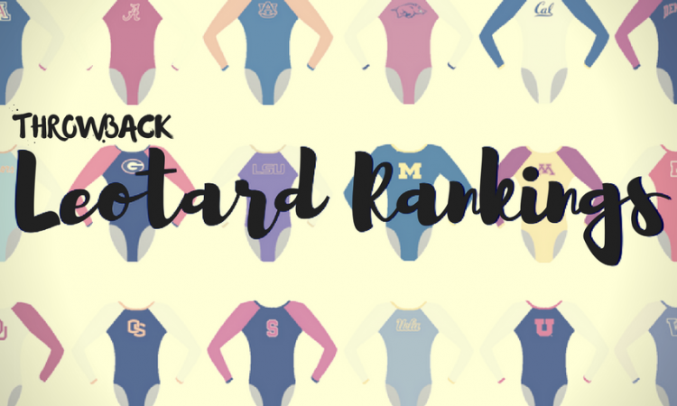
By Elizabeth Grimsley, Christina Marmet and Caroline Medley
Continuing with the throwback leotard theme, this week we’re taking a look back at the fashion at the 2012 national championship event finals. While the designs were similar to what we see today, there were a LOT fewer sparkles. Thanks to Allie for suggesting the meet!
The criteria is the same as during the season. But to refresh your memory: up to three points for design; two points for fabric, sparkle, etc.; and two points for school spirit; three points for overall appearance. But we want to know your thoughts too! Make sure to vote in our poll at the bottom of the page.
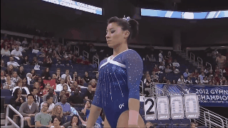
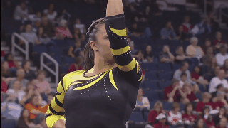
Oklahoma: 7.933
|
Caroline
Design: 2.4/3 Fabric/Sparkle: 1.6/2 School Spirit: 1.6/2 Overall Appearance: 2.2/3 Total: 7.8/10 This feels like a lot of Oklahoma leos: red bodice, white shimmery design, name written down the sleeve. These are all good elements of a leo, but it’s obvious that their style is still pretty similar today. I do really like this particular white design though, with the criss-crossed curves. It accentuates their lines and curves while not being too “here’s my chest!!!!” and it transitions well into the white sleeves. |
Christina
Design: 2.5/3 Fabric/Sparkle: 1.6/2 School Spirit: 1.7/2 Overall Appearance: 2.5/3 Total: 8.3/10 This has a very Adidas look to it, and I love it. It’s a simple yet very elegant look, and I love the multiple white stripes that cross on the front. Perfect amount of sparkles. Ah Oklahoma, you win my heart again. |
Elizabeth
Design: 2.2/3 Fabric/Sparkle: 1.4/2 School Spirit: 1.7/2 Overall Appearance: 2.4/3 Total: 7.7/10 I’ve always liked this design, and, paired with the classic Oklahoma white mesh sleeves and crimson body, it’s a hit for me. And I do believe this design was new for this time. However, since then there have been many copycats. I do like the added sparkles and the OU on the back as well. Plus, that FTDLO tho. |
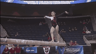
Stanford: 7.733
|
Caroline
Design: 2.3/3 Fabric/Sparkle: 1.6/2 School Spirit: 1.3/2 Overall Appearance: 2.5/3 Total: 7.7/10 Oh my gosh, this is MILES better for Stanford than its other showing! I feel like this is a very Ivana design too, like I’m in love with it just as much as her beam routine. The random swirls are my pet peeve, but honestly they’re kinda flattering and I can’t bring myself to mind them as much? The color is lovely and the incorporation of both black and gold gives it a depth not seen in many designs at this meet. Just could’ve used a Stanford logo somewhere and it’d be my favorite of the night. |
Christina
Design: 2.2/3 Fabric/Sparkle: 1.5/2 School Spirit: 1.6/2 Overall Appearance: 2.5/3 Total: 7.8/10 Ah, this is already so much better than Shapiro’s (Seriously Sam, why did you have to go pick the worst leo ever?). This shade of red is beautiful and I love the gold incorporated subtly into the swirls. The design in itself is fairly overused, but the color combination is so pretty here that I forgive that. Also, always bonus points for Ivie. |
Elizabeth
Design: 2.3/3 Fabric/Sparkle: 1.4/2 School Spirit: 1.6/2 Overall Appearance: 2.4/3 Total: 7.7/10 I like this one. It’s so unlike the Stanford leos we normally see—and so like a leo Ivana Hong would wear—that it’s perfect. The touch of gold is a nice accent and not too overwhelming and the red color is gorgeous. I also like the use of mesh in the design. |
Alabama: 7.7
|
Caroline
Design: 2.2/3 Fabric/Sparkle: 1.4/2 School Spirit: 2/2 Overall Appearance: 2/3 Total: 7.6/10 This leo has such a great message and story and is quite unique, but that doesn’t necessarily make it a 100 percent winner in my book? The ribbon design is fun, but the little ribbon sparkles all along the sleeves feels like a little bit overkill to me. And I would have loved to see a little splash of color somewhere in there, even just in the Bama written along the hip would have been enough. |
Christina
Design: 2.4/3 Fabric/Sparkle: 1.2/2 School Spirit: 1.9/2 Overall Appearance: 2.2/3 Total: 7.7/10 How can you not like this leo knowing everything it stands for? I love the meaning behind it, and I remember how powerful it was at the time since the tornado in Tuscaloosa happened just the year before. The ribbon-like design is fairly unusual, but I really like the black and white look with the houndstooth incorporated. It gives a somber and elegant look that go well with the significance of the entire design. I’ll have to agree with Elizabeth regarding the ribbons on the sleeves. It’s a bit much, but it doesn’t bother me that much either. |
Elizabeth
Design: 2.2/3 Fabric/Sparkle: 1.3/2 School Spirit: 1.9/2 Overall Appearance: 2.2/3 Total: 7.8/10 This is that tornado relief leo that we’ve seen more recently as well, so points for supporting a cause that’s not breast cancer (a worthy cause as well). I like the use of hounds tooth as it adds to the school spirit factor while not being my personal favorite pattern. I do think this is a good way to elevate a black leo and it’s well done. Maybe there’s too many ribbons all over the arms but what can you do. |
Arkansas: 7.667
|
Caroline
Design: 2/3 Fabric/Sparkle: 1.6/2 School Spirit: 1.3/2 Overall Appearance: 2.1/3 Total: 7.0/10 I’m half and half on this one. The front is a blah typical design for me, but the back is really fun! I love the lattice design, but putting the grey behind it is a new take, which I love. I do wish there were something to mark it as an Arkansas leo, cuz this could just as easily be any other school with red as their primary color. |
Christina
Design: 2/3 Fabric/Sparkle: 1.4/2 School Spirit: 1.6/2 Overall Appearance: 2.3/3 Total: 7.3/10 I am torn on this one. I really like the front, but I can’t get myself to like the back that much. The criss-crossing on this grey mesh bothers me but I can’t really explain why. Probably the color grey, because as you may remember, I essentially don’t like anything grey on leos. Anyway, I love the shade of red, and it has the perfect amount of sparkles, but the back doesn’t do it for me. |
Elizabeth
Design: 2.7/3 Fabric/Sparkle: 1.7/2 School Spirit: 1.8/2 Overall Appearance: 2.8/3 Total: 9.0/10 Get ready. This is my favorite Arkansas leo. Hands down. No contest. I LOVE the back. The mesh with the red lines accenting, the subtlety outlines hog in sparkles, the red color—it’s all great. Plus, it’s elegant while still looking athletic. |
Florida: 7.466
|
Caroline
Design: 2/3 Fabric/Sparkle: 1.6/2 School Spirit: 1.2/2 Overall Appearance: 2.1/3 Total: 6.9/10 Sigh. Another basic blue Florida leo. It’s a nice one though, I wouldn’t mind seeing it more often today. The faux halter neckline is fun, and the sparkly mesh sleeves are lovely. I also really like the back, it serves as a functional piece to let their muscles flex and stretch with their movements but it’s also really cute! |
Christina
Design: 2.3/3 Fabric/Sparkle: 1.5/2 School Spirit: 1.4/2 Overall Appearance: 2.4/3 Total: 7.6/10 I like this one. It’s a very elegant look, and I love the originality of the back with the two small holes on the shoulder. I also like that the sleeves are mesh and the bodice is solid, and that the two are well separated by the solid white stripes. I do wish it had something Gator-like incorporated, maybe a logo, a tad of orange, or simply “UF.” That said, it’s a solid look for me. |
Elizabeth
Design: 2.4/3 Fabric/Sparkle: 1.5/2 School Spirit: 1.6/2 Overall Appearance: 2.4/3 Total: 7.9/10 I actually really like this one! It’s not blue and black or blue and white (for the most part) but also not one note either. I like the unique cutouts in the back and the fact that the while is only there to outline but is thicker, making it stand out more. I also like that the sparkles make the whole design pop. This is a solid one for me! |
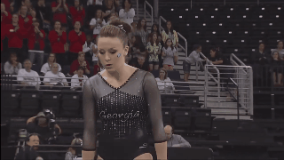
Georgia: 7.433
|
Caroline
Design: 1.8/3 Fabric/Sparkle: 1.3/2 School Spirit: 1.6/2 Overall Appearance: 2/3 Total: 6.7/10 So the Georgia script on the front is kinda different, which I don’t mind, but I find the sleeves a bit disjointed and the inverted V neckline isn’t very flattering. I do like the diamond with the super G on the back, and I appreciate the use of red there! |
Christina
Design: 2.3/3 Fabric/Sparkle: 1.6/2 School Spirit: 1.9/2 Overall Appearance: 2.3/3 Total: 8.1/10 First of all, can Cheek make a comeback already? Anyways, back to the point. I really like this leo overall. The design on the front is not of my favorite but I do like the glittery rain and the Georgia in the middle. The back is lovely and I love the originality. A solid look for me, and I wouldn’t mind seeing this leo come back too. |
Elizabeth
Design: 2.0/3 Fabric/Sparkle: 1.4/2 School Spirit: 1.8/2 Overall Appearance: 2.3/3 Total: 7.5/10 I like this one. It’s not at “OMG LOVE” status or anything but it’s a solid Georgia leo. I like the big red super G on the back and the almost bronze arms are one of my favorite parts. I could take or leave the font used for “Georgia,” but over all this is a solid one for me. |
UCLA: 7.133
|
Caroline
Design: 2/3 Fabric/Sparkle: 1.5/2 School Spirit: 1.2/2 Overall Appearance: 2.3/3 Total: 7.0/10 I feel like either we’ve judged this a bunch or UCLA has a million icicle leos… maybe both? This is one of the better ones though, the arms aren’t weird on it and I far prefer the navy to the black or any other color they have this in. Also bonus points for how bomb it looks on EHH! But minus points for how tired it is, so that kinda balances it out. |
Christina
Design: 2.2/3 Fabric/Sparkle: 1.6/2 School Spirit: 1.4/2 Overall Appearance: 2.4/3 Total: 7.6/10 I feel like we already judged this leo 100 times. We probably did. At the time it was a cool and unique leo, but considering we have seen it all the time since, I’m tired of it. I know I’m supposed to judge a leo relative to its time period, but it’s hard to go beyond that for this one. That said though, I still do like the look and especially the glittery rain feel on the front and the back, but yeah, I feel like a broken record on this one? Time for new leos UCLA! |
Elizabeth
Design: 2.1/3 Fabric/Sparkle: 1.3/2 School Spirit: 1.4/2 Overall Appearance: 2.0/3 Total: 6.8/10 I’m tired of this leo. And I’m ready for UCLA to stop wearing it. Plus, the fact that the Bruins are wearing it here, in 2012 (and who knows how many years before), and then wore it in 2017 means that it’s time for some new designs. And that’s all I really have to say about this one… But I do want to note that I love EHH, so bonus points? |
Nebraska: 7.033
|
Caroline
Design: 1.8/3 Fabric/Sparkle: 1.6/2 School Spirit: 1.6/2 Overall Appearance: 1.7/3 Total: 6.6/10 I love the bold color and sparkle on this one! However, I’m not really a huge fan of the neckline, and it definitely could have done with some accents of either white or black as far as the school spirit goes. Also, the back is kinda lackluster, especially compared to the other leos at this meet. |
Christina
Design: 1.7/3 Fabric/Sparkle: 1.5/2 School Spirit: 1.8/2 Overall Appearance: 2/3 Total: 7/10 I am obsessed with this shade of red, and points for the gigantic sparkly N on the side for school spirit. The design is however a bit simple for my taste. A clean look, but too simple. |
Elizabeth
Design: 2.1/3 Fabric/Sparkle: 1.4/2 School Spirit: 1.8/2 Overall Appearance: 2.2/3 Total: 7.5/10 I actually really like this one! It’s a great color of red and the N on the side pops super well but isn’t TOO blingy despite being all rhinestones. I wish there was a little something else to the design, but overall it’s nice and not too crazy as we all know Nebraska can get sometimes. |
Missouri: 6.967
|
Caroline
Design: 2.1/3 Fabric/Sparkle: 1.2/2 School Spirit: 1.6/2 Overall Appearance: 2.2/3 Total: 7.1/10 Tiger stripes!! One of my favorite prints. I wish there were more of them though, the bodice feels too blah for me compared to the shoulder and arms. Also, while there are big school spirit points in repping the school mascot, I would have loved to see an M or Mizzou somewhere as well. |
Christina
Design: 2.1/3 Fabric/Sparkle: 1.1/2 School Spirit: 1.7/2 Overall Appearance: 2/3 Total: 6.9/10 I like the Tiger stripes look on this one, but this shade of yellow kills me. I wish it was a bit more subdued. The design is fairly simple, and I wish the rest of the bodice had something else to it. Probably more glitters, because it’s just plain back and it’s boring. An average look. Don’t love it, but don’t hate it either. |
Elizabeth
Design: 2.0/3 Fabric/Sparkle: 1.2/2 School Spirit: 1.8/2 Overall Appearance: 1.9/3 Total: 6.9/10 I don’t hate it. But I don’t love it either. I like now the arms look like a Tiger, which is fitting. The yellow also isn’t killing me either. There’s just something about it that doesn’t wow me. |
LSU: 6.933

|
Caroline
Design: 2.2/3 Fabric/Sparkle: 1.4/2 School Spirit: 1.7/2 Overall Appearance: 2.1/3 Total: 7.4/10 I actually really like this! The contrast between the yellow and deep purple is really nice, and the bloom/flames design is pretty cool. I would love to see more bling and maybe a school logo somewhere. |
Christina
Design: 1.8/3 Fabric/Sparkle: 1/2 School Spirit: 1.6/2 Overall Appearance: 2.1/3 Total: 6.5/10 I love the shade of purple but this yellow is too… yellow? I wish it was more golden and less mustard-y. Other than that the design is fairly simple, but nothing really outstanding to it. |
Elizabeth
Design: 1.9/3 Fabric/Sparkle: 1.2/2 School Spirit: 1.7/2 Overall Appearance: 2.1/3 Total: 6.9/10 Now THAT is yellow. It’s almost offensively yellow. But I don’t hate it? It works with the purple and the design isn’t bad. I just prefer some of the newer gold and purple options we’ve seen more recently. |
Oregon State: 6.9
|
Caroline
Design: 1.8/3 Fabric/Sparkle: 1.3/2 School Spirit: 1.5/2 Overall Appearance: 2/3 Total: 6.6/10 So the tribal swirly pattern is not doing it for me, especially not with its placement on the basically straight neckline, which I really don’t like in the first place. The colors are nice, and I always love OSU’s use of orange, since it’s not a color we see often, and the sleeves are fun! But no school logo or name and overall just a little uninspired. |
Christina
Design: 1.6/3 Fabric/Sparkle: 1.2/2 School Spirit: 1.8/2 Overall Appearance: 1.7/3 Total: 6.3/10 Booooring. First of all, this is another one of these leos with the neckline I really despise and find unflattering, so you automatically lost me there. Second of all, the orange swirls are just so random and I don’t feel have been incorporated nicely into the overall look. That said, good on you for using all school colors, including the orange. It does work well with this look. So yay for the colors, nay for the design. |
Elizabeth
Design: 2.4/3 Fabric/Sparkle: 1.3/2 School Spirit: 1.7/2 Overall Appearance: 2.4/3 Total: 7.8/10 I love the combo of mostly black and white with a touch of orange—because too much orange is not cute on pretty much everyone. That being said, this one works for me. I like the uniformity of the orange design as well. Sometimes when you use squigglies, it can get too random, but this placement is nice. |
Stanford: 6.7
|
Caroline
Design: 1.8/3 Fabric/Sparkle: 1.4/2 School Spirit: 1.6/2 Overall Appearance: 1.9/3 Total: 6.7/10 Yeah, I totally would not have noticed the SWG in the squiggles if Elizabeth hadn’t said something… So points for cool school spirit implementation, but deduction for making it practically unseeable. The black and white diagonal is nice, though that does kind of give it a lack of a neckline, so Spinner has to work harder than she should have to to elongate her lines. Kinda torn on it overall, but definitely not my favorite. |
Christina
Design: 1.6/3 Fabric/Sparkle: 1.2/2 School Spirit: 1.8/2 Overall Appearance: 2/3 Total: 6.6/10 What is even happening here. In motion and from further away it just looks like a bunch of random red squiggles. I honestly might not even have seen the ‘SWG’ spelled out if Elizabeth hadn’t mentioned it. Now that I see it, I like the idea, but I wish it was maybe more precise. With the other red flames happening, there is a lot going on, and overall it’s a cluttered design. That said, when has Stanford ever had a leo with so much school spirit on it? This is a refreshing change. |
Elizabeth
Design: 1.8/3 Fabric/Sparkle: 1.3/2 School Spirit: 1.7/2 Overall Appearance: 2.0/3 Total: 6.8/10 This one kind of reminds me of a German leo? I like how the design spells out “SWG” but the rest kind of looks like a random mess. It’s not too bad, it just looks cluttered with too much going on. I do like how it sparkles, though, and the shiny white used as well as the gold (?) around the red. However, I do want to note this is one of Stanford’s most school spirit-y leos. |
Utah: 6.566
|
Caroline
Design: 2.3/3 Fabric/Sparkle: 1.7/2 School Spirit: 1.5/2 Overall Appearance: 2.5/3 Total: 7.9/10 Ooh, I love this! The contrast between the red and black is really stark, and the flame/flower design is actually quite lovely. I would like to have seen a larger U somewhere, though I do give points for the hip logo, but other than that I quite like it! |
Christina
Design: 1.3/3 Fabric/Sparkle: 1/2 School Spirit: 1.5/2 Overall Appearance: 1.7/3 Total: 5.5/10 Meh. I mean, it’s fine, but I don’t find it that exciting either. I’m kind of over the flamey design even though it was really popular at that time (and I did not like it either then). Just an okay look, and I am so glad Utah has gotten better leos since working with UA. |
Elizabeth
Design: 1.7/3 Fabric/Sparkle: 1.1/2 School Spirit: 1.7/2 Overall Appearance: 1.8/3 Total: 6.3/10 This is DRASTICALLY different from what we see from Utah today, mainly because, since then, Utah booked a deal with Under Armor. And, at least in this case, I’m happy about that because this leo doesn’t do much for me. The design is tired, even for 2012, and it’s too dark for my taste. I do like the Utah incorporated on the hip and the use of red, though. |
Arizona: 5.8

|
Caroline
Design: 1.5/3 Fabric/Sparkle: 1/2 School Spirit: 1.8/2 Overall Appearance: 1.4/3 Total: 5.7/10 Ohhh my lanta. I am so glad Arizona has ditched this leo now because hot damn, that back is obnoxious. I’m all for prominent back designs but the enormous A is a bit much, and the fabric of the logo actually makes it look a bit ill-fitting, which is unfortunate. The front is also pretty boring, as the sparkle really isn’t enough to keep it eye-catching. Points for risk-taking, but this did not work out. |
Christina
Design: 1.4/3 Fabric/Sparkle: 0.8/2 School Spirit: 2/2 Overall Appearance: 1.3/3 Total: 5.5/10 Ah the infamous Arizona leo with the ginormous “A” on the back. Well, this one is too much for me. I understand you need a bland front to be able to pull off such an exuberant back, but it doesn’t work here at all. The front is boring, and the back is just ridiculous. The “A” is actually probably bigger than some of these girls. I wish the back had been dialed down to be able to do something more on the front, because it’s so unbalanced right now. Just…. chill, Arizona. |
Elizabeth
Design: 1.7/3 Fabric/Sparkle: 0.9/2 School Spirit: 2/2 Overall Appearance: 1.6/3 Total: 6.2/10 Ahh yes… The mullet leo. The front is so boring and plain black and then BAM on the back you’re slapped across the face with a ginormous, shiny Block A. I might be OK if the back logo was maybe a third of its size but that thing is so big it extends to the sides of the leo! Too much! I do like how shiny it is though… |
Stanford: 2.5
|
Caroline
Design: 0.3/3 Fabric/Sparkle: 0.6/2 School Spirit: 0.5/2 Overall Appearance: 1.8/3 Total: 3.2/10 The design here is almost nonexistent, though I think the little flower on the shoulder is kinda cool. Definitely unique I guess? I give the school spirit points purely because this is something we’ve come to expect from Stanford, this is more “them” than showing off school spirit or using red or anything. The black is a nice look on her but honestly this is a dud in all other departments. |
Christina
Design: 0.5/3 Fabric/Sparkle: 0.3/2 School Spirit: 0.1/2 Overall Appearance: 0.3/3 Total: 1.2/10 Girl, no. When I first looked at that leo, I was like “really, that’s it?” It’s basically a plain black leo with the smallest white leaf-like design on the left shoulder. What are you doing Stanford? This is so boring. Give me something! Sparkles, more red, a school logo, anything at this point! No design, no sparkles, no school spirit. I feel bad giving such low points, but this leo is essentially nothing. Nope, nope. This should be a training leo, not an NCAA Event Finals leo. |
Elizabeth
Design: 1.1/3 Fabric/Sparkle: 0.6/2 School Spirit: 0.4/2 Overall Appearance: 1.0/3 Total: 3.1/10 I want to bring up something first. I’m pretty sure the Stanford gymnasts got to pick their leos for this event final competition because all three had on a different one. That being said, WHY, Samantha Shapiro, did you pick the most boring leo in the history or leos??? It’s literally just black with three tiny white blobs on the one shoulder… I mean, if you wanted to wear black, I’m sure there was another on in the stockroom you could have chosen. |
Have a throwback meet you want us to judge? Stick it in the comments or hit us up on Twitter, and we’ll try to get to it in the coming weeks!