By Elizabeth Grimsley, Christina Marmet and Caroline Medley
Cami with the Yurchenko Full pic.twitter.com/Q6ycc2Vx2R
— GW Gymnastics Team (@GWGymnastics) February 18, 2017
|
Caroline
Design: 2.4/3 Fabric/Sparkle: 1.8/2 Pink Meet Spirit: 1.5/2 Overall Appearance: 2.3/3 Total: 8.0/10So the color distortion in the video probably makes it looks redder and darker than it actually was. GW has done a lot of ombre this season, but I don’t think anyone out there is doing pink ombre, so kudos to them for continuing to take that risk. I could have used some more bling bling, but other than that, I love this. |
Christina
Design: 2.7/3 Fabric/Sparkle: 1.7/2 Pink Meet Spirit: 2/2 Overall Appearance: 2.6/3 Total: 9/10 I LOVE this leo! GW has been on top of it this season with unique (albeit sometimes weird) designs, and this one is no exception. I am a huge fan of this pink shade mixed with purple to get this ombre look, and I am obsessed with the sparkly neckline. Just like with all of GW’s leo, it goes huge on the school spirit with the George Washington head on the sleeve (another one with a dead president woohoo!), the Colonials on the back and the gigantic “GW” on the front. In case you ever were guessing what school they were from! But I forgive the overwhelming school spirit because I am just so obsessed with these colors. After judging all these other pink leos that all basically looked the same, this is so refreshing. All the points to you GWU! |
Elizabeth
Design: 2.6/3 Fabric/Sparkle: 1.8/2 Pink Meet Spirit: 1.9/2 Overall Appearance: 2.7/3 Total: 9.0/10This is what I’m talkin’ ‘bout! I love the ombre with the pink and navy, and the neckline and cuff rhinestones make those parts really standout. I also love the big GW on the front and the Colonials on the back. It’s almost the exact same as some of GW’s other leos, but it’s so much better than almost all other teams’ that I’m forgiving that part. Also, A+ for the dead president AND ribbon on the sleeves. |
ICYMI: Check out highlights of our best team score of the season from our win over the Wildcats! ? #GoHeels pic.twitter.com/UXgi7EwRbC
— Carolina Gymnastics (@uncgymnastics) February 20, 2017
|
Caroline
Design: 2.4/3 Fabric/Sparkle: 1.5/2 Pink Meet Spirit: 1.7/2 Overall Appearance: 2.6/3 Total: 8.2/10I kinda love this retro sort of design? It’s not usually my cup of tea but UNC pulls it off really well. I kinda wish there were a little more pink to it, some pink sparkles on the back or the ribbon design or something. I also could’ve done with a richer color, but I think the baby pink works for the retro style they were going for. And I absolutely love the script Heels on the front! It contributes to that retro feel and it’s something new and creative that we don’t really see, so bonus points for creativity. |
Christina
Design: 2.7/3 Fabric/Sparkle: 1.5/2 Pink Meet Spirit: 1.8/2 Overall Appearance: 2.7/3 Total: 8.7/10I am obsessed with the back! It’s so unique yet lovely. This is something we would see on UCLA, but I am so glad UNC did it first. This shade of pink is also great and not too in your face like most other pink leos. The Heels on the front adds a nice little school spirit touch. Overall, this is such a gentle look, I love it. |
Elizabeth
Design: 2.7/3 Fabric/Sparkle: 1.6/2 Pink Meet Spirit: 1.8/2 Overall Appearance: 2.6/3 Total: 8.7/10I love this one. The light pink makes sense for UNC because Carolina blue is a similar shade (not in color but in lightness). I also love the back, how it’s mostly mesh, has a neat design and isn’t just the one tone but is two shades of the black. I also like the front but wish a different font was used. |
|
Caroline
Design: 2.1/3 Fabric/Sparkle: 1.8/2 Pink Meet Spirit: 1.7/2 Overall Appearance: 2.2/3 Total: 7.8/10An all pink leo! What a refreshing take on what is always called the pink meet, yet never features leos that are more than 50% pink. The design looks sophisticated, like it’s straight out of elite, so it feels perhaps a little out of place, but it kind of works for the Beavers, as this is a much better step in the right direction than the many random swirlies we see from them. While I don’t normally love this shade of pink, I’m willing to overlook personal taste for the fact that they actually did a full pink leo. |
Christina
Design: 2.4/3 Fabric/Sparkle: 1.6/2 Pink Meet Spirit: 1.8/2 Overall Appearance: 2.4/3 Total: 8.2/10 I really love this shade of magenta, and I am so glad this is not hot pink. I love the all-pink look though, but the design is quite simple (I feel like I’m repeating myself a little this week). I like the sparkly neckline-y design, and I like that it’s symmetrical to the back as well. A nice, elegant look! |
Elizabeth
Design: 2.5/3 Fabric/Sparkle: 1.6/2 Pink Meet Spirit: 1.8/2 Overall Appearance: 2.6/3 Total: 8.5/10 The magenta is great! One note though: Minnesota has the exact same pink leo. That doesn’t stop me from loving it though. It’s simple (are you seeing a theme here?), but there’s just enough sparkle on it to make it stand out and just be a solid-colored leo. |
Illinois produces a season-high 196.625 to earn a share of first place at Kentucky. What a night! #Illini
Story: https://t.co/jwTpz9qu5m pic.twitter.com/qrkRisVYwp— Illini W Gym (@IlliniWGym) February 25, 2017
|
Caroline
Design: 2.3/3 Fabric/Sparkle: 1.4/2 Pink Meet Spirit: 1.8/2 Overall Appearance: 2.1/3 Total: 7.6/10I like this one! There’s more pink here than the Auburn one so it stands out better against the navy, and I love the use of the ribbon. The asymmetrical mesh is a little weird, especially as low as it dips by the main ribbon, and I could use some more bling, but overall a solid showing. |
Christina
Design: 2.5/3 Fabric/Sparkle: 1.6/2 Pink Meet Spirit: 1.9/2 Overall Appearance: 2.5/3 Total: 8.5/10 This one is nice! The ribbon is incorporated so nicely into the overall design (on the front and back!) and it matches the other swirls well. I’m fine with this amount of sparkles and that they are clustered around the ribbon. |
Elizabeth
Design: 2.4/3 Fabric/Sparkle: 1.5/2 Pink Meet Spirit: 1.7/2 Overall Appearance: 2.5/3 Total: 8.1/10I like this one! The way the ribbon is incorporated into the rest of the swirly design is cool, and I like the lopsided mesh as well as it breaks up the navy, navy, navy look as a whole. I could use a bit more sparkle, but overall it’s a win for me. I almost like it better than most of Illinois’ regular leos? |
|
Caroline
Design: 2.3/3 Fabric/Sparkle: 1.4/2 Pink Meet Spirit: 1.7/2 Overall Appearance: 2.1/3 Total: 7.5/10Again, I love the inclusion of the ribbon, this time in sparkle form! I also like the sweetheart neckline and the spritzing of bling we get across the rest of the leo. It is a little simple though, like since the ribbon was in sparkle I feel like we needed some other design just in fabric or color contrast to give it a little more oomph. |
Christina
Design: 2/3 Fabric/Sparkle: 1.4/2 Pink Meet Spirit: 1.8/2 Overall Appearance: 2/3 Total: 7.2/10Hot pink alert! Again, not a fan. This leo is alright, I like the ribbons in glitter but this shade of pink is so vibrant that you barely see the ribbons. The design is super simple although I do like the hole in the back. I’m torn on that one though, mostly because of the hot pink. |
Elizabeth
Design: 2.2/3 Fabric/Sparkle: 1.3/2 Pink Meet Spirit: 1.6/2 Overall Appearance: 2.1/3 Total: 7.2/10There are pieces and parts of this leo I like, but as a whole it’s kind of meh for me. I do like the shimmery pink color and how the back hole makes the ribbon with sparkles. The rest of the rhinestones are also nice and there’s a good amount. |
□ Watch the highlights as Auburn scores a season high 196.075 in front of a sold-out Auburn Arena#WarEagle pic.twitter.com/akqarhr5Uu
— Auburn Gymnastics (@AuburnGym) January 14, 2017
|
Caroline
Design: 2/3 Fabric/Sparkle: 1.3/2 Pink Meet Spirit: 1.4/2 Overall Appearance: 2.1/3 Total: 6.8/10I like this one, but I’m not totally sold. The pink doesn’t pop that well against the blue, and there’s really not that much of it. I do like that they made the Auburn on the back in pink sparkles, that was a nice touch, and the overall usage of sparkle is solid. Just not totally sold on the design or navy fabric. |
Christina
Design: 2.2/3 Fabric/Sparkle: 1.5/2 Pink Meet Spirit: 1.6/2 Overall Appearance: 2.3/3 Total: 7.6/10This one is nice. I really like that the color of bodice matches the Auburn blue we see on its other leos, so it maintained school spirit while doing a pink leo. I like this shade of pink, and it’s not too overwhelming since it’s only in the stripes at the top of the bodice. I also like the “Auburn” in pink sparkles in the back. A simple but nice look. |
Elizabeth
Design: 2.1/3 Fabric/Sparkle: 1.4/2 Pink Meet Spirit: 1.6/2 Overall Appearance: 2.2/3 Total: 7.3/10I like it. Plus, it’s SO much better than Auburn’s old pink leo. And it includes some school spirit still with the navy vs. black like so many other teams do. I like the pink bands on the top, creating a kind of halter top look, and the simple “Auburn” on the back is a good addition too. |
One hour from the #GymTerps first night meet of the season. Terps are in their pink leos for tonight’s Pink Meet at Rutgers! #FearTheTurtle pic.twitter.com/B9jmqVnQ1I
— Maryland Gymnastics (@TerpsGymnastics) February 11, 2017
|
Caroline
Design: 2/3 Fabric/Sparkle: 1.2/2 Pink Meet Spirit: 1.7/2 Overall Appearance: 1.9/3 Total: 6.8/10The circle neck is a creative touch, makes it stand out from the rest of these, which I definitely appreciate it. The ribbon is great, and I like that there are multiple shades of pink in there… but so little bling? Doesn’t do it for me. Makes the neckline look a little odd, actually, since the sparkle is drawing attention there where the neckline and circle around the neck are so disjointed. |
Christina
Design: 1.9/3 Fabric/Sparkle: 1.3/2 Pink Meet Spirit: 1.9/2 Overall Appearance: 2.1/3 Total: 7.2/10I always am a big sucker for symmetrical design, so this one looks nice to me. I like the ribbon front and center and the two smaller pink stripes going out of it. It also works well that it’s two different shades of pink. I am not a fan of the black design, especially the part around the neck, but I don’t think I would like it without it either. Nobody can win here, apparently. Anyway, a simple one but it works. |
Elizabeth
Design: 2.1/3 Fabric/Sparkle: 1.4/2 Pink Meet Spirit: 1.8/2 Overall Appearance: 2.3/3 Total: 7.6/10I like this one! It’s very symmetrical, and that’s always a win for me. The pink mesh color is also nice, and I like the two-colored ribbon and resign from that. I also like the thicker neckline and the rhinestone Maryland on the sleeve. |
|
Caroline
Design: 1.7/3 Fabric/Sparkle: 1.3/2 Pink Meet Spirit: 1.7/2 Overall Appearance: 1.8/3 Total: 6.5/10The pink is too muddled, the sparkle use is too top-heavy, and the squiggles totally cut some of the really nice lines these gymnasts have. I would love for them to use brighter colors and maybe make the squiggles more diagonal rather than cutting straight down the middle of the bodice. Definite bonus points for the inclusion of blue, though, and the sparkly LSU on the arm. |
Christina
Design: 1.9/3 Fabric/Sparkle: 1.3/2 Pink Meet Spirit: 1.7/2 Overall Appearance: 1.8/3 Total: 6.7/10Just like Georgia, LSU is being inclusive of more types of cancer here and going for the color combo of light blue and pink. Overall though, I’m a bit meh on this one. The design doesn’t do anything for me, and I am annoyed by the one sleeve being mesh and the other not. I do like the off-center neckline, but overall I’m underwhelmed by this one. It needs a little more pop or maybe more sparkles. |
Elizabeth
Design: 2.4/3 Fabric/Sparkle: 1.4/2 Pink Meet Spirit: 1.8/2 Overall Appearance: 2.4/3 Total: 8.0/10I’ve always liked this one from LSU. Like Georgia, it strays from the traditional pink meet and hits on something a little more authentic to the team itself. The baby blue and light pink so well together and the design is nice too. There’s just enough mesh and sparkle and overall it looks good on the gymnasts. |
|
Caroline
Design: 2/3 Fabric/Sparkle: 1.4/2 Pink Meet Spirit: 1.4/2 Overall Appearance: 2/3 Total: 6.8/10This one’s okay. The lattice reminds me of some non-pink things Michigan has done this season, though it’s still cool. I would’ve loved to have seen more sparkle outside the lattice. Just more in general would be nice. Good base, now build on it. |
Christina
Design: 2.2/3 Fabric/Sparkle: 1.2/2 Pink Meet Spirit: 1.3/2 Overall Appearance: 2.2/3 Total: 6.9/10 I like the design although I’m fairly sure a bunch of other teams have it (not for pink leos though), so it’s quite common and plain. The overall look is nice, but I wish this leo popped a bit more. Now that we have see what the Santoses have in store for us with new leos, I’m quite excited to hopefully see a new pink one next season! |
Elizabeth
Design: 2.4/3 Fabric/Sparkle: 1.4/2 Pink Meet Spirit: 1.4/2 Overall Appearance: 2.1/3 Total: 7.3/10I like the design—it’s very athletic-looking. However, it’s also very plain. I could have used some more sparkle or something, but overall it’s nice. |
|
Caroline
Design: 2.2/3 Fabric/Sparkle: 1.1/2 Pink Meet Spirit: 1.2/2 Overall Appearance: 2/3 Total: 6.5/10The black pink combination is nice and all, but this one is so much more black than it is pink. If it didn’t have the ribbon design in there, I probably wouldn’t even think about the fact that it’s pink and that that might mean something. I do like the ribbon design though, but the back is so dead and the sparkle is severely lacking. Definitely not the worst, but not my favorite. |
Christina
Design: 2/3 Fabric/Sparkle: 1.2/2 Pink Meet Spirit: 1.6/2 Overall Appearance: 2.1/3 Total: 6.9/10 This is simple, maybe a bit too simple for me, but I like the clean look of it. The ribbon on the shoulder works well, and I like that it continues onto the back, kinda. I’m used to more outlandish looks from Utah (where are all the “U”s?), but it’s alright here. |
Elizabeth
Design: 2.4/3 Fabric/Sparkle: 1.3/2 Pink Meet Spirit: 1.5/2 Overall Appearance: 2.3/3 Total: 7.5/10I don’t remember Utah ever having a pink leo before this? Either way, I like the look. It’s simple yet very “Utah.” I like how the ribbon is incorporated in the design and the pink color works well with the black. |
Read how @bethroberts__ remained confident on vault & about her road to put up a strong score last Friday!
>> https://t.co/7K4Sc2R0wT#AsOne pic.twitter.com/w87TbhdRPD— Georgia Gymdogs (@UGAGymnastics) February 2, 2017
|
Caroline
Design: 2/3 Fabric/Sparkle: 1.5/2 Pink Meet Spirit: 1.7/2 Overall Appearance: 2/3 Total: 7.2/10 So I do like that schools are starting to give recognition to other cancers in addition to breast cancer, so bonus points for the green incorporation to cover all cancers. I always want more purpose out of my random swirlies, as we all know, and the line where it switches from pink to black is oddly a bit high. I do like the use of sparkle, though, and the use of the super G on the arm. |
Christina
Design: 1.4/3 Fabric/Sparkle: 1.4/2 Pink Meet Spirit: 1.9/2 Overall Appearance: 2.2/3 Total: 6.9/10I like this one, and the green surprisingly works well with this shade of pink. The design itself on the front is super generic and something that’s probably seen all over the compulsory/L10 leos (boooring), but this color combo does make it look nice and pop out more. Unlike Elizabeth, I’m really not bothered by the color combo, and I do think it makes it different than the billion other pink leos we see. |
Elizabeth
Design: 1.1/3 Fabric/Sparkle: 1.0/2 Pink Meet Spirit: 1.9/2 Overall Appearance: 1.8/3 Total: 5.8/10No, Georgia. I mean, good job for being inclusive of all types of cancer (such a Danna move, btw), but this color combo is a no from me. And the design is definitely something you’d see from a compulsory-level club team. I loved Georgia’s old pink leo with the silvery-grey and script G. The team should have stuck with that. |
|
Caroline
Design: 2.1/3 Fabric/Sparkle: 1.4/2 Pink Meet Spirit: 1.6/2 Overall Appearance: 2.2/3 Total: 7.3/10I feel like this is the base level of what a pink leo should be. Lots of pink with a popping contrast color, a breast cancer awareness ribbon, and a cool design. I did take points off for the random swirlies, but I really like the angular design where the black meets the pink and how the pink spears down into the black, that’s cool. |
Christina
Design: 1.2/3 Fabric/Sparkle: 1.2/2 Pink Meet Spirit: 1.4/2 Overall Appearance: 1.3/3 Total: 5.1/10 Meh. The front doesn’t do it for me. There is a lot of black, and I’m not a fan of the cut with the weird pink cut right on the side of it. The glitter swirls are kind of random and don’t add much to the leo. I do wish they had put sparkles along the borders of the black though, especially in the back. I’m just very underwhelmed with this one—too bland and boring. It doesn’t look like any effort went into it. |
Elizabeth
Design: 1.7/3 Fabric/Sparkle: 1.2/2 Pink Meet Spirit: 1.5/2 Overall Appearance: 1.8/3 Total: 6.2/10Eh. I like the color of pink used here, but the design is tired. Florida has SO many pink leos, which is kind of weird in and of itself, but this one is just alright for me. I think the pink spirit is there, but there’s nothing overly special about it. |
PERFECT □ !
Check out these spotless bar routines from @uclagymnastics ⭐️s @MadisonKocian & @PengPengCLee! #Pac12Gym pic.twitter.com/OfzNqMO1B7
— Pac-12 Network (@Pac12Network) February 11, 2017
|
Caroline
Design: 1.7/3 Fabric/Sparkle: 0.9/2 Pink Meet Spirit: 0.5/2 Overall Appearance: 1.8/3 Total: 4.9/10When I saw this, I actually had to ask if this was their pink leo! I don’t think we ever got an official answer but like, come on. Y’all can do better. The funny thing is, if you take out the pink, it actually looks like a UCLA leo and not just a generic navy leo like a lot of their designs this season. With the pink in there it’s even more of a game of mistaken identity. The design itself is okay. The scalloped line is a bit odd and the inability to wear a bra is obnoxious and unflattering to some of the gymnasts, though. Come on UCLA, you can do better than this! |
Christina
Design: 2.2/3 Fabric/Sparkle: 1/2 Pink Meet Spirit: 1/2 Overall Appearance: 2.3/3 Total: 6.5/10This one always makes me laugh because UCLA put 1.5 percent effort into trying to have a pink leo (although it’s better than Stanford that has none), and was basically like “let’s just change the color of this one swirl on this old leo we have had forever!” It works, but I never was a fan of the leo to start with. The little hole on the front is just odd, and I’m not a fan of the fabric used for the navy part of the bodice. I like the cutout in the back but in typical UCLA fashion, you shan’t wear a bra ever. All in all though, it still looks decent, but can do better for our pink meet spirit criteria. |
Elizabeth
Design: 2.3/3 Fabric/Sparkle: 1.3/2 Pink Meet Spirit: 1.1/2 Overall Appearance: 2.4/3 Total: 7.1/10So this leo technically wasn’t for a pink meet, but it has pink on it so we’re going with it… I really like it though. The back makes everyone’s muscles really standout and the light blue color mixed with the navy and the little bit of pink works for me. Yeah, it’s another, “How do I wear a bra?” leo, but it’s less offensive than some of the others. |
We’re wearing our pink leos again for Georgia’s Pink & Green Meet! pic.twitter.com/Kht7Pg8EmH
— Mizzou Gymnastics (@MizzouGym) January 27, 2017
|
Caroline
Design: 1.9/3 Fabric/Sparkle: 1.4/2 Pink Meet Spirit: 1.7/2 Overall Appearance: 2/3 Total: 7.0/10The minimalist design is nice, though I wish there were more of the sparkles in the V to kinda define the design there more. I also love the tiger stripes on the sleeve! I think that’s an awesome way to keep the school spirit in there while still keeping to the pink theme. I could have used just a little more though. |
Christina
Design: 1.3/3 Fabric/Sparkle: 0.5/2 Pink Meet Spirit: 1.3/2 Overall Appearance: 1.4/3 Total: 4.5/10This one is just so simple and flat! The design is so common, and I need more bedazzling on the front puh-lease! I also really am not a fan of the Nastia hot pink shade here, and this neckline isn’t really flattering on anybody. But seriously, more sparkles. |
Elizabeth
Design: 1.3/3 Fabric/Sparkle: 0.8/2 Pink Meet Spirit: 1.4/2 Overall Appearance: 1.4/3 Total: 4.9/10I’ve never been a fan of the reverse-V, triangular neckline, it’s not flattering on anyone and that’s the case here as well. The pink color also reminds me of medicine, so that’s a big no as well. Overall, it just falls flat for me. It just needs something more to make it good. Yeah, it’s a leo teams only wear once or twice a year, but at least look good in those few occasions? |
Tonight the GymCats will be wearing “The Belle” competition leo✨ #PinkMeet pic.twitter.com/9deitujrF4
— Arizona GymCats (@AZGymnastics) February 10, 2017
|
Caroline
Design: 2.2/3 Fabric/Sparkle: 1.1/2 Pink Meet Spirit: 1.6/2 Overall Appearance: 1.9/3 Total: 6.8/10There’s like no sparkle! More stones would absolutely make this leo. That being said, love the ribbon, love the asymmetry up top, and I like that it’s actually almost 50/50 pink and black rather than mostly black with touches of pink. I could have done with a brighter or richer pink, the baby pink is kinda meh to me. |
Christina
Design: 1/3 Fabric/Sparkle: 0.6/2 Pink Meet Spirit: 1.4/2 Overall Appearance: 1.2/3 Total: 4.2/10I’m just kind of like “…that’s it?” Overall this is just so simple and it needs some finishing touches. This just has such an “old” feel to it, and I wonder how long Arizona has had it for. It looks like not much thought went into the design and that the ribbon is just kinda there. Also, what does a girl have to do to get her dose of sparkles on a leo? |
Elizabeth
Design: 0.7/3 Fabric/Sparkle: 0.8/2 Pink Meet Spirit: 1.3/2 Overall Appearance: 1.4/3 Total: 4.2/10 This design is old. It’s like something a team or club would wear in the early 2000s. I’m ready for some Tabitha Yim magic to happen at next year’s pink meet. |

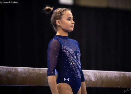
You forgot about New hampshires ombre pink leotard. I definetly think that is one of the best pink leotards