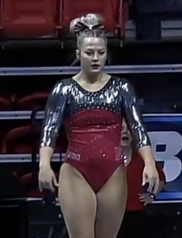
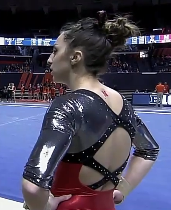
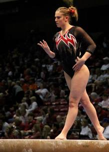
The criteria is the same as always. But to refresh your memory: up to three points for design; two points for fabric, sparkle, etc.; and two points for school spirit; three points for overall appearance. After assigning points to each category, we’ll tally up the scores and average them with the previous week’s. So by the end of the season, we’ll know for sure which team has the best leotards (according to us) and which teams not so much. We want to know what you thought too (or if we forgot one of your favorites from this weekend)! Let us know in the comments below or on Twitter. And make sure to vote in our poll at the bottom of the page to make your opinion heard in the fan vote, new this season.
everyone look at @UMichWGym stunning leo’s, they are gorgeous!! □ pic.twitter.com/RhycKvaKAv
— Gymnast Relate (@gymnastrelate) March 11, 2017
|
Caroline
Design: 2.7/3 Fabric/Sparkle: 1.8/2 School Spirit: 1.7/2 Overall Appearance: 2.7/3 Total: 8.9/10IN LOVE with this! The ombre is gorgeous, the use of the yellow is perfect, and the back section centered on the Michigan M is a perfect school spirit tribute. The swirls on the arms actually don’t bother me all that much? But I would’ve liked the design more if the swirlies were more purposeful. |
Christina
Design: 2.6/3 Fabric/Sparkle: 1.7/2 School Spirit: 1.9/2 Overall Appearance: 2.7/3 Total: 8.9/10YES! Finally a completely different look and design for Michigan, and I am so here for it. All the other leos were starting to blend together in my head, so this is very refreshing! I LOVE the ombre of course, and the yellow is incorporated very nicely in the leo. Maybe I could have gone with a little less swirlies, but it doesn’t bother me too much. Anyways, I really dig this one! |
Elizabeth
Design: 2.6/3 Fabric/Sparkle: 1.6/2 School Spirit: 1.7/2 Overall Appearance: 2.6/3 Total: 8.5/10Yes, Michigan! Finally a leotard that’s not over-the-top busy in its design! I love the shiny ombre and the rhinestone M and the yellow color on the sleeves. However, I’m not a fan of the weird huge block or yellow on the underpart of the wrists? It’s so random and doesn’t really go with the rest of the swirly design. Otherwise, love! |
|
Caroline
Design: 2.8/3 Fabric/Sparkle: 1.6/2 School Spirit: 1.7/2 Overall Appearance: 2.6/3 Total: 8.7/10So as a fellow graduate from a North Carolina school, I have to applaud UNC for finding a way to incorporate this unique, super recognizable pattern. Also, has any other school ever used argyle like this?? Major bonus points for originality and school spirit. As far as the design itself, it almost reminds me of a Christmas sweater, between the argyle and the way the stones are patterned. I almost wish they had worn it earlier in the season when it was still winter, but I guess it’s supposed to snow in NC this weekend so it counts, haha. I do wish there were more on the back, though. That’s my only complaint. |
Christina
Design: 2.6/3 Fabric/Sparkle: 1.5/2 School Spirit: 2/2 Overall Appearance: 2.5/3 Total: 8.6/10Yes, yes! I dig this. This looked great on TV, and it’s such a fantastic way to incorporate the pattern onto a leo. It works really well here. I love the designs with the sparkles as well. The only thing I have to say about this leo is that I really wish the back was less…. Black and empty. I would have loved to see the argyle pattern continue on there, or be included again. Or the NC logo? I don’t know, just something to fill in all this empty space. And maybe add some sparkles around the sleeves’ cuffs too? But other than that, it’s a really cool leo! |
Elizabeth
Design: 2.6/3 Fabric/Sparkle: 1.4/2 School Spirit: 1.9/2 Overall Appearance: 2.5/3 Total: 8.4/10I love that UNC incorporated the argyle pattern without it being super ugly. It’s actually the opposite of ugly! I liked where the pattern was placed on the top and sleeves and the classic black design with minimal rhinestones and sparkles gave it a nice, classic look. |
Photo gallery from tonight’s 197.60-196.10 win against the Mountaineers, by @stamey https://t.co/Y9h9qljbnq #GoGators pic.twitter.com/KxDi4JxwOB
— Gators Gymnastics (@GatorsGym) March 11, 2017
|
Caroline
Design: 2.5/3 Fabric/Sparkle: 1.8/2 School Spirit: 1.3/2 Overall Appearance: 2.7/3 Total: 8.3/10When I saw this leo in Gainesville, I literally gasped. The baby blue to Florida blue ombre is absolutely gorgeous, but what really makes this design for me is all the little details. There’s a sparkle star on the shoulder, the jewel-encrusted band along the line where mesh meets opaque fabric in the back, and the sparkly cuffs at the three-quarter sleeve… all the small embellishments just show such an attention to detail that really brings the design to a new level. |
Christina
Design: 2.6/3 Fabric/Sparkle: 1.8/2 School Spirit: 1.5/2 Overall Appearance: 2.7/3 Total: 8.6/10This is one of my favorite Florida leos. Ombre and teal, light blue colors? You got me. I love it. AND we are finally getting out of our dark blue/black leo rut, so all the points to you Gators. Moreover, I like the sparkle design on the front that creates a deep-V. The back mesh goes maybe a bit too low for my taste, but it’s not bothering me that much. A very lovely look overall. |
Elizabeth
Design: 2.5/3 Fabric/Sparkle: 1.4/2 School Spirit: 1.5/2 Overall Appearance: 2.6/3 Total: 8.0/10Best Florida leotard hands down. The blue ombre is stunning and the shimmeriness of it looks like a ballgown. The small rhinestone detailing is also nice, but I’m not a fan of the random stars? Do they have a purpose, or are they just random stars? Also, I wish the back was in a V rather than a scoop but these are minor complaints. |
Today’s leo! ✨ pic.twitter.com/S2VK9KpWPf
— Oklahoma Women’s Gym (@OU_WGymnastics) March 12, 2017
|
Caroline
Design: 2.6/3 Fabric/Sparkle: 1.7/2 School Spirit: 1.4/2 Overall Appearance: 2.7/3 Total: 8.4/10This is my favorite from Oklahoma so far, holy cow! I love the mermaid front and the lattice back, so big bonus for use of bling there. I can’t decide if I like the white sleeves or not? From the front it looks like a fine transition but from the back it’s a little more jarring. Otherwise a nice showing from the Sooners. |
Christina
Design: 2.4/3 Fabric/Sparkle: 1.8/2 School Spirit: 1.7/2 Overall Appearance: 2.4/3 Total: 8.3/10I really like this one from OU. The front is very mermaid-y almost, and I love the pattern the sparkles create. I guess that comment applied for the back as well. I do kind of wish the sleeves weren’t solid white…maybe that same crimson mesh that’s on the front? I’m not sure, but the crimson to white transition is a bit abrupt. |
Elizabeth
Design: 2.3/3 Fabric/Sparkle: 1.6/2 School Spirit: 1.7/2 Overall Appearance: 2.4/3 Total: 8.0/10I like the front design. It kind of reminds me of a mermaid for some reason? Anyway, it’s nice and obviously looks like an OU leo. But it also obviously looks like an OU leo. |
And Chelsea NAILS her last-ever vault in the Smith Center! Gorgeous Yurchenko 1.5 #RaiseHigh pic.twitter.com/1KqCOChLhZ
— GW Gymnastics Team (@GWGymnastics) March 12, 2017
|
Caroline
Design: 2.4/3 Fabric/Sparkle: 1.6/2 School Spirit: 1.6/2 Overall Appearance: 2.5/3 Total: 8.1/10I’m totally digging this neon thing! The contrast between the bright yellow, blue, and black (is that black or just a darker blue?) is very striking, and very different, which I love. I really dig the streaks of white in there too, it really breaks up the color blocks too. The sparkle is subtle, but it’s there, and I see a small GW logo on the arm? It checks all my boxes. Really lovely. |
Christina
Design: 2.4/3 Fabric/Sparkle: 1.6/2 School Spirit: 1.9/2 Overall Appearance: 2.5/3 Total: 8.4/10I like that GW has multiple ombre leo but they all are rather unique and use the ombre in different ways. This one almost looks like a slight watercolor brush along the side, and I love it. I could have done without the bright yellow on the right shoulder though, as it kinda ruins this whole gentle, watercolor-feel from the rest of the design. I wish it had been the same shade of darker ocean blue than the rest of the bodice. Other than that, great leo. And no hashtag as far as I can tell? So all the points to you GWU! |
Elizabeth
Design: 2.1/3 Fabric/Sparkle: 1.4/2 School Spirit: 1.8/2 Overall Appearance: 2.1/3 Total: 7.4/10I’m liking it! The color combo is on point and the use of neon yellow is a different addition I’m digging. However, the design is meh to me. It could have been better, but overall it’s a solid leo. And I do like how the ombre is kind of incorporated into the design. |
|
Caroline
Design: 2.3/3 Fabric/Sparkle: 1.6/2 School Spirit: 1.5/2 Overall Appearance: 2.2/3 Total: 7.6/10I do dig the belt thing! It’s a nice change from the sea of single-color bodices we often get. They get some nice school spirit in there too, as is typical for the Gymdogs. I would like just a little more sparkle maybe? And for the red to be a little brighter, I think that would really make it for me. |
Christina
Design: 2.2/3 Fabric/Sparkle: 1.4/2 School Spirit: 1.8/2 Overall Appearance: 2.4/3 Total: 7.8/10Overall, I like this, but I have to admit I’m not the biggest fan of that red mesh band going across the middle of the leo. That said, it’s quite original, and it does cut all the solid black, so that’s nice. Anyways, this is a decent leo from Georgia, quite original and shows off school spirit fairly well. |
Elizabeth
Design: 2.4/3 Fabric/Sparkle: 1.5/2 School Spirit: 1.8/2 Overall Appearance: 2.4/3 Total: 8.1/10I like the lattice design that the sparkles made and the mesh “strap” around the middle as it’s in a good and not awkward place. I also really like the Super G on the back and don’t think it’s too big since it’s really the only school spirit besides the colors. |
.@kennediedney matches her career high with a 9.95! pic.twitter.com/Tn8Kpiz8ep
— LSU Gymnastics (@LSUgym) March 11, 2017
|
Caroline
Design: 2.3/3 Fabric/Sparkle: 1.6/2 School Spirit: 1.5/2 Overall Appearance: 2.2/3 Total: 7.6/10This is a new design for LSU I think? I kinda love the structure the sparkle lines give it, and I don’t so much mind the black mesh so much. I could’ve used a little more bling, though, maybe like make the purple fabric glittery? And having the school name somewhere would boost those school spirit points too. |
Christina
Design: 2.3/3 Fabric/Sparkle: 1.4/2 School Spirit: 1.7/2 Overall Appearance: 2.2/3 Total: 7.6/10This is a cool one, although I am a bit indifferent to it. I like that it incorporates both school colors, but I am not really sure how to feel about the glittery black straps that go up the front, down the sleeves, and are also on the back. I just don’t know how to feel about this leo honestly. Maybe the black mesh around the collar is bothering me? But it really does look like some leos have solid black in that area, while others have black mesh?! Either way, I like the solid black better. |
Elizabeth
Design: 2.5/3 Fabric/Sparkle: 1.4/2 School Spirit: 1.7/2 Overall Appearance: 2.6/3 Total: 8.2/10I really like this one! Except whyyyyy are some of the leotards different? Myia and Ashleigh had almost solid black tops while everyone else’s were mesh. I don’t understand, and it’s bothering me. But that’s beside the point. I like the gold color and the black and sparkly strip down the arms. I also like how the design continues on the back yet isn’t super over the top. |
|
Caroline
Design: 2.2/3 Fabric/Sparkle: 1.8/2 School Spirit: 1.3/2 Overall Appearance: 2.1/3 Total: 7.4/10Ooh this is a pretty one. The use of sparkle is definitely my favorite part, but I also dig all the school spirit with PSU on the arm and their mascot on the back. I could’ve used a little more contrast, I know their other color is white, but even some white trim in there would’ve been a nice complement to the navy. Great showing for PSU. |
Christina
Design: 2.2/3 Fabric/Sparkle: 1.7/2 School Spirit: 1.8/2 Overall Appearance: 2.2/3 Total: 7.9/10I like this one. It’s very elegant and clean, and I love all the sparkles. I don’t have much else to say about it, honestly! School spirit is there, nice look. |
Elizabeth
Design: 2.3/3 Fabric/Sparkle: 1.6/2 School Spirit: 1.8/2 Overall Appearance: 2.4/3 Total: 8.1/10This is a good one! I like the criss-cross design on the front as it’s unusual and doesn’t make the front look weird at all. I also like the school spirit brought in on the back with the Nittany Lion logo but think it’s a tad too big. The amount of sparkle on the arms is good though! |
Zoe Draghi finishing off the meet with a STRONG routine– season-high and career-tying! #FiatLux ✨https://t.co/oQ16Ke7TR2
— Cal W Gymnastics (@calwgym) March 12, 2017
|
Caroline
Design: 2.1/3 Fabric/Sparkle: 1.5/2 School Spirit: 1.3/2 Overall Appearance: 2/3 Total: 6.9/10Alllll the Cal leos have run together for me now. This solid blue with a different sparkle pattern each week is getting old. I do like the V in the back with the Cal logo on it, and the sweetheart neckline in the front is nice, but I’m just kinda meh on this general look after so many weeks of it. |
Christina
Design: 2.3/3 Fabric/Sparkle: 1.5/2 School Spirit: 1.5/2 Overall Appearance: 2.4/3 Total: 7.7/10Pretty! I love the front with all the sparkles and the sweetheart/small V cut. The back is lovely as well although I do wish it contained as much sparkles as the front. This is a very elegant leo, but a hint of gold somewhere on there would have been nice. Still a lovely look overall! |
Elizabeth
Design: 2.4/3 Fabric/Sparkle: 1.5/2 School Spirit: 1.6/2 Overall Appearance: 2.3/3 Total: 7.8/10I really like the sparkle design on the front of this one but can’t explain why. And the back is nice with the little script Cal in the V. I also like the color and mesh and think it works well altogether. |
|
Caroline
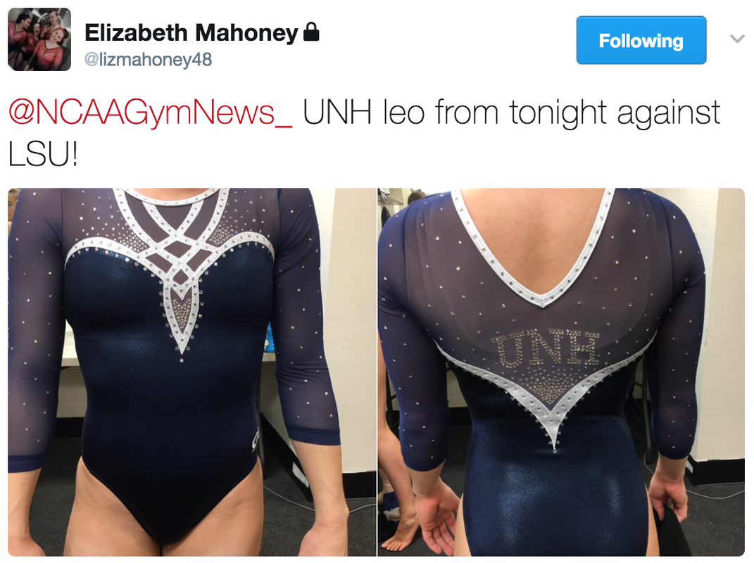
Design: 2.3/3 Fabric/Sparkle: 1.4/2 School Spirit: 1.6/2 Overall Appearance: 2.4/3 Total: 7.7/10Oooooh, I love this. I know other teams have similar or identical designs (Iowa State maybe? Or Stanford? Somebody with red, anyway.) but I love it in the blue/white combo. I would have preferred to have some more sparkle on the bodice, though it’s used very well on the arms and in the back. Overall an excellent showing for UNH. |
Christina
Design: 2.2/3 Fabric/Sparkle: 1.2/2 School Spirit: 1.5/2 Overall Appearance: 2.3/3 Total: 7.2/10Alright, nice one UNH. I like the overall design although I feel like we’ve seen it before on other teams, or something very similar at least, and I do wish this leo “popped” a little more. But all in all, a clean and elegant look. |
Elizabeth
Design: 2.2/3 Fabric/Sparkle: 1.2/2 School Spirit: 1.7/2 Overall Appearance: 2.3/3 Total: 7.4/10I really like this one! And it looked good on all the girls, and made them look super athletic even though it’s not an especially athletic design. Maybe the girls are just really athletic (shocker)! The color is nice, and I like the white design on the front. The rhinestones add another dimension to the arms. Overall, great! |
|
|
|
Caroline
Design: 2.4/3 Fabric/Sparkle: 1.7/2 School Spirit: 1.3/2 Overall Appearance: 2.4/3 Total: 7.8/10Is this really that same design a bunch of other schools have had recently? If so, this is by far my favorite iteration. I would’ve preferred the white trim to be yellow or gold, for school spirit reasons, but other than that, I love this leo! It’s got just enough sparkle in just the right places, the neckline is cool and different, and the contrast between the colors makes the trim ten times more visible. Definitely a plus, because the trim is really what makes this design. And I love the sparkle Hawkeye on the back! |
Christina
Design: 2.3/3 Fabric/Sparkle: 1.4/2 School Spirit: 1.3/2 Overall Appearance: 2.2/3 Total: 7.2/10This is that one leo that’s been going around so many teams lately and that we have already judged, in different colors of course. The overall design is alright, and I can get behind the thin white straps in the back, but they just look odd on the front. I do wish this leo had a little more pop to it, maybe by adding some gold somewhere. Overall though, it is an elegant one and it makes for a clean look. This one is probably one of my favorites from all the versions we’ve seen from other schools. |
Elizabeth
Design: 2.2/3 Fabric/Sparkle: 1.1/2 School Spirit: 1.7/2 Overall Appearance: 2.1/3 Total: 7.1/10I like this version of this design that a lot of teams have. Except Iowa missed a great opportunity for some black and yellow ombre sleeves! Like I’ve said before, I like the design, and the white really pops on the back. I also really like the Hawkeye logo on the back for a little added school spirit. |
#LEOWATCH Auburn is wearing its “Spiderman” leo for Senior Night #WarEagle pic.twitter.com/sXJ4zylniW
— Auburn Gymnastics (@AuburnGym) March 10, 2017
|
Caroline
Design: 2.4/3 Fabric/Sparkle: 1.3/2 School Spirit: 1.6/2 Overall Appearance: 2.1/3 Total: 7.4/10I actually kinda love the arm design and wish it continued into the bodice some! The orange and white contrast really nicely, and the sort of vein-y design is very different than anything else we typically see from Auburn, or any team, really. The blue bodice is fine, if a bit boring, and the school spirit is there, but this would’ve been infinitely better with more of that “Spiderman” design in the bodice of the leotard itself. |
Christina
Design: 1.9/3 Fabric/Sparkle: 1.3/2 School Spirit: 1.7/2 Overall Appearance: 2.0/3 Total: 6.9/10Spiderman leo? Because of the white lines on the sleeves kinda coming out of the wrists? Ok, maybe. Either way, this is alright, although a bit plain and ‘boring’ to me. I actually really do like the sleeves, but the rest of the bodice is just so simple. Even the back doesn’t have anything special about it. It is a clean look, I guess, but I’ve come to expect a bit better from Auburn. |
Elizabeth
Design: 2.1/3 Fabric/Sparkle: 1.3/2 School Spirit: 1.8/2 Overall Appearance: 2.2/3 Total: 7.4/10I like it more than most Auburn leos because it features more orange. And it pairs well with the white on the sleeves. There’s also just enough sparkly. Overall it’s a solid one! |
|
Caroline
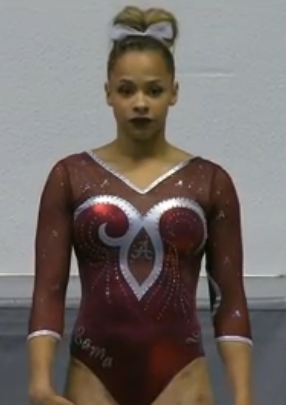
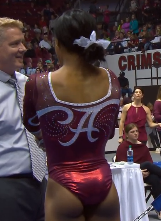
Design: 1.9/3 Fabric/Sparkle: 1.6/2 School Spirit: 1.6/2 Overall Appearance: 1.8/3 Total: 6.9/10Who decided to put the swirl on only ONE SIDE?? It looks so awkward that way, and really, that swirl was a poor design choice in the first place. Do we really need to define the shape of a boob that specifically? Though it would’ve been simpler, I would have liked this design a lot better if they’d duplicated the side without the extra swirl. Other than that, I actually kind of like it – love the Bama on the hip and the big A on the back, and the diamond in the center is kinda cool! Just a shame they had to make the awkward swirl. |
Christina
Design: 2.4/3 Fabric/Sparkle: 1.4/2 School Spirit: 1.9/2 Overall Appearance: 2.3/3 Total: 8.0/10I really like the front, but the back is ugh…. So Bama! The front reminds me almost of a pattern or a drawing you would see on stained-glass. In the back, the ‘A’ is nicely incorporated, but it just doesn’t go well with the front. And it’s so simple and boring compared to the front. Plus, we already have the ‘A’ essentially all over the leo. I think we got it! I guess all the points for school spirit? That random boob swirl on the front does bother me a bit as I like symmetry. |
Elizabeth
Design: 1.3/3 Fabric/Sparkle: 1.6/2 School Spirit: 1.9/2 Overall Appearance: 1.8/3 Total: 6.6/10Whyyyyy is there a random swirl hook on just one side? This leotard had such potential! But not my OCD-self just can’t stop looking at the anomaly… And I can’t focus on anything else. |
Tonight’s leo …. presented by @jazmynlisette. #AggiesAllTheWay #Breakthrough pic.twitter.com/fjLFcIin8g
— USU Gymnastics (@USUGymnastics) March 11, 2017
|
Caroline
Design: 2/3 Fabric/Sparkle: 1.2/2 School Spirit: 1.6/2 Overall Appearance: 1.9/3 Total: 6.7/10A lot of choices here confuse me. The line across the front of the leotard, sleeves and bodice and all, seems just awkward to me. It cuts off their body line, it doesn’t serve any purpose to structure the design, and it doesn’t seem to actually represent anything. All the ribbon lines also have the weird fish hook-y looking thing on them somewhere, which I don’t understand either. The design underneath the ribbons is fine. I actually like how the neckline of the silver kinda looks like a mountain range, very school spirit-y. If it had just been that, it may have been simpler, but I probably would’ve liked it better. |
Christina
Design: 1.6/3 Fabric/Sparkle: 1.0/2 School Spirit: 1.4/2 Overall Appearance: 1.5/3 Total: 5.5/10This is alright. I just feel okay about it; I don’t hate it but I also don’t love it. Once again I am not a big fan of silver on leos, and I do realize that’s one of USU’ colors, so it has to work with what it has. The leo and design feel very generic, and this is an average look to me. |
Elizabeth
Design: 1.9/3 Fabric/Sparkle: 1.4/2 School Spirit: 1.6/2 Overall Appearance: 2.0/3 Total: 6.9/10I kind of like this. I, of course, love the shiny silver color and it looks nice witht he white sleeves and touch of navy. The design is a bit random but overall it’s a nice one and better than some other USU leos. |
|
Caroline
Design: 1.6/3 Fabric/Sparkle: 1.3/2 School Spirit: 1.5/2 Overall Appearance: 1.5/3 Total: 5.9/10I don’t know if it’s just the screencaps we got but this is not flattering. Like at all. The faux neckline created by the band of sparkle is either too high or too low. It got caught in the middle and it doesn’t really define the gymnasts’ shape at all, it’s just kinda there, sitting across the chest awkwardly. I like the back, the back is cool, and I like the metallic silver, but the structuring of the front I just can’t handle, and there’s nothing else to look at on the front, which makes it even worse! |
Christina
Design: 1.8/3 Fabric/Sparkle: 1/2 School Spirit: 1.3/2 Overall Appearance: 1.7/3 Total: 5.8/10Ugh I’m so torn. I love the design in the back with the straps and all, but that silver is a no-no for me. I am not a big fan of the design in the front and I just don’t find it flattering. This is one of my least favorites leo of Nebraska honestly. I can’t get past that dark shiny silver. |
Elizabeth
Design: 2.0/3 Fabric/Sparkle: 1.4/2 School Spirit: 1.7/2 Overall Appearance: 2.3/3 Total: 7.4/10Nebraska always has the most interesting leos. Sometimes they fall flat, but I like this one! The tin-foil material on top is amazing. I want to stare at it all day. I also really love the back. It’s not too revealing or tight on the gymnasts muscles. And the silver and black pair well with the red and bring it all together. |
|
Caroline
Design: 1.8/3 Fabric/Sparkle: 1.4/2 School Spirit: 1.1/2 Overall Appearance: 2/3 Total: 6.3/10This isn’t my favorite, but it’s not terrible? It just isn’t very Utah to me. The squiggles are odd, very aggressive looking, and having mesh under them places some translucent fabric in some places you don’t exactly want to be translucent… the use of sparkle is nice and the contrast between the colors is nice but I’m just not really a fan. |
Christina
Design: 1.5/3 Fabric/Sparkle: 0.9/2 School Spirit: 1/2 Overall Appearance: 1.4/3 Total: 4.8/10Noooope. I have gotten used to so much better coming from Utah. This design just doesn’t do it for me, especially with the weird mesh cutouts underneath the red flamey stuff? That red flame stuff actually reminds me of something we would see in outfits worn in these dramatic wrestling games. Anyways, I just can’t get myself to like this one; it looks almost cheap and older. |
Elizabeth
Design: 1.8/3 Fabric/Sparkle: 1.3/2 School Spirit: 1.6/2 Overall Appearance: 1.9/3 Total: 6.3/10So when they lift their arms, the mesh part, while lined, goes right over their boobs, which gives it a weird look. I do like the red and white design on the front, but there just needed to be more of that design and less mesh. Maybe if the body was solid with the same mesh sleeves, it would have been better. |
TWO□ PERFECT□ TENS□
Peng-Peng Lee & Katelyn Ohashi of @UCLAGymnastics combine to deliver the @OpusBank #12Best Moment! pic.twitter.com/FEURZcHojQ
— Pac-12 Network (@Pac12Network) March 12, 2017
|
Caroline
Design: 1.8/3 Fabric/Sparkle: 1.4/2 School Spirit: 0.8/2 Overall Appearance: 1.7/3 Total: 5.7/10Okay, UCLA. We’ve had enough of the low-cut backless leos that aren’t conducive to bra-wearing. I love the sparkle pattern, though, and I do appreciate that they put UCLA on the hip this week. I think this leo would be more appropriate for like a blackout meet or something? But that still doesn’t help the potential for wardrobe malfunction. Yes, we like pretty leos, but we like functional ones too!! |
Christina
Design: 1.2/3 Fabric/Sparkle: 1.3/2 School Spirit: 0.3/2 Overall Appearance: 1.3/3 Total: 4.1/10Ugh, why is UCLA still using this leo? This is probably one of my least favorite of its. The front is like a nip slip waiting to happen, and the cut is just so low and awkward. You really don’t want your gymnasts to wear bras, do you? It’s such an unflattering look. The back doesn’t bother me as much, although it is very much open and meshy, maybe a bit too much. I also dislike that the sleeves are half mesh, half solid. School spirit is non-existent… except if we consider open backs and “you shall not wear a bra ever” UCLA gymnastics’ spirit? Because only they would wear this, obviously. Anyways, just throw this one in the back of the closet and let’s not talk about it ever again, shall we? |
Elizabeth
Design: 0.2/3 Fabric/Sparkle: 0.8/2 School Spirit: 0.4/2 Overall Appearance: 0.3/3 Total: 1.7/10NOPE. |

