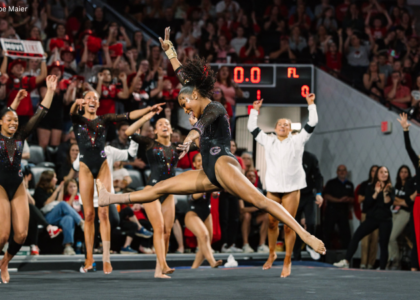
By Elizabeth Grimsley, Christina Marmet and Caroline Medley
|
|
|
|
Caroline
Design: 2.5/3 Fabric/Sparkle: 1.8/2 School Spirit: 1.7/2 Overall Appearance: 2.4/3 Total: 8.4/10 This ombre is gorgeous! The lighting in a lot of these is odd so it’s hard for me to tell that the bottom is blue and not black. Even so, I love the lines along the sleeves, accentuating the gymnasts’ lines, and the back is so cool! I wish we could find a better shot of it. Really pleased with this one from Arizona. |
Christina
Design: 2.8/3 Fabric/Sparkle: 1.9/2 School Spirit: 1.7/2 Overall Appearance: 2.8/3 Total: 9.2/10 Love! We originally didn’t have it in this week’s selection until I looked at Arizona’s Snapchat and freaked out about it to Caroline and Elizabeth. So here we are. The ombre is stunning with the red to blue and some subtle purple shade in the middle. I love the fabric of this leo, with this “shattered glass” look indeed that almost makes it look velvety at times… Except it’s even better! The back is super original and it works well with the rest of the leo. And to think we almost missed it! |
Elizabeth
Design: 2.9/3 Fabric/Sparkle: 1.9/2 School Spirit: 1.9/2 Overall Appearance: 2.8/3 Total: 9.5/10 I’m in love with this leotard. The red to blue ombre is stunning and I adore the shattered glass look the fabric has. I also love the arm design. It’s simple with the white and not overwhelming. It doesn’t make the leo too busy. Then there’s the back. Which I also love. The straps making the X with the band with the writing looks great. I can’t really find fault with these leos at all! But we all should have guessed the leo game would be stepped up majorly with Tabitha. |
OH MY! Watch this PEFECTION from @A_Bugs_Lyfe. pic.twitter.com/GeQaXAHCg9
— LSU Gymnastics (@LSUgym) March 5, 2017
|
Caroline
Design: 2.3/3 Fabric/Sparkle: 1.7/2 School Spirit: 1.7/2 Overall Appearance: 2.4/3 Total: 8.1/10 These looked so great in motion! The cascading waterfall of sparkles is my favorite, and I love the particular shade of purple they chose for this. The contrast between that and the gold is just spot on. Standing still, the back looks a little odd, and I would have loved a little LSU or Tigers somewhere. |
Christina
Design: 2.4/3 Fabric/Sparkle: 1.7/2 School Spirit: 1.8/2 Overall Appearance: 2.4/3 Total: 8.3/10I thought this one looked a lot better in motion and on video than in photos! I am really digging the psychedelic color mixing between the gold, purple and glitters happening on the sleeves, and the overall design is different and unique. I also like the sparkle rain on the front and back. Anyways, quite a nice leo from LSU. |
Elizabeth
Design: 2.6/3 Fabric/Sparkle: 1.6/2 School Spirit: 1.7/2 Overall Appearance: 2.7/3 Total: 8.6/10 The pictures don’t do this leo justice. It’s stunning in motion, and SO sparkly! I love the kind of boxy look to the design on the back and the way the gold was paired with the purple and black works really well. I also love how a significant design is made with rhinestones on the front and back, making those sparkles more important than just being there to… Sparkle. |
#Gophers junior @ademuse14 has today’s leo reveal! pic.twitter.com/mvC1JRoTCh
— Minnesota W Gym (@GopherWGym) March 4, 2017
|
Caroline
Design: 2.4/3 Fabric/Sparkle: 1.7/2 School Spirit: 1.6/2 Overall Appearance: 2.5/3 Total: 8.2/10 Two weeks in a row with some killer leos, well done, Minnesota! Love the subtle ombre sleeves, love the illusion of structure of the design on the bodice, love the sparkly M on the back. I just could’ve used a little more sparkle, and a little more yellow. That’s my only complaint. |
Christina
Design: 2.3/3 Fabric/Sparkle: 1.7/2 School Spirit: 1.8/2 Overall Appearance: 2.5/3 Total: 8.3/10 Minnesota is killing the leo game lately! I really like this one, although not as much as last week’s new leo that got first place with us. Again, gorgeous use of the subtle ombre and way to incorporate yellow onto a leo. The design in the front makes it looks very superhero-like, so I dig it. The back is a bit lackluster for me, and I wish it had also incorporated some yellow ombre, or some sort of golden/yellow accents like in the front. It is still a lovely design in the back though. Anyways, I still really like this one! Keep them coming, Gophers! |
Elizabeth
Design: 2.5/3 Fabric/Sparkle: 1.7/2 School Spirit: 1.7/2 Overall Appearance: 2.5/3 Total: 8.4/10 I love it! Maybe not quite as much as last week’s but it’s still a great one from Minnesota! The arm ombre blends the maroon and white together nicely. Although the column-type look kind of reminds me of a trident for some reason? But I do like the sparkly M on the back and the somewhat simple design surrounding it, bringing your full attention to the logo. |
Having the time of our lives. Emma blows it up with a 9.925. #GoBlue pic.twitter.com/sBg3l1BKSn
— Michigan Gymnastics (@UMichWGym) March 4, 2017
|
Caroline
Design: 2.3/3 Fabric/Sparkle: 1.8/2 School Spirit: 1.4/2 Overall Appearance: 2.6/3 Total: 8.1/10 Oooooh this is gorgeous! I love that the design is purely in sparkle, it really makes it stand out. I’m not really sure what it’s of, so some tenths off there, but I love the faux V-neck and the strappy back, that’s cool. I could’ve used a contrasting color somewhere (yellow??) but overall a lovely leo. |
Christina
Design: 1.9/3 Fabric/Sparkle: 1.8/2 School Spirit: 1.7/2 Overall Appearance: 2.1/3 Total: 7.5/10 I believe this is a new leo for Michigan? At least it’s one I can’t remember seeing before. This is nice, although I wish it had incorporated some more gold. The design in the back is reminiscent of a few other leos the Wolverines already have, with the small criss-crossing straps at the top. I guess this is becoming Michigan’s trademark. The front design is… interesting. I am not sure how to feel about the glittery flames in the chest area. I do like that the glitters below the flamey-flames end up shaping an “M” right below it, whether intentional or not. From far away though and in motion, it does look nice, and I actually kind of appreciate the front if I don’t pay too much attention to the details. The amount of sparkles on this leo is top-notch. But the weird side mesh cutouts?! Nope! |
Elizabeth
Design: 2.2/3 Fabric/Sparkle: 1.5/2 School Spirit: 1.6/2 Overall Appearance: 2.4/3 Total: 7.7/10 Yay for Michigan and new leos! I like this one, especially the mesh part on the sides. It blends in with the rest of the leo color but adds another dimension besides just blue. I also like how that mesh extends to the arms and kind of flips flops on the back. As for the front design, I love it. The way it kind of looks like flower petals gives the girls a nice shape when they wear it if that makes sense. As for the back straps, they’re definitely unusual! I could have used a hint of yellow or gold on it, though. It’s a bit “too” blue. Maybe if the sparkles were gold instead? |
Closer look at tonight’s NEW Maryland Pride leos! #FearTheTurtle pic.twitter.com/Y0Ynw43XGc
— Maryland Gymnastics (@TerpsGymnastics) March 1, 2017
|
Caroline
Design: 2.1/3 Fabric/Sparkle: 1.5/2 School Spirit: 2/2 Overall Appearance: 2.1/3 Total: 7.7/10 Now this is how you do the flag thing! Maryland has gone wrong with this idea many times, but I really like the way they did it this time around. It doesn’t take up the whole leo, the background is simple and clean, and the design is shiny and purposeful. Nicely done! |
Christina
Design: 1.5/3 Fabric/Sparkle: 1.5/2 School Spirit: 2/2 Overall Appearance: 1.7/3 Total: 6.7/10 Love the school spirit on this one, but this almost looks like one of those Nascar outfits with the banner on it? That’s the first thing that came to my mind when I saw it. That said, it is still a cool and unique way to incorporate the school’s logo onto the leo. The design itself is fairly simple though. I like that they didn’t want to overwhelm the whole thing too much, but the design is a bit too simple for me. I don’t know, it’s lacking… something, although definitely not any more sparkles. |
Elizabeth
Design: 2.4/3 Fabric/Sparkle: 1.7/2 School Spirit: 2/2 Overall Appearance: 2.5/3 Total: 8.8/10 I like this one! Better than its other Maryland pride leo (although I liked that one too). The black is classy, and I like how the Maryland flag is portrayed on the body with sparkles and rhinestones. It’s just enough bling without going overboard and being too in your face. But it’s also not too muted either. |
.@alexmcmurtry‘s vault in one word: PERFECT!@GatorsGym □‼️ https://t.co/UZE0t65B8p pic.twitter.com/dygjxDZ4Qr
— SEC Network (@SECNetwork) March 5, 2017
|
Caroline
Design: 2.3/3 Fabric/Sparkle: 1.3/2 School Spirit: 1.3/2 Overall Appearance: 2.4/3 Total: 7.3/10 So I love this design, the stained glass window idea is so creative and so well-executed. However, I’m kinda thinking along the same lines as Christina. I love the blue, but where are the other Florida colors?? This design would look even prettier with white and orange detailing thrown in – even more like a stained glass window. That’s what makes stained glass so pretty! Vibrant, contrasting colors! Anyway, I’ll get off the soapbox. Hoping to see more orange in the postseason leos pretty please. |
Christina
Design: 1.9/3 Fabric/Sparkle: 2.3/2 School Spirit: 1.2/2 Overall Appearance: 2.0/3 Total: 7.4/10 What does a girl have to do to get Florida to wear some white, or orange? Or anything besides dark blue? I sound like a broken record, as this is probably the fourth leo in a row we are judging that’s in this color shade and not much else. That said, I do like this leo and it shined so brightly on TV it was awesome. But I am very fond of the back with that diamond design. I do kinda wish the Gators had worn something else to make themselves stand out more in this crowded LSU arena. |
Elizabeth
Design: 2.4/3 Fabric/Sparkle: 1.4/2 School Spirit: 1.6/2 Overall Appearance: 2.2/3 Total: 7.6/10 This leo reminds me of a stained glass window with the diamond design. I like how the mesh sleeves differentiate the body from the rest of the leo. And it looks really great on the girls. However, like Christina said I wish another color was incorporated. I also love how we’re now basically begging for white and blue when that’s literally all Florida wore under the Rhonda-era. I can see why Jenny would want to change things up and leave her own mark though. |
Today’s Leotards! @NCAAGymNews_ □□ pic.twitter.com/TKQPTx8qXw
— WMU Gymnastics (@WMU_Gymnastics) March 5, 2017
|
Caroline
Design: 2/3 Fabric/Sparkle: 1.6/2 School Spirit: 1.2/2 Overall Appearance: 2.1/3 Total: 6.9/10 This is super minimalist, but I kinda dig it. It’s a clean, simple look, looks good on everyone, and it looks like it has a touch of school spirit on the sleeve there. The sparkle placement is great (though I could do with more on the back in a similar pattern) and the sleeves are almost ombre with their opacity, which is a creative way to stay on-trend. Overall a solid showing. |
Christina
Design: 2.3/3 Fabric/Sparkle: 1.7/2 School Spirit: 1.3/2 Overall Appearance: 2.4/3 Total: 7.7/10 WMU should get two extra bonus points simply for posting a photo front and back of its leo, AND tagging us in it! We love it. Anyways, this is a lovely leo! It’s quite simple but elegant at the same time. I love the front, and I wish the back contained just as much sparkles! |
Elizabeth
Design: 2.3/3 Fabric/Sparkle: 1.5/2 School Spirit: 1.6/2 Overall Appearance: 2.2/3 Total: 7.6/10 I like it! It’s super classy and not too over the top but also not boring! I like the sparkle detail on the neckline, the curved nature of the V and the rhinestone W on the sleeve. I also like the mesh arms. I do with the back had a few more sparkles, but overall it’s a great leo. |
Great shots from a great night in Memorial.
GALLERY: https://t.co/I1lfWXmcDW pic.twitter.com/3e90iaL895
— Kentucky Gymnastics (@UKGymnastics) March 4, 2017
|
Caroline
Design: 1.7/3 Fabric/Sparkle: 1.3/2 School Spirit: 1.6/2 Overall Appearance: 2/3 Total: 6.6/10 I’m kinda torn on this one. I love the back, I think the script Kentucky is gorgeous and the sparkle V is nice. However, the front, since it’s all white and has no contrast, even in the sparkle, leaves nowhere to hide. There are parts of it I like, but I just can’t do the white leo thing. |
Christina
Design: 2.4/3 Fabric/Sparkle: 1.7/2 School Spirit: 1.5/2 Overall Appearance: 2.4/3 Total: 8.0/10 I really like this one! It’s so rare to see an all-white leo, but Kentucky definitely pulled it off here. I like that it’s two different kinds of fabric yet all in white, so it provides some contrast between the upper body and sleeves, and the rest of the leo. I dig the blue border around the neckline and the cuffs, and the “Kentucky” in the back as well. Overall, a very nice look! |
Elizabeth
Design: 2.1/3 Fabric/Sparkle: 1.4/2 School Spirit: 1.7/2 Overall Appearance: 2.3/3 Total: 7.5/10 I liked this white leo much better than Oregon State’s. The slight shininess to it looked good and elevated it from a plain white leo despite there not being much extra sparkle or rhinestones. It also looked good on all the girls, a feat in and of itself for a white outfit. |
Today’s leo! ✨ pic.twitter.com/38LWaLENYb
— Oklahoma Women’s Gym (@OU_WGymnastics) March 4, 2017
|
Caroline
Design: 1.6/3 Fabric/Sparkle: 1.2/2 School Spirit: 1.8/2 Overall Appearance: 1.8/3 Total: 6.4/10 I can’t get behind this one. The line across the chest cuts off their lines completely, and the icicles dripping down look like slashes (or the Monster logo apparently?) and it’s not exactly the elegance we typically get from the Sooners. I like the ombre sleeves and the school spirit is excellent, but this is definitely not my favorite. |
Christina
Design: 1.9/3 Fabric/Sparkle: 1.5/2 School Spirit: 1.8/2 Overall Appearance: 1.8/3 Total: 7.0/10 I read somewhere (or somebody told it to me?) that this leo looked like the Monster logo, and now I just can’t unsee it. It is still a decent leo, although not one of my favorites from Oklahoma. The design is very unique, as we rarely see these sort of mesh stripes going vertically. The ombre on the sleeves and upper bodice is nice. I like the symmetry in the back as it uses the same “Monster” stripes as in the front. But yeah… I just have so many other OU favorites that this one doesn’t do much for me. |
Elizabeth
Design: 2.6/3 Fabric/Sparkle: 1.7/2 School Spirit: 1.8/2 Overall Appearance: 2.6/3 Total: 8.7/10 This is one of my more favorite OU leos. The icicle design is made to stand out with not just mesh but sparkles on top of it, making the design pop. The ombre sleeves are obviously a great touch, and the OU on the back plus Sooners on the arm is just the right amount of school spirit. I also like the thicker, white neckline with rhinestones. It makes it stand out more. |
|
Caroline
Design: 2.2/3 Fabric/Sparkle: 1.5/2 School Spirit: 1.7/2 Overall Appearance: 2.1/3 Total: 7.5/10 See, I don’t see ovaries, I see vines creeping up a wall, or butterfly wings, but that’s me. I really like it, it’s very symmetrical which is important for aesthetic, and the stoning is just excellent. I like the Alabama A in the center and the Bama on the hip. Definitely one of the better Bama leos. |
Christina
Design: 1.5/3 Fabric/Sparkle: 1.4/2 School Spirit: 1.6/2 Overall Appearance: 1.6/3 Total: 6.1/10 Elizabeth keeps calling this one the “ovaries leo,” and I hadn’t really seen it until now, but now I just can’t unsee it. I used to see sort of a butterfly, but now ovaries it is. Overall, it’s a nice leo but I have to admit I’m rather indifferent to it. I don’t love it, but I don’t hate it either. Just a bit plain for me, I guess. |
Elizabeth
Design: 2.3/3 Fabric/Sparkle: 1.4/2 School Spirit: 1.9/2 Overall Appearance: 2.3/3 Total: 7.9/10 Ahh yes, the ovaries leo. I first saw this one last year, honed in on the circles on the hips and could never look back. But, don’t get me wrong, I actually really enjoy the design. It’s elegant without being over the top, and I love the shade and texture of the crimson fabric used. But the design is supposed to be an elephant head, right? I literally just saw it. If so, A+ for school, spirit (that’s like the Stanford leo that’s supposed to be the tree that I didn’t notice until Casey pointed it out). Also, points for Bama on the hip. |
We caught up to @NastiaLiukin right before last night’s eighth-annual #NastiaCup. Read the Q&A here: https://t.co/OtIcKmRAgE pic.twitter.com/gNsyRcADs5
— USA Gymnastics (@USAGym) March 4, 2017
|
Caroline
Design: 2/3 Fabric/Sparkle: 1.4/2 Nastia Spirit: 1.7/2 Overall Appearance: 2.1/3 Total: 7.2/10 This is one of the better NLC leos we’ve had, and I really like the faux halter neck silhouette with the black fabric. The little straps in the back keyhole are cute, but I can’t do the random swirlies. We know how I hate the swirlies. |
Christina
Design: 1.3/3 Fabric/Sparkle: 1.0/2 Nastia Spirit: 1.8/2 Overall Appearance: 1.4/3 Total: 5.5/10 Meh. I actually liked the Junior one better, but I am still not a big fan of this black and hot pink combo. I (of course) liked the ombre sleeves, but the rest of the design is just blah to me. I’m just not a fan of how the black kinda going up their necks as if it were about to choke them? It’s hard to describe. And no to the swirlies. The back is also not doing it for me, especially with the two random pink straps going through the hole. Nah. |
Elizabeth
Design: 2.3/3 Fabric/Sparkle: 1.6/2 Nastia Spirit: 1.8/2 Overall Appearance: 2.3/3 Total: 8.0/10 I don’t like the junior one at all. The pink doesn’t do it for me. I looooved the senior one when I first saw it but then I got a glimpse of the back, and I didn’t like it to much anymore. Why’d you have to go and ruin it with the back?? But I do love the mostly black body, subtle ombre sleeves and the way the neckline design curves in some. |
□ Highlights from Auburn’s meet at Missouri #WarEagle pic.twitter.com/piZTcUhs9U
— Auburn Gymnastics (@AuburnGym) March 4, 2017
|
Caroline
Design: 1.9/3 Fabric/Sparkle: 1.5/2 School Spirit: 1.7/2 Overall Appearance: 2.2/3 Total: 7.3/10 This is OK. The lines draw focus to the school logo, which I like, and the sparkle is nice. I just wish there was more of it—more sparkle, more to the design, more something. I normally like the minimalist look but I dunno, this one falls flat-ish for me. |
Christina
Design: 1.7/3 Fabric/Sparkle: 1.6/2 School Spirit: 1.8/2 Overall Appearance: 1.8/3 Total: 6.9/10 Okay.. decent one although I’ve come to expect better from Auburn. This one is just very simple. I do like the off-center neckline, especially in the back, and the good mix of school colors. I could have done without the big orange blotch on the right side though. |
Elizabeth
Design: 1.8/3 Fabric/Sparkle: 0.9/2 School Spirit: 1.8/2 Overall Appearance: 1.9/3 Total: 6.4/10 I also like the off-centered neckline but the AU logo is way too big and orange for my taste. I do like the arm design, though. However, it’s just a typical Auburn leo for me. Navy body, some orange and white highlights, something referencing Auburn or Tigers or War Eagle. |
Tonights leos□□□ pic.twitter.com/bpYpwRuPHV
— MSU Gymnastics (@MSUgymnastics) March 5, 2017
|
Caroline
Design: 1.8/3 Fabric/Sparkle: 1.1/2 School Spirit: 1.2/2 Overall Appearance: 1.9/3 Total: 6.0/10 This would be way better without the collar, that just kinda ruins it for me. I like the V neck and the sparkle diagonals, and the sparkle at the end of the sleeve is really cool! But the reverse V and the collar just make it way too closed off for me, a little overly dramatic I guess. |
Christina
Design: 1.7/3 Fabric/Sparkle: 1.3/2 School Spirit: 1.5/2 Overall Appearance: 1.8/3 Total: 6.3/10To be honest, I liked the warmup/short-sleeves version for some reason. This reminds me of the black dominatrix-y leo that Catalina Ponor wore in Rio, but I do like this one better. The design is original, but I prefer the back a lot more than the front. I guess we don’t see the reversed V neckline on the front, if it makes sense. I don’t really like the glittery collar either, but I’m just not a fan of collared leos in general. All in all, this is a neat leo, but I can’t say I’m loving it. |
Elizabeth
Design: 2.6/3 Fabric/Sparkle: 1.5/2 School Spirit: 1.6/2 Overall Appearance: 2.4/3 Total: 8.1/10YAS. I saw this as a warmup and immediately knew I would like it. I personally am not a fan of the super high choker-style neckline, but it looks really great on the girls. I also really love the design on the body and how the mesh pairs with the solid fabric. It’s unusual but works for the leo design. I also really like the sleeve detailing and the Spartan head on the hip. |
Wearing our brand new leos today □□ pic.twitter.com/E6xzLiZniP
— UW Gymnastics (@UWGymnastics) March 5, 2017
|
Caroline
Design: 1.7/3 Fabric/Sparkle: 1.6/2 School Spirit: 1.8/2 Overall Appearance: 1.5/3 Total: 6.6/10In theory, this should be fine. In practice… not so much. It feels very outdated in the front, very blah and a little cheap. The back is lovely, especially with the smattering of sparkles there. I wish that there had been more to the front, a design behind or below the W maybe. |
Christina
Design: 1.5/3 Fabric/Sparkle: 1.6/2 School Spirit: 1.9/2 Overall Appearance: 1.6/3 Total: 6.6/10All the points for school spirit, I guess? I really do love the back, and the golden criss-cross over the purple mesh. The front is quite underwhelming to me. The design is just so simple. Overall it is a clean look, but I am a bit disappointed by this one since it’s a new leo for Washington. |
Elizabeth
Design: 1.8/3 Fabric/Sparkle: 1.3/2 School Spirit: 1.8/2 Overall Appearance: 1.9/3 Total: 6.8/10I like this but it looks kind of old school. There’s nothing wrong with that, but it’s definitely not in the style of a lot of new leos we’ve seen this season. I do like the shade of purple, though, and the huge W actually works for me. The addition of sparkle and mesh sleeves are a nice touch as well. |
Leotards for today’s meet! □⚔️ pic.twitter.com/2QwhGNVobb
— UB Gymnastics (@UBGymnastics) March 5, 2017
|
Caroline
Design: 1.5/3 Fabric/Sparkle: 1.3/2 School Spirit: 1.7/2 Overall Appearance: 1.8/3 Total: 6.3/10 They have their names on the back!!!! Like a real sports jersey, oh my goodness, I’m in love with that idea. Not every leo should have this, but every team should find a way to incorporate this. It has to make them feel individually recognized, which is always nice since NCAA is constantly so team-focused, and it makes it way easier for us to distinguish who’s who! As far as the rest of it, the lighting in this picture is kinda funky so it makes the fabric look more gold than silver. I kinda like the iridescence of it, very cool. I don’t like the squigglies in the armpit and the band in the back just looks out of place. I would have preferred a little criss-cross strappy thing like Michigan’s been doing recently, that would’ve been better. |
Christina
Design: 1.2/3 Fabric/Sparkle: 0.9/2 School Spirit: 1.2/2 Overall Appearance: 1.0/3 Total: 4.3/10Oof, this is a no for me. I don’t like grey on leos to start with, but this one is just way too overwhelmingly grey. The purple flames coming out of the sides are meh, but I do like the strap design in the back. I also weirdly like the idea of putting names of gymnasts on the back of leos, but I also don’t want to see every team do it either. I’m a bit undecided on that front, but it’s still cool and something we don’t see very often. Other than that… I just really don’t like this leo. |
Elizabeth
Design: 1.3/3 Fabric/Sparkle: 1.4/2 School Spirit: 1.7/2 Overall Appearance: 1.6/3 Total: 6.0/10 You know I love this silver color. But maybe there’s a bit too much of it here? I do like it paired with the purple and the font of Bridgeport is lovely. But one thing I love above all: the last name on the leo!!!!!!!! I love that. It’s not traditional by any means, but it’s a great personalized factor for each girl. The back strap I could take or leave, though. |