
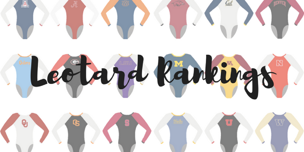
The criteria is the same as last season. But to refresh your memories: up to three points for design; two points for fabric, sparkle, etc.; and two points for school spirit; three points for overall appearance. After assigning points to each category, we’ll tally up the scores and average them with the previous week’s. So by the end of the season, we’ll know for sure which team has the best leotards (according to us) and which teams not so much. We want to know what you thought too (or if we forgot one of your favorites from this weekend)! Let us know in the comments below or on Twitter. And make sure to vote in our poll at the bottom of the page to make your opinion heard in the fan vote, new this season.
|
Caroline
Design: 2.6/3 Fabric/Sparkle: 1.7/2 School Spirit: 1.8/2 Overall Appearance: 2.4/3 Total: 8.5/10 This is a gorgeous leo! I love the designs on both sides, especially how the back is kind of a different take on your run-of-the-mill criss-cross. I think that’s an OU logo on the top of the sleeve, so there’s a little bonus boost in the school spirit department. However, I would love if future designs took into account the girls’ back muscles! I know when I buy competition dresses that I have to be conscious of back cutout designs because my muscles can bulge out, making it look like the dress is too small for me. Gymnasts have even bigger muscles than I do, so I would think they’d choose designs that flatter their musculature rather than make it bulge out. |
Christina
Design: 3/3 Fabric/Sparkle: 2/2 School Spirit: 2/2 Overall Appearance: 3/3 Total: 10/10Picture me doing the “10” hands while chanting “10.0, 10.0, 10.0” as I look at the photo of this leo. I ADORE it. The front is gorgeous and elegant. The back is intricate, unique, stunning and incredible. The arms are ombre!! I mean, what more could we want?! This leo has everything. Just send me one and bury me in it already because I die from happiness every time I see this beauty. |
Elizabeth
Design: 3/3 Fabric/Sparkle: 2/2 School Spirit: 1.9/2 Overall Appearance: 2.9/3 Total: 9.8/10I LOVE THIS LEO. From the ombre arms to the simple sparkles on the front to the absolutely STUNNING BACK. I find no fault with this leotard and would be perfectly fine with the team wearing it for every meet until the end of time. |
Today’s leos! #Huskers at Minnesota, 3 pm on Big Ten Network!#FuelTheFire #GBR □□□ pic.twitter.com/CDa3Kg4xDl
— Nebraska Women’s Gym (@HuskersWGym) February 11, 2017
|
Caroline
Design: 2.4/3 Fabric/Sparkle: 1.7/2 School Spirit: 1.5/2 Overall Appearance: 2.5/3 Total: 8.1/10 This is subtly different in the best way possible. I love the multiple keyhole design in the back and how sparkly it gets, and I like that they kept it simple in the front without going too plain. I could’ve done with a little more sparkle in the front, but I did like the big N on the hip. Also bonus tenth on school spirit for the temporary tattoo on the back of the neck rather than the face! |
Christina
Design: 2.4/3 Fabric/Sparkle: 1.5/2 School Spirit: 1.6/2 Overall Appearance: 2.5/3 Total: 8.0/10I saw it when Nebraska first posted it and was like “oooooh cool!” I really like the unique back, as this “bubble” design is really not something we see all the time. I also like that the sparkles seem to come out of it and spread out and away. The front is lovely as well, although a bit simple and with nothing special going on. But with such a unique back, you definitely don’t want to go too crazy in the front. Overall, a very nice leo that looks elegant and brings an interesting twist with the design. |
Elizabeth
Design: 2.5/3 Fabric/Sparkle: 1.7/2 School Spirit: 1.6/2 Overall Appearance: 2.5/3 Total: 8.3/10I really like this one. The red on the front is a nice color and not boring because of the sparkle around the neckline and shininess of the fabric. And I love the back. When we’ve got so many other leos with big holes and straps, this unique concept is a nice change. Plus the sparkle around helps the design stand out. A win for Nebraska for me! |
|
Caroline
Design: 2.3/3 Fabric/Sparkle: 1.5/2 School Spirit: 1.4/2 Overall Appearance: 2.3/3 Total: 7.5/10 This one isn’t my favorite in a still photograph, but on the broadcast it looked a lot better! It moved really well, and the diagonals are simple enough to flatter all shapes but complex enough to add a little depth to the look. I could use a little more sparkle in the red section, and of course a school logo of some kind, but other than that, I like it. Very simple and classic. |
Christina
Design: 2.4/3 Fabric/Sparkle: 1.7/2 School Spirit: 1.6/2 Overall Appearance: 2.5/3 Total: 8.2/10I really like this one. It’s simple and elegant, and I like that most of the design is going sideways. It creates nice lines. The balance between red, white and sparkles on the sides. It shows nice school spirit without it being too much “in your face.” |
Elizabeth
Design: 2.5/3 Fabric/Sparkle: 1.6/2 School Spirit: 1.7/2 Overall Appearance: 2.5/3 Total: 8.4/10I think this is my favorite Alabama leo. It’s similar to the BEAUTIFUL one OU’s Taylor Spears wore in beam finals at nationals a few years ago (sidenote: why haven’t the Sooners worn that since?!). Anyway, I love the basically completely sparkled-out sides and the white sleeves on crimson body is a nice combo as well. It’s simple yet all blinged out. |
|
Caroline
Design: 2.4/3 Fabric/Sparkle: 1.7/2 School Spirit: 1.3/2 Overall Appearance: 2.7/3 Total: 8.1/10This leo looked so cool in person! I loved how the sparkles really made the design rather than just using colored fabric. It makes a really stark contrast against the black bodice. The back is really cool too, with the V of sparkly mesh complementing the black section on the lower half. It looks very classic, but I also think it’s very safe. We haven’t seen Florida take any risks in their leos lately, and I would love to see that change. |
Christina
Design: 2.6/3 Fabric/Sparkle: 1.4/2 School Spirit: 1.2/2 Overall Appearance: 2.4/3 Total: 7.6/10Finally a new leo for Florida this season! I am a bit bummed it’s another with the same color combo of black and dark blue, but it is still very pretty. I like the design created by the sparkles in the front of the bodice, almost like a crown-ish design. It is very elegant, and I like the small details in there. The back is lovely as well with the V filled with sparkles, and the thicker black neckline. It worked well. Again, I wish the color combo was a bit lighter or just different, but it is still a very nice leo. |
Elizabeth
Design: 2.6/3 Fabric/Sparkle: 1.6/2 School Spirit: 1.5/2 Overall Appearance: 2.5/3 Total: 8.2/10I really like this one. You can definitely tell Jenny likes the blue and black combo more than Rhonda’s preferred blue and white one. I like the thicker neckline and cuffs on this one. It makes it look almost retro, and I’m all for it. I also like the simple but elegant rhinestone design on the body and the V plus the splayed out look on the front is neat as well. |
Tonight’s Leo! □❤️ #GeorgiaPride #UGAvsUF pic.twitter.com/JZmyaO8qrJ
— Georgia Gymdogs (@UGAGymnastics) February 10, 2017
|
Caroline
Design: 2.1/3 Fabric/Sparkle: 1.4/2 School Spirit: 1.8/2 Overall Appearance: 2/3 Total: 7.3/10So seeing this leo live was interesting, because the school logo across the front was not nearly as vibrant in person as it is in pictures. I do like the kind of retro banner graphic and the sparkly sleeves, but I could do with a little more bling on the bodice as well. The band around the back is interesting… I’m not sure how I feel about it? Like it looks fine in the picture but in motion it was a little more awkward. If the cutout ended at the band, I think it’d look a lot better. |
Christina
Design: 2.4/3 Fabric/Sparkle: 1.5/2 School Spirit: 1.9/2 Overall Appearance: 2.4/3 Total: 8.2/10I like this one, and I also love that it’s kind of a throwback leo too back to the 2008-2009 era of the good old days of Kupets, Taylor, Childs and others. I like that the Georgia white band goes all the way around to create a nice, different back design. School spirit is awesome on this one, again especially because it recalls old times. |
Elizabeth
Design: 2.4/3 Fabric/Sparkle: 1.5/2 School Spirit: 1.8/2 Overall Appearance: 2.6/3 Total: 8.3/10I like this one of Georgia’s, especially how the Georgia band goes all the way around the back and makes that little hole below it. However, the band does kind of look like a bandeau. But I’m not complaining too much. I like how the white fabric is shiny and the arms are more than plain black mesh. |
|
Caroline
Design: 2/3 Fabric/Sparkle: 1.4/2 School Spirit: 1.3/2 Overall Appearance: 2.1/3 Total: 6.8/10So I actually really like the mesh overlay and the sparkle in it… but the color of the belt seems off to me. I feel like it doesn’t match the color of the overlay and that it’s just off enough where it’s not even complementary anymore. I really like the ombre sleeves too, those are fun, and they make it so that the mesh overlay isn’t all one color, which is good. I would have liked to see a logo – LU or Lions or something like that. Maybe there’s one on the back, but I can only judge on what I’ve seen. |
Christina
Design: 2.3/3 Fabric/Sparkle: 1.4/2 School Spirit: 1.5/2 Overall Appearance: 2.4/3 Total: 7.6/10Overall, I like it and am a big fan of this overlay design, but I wish the black cutout on the front of the bodice was much higher. I love the color combo and the golden “belt,” but I really wish that neckline was higher and in a different shape. Maybe sweetheart or V, but this straight neckline is a bit odd and cuts the figure. Big fan of the ombre sleeves, of course. |
Elizabeth
Design: 2.1/3 Fabric/Sparkle: 1.3/2 School Spirit: 1.5/2 Overall Appearance: 2.2/3 Total: 7.1/10This is a similar design to Kentucky’s lace one—except it’s not lace, it’s mesh! So I already like it better. But I still don’t like the overlay look. I do like the thicker band connecting the two and the use of gold is nice and not too overpowering, which can happen when your school colors are close to yellow. |
9.850 for Emma on floor. #GoBlue pic.twitter.com/a17WFsfeU6
— Michigan Gymnastics (@UMichWGym) February 11, 2017
|
Caroline
Design: 2.1/3 Fabric/Sparkle: 1.2/2 School Spirit: 1.6/2 Overall Appearance: 2.2/3 Total: 7.1/10I feel like a lot of the Michigan leos are all starting to run together for me; many of them look very similar. That said, I thought the M on the back was kinda cool, and I’m always a sucker for the little lattice. It looks like there’s like two mesh stripes on the front of the bodice though, which is kinda weird to me. Why do they exist at all, and if they must exist, why put them there? |
Christina
Design: 2.3/3 Fabric/Sparkle: 1.1/2 School Spirit: 1.9/2 Overall Appearance: 2.2/3 Total: 7.5/10I really like the back with the “M” that fits well into the design of the leo and continues onto the sleeves. Points for school spirit for sure. I could have done without the small criss-cross straps to be honest, but it’s a minor detail. I like the V neckline in the front, especially with it highlighted in yellow. The big thing that bothers me in this leo is the weird mesh cutouts smack down in the middle of the leo, and I really wish it had been solid. At least the mesh continues onto the back, but I don’t find it very flattering on the front like that. |
Elizabeth
Design: 2.0/3 Fabric/Sparkle: 0.8/2 School Spirit: 1.9/2 Overall Appearance: 1.9/3 Total: 6.6/10I have to talk about the huge, bright yellow M designed into the back. It stands out SO much that it’s literally all I can look at when the gymnasts have their back to me. It’s way too big, way too bright and way too yellow that it detracts from the gymnastics actually being done. Also, the weird mesh cutouts around are a bit strange and random but my main issue is with the M. Kudos for the school spirit though. |
|
Caroline
Design: 2.1/3 Fabric/Sparkle: 1.3/2 School Spirit: 1.6/2 Overall Appearance: 1.9/3 Total: 6.9/10So I love the front, but it looks unfinished! The back has nothing, it’s like they forgot or didn’t have time or something! So that’s very disappointing. I love the design on the front, especially the way the sparkles radiate away from the school logo. I also like the sleeve design (I think that’s a Buckeye? Maybe?) but they didn’t need that many, I think just one on either the elbow or the bicep would’ve been fine. |
Christina
Design: 2/3 Fabric/Sparkle: 1.1/2 School Spirit: 2/2 Overall Appearance: 1.9/3 Total: 7.0/10I’m torn on this one. I really like the front, and the logo is just so shiny it looked great in motion and on video. You can basically see the girls from a mile away. The back is just so bland and simple though. Party in the front, nothing in the back. That back though is really what’s bugging me most… Just put something on there?! Maybe a touch of red sparkles, or any sparkles for that matter? The different sleeves are bugging me too, although not as much, especially since one is so busy and the other has nothing. I do like the cuffs with the touch of red sparkles though. |
Elizabeth
Design: 2.1/3 Fabric/Sparkle: 1.2/2 School Spirit: 2/2 Overall Appearance: 1.9/3 Total: 7.2/10So I like parts of this one and am meh on other parts. I love the amount of sparkle and school spirit on the front. And the jewels on the cuffs are nice too. The two different arms though are weird. Plus, did we really need five huge not-actually-a-weed-leaf-but-looks-like-a-weed-leaf leaf on the sleeve? I would have liked this leo SO much better if the arms were plain black mesh and didn’t have all the extra bling on them. The back, though, it a bit plain for my taste. I like the criss-cross straps but with there was more to the back as a whole. Maybe making the straps red or something? But overall, this was a solid one for me minus the sparkly leaves on one arm. Although, you can’t get more school spirity than a giant Ohio State logo AND leaves down the arm. |
|
|
|
Caroline
Design: 2/3 Fabric/Sparkle: 1.6/2 School Spirit: 1.2/2 Overall Appearance: 2.3/3 Total: 7.1/10This is kind of a different one for Iowa State, which I really like! It is mostly red, which makes it hard to distinguish it as an ISU leo (rather than, say, an OU one?) but they do throw in that subtle yellow stripe along the neckline. I love the sparkle design on the front and the little criss cross, but I wish that it didn’t have the white background part in the back? If they needed the background, I wish they’d done like a mesh rather than a white. |
Christina
Design: 1.8/3 Fabric/Sparkle: 1.2/2 School Spirit: 1.3/2 Overall Appearance: 1.9/3 Total: 6.2/10I really like the front, but just can’t get myself to appreciate the back. So overall, I’m a bit “meh” on this one. The front is lovely, and I love that the sparkles appear to continue the neckline bands’ design if that makes sense. I should like the back in theory because I like the criss-cross/lattice design, but the white doesn’t do it for me. There is too much of it, and it just doesn’t give a clean look to the entire thing. I am also bothered by the yellow neckline. It feels very random and doesn’t stand out *enough* in my opinion. Either go all in with the yellow, or don’t include it. |
Elizabeth
Design: 2.3/3 Fabric/Sparkle: 1.3/2 School Spirit: 1.4/2 Overall Appearance: 2.3/3 Total: 7.3/10I really like this one. It’s simple but not boring. I love the lattice like design on the back and the continuation on the front but not going all out with it. I do wish the neckline wasn’t yellow/gold, though. I know they were trying to bring in the school colors but it just seems random. |
|
Caroline
Design: 2.5/3 Fabric/Sparkle: 1.2/2 School Spirit: 2/2 Overall Appearance: 2.2/3 Total: 7.9/10This is the leo with the bronco on it! I love the way they incorporate the bronco like it’s stampeding, with like the flames moving forward. All the school spirit points for you! I would have loved more sparkle though – always want more sparkle. |
Christina
Design: 1.8/3 Fabric/Sparkle: 0.7/2 School Spirit: 1.9/2 Overall Appearance: 1.7/3 Total: 6.1/10I understand Boise State has some tough school colors to work with, so I guess this is a decent leo with that in mind. The design is nothing new with all the flamey bands going on. I do appreciate that they made blue and white the dominant colors, and not the orange. I also think it’s pretty neat that this leo incorporates the mascot, but to be honest I hadn’t even noticed at first. This leo isn’t very memorable to me although school spirit definitely is there. |
Elizabeth
Design: 1.9/3 Fabric/Sparkle: 0.9/2 School Spirit: 1.9/2 Overall Appearance: 1.8/3 Total: 6.5/10Lol. Well, it is a neat way to incorporate the mascot into the design. And I like this blue, orange and white version than its exact same variation in black and blue. School spirit is at an all-time high but that’s where it ends for me. Boise is at a disadvantage with its school colors from the start though. |
.@erichardson459: rock. solid.
(Watch us now on Pac-12 Bay Area/Arizona)https://t.co/PvgA2heDhe
— Cal W Gymnastics (@calwgym) February 11, 2017
|
Caroline
Design: 2.2/3 Fabric/Sparkle: 1.4/2 School Spirit: 0.9/2 Overall Appearance: 2.2/3 Total: 6.7/10This leo falls into the UCLA trap of “I’m a pretty navy leo, what team do I belong to?” So low marks on school spirit there. However, love the rhinestone design on the front, criss cross in the back is big enough to merit calling it a design, though the back could’ve been a great place to put “Cal” or “Bears” or something. |
Christina
Design: 2.2/3 Fabric/Sparkle: 1.3/2 School Spirit: 1.0/2 Overall Appearance: 2.2/3 Total: 6.7 /10I loved it when I saw the back at first, then the gymnasts turned around and was a bit disappointed by the front. I do love the thick criss-cross straps in the back, and the sparkles on the front are nice. I like that they kind of follow the same criss-cross pattern as in the back. Overall I really do wish it contained some sort of golden accent, maybe on the front or something. The navy blue is lovely, but it’s definitely missing a bit of gold somewhere! |
Elizabeth
Design: 2.2/3 Fabric/Sparkle: 1.2/2 School Spirit: 1.3/2 Overall Appearance: 2.1/3 Total: 6.8/10Like a lot of other Cal leos, I really like the back on this one and the front is less nice comparatively. The leo as a whole is a tad one-note as well. I wish another color besides navy was brought in to complement it. But on the back, I like the thicker criss-crossing straps as we normally see thin ones. |
|
|
|
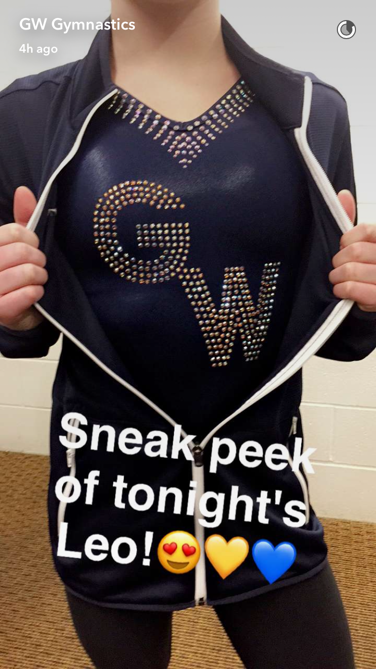
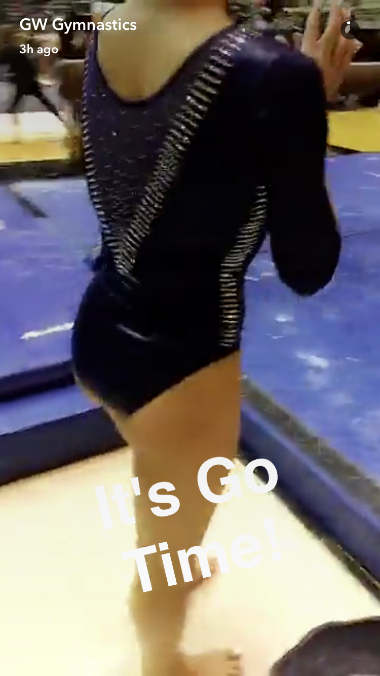
Caroline
Design: 2.2/3 Fabric/Sparkle: 1.6/2 School Spirit: 1.4/2 Overall Appearance: 2.1/3 Total: 7.3/10Again, very classic look, but GW saves itself from the nondescript navy leo problem by putting their logo front and center, which I love. The back is really cool too, and I kinda like that they used the majority of their sparkle on the back, which is out of the ordinary for your typical leo. Standing out and being different gets you points in my book! |
Christina
Design: 1.5/3 Fabric/Sparkle: 0.9/2 School Spirit: 1.3/2 Overall Appearance: 1.3/3 Total: 5.0/10Hmmmmm, I’m not a huge fan. It’s quite the change from what we are used to seeing from GWU, and the choice of this dark navy blue is interesting. I like the V in the front, and the deep V in the back, especially with all the sparkles. That said, the thick bands of glitters just reminded me of rows of staples. That “staples” design was also straight down onto the sides, and that was just weird. Not digging it. I am also not loving the gigantic, glittery “GW” on the front. So yes, this is different, but I’m not loving how it was done. |
Elizabeth
Design: 2.0/3 Fabric/Sparkle: 1.3/2 School Spirit: 1.4/2 Overall Appearance: 2.0/3 Total: 6.7/10I liked this one! It’s super athletic looking and simple yet not boring. I love how the thick band of rhinestones created the deep V in the back and the same rhinestone concept it on the front for the GW. The navy is also nice and all the girls looked good in it. |
#BEAM @PackGymnastics #GoPack pic.twitter.com/zAajYY47tS
— Larry Blankenship (@Lblankman) February 11, 2017
|
Caroline
Design: 2.3/3 Fabric/Sparkle: 1.2/2 School Spirit: 1.4/2 Overall Appearance: 2/3 Total: 6.9/10NCSU took a big risk with this design, and I actually really like the image on the bodice. I believe the zig-zag is actually supposed to look like something’s been ripped open? Like the leotard was all red, and the wolf (since their mascot is the Wolfpack) tore it open to reveal the white? Or maybe it’s like fur? I dunno, I’ve just seen it before in NCSU graphics and it has something to do with their mascot, which is why I gave them a few more tenths on school spirit for more than just school colors. I do think that the sleeves could’ve just been one color. Matching them to the sides of the bodice just overcomplicates the design. Also, I can tell that there are a lot of stones, but they don’t really seem to catch the light like other leos have? So maybe a different kind would’ve been better. |
Christina
Design: 1.8/3 Fabric/Sparkle: 1/2 School Spirit: 1.1/2 Overall Appearance: 1.8/3 Total: 5.7/10At first sight, I liked it, but the more I look it, the more I really how busy it is. The design has potential as it’s not something we see often, but it’s a bit much here. The zig-zag design is alright but I wish it was done in a more subtle way, I guess. I get that the sleeves match the colors of the leo’s side they are on, but I wish the sleeves were just the same black mesh as the rest of the upper bodice. I mean, overall it’s not as bad as I make it sound I guess, but it’s not one of my favorite leos. |
Elizabeth
Design: 1.8/3 Fabric/Sparkle: 0.9/2 School Spirit: 1.2/2 Overall Appearance: 1.8/3 Total: 5.7/10This leo has too many bold things going on in the same leo. The black zig-zag is too exaggerated, the divided sections too solid and stand out a bit too much and the black mesh with the sparkles just adds in another layer to an already cluttered and busy design. |
Christopherson’s 9.800 marks her third 9.8+ tally on the event this season!#WeWill
□: @Pac12Network AZ pic.twitter.com/2YYw0TMbzW— ASU Gymnastics (@ASUGymnastics) February 11, 2017
|
Caroline
Design: 1.7/3 Fabric/Sparkle: 1.3/2 School Spirit: 1.5/2 Overall Appearance: 1.8/3 Total: 6.3/10So this leo confuses me. The split bodice between black and white isn’t inherently bad, but it’s not just a color difference, it’s a fabric difference too. There’s too much disconnect. There’s also the inability to distinguish what color the sleeve is, which is either a problem with the fabric or the lighting… or both? I do like the pitchfork logo – though it’s an odd logo, I like that they’re using their school spirit. |
Christina
Design: 1.4/3 Fabric/Sparkle: 1.0/2 School Spirit: 1.5/2 Overall Appearance: 1.5/3 Total: 5.4/10Noooope. I don’t find it flattering at all, and that separation between black and white in this shape and kind of in the middle of the chest really doesn’t work. I believe this is an older leo from ASU (right? Maybe I’m imagining it), but ASU has me used to gorgeous, dreamy Arizona sunset ombre nowadays, so this is a disappointment. The giant glittery pitchfork on the front doesn’t work for me either, and is just too much. Overall, the entire design could have been done much better. You would think you can’t go wrong with black, white and glitter, yet here we are. I’m really having trouble getting behind this leo. |
Elizabeth
Design: 1.7/3 Fabric/Sparkle: 1.1/2 School Spirit: 1.5/2 Overall Appearance: 1.7/3 Total: 6.0/10I don’t like this one as much as the newer ASU leos, but it’s still nice and a lot tamer than we’ve seen from the team in the past. I couldn’t tell when watching the broadcast whether the color was white or a very light pink, so that’s an issue for me. I do like the rhinestone pitchfork and ASU on the back though. |


Regarding the OU leo Taylor Spears wore at beam finals in 2014; there were only 1 or 2 leos made, not enough for the whole team. It was a sample. I too loved that one and was hoping they would wear it. : ( But I decided they have so many other ones that I love too so I don’t have to be too disappointed. ; )