
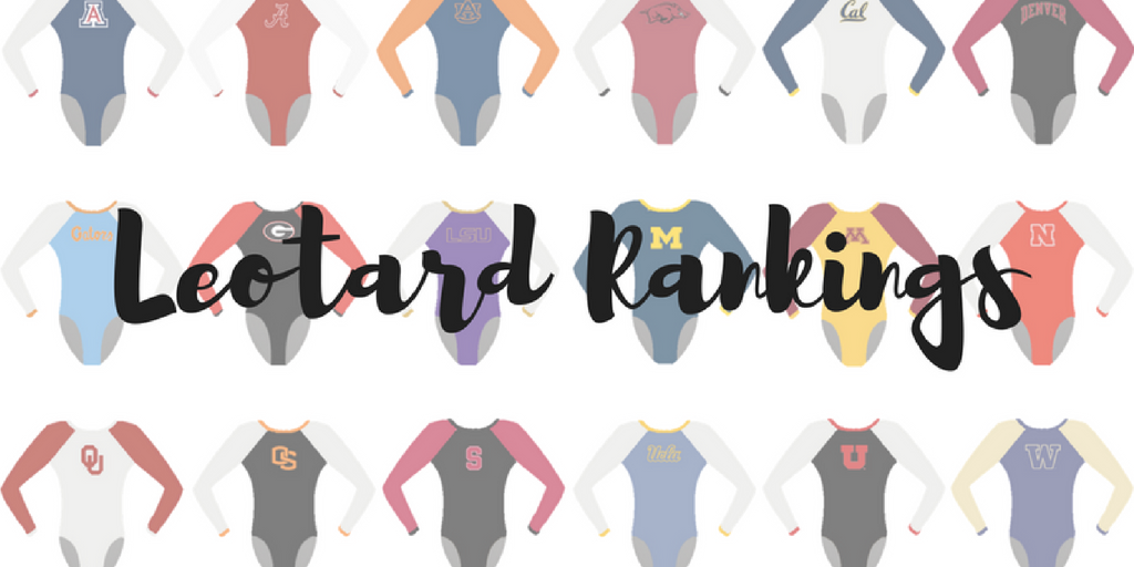
The criteria is the same as last season. But to refresh your memories: up to three points for design; two points for fabric, sparkle, etc.; and two points for school spirit; three points for overall appearance. After assigning points to each category, we’ll tally up the scores and average them with the previous week’s. So by the end of the season, we’ll know for sure which team has the best leotards (according to us) and which teams not so much. We want to know what you thought too (or if we forgot one of your favorites from this weekend)! Let us know in the comments below or on Twitter. And make sure to vote in our poll at the bottom of the page to make your opinion heard in the fan vote, new this season.
New leotard tonight □□ pic.twitter.com/PyxeEunwdf
— ASU Gymnastics (@ASUGymnastics) January 21, 2017
|
Caroline
Design: 2.5/3 Fabric/Sparkle: 1.9/2 School Spirit: 2/2 Overall Appearance: 2.7/3 Total: 9.1/10 So besides looking like a gorgeous Arizona sunset, this leo also incorporates the school’s colors, an elegant crisscross and waterfall design in sparkles, and and identifies itself as an ASU design. This is the kind of leotard innovation we are looking for!! |
Christina
Design: 2.6/3 Fabric/Sparkle: 1.8/2 School Spirit: 1.8/2 Overall Appearance: 2.6/3 Total: 8.8/10 I really really like this one! The sleeves look like an Arizona sunset, and the color shades on the entire leo are just gorgeous and represent the school colors so well. The assortment in the sparkles is actually really cool and unique. Very simple design but oh so well done! One of my favorites this week. |
Elizabeth
Design: 2.9/3 Fabric/Sparkle: 2/2 School Spirit: 1.9/2 Overall Appearance: 2.9/3 Total: 9.7/10 THIS LEOTARD THO. Arizona State is absolutely killing the leo game this year. I couldn’t care less about the gymnastics part if the leos keep looking like this. Christina and Caroline described it perfectly when she called the arms an Arizona sunset. I LOVE the incorporation of yellow with the red in the sleeve ombre. The rhinestone design on the front and back are also the perfect amount and not overwhelming in the slightest. And the black body blends and goes well with the rest of the leo. I have VERY little I don’t like about this one. I might have even given it above a 10 if I could. |
|
Caroline
Design: 1.9/3 Fabric/Sparkle: 2/2 School/Theme Spirit: 2/2 Overall Appearance: 2.3/3 Total: 8.2/10 Okay, so while I love the heart and the theme and the whole idea of this leo… I actually expected more? I don’t know, I had hoped for a full rainbow leotard, or like a larger section of rainbow on the leo rather than just the little tribute heart. Don’t get me wrong, I love the tribute heart, and I love their LOVE tattoos too! I was just hoping for more. |
Christina
Design: 2.8/3 Fabric/Sparkle: 1.4/2 School/Theme Spirit: 2.0/2 Overall Appearance: 2.8/3 Total: 9.0/10 This leo is beautiful, not only in the design but also in what it represents. It is simple, yet so very elegant. I was worried UNC would go all crazy on the rainbow, and that we would have a super colorful and maybe a “too much” leo. Thankfully, it wasn’t the case. I love the V-neck shape in the front, the subtle touch of North Carolina blue around the collar, and of course the rainbow heart on the back. Mayybe I’d have liked to see a little more sparkles at the line between the white and the black, but other than that, it’s just lovely. |
Elizabeth
Design: 2.7/3 Fabric/Sparkle: 1.6/2 School/Theme Spirit: 2.0/2 Overall Appearance: 2.8/3 Total: 9.1/10 I LOVE this leo. Maybe not for the design per say but for the message. It’s incredible for UNC to be supporting LGBTQ rights, especially as a public university in North Carolina. While the rainbow design isn’t a huge part of the leotard, I think that’s OK because it’s there. But as for the actual leo, I do like it a lot. The white and black V on the front actually looked quite nice on all the girls and the small touch of school spirit to go with the rainbow heart on the back made the look complete. |
|
Caroline
Design: 2.4/3 Fabric/Sparkle: 1.9/2 School Spirit: 1.4/2 Overall Appearance: 2.7/3 Total: 8.4/10This is so elegant and flattering on all the gymnasts, I love it! The circle neck styling, the belt of sparkle and the mesh sleeves all come together to really shine both in action and on the broadcast. I just wish there was a UK somewhere more evident (if there even is one at all) and maybe another color besides just the blue. |
Christina
Design: 2.7/3 Fabric/Sparkle: 1.7/2 School Spirit: 1.5/2 Overall Appearance: 2.8/3 Total: 8.7/10This is prettyyyyyyy. I really like the overall design, the round neckline and love that the front matched the back perfectly. I am a big fan of the sparkles “belt” going across the back and thought it looked great. Overall a super pretty leo that I thought looked good on everybody. |
Elizabeth
Design: 2.7/3 Fabric/Sparkle: 1.8/2 School Spirit: 1.6/2 Overall Appearance: 2.7/3 Total: 8.8/10 Now this is a leo you wear to set a program record! Kentucky not performed exceptionally in front of a sold-out crowd at its Excite Night, it looked good doing it. The design on the front made the gymnasts look elegant and athletic while. There wasn’t much change in color, but it was enough to allow the design to stand out but not be overwhelming. Overall, I liked this one, and it was a step up from previous weeks. |
Definitely an experience I will never forget. 11,532 people in the stands watching TWU gymnastics. pic.twitter.com/a3r4RpKbnZ
— Schyler Jones (@schyler_jones) January 22, 2017
|
Caroline
Design: 2/3 Fabric/Sparkle: 1.6/2 School Spirit: 1.8/2 Overall Appearance: 2/3 Total: 7.4/10 My biggest problem with this leo is that it’s busy. It’s hard to see the front in these pictures, but I would love it so much more if it didn’t have the sticky-uppity bit in the middle of what looks like a V silhouette, which I really like. I also dig the Texas silhouette, that’s a very creative way to represent their school pride. I actually don’t mind the side diamond cutouts though, I think they add some depth to the overall look of it, especially on screen. |
Christina
Design: 2.5/3 Fabric/Sparkle: 1.7/2 School Spirit: 1.8/2 Overall Appearance: 2.4/3 Total: 8.4/10 There are a lot of things going on in this leo, but overall I do like it. I like the ombre shade and the design in the front. I also like the shape of Texas in the back, and it’s a fun way to show school spirit. The only thing bothering me with this one are the side diamond designs. I am never a fan of any sort of cutouts or design stuff on the ribcages like here, and I found that it disrupted the whole design when viewing it from the back. Other than that, it’s a nice leo with lovely shades of red. |
Elizabeth
Design: 2.8/3 Fabric/Sparkle: 1.9/2 School Spirit: 1.9/2 Overall Appearance: 2.9/3 Total: 9.5/10 I loved this leo the moment I saw it when I tuned into the LSU meet! The color is LOVELY, the side design isn’t awkward, the ombre is a nice blend and the school spirit, including the shape of Texas, is just enough. Well done, TWU! |
|
Caroline
Design: 2.3/3 Fabric/Sparkle: 1.6/2 School Spirit: 1.8/2 Overall Appearance: 2.5/3 Total: 8.2/10 I love that Auburn is finally taking on the tiger stripes in a fashionable way! I love how they incorporate it into the ombre and how the sparkles help accentuate the stripes. I actually like the use of the darker blue on the sides and the light almost-white on the front; I feel like the all the colors blend really nicely, and I love the sleeve cuff design. I would’ve liked a more prominent Auburn logo somewhere and the lighter color on the back doesn’t blend as well, but other than that I really like this. |
Christina
Design: 2.4/3 Fabric/Sparkle: 1.4/2 School Spirit: 1.9/2 Overall Appearance: 2.4/3 Total: 8.1/10 This one is nice, and I really like the tiger stripes design incorporated into the ombre accents. Auburn has tough school colors to wear, but it did a fine job with this leo. Just like with TWU, I am not a fan of any sort of side design, and this one on the right side is no exception and it’s just a really random, small cutout that I’m not a fan of. Other than that, I fairly like this leo and do like that the colors are subtle. |
Elizabeth
Design: 2.4/3 Fabric/Sparkle: 1.4/2 School Spirit: 1.8/2 Overall Appearance: 2.5/3 Total: 8.5/10 This was another of Auburn’s new leos and I applaud it for continuing to break out of the navy-body-some-orange-and-white-accents shell. I’m not typically a fan of the printed-on-design look but this worked pretty well. I also like the side design but not completely. It needed something more. But I do like how as a whole it looked like Tiger claw marks on the leo, so A+ for school spirit because what says “Go team!” like being mauled by your mascot? |
Memory Shettles is starting the year off right on bars, how about that stick!!!!! #TbirdNation pic.twitter.com/2nJ0ByKyC8
— Scotty Bauman (@ScottyBauman) January 21, 2017
|
Caroline
Design: 2.4/3 Fabric/Sparkle: 1.7/2 School Spirit: 1.3/2 Overall Appearance: 2.6/3 Total: 8/10 I love this leo! The lace arms are a cool touch, the red is nice and vibrant, and the sparkles on the front really add some extra oomph. My one issue is the weird hole in the back – it’s like a semicircle rather than an actual round circle, which bothers my OCD a little bit, but that’s a matter of personal taste. I don’t think having the giant school letters right above it helps the aesthetic either, though I appreciate their inclusion. |
Christina
Design: 2.3/3 Fabric/Sparkle: 1.6/2 School Spirit: 1.4/2 Overall Appearance: 2.2/3 Total: 7.5/10I guess Elizabeth and I are switching places this week on the lace point of view! I usually do like lace leos, but I’m having trouble really liking this one, particularly the grey-ish shade. I do like the front of the leo with the V-neck and all the sparkles, and the cutout in the back was nice although I wished the back matched the front a bit better (maybe keep the V-neck theme going?). |
Elizabeth
Design: 2.5/3 Fabric/Sparkle: 1.7/2 School Spirit: 1.6/2 Overall Appearance: 2.6/3 Total: 8.4/10 This is my favorite of the lace leo designs from all the schools. The lace actually looks good in this greyish color and pairs well with the red. I also like that the rest isn’t just plain like all the other lace leos. The back cutout adds another dimension to the design that works, and I thought it looked nice on all the gymnasts wearing it. |
|
Caroline
Design: 2.5/3 Fabric/Sparkle: 1.6/2 School Spirit: 1.7/2 Overall Appearance: 2.6/3 Total: 8.4/10 I love the retro feel of the front of this leo, but I feel like the back doesn’t really match the same tone. The front logo almost reminds me of like a ‘50s logo for like dish detergent or something, where they’re trying to indicate that something shines. Personally I find it super cute, but maybe that’s just me. The back is interesting, which usually is a bonus for me, but it makes her back look boxy (unsurprisingly, considering the trapezoidal mesh cutouts) and the sparkles only further emphasize that. |
Christina
Design: 2.4/3 Fabric/Sparkle: 1.3/2 School Spirit: 1.5/2 Overall Appearance: 2.4/3 Total: 7.6/10 This is a bit underwhelming to me. I adore the back, but the front is too simple and plain for me. The “Cal” looks nice, but it’s just kinda there. I feel like something is missing to the front of this leo, maybe a more intricate pattern, more sparkles, some kind of color shading… something. |
Elizabeth
Design: 2.5/3 Fabric/Sparkle: 1.4/2 School Spirit: 1.4/2 Overall Appearance: 2.4/3 Total: 7.7/10 I first only saw the front of this leo and was like, “Booooorrinnggg.” But then I saw the back, and loved it exponentially more. As a whole, it’s a great design, but in parts, it’s a toss up. The front could have used something else to make it more than just a navy leo with “Cal” on the chest. The back is SUPER lovely. I like the idea of back cutouts without actually having back cutouts. |
|
Caroline
Design: 2/3 Fabric/Sparkle: 1.6/2 School Spirit: 1.6/2 Overall Appearance: 2.1/3 Total: 7.3/10 I love the black to white ombre, but I would’ve liked this a lot better with some green in the mix! EMU’s use of green is usually much more prominent, so seeing this was a change, but not necessarily a good one in my book. I love the big E and the Eagles on the back, and I like that the big E is in green sparkles, but it’s very hard to tell, especially in photographs. |
Christina
Design: 2.1/3 Fabric/Sparkle: 1.5/2 School Spirit: 1.7/2 Overall Appearance: 2.0/3 Total: 7.3/10I am torn on this one. I love the ombre of course, and I do like that the fabric is different from what we usually see with this kind of leos. The color gradient is nice and I like the subtle touch of green on the end of the sleeves so the school colors are there. I do wish there was more green though. However, I am really not a big fan of the huge E on the front, and really wish it was smaller and somewhere else on the leo, like on the hip. I guess I wish they had gone with either the gigantic “E” in the front or the “Eagles” in the back. So, school spirit is definitely there, but it might be a bit over the top for me. More green, smaller letters! |
Elizabeth
Design: 2.6/3 Fabric/Sparkle: 1.6/2 School Spirit: 1.7/2 Overall Appearance: 2.6/3 Total: 8.5/10 I really like this one. It takes a different approach to ombre by using the shiny fabric instead of mostly mesh and sparkle. It’s just enough school spirit without going over the top and the colors used in the gradient are good as well. Maybe I would have liked more green featured, but overall it’s a win for me! |
|
Caroline
Design: 1.7/3 Fabric/Sparkle: 1.8/2 School Spirit: 1.5/2 Overall Appearance: 2.1/3 Total: 7.1/10 I actually kinda like this one! I dig the ombre sleeve and the use of sparkle is really nice. I know yellow is a difficult color to work with on leotards, but I wish this one had included a little more yellow or gold or something rather than just the blue and white. I also feel like the embroidery around the cuff of the sleeve makes their arms look shorter, it cuts off their lines a bit. |
Christina
Design: 2.0/3 Fabric/Sparkle: 1.3/2 School Spirit: 1.6/2 Overall Appearance: 2.0/3 Total: 6.9/10 Meh, I don’t love it, I don’t hate it. The sleeves are nice, but the bodice is a bit too plain for me. I don’t really have much to say about it other than it’s alright. |
Elizabeth
Design: 2.2/3 Fabric/Sparkle: 1.4/2 School Spirit: 1.7/2 Overall Appearance: 2.2/3 Total: 7.5/10 This one’s fine. There’s nothing I technically dislike about it, but there’s nothing really I love about it either. The sleeves are nice, but it seems like not enough ombre. The logo on the chest is nice but maybe a tad big? Overall it’s a solid leo but it needs a little extra something to bump it up to the next level. |
|
Caroline
Design: 1.6/3 Fabric/Sparkle: 1.5/2 School Spirit: 1.7/2 Overall Appearance: 1.8/3 Total: 6.6/10 So I don’t hate the hog. This one isn’t super aggressive looking and its mouth isn’t open so it’s not as bad? I guess? And I understand the desire for it, but like. The Gymdogs don’t have leos with the bulldog on it, and I actually think the Gators don’t have any on their leos either? If they do it’s only one. So I think the Gymbacks could go without it. I love the sleeves though! And great use of bling. |
Christina
Design: 1.5/3 Fabric/Sparkle: 1.5/2 School Spirit: 1.8/2 Overall Appearance: 1.5/3 Total: 6.3/10 This is an alright design, but the gigantic glittery hog’s head on the front is a big nope for me. I understand you’re proud of your school, but come on now. Plus, you already have essentially the exact same thing tattooed on your face. Anyways, I like the details on the sleeves, but this leo doesn’t do much for me overall. It’s simple, but almost reminds me of some of the older leo designs we used to see in the 2009-2012 elite quad.. Well, minus the hog. |
Elizabeth
Design: 2.4/3 Fabric/Sparkle: 1.7/2 School Spirit: 2/2 Overall Appearance: 2.3/3 Total: 8.4/10 I would really enjoy this Arkansas leo if it weren’t for the giant hog on the gymnasts’ chests. That’s an unfortunate mascot to begin with, so why highlight it on your chest? At least it’s not the word HOGS on the chest? Anyway, I do like the mesh detailing on the sides and back as it’s not “real” mesh as it has the liner underneath. |
|
Caroline
Design: 1.7/3 Fabric/Sparkle: 1.8/2 School Spirit: 1.6/2 Overall Appearance: 2.1/3 Total: 7.2/10 Oooooh shiny! I like the bling and I’m sure it televised well, and I love the SOONERS written vertically down the sleeve. I just seems like same old, same old for OU to me. Not that that’s a bad thing, but I’m looking for something with a little more pizzazz I guess? |
Christina
Design: 2.0/3 Fabric/Sparkle: 1.5/2 School Spirit: 1.5/2 Overall Appearance: 2.3/3 Total: 7.3/10 I basically have loved all the OU leos in recent years, so of course I like this one. Like Elizabeth, it’s not my favorite one, but it is so glittery and shiny that it makes up for it. The mesh top is interesting and something we don’t see very often, but it works well here and the middle “band” on the front is incorporated nicely although I’m not necessarily a fan of that part. Either way, it’s a nice leo that screams OU as much in the colors as in the amount of sparkles, and it does look great on TV. |
Elizabeth
Design: 1.8/3 Fabric/Sparkle: 1.2/2 School Spirit: 1.4/2 Overall Appearance: 2.2/3 Total: 6.6/10 This isn’t one of my favorite OU leotards, but the simple fact that it’s an OU leotard means I like it because it’s rare I meet one I don’t like. The completely mesh top is interesting, but works with all the rhinestones covering it. The weird tie think in the center is alright—I don’t love it or anything. But overall, another good one from the Sooners but not my fave of the week by a long shot. |
|
Caroline
Design: 1.5/3 Fabric/Sparkle: 1.1/2 School Spirit: 1.3/2 Overall Appearance: 2/3 Total: 5.9/10 This might just be me, but I feel like most ISU leos look the same. I do like the gold ribbons and the smatterings of sparkles, but other than that, this kinda falls flat for me. |
Christina
Design: 1.9/3 Fabric/Sparkle: 1.5/2 School Spirit: 1.3/2 Overall Appearance: 2.0/3 Total: 6.7/10 This is alright. I do really like the shades of the top and the sleeves, and really wished it had continued onto the bodice. I find the black a bit too prominent. The overall design is alright, nothing new or exciting. |
Elizabeth
Design: 2.3/3 Fabric/Sparkle: 1.7/2 School Spirit: 1.4/2 Overall Appearance: 2.1/3 Total: 7.5/10 I like the off-the-shoulder look of this one. The reddish, goldish sheen to the arms is also really, really nice. That’s an unusual fabric, and I like it a lot. I actually would have liked to see more of it rather than all that black, but what can you do? |
|
Caroline
Design: 1.7/3 Fabric/Sparkle: 1.6/2 School Spirit: 1.8/2 Overall Appearance: 2.1/3 Total: 7.2/10Honestly, my least favorite part about these leos is the way they’re posed! I really like the faux V-neck design and the way the sparkle accentuates it, and I think the feather is a really creative way to represent their mascot and sets them apart from other teams with bird mascots. I haven’t seen the back, so it may help, but I wish the design was just slightly more complex. |
Christina
Design: 1.3/3 Fabric/Sparkle: 1.2/2 School Spirit: 1.4/2 Overall Appearance: 1.4/3 Total: 5.3/10 Eh. I don’t like silver leos, and shiny silver leos even less. This one is no exception. Waayy too much silver for me here. While watching the meet, I couldn’t really see what the side design was (me not liking side designs is a theme this week apparently), but now that I see it’s a feather, I’ll admit it’s kind of cool… Because you know, Falcons and all. This photo actually makes me like the leo a lot better than when I watched it on the live stream, but overall still not a big fan. |
Elizabeth
Design: 2.3/3 Fabric/Sparkle: 1.8/2 School Spirit: 1.3/2 Overall Appearance: 2.2/3 Total: 7.6/10 I actually liked this one? Christina told me about it, and I imagined the worst, but upon seeing it, I find it pretty enjoyable. Maybe it’s because I’m a huge sucker for this silver-colored fabric used on the body. I also like that color paired with the red. The side cutouts elevate it from just being a silver leo with some black mesh sleeves. But overall I like it—better than some of SPU’s other leos. |
|
Caroline
Design: 2.1/3 Fabric/Sparkle: 1.7/2 School Spirit: 1.5/2 Overall Appearance: 2.2/3 Total: 7.5/10 This one’s really shiny too! I love all the bling on the front, though I do think it would’ve been nice to differentiate or isolate the WV so you could see it from afar better. I’m in love with the back, the depth of color is awesome and it’s a very eye-catching design. |
Christina
Design: 1.9/3 Fabric/Sparkle: 1.0/2 School Spirit: 1.3/2 Overall Appearance: 2.0/3 Total: 6.2/10 I am torn on this one. I do like the back with the multiple colors and the multiple “Vs” as it’s a change from what we usually see. The front is alright, but it’s very hard to tell that there is actually a WV in the front especially when the girls are moving. There is maybe a bit too much sparkle, or the WV should have been a different color in order to stand out in this sea of glitter. |
Elizabeth
Design: 1.8/3 Fabric/Sparkle: 1.1/2 School Spirit: 1.6/2 Overall Appearance: 1.8/3 Total: 6.3/10 I really liked the back on this one. Not only is is a V but incorporating all the other colors in there with multiple Vs made the design stick out that much more. I also liked the WV on the front but it could have stood out more with maybe more color. It’s a bit blah until you get to the back, so it’s basically a mullet leotard. |
Thank you to the 9,899 who #BlackedOutStegeman! We have the best fans in the country! Come back next Friday for more of this ⬇️ pic.twitter.com/2UPMNi3bFU
— Georgia Gymdogs (@UGAGymnastics) January 21, 2017
|
Caroline
Design: 2/3 Fabric/Sparkle: 1.5/2 School Spirit: 1.3/2 Overall Appearance: 2.2/3 Total: 6.9/10 So because it’s a blackout-themed leo, I’m not taking off as much for school spirit, but as far as blackout leos go, it’s kinda bland! I like the sparkle and the Dawgs on the back, but I feel like those are kind of standard. It just falls sort of flat for me. |
Christina
Design: 1.7/3 Fabric/Sparkle: 1.6/2 School Spirit: 1.3/2 Overall Appearance: 1.9/3 Total: 6.5/10 Georgia hasn’t blown me away yet with its leos so far this season. This one is alright and it does go well with the “blackout” theme of the meet. The design on the front and the back is just so simple, and may not be necessarily flattering for the bigger-chested girls (that round neckline is a killer). School spirit… I wish the “Dawgs” wasn’t there, and could see a simple UGA logo somewhere on the leo as it would add a touch of red on the whole thing. I know, I know, blackout… But still. That’s yet another all-black leo for Georgia, and I’m kinda over it! |
Elizabeth
Design: 1.8/3 Fabric/Sparkle: 1.3/2 School Spirit: 1.5/2 Overall Appearance: 2.0/3 Total: 6.6/10 So I struggle with this leo of Georgia’s. First off, I’m not a fan of “Dawgs”. And I went to Georgia… It just makes me think of the stereotypical Georgia football fan screaming “GO DAWWWWGS” in a super southern accent. So I’d prefer that stay off the gymnasts’ leotards. The rounded neckline on the chest separating the mesh from the rest of the body isn’t super flattering either. Simply changing this to a sweetheart or V would have made a huge difference. I did, however, like how some of the girls went all out and even wore black lipstick for the blackout. |
|
Caroline
Design: 1.7/3 Fabric/Sparkle: 1.5/2 School Spirit: 1.3/2 Overall Appearance: 2/3 Total: 6.5/10This one is very meh for me. The boob swirls are a little random and the black background behind them actually looks like Mickey ears, but maybe that’s just the Disney coming out in me. I haven’t seen the back, but the itty bitty Utah on the sleeve is very miss-able, so I don’t feel like it has a lot of school spirit in there either. I feel like this was just a club leo and they just slapped the school name on the sleeve and said “K, now it’s ours.” |
Christina
Design: 1.9/3 Fabric/Sparkle: 1.2/2 School Spirit: 1.3/2 Overall Appearance: 2.0/3 Total: 6.4/10 The design isn’t really anything new, but it’s still a nice leo. School colors are there, but nothing special about the whole thing that make me go “yay” or “nay.” A classic leo. |
Elizabeth
Design: 2.0/3 Fabric/Sparkle: 1.0/2 School Spirit: 1.2/2 Overall Appearance: 2.0/3 Total: 6.2/10 We’re getting into the Utah leos that all basically look the same: black body, white shimmery arms and shoulders and a bit of red thrown in on the chest. It’s an alright design, but nothing new. I prefer Utah’s first two leos to this one. |
Great job by my home state @TerpsGymnastics last night competing at Penn State. @mem6497 took to the floor first. @NCAAGymNews_ pic.twitter.com/lIzQY0Vted
— Strong Sports Photos (@StrongSportsPho) January 22, 2017
|
Caroline
Design: 1.4/3 Fabric/Sparkle: 1.1/2 School Spirit: 1.5/2 Overall Appearance: 1.6/3 Total: 5.6/10 So while I understand the use of these particular colors (for those who don’t know, they’re Maryland’s school and state colors), it didn’t need to be this particular shade of yellow. The swirl design reminds me of the Utah one, very abstract and kinda meh. There’s also a massive lack of sparkle, save for the Maryland on the sleeve, which I dig. School spirit is awesome, just slightly eye-burning. |
Christina
Design: 1.6/3 Fabric/Sparkle: 1.0/2 School Spirit: 1.4/2 Overall Appearance: 1.5/3 Total: 5.5/10 This is a perfect example for how NOT to incorporate yellow in a leo. This mustardy-shade is so bright and just way too much. I understand all school colors are there, but there has got to be a more subtle way to get the yellow in there. The design is fairly common, and this leo is desperately lacking in sparkles. Just really gotta tone down on the yellow here. |
Elizabeth
Design: 1.8/3 Fabric/Sparkle: 1.1/2 School Spirit: 1.6/2 Overall Appearance: 1.9/3 Total: 6.4/10 This reminds me too much of McDonalds. The yellow color stands out A LOT. Almost too much. The design is tired but the red and black are nice. I could have used some more sparkle or something? But kudos for incorporating all the school colors instead of taking the easy way out and sticking with red and black. |

Thanks for the blog! I’m new to NCAA Gym viewing (found it after the Olympics – yay for gymnastics more than once every four years!)
One of the things you don’t comment on is cut and fit: to me the OU leos seem to ride up a lot and show the girls’ underwear (they just look like they get a size or two too small).
This might go down well with the crowd, but isn’t there a deduction for showing underwear? Or is that another question about judging!