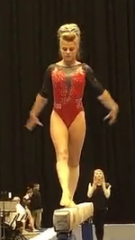
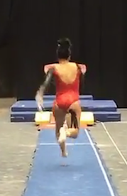
This week truly defined the good, the bad and the ugly. There were some gorgeous leotards but also some on the very opposite end of the spectrum. But don’t worry, we break it all down for you.The criteria remains the same though:up to three points for design; two points for fabric, sparkle, etc.; and two points for school spirit; three points for overall appearance. We want to know what you thought too (or if we forgot one of your favorites from this weekend)! Let us know in the comments below or on Twitter.
|
Stanford
Score: 9.2 Casey Design: 2.8/3 Fabric/Sparkle: 2/2 School Spirit: 1.5/2 Overall Appearance: 2.9/3 Total: 9.2/10 I AM OBSESSED. This is the best leo Stanford has ever worn. It looked great on the girls. The white popped on the dark color scheme to highlight the classy neckline and details. The red fabric was basically a red overlaid with a black mesh to create the super pretty and deep red color. Elizabeth I loooooove this Stanford leo. It’s so different that the Cardinal normally does. it’s so pretty. The deep red looks great and especially with the rhinestones on top. The white really pops on the darker red and black. This is a total win for Stanford. |
|
|
SUU
Score: 8.8 Casey Design: 2.6/3 Fabric/Sparkle: 1.7/2 School Spirit: 1.7/2 Overall Appearance: 2.8/3 Total: 8.8/10 Yes SUU! This is a fun leo, but not too crazy. The grey lace looks very unique and seems less intense than the tradition black we see. Especially with the red, a black lace can look too… sultry. I also approve of all back cutouts forever, so bonus points there. Elizabeth I *think* this is my favorite lace leotard of all the teams. Most use black lace, and this is more grey with a nude underlay, so it looks lighter and less dark and fierce. The back cutout is cool and I like how SUU is displayed on the back. The neckline is really nice too. |
|
|
Denver
Score: 8.2 Casey Design: 2.7/3 Fabric/Sparkle: 1.5/2 School Spirit: 1.5/2 Overall Appearance: 2.7/3 Total: 8.4/10 Denver I love you. Why did I ever move from Denver? Oh yes, the snow. If I could see leos like they have every week, I might consider moving back. Elizabeth I almost always like Denver’s leos and this one’s no different. The red color is really nice and the black has just the right amount of sparkles. Sweetheart necklines look good on everyone, and this is nothing different. |
|
|
Oregon State
Score: 7.65 Casey Design: 2.2/3 Fabric/Sparkle: 1.8/2 School Spirit: 1.8/2 Overall Appearance: 2.5/3 Total: 8.3/10 Rhinestones on black is a winning combination for me. Also they managed to do a black leo that doesn’t use trash bag fabric! The orange pop on the collar brings it all together, and the beaver sleeve gets some school spirit points from me. Elizabeth I feel like I’ve seen this design a lot. It looks good in classic black, and the heavy rhinestoning looks good. I don’t really like the circle in the middle, but the little bit of orange on the neckline and sparkles on the mesh sleeves are pretty. |
|
|
Nebraska
Score: 7.5 Casey Design: 1.8/3 Fabric/Sparkle: 1.5/2 School Spirit: 1.2/2 Overall Appearance: 2/3 Total: 6.5/10 Back is too low for me. I said I love back cutouts, but this isn’t a cut out… it’s an omission. I like the front and the blinging is nice. Elizabeth I like the low back. But the V in the front is just a tad too low. I like how it swoops to the side, though. I also like the amount of rhinestones around the V and the black arms are nice too. Overall, it’s not too wild for a Nebraska leo, which are known to get pretty weird. |
Pictures via Nebraska women’s gymnastics Snapchat.
|
|
Arizona
Score: 7.45 Casey Design: 2.1/3 Fabric/Sparkle: 1.5/2 School Spirit: 1.5/2 Overall Appearance: 2/3 Total: 7.1/10 God Bless America. This would make a nice national team leo? Don’t hate it, but it reads way too patriotic for me. Other than that, it is a nice leo. I like the contrast between the top and bottom. And the A is a nice touch to bring it all together. Elizabeth I oddly really like this leotard. Sometimes I surprise even myself. The silver/white and red sun ray type thing on the top is cool and looked good on the girls. The block A isn’t too big and represents the school well. The rhinestones on the chest are just the right amount and the mesh arms add a delicate look. I like the shiny fabric too. |
|
|
Oklahoma
Score: 7.15 Casey Design: 1.5/3 Fabric/Sparkle: 1.8/2 School Spirit: 1.5/2 Overall Appearance: 2/3 Total: 6.8/10 This one is nice. All these OU leo’s kinda blend together in my mind. They also all have some weird boob thing going on. Like please let’s focus on another part of the body? Good fabrics and good blinging. Elizabeth It’s not my favorite Oklahoma leotard, but it’s still lovely as all OU leos are. I like the arrow rhinestone design on the middle strip and the sparkle band is nice too. The OU on the back is a good touch. I just don’t care for the huge mesh blocking on the chest, but it doesn’t appear like full mesh, so it doesn’t bother me too much. |
|
|
Maryland
Score: 7.05 Casey Design: 1.5/3 Fabric/Sparkle: 1.4/2 School Spirit: 1.8/2 Overall Appearance: 2/3 Total: 6.7/10 I like the craziness, but it is a bit to much. Their cheerleaders wear a similar design on their uniforms, and it is very Maryland. I just think something this busy takes away from the gymnastics… or maybe that’s their strategy? Blind the judges with checks to hide deductions. Elizabeth I kind of love these? They’re so wild that they’re great. I love the attempt at putting the unique Maryland flag on the leotard, and it’s done in a non-ugly way. The little M on the back might be a bit much but I think it’s fine. |
|
|
Utah
Score: 6.95 Casey Design: 2.3/3 Fabric/Sparkle: 1.6/2 School Spirit: 1.5/2 Overall Appearance: 2.4/3 Total: 7.8/10 This leo is very pretty. Classy and sassy with just the right amount of sparkle added. The mesh cut outs are in a cool pattern and don’t take over this simple design. I liked it. Elizabeth I wish there was more red, but the sparkly black U on the front is a good amount. The mesh isn’t bad and the faux halter top straps aren’t bad. It just seems a tad boring for me. |
|
|
Alabama
Score: 6.2 Casey Design: 2/3 Fabric/Sparkle: 1.4/2 School Spirit: 1.5/2 Overall Appearance: 2.2/3 Total: 7.1/10 I like houndstooth and I love when Bama works that into their leos. The big A is a classic for them and this is a well done design. Nothing to unique for them but stick with what you know. Elizabeth Almost all of Alabama’s leos are super similar but with one or two small adjustments. That same theory goes for this one: giant A, red, some mesh. I guess good job changing things up by incorporating the houndstooth, but, I don’t know… It’s just not my fave. |
|
|
Michigan
Score: 6.0 Casey Design: 2/3 Fabric/Sparkle: 1.6/2 School Spirit: 1.2/2 Overall Appearance: 2/3 Total: 6.8/10 I have had more than enough of this design. You’re not Katy Perry, you’re not a firework. The color combo and fabric choices are good. I just need something else in my life please. I would be less annoyed if I had seen this last week so I will score it evenly with Bama’s which is the same leo. Elizabeth Just like Alabama last week, this design issooverdone. I really like the blue color used, though, and the gold with it is a nice change. Other than that, it’s the same old same old. |
Note: The video shows the warmup-version of the leotard. The competition leo was the same with one blue arm and one white to go with the design.
|
|
Auburn
Score: 5.95 Casey Design: 1.3/3 Fabric/Sparkle: 1.2/2 School Spirit: 1.6/2 Overall Appearance: 1.8/3 Total: 5.9/10 For some reason this reminds me of a butterfly. It’s nice, and the ribbon like design makes it pretty girly. Just doesn’t really look great to me. Cutting across the stomach is not a design feature I like. Elizabeth I like that the body design is trying to do, but it just looks like a heavyweight belt in the place it’s at. The AU design is cool on the chest and the navy and orange colors are fine. |
|
|
LSU
Score: 5.8 Casey Design: 2/3 Fabric/Sparkle: 0.2/2 School Spirit: 1.5/2 Overall Appearance: 1.8/3 Total: 5.5/10 Usually I am LSU leo obsessed, but this one isn’t for me. I like the tiger design and don’t hate the not match sleeve colors. However, that gold fabric is a crime. It’s worst gold possible. If you are going to do gold, DO IT BIG and be glamourous. Don’t be yellow and low budget 80’s spandex. Elizabeth The tiger eye woven into the design is cool, but besides that the leo’s a bit boring. The back is just plain — no rhinestones or anything. I don’t really care for the gold color either. |
|
|
Florida
Score: 4.55 Casey Design: 0.8/3 Fabric/Sparkle: 1.3/2 School Spirit: 1/2 Overall Appearance: 1.3/3 Total: 4.4/10 This one is alright. The rhinestone pattern is perplexing. Last year @spannytampson pointed out an unforgettable shape in it and I will forever see that image in my mind. For that reason alone I cannot score this above a 5 Elizabeth I like the multi-colored rhinestones on the neckline, but the design on the chest is weird. I don’t like that it’s random. Unless it has some significance I don’t know about, I’d prefer a huge, sparkly gator over it. The blue color’s nice. |
|
|
Arkansas
Score: 4.35 Casey Design: 1/3 Fabric/Sparkle: 1/2 School Spirit: 1.6/2 Overall Appearance: 1.2/3 Total: 4.8/10 Not a winner. Great school spirit though! I may consider the razorback one of my least favorite mascots… but it still beats the USC Gamecocks. I like the angles and triangles but overall this doesn’t work. Elizabeth Ah yes. Giant hogs and mesh. My favorite. Except completely the opposite of that. I like the white and black scheme, and I normally don’t mind mesh. But this mesh is in the wrong places. Take away the hog wrapped around the side of her body andmaybeI like it? Can’t knock ‘em on school spirit though… |
|
|
UCLA
Score: 3.05 Casey Design: 1.4/3 Fabric/Sparkle: 1.6/2 School Spirit: 0.8/2 Overall Appearance: 1/3 Total: 3.4/10 I love the blue, I love the patterned fabric, I like side cut outs. All the ingredients were good, but somehow it turned out so wrong. Like pineapple pizza. I love pineapples, but not with cheese. (Sorry to all you Hawaiian pizza lovers.) Elizabeth The leotard itself isn’t terrible. But the design was the complete opposite of flattering on 99% of the UCLA gymnasts. Poor Melissa Metcalf looked about twice as big as she is. The random mesh portions on the shoulders were like perfect little windows to the girls’ bra straps and the back made their shoulders look as broad as a man’s. The blue color is nice, but this looks like something a six-year-old might want to wear versus something a grown woman in college would be wearing. |
|


