Another week, another round of leotards to judge. And there were definitely some interesting ones this go round. From rhinestone hogs to mesh, we saw a little bit of everything this weekend. As always, we’ve got some simple criteria for judging the leos: up to three points for design; two points for fabric, sparkle, etc.; and two points for school spirit; three points for overall appearance. We’ll be looking at leotards we saw that caught our eye — in either a good way or a bad one. Then we’ll tally up the scores and average them with the previous week’s. So by the end of the season, we’ll know for sure which team has the best leotards (according to us) and which teams not to much. We want to know what you thought too (or if we forgot one of your favorites from this weekend)! Let us know in the comments below or on Twitter.
|
Denver
Score: 8.35 Emily Design: 2.5/3 Fabric/Sparkle: 1.6/2 School Spirit: 1.3/2 Overall Appearance: 2.5/3 Total: 7.9/10This might be my favorite leo of the batch.There weren’t a ton of awesome ones this week, but I really like the color and the design around the neck and on the sleeves. Good job, Denver. Elizabeth I really like this one. Denver is already a step ahead with the colors it gets to work with. I love the shininess of the crimson and the criss-cross of the white on the chest and sleeves. There aren’t too many or too few sparkles and the sleeves are more than just boring black. Love. |
|
|
Oregon State
Score: 7.2 Emily Design: 1.6/3 Fabric/Sparkle: 1.1/2 School Spirit: 1.5/2 Overall Appearance: 1.2/3 Total: 5.4/10I’m not a fan of of the giant beaver. The OSU on the back isn’t bad. I’m also not typically a fan off all black leos. Elizabeth For some reason, I’m really loving the Oregon State leos this year. And I really shouldn’t be with this one because a giant sparkly beave? Really? But it’s cute? And I really loved the ombre-like sparkle-fade on the shoulders and the simple orange neckline on the otherwise black leo. The OSU on the back is nice too. |
|
|
Alabama
Score: 7.2 Emily Design: 2.1/3 Fabric/Sparkle: 1.4/2 School Spirit: 1.4/2 Overall Appearance: 2.1/3 Total: 7.0/10 This is one of my favorite Alabama leos. I like the giant A and the mesh works well. The more I look at the rhinestones on the front, the harder time I have figuring out the thought-process behind them. It’s like a little firework coming out of two parts of the A. But not bad. Elizabeth I like this Alabama leo. The Script A is huge, but I like how it is on the side and split on the front and back. The neckline cut and mesh sleeve are nice too. I don’t know why I like this one, because I typically wouldn’t. There’s just things about it. |
|
|
Stanford
Score: 6.8 Emily Design: 2.1/3 Fabric/Sparkle: 1.3/2 School Spirit: 1.2/2 Overall Appearance: 2.2/3 Total: 6.8/10This is pretty simple and way overused, but that doesn’t mean I don’t like it. For some reason, I’ve always liked this Stanford leo and I think it looks really good on everyone. I like it. Elizabeth It’s the leotard pretty much every team has. I don’t know why this became the compulsory design, but it did. It’s not a bad leo though. This color combo isn’t the worst of them. There are a tad too many rhinestones and the non-mesh fabric on the arms is weird and seems out of place. But overall, it’s a solid leo. |
|
|
Iowa
Score: 6.35 Emily Design: 2.5/3 Fabric/Sparkle: 1.3/2 School Spirit: 0.9/2 Overall Appearance: 2.3/3 Total: 7.0/10OK, I really like this design. It reminds me of the Georgia Elite and Everest leos (for those of you who actually care about J.O.), both of which I really like. I don’t like that right sleeve, but other than that the design is good. Not sure about the colors though. Nude is better than yellow. Always. Elizabeth Iowa is really hitting it hard with the nude over yellow this year. I don’t hate it, but it’s getting slightly old to me. This design is ok. The black extending onto the sleeve is weird but the rest is fine. |
|
|
California
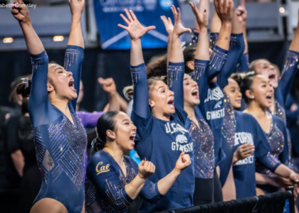
Score: 6.35 Emily Design: 1.4/3 Fabric/Sparkle: 1.2/2 School Spirit: 1.5/2 Overall Appearance: 1.5/3 Total: 5.6/10Interesting. Not sure if I like the front design, but I do like how it incorporates the word Cal. The criss-cross on the arms is pretty good. Just a little boring maybe. Elizabeth It’s not bad. I like the white on the arms and the “Cal” detailing in rhinestones on the chest. I also like the mesh. There’s just not anything Iloveabout it. |
|
|
UCLA
Score: 6.25 Emily Design: 1.5/3 Fabric/Sparkle: 0.7/2 School Spirit: 0.9/2 Overall Appearance: 1.8/3 Total: 4.9/10I actually kind of like this, but I also think the fabric has a weird look to it. The rhinestones on the end of the sleeve help turn a super boring leo into a kind of boring leo, so that’s good. I surprisingly like the neckline, but don’t think any team other than UCLA could pull it off. Elizabeth The fabric has a weird quality to it that I like but can’t describe. The sparkles look good around the neck and the scalloped holes are cool. The almost off the shoulder look makes the girls’ shoulders look extra wide, though, which is a check in the don’t like column for me. But overall it’s a good one for UCLA. |
|
|
Nebraska
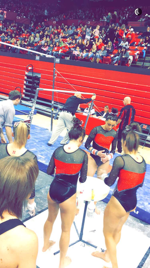
Score: 5.95 Emily Design: 1.1/3 Fabric/Sparkle: 1.4/2 School Spirit: 1.3/2 Overall Appearance: 1.7/3 Total: 5.5/10OK, I don’t like the giant mass of red. If it was a little more narrow, maybe this could have worked though. To me, it just looks like three blocks of different colors. Elizabeth Nebraska always has some funky leos and this one is quite tame in comparison. It’s just alright to me. Maybe it’s boring considering some of the things they wear, but I do like the neckline and kind of sparkly mesh. The way the red and black are put together are weird. I don’t know what I don’t like, but there’s something. Sidenote: I like how they put their N tattoo on their back vs. their face. It’s different. |
Via Nebraska women’s gymnastics Snapchat.
|
|
Illinois
Score: 5.8 Emily Design: 1.5/3 Fabric/Sparkle: 1.1/2 School Spirit: 1.1/2 Overall Appearance: 1.7/3 Total: 5.4/10I’m not a huge fan of these colors. The bottom half of the front is super boring, but I really like the back. I also like the white mixed in at the top. Overall, I like the top half, but not the bottom half. Elizabeth I like the back of this one more than the front. The I looks good with the design and the white design pairs nicely with the orange. The front, however, reminds me of those crop cardigan things that used to be all the rage. I do like the shininess of the orange fabric, though. |
|
|
Utah
Score: 5.45 Emily Design: 1.8/3 Fabric/Sparkle: 1.4/2 School Spirit: 1.5/2 Overall Appearance: 1.7/3 Total: 6.4/10I actually kind of like this. I know the excessive Us are a little overwhelming, but at the same time it looks OK. They almost blend into rhinestones. I really don’t mind this. Elizabeth This is probably my least favorite Utah leo. I don’t see the need for all the “U”s. You only need one, maybe two so you can have one on the front and one on the back. The rest of the sparkles are nice though. I like the combo or red and silver on the black body. |
|
|
Arkansas
Score 4.35 Emily Design: _0.6/3 Fabric/Sparkle: 1.2/2 School Spirit: 1.3/2 Overall Appearance: 1.1/3 Total: 4.2/10I don’t like the giant hog at all. You can’t even tell that’s what it is from far away. The front is super boring , and I’m kind of having a hard time finding a lot of positives. I kind of like the design but it’s too simple. Again, Arkansas is at a major disadvantage due to its mascot. Elizabeth I saw the hog on the back and immediately was like, “Nope.” The front isn’t bad albeit a bit boring. The back is just no. If you insist on having a bedazzled hog on your leotard, that is probably the last one I would pick. I guess it’s better than having the word “Hogs” on your chest? |
|
Michigan
Score 4.1 Emily Design: 1.1/3 Fabric/Sparkle: 1.0/2 School Spirit: 1.1/2 Overall Appearance: 1.8/3 Total: 5.0/10 I’m usually not a huge fan of Michigan’s leo but I think I like this one OK because it doesn’t have yellow. That’s usually what throws me off. I don’t like the sleeves or the weird strap on the back. Elizabeth The leo has WAY too much going on. The silver isn’t plain silver but has a shimmery quality to it that includes a lot of other colors. There are about six different patterns going on with the rhinestones on the chest and back. The bow strap things in the back are meh and the M kind of looks like it’s just thrown on there. This leotard is just a big N.O. |
|
|
Arizona
Score: 3.55 Emily Design: 0.5/3 Fabric/Sparkle: 1.0/2 School Spirit: 1.5/2 Overall Appearance: 0.4/3 Total: 3.4/10 OK, this is rough. The giant A is awful. I really can’t passed that. Boring front, awful back. Yeah, this is really rough. Elizabeth This leotard is a mullet. Boring black business in the front and giant A party in the back. That A is WAAAAAAY too big. It even starts to creep around the gymnast’s sides and, if they’re super thin, onto their front. Just no. No. No way. I know this was a hand-me-down from the old coaching staff, but Tabitha, I thought better of you. |
|


