It’s the Olympics! Well, it was. But now that artistic gymnastics at the Tokyo Games has concluded, it’s time to judge the best leos worn on the competition floor. We of course couldn’t include ever great design in our rankings, so let us know your favorites that are missing from the list in the comments or on social media.
Canada: 9.280

Photo/Instagram, TeamCanada
Elizabeth: 9.7/10.0
If Georgia doesn’t steal this design and put sleeves on it immediately, I’ll give back my diploma. Just kidding but also maybe not? That’s how passionate I am about this leo design. It’s just fantastic.
Emily M: 9.2/10.0
Definitely one of my favorite ombres! The competing diamond patterns make it a little busy for me, but I still would love to see it with sleeves at Auburn, a team that knows ombre like no other.
Tavia: 9.1/10.0
Is there a leotard from this Olympics that I don’t love? That is the question. The sparkle and ombre are amazing. The addition of the leaf lets us know it’s Canada without taking away from the rest of the design. Could Georgia get a warm up leo like this one?
Tara: 9.5/10.0
LOVE. The red-to-black ombre is gorgeous, and the sparkle design is great too. The colors scream Georgia or maybe Utah.
Katie W: 8.9/10.0
The sparkle design is so pleasing, and the ombre is fantastic. I’m definitely thinking Utah could use a similar style with sleeves, or I could see Georgia using the ombre idea for one of its leos.
Netherlands: 8.800

Photo/Twitter, DutchGymnastics
Elizabeth: 8.2/10.0
I like the black and orange ombre and the geometric side design. I mean I have to go with Oregon State, right? I know we’re supposed to be more creative and not just go off colors, but the design itself reminds me a lot of Oregon State leos anyway, so I’m going with it.
Emily M: 8.3/10.0
Well this screams Florida! I’m not sure how I feel about the side cutouts, but I love that the sleeve ombre is echoed there.
Tavia: 8.8/10.0
Hello Oregon State! This leotard is a must! I’m loving the deep V and ombre combination. The pops of orange on the side were a nice touch, too.
Tara: 9.2/10.0
I love this! I’m a fan of the geometric side design and the ombre. It’s very Oregon State, though I can also see Bowling Green adopting something similar.
Katie W: 9.5/10.0
This is absolutely stunning. I love the elegant look with the black solid bodice and the ombre mesh. The side cutouts are so flattering and add to the beauty. I could definitely see N.C. State adding this to its leotard collection.
USA: 8.680
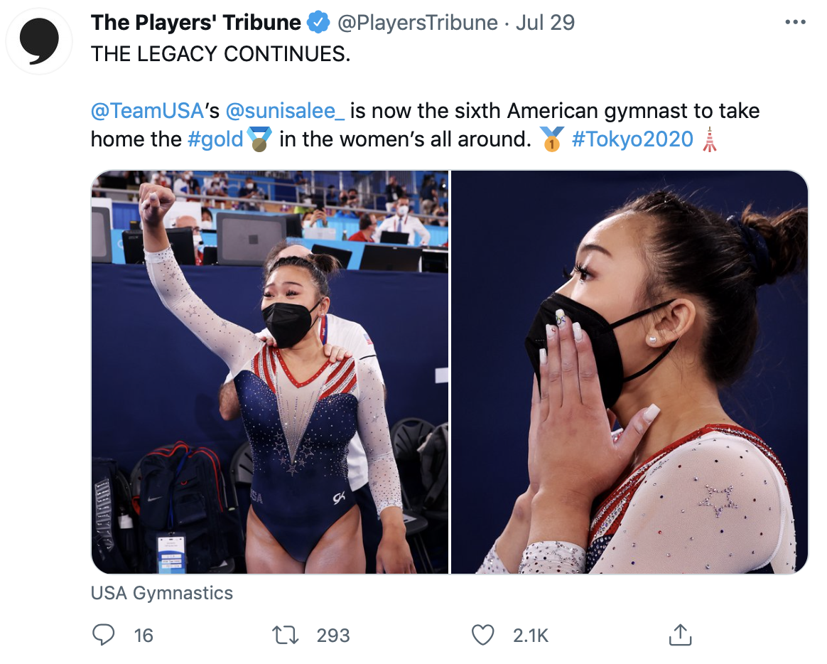
Photo/Twitter, PlayersTribune
Elizabeth: 8.0/10.0
The way the ombre and rhinestones are incorporated in the V makes it look a little like ruching without it actually being ruching, which I sort of like. This also does a good job at being patriotic without being in-your-face USA. I want Auburn to do a similar design in homage to Sunisa’s Olympic gold. Turn those red stripes into orange Tiger stripes. Otherwise I could also see it working for Illinois.
Emily M: 7.8/10.0
I love a deep V, but the stars on this one seem a bit of an afterthought, and I wish they were just clusters of crystals rather than literal stars. That said, it has a Michigan vibe to me. I’m imagining maize stripes with a M hidden in there somehow.
Tavia: 9.3/10.0
I love this leo! This incorporates the stars and stripes without being gaudy. I love the deep V and the sparkle. The stripes going to a V in the back really does it for me. This sounds stereotypical, but I could see Air Force rocking this leotard.
Tara: 9.0/10.0
I love this! It’s definitely grown on me. I really love the deep V paired with the sparkles and how the stripes look in the back. It’s very reminiscent of Arizona.
Katie W: 9.3/10.0
Deep Vs are very hit or miss for me, but this has to be the best deep V I’ve ever seen on a leo. I have to echo what Tavia says with the nice inclusion of the stars. For patriotic emphasis the stripes on the shoulders fit right in, but that’s holding me back from a perfect score. I really love what Elizabeth said about Auburn adapting this, but I could also see an Oregon State version.
South Africa: 8.580
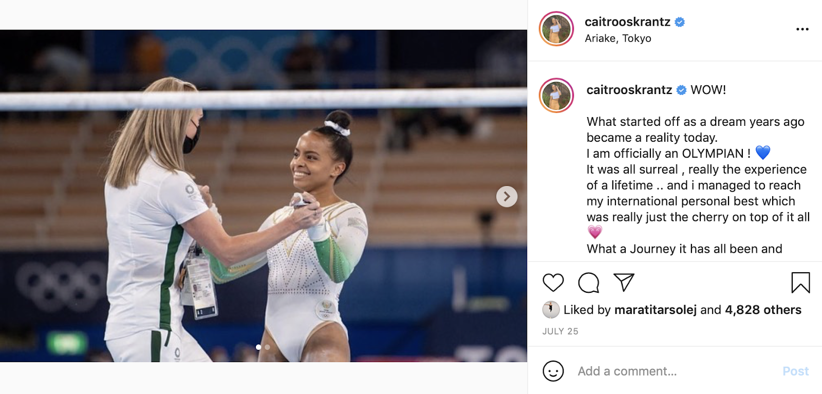
Photo/Instagram, CaitRooskrantz
Elizabeth: 9.6/10.0
I’m absolutely obsessed with this leo. I love everything from the matte white to the subtle green ombre to the gold piping. The gold makes me want to see how it would look with purple instead of green for Washington or LSU.
Emily M: 8.5/10.0
Imagine it in black with yellow ombre sleeves and you have an Iowa leo. Simple, clean, classy.
Tavia: 8.7/10.0
I’m really only deducting points because I’m not a huge fan of white leotards, but I really think this design works well in white. I like the simplicity and the pop of green on the sleeves. I think a team like EMU could diversify its leotard collection with the addition of this design.
Tara: 8.5/10.0
I love the green to white ombre with the gold accents. I’m also a fan of the geometric design. I can see this as an LSU leo.
Katie W: 7.6/10.0
I clicked on the leotard link and immediately envisioned the leotard at LSU with gold and purple. Clearly, it seems like my fellow editors had the same idea. I really love the sleeve design and the touch of sparkle with the geometric design.
Portugal: 8.580
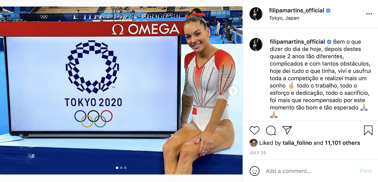
Photo/Instagram, FilipaMartins_Official
Elizabeth: 9.4/10.0
It’s very similar to the South African leo, which means I love it as well. The thin red rhinestone belt is very flattering and I love the well-placed ombre. I have to agree with Emily M that this would make a fantastic Illinois leo with blue ombre and orange rhinestones.
Emily M: 8.0/10.0
That splash of red is so striking against the white! I could see this as an Illinois leo if you swap in orange.
Tavia: 7.9/10.0
Once again, the main fault I have with this leotard is the amount of white on the body. I love the ombre, and I like that the sparkle design from the body is carried over to the sleeves. This leotard could look good on Nebraska.
Tara: 9.0/10.0
I love this! I enjoy the contrast of the red and white. The ombre is gorgeous, the V is nice and the sparkles are lovely. Change the red to purple and this would make a nice LSU leo.
Katie W: 8.6/10.0
The vertical lines on a leotard typically aren’t my favorite design choice, but this leotard is sophisticated glam. I think the color contrast and the right amount of jewels makes it stand out. I would love to see Kentucky adapt this with its royal blue and white school colors.
Switzerland (AA): 8.520
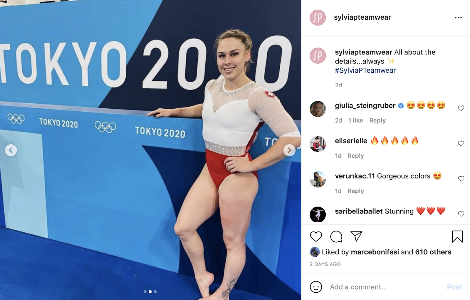
Photo/Instagram, SylviaPTeamwear
Elizabeth: 9.8/10.0
This may be my favorite leo of the entire Games. I am obsessed with the matte white, the sweetheart neckline, the back, the colors, the rhinestone belt… Basically everything. Utah would 100% rock this design.
Emily M: 9.5/10.0
My favorite leo of the entire Olympics? Probably! The back is amazing, the colors are stunning, the neckline is elegant. Utah, where you at?
Tavia: 9.7/10.0
Hello! This is beautiful! I love the strappy back and the jewel belt. Only deducting points because the white fabric transitioning into the mesh is a bit too choppy for me. But this design definitely is a head turner. I could see this leotard in the Arkansas collection in the near future.
Tara: 8.7/10.0
I love the elegance of this. Between the red and white, the rhinestone belt and the strappy back, there’s a lot I love about this. I could totally see Arkansas or Alabama do something similar.
Katie W: 4.9/10.0
I actually hate this. I think the stark contrast just gets me, and I’m not a fan whatsoever of white mesh contrast with the solid white. I could see Arkansas taking a spin on this design, though.
Poland: 8.500
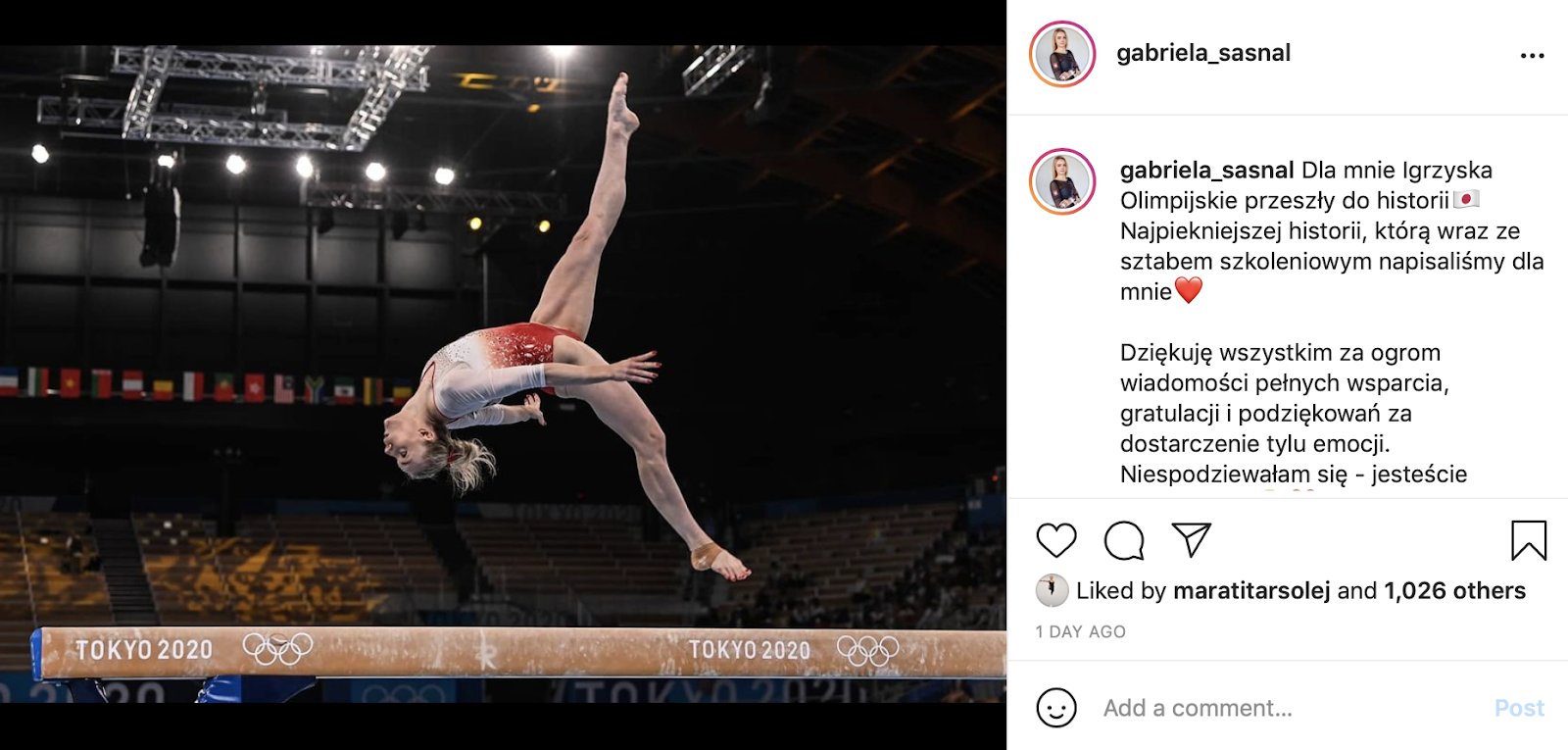
Photo/Instagram, Gabriela_Sasnal
Elizabeth: 8.6/10.0
So much good matte white and ombre at this Olympics! I love the rhinestone clusters on this design, but I wish the red went up just a touch higher on the body. UCLA would look great in this design in blue. Oh! Or Cornell if you wanted to stick with red.
Emily M: 8.0/10.0
Simple and classy, a winning combo for me! I’d love to see Utah State try this with a blue ombre.
Tavia: 7.9/10.0
This checks all the boxes in the ombre category. I like the amount of sparkle too. This one comes off as a little too basic for me. I could see this leotard on Arizona with some accents of blue.
Tara: 8.6/10.0
Another leo with gorgeous ombre! The sparkle design gives it the pizazz it would be lacking otherwise. I think Cal’s blue would be gorgeous with it.
Katie W: 9.4/10.0
One of my favorites from the games with the gorgeous ombre, simple design and addition of some sparkle. I could see William and Mary rocking this with a beautiful shade of green and white.
Brazil (AA): 8.360

Photo/Twitter, JogosOlimpicos
Elizabeth: 9.3/10.0
I LOVE this design. The diamonds created with color blocking and rhinestones is creative, and I like the mix of colors to make it quintessentially Brazil. Southern Utah should do something similar with red, white and black.
Emily M: 8.5/10.0
These colors! So stunning. I love the use of crystals to create definition at the middle without adding a belt, too. Just really lovely. I could see LSU doing something like this, with an added fleur de lis, as its Mardi Gras leo.
Tavia: 9.3/10.0
This leotard has a special place in my heart. I love how bright it is and the incorporation of geometric shapes across the chest. It has a throwback feel with all the sparkle of a 2021 design. I agree with Emily M that this would work perfectly as an LSU Mardi Gras leo.
Tara: 8.7/10.0
I love the diamond design on the front, and the fact that it pays homage to Brazil’s flag makes it even better. It’s very Brazil. I’d love to see North Carolina do a take on this since it reminds me of its signature argyle.
Katie W: 6.0/10
I like the patriotic feel Brazil always has to its leotards, but this one is just a tad too bright for me. Geometric designs are not my favorite either, but I will say it fits Brazil very well. I could see Bowling Green tackling something like this.
Brazil (PT): 8.280
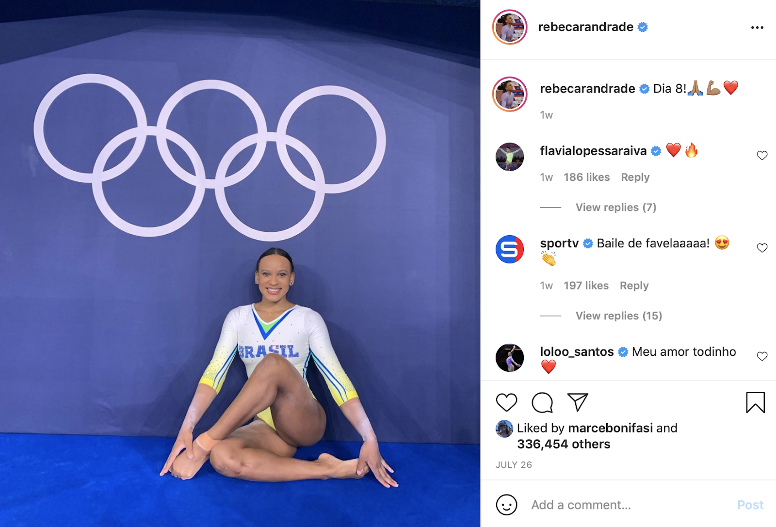
Photo/Instagram, RebecaAndrade
Elizabeth: 8.5/10.0
I feel like only Brazil can pull off fluorescent yellow like this. I have to agree with Emily M that neon yellow is so George Washington that I just have to choose the Colonials here.
Emily M: 8.7/10.0
Very much like that UCLA centennial leo I loved! But that’s too easy. I could see George Washington doing something like this in the future.
Tavia: 8.0/10.0
No one can pull off this design quite like Brazil can. This leo is reminding me of something UCLA would rock.
Tara: 8.5/10.0
The color contrast is lovely, and I love the geometric lines combined with the V. I think I’m also going to go with George Washington here.
Katie W: 7.7/10.0
Ombre has my heart clearly, but I don’t love the V neckline with multiple colors. I do think this is perfect for a simple college school spirit color for any team, but LIU in particular comes to mind.
Argentina: 8.080

Photo/Instagram, EnardInfo
Elizabeth: 7.8/10.0
This is fine. I know some of my editors loved this one a lot, but it’s kind of busy for me. The shade of blue is lovely though. I could see Boise State running with this concept.
Emily M: 8.7/10.0
So. Many. Swirlies. Still not my favorite pattern, but the colors are so lovely that I almost don’t care. It has an Alabama vibe to me.
Tavia: 8.9/10.0
This leo is just a classic. The swirl design and sparkles are just dreamy. I would agree that this reminds me of an Alabama design.
Tara: 7.6/10.0
I normally don’t like designs like this, but I don’t mind this one. I especially love the blue color and sparkle accents. My mind immediately goes to BYU with the swirly design and blue.
Katie W: 7.4/0.0
I actually don’t mind the swirlies, but this has a tad too many of them. I think it would have been nice to have a lower neckline that allowed the amount of swirls to peter out. Swirly designs always make me think of Florida leotards.
Great Britain: 8.060

Photo/Twitter, TeamGB
Elizabeth: 8.8/10.0
The Brits killed the leo game this Olympics. I liked this one in particular for the opposing arrows design with the rhinestones pointing one way and the red going the other. I’m thinking Nebraska could do something similar.
Emily M: 9.0/10.0
Team GB had my favorite full set of leos in Tokyo I think. I like that this one is simple but then has those flowers for a little visual interest. I’m guessing the flowers will be unpopular with my fellow editors, but I think they’re a perfect touch. Seems reminiscent of something Oklahoma would do, no?
Tavia: 8.2/10.0
I was so close to really loving this leotard. The ombre and amount of sparkle are second to none. However, the pattern underneath the sparkle design really just threw me off. I understand what they were going for though. I could see this design on Oklahoma maybe.
Tara: 7.3/10.0
I like the other GB leo better, but I don’t mind this one. The colors are nice, along with the sparkle design. Emily M was right saying the other editors might not love the flower pattern, and I don’t like the cutoff line between the white and red either. Like others, I’m seeing Oklahoma all over this one.
Katie W: 7.0/10.0
I loved a lot of GB leotards in Tokyo, but this one happens not to be my favorite. I don’t love how busy the top is with the added sparkle stripe design. The leotard would have benefited from a simpler top half. I agree with the others in Oklahoma, but I also feel like Cal could add a fun twist.
Switzerland (Quals): 7.980
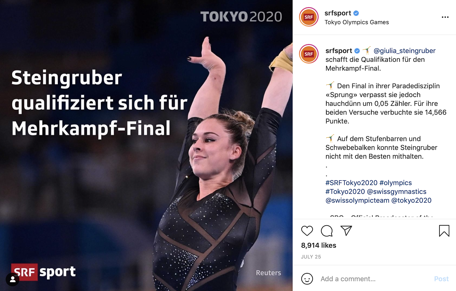
Photo/Instagram, SRFSport
Elizabeth: 8.3/10.0
Normally mesh like this would be a big no for me, but it works? I don’t know if that’s because the design is good or Giulia Steingruber is just a queen, but it makes me like the leo. The black is classy and reminds me of something Oklahoma or Iowa might do.
Editor: 6.2/10.0
That’s a lotta weird mesh. Phew. I’m not a big fan of mesh insets, but these aren’t as bad as they could be. Oregon State could pull off something like this; imagine it with orange crystals to jazz it up a little.
Tavia : 8.5/10.0
Why am I finding myself liking the mesh cutouts? The use of the geometric patterns and just enough jewels comes off more flattering than one would expect. The mesh takes an otherwise simple design up a notch. This is definitely giving me Iowa vibes.
Tara: 8.4/10.0
I actually like this! The mesh really works well in this case. I feel like UCLA or Iowa would embrace it!
Katie W: 8.5/10.0
If this color was anything other than black, it would be a disaster. However, the black mesh combined with the geometric cut-out design works really well. It actually reminds me of a dance competition leotard in so many ways. It’s adventurous for the program, but Southern Utah could adapt a similar style.
Mexico: 7.960
Elizabeth: 9.4/10.0
Mexico (and trampoline gymnasts in general) consistently kills the leo game, and this is no exception. It’s very similar to the Hungary leo, but I think I like this one a touch more. I love the white and green combo, as well as the chest design. I’lls ay Michigan State simply because I want this turned into an NCAA leo ASAP.
Emily M: 9.1/10.0
This is so pretty! The ombre is great, and I love that the pattern ends higher than on most leos; it gives it some originality. I’m getting a Kentucky sense from it!
Tavia: 9.0/10.0
I love the ombre and the sparkle design. This leo really has everything going for it. I just wish that the pattern was a little less subtle. I would like to see a team like Sacramento State in this design.
Tara: 6.2/10.0
I love the white and green ombre, but I’m not a fan of the sparkle design. I could see Alabama adopting something similar, or William & Mary if we’re keeping the green color.
Katie W: 6.1/10.0
The ombre and color are great, but I’m not a fan of the bodice design. I know I already picked one for William & Mary, but I could definitely see the school adapting this one. To stray away from color, I could also see San Jose State going for it, too.
China: 7.880
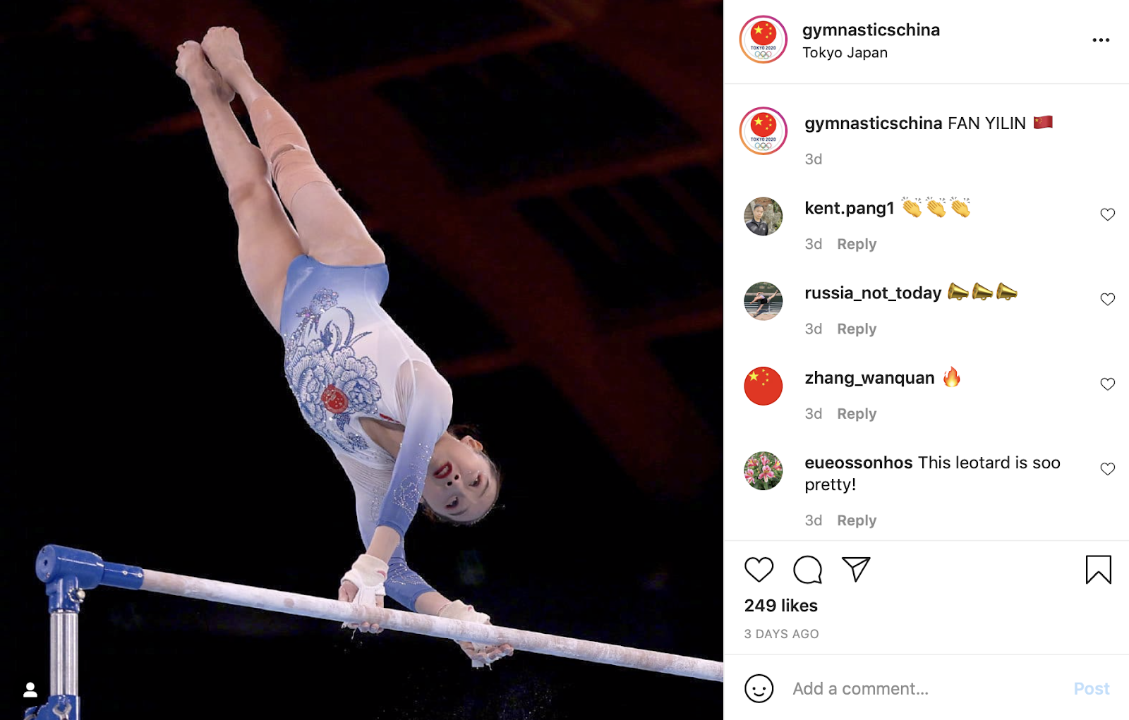
Photo/Instagram, GymnasticsChina
Elizabeth: 8.4/10.0
I normally don’t care for China’s leos, but this one is really nice. The shade of blue with white in ombre is simple yet flattering, and I even like the flower. When I think of flowers for some reason I think of BYU? Although this would be pretty tame for the Cougars.
Emily M: 8.3/10.0
This ombre is beautiful. I love the tone-on-tone purple of the floral pattern, too. It would be too much if the rest of the leo weren’t so simple. This feels like something UCLA could pull off.
Tavia: 7.7/10.0
I really appreciate that China went for something different here! I like the ombre and the use of the floral design. There are several college teams that could pull off this design. I’m leaning toward UCLA only because of its recent use of screen printed leo designs. I also think Auburn could do something with this concept as well.
Tara: 7.0/10.0
Like Elizabeth, I’m normally not a fan of China’s leos, but this one isn’t bad. I really like the shade of blue and the ombre. I don’t love the flower design, but it’s not terrible either. I think I’m going to go with UCLA on this one.
Katie W: 8.0/10.0
This has to be one of my all-time favorite leotards for China. I love the fact it switched it up from the typical red and white. The ombre is my favorite thing about the design, but I also appreciate the floral pattern. I like how it has one standout flower that doesn’t overpower the ombre. I could certainly see BYU tackling this one.
Hungary: 7.520
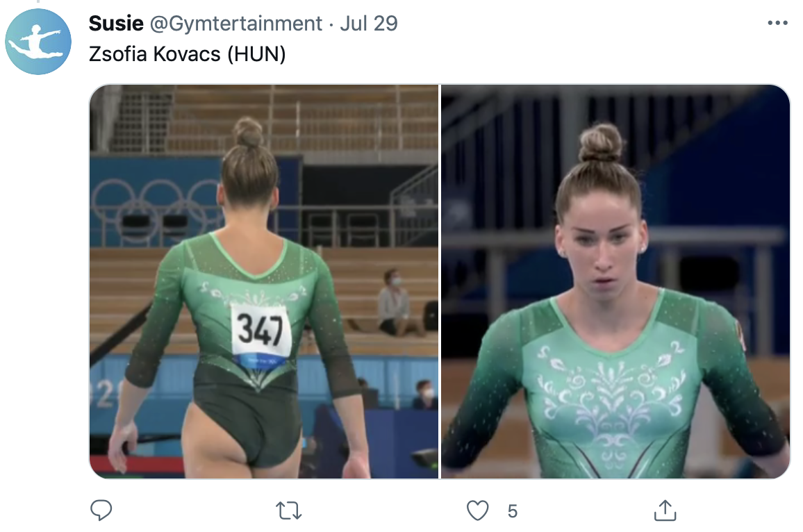
Photo/Twitter, Gymtertainment
Elizabeth: 8.8/10.0
While great white leos was a theme of Tokyo, green was a close second. I love this design—the shades of green are fantastic, the black really works and I don’t even mind the random floral design on the chest. I could see N.C. State taking on a version of this leo.
Emily M: 8.6/10.0
I adore a green leo. The shoulder cuts on this one are a little funky, but I love everything else about it. This could be a good look for Southern Utah, in red.
Tavia: 8.2/10.0
I’m not normally a fan of green, but this really works! I like the ombre and the overall flow of this design. I could see this design on Michigan State.
Tara: 6.0/10.0
The green colors and ombre are nice, but I don’t love the design. I could see Eastern Michigan going for something like this.
Katie W: 6.0/10.0
I like the shades of green, but I’m not sure I like them together. I’m also not a huge fan of the front design, but this could work for LSU—for some reason I feel like the front could be replicated with something for Mardi Gras.
Italy: 7.400

Photo/Twitter, Gymnastics
Elizabeth: 7.2/10.0
This is honestly pretty tame for an Italian leo, which is what makes me like it. I could see William & Mary doing something with a similar design.
Emily M: 6.5/10.0
There’s a lot of swirly action going on here, which is never my favorite. The colors are superb, though! I could see Missouri doing something similar in its colors.
Tavia: 9.2/10.0
Can I explain why I love this? Not really. I just love the color and fabric choice that Italy chose here. It’s relatively simple, but I love the way it shines. I would love to see this design on Washington.
Tara: 6.5/10.0
This is fine. The colors are nice, but the swirls aren’t my favorite. I can picture Michigan State in this leo.
Katie W: 7.6/10.0
I don’t have anything I hate about it, but I also don’t love it. I think the mesh could be toned down a tad. I’m envisioning Clemson debuting a similar style when the program hits the competition floor in a few years.
Russia: 6.500

Photo/Instagram, Liliakhaimova
Elizabeth: 7.1/10.0
When I first saw this leo I thought it was very Italy if that tells you anything. But I actually like it? It’s certainly very busy, but the ombre and amount of rhinestones is a win for me. Oklahoma could take the concept and run for sure.
Emily M: 7.0/10.0
This one perplexes me. I like the colors, but the pattern just strikes me as weird. I don’t know! It’s solid but doesn’t wow me. It feels like something Denver is evolving toward, but in black and crimson.
Tavia: 7.0/10.0
I spoke too soon. This is my least favorite of the ROC leotards. I think it’s an interesting concept, but I don’t like the use of ombre to create more dimension on the chest. The sparkle is nice, but overall this falls flat for me. With some tweaks maybe this could be a good New Hampshire design.
Tara: 5.8/10.0
Like Tavia, I think this is my least favorite of the ROC leos. It’s grown on me, but the pattern isn’t my favorite. Change the red to green and I think I could see Sacramento State in a similar design.
Katie W: 5.6/10.0
It has a tad too many shades of red and just too many design elements for me to truly like it. I feel like this leotard could be nice to see on a Big 10 stage with Illinois.
READ THIS NEXT: Leotard Rankings: Throwback Olympic Leotards
Article by Elizabeth Grimsley, Emily Minehart, Tara Graeve, Katie Walsh
Like what you see? Consider donating to support our efforts throughout the year!