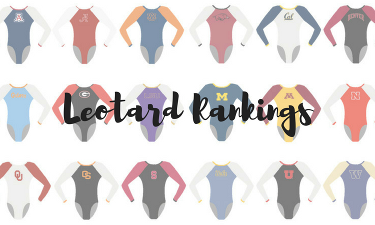
As the season winds down, teams are continuing to bring their A-game when it comes to leotards. From themed designs to ones featuring our favorite elements, there were a lot of well-dressed teams this weekend. Which were your favorites? The criteria is the same as always: up to three points for design; two points for fabric, sparkle, etc.; and two points for school spirit; three points for overall appearance. This week’s guest judge is Alicia, our EAGL and ECAC editor.
UCLA: 9.225
https://twitter.com/uclagymnastics/status/972934256124030976
| Design | Fabric/
Sparkle |
School
Spirit |
Overall
Appearance |
Total | |
| Caroline | 2.8/3 | 1.9/2 | 1.5/2 | 2.8/3 | 9.0/10 |
| Christina | 2.9/3 | 2.0/2 | 1.8/2 | 2.9/3 | 9.6/10 |
| Elizabeth | 2.8/3 | 2.0/2 | 1.7/2 | 2.8/3 | 9.3/10 |
| Alicia | 2.9/3 | 2.0/2 | 1.4/2 | 2.7/3 | 9.0/10 |
Caroline: Easily my top leo of the week, and UCLA’s best leo overall as well. The ombré is basically perfect, and the sweetheart neckline is flattering on pretty much everyone. The only thing I could use is more sparkle, and of course a defining logo for the Bruins.
Christina: This is definitely my favorite UCLA leo ever. I’d be totally fine if they wore this every day. I love love love LOVE the ombre, the sweetheart neckline and the lower back. Love, love, love.
Elizabeth: This is by far my favorite UCLA leo, maybe of all time. The ombre from blue to a different blue is AMAZING. The lower back—yet not being backless—is great, and the sweetheart neckline on the front is really flattering. Love.
Alicia: THIS is how we can have white on a leo without it being harsh! OMBRE IT! This leo makes me happy. It reminds me of a nice, sunny day. I’m obsessed with the ombre, I love the neckline and the back isn’t a typical UCLA back. Total win.
Maryland: 9.125
https://twitter.com/TerpsGymnastics/status/972881724018515970
| Design | Fabric/
Sparkle |
School
Spirit |
Overall
Appearance |
Total | |
| Caroline | 2.5/3 | 1.8/2 | 2.0/2 | 2.6/3 | 8.9/10 |
| Christina | 2.6/3 | 1.8/2 | 2.0/2 | 2.6/3 | 9.0/10 |
| Elizabeth | 2.8/3 | 1.9/2 | 2.0/2 | 2.8/3 | 9.5/10 |
| Alicia | 2.5/3 | 1.8/2 | 2.0/2 | 2.8/3 | 9.1/10 |
Caroline: This is such an elegant leo, especially considering everything going on. The design in the front almost feels like an expensive piece of jewelry, and the back so effortlessly integrates the Maryland flag design. I love it!
Christina: There is a lot happening here, but I think I like it for the most part. The front bugs me a little with the random moth-like design with the sparkles, but I am obsessed with the back. What a fun and unique way to display school spirit! I also love the ombre on the sleeves of course.
Elizabeth: I LOVE THIS LEO. It’s killing it in the school spirit category with the flag design on the back, as well as “Maryland.” I also love the red ombre, the back criss cross design and the geometric neckline. Plus, there’s a good amount of sparkle! A win for Maryland here.
Alicia: This is such a cool leo. This is the leo with the most school spirit this week, hands down. I love that the front has a lot of flash but it isn’t scary—enough that your eye can catch it. But the BACK! That flag design in the leo is genius, and I need to know who thought of that—so smart. And pairing it with the mesh ombre sleeves? You cannot go wrong.
Lindenwood: 9.050
OBSESSED #NCAAgym #LeoWatch pic.twitter.com/inUZZizw8z
— NCAA Gym News (@NCAAGymNews) March 11, 2018
| Design | Fabric/
Sparkle |
School
Spirit |
Overall
Appearance |
Total | |
| Caroline | 2.2/3 | 1.2/2 | 1.7/2 | 2.0/3 | 7.1/10 |
| Christina | 2.7/3 | 1.8/2 | 2.0/2 | 2.7/3 | 9.2/10 |
| Elizabeth | 2.9/3 | 2.0/2 | 2.0/2 | 2.9/3 | 9.8/10 |
| Alicia | 2.7/3 | 2.0/2 | 2.0/2 | 2.7/3 | 9.4/10 |
Caroline: This is such a classy look on Lindenwood, I love it! The only thing I’m not a fan of is the band on the back, but everything else is lovely—the spirit, the front criss-cross into the sweetheart neckline. Gorgeous!
Christina: This is beautiful! I love the sweetheart neckline on the front and the golden bands work well. The back is nice as well with the low back and the “Lindenwood” on the band across. A great look!
Elizabeth: I’m obsessed with this leo. Lindenwood does gold perfectly, and it works so well with the white mesh and black. I love the sweetheart neckline and the complementing body design, the Lion logo on the sleeve and the back with the band—it makes the gymnasts look SO athletic and muscular. A total win for me on this one.
Alicia: What a great example of a simple leo with just the right amount of flash. I love how they work gold into it—the criss cross in the front is unique, and I love it with the neckline. I wish the band in the back was worked in slightly different, but otherwise this is stunning.
Sacramento State: 8.700
Our tie dye leotard for tonight! Come out to The Nest RIGHT NOW to see them in action! #TiedTogether
Posted by Sac State Gymnastics on Friday, March 9, 2018
| Design | Fabric/
Sparkle |
School
Spirit |
Overall
Appearance |
Total | |
| Caroline | 2.1/3 | 1.5/2 | 2.0/2 | 2.2/3 | 7.8/10 |
| Christina | 2.4/3 | 1.9/2 | 2.0/2 | 2.5/3 | 8.8/10 |
| Elizabeth | 2.5/3 | 1.8/2 | 2.0/2 | 2.6/3 | 8.9/10 |
| Alicia | 2.6/3 | 2.0//2 | 2.0/2 | 2.7/3 | 9.3/10 |
Caroline: When Sac State teased a tie dye leo, this isn’t exactly what I had hoped for. I gave bonus points for the risk taking, and I actually like that it incorporated some sparkle that didn’t overpower or mess with the pattern. That said, this green/yellow color mix is not my fave, and it kinda loses the tie dye feel in the arms.
Christina: Oh my god this is amazing. I need more tie dye leos in my life. The colors are great, and the finition with the ombre works well. The logo on the front is a bit too big for my taste, but in the overall design of the leo I guess it’s fine. But seriously, amazing. All the points fo Sac State on this one.
Elizabeth: I LOVE this. It was for Sacramento State’s tied together meet, and I’m HERE FOR IT. The colors used in the tie dye work great together, and the ombre to black (dark green?) looks nice as well. I also like the “Hornets” on the sleeve and the Sacramento State logo on the front. This leo just WORKS.
Alicia: I am obsessed with this leo. This could have been an absolute disaster, but Sacramento State KILLED IT! I love how the greens blend together. The tie dye isn’t obnoxious like what we think of when we see tie dye. It’s, for lack of a better word, subtle. The sparkles are not overwhelming. I agree with Christina that the logo is a bit too large, but otherwise wow… I am obsessed. This is so Sacramento State. LOVE.
Stanford: 8.025
https://twitter.com/NCAAGymNews/status/972928383729524739
| Design | Fabric/
Sparkle |
School
Spirit |
Overall
Appearance |
Total | |
| Caroline | 2.4/3 | 1.8/2 | 1.4/2 | 2.3/3 | 7.9/10 |
| Christina | 2.5/3 | 1.9/2 | 1.5/2 | 2.5/3 | 8.4/10 |
| Elizabeth | 2.4/3 | 1.9/2 | 1.6/2 | 2.5/3 | 8.4/10 |
| Alicia | 2.0/3 | 1.9/2 | 1.5/2 | 2.0/3 | 7.4/10 |
Caroline: Ooh, the sleeve ombré here is really nice, and I love the tree on the arm too! My only issue with this is the lack of transition between the bodice and the shoulders, it really cuts off their lines in the arms. Other than that, this is a lovely design—love the use of sparkle and color!
Christina: I really like the ombre on the sleeves, and the sweetheart neckline on the front is lovely. The back hole looks fine, but what bothers me is the crop top sweater look that ruins the front for me. That said, it does look better in motion than in photos.
Elizabeth: I really love this, but there are some elements I could do without. The shiny ombre is lovely, the sparkle design really stands out—especially on the sleeves—and the back hole is very athletic-looking. What I could do without is the front design and how it looks like a crop top sweater thing.
Alicia: Not my favorite this week. The ombre is great, I love the back cut out and and the mesh/sparkle on the front. The sparkle on the arms is also very unique, and I appreciate a nice unique sleeve. But…the shoulders. It looks like a short sweater from the early 2000s, which was not a great time in fashion and not something for a leo.
N.C. State: 7.350
We're loving N.C. State's ombre leos tonight! #NCAAgym #LeoWatch pic.twitter.com/y59kVwRYHw
— NCAA Gym News (@NCAAGymNews) March 10, 2018
| Design | Fabric/
Sparkle |
School
Spirit |
Overall
Appearance |
Total | |
| Caroline | 2.2/3 | 1.6/2 | 1.6/2 | 2.0/3 | 7.4/10 |
| Christina | 2.0/3 | 1.8/2 | 1.6/2 | 2.0/3 | 7.4/10 |
| Elizabeth | 2.1/3 | 1.7/2 | 1.7/2 | 2.2/3 | 7.7/10 |
| Alicia | 2.0/3 | 1.5/2 | 1.4/2 | 2.0/3 | 6.9/10 |
Caroline: It starts out looking too busy, but the more I stare at it, the more I get it? The scratch across the design feels very school spirity considering the Wolfpack mascot. I love that the ombré goes both ways, but I do think it oddly highlights the chest area a bit? I do like the back though!
Christina: At first glance, I was “meh,” but the more I look at it, the more I like it. I love the shades used for the ombre, and the ribbon-like design is fine here. It’s a bit random especially on the back but it doesn’t bother me as much as when I first saw the leo.
Elizabeth: I like this for the most part. The ombre is lovely, and I appreciate the NCSU logo on the sleeve. I also don’t mind the silver ribbon streak things on the front and back. I just can’t pinpoint what’s missing to make me LOVE it.
Alicia: I would have rated this leo so much higher, but I really dislike the the silver design in the front. I feel like that is so overwhelming, especially when the ombre is so beautiful and subtle. I wish the bright silver squiggle was subtler and didn’t overtake the leo like a scratch mark. The ombre to mesh is a winner, though.
Nebraska: 7.200
https://twitter.com/Emilykhf/status/973269242597355521
| Design | Fabric/
Sparkle |
School
Spirit |
Overall
Appearance |
Total | |
| Caroline | 2.2/3 | 1.6/2 | 1.4/2 | 2.4/3 | 7.6/10 |
| Christina | 1.9/3 | 1.5/2 | 1.6/2 | 2.0/3 | 7.0/10 |
| Elizabeth | 2.0/3 | 1.4/2 | 1.7/2 | 2.1/3 | 7.2/10 |
| Alicia | 2.0/3 | 1.6/2 | 1.4/2 | 2.0/3 | 7.0/10 |
Caroline: This was sooo sparkly in person! I love the back keyholes, and I like that it keeps it simple in the front so it doesn’t feel too busy. I would have appreciated more than just the N on the hip for school spirit, but overall this was a win for me.
Christina: Nebraska always has unique back designs and this one is no exception. The small row of keyholes work great here. I do find the front rather basic, but I guess you can’t go crazy on both fronts—although it’s not something Nebraska shies away from usually.
Elizabeth: I love the back on this. You can always count on Nebraska to bring the interesting and unique to its leotards. The front, however, is rather plain—just a simple red with sweetheart neckline and a sparkly N on the hip. But I guess with more it might be overwhelming with the back being so intricate?
Alicia: I so wish Nebraska did to the front of its leos what it does in the back. I love the black and red together, and I love the cut off. It reminds me of an elegant dress. But the front is so underwhelming compared to the back. The back is gorgeous; I love the diamond cutouts and the sparkle. I wish it were the front, but I do have to hand it to Nebraska to keep its leo situation unique!
Eastern Michigan: 6.600
A better view! pic.twitter.com/FyCCh3QlZF
— NCAA Gym News (@NCAAGymNews) March 11, 2018
| Design | Fabric/
Sparkle |
School
Spirit |
Overall
Appearance |
Total | |
| Caroline | 1.8/3 | 1.2/2 | 1.6/2 | 2.0/3 | 6.6/10 |
| Christina | 1.5/3 | 1.0/2 | 1.7/2 | 1.8/3 | 6.0/10 |
| Elizabeth | 1.8/3 | 1.3/2 | 1.7/2 | 1.9/3 | 6.7/10 |
| Alicia | 2.0/3 | 1.3/2 | 1.8/2 | 2.0/3 | 7.1/10 |
Caroline: This design is lovely—I just need more! I would love to see the sparkle amplified and used on the back, as well as maybe an “Eagles” somewhere. I like what’s here, but I can’t give full marks because it’s just not quite enough.
Christina: This is a bit too simple for my taste even though the look is overall very elegant. I like the sweetheart neckline and the green sparkles on the front, but I need…more. The sparkles on the back are barely visible. This leo definitely needs a little more pop to it.
Elizabeth: I love the simplicity of this but still wish there was more. I appreciate the sweetheart neckline and the classy black and white. I also like the use of colored sequins with the emerald green. The EMU black E on the sleeve is also a nice touch.
Alicia: I actually really like this leo. I’m a sucker for green done right, and the light-to-dark sparkles remind me of something from Emerald City. I wish the white part wasn’t so…white. It’s a bit harsh. I think a mesh could have been nice!
Michigan State: 6.300
Thoughts on @MSUgymnastics' new leo? #NCAAgym pic.twitter.com/hTQtD4ilIs
— NCAA Gym News (@NCAAGymNews) March 10, 2018
| Design | Fabric/
Sparkle |
School
Spirit |
Overall
Appearance |
Total | |
| Caroline | 1.2/3 | 1.4/2 | 1.8/2 | 1.1/3 | 5.5/10 |
| Christina | 1.4/3 | 1.5/2 | 1.7/2 | 1.6/3 | 6.2/10 |
| Elizabeth | 1.8/3 | 1.7/2 | 1.8/2 | 1.9/3 | 7.2/10 |
| Alicia | 1.5/3 | 1.5/2 | 1.8/2 | 1.5/3 | 6.3/10 |
Caroline: I can see elements of the armor in here, particularly if you remember that the Spartan mascot would have worn traditional Spartan armor, rather than what we maybe think of as armor today. Definitely a cool homage to the school. That being said, I don’t think armor belongs on a leotard—if you have to think about it that hard, it isn’t translating well enough.
Christina: Oh god, what is even happening on the front?! I really don’t see the armor. It reminds of a tuxedo or the outfit you’d find on a jack or a queen in a deck of card. I also really dislike the random shoulder pads although I like the shade of green used. The back is decent, and I like the sparkly “Spartans,” but the front is just too much for me.
Elizabeth: This was apparently for an armor theme, but I don’t really get it. I like the direction the design is going in but don’t think it was executed very well. I love the emerald green color, and it looks great paired with white. I also like the sparkly “Spartans” on the back. What I don’t like is the design on the shoulders. It just doesn’t work for me.
Alicia: Confession: I actually love (dark) green leos. I think they’re really underrated and when done right can be beautiful. I understand there is a armor theme here… But I can’t help but think this looks like a tuxedo with a lot of patches. It doesn’t flow for me. I like the back, especially with the “Spartans” on it, and I love this shade of green, but I wish it was more ombre or less square.
Rutgers: 5.900
And Rutgers! #NCAAgym #LeoWatch pic.twitter.com/6jmaRHfQig
— NCAA Gym News (@NCAAGymNews) March 11, 2018
| Design | Fabric/
Sparkle |
School
Spirit |
Overall
Appearance |
Total | |
| Caroline | 2.0/3 | 1.1/2 | 1.6/2 | 2.0/3 | 6.7/10 |
| Christina | 1.1/3 | 1.0/2 | 1.5/2 | 1.3/3 | 4.9/10 |
| Elizabeth | 1.6/3 | 1.2/2 | 1.6/2 | 1.7/3 | 6.1/10 |
| Alicia | 1.3/3 | 1.5/2 | 1.6/2 | 1.5/3 | 5.9/10 |
Caroline: I actually kinda like this one, especially the sleeves—I think they look really classically athletic. The front is a bit plain, but I like the focus on the school logo. I think the front design could just be bigger/more in general.
Christina: Meh, I don’t really like this one. The front doesn’t have much going on, and the sleeves aren’t flattering at all. I really can’t get behind it.
Elizabeth: I like this but not as much as some of the leos Rutgers debuted this year. The design on the arms makes the gymnasts look extra buff and isn’t super flattering. I also like the block R on the front and the use of sparkle and red as a whole.
Alicia: The sleeves really bug me on this. They aren’t flattering at all, and the cut out is so weird for an arm. What I do like is the neckline sparkle with the R on the front; it reminds me of a necklace, and it’s a great, simple way to show school spirit.
Want to receive the latest collegiate gymnastics news in your inbox? Sign up for the NCAA Gym NewsLetter here.
Article by Elizabeth Grimsley, Caroline Medley, Christina Marmet and Alicia Bettano