By Elizabeth Grimsley, Christina Marmet and Caroline Medley
Teams sure ended their seasons with a bang with their leotard game! With so many new leotards, it was extremely difficult to choose our favorite! But we managed… The criteria is the same as always. But to refresh your memory: up to three points for design; two points for fabric, sparkle, etc.; and two points for school spirit; three points for overall appearance. After assigning points to each category, we’ll tally up the scores and average them with the previous week’s. So by the end of the season, we’ll know for sure which team has the best leotards (according to us) and which teams not so much. We want to know what you thought too (or if we forgot one of your favorites from this weekend)! Let us know in the comments below or on Twitter. And make sure to vote in our poll at the bottom of the page to make your opinion heard in the fan vote, new this season.All photos courtesy of Christy Ann Linder Gymnastics Photography.
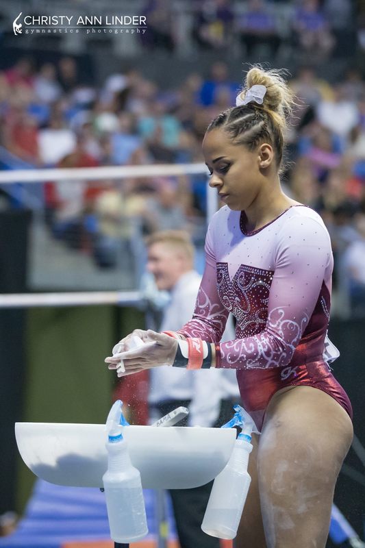
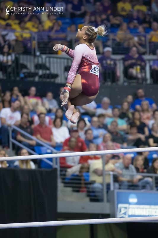
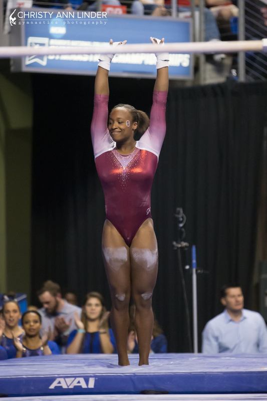
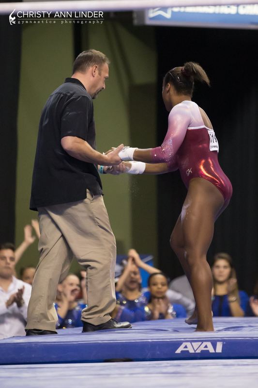
Alabama: 9.133
|
Caroline
Design: 2.5/3 Fabric/Sparkle: 1.8/2 School Spirit: 1.8/2 Overall Appearance: 2.7/3 Total: 8.8/10When Bama does leo reveal videos, I’m usually disappointed, but this one is amazing!! All the little details – the swirls coming up the sleeve, the little Bama on the hip, the A on the back – all compliment the main design on the front so well. This is gorgeous. |
Christina
Design: 2.9/3 Fabric/Sparkle: 1.8/2 School Spirit: 1.9/2 Overall Appearance: 2.8/3 Total: 9.4/10I loved this, and I basically drooled over Bama’s reveal video for this leo. It’s gorgeous. I love the ombre obviously, and the sparkly design on the front. It reminded me a lot of OU’s Big 12 leo, but it was much more well done here. The detailing on the bodice and the sleeves is exquisite. I love the neckline with the small “V”. The back looks great, very simple with the line of sparkles and the A on the mesh fabric, but it works so well here. It was probably my favorite of the weekend! |
Elizabeth
Design: 2.8/3 Fabric/Sparkle: 1.8/2 School Spirit: 1.8/2 Overall Appearance: 2.8/3 Total: 9.2/10This was one of the best of the Super Six! I loved the ombre and the doily look was similar to the leo OU has but way less. I love that neckline with the little V on the mainly straight line. I also liked the body sparkly design although I wish it didn’t stop partway down the body. |
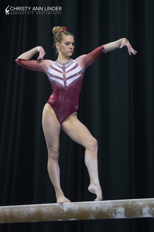
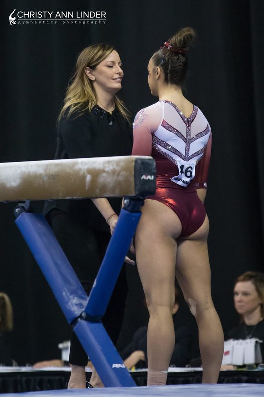
Oklahoma: 8.7
|
Caroline
Design: 2.2/3 Fabric/Sparkle: 1.6/2 School Spirit: 1.5/2 Overall Appearance: 2/3 Total: 7.3/10This design… confused me. The white background sort of makes a heart over the boob area, which was weird to begin with, and then to add almost a tree outline on top made it even weirder. The ombre sleeve is lovely and I didn’t really mind the back, but the front just killed it for me. |
Christina
Design: 2.7/3 Fabric/Sparkle: 1.8/2 School Spirit: 2/2 Overall Appearance: 2.8/3 Total: 9.3/10I wasn’t sure what to make of this one at first since there is a lot going on, but I grew accustomed to it and ended up liking it in the end. The only part that does bother me is the solid white on the chest area, but it obviously makes sense to have solid fabric in that area. Maybe I would have liked to see some sort of ombre instead? I liked this sparkly arrow-like design going on, and the ‘Sooners’ and ‘OU’ on each sleeve. Overall, a great leo that I grew to love by the end of the night. |
Elizabeth
Design: 2.9/3 Fabric/Sparkle: 1.9/2 School Spirit: 1.9/2 Overall Appearance: 2.8/3 Total: 9.5/10So I know a lot of people aren’t fans of this one but I love it! And it grew on me even more as the meet went on. I’ve always loved the white material used on the top of the leo, and the design on top made the super elegant and sparkly design look athletic at the same time. I also loved the ombre and the mesh and where it was used. Plus, the Sooners down the arm! Perfect for a title winning leo! |
Stanford: 8.3
|
Caroline
Design: 2.1/3 Fabric/Sparkle: 1.6/2 School Spirit: 1.4/2 Overall Appearance: 2.3/3 Total: 7.4/10This is a lovely design, a bit simple, but I think the understated look fits Ebee. I like the little sparkle detail on the sleeve, and the ombre is perfection. I would have liked some more sparkle along the bodice itself, but this is really nice. |
Christina
Design: 2.5/3 Fabric/Sparkle: 1.7/2 School Spirit: 1.4/2 Overall Appearance: 2.7/3 Total: 8.3/10Pretttyyyyyyyyy! This is simple, but the ombre and the sparkly V-neck gives it a very elegant look. The back hole works well here too. A great look overall. |
Elizabeth
Design: 2.8/3 Fabric/Sparkle: 1.9/2 School Spirit: 1.7/2 Overall Appearance: 2.8/3 Total: 9.2/10I love this one! And I don’t think Stanford’s worn it in the past, right? I also love that they let Ebee wear a new leo, if it is in fact new, rather than being disappointed the team didn’t make it and have her wear an old one. But back to the leotard itself, which I love. The ombre is subtle but lovely. The sparkle design on the front is just enough. The back hole really accentuates her back muscles and the white detailing is great too. Overall, this was one of my faves of the whole weekend. |
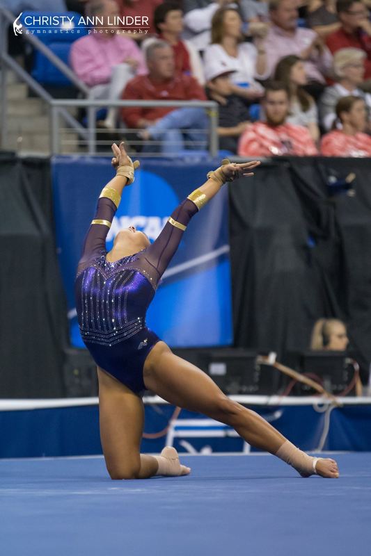
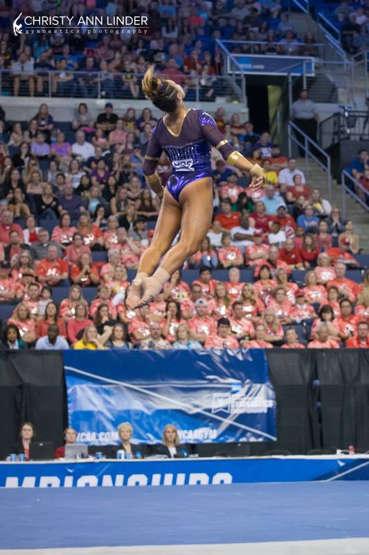
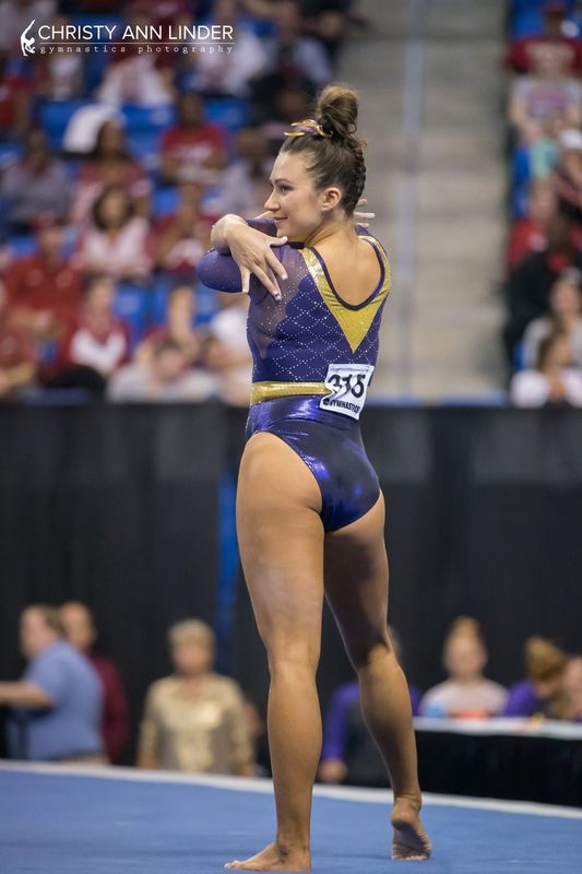
LSU (Super Six): 8.266
|
Caroline
Design: 2.6/3 Fabric/Sparkle: 1.7/2 School Spirit: 1.7/2 Overall Appearance: 2.5/3 Total: 8.5/10I loved this so much! The attention to detail on this one is even better than their semi design, it kind of reminds me of armor on top, which is why I don’t so much mind the separation at the shoulders. Armor is separated at the shoulders too! And then the corset style design on the bodice is just lovely, and the Wonder Woman arm bands are awesome! I wonder if this design was inspired by her perhaps? Between the armor look and the sweetheart neckline sort of like her classic look, I can totally see it. |
Christina
Design: 2.5/3 Fabric/Sparkle: 1.4/2 School Spirit: 1.8/2 Overall Appearance: 2.5/3 Total: 8.2/10I am torn on this one, but overall I do like it. The shoulder pads bother me so much; they are so random and don’t really add anything to the overall look. I like the design on the lower part of the bodice and on the back, with the straight lines of sparkles and the sweetheart neckline.. The solid purple with the criss-cross design on top of the mesh overall looks nice, but if I’m being nitpicky, I’ll say it looks a bit odd. I’m not sure I like the mesh coming in between either. And those shoulder pads! No. That said, I’m a big fan of the gold Wonder Woman-like arm bands. Great touch for school spirit and a neat way to add in all the school colors in a leo. |
Elizabeth
Design: 2.5/3 Fabric/Sparkle: 1.3/2 School Spirit: 1.7/2 Overall Appearance: 2.6/3 Total: 8.1/10This leo was very Cleopatra meets Wonder Woman to me. I like the design as a whole and the touches of gold on it, but the random solid pieces of fabric weren’t doing it for me. The parts on the sleeves looked like random shoulder pads and the mesh in between was odd. But overall, I liked this one a lot and better than the semifinals look. |
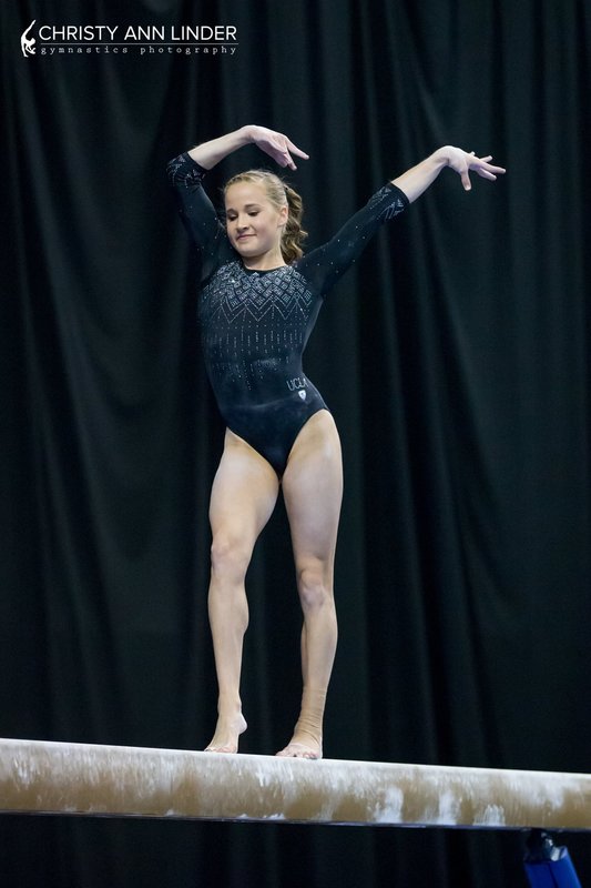
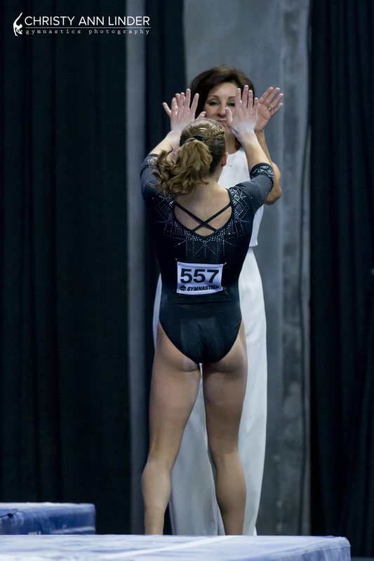
UCLA: 7.866
|
Caroline
Design: 2.1/3 Fabric/Sparkle: 1.7/2 School Spirit: 1.3/2 Overall Appearance: 2.2/3 Total: 7.3/10I wanted the warmup leo to be the real one! It actually said UCLA on it! That would’ve been a miracle, to finally have a design marked with the school name for the last meet of the season. However, I do appreciate that it’s a full coverage leo, and I love the little sparkle snowflakes (salt flakes maybe? Since they sprinkle the salt on beam? I know, I’m reaching) along the front. It does make it look a little winter-y though, and we’re in the middle of April now. I had hoped for a little more wow factor from them for Super Six, but this was okay. |
Christina
Design: 2.6/3 Fabric/Sparkle: 1.7/2 School Spirit: 1.4/2 Overall Appearance: 2.6/3 Total: 8.3/10A UCLA leo where the girls can wear a bra, what?! I liked this one and I especially loved the design the sparkles create on the front, almost like snowflakes. However, it’s quite tame to be a UCLA leo. I actually liked the warm-up leo better that has the same design but with ‘UCLA’ written in glitter across the chest. I am digging this black/dark navy look though. Overall though, I like this very much, but I wish it had a little more “woah” effect for the Super Six. |
Elizabeth
Design: 2.2/3 Fabric/Sparkle: 1.5/2 School Spirit: 1.5/2 Overall Appearance: 2.3/3 Total: 8.0/10This was fine. It’s really just another UCLA leo, though, but without the cool, low backs. Yeah, they could wear a real bra this time (thank god), but it was kind of not unique in the slightest. I did like how it had blue rhinestones to add some school spirit. And I liked the black look vs. all the navy UCLA normally wears. |
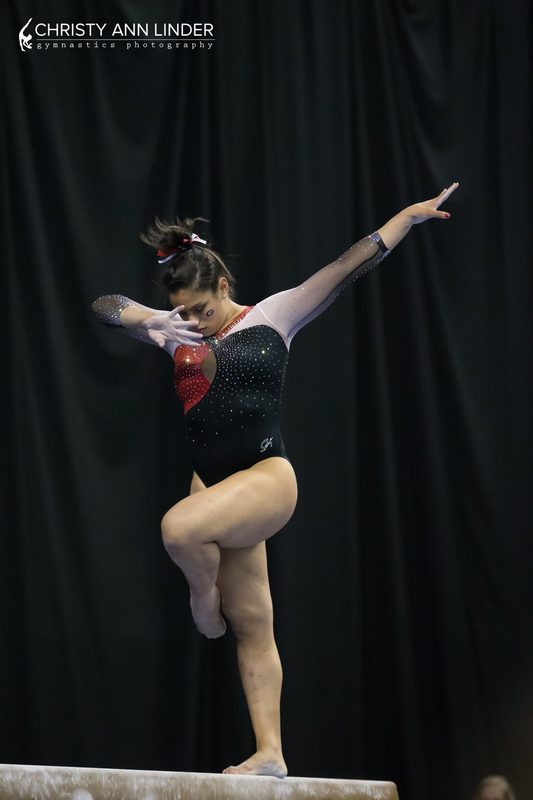
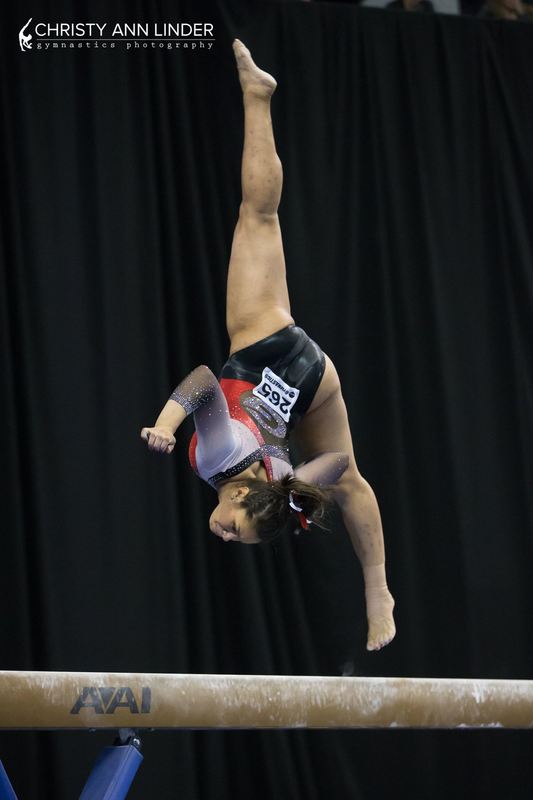
Georgia: 7.85
|
Caroline
Design: 2.1/3 Fabric/Sparkle: 1.6/2 School Spirit: 1.9/2 Overall Appearance: 2/3 Total: 7.6/10When the meet started I wasn’t really a fan, especially because on the broadcast it looked pink rather than white in the arms and shoulders, but the more I’ve looked at it the more it’s grown on me. I wish there was a little more red to it in the back to make it more symmetrical, but I like the keyhole look in the front. And the sparkly G in the back is just big enough to make a statement but not too big that it overpowers anything. |
Christina
Design: 2.3/3 Fabric/Sparkle: 1.5/2 School Spirit: 2/2 Overall Appearance: 2.3/3 Total: 8.1/10This is a nice one, but I really could have done without that mesh hole on the front. I love that it incorporates all school colors nicely, and the ombre sleeves are to die for. All in all a pretty look, but really what is the point of that front hole? |
Elizabeth
Design: 2.3/3 Fabric/Sparkle: 1.6/2 School Spirit: 1.9/2 Overall Appearance: 2.4/3 Total: 8.2/10I liked this one! The sleeve ombre is super pretty and the amount of sparkle is just enough. I like how the back mesh hole isn’t super obvious because of the Super G in the center, but I don’t LOVE the front mesh hole. But it’s not as bad as that nude sleeve leo the Gymdogs have.I like the red incorporated on here, though, and the little extra addition of the color on the neckline. |
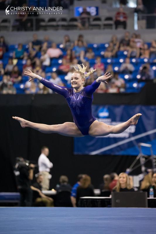
LSU (Semifinals): 7.466
|
Caroline
Design: 2.4/3 Fabric/Sparkle: 1.7/2 School Spirit: 1.6/2 Overall Appearance: 2.3/3 Total: 8.0/10I love this! The scallop design is just pronounced enough to make it different but doesn’t accentuate any weird areas like the OU scallop one earlier in the season. I love the faux belt and the gold V in the back, and it was soooo sparkly! Definitely one of my top LSU looks of the season. |
Christina
Design: 2.2/3 Fabric/Sparkle: 1.4/2 School Spirit: 1.5/2 Overall Appearance: 2.2/3 Total: 7.3/10Overall, I quite like this one. The ‘scallop’ design makes it all look mermaid-y and I love it. I do wish it covered the sides more instead of creating *gasp* mesh cutouts under the arms. I like the touches of gold but I don’t like this whole belt business. I want more mermaid design! |
Elizabeth
Design: 2.0/3 Fabric/Sparkle: 1.4/2 School Spirit: 1.6/2 Overall Appearance: 2.1/3 Total: 7.1/10I honestly kind of liked the warm up leo LSU wore during semifinals better? I like the back on this leo with the deep gold V but the front is just meh for me. I’m not a fan of the scalloped edges of the front or how it looks like a halter top with the thick gold neckline. I also am not a huge fans of how the mesh extends under the arms too. I do, however, like how the sparkle design is, what I’m assuming is inadvertent, dragon scales. |
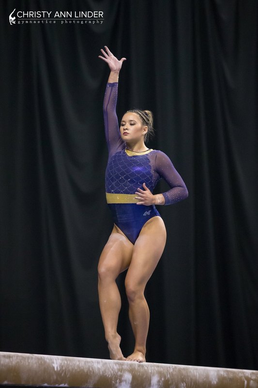
Washington: 7.3
|
Caroline
Design: 2.2/3 Fabric/Sparkle: 1.4/2 School Spirit: 1.2/2 Overall Appearance: 2.4/3 Total: 7.2/10This reminds me of Florida’s stained-glass-esque leo, but I actually like this design on the front better, and the keyhole in the back is really nice. I do wish there had been a contrasting color – black, white, gold, silver – but the different shades of purple do give it some depth. It was also really sparkly on the broadcast, which I loved! |
Christina
Design: 1.7/3 Fabric/Sparkle: 1.5/2 School Spirit: 1.4/2 Overall Appearance: 1.8/3 Total: 6.4/10Just like OSU, I find this one a bit underwhelming for a national championship leo. Where is the gold?! The design is fairly common as well and something we have seen on other teams with different shades. I’m not a fa of the front, with this “flames coming out of your boobies to strangle you” design, but I do like the hole in the back. |
Elizabeth
Design: 2.4/3 Fabric/Sparkle: 1.7/2 School Spirit: 1.7/2 Overall Appearance: 2.5/3 Total: 8.3/10I was hoping we’d get a chance to judge this one since we missed it the first go round. I love the color of purple used and the shimmery nature of it. The design is elegant and it’s definitely befitting of a national championship! |
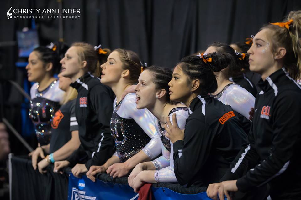
Oregon State: 6.7
|
Caroline
Design: 2/3 Fabric/Sparkle: 1.4/2 School Spirit: 1.4/2 Overall Appearance: 2/3 Total: 6.8/10When I saw tweets about how sparkly and great this leo was I got excited, but when I went back to watch semi I, I was a little disappointed. There’s no orange, which to me says they took the easy route, and the color patterning is actually kind of basic. I do like the big sparkly OSU on the front, and the sparkle belt that goes all the way around is pretty cool. But I expected more from the Beavs at nationals! |
Christina
Design: 1.7/3 Fabric/Sparkle: 1.4/2 School Spirit: 1.6/2 Overall Appearance: 1.9/3 Total: 6.6/10This is alright, although fairly simple coming from OSU (what do you mean we don’t get a sports bra-Vanessa Ferrari-UCLA-random-strap mesh up this week?). The black and white creates an elegant look, but I do wish it had a touch of orange somewhere. This is a bit underwhelming for a national championship leo, but it is still a nice one though. |
Elizabeth
Design: 1.9/3 Fabric/Sparkle: 1.2/2 School Spirit: 1.6/2 Overall Appearance: 2.0/3 Total: 6.7/10Hmm… Can’t believe I’m saying this but I wish this had more orange. But as a whole, I like it. I like that the white sleeves are that shimmery white material and the OSU on the front is in a reverse sparkle design. I also like the thicker neckline. But other than that, I need a touch more excitement for a national championship. Maybe wearing this one at regionals and the monstrosity the Beavers wore at regionals here? |
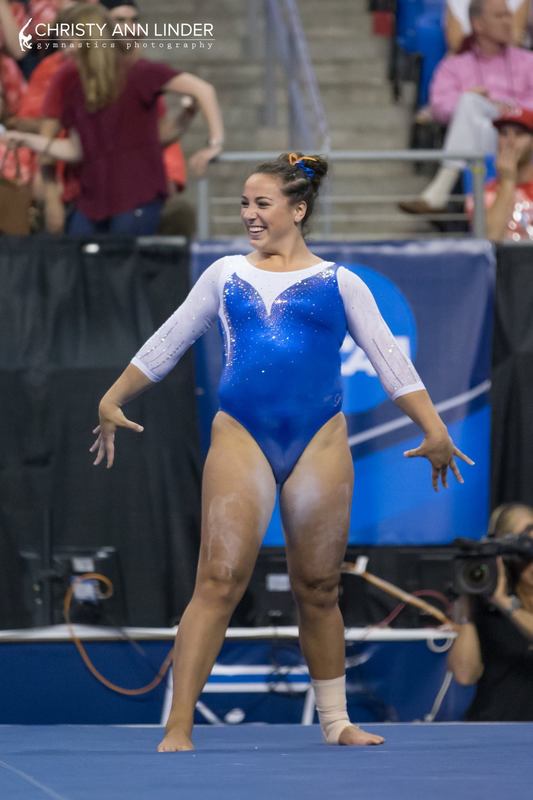
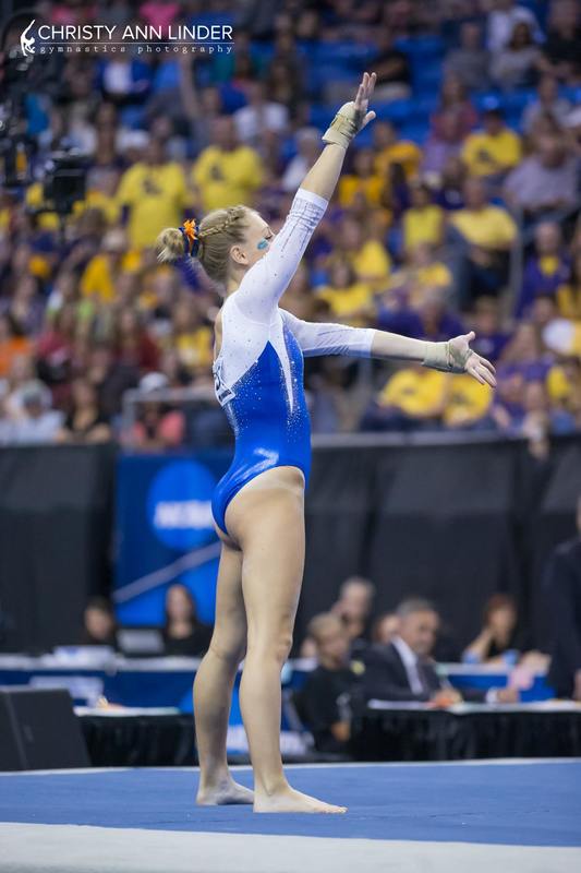
Florida: 5.833
|
Caroline
Design: 2/3 Fabric/Sparkle: 1.2/2 School Spirit: 1.2/2 Overall Appearance: 1.8/3 Total: 6.2/10Boooooooooo. No orange, no Gators or Florida anywhere on it – this could easily have been any other team’s blue leo! I expected far more from Florida in Super Six, and I know most of the time they don’t use orange, but I think that’s a waste! The asymmetry of the neckline is okay, I didn’t mind it terribly, and the sparkle is solid, but overall it fell flat for me. |
Christina
Design: 1.5/3 Fabric/Sparkle: 0.7/2 School Spirit: 1.2/2 Overall Appearance: 1.7/3 Total: 5.1/10This is way too simple for a Super Six leo. It did look alright overall, but underwhelming for the occasion. The big thing I hated about this leo is the asymmetrical design on the front, and it makes it look like one boob is smaller and the entire right side is just not proportional with the left. Anyways, this is a clean look, but too meh for Super Six. |
Elizabeth
Design: 1.9/3 Fabric/Sparkle: 0.8/2 School Spirit: 1.5/2 Overall Appearance: 2.0/3 Total: 6.2/10I was actually super underwhelmed by this Florida leo. I mean, it’s the Super Six for goodness sake! I wasn’t really a fan of the mismatched look and the design was super simple and not very sparkly. I liked the side with the white that went down more than the blue across the shoulder side. Overall, a big meh from me. |
Nebraska: 5.6
|
Caroline
Design: 1.7/3 Fabric/Sparkle: 1.1/2 School Spirit: 1.6/2 Overall Appearance: 1.9/3 Total: 6.3/10So on broadcast I didn’t mind it as much, but standing still that white ribbon looks really random on the front and distracts from the N itself. And the red N didn’t need to go up on the arm either. My biggest complaint is that it’s not sparkly enough! You’re on national TV, you want that leo to shine! It paled in comparison to a lot of the other designs they competed against. |
Christina
Design: 1.4/3 Fabric/Sparkle: 0.7/2 School Spirit: 1/2 Overall Appearance: 1.5/3 Total: 4.6/10Meh, this is just so simple and bland. This is NCAAs! Time to go crazy with the weird designs and all the sparkles. I am also not a fan of the random mesh part at the top of the leo that weirdly goes down on one sleeve into a V. All in all, this is just so simple and a bit of a letdown from Nebraska which usually comes through with interesting designs. |
Elizabeth
Design: 1.7/3 Fabric/Sparkle: 0.9/2 School Spirit: 1.5/2 Overall Appearance: 1.8/3 Total: 5.9/10There’s so many better leotards Nebraska could have worn. I’m not sure why the team chose this one for the national championships. It’s alright. The mesh is weird and random, and the squiggly design is also kind of an afterthought apart from the red part that makes an N. Where’s the cool-back leos Nebraska’s known for! |

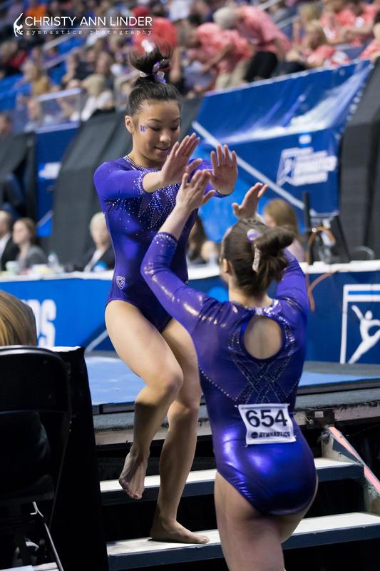
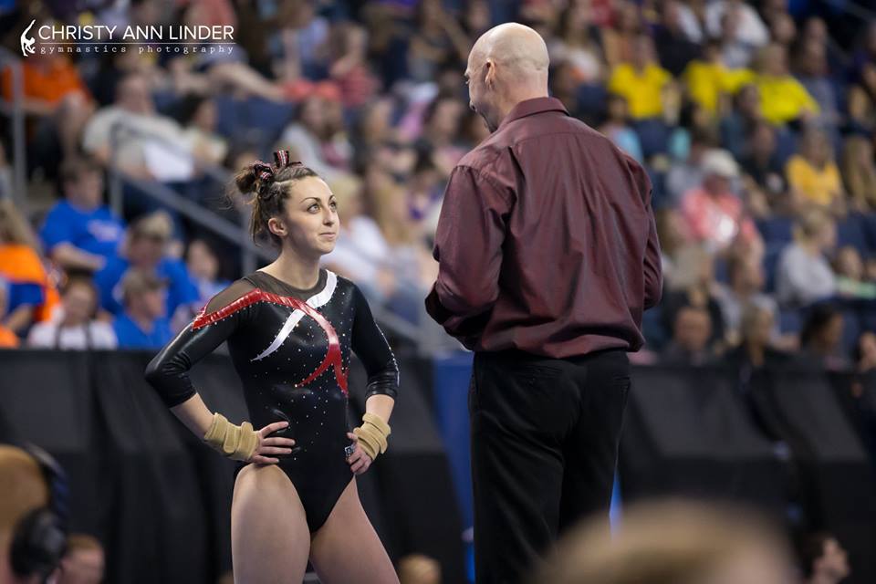
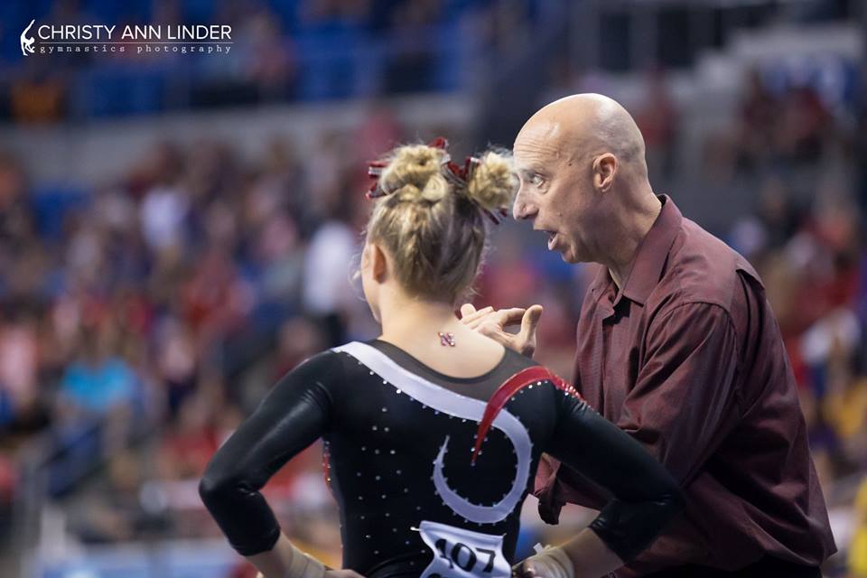


Hey, was Utah vapor at Nationals!! their leos were fabulous.
Hi Janny,
Thanks for reaching out! As neither Utah leotards were new, we chose not to judge them because we have done so in the past.
Thanks for reading the post and visiting the site!