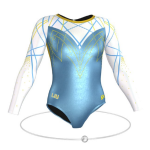
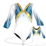
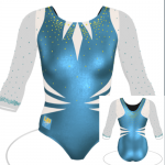
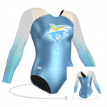
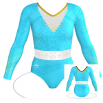
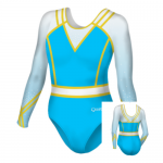
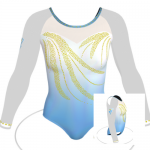
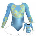
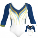
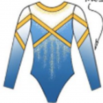
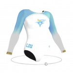
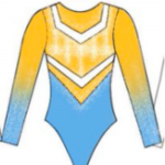
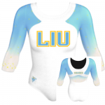
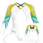
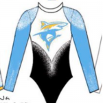
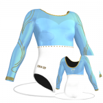
You submitted some great designs for our Long Island University leo design contest, and our editors chose their top 10! Did your design make one of the lists? Which is your favorite of all the finalists? Let us know on social media or in the comments!
Elizabeth
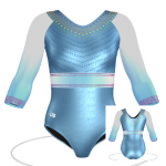
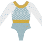
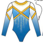
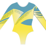
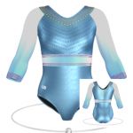
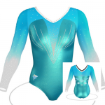
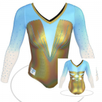
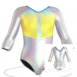
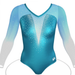
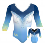
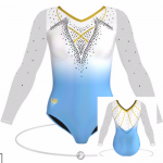
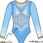
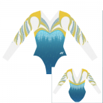
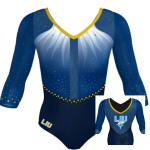
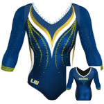
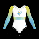
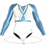
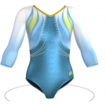
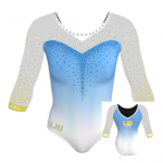
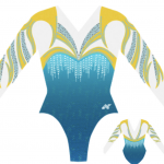
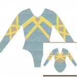
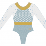
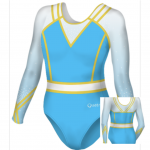
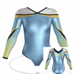
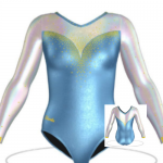
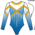
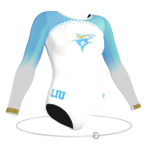
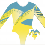
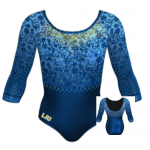
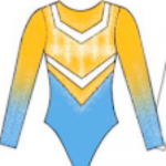
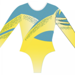
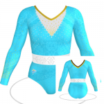
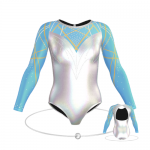
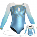
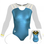
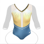
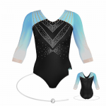
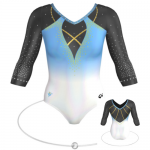
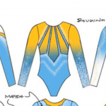
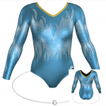
I obviously have a type. Overall, I preferred the leos that weren’t straight-up stock designs and showed a bit more creativity. And while some of the designs in my top 10 are ones we’ve seen before, they’re good ones nevertheless. You’ll also notice what I’m calling a subtle water/Atlantis theme, where a lot of the designs show school spirit in unique ways, like the fish scales in No. 4 or the wave-like design of No. 10. Plus, colors. All of these leos used colors in the right combinations and in the right places on the designs to satisfy my eye.
Katherine
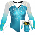
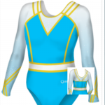
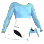
Full disclosure: I barely considered school spirit for these designs. Since they’re all hypothetical, my thinking was mostly along the basic lines of “this would look pretty” or “this wouldn’t.” That said, my No. 1 pick would be one of the most ambitious leos ever attempted, and I love how unique it is; did @PressHandstand page KJ Kindler for help? I loved the incorporation of aqua colors—Nos. 3, 5 and 7 would certainly pop off the floor. Going down the list, though 9 and 10 were lacking in some ways for me, the sparkle distribution was *chef’s kiss* enough to make my top 10.
Allie
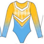
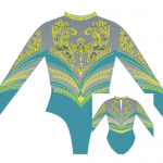
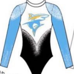
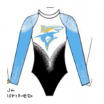
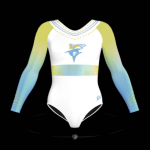
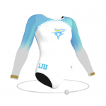
First I want to acknowledge that these are some tough school colors to work with. All of the colors are light so it is difficult to design a flattering leo. My favorite two have to be by @marykorlindowns, specifically the last two on the bottom row. I would love to see that last one with the shark mascot on the front made into a competition leo for them. It definitely takes the title for school spirit from me, and I’m a fan of a high neckline.
Mary Emma
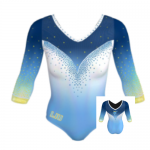
As I’m sure you all know by now the leo design element I’m drawn most to is ombre, so you’ll notice that as a pattern throughout. There are a few exceptions, however, as I couldn’t help putting the designs from @marykorlindowns, @eric13578 and @MDJDS_FAN in my top 10 as well.
Claire
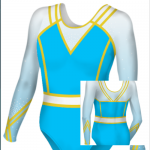
I picked clean, bold designs that embraced LIU’s colors. Admittedly, this isn’t the easiest combination to work with, but when done right, it can be a showstopper (see UCLA’s Centennial leo). Each of my picks had some eye-catching element—from fish scale sparkles to striking yellow piping—that made it stand out without being too cluttered. I hope LIU reads this, because I’d really love to see some of these come to life!
Emily M
Can you tell I like an ombre with a sweetheart neckline? HA. I also was drawn to looks that featured little nods to water or sharks, like the shark fin inset in No. 7. No one can ever say the gymternet isn’t creative! Plays on different shades of blue were also intriguing; I enjoyed looks that worked in deeper blues.
Kalley
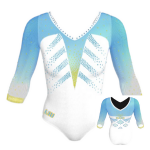
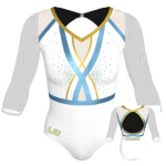
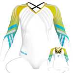
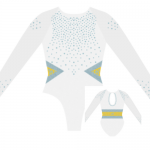
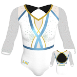
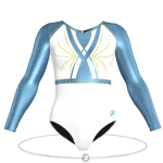
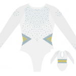
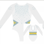
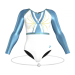
It’s pretty obvious how drawn I am to white leos after reviewing what made my top 10. What can I say? I like what I like. I am a big fan of an almost-retro athletic look, as demonstrated in the designs I chose by @marykorlindowns. Another fun design aspect was the fin-like pattern on the design by @PressHandstand. I hope LIU doesn’t shy away from embracing its colors (looking at you, UCLA) or mascot because there is some serious fun to be had in these designs.
Tara
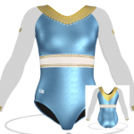
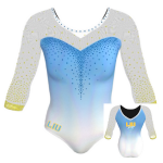
OK, this really emphasizes my love of ombre and geometry. I had a hard time choosing just one top leo, but ultimately I went with Mariah’s design. The classic sweetheart neckline paired with the ombre is just too irresistible. I love how the majority of these incorporate gold into the leotard as well. I chose ones that I felt would also be more likely to become a real leo, hence the use of more white, but I would love to see LIU use black also. It adds contrast to an otherwise light color palette, as exemplified by Callie’s and @eric13578’s designs.
Article by the editors of College Gym News
Like what you see? Consider donating to support our efforts throughout the year! [wpedon id=”13158″]




One comment