By Christina Marmet, Caroline Medley and Elizabeth Grimsley
Continuing with the throwback leotard theme, this week we’re taking a look back at the fashion at the 2005 NCAAs Super Six. There was lots of shiny fabric, bold designs and… confusing choices. Thanks to David for suggesting the meet!
The criteria is the same as during the season. But to refresh your memory: up to three points for design; two points for fabric, sparkle, etc.; and two points for school spirit; three points for overall appearance. But we want to know your thoughts too! Make sure to vote in our poll at the bottom of the page.
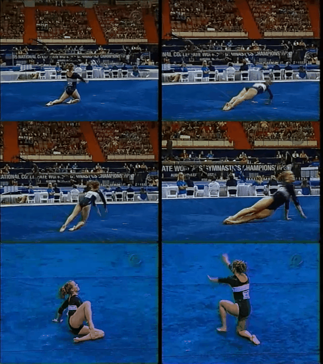
Georgia 7.7
Caroline
Design: 2/3
Fabric/Sparkle: 1.3/2
School Spirit: 1.8/2
Overall Appearance: 1.8/3
Total: 6.9/10
Doesn’t Georgia still wear this leo? Or something kinda like it? Anyway, the band across the chest is awkwardly placed, but it IS the design, and it uses all three colors, so big points for school spirit. Other than that, it just feels kinda bland. Also, severely lacking in sparkles!
Christina
Design: 2.6/3
Fabric/Sparkle: 1.5/2
School Spirit: 1.9/2
Overall Appearance: 2.6/3
Total: 8.6/10
I love this one, especially the boldness and originality of the look back then with the big white band across the chest with ‘Georgia’ in it. Georgia went for the sporty, cheerleader look there, and it’s a nice change from every other generic looks we saw around that time. I was so happy when this leo got revisited a few years ago, and it’s still very much a look I like. My only small pet peeve is that I wish it had a tiny bit more red in it, but I also like how the neckline and the white band are lined up with red. It’s well-balanced that way too. Anyways, overall a solid look from UGA.
Elizabeth
Design: 2.3/3
Fabric/Sparkle: 1.3/2
School Spirit: 1.7/2
Overall Appearance: 2.3/3
Total: 7.6/10
I’ve always liked this one. It’s simple yet classy and shows a bunch of school spirit. However, after seeing the updated version Georgia came out with a couple years ago, I don’t like this one as much haha
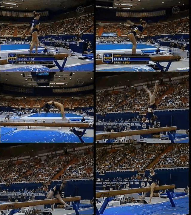
Michigan 7.166
Caroline
Design: 2.4/3
Fabric/Sparkle: 1.4/2
School Spirit: 1.7/2
Overall Appearance: 2.6/3
Total: 8.1/10
Can Michigan wear this one again? Holy cow I love this! The navy blue and the burnt yellow/gold contrast so nicely, and the sunburst design feels very reminiscent of that Team USA leo in Beijing. Super cute, looks great on broadcast, and school spirity—just would have liked more sparkle!
Christina
Design: 2.1/3
Fabric/Sparkle: 1.4/2
School Spirit: 1.4/2
Overall Appearance: 1.9/3
Total: 6.8/10
Oh hi Elise! Long time no see hehe. Back to the topic, this leo is OK I guess. This shade of blue is lovely, I like the front neckline and the little hole on the back, and the fact that they are lined up by yellow/gold. However, I am really not a fan of the gigantic yellow star-ish design on the side. It’s just way too big and ‘in your face.’ It’s still a decent look and the color combo is great, but I’m not deeply in love with this leo either.
Elizabeth
Design: 1.9/3
Fabric/Sparkle: 1.2/2
School Spirit: 1.5/2
Overall Appearance: 2.0/3
Total: 6.6/10
Eh… I mean, good job for using school colors but this is kind of plain for my taste. I don’t not like anything about it, but I don’t love any aspect either.
UCLA 7.033

Caroline
Design: 2.1/3
Fabric/Sparkle: 1.3/2
School Spirit: 1.2/2
Overall Appearance: 2.2/3
Total: 6.8/10
I don’t remember judging this before, the details on the arms look new? Anyhow, that’s what really makes the design for me. The rest of it is kinda boring and the neckline is my least favorite. Also, UCLA never seems to learn that school spirit is needed!! Same then as it was now.
Christina
Design: 2/3
Fabric/Sparkle: 1.7/2
School Spirit: 1.5/2
Overall Appearance: 2.4/3
Total: 7.6/10
Well, we already judged this one when we did the 2009 leo rankings. Of course UCLA would bring back the same leo four years later… My criticism hasn’t changed since! I love the color combo and this shade of blue, and the “risqué” open V neckline. However, I hate where the white and blue meet and it’s such a sharp transition. I feel like it’s at such an awkward place right across the boobs and it just cuts the entire figure so the entire thing is very unflattering. So yeah, still meh on this one.
Elizabeth
Design: 1.9/3
Fabric/Sparkle: 1.3/2
School Spirit: 1.5/2
Overall Appearance: 2.0/3
Total: 6.7/10
UCLA, my thoughts for your leo can be described by the following GIF.
Nebraska 6.8
Caroline
Design: 1.8/3
Fabric/Sparkle: 1.5/2
School Spirit: 1.3/2
Overall Appearance: 1.8/3
Total: 6.4/10
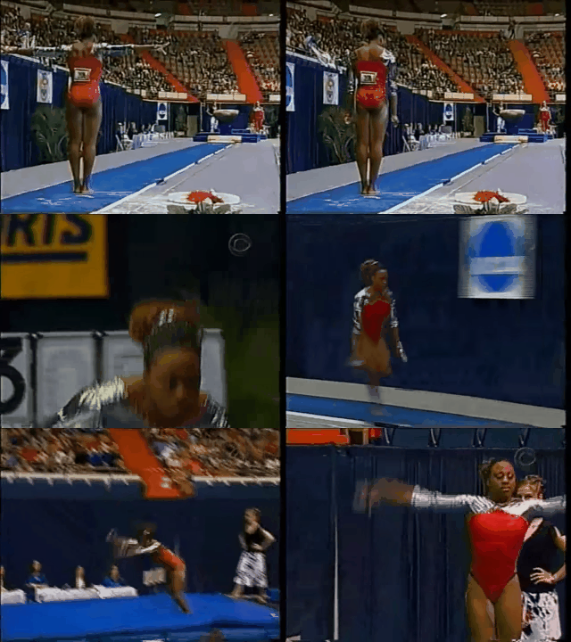
I’m pretty sure Nebraska wore this this past season. While I hate the neckline, the silver/red contrast is nice, and call me crazy, but I kinda love the spacesuit silver fabric! I also love the matching silver hair scrunchie, so bonus for accessory, but minus points for lack of logo or team name.
Christina
Design: 2.2/3
Fabric/Sparkle: 1.3/2
School Spirit: 1.3/2
Overall Appearance: 2/3
Total: 6.8/10
This is something I could totally see Nebraska still wear today. Unfortunately, this leo combines two things I dislike: shiny silver fabric and the weird neckline that comes up in the center. That said, the silver and this shade of red kind of work well here, so I can tolerate it. It’s just so shiny, but I guess it makes the gymnasts stand out in a sea of darker leos. A small ‘N’ maybe on the hip or on the back would have been a nice addition, as the whole bodice is a bit boring otherwise.
Elizabeth
Design: 2.0/3
Fabric/Sparkle: 1.5/2
School Spirit: 1.5/2
Overall Appearance: 2.2/3
Total: 7.2/10
Nebraska hasn’t actually worn this leo recently but has just used a similar fabric as on the arms. Either way, I love that tin foil silver! What I don’t like, though, is the front neckline design. The back is fine, though. I just feel like this was a missed opportunity.
Alabama 6.6
Caroline
Design: 1.6/3
Fabric/Sparkle: 1.4/2
School Spirit: 1.5/2
Overall Appearance: 2/3
Total: 6.5/10
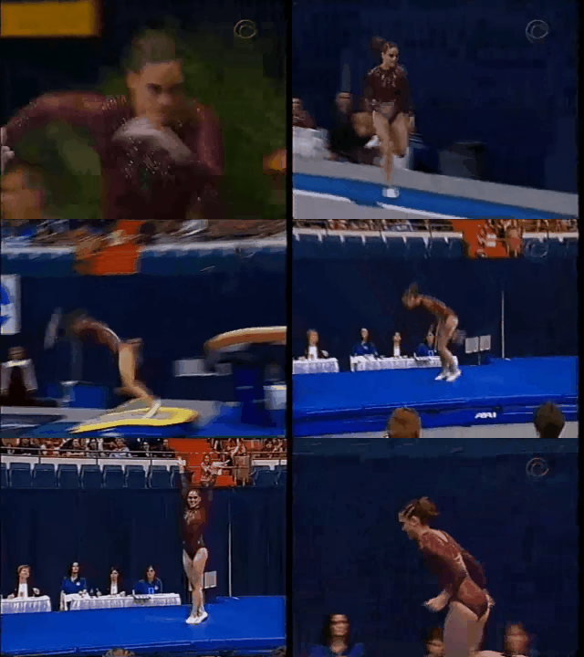
The sparkle cascade is basic but cute, and it looks pretty good on the broadcast. This particular shade of red is not my favorite, but the high neck and low back is fun and it looks really great in motion. Kind of a mixed bag I suppose.
Christina
Design: 1.7/3
Fabric/Sparkle: 1.2/2
School Spirit: 1.4/2
Overall Appearance: 1.9/3
Total: 6.2/10
Hmmmmm I am not sure how to feel about the glittery teardrops here. The ones on the chest and on the back are alright, but I am really not digging the ones that are on the shoulders and around the neckline, where the inside is filled with crimson mesh. Nope. I do like this shade of crimson red though, but I wish there was something more to the design than these drops.
Elizabeth
Design: 2.1/3
Fabric/Sparkle: 1.4/2
School Spirit: 1.4/2
Overall Appearance: 2.2/3
Total: 7.1/10
I like it. The red color is nice and I think the sparkle design adds just enough to the leo without making it too busy.
Utah 4.533
Caroline
Design: 2/3
Fabric/Sparkle: 0.6/2
School Spirit: 0.3/2
Overall Appearance: 1.2/3
Total: 4.1/10
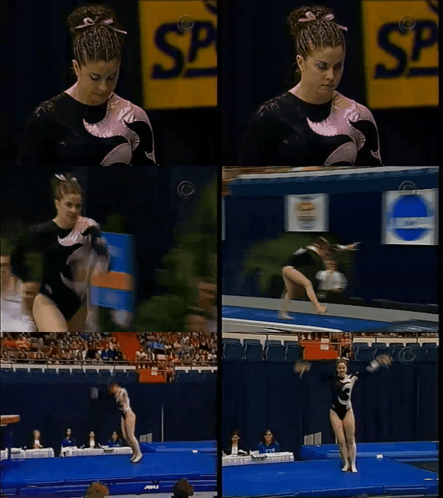
I probably wouldn’t mind the design as much if it were the right colors… or like any decent color at all? This shade of pink is awful and it has nothing to do with Utah. I honestly would have liked it better if it were just black and white. Also, is the black velvet? Hard to tell here, and I can’t decide if that makes it better or worse… Overall just a hot mess for me.
Christina
Design: 1.4/3
Fabric/Sparkle: 0.9/2
School Spirit: 0.4/2
Overall Appearance: 1.5/3
Total: 4.2/10
… Why are you wearing pink? We are not at a pink meet, and it’s not part of your school colors. Utah has always tried to stand out from everybody else, especially the fans who to this day have crazy colorful shirts in the stands. However, this leo is just super random for a Super Six. You should be wearing something that screams ‘Utah’! Plus, I don’t like this shade of pink much here, and the design itself is just so random and ridiculous. Yes, I know this was very trendy back then, but I didn’t like it back then either.
Elizabeth
Design: 1.6/3
Fabric/Sparkle: 1.1/2
School Spirit: 0.8/2
Overall Appearance: 1.8/3
Total: 5.3/10
Utah what are you doing… Why are you wearing pink—and gross baby pink at that—at the Super Six. Really? Not only is the color a big nope for me but the design is too consuming of the arm as well. I just don’t like this at all.
Have a throwback meet you want us to judge? Stick it in the comments or hit us up on Twitter, and we’ll try to get to it in the coming weeks!

