

Gymnastics fans love leotards, it’s just a fact. We love seeing new designs, creating our own, and especially judging them. That’s why we’re back for another season of leotard rankings!
Each week we’re analyzing new designs to find our weekly faves. Leos can earn up to three points for design; up to two points for construction, which includes fabric, fit, and sparkle; up to one point each for school/theme spirit and creativity; and up to three points for overall appearance. This week Hope M, Izzi, and Jessica are joining editor-in-chief Elizabeth for judging.
Don’t agree with our ranking? Make your opinion heard by voting in the fan poll at the end of the article each week or by voicing your thoughts on social media!
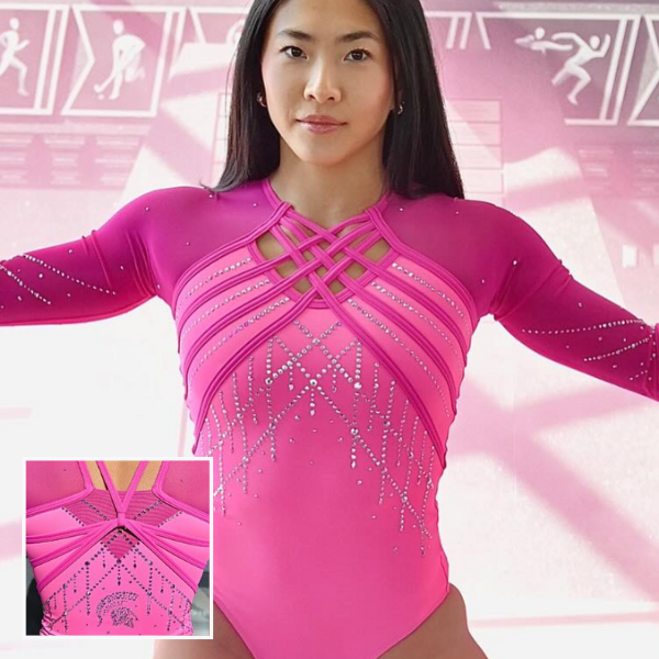
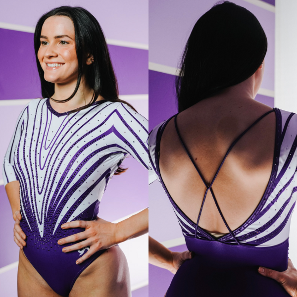
Michigan State: 8.125
View images of this leotard here.
 Elizabeth: 7.300
Design 2.0/3, Construction 1.7/2, School/Theme Spirit 0.7/1, Creativity 0.7/1, Overall Appearance 2.2/3
I prefer Michigan State’s old pink leo, but this one gets the job done and is at least unique and not a stock design. I like the two shades of pink and how they keep the leotard from being one-note. I also like the straps and how they make a very subtle heart. The back strap design is neat, too.
 Hope M: 8.100
Design 2.5/3, Construction 1.5/2, School/Theme Spirit .8/1, Creativity 0.8/1, Overall Appearance 2.5/3
Well there’s no missing the theme here! LOVE the monochromatic color story and think it works well with the chandelier rhinestone design at embracing the general vibe of feminine but not dainty. The sneaky heart in the waffle weave on the chest is a neat aspect, but I can’t stop thinking about how annoying/distracting it would be to actually wear.
 Izzi: 8.500
Design 2.4/3, Construction 1.8/2, School/Theme Spirit 1.0/1, Creativity 0.9/1, Overall Appearance 2.4/3
I absolutely love this? Michigan State has a way of getting me to like a strappy back, which isn’t easy to do. I love the dripping crystal theme contrasted with the athletic, adidas-esque stripes. I think I want them to make this into a green/white leo…
 Jessica: 8.600
Design 2.5/3, Construction 1.8/2, School/Theme Spirit 1.0/1, Creativity 0.8/1, Overall Appearance 2.5/3
I LOVED this one omg. A monochromatic moment? Yes please, sign me up. I love how flattering the strappiness is and I like how they come together in the back. The chandelier-style rhinestones might be my favorite part, aside from the shade of pink used on the body.
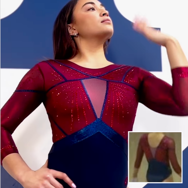
Penn: 7.600
View a video of this leotard here.
Elizabeth: 8.600
Design 2.5/3, Construction 1.7/2, School/Theme Spirit 0.9/1, Creativity 0.8/1, Overall Appearance 2.7/3
This is really really nice. I like how Penn goes for it and uses a lot of both of its school colors. The geometric design on the chest is also neat. I wish the matte blue fabric on the bottom matched the mystique blue accents on the chest better because in some lighting, the bottom looks more black than navy. Otherwise, this is a great leo from the Quakers.
Hope M: 6.400
Design 1.7/3, Construction 1.2/2, School/Theme Spirit 0.8/1, Creativity 0.7/1, Overall Appearance 2/3
Mixed feelings about this one – there’s nothing wrong per say, but it just isn’t landing for me. I appreciate the jewel tones and use of mixed fabrics, but the half committed stained glass design of the top and the way the mesh on the back is so open ended aren’t my favorite.
Izzi: 7.600
Design 2.2/3, Construction 2.0/2, School/Theme Spirit 0.7/1, Creativity 0.5/1, Overall Appearance 2.2/3
The colors here feel regal and opulent, which I love for the Ivy Classic. I like the inverted waist and the simple piping as well. My only complaint is the triangle chest faux cutout. Nobody asked for that.
Jessica: 7.800
Design 2.3/3, Construction 1.8/2, School/Theme Spirit 0.8/1, Creativity 0.5/1, Overall Appearance 2.4/3
The simplicity of this one speaks for itself. A little bland? Maybe, but full of spirit. I love the use of colors and how this leo is very Ivy League. My biggest qualm with this is the mesh on the front and back, like why couldn’t we just make it some extra rhinestones or a P or something fun?
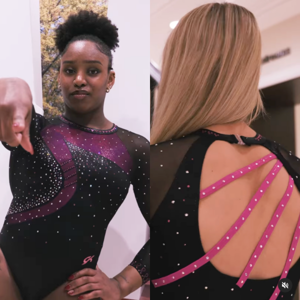
Alabama: 7.075
View a video of this leotard here.
Elizabeth: 6.600
Design 1.7/3, Construction 1.5/2, School/Theme Spirit 0.8/1, Creativity 0.6/1, Overall Appearance 2.0/3
I like that this pink leo is different. The darker look with subtle pink accents works. The design itself is just OK, but I do like the back—how some straps extend past the hole while others don’t—and the mini ribbons on the sleeve cuffs.
Hope M: 7.600
Design 2/3, Construction 1.7/2, School/Theme Spirit .7/1, Creativity .7/1, Overall Appearance 2.5/3
I love a black leo moment, and this one works! I wish the lighter pink of the back straps was somehow represented on the front as well because the bold contrast works so well with the rhinestones and black of the back design. The ribbon rhinestone detail at the end of the sleeves is also working big time for me.
Izzi: 7.000
Design 1.8/3, Construction 1.4/2, School/Theme Spirit 0.8/1, Creativity 0.8/1, Overall Appearance 2.2/3
For some inexplicable reason, I really like this one? The back straps and the 2010-ish front design point to my hating it, but the whole is greater than the sum of the parts here, I suppose. I love the black overlay to mute the pink; it makes it look like the leo was made for adult women and not children. I also liked the asymmetrical stripes and how they continue subtly in the front.
Jessica: 7.100
Design 1.8/3, Construction 1.5/2, School/Theme Spirit 0.7/1, Creativity 0.8/1, Overall Appearance 2.3/3
At first glance, I was not a huge fan of this one. It just felt a little boring to me. However, I love the use of the different pinks and I LOVE the back. I also love the small details throughout the leotard, especially the little ribbons on the cuffs of the sleeves.
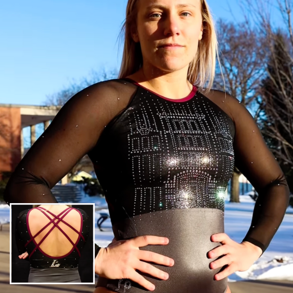
La Crosse: 6.800
View a video of this leotard here.
Elizabeth: 8.000
Design 2.0/3, Construction 1.7/2, School/Theme Spirit 1.0/1, Creativity 0.8/1, Overall Appearance 2.5/3
While doing a rhinestone design based on a pretty nondescript building is kind of funny, I do like the overall leotard design. The grey and black work really well together, and I love the maroon accents.
Hope M: 7.600
Design 2.3/3, Construction 1.5/2, School/Theme Spirit 1/1, Creativity .5/1, Overall Appearance 2.3/3
Architectural designs can get very funky, but this one is nice! It’s neat to see the gray working well because it’s not a color we see often in leotards. Sleeves and back are pretty standard, but it does keep the focus on the main theme.
Izzi: 5.000
Design 2.0/3, Construction 0.1/2, School/Theme Spirit 1.0/1, Creativity 0.9/1, Overall Appearance 1.0/3
Did the printer run out of ink halfway through? I think the lighting is partially to blame, but the design just looks like it decided to bail halfway. I’m obsessed with the Washington library leo, so in theory this is right up my alley, but they really swung and missed here.
Jessica: 6.600
Design 2.0/3, Construction 0.8/2, School/Theme Spirit 1.0/1, Creativity 0.9/1, Overall Appearance 1.9/3
I like what they were trying to do with the rhinestone building but I feel like it missed the mark a bit. I wish the building faded out more into the grey, rather than the abrupt end. Overall, I like the use of the school colors and the way they were implemented here.
Clemson: 6.475
View a video of this leotard here and images here.
Elizabeth: 6.800
Design 1.7/3, Construction 1.7/2, School/Theme Spirit 0.7/1, Creativity 0.7/1, Overall Appearance 2.0/3
I almost like this. The purple is great, and the back is simple but unique. However, I’m not a fan of the zebra-esque design and lack of orange. It’s not offensive by any means, but it’s also not my favorite.
Hope M: 8.000
Design 2.3/3, Construction 1.8/2, School/Theme Spirit 0.6/1, Creativity 0.8/1, Overall Appearance 2.5/3
Is my judgement clouded by the trauma of purple leos past or is this actually okay? It does get zebra-y when the arms are lifted and the extreme openness of the back meant a lot of undergarments showed through during actual competition which is a sad face for me, BUT I like the fact that it’s a simple but not boring design. I’ve watched enough Project Runway to appreciate the fabric matching up the lines at the seams to make it cohesive.
Izzi: 3.100
Design 0.4/3, Construction 0.2/2, School/Theme Spirit 0.6/1, Creativity 0.7/1, Overall Appearance 1.2/3
I’m just… confused? There are so many little things that irk me about this leo: The V-neck doesn’t match the curved V of the pattern, the tiny thin backstraps come out of nowhere, and I don’t know if I’m looking at a tiger print or some simple procreate melting demo. That being said, somehow it manages to look very average and normal in motion.
Jessica: 8.000
Design 2.0/3, Construction 1.7/2, School/Theme Spirit 0.8/1, Creativity 0.8/1, Overall Appearance 2.7/3
I actually love the creativity here. And this particular shade of purple is fantastic. Seeing this one in person, it’s so much better under arena lights. The back however, as a former gymnast myself, is a major design flaw. It cuts too low making it hard to hide a bra or other such undergarments, especially when you’re tumbling.
Fan Poll
Congrats to George Washington for winning last week’s fan poll! Vote for your favorite design from this week here.
READ THIS NEXT: The Dismount: Week 8
Article by Elizabeth Grimsley, Hope Maier, Izzi Baskin, and Jessica Brock
For the Michigan state pink leo, that is actually a stock design from their most recent catalog (link to page below). Also, *Adidas* 🙂
https://teamwear.sylviap.net/pages/catalog/2024-25-forever