Gymnastics fans love leotards, it’s just a fact. We love seeing new designs, creating our own, and especially judging them. That’s why we’re back for another season of leotard rankings!
Each week we’re analyzing new designs to find our weekly faves. Leos can earn up to three points for design; up to two points for construction, which includes fabric, fit, and sparkle; up to one point each for school/theme spirit and creativity; and up to three points for overall appearance. This week Peri, Rebecca S, and Savanna are joining editor-in-chief Elizabeth for judging.
Don’t agree with our ranking? Make your opinion heard by voting in the fan poll at the end of the article each week or by voicing your thoughts on social media!
Clemson: 9.150

View a video and image of this leotard here.
 Elizabeth: 9.500
Design 2.8/3, Construction 1.9/2, School/Theme Spirit 1.0/1, Creativity 0.9/1, Overall Appearance 2.9/3
Before we ever saw a competition leotard from the new Clemson program, I hoped it would design a leotard like this. Needless to say, I love it (although I do have complaints about the teaser video lighting making it look like purple-to-orange ombre, which I would have been even more obsessed with). This is close to perfect, though. I love the matte white, the focus on the tiger paw, and the use of orange rhinestones. I can’t think of much I would do differently.


Design 2.7/3, Construction 1.8/2, School/Theme Spirit 1.0/1, Creativity 0.8/1, Overall Appearance 2.8/3
I understand this is tame by Clemson’s standards, but it’s a hit for me! The program has found its sweet spot using two colors that each demand full attention, and managed to soften the ombre with deliberate spacing in all three design elements that use stoning. Bonus points for having the ombre not follow a straight line, it frames the paw without cutting off the room it needs to shine.


Design 2.5/3, Construction 1.9/2, School/Theme Spirit 1/1, Creativity 0.7/1, Overall Appearance 2.6/3
This is very nice. I’ve got a few nitpicks, though: the way the sparkles cut off just below the neckline is a bit odd, and I’m not a big large logo fan, especially when it’s something a little sillier like a paw print. (Real ones remember my apoplectic rage every time someone puts claw scratches on a leotard.) But given what it is, I don’t think Clemson could have executed it much better. Matte white is a great baseline, and the sparkles and ombre are really nice.


Design 2.7/3, Construction 1.8/2, School/Theme Spirit 1/1, Creativity 1/1, Overall Appearance 2.8/3
Finally, a Clemson leo that doesn’t make me want to scream! I always find myself disappointed in the team’s new leos, but this is one that I wouldn’t mind seeing again and again. I love the incorporation of the purple with a slight amount of orange added in the sparkles. It’s not too much, but not too little. The v-shape in the midsection is a little odd, but if that’s the oddest thing about this leotard, I’ll take it.
UCLA: 8.975
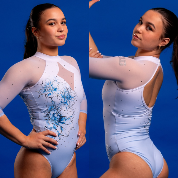

View images and a video of this leotard here.


Design 2.7/3, Construction 1.8/2, School/Theme Spirit 0.7/1, Creativity 0.9/1, Overall Appearance 2.7/3
Love. Adore. Idolize. This is just a fantastic leotard all around. The shade of light blue, while not screaming UCLA, is superb. The watercolor effect of the flower design goes well with the overall “delicate” design, and I like the relative simplicity of the rest of the leotard. The front mesh hole is a little weird, but I love the rest so much that I’m finding it hard to care.


Design 2.6/3, Construction 1.7/2, School/Theme Spirit 0.7/1, Creativity 0.9/1, Overall Appearance 2.6/3
Add UCLA to the list of blue teams opting for a baby blue leo! I love seeing teams make that jump, and I think the baby blue goes especially well with UCLA’s resurgence of floral leos in their design closet. A little sparkle goes a long way with this piece, and I hope it’s one we see more often.


Design 2.8/3, Construction 1.9/2, School/Theme Spirit 0.8/1, Creativity 1/1, Overall Appearance 2.9/3
I love this. It’s elegant and delicate, and the chest hole doesn’t bother me given that it matches with the lovely white mesh of the sleeves. How nice of UCLA to pick a mesh that’s consistent with the leotard design instead of going for nude! I also love that they picked Brooklyn Moors to model this one because it’s precisely her vibe.


Design 2.8/3, Construction 1.8/2, School/Theme Spirit 0.8/1, Creativity 1/1, Overall Appearance 2.8/3
WOW. I can’t think of the last time I was absolutely obsessed with a UCLA leotard, but this is probably one of my favorites it’s ever done. Baby blue is starting to become more popular in teams’ color palettes and it absolutely works here. I also normally hate floral, but this isn’t as gaudy or outlandish as others, so I will forgive UCLA here. Love, love, love!
Stanford: 8.150


View a video of this leotard here and images here.


Design 2.4/3, Construction 1.6/2, School/Theme Spirit 0.9/1, Creativity 1.0/1, Overall Appearance 2.5/3
Making a leotard design based on the Golden Gate Bridge is one of the best ideas a team has thought of, but in the interest of full disclosure: I am absolutely biased, as the bridge is one of my favorite places. I think Stanford did a good job of making the design so that it was recognizable but not obvious or cheesy. I especially like the star/twinkle rhinestone additions. My one complaint is that the off-center back hole, which follows the swoop of the bridge design, isn’t quite off-center enough, so to me it just looks a bit awkward in execution.


Design 2.7/3, Construction 1.6/2, School/Theme Spirit 1.0/1, Creativity 1.0/1, Overall Appearance 2.7/3
I’m not alone in thinking this: I love landmark/landform/otherwise geographical design concepts. The asymmetry works wonders for me, as it matches the geometric stoning across the bottom of the bridge. Sublimating the base of this leotard also allows for Stanford to nail adding Cardinal Red to the ombre!


Design 2.3/3, Construction 1.5/2, School/Theme Spirit 0.7/1, Creativity 0.9/1, Overall Appearance 2.1/3
I don’t think I’d have understood the concept of this leo if they hadn’t told me, but if that’s the worst thing about it, I’ll take it. The star-shaped sparkles are maybe a little cheesy, but I like the big picture of the design. The asymmetry doesn’t bother me at all.


Design 2.2/3, Construction 1.4/2, School/Theme Spirit 0.8/1, Creativity 1/1, Overall Appearance 2.3/3
I get the vibe this was going for with the Golden Gate Bridge, but something feels like it’s missing. I do like the twinkling night sky design with the sparkles toward the top of the leo, but I’m not sure how I feel about the asymmetry of the bridge design. This might be one I have to see a couple more times before I get a true opinion of it.
Minnesota: 8.125


View a video and images of this leotard here.


Design 2.3/3, Construction 1.3/2, School/Theme Spirit 0.7/1, Creativity 0.9/1, Overall Appearance 2.3/3
This is not typically a design I would like, but for some reason, I do. I like the overall “tough” look it brings. The side straps are neat, and it’s clever how they turn into back straps. However, I wish the back straps were more visible somehow. Maybe a lower back or higher straps? Or at least some color differentiation to make them stand out better.


Design 2.5/3, Construction 1.7/2, School/Theme Spirit 0.6/1, Creativity 0.8/1, Overall Appearance 2.7/3
This looks like a Disney villain inspired leo, and I mean that as a compliment in the highest fashion. The collar offsets the open back, keeping a nice distribution of the two contrasting fabrics. I wish the side straps either screamed or disappeared, but that’s the only thing I’d touch.


Design 2.7/3, Construction 1.7/2, School/Theme Spirit 0.6/1, Creativity 0.7/1, Overall Appearance 2.8/3
This one has grown on me over time. The creative neckline with the spike in the middle works for me, and I really appreciate how the sides are thoughtfully incorporated into the design where so many leotards leave that area blank or let the design fail to match up over a seam. It’s pretty and well-executed, and it’s a good match with the visual identity Minnesota has developed over the last few years, even if it doesn’t necessarily scream GOPHERS.


Design 2.3/3, Construction 1.7/2, School/Theme Spirit 0.7/1, Creativity 0.8/1, Overall Appearance 2.7/3
This feels so different for Minnesota compared to other things we’ve seen from them, but I certainly don’t mind it. I love a good swirl pattern with the sparkles in the front and though I normally hate collars, it works with this design. The open back is a plus, though I wish the straps were either better acknowledged in the design or removed altogether.
Missouri: 7.825


View images of this leotard here and a video here.


Design 2.2/3, Construction 1.6/2, School/Theme Spirit 0.9/1, Creativity 0.7/1, Overall Appearance 2.2/3
Anytime velvet appears on a leotard, it gets high marks. This is a somewhat simple design, but the small details—like the yellow/gold rhinestones and velvet bottom—are what elevate it into something great.


Design 2.2/3, Construction 1.9/2, School/Theme Spirit 0.8/1, Creativity 0.8/1, Overall Appearance 2.5/3
Points, points, and more points. Each seam is virtually invisible, and the velvet does the talking instead of needing to add extra straps or text. This is the gold standard for me on reviving leos from decades past, for the teams that go way back into their leo closets for inspiration.


Design 1.8/3, Construction 1.9/2, School/Theme Spirit 0.9/1, Creativity 0.5/1, Overall Appearance 2.3/3
Obligatory free velvet points, and I love the interplay between the silver and gold sparkles. The design isn’t necessarily the most inventive, but this leotard is simply pleasant overall.


Design 2.3/3, Construction 1.9/2, School/Theme Spirit 0.7/1, Creativity 0.8/1, Overall Appearance 2.4/3
VELVET! It’s immediately at the top of my list because of that alone. I wish the logo design had a little bit more sparkle to it, mostly so it’s more visible for my personal taste. Overall though, this is a great leo for Missouri!!
Utica: 7.375
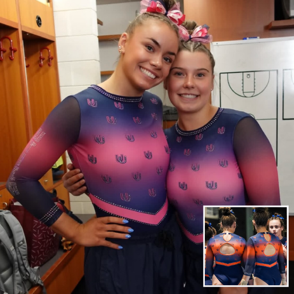

View an image of the front of this leotard here and an image of the back of the orange and blue version here.


Design 2.2/3, Construction 1.6/2, School/Theme Spirit 1.0/1, Creativity 0.6/1, Overall Appearance 2.2/3
It’s a little funny how Utica hasn’t worn the orange and blue version of this leo in an official competition yet (just the preseason intrasquad) because it’s a really good one. That being said, I’m not really a fan when teams just take one of their other leos and make it pink. Use the opportunity to do something different! This leo is still a good one, though. The little UU logos all over are fun, and the ombre is great—although I don’t love how the ombre makes a band across the chest.


Design 2.3/3, Construction 1.7/2, School/Theme Spirit 1.0/1, Creativity 0.7/1, Overall Appearance 2.5/3
Something I love about new teams is their early incorporation of theme leos, and Utica’s pink only affirms that love. On top of the logos becoming the pattern, I appreciate the ombre lining up on the torso and sleeves.


Design 1.7/3, Construction 1.5/2, School/Theme Spirit 1/1, Creativity 0.5/1, Overall Appearance 1.9/3
Remixing an existing design for a pink meet is one of the better ways to do it in my opinion. This design was always slightly too out-there for me, and the pink doesn’t change that, but I do like the way the pink plays against Utica navy.


Design 1.8/3, Construction 1.6/2, School/Theme Spirit 0.7/1, Creativity 0.7/1, Overall Appearance 2.3/3
Sorry, I’m likely going to be the outlier here, but I am not a fan of the little school logos all over the chest. It’s just not my personal choice. I do appreciate the ombre this leo has and even how well the design flows from the sleeves to the midsection. The v-shaped belt also works here, unlike in other designs where we’ve seen them go straight across the midsection.
Temple: 6.900


View a video of this leotard here.


Design 2.0/3, Construction 1.6/2, School/Theme Spirit 0.9/1, Creativity 0.6/1, Overall Appearance 2.2/3
It’s a very basic leotard concept, but it works. The red-to-black ombre is a classic look, and I like the shield on the front as a different way to show school spirit. The back hole is a bit too wide for my taste; the screenshot on the right shows how it stretches the band and distorts “Temple” in a weird way. I do like the shape of the hole, though, how it mirrors the shield on the front, and the solid black part at the bottom of the hole to complete the shield look.


Design 2.0/3, Construction 1.5/2, School/Theme Spirit 0.8/1, Creativity 0.6/1, Overall Appearance 2.0/3
Big fan of the front. It looks comfortable to wear while still having the complete look and weight of a competition leotard. The back doesn’t have the same polish and draws attention to it with the thin text, though I appreciate the open back.


Design 1.6/3, Construction 1.4/2, School/Theme Spirit 0.7/1, Creativity 0.3/1, Overall Appearance 1.5/3
This one’s almost a little retro to me; it reminds me of the mid-2010s ombre craze when everyone had to have an ombre leotard. The design isn’t the most imaginative and the back doesn’t make sense (why is the hole wider under the band than above it?), but seen from a distance it’s fine.


Design 1.9/3, Construction 1.5/2, School/Theme Spirit 0.9/1, Creativity 0.9/1, Overall Appearance 2.3/3
Ombre is an immediate yes and I very much love the incorporation of a different logo style than we normally see from Temple. However, who on earth thought the “Temple” looking as distended as it does on the back was a good idea? That’s about the only negative thing I have to say about this leotard.
Kentucky: 6.550


View a video and images here.


Design 1.7/3, Construction 1.6/2, School/Theme Spirit 0.9/1, Creativity 0.9/1, Overall Appearance 2.0/3
Matte white rarely misses, and I love it here paired with this particular shade of blue. My other favorite part is the intricate back straps and how they play off the front design. The sleeve pattern is also a nice touch—that sleeve design always gives a leotard an athletic look, which I like. The front isn’t my favorite (from far away it looks a little weird on the chest in particular), but I get the nod to Historic Memorial Coliseum, so I’m giving it a pass.


Design 1.6/3, Construction 1.5/2, School/Theme Spirit 1.0/1, Creativity 0.8/1, Overall Appearance 2.0/3
The colors are perfectly Kentucky, and they lend themselves to the precise geometric work this design needs to be understood. I’m a huge fan of the back, but if I had control over this design I’d shift the piping on the front up to sit at the gymnasts collarbones. The sleeve striping also looks great in motion, but I can’t unsee tire treads that associate more with Bowling Green, KY than Lexington, KY.


Design 1.3/3, Construction 0.8/2, School/Theme Spirit 0.7/1, Creativity 0.9/1, Overall Appearance 1.2/3
I just don’t think the design of this one looks good. The dark stripes on the top of the sleeves shrink the overall appearance and make it very unflattering to me, the middle belt is weirdly bulky, and the waist is very oddly placed. I’ve also looked at tons of pictures of the arena it’s supposedly in homage to in an attempt to justify the design choices and can’t figure out where the concept came from.


Design 2.0/3, Construction 1.7/2, School/Theme Spirit 0.8/1, Creativity 0.8/1, Overall Appearance 2.0/3
Yes, I understand the purpose of this being that it’s a nod to the coliseum, however, this is one that might’ve needed a little more in terms of execution. I’m not the biggest fan of the gray belt-like feature in the middle (it always looks like a diaper to me when it’s straight across like that). Points for the strappy back though, that is my favorite type of design.
Fisk: 6.300


Design 1.5/3, Construction 1.5/2, School/Theme Spirit 0.7/1, Creativity 0.5/1, Overall Appearance 2.3/3
The shade of pink is great. Unlike other Pepto Bismol-esque leotards, I don’t actually mind this that much. I think it’s because of the subtle ombre. The rhinestone design is fine; it’s there but nothing special. I wish there was a little more to the overall leotard, but for its purpose, it gets the job done.


Design 1.5/3, Construction 1.4/2, School/Theme Spirit 0.7/1, Creativity 0.4/1, Overall Appearance 2.0/3
Thank you Fisk for letting the pink be the star of the show, instead of adding for the sake of adding! Pink leos are notoriously hard to nail, and the less-is-more approach is one I wish we’d see more often with theme leos. I wish there was a focal point, but I’m happier with none than too many.


Design 1.4/3, Construction 1.2/2, School/Theme Spirit 0.6/1, Creativity 0.4/1, Overall Appearance 2.1/3
This isn’t the most groundbreaking, but it gets the idea across without being gaudy or overwhelming. It looks comfortable and flattering, and the sparkles are pleasantly restrained.


Design 1.8/3, Construction 1.7/2, School/Theme Spirit 0.6/1, Creativity 0.7/1, Overall Appearance 2.2/3
Ah, yes, another pink leo. The good thing is that this one doesn’t remind me of the color of a Benadryl pill, so it’s automatically not hated. I wish the sparkles stood out a little more, the design is really hard to see, but for what it’s meant for, it’s a good addition to the closet.
Fan Poll
Congrats to Utica for winning last week’s fan poll! Vote for your favorite design from this week here.
READ THIS NEXT: The Dismount: Week 5
Article by Elizabeth Grimsley, Peri Goodman, Rebecca Scally, and Savanna Wellman


