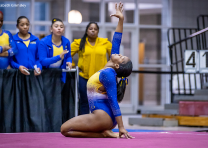
Gymnastics fans love leotards, it’s just a fact. We love seeing new designs, creating our own, and especially judging them. That’s why we’re back for another season of leotard rankings!
Each week we’re analyzing new designs to find our weekly faves. Leos can earn up to three points for design; up to two points for construction, which includes fabric, fit, and sparkle; up to one point each for school/theme spirit and creativity; and up to three points for overall appearance. This week Jessica, Claire H, and Mariah are joining editor-in-chief Elizabeth for judging.
Don’t agree with our ranking? Make your opinion heard by voting in the fan poll at the end of the article each week or by voicing your thoughts on social media!
Illinois: 9.475

 Elizabeth: 9.700
Design 2.8/3, Construction 2.0/2, School/Theme Spirit 1.0/1, Creativity 1.0/1, Overall Appearance 2.9/3
I. Am. Obsessed. I love everything about this. The only—and I mean only—fault I can find is the offset script Illinois along the neckline. I wish it was somewhere else. Otherwise, this is a perfect leotard.
 Jessica: 9.500
Design 2.8/3, Construction 2/2, School/Theme Spirit 0.9/1, Creativity 0.9/1, Overall Appearance 2.9/3
I honestly have no notes with this one. I love the elegance and simplicity of this one. The way the rhinestones are tastefully placed and the incorporation of the blue and orange is just so aesthetically pleasing.
 Claire H: 9.500
Design 2.8/3, Construction 2/2, School/Theme Spirit 1/1, Creativity 0.9/1, Overall Appearance 2.8/3
I loved this leo so much when I first saw it until I saw the script Illinois on the neckline. It just feels out of place on such a clean design. I love the way they incorporated the blue and orange colors across the front with the rhinestones and the back outlining the mesh. So pretty!
 Mariah: 9.200
Design 2.7/3, Construction 1.9/2, School/Theme Spirit 0.8/1, Creativity 1.0/1, Overall Appearance 2.8/3
This is such a unique design! The off-center script Illinois isn’t my favorite detail, but I don’t think it takes away from the design. I LOVE the back and the orange ombre sleeves. Incorporating orange is something Illinois does extremely well, and this is no exception.
Texas Woman’s: 9.325

View a video of this leotard here.
Elizabeth: 9.700
Design 2.9/3, Construction 2.0/2, School/Theme Spirit 0.9/1, Creativity 1.0/1, Overall Appearance 2.9/3
This might be a flawless leotard. It’s unlike anything I’ve seen TWU ever do, and I adore it. The white-to-crimson ombre is perfection, and I love the way the mesh sleeve seamlessly flows into the body—like one of Shilese Jones’ elite leos. I also love how the design continues onto the back, too. Superb.
Jessica: 9.500
Design 2.9/3, Construction 2/2, School/Theme Spirit 1/1, Creativity 0.8/1, Overall Appearance 2.8/3
The. Rhinestone. Waterfall. I’m so in love with everything about this leotard, and I’m obsessed with how it’s so different from the typical leo style. It’s hands down my favorite of the week!
Claire H: 9.100
Design 2.7/3, Construction 1.8/2, School/Theme Spirit 0.9/1, Creativity 0.9/1, Overall Appearance 2.8/3
The ombre coloring on this leo is gorgeous and completely makes me forget I dislike asymmetry. The way the mesh wraps around to the back also helps make the mesh cutout grow on me. It’s definitely one of the highlight leos of the week!
Mariah: 9.000
Design 2.7/3, Construction 1.8/2, School/Theme Spirit 1.0/1, Creativity 0.8/1, Overall Appearance 2.7/3
This is a stunner!!! The ombre is gorgeous, and the dripping gem design is so elegant. I’m not crazy about the lower back mesh, but everything else is so perfect it’s barely noticeable. I also love the subtle Texas outline on the hip.
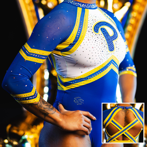
Pittsburgh: 8.850
View a video and pictures of this leotard here.
Elizabeth: 9.200
Design 2.7/3, Construction 1.9/2, School/Theme Spirit 0.9/1, Creativity 0.9/1, Overall Appearance 2.8/3
Love, love, love. The matte colors give it a very athletic look while the rhinestones still make it flashy. I love the back the most; those straps are similar to Fisk’s new leo this season, and I’m into it. Pitt rarely disappoints.
Jessica: 8.600
Design 2.5/3, Construction 1.8/2, School/Theme Spirit 1/1, Creativity 0.7/1, Overall Appearance 2.6/3
Everything about this is chef’s kiss. The look of this is a perfect blend of retro vibes and an athletic build. The back, the neckline, the rhinestones. It’s just so simple yet so perfectly Pittsburgh.
Claire H: 9.400
Design 2.9/3, Construction 1.9/2, School/Theme Spirit 1/1, Creativity 0.7/1, Overall Appearance 2.9/3
I love the athletic look of this leo! Sometimes I find straps on the back out of place or random, but the ones here perfectly tie the leo together. Plus the rhinestone neckline adds the perfect amount of flash.
Mariah: 8.200
Design 2.3/3, Construction 1.8/2, School/Theme Spirit 0.8/1, Creativity 0.8/1, Overall Appearance 2.5/3
Athletic designs are always my favorite and Pitt is a solid leo team so this gets pretty high marks from me. I think the only thing I don’t love is the way the belt angles upward. I wish it was angled downward more to match the sleeves.
Utah State: 8.650

View a video of this leotard here and pictures here.
Elizabeth: 8.900
Design 2.5/3, Construction 2.0/2, School/Theme Spirit 0.8/1, Creativity 1.0/1, Overall Appearance 2.6/3
This is fantastic. I was worried with the teaser that the neckline would be the bib design some teams have done recently, but I am pleasantly surprised. Like West Virginia’s this week, the design is similar to older ones but the leotard overall doesn’t look dated. I love how the back hole continues over the shoulder into the front design—super creative and not something I’ve ever seen before I don’t think.
Jessica: 8.600
Design 2.5/3, Construction 1.8/2, School/Theme Spirit 0.7/1, Creativity 1/1, Overall Appearance 2.6/3
I love how different this leo is from others I’ve seen! The rhinestones are so pretty and I love love love the location on the sleeve. I do feel, though, this leo has almost too much going on and takes away from its overall elegance.
Claire H: 8.300
Design 2.5/3, Construction 1.6/2, School/Theme Spirit 0.7/1, Creativity 1/1, Overall Appearance 2.5/3
This is probably the closest I’ll come to liking a leo with a cutout! Usually, I’m very against them, but I like the way it carries over from the asymmetrical open back. The white diagonal with the rhinestone stripes is really pretty and effective across the front.
Mariah: 8.800
Design 2.5/3, Construction 1.9/2, School/Theme Spirit 0.7/1, Creativity 1.0/1, Overall Appearance 2.7/3
This is a very unique and bold design for the Aggies! I don’t think I’ve ever seen a back cutout that carries over the shoulder to the front like this, but I think it’s cool and different. I also just like the asymmetry of the whole design. There are enough interesting details going on that the design doesn’t even need a lot of sparkle to keep it interesting.
West Virginia: 8.525

View a video of this leotard here.
Elizabeth: 7.700
Design 2.0/3, Construction 1.8/2, School/Theme Spirit 0.7/1, Creativity 0.8/1, Overall Appearance 2.4/3
This design is interesting because it’s a very 2010s design but the leo overall doesn’t look dated. I love the use of “real” gold, as well as the small amount of mesh adding depth to the blue. I also love the back. It’s not basic but it’s also not overly complicated.
Jessica: 8.900
Design 2.7/3, Construction 1.8/2, School/Theme Spirit 0.8/1, Creativity 0.9/1, Overall Appearance 2.7/3
I love the asymmetrical design on the front, it’s unique and fun for a leotard. An open-back design always bring me joy and this one is no exception. I’m obsessed with the back and the rest of the detail here.
Claire H: 8.900
Design 2.8/3, Construction 1.9/2, School/Theme Spirit 0.7/1, Creativity 1/1, Overall Appearance 2.5/3
I like this one a lot! It’s very different from most of the leos we see today and stands out in a good way. It has nice details without being over the top.
Mariah: 8.600
Design 2.5/3, Construction 1.9/2, School/Theme Spirit 0.8/1, Creativity 0.8/1, Overall Appearance 2.6/3
I really like this one! The colors are great and overall the design feels very cohesive. The only thing I’m not crazy about are the two straps closest to the edge of the open back. They just seem a bit squished and unnecessary.
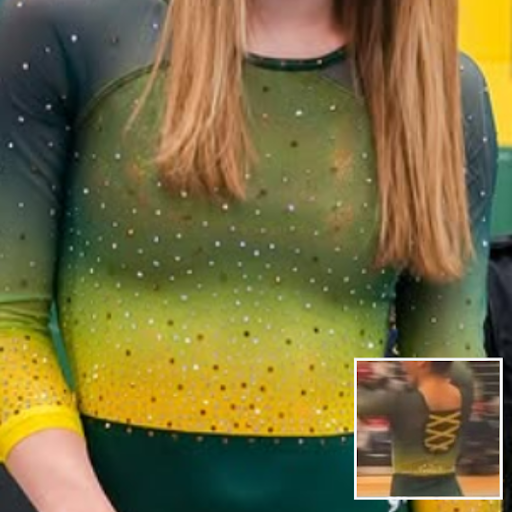
Brockport: 7.925
View pictures of this leotard here.
Elizabeth: 8.300
Design 2.4/3, Construction 1.8/2, School/Theme Spirit 0.9/1, Creativity 0.8/1, Overall Appearance 2.4/3
The top ombre is to die for. I like that Brockport really let that part shine, too, by not adding any other elements on top. That also allowed for the back to stand out with the fun criss-cross design. Once again, I wish the fabric wasn’t underneath those straps, but it’s a minor gripe.
Jessica: 7.900
Design 2.3/3, Construction 1.7/2, School/Theme Spirit 0.8/1, Creativity 0.7/1, Overall Appearance 2.4/3
The ombre is ever so pretty, I’m obsessed. I do feel it’s a wee bit on the overly simple side, which might just be me being nit-picky. What I do dislike though is the mesh/fabric under the criss-cross on the back. I usually love a cool open-back design but the fabric underneath takes away from this I fear.
Claire H: 8.000
Design 2.5/3, Construction 1.7/2, School/Theme Spirit 0.8/1, Creativity 0.5/1, Overall Appearance 2.5/3
The ombre top of this leo is so pretty. The contrast with the solid bottom is really effective. I don’t love the back of this leo though. Unnecessary criss-cross straps are one of my pet peeves with leos.
Mariah: 7.500
Design 2.2/3, Construction 1.8/2, School/Theme Spirit 0.7/1, Creativity 0.5/1, Overall Appearance 2.3/3
Brockport has some of my favorite DIII leos and I would definitely add this one to the list. The ombre is gorgeous and I like that they used two colors of gems to add some dimension. Simple yet effective!
Whitewater: 7.625

Elizabeth: 7.300
Design 2.0/3, Construction 1.6/2, School/Theme Spirit 0.9/1, Creativity 0.8/1, Overall Appearance 2.0/3
I love the use of silver and a mostly monochromatic look here because it makes the purple heart for Kara Welsh stand out even more. I don’t care for how the neckline stops and the black fabric comes up; it seems unnecessary, but I do like the belt and the rhinestones star-bursting out of the Warhawk logo on the chest.
Jessica: 7.500
Design 2/3, Construction 1.5/2, School/Theme Spirit 0.9/1, Creativity 0.5/1, Overall Appearance 2.6/3
Overall, it’s a little on the plain side and I’m not the biggest fan of the neckline. However, understanding the reason behind this leo is why I love it. I like the way the rhinestones sit so aesthetically and the placement of the purple heart.
Claire H: 8.200
Design 2.6/3, Construction 1.5/2, School/Theme Spirit 1/1, Creativity 0.6/1, Overall Appearance 2.5/3
Overall it’s a solid design but knowing what this leo means to the team definitely gives it a few bonus points in my book. I like the burst of rhinestones around the logo plus the purple heart for Kara Welsh. A great combination of school spirit and tribute. I don’t love the neckline or the deep V in the back though.
Mariah: 7.500
Design 1.9/3, Construction 1.7/2, School/Theme Spirit 1.0/1, Creativity 0.7/1, Overall Appearance 2.2/3
This is really nice! I like when teams use gunmetal grey and I like even more that it really lets the purple heart stand out in this particular design. I don’t like the way the black fabric extends over the neckline though. It’s a strange design feature that I think could’ve been eliminated. Whitewater has a pretty solid leotard collection and this one will fit in nicely.
Ursinus: 7.375

View a video of this leotard here.
Elizabeth: 7.500
Design 2.1/3, Construction 1.6/2, School/Theme Spirit 1.0/1, Creativity 0.8/1, Overall Appearance 2.0/3
I like this a lot. Ursinus’ leos always go big, and this is no different. I love the bear claw on the front with the UC logo inside. I also love the ombre and otherwise relatively plain body, which really makes the logo on the front pop.
Jessica: 7.600
Design 2.1/3, Construction 1.6/2, School/Theme Spirit 1/1, Creativity 0.9/1, Overall Appearance 2.0/3
Generally, I’m not the biggest fan of leos like this but something about the way Ursinus designed this one makes it okay. The bear claw is super fun and embraces school spirit. It helps offset the simplicity of the overall leo, which I like.
Claire H: 7.200
Design 2.2/3, Construction 1/2, School/Theme Spirit 1/1, Creativity 0.9/1, Overall Appearance 2.1/3
I went back and forth on how I feel about this design, but ultimately decided that the giant off-center bear claw is fun and original. The rest of the leo is simple, but with such a big focal point on the front they could have easily gone overboard so I appreciate the simplicity.
Mariah: 7.200
Design 1.8/3, Construction 1.8/2, School/Theme Spirit 1.0/1, Creativity 0.5/1, Overall Appearance 2.1/3
This is probably one of my favorite Ursinus leotards. Although simple, the design certainly doesn’t lack school spirit and the ombre is gorgeous. Great job!
Wilberforce: 7.275

View an image of the front of this leotard here and a video of its creation here.
Elizabeth: 7.300
Design 2.0/3, Construction 1.6/2, School/Theme Spirit 0.8/1, Creativity 0.8/1, Overall Appearance 2.1/3
I think what makes this leotard stand out are the details. Most “wrap” designs only have the sternum hole, but this design elevates the look even more with the subtle side mesh, too. Elsewhere, I love the gold fabric used, as well as the shade of green—the pair really well together.
Jessica: 7.400
Design 2.2/3, Construction 1.5/2, School/Theme Spirit 0.7/1, Creativity 0.6/1, Overall Appearance 2.4/3
This design in general is great, especially for a new team. I just wish the colors were better paired together as I don’t feel like they complement each other well here or appear super flattering. The wrap design on the other hand is perfection and really makes for a cool and unique leo.
Claire H: 7.200
Design 2.2/3, Construction 1.3/2, School/Theme Spirit 0.7/1, Creativity 0.5/1, Overall Appearance 2.3/3
Wilberforce has done a great job so far this season designing leos. Despite a pair of colors that I wouldn’t typically like, they’re managing to use them well. I like the wrap look of the leo, but my one big complaint is the cutouts on the side. I’m just not a fan of cutouts.
Mariah: 7.200
Design 1.8/3, Construction 1.8/2, School/Theme Spirit 0.7/1, Creativity 0.7/1, Overall Appearance 2.2/3
I normally wouldn’t love these colors together, especially in a color block design, but they work well here. I’m also normally not a fan of mesh cutouts, but I think they actually make sense with the wrap design in this case. Wilberforce is starting out with a pretty impressive leo closet!
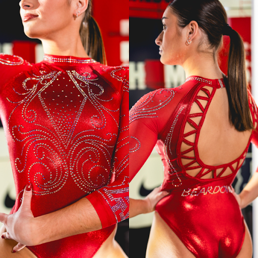
Arizona: 7.075
View a video of this leotard here and pictures here.
Elizabeth: 7.200
Design 2.1/3, Construction 1.6/2, School/Theme Spirit 0.7/1, Creativity 0.7/1, Overall Appearance 2.1/3
I love the back—that design around the whole is so clever and fun—but the front is just downright boring. I wish there was something to break it up some, even if the intention is a fully red leo.
Jessica: 7.500
Design 2.3/3, Construction 1.4/2, School/Theme Spirit 0.7/1, Creativity 0.7/1, Overall Appearance 2.4/3
I might be the lone wolf on this one, but I actually love everything about this leo. I’m not normally a huge fan of red or completely monochromatic leos but something about this one is so elegant. As a sucker for a high neckline and an open back, this leo checks all the boxes. I only wish the back’s open design was a slightly different pattern but that’s just me being nit-picky.
Claire H: 6.300
Design 2.0/3, Construction 1.2/2, School/Theme Spirit 0.5/1, Creativity 0.6/1, Overall Appearance 2/3
I feel the exact opposite of Elizabeth here. I love the front but hate the back. The design of the rhinestones on the front is so pretty and elegant, but the straps around the back feel random and out of place to me.
Mariah: 7.300
Design 1.9/3, Construction 1.8/2, School/Theme Spirit 0.7/1, Creativity 0.7/1, Overall Appearance 2.2/3
I’m not a huge fan of the back, but the front is nice and elegant. However, I can’t help but feel a bit underwhelmed. After the monochrome red look Ohio State debuted last season that I was obsessed with, this one falls a little flat in comparison.
Centenary: 7.075

Note: The sleeve says “1825” for Centenary College of Louisiana’s 200th birthday.
Elizabeth: 7.100
Design 2.0/3, Construction 1.6/2, School/Theme Spirit 0.7/1, Creativity 0.7/1, Overall Appearance 2.1/3
This is a fancier look than I’m used to from Centenary, but I like it! The colors go well together, especially with the matte fabric, and I like the front rhinestone design. The sleeve numbers are a little big and cartoonish, but that’s really my only gripe.
Jessica: 7.000
Design 1.8/3, Construction 1.6/2, School/Theme Spirit 0.9/1, Creativity 0.6/1, Overall Appearance 2.1/3
Not to hop on the bandwagon, but I agree the numbers on the sleeve are a bit aggressive and a little too big. The idea of belts is always a risk, and unfortunately, it doesn’t seem necessary here when the overall body is so pretty. This aside, I do really like the simplicity of this leo.
Claire H: 7.300
Design 2.2/3, Construction 1.5/2, School/Theme Spirit 0.8/1, Creativity 0.6/1, Overall Appearance 2.2/3
This is a pretty leo overall, but I have to agree with the others that the numbers on the sleeve are a little too big. Besides that, I like the white belt and the simple rhinestone design on the front. The back has criss-cross straps that add to the design without being over the top.
Mariah: 6.900
Design 1.7/3, Construction 1.7/2, School/Theme Spirit 1.0/1, Creativity 0.5/1, Overall Appearance 2.0/3
The numbers on the sleeve are a bit oversized and the belt contrasts a bit too much for my taste, but other than that, there’s really nothing to dislike about the look.
Oklahoma: 7.025
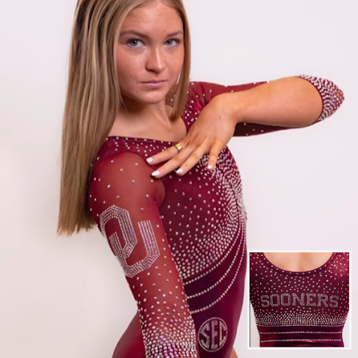
View a video of this leotard here.
Elizabeth: 6.400
Design 1.8/3, Construction 1.5/2, School/Theme Spirit 0.7/1, Creativity 0.4/1, Overall Appearance 2.0/3
Oklahoma always has one very boring leo that it debuts at a random home meet during the regular season. This is 2025’s. It’s not bad, but compared to what Oklahoma puts out by comparison, it’s downright dull. (I still like it, though.)
Jessica: 7.200
Design 2/3, Construction 1.6/2, School/Theme Spirit 0.6/1, Creativity 0.6/1, Overall Appearance 2.4/3
While this leo is pretty to look at, it just seems so boring to me to be an Oklahoma leo. The rhinestone placement is beautiful and I love the “Sooners” on the back. But overall, this one is just overly simple to be in the Rolodex of a team known for extravagant and stunning leos.
Claire H: 6.600
Design 1.9/3, Construction 1.7/2, School/Theme Spirit 0.5/1, Creativity 0.5/1, Overall Appearance 2/3
Oklahoma made a pretty design with their rhinestones, but that’s all it is. A maroon leo with some rhinestones. It’s not a bad leo by any means, but it’s not memorable either. I’ll probably forget that I’ve seen this leo next time they wear it.
Mariah: 7.900
Design 2.2/3, Construction 1.9/2, School/Theme Spirit 0.8/1, Creativity 0.6/1, Overall Appearance 2.4/3
I’m not typically a fan of Oklahoma’s more bold designs, so although this may be underwhelming to some, I actually really like it. I think they could’ve done something a bit more interesting with the rhinestone design, but overall I’m a fan.
Sacramento State: 6.975

View a video of this leotard here.
Elizabeth: 7.500
Design 2.0/3, Construction 1.5/2, School/Theme Spirit 1.0/1, Creativity 1.0/1, Overall Appearance 2.0/3
Longtime leo lovers remember Sacramento State’s “first” tie-dye leotard. This one is different but still just as great. I love when teams or designs really go for it, and this one did. Is it the greatest leotard ever made? No. But that doesn’t stop me from liking it a whole lot.
Jessica: 7.200
Design 2/3, Construction 1.4/2, School/Theme Spirit 0.8/1, Creativity 0.9/1, Overall Appearance 2.1/3
The tie-die is so creative but also a nod to a former Sacramento State classic. The blend of school spirit and wow factor is just so good here. My only qualm is the sleeves; I wish they weren’t mesh-looking and instead matched the solidness of the rest of the leo.
Claire H: 6.800
Design 2/3, Construction 1.4/2, School/Theme Spirit 0.6/1, Creativity 0.8/1, Overall Appearance 2/3
The tie-dye is a fun design for a leo that we don’t see often. But overall, this leo falls a little flat for me. There’s nothing too special about it beyond the tie-dye coloring. I do like that they continued the coloring down the mesh sleeves though.
Mariah: 6.400
Design 1.5/3, Construction 1.6/2, School/Theme Spirit 0.7/1, Creativity 0.7/1, Overall Appearance 1.9/3
I like the tie-dye as a concept and like the look overall, but there are a couple details I’m not obsessed with. I wish there wasn’t the vertical break in the pattern on the front, especially since the design swirls out from the center. Putting the school logo there like the original tie-dye leo, or something similar, would’ve looked nicer. I also wish the sleeves were lined so that the color matched the rest of the bodice.
BYU: 6.950

View a video and images of this leotard here.
Elizabeth: 7.300
Design 1.8/3, Construction 1.6/2, School/Theme Spirit 0.9/1, Creativity 1.0/1, Overall Appearance 2.0/3
This leo is so BYU. I was honestly a little worried from recent years where the new designs were more tame that BYU wasn’t quite as wild anymore, but then it debuted this. I love it in a go big or go home way. It’s just a fun design and certainly different than anyone else is doing.
Jessica: 7.100
Design 1.8/3, Construction 1.5/2, School/Theme Spirit 1/1, Creativity 0.8/1, Overall Appearance 2/3
Like Elizabeth said, this leo is so BYU. I love how fun and interesting the design is, especially on the front. Personally, the back is a bit underwhelming, as I wish it had the same pizazz as the front.
Claire H: 7.000
Design 2/3, Construction 1.5/2, School/Theme Spirit 0.7/1, Creativity 0.8/1, Overall Appearance 2/3
The front of this leo is great, but the back falls short for me. I love the geometric design and the V-shaped belt. But the non-symmetrical straps on the back and the blue swatch of fabric in the center look like they were just thrown in at the end.
Mariah: 6.400
Design 1.2/3, Construction 1.6/2, School/Theme Spirit 0.8/1, Creativity 0.9/1, Overall Appearance 1.9/3
This is a bit busy for my taste, but it’s very BYU. The geometric print is fun and pairs well with the geometric design and bold color choice. However, I agree with Claire about the back, it just doesn’t seem as well thought out as the front. The different elements just don’t seem to mesh well together.
Kentucky: 6.875

View pictures of this leotard here.
Elizabeth: 7.600
Design 2.2/3, Construction 1.7/2, School/Theme Spirit 0.8/1, Creativity 0.7/1, Overall Appearance 2.2/3
Kentucky’s leos are almost always good, but they were starting to fall into the Florida problem of all looking similar (minus the baddie from last season). I like this one a lot, though, especially the watercolor-esque ombre design on the front and the fun rhinestone pattern on the back.
Jessica: 7.000
Design 2/3, Construction 1.5/2, School/Theme Spirit 0.8/1, Creativity 0.5/1, Overall Appearance 2.2/3
I love the ombre design on this one, but it kind of looks like other leos Kentucky has and is borderline overly simple. The placement of the rhinestones all over is elegant and draws the eyes in and the back design is to die for. The low V in the front bothers me though because I feel like it takes away from the overall elegance of the leo.
Claire H: 5.700
Design 1.7/3, Construction 1/2, School/Theme Spirit 0.6/1, Creativity 0.4/1, Overall Appearance 2/3
At first glance, I didn’t realize this was a new leo since Kentucky does some version of a blue and white ombre pretty often. It’s simple but has a few design choices I don’t love, like the deep mesh cutout in the front and the extra strap across the back.
Mariah: 7.200
Design 2.0/3, Construction 1.7/2, School/Theme Spirit 0.9/1, Creativity 0.5/1, Overall Appearance 2.1/3
Kentucky ombre always looks so pretty! Something about the cut of the front isn’t my favorite. Maybe if the deep V was slightly more V-shaped I might like it a bit better? I really like the sparkle design, especially the fully encrusted neckline though.
Maryland: 6.875

Elizabeth: 7.100
Design 2.2/3, Construction 1.7/2, School/Theme Spirit 0.6/1, Creativity 0.6/1, Overall Appearance 2.0/3
When Maryland teased this design, I said I would be so bored if it ended up just being all red. And I am. I will give credit where credit’s due, though. The mesh placement makes for a flattering look on the gymnast, and I like the way the back accentuates the whole and their muscles.
Jessica: 7.300
Design 2.4/3, Construction 1.7/2, School/Theme Spirit 0.5/1, Creativity 0.5/1, Overall Appearance 2.2/3
All red is everything sometimes to me. However, this leo just doesn’t scream Maryland and therefore misses the mark just a smidge. The rhinestone and mesh placement, on the other hand, is so stunning and flattering on a gymnast.
Claire H: 5.200
Design 1.8/3, Construction 1/2, School/Theme Spirit 0.5/1, Creativity 0.5/1, Overall Appearance 1.4/3
I really do not like this leo. The mesh across the neck and on the waist makes it look super disjointed like different pieces of fabric were just thrown together randomly. This just isn’t my style.
Mariah: 7.900
Design 2.3/3, Construction 1.9/2, School/Theme Spirit 0.5/1, Creativity 0.7/1, Overall Appearance 2.5/3
I like this one quite a bit better than the all-red look Arizona debuted this week. I think the mesh at the shoulders and waist adds a bit more interest to the design, and the simple open back is pretty. It’s lacking a bit in school spirit though.
UC Davis: 6.875

View pictures of this leotard here.
Elizabeth: 9.100
Design 2.6/3, Construction 1.8/2, School/Theme Spirit 1.0/1, Creativity 1.0/1, Overall Appearance 2.7/3
I’m sure this will be controversial, but I’m into the mini-logos-all-over-the-place look. It’s a fun way to introduce school spirit in a bold way without it being ugly (in my opinion). I also love how the rest is kept pretty simple to let that stand out. I love the shiny bottom, the mesh panels on the front, and the open back, all making the leo extremely flattering on the gymnasts.
Jessica: 7.000
Design 1.9/3, Construction 1.7/2, School/Theme Spirit 0.9/1, Creativity 0.7/1, Overall Appearance 1.8/3
Generally speaking, I’m not a fan of how this leo looks as I don’t feel it’s super appealing to the eyes. However, I love the way the mini logos are incorporated into the overall body and love how creative it feels. I also love the criss-cross contrast in the middle of the front and the open back, it’s flattering and accentuates the gymnast’s back muscles nicely.
Claire H: 5.000
Design 1.3/3, Construction 1/2, School/Theme Spirit 1/1, Creativity 0.7/1, Overall Appearance 1/3
The mini logos here are too much for me. Unfortunately, I am not a fan. They get the school spirit points though. In addition, the way the mesh cutout goes up and then the logo fabric comes back in the back feels like a poor design choice. I wish the mesh continued around the back.
Mariah: 6.400
Design 1.2/3, Construction 1.6/2, School/Theme Spirit 1.0/1, Creativity 0.8/1, Overall Appearance 1.8/3
In contrast to Elizabeth, I’m not typically a fan of the mini-logos-all-over-the-place look, but it’s not terrible. My biggest gripe is actually the way the mesh cutouts on the front just abruptly stop at the side seams. I wish they carried over onto the back, or just didn’t contrast so much with the white fabric. I do love the open back though.
Cornell: 5.075

View a video of this leotard here.
Elizabeth: 4.600
Design 1.5/3, Construction 1.0/2, School/Theme Spirit 0.4/1, Creativity 0.4/1, Overall Appearance 1.3/3
I love the back (although I wish that mesh wasn’t underneath the fun straps), but the rest is just so boring. In fact, it’s pretty similar to a design AlphaFactor did in the 2010s that a LOT of teams wore. A basic black leo is totally fine, but for a team like Cornell, which gets so few new leos in general, I wish this leo incorporated at least a little red. The nickname is Big Red after all…
Jessica: 5.200
Design 1.4/3, Construction 1.3/2, School/Theme Spirit 0.4/1, Creativity 0.3/1, Overall Appearance 1.8/3
Okay speaking of boring designs, this one might take the cake this week. I love an all-black look but the dark rhinestones take away from the overall design as it becomes too monochromatic and minimizes the glitz and glamour that leos can have. I agree with Elizabeth here that there should’ve been some red shown, even if it was in some of the rhinestones or in the accents…just a little something to brighten up what could’ve been a super stunning leo.
Claire H: 4.800
Design 1.4/3, Construction 1/2, School/Theme Spirit 0.3/1, Creativity 0.4/1, Overall Appearance 1.7/3
There are ways to make a nice all-black leo, but this leo is just so dark with minimal details and black mesh between the straps in the back. I want something to lighten it up a bit. An accent of red could have helped this leo a lot.
Mariah: 5.700
Design 1.6/3, Construction 1.6/2, School/Theme Spirit 0.4/1, Creativity 0.3/1, Overall Appearance 1.8/3
I like a simple leo, but this is a bit one-note to me. I think it needs some contrast somewhere. Removing the mesh under the straps on the back and using red gems would have made a big impact.
Fan Poll
Congrats to Greenville for winning last week’s fan poll! Vote for your favorite design from this week here.
READ THIS NEXT: The Dismount: Week 3
Article by Elizabeth Grimsley, Jessica Brock, Claire Harmon, and Mariah Dawson