It’s NCAA gymnastics season and the leotards are as sparkly as ever. And with new designs comes your favorite series: Leotard Rankings! Each week we’re analyzing leotard debuts to find our weekly faves. There will be up to three points for design, up to one point each for fabric, sparkle, school spirit and uniqueness, and up to three points for overall appearance. This week Claire, Emily M, Emily L, Peri, Savanna and Christina are joining our editor-in-chief, Elizabeth, to help judge.
Don’t agree with our ranking? Make your opinion heard by voting in the fan poll at the end of the article each week or voicing your thoughts on social media.
California: 8.814
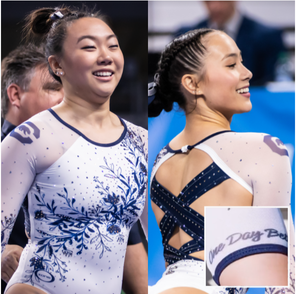
View a video of this leotard here.
 Elizabeth: 8.300
Design 2.5/3, Fabric 0.8/1, Sparkle 0.8/1, School Spirit 0.9/1, Uniqueness 0.8/1, Overall Appearance 2.5/3
This is a leo I would have thought was just OK if I had only seen it in pictures. However, I got to look at it up close, from the floor, and I definitely like it. The flower design normally isn’t my favorite, but I like it on the white and in this context. Plus, the back is great, and I love the small bit of motivation on the sleeve.
 Claire: 8.800
Design 2.5/3, Fabric 0.9/1, Sparkle 0.9/1, School Spirit 0.9/1, Uniqueness 0.8/1, Overall Appearance 2.8/3
You can always rely on Cal to have flawless piping on its leos and this is no exception. I love a good floral design, and this is a good floral design. Screen printing on mesh is really hard to pull off, but like Andi Li’s bars set, the execution elevates this to the next level!
 Emily M: 9.200
Design 2.8/3, Fabric 0.8/1, Sparkle 0.9/1, School Spirit 0.9/1, Uniqueness 1.0/1, Overall Appearance 2.8/3
An somewhat unpopular CGN opinion, but I love a good floral, and this is a great one. It leans chinoiserie in a really lovely way and it’s delicate and feminine without being unathletic. The back is excellent, too.
 Emily L: 9.500
Design 2.9/3, Fabric 0.9/1, Sparkle 1/1, School Spirit 0.9/1, Uniqueness 0.9/1, Overall Appearance 2.9/3
I love this one. When I was watching Cal’s session I could not stop talking about how much I loved it (seriously, I think I texted my mom three separate times about it). The sparkly strappy back is what sets it over the top for me. I also just love white leos, and combined with the dark blue flowers I think it looks very pretty.
 Peri: 8.500
Design 2.7/3, Fabric 0.9/1, Sparkle 0.7/1, School Spirit 0.9/1, Uniqueness 0.8/1, Overall Appearance 2.5/3
If any team can pull off a matte white leo without making it look like it’s from a dance catalog, it’s Cal. They have a knack for including school spirit within their designs instead of on top of the designs, and this iteration is no different. This was also the most comfortable-looking leo I saw over the weekend.
 Savanna: 8.200
Design 2.4/3, Fabric 0.8/1, Sparkle 0.8/1, School Spirit 1/1, Uniqueness 0.9/1, Overall Appearance 2.3/3
I feel like this is one I would’ve had to see in person to get a good perspective, but this is fine. Love the back and the flower design actually works with this when I normally would’ve said absolutely not. Overall, good leo for Cal!
 Christina: 9.200
Design 2.8/3, Fabric 1/1, Sparkle 0.9/1, School Spirit 0.7/1, Uniqueness 0.9/1, Overall Appearance 2.9/3
I have yet to find a Cal leo I dislike. This is stunning. The back is my favorite part. I love that this was an homage to the Soviet great Tatiana Groshkova. I do wish the gold was a bit more visible, but I like having some touches of it in the sparkles. Truly a beautiful look.
Auburn: 8.486
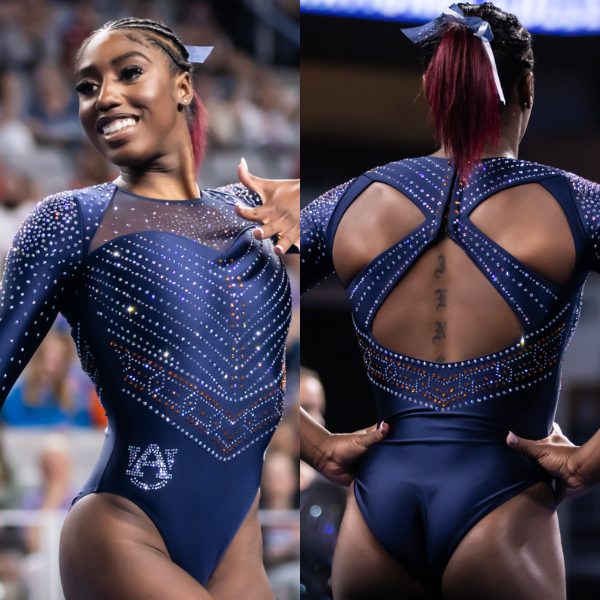
View a video of this leotard here.
 Elizabeth: 7.600
Design 2.4/3, Fabric 0.7/1, Sparkle 0.8/1, School Spirit 0.7/1, Uniqueness 0.6/1, Overall Appearance 2.4/3
This is similar to another Auburn leo, so points off for uniqueness, but I do really like the design nevertheless. It looked great on Gobourne and was a nice one to wear for her final sendoff. The orange accents are just enough, and the back is flattering, really accentuating the gymnast’s strength.
 Claire: 9.100
Design 2.7/3, Fabric 0.9/1, Sparkle 1.0/1, School Spirit 0.8/1, Uniqueness 0.7/1, Overall Appearance 3.0/3
I adore this leo. The back is such a departure from the strappy or open designs we usually see, and it works beautifully. The crystal designs are perfect with those pops of orange. This is a worthy look for Gobourne’s last dance.
 Emily M: 7.500
Design 2.0/3, Fabric 0.8/1, Sparkle 1.0/1, School Spirit 0.8/1, Uniqueness 0.5/1, Overall Appearance 2.4/3
As everyone mentioned, this looks like it was custom-made for Gobourne. The back just fits her so perfectly. I think it’ll look good on anyone, too, and the matte navy against the orange-accented crystals is a stunner. My only big complaint is the cut of the shoulder fabric and the armor-like mass of crystals on the shoulder.
 Emily L: 9.000
Design 2.6/3, Fabric 0.9/1, Sparkle 1/1, School Spirit 1/1, Uniqueness 0.9/1, Overall Appearance 2.6/3
I really like this one! It’s super sparkly and it has a cool design on the front without being too much. I also like what they did with the back. It’s interesting, but I feel like if they did straps that were any more complex it would’ve been too much. Good job, Auburn!
 Peri: 8.500
Design 2.6/3, Fabric 0.8/1, Sparkle 1.0/1, School Spirit 0.8/1, Uniqueness 0.7/1, Overall Appearance 2.6/3
Auburn has found its momentum with navy and orange, and this iteration is another hit in my books. Open backs with intricate straps run the risk of not fitting well, but the thick straps here look like they were BUILT for Derrian.
 Savanna: 8.600
Design 2.5/3, Fabric 0.9/1, Sparkle 1/1, School Spirit 0.9/1, Uniqueness 0.6/1, Overall Appearance 2.7/3
I’m still in mourning that Gobourne is done forever, so if I don’t rank this one, does that mean she never leaves? No? Fine. I do actually really like this one, it’s timeless and will always bring out the positives in whomever wears it and I even like the way the orange was incorporated into it. Solid way to go out!
 Christina: 9.100
Design 2.9/3, Fabric 0.6/1, Sparkle 1/1, School Spirit 0.9/1, Uniqueness 1/1, Overall Appearance 2.7/3
A stunner and a very classy look. The back is so unique, and I am obsessed with the geometric pattern of the sparkles across the front and back. The mesh at the top of the front bodice feels a bit random, but I am not sure if I’d rather have mesh sleeves or a fully solid look. A truly beautiful leo that looked great on Gobourne.
Utah: 8.186
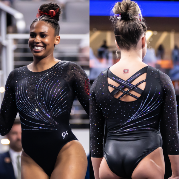
View photos of this leotard here.
 Elizabeth: 8.200
Design 2.3/3, Fabric 0.7/1, Sparkle 0.8/1, School Spirit 0.8/1, Uniqueness 0.8/1, Overall Appearance 2.4/3
This, like Cal’s, is one I probably wouldn’t like as much had I only seen it in pictures. But in person it’s great. It may seem busy, but all the elements really work well together. The arm design gives a textured look even if you can’t see the actual design well, and the sparkle pattern flows well and looks great on. Plus, I like the back a lot with the different thicknesses of straps.
 Claire: 7.900
Design 2.2/3, Fabric 1.0/1, Sparkle 0.8/1, School Spirit 0.6/1, Uniqueness 0.8/1, Overall Appearance 2.5/3
This is another one that looked a lot better in Dickies Arena than it does on camera: The lacy sleeves stood out a lot more from the matte black body, and the crystals really popped. I appreciate that Utah is taking a note from Michigan and leaning into lace as its signature fabric.
 Emily M: 7.200
Design 1.9/3, Fabric 1.0/1, Sparkle 0.7/1, School Spirit 0.8/1, Uniqueness 0.8/1, Overall Appearance 2.0/3
This feels almost like a throwback, with modern elements added. That old swooshy design was very tired by about 2008, but here it’s updated with a lot of sparkle, faux lace and a strappy back. Overall, I like it, but I found myself wishing for a little something more while watching on TV. Some red crystals in the swooshy bit, maybe?
 Emily L: 8.100
Design 2.4/3, Fabric 1/1, Sparkle 1/1, School Spirit 0.7/1, Uniqueness 0.6/1, Overall Appearance 2.4/3
This one is similar to Stanford’s leo for me. It’s definitely nice, I love the use of sparkle with that nice wave pattern. It’s just nothing that special.
 Peri: 7.900
Design 2.4/3, Fabric 0.7/1, Sparkle 0.8/1, School Spirit 0.7/1, Uniqueness 0.8/1, Overall Appearance 2.5/3
This looked amazing in motion, and stood out as most teams have departed from black leos since the pandemic. The lace is also subtler than other times we’ve seen it on collegiate designs, and it helps to balance out how dense the stoning is on top of it.
 Savanna: 9.100
Design 2.8/3, Fabric 0.9/1, Sparkle 1/1, School Spirit 0.7/1, Uniqueness 0.9/1, Overall Appearance 2.8/3
This is a fun little design! I love a good flow and I’m always a fan of tons of sparkles. I wish I could better see the pattern in the mesh, but it’s not that important in the grand scheme of the leotard because everything else works so well.
 Christina: 8.900
Design 2.6/3, Fabric 0.9/1, Sparkle 1/1, School Spirit 0.8/1, Uniqueness 0.8/1, Overall Appearance 2.8/3
I really like this one, and it looked so much better on TV/in motion. It’s so different from any other recent Utah leotards. The flowy design, the subtle pattern on the mesh, the crazy amount of glitter. If I truly have to point something out, it would be the two sets of straps on the back of different widths that are a bit weird. But that’s a minor detail.
Penn State (Cassidy Rushlow): 8.157
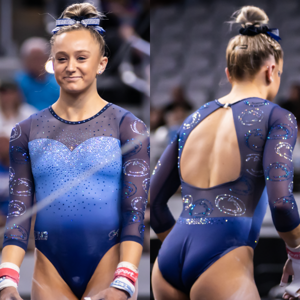
View a video of this leotard here.
 Elizabeth: 8.600
Design 2.4/3, Fabric 0.9/1, Sparkle 0.8/1, School Spirit 1.0/1, Uniqueness 0.9/1, Overall Appearance 2.6/3
This is nearly perfect. The ombre is so nice, but the school spirit is a little overboard for me. Although from afar it just looks like sparkles, which I appreciate. It’s a different direction for Penn State, one I’m not mad about.
 Claire: 8.500
Design 2.5/3, Fabric 0.8/1, Sparkle 0.8/1, School Spirit 1.0/1, Uniqueness 0.9/1, Overall Appearance 2.5/3
I’m not a particular fan of sweetheart necklines, but this works nicely with the overall design. I love the Nittany heads as a pattern! If they’d had one on the chest too it’d be too much, but the sleeves are great. I actually wish there were fewer sparkles on the body to let the ombre and logos pop. The back is a 10/10, no notes.
 Emily M: 8.700
Design 2.6/3, Fabric 0.6/1, Sparkle 1.0/1, School Spirit 1.0/1, Uniqueness 0.7/1, Overall Appearance 2.8/3
I do really love this. The ombre is delightful, especially with the deep blue and clear crystals emphasizing it even more. The many Nittany Lion heads all over the mesh are a lot. But I’m almost willing to overlook that.
 Emily L: 7.700
Design 2/3, Fabric 0.5/1, Sparkle 0.9/1, School Spirit 1/1, Uniqueness 0.8/1, Overall Appearance 2.5/3
This isn’t bad but it doesn’t stick out to me as one of my favorites. I’m not a huge fan of all the logos all over the sleeves, but I don’t think that makes it bad. Overall, not my favorite but not terrible either.
 Peri: 8.600
Design 2.5/3, Fabric 0.8/1, Sparkle 0.8/1, School Spirit 1.0/1, Uniqueness 0.9/1, Overall Appearance 2.6/3
The logo as a sleeve pattern is untapped territory, and if I had to guess a school outside of the SEC to do it first, it’d be Penn State. I can’t wait to see when/how other teams start to use logos as a recurring pattern, after how clean this leo looks!
 Savanna: 7.200
Design 2.2/3, Fabric 0.7/1, Sparkle 0.8/1, School Spirit 1/1, Uniqueness 0.5/1, Overall Appearance 2.0/3
This has a lot of my favorite leotard elements: a sweetheart neckline, a subtle ombre, and lots of sparkles! I don’t particularly like the amount of school logo in the sparkles—I could’ve done with a little less—but overall, this is solid for Penn State!
 Christina: 7.800
Design 2.5/3, Fabric 0.9/1, Sparkle 0.9/1, School Spirit 1/1, Uniqueness 0.5/1, Overall Appearance 2.0/3
Overall, I quite like this. I never get tired of a blue ombré, a sweetheart neckline, an open back and mesh sleeves. However, I could do without the million Penn State logos on the entirety of the mesh. But overall, it’s a pretty one.
Michigan: 7.871
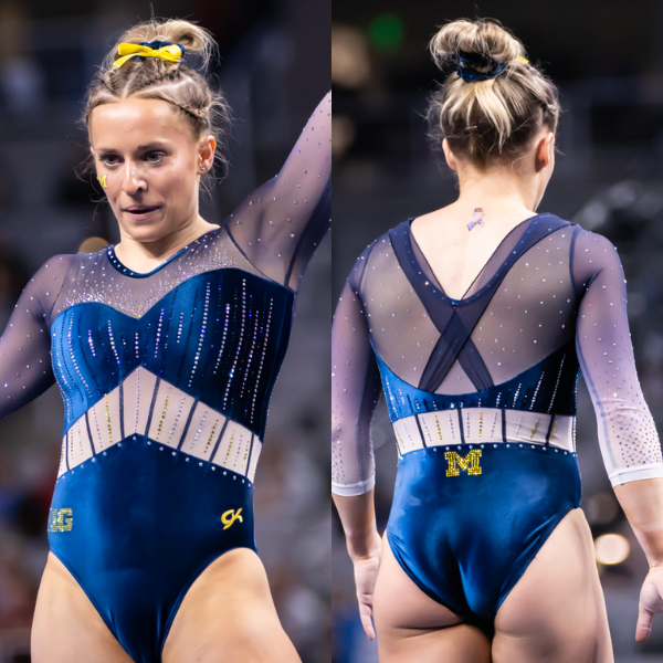
View a video of this leotard here.
 Elizabeth: 8.500
Design 2.6/3, Fabric 0.9/1, Sparkle 0.8/1, School Spirit 0.8/1, Uniqueness 0.8/1, Overall Appearance 2.6/3
I still have some questions, but this is SO great compared to Michigan’s recent debuts. I of course love the velvet—thank you Michigan for single-handedly bringing upon its resurgence—and the middle mesh doesn’t actually offend me. The ombre is great as well. I just don’t like the back mesh strap things. Leave it plain and more the block M up to that part instead. That extra fabric has no point.
 Claire: 8.700
Design 2.6/3, Fabric 0.9/1, Sparkle 0.8/1, School Spirit 0.8/1, Uniqueness 0.8/1, Overall Appearance 2.8/3
As a former gymnast in the ‘90s, I’m a sucker for anything crushed velvet and this particular shade of blue is *chef’s kiss.* My minor complaints are that I wish the mesh in the middle was the same blue as the chest and shoulders and that they’d continued the maize crystals all the way up the bodice. My big complaint is the big X on the back breaking up an otherwise clean and simple aesthetic. Overall though, this is a winner!
 Emily M: 8.900
Design 2.7/3, Fabric 1.0/1, Sparkle 1.0/1, School Spirit 0.8/1, Uniqueness 0.9/1, Overall Appearance 2.5/3
Did Olivia Karas single handedly ignite a velvet leo revolution? Maybe, and I’m here for it. Velvet is comfy, forgiving, and has a really nice depth to it, so A+ on that front. I normally hate a belt cutout, but this one is tied into the design in a way that makes me hate it less. I agree with everyone else that this is marred by that back fabric X. Full sparkle points because this one utilizes both blue and maize crystals.
 Emily L: 6.200
Design 1.5/3, Fabric 0.5/1, Sparkle 1/1, School Spirit 0.9/1, Uniqueness 0.8/1, Overall Appearance 1.5/3
Apparently this is an unpopular opinion, but I do not like this one. I think it would be fine without that white section in the middle. But I do like the velvet and the use of sparkle!
 Peri: 7.300
Design 2.0/3, Fabric 0.7/1, Sparkle 0.7/1, School Spirit 0.7/1, Uniqueness 0.8/1, Overall Appearance 2.4/3
Block M emoji, handshake emoji, is there a velvet emoji? I see what they were going for, as will everyone that watched their championship run in 2021, but the accent mesh straps and low logo placement seem out of place. I do give immense credit for making sure the torso cutouts are continuous – they look seamless transitioning from the front to the back of the leo.
 Savanna: 8.200
Design 2.4/3, Fabric 1/1, Sparkle 0.9/1, School Spirit 0.7/1, Uniqueness 0.8/1, Overall Appearance 2.4/3
Velvet!! Immediate win on that front. The straps on the back are a bit confusing because it doesn’t look like there’s much of a purpose to them, but this is such a good leotard compared to some of the others Michigan brought out this season.
 Christina: 7.300
Design 2.2/3, Fabric 0.9/1, Sparkle 0.6/1, School Spirit 0.7/1, Uniqueness 0.5/1, Overall Appearance 2.4/3
I feel like we’ve seen multiple teams this season with more or less the same design and this Burlesque-like bodice. That said, I do like this one, especially with the velvet and ombré sleeves. The only detail slightly bugging me are the faux straps on the back, especially placed on top of the mesh, but overall this is a pretty nice leo.
LSU (team final): 7.786
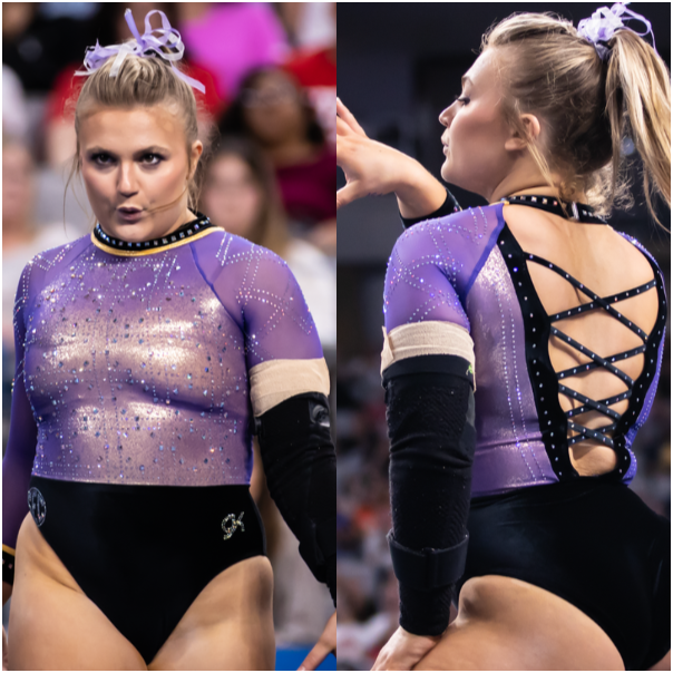
View a video of this leotard here.
 Elizabeth: 8.700
Design 2.6/3, Fabric 1.0/1, Sparkle 0.8/1, School Spirit 0.8/1, Uniqueness 0.9/1, Overall Appearance 2.6/3
The first LSU leo I’ve absolutely loved in a while! I love everything about it. The velvet? Adore. The shimmery purple/yellow chest? Fabulous. The design? On point.
 Claire: 8.600
Design 2.5/3, Fabric 1.0/1, Sparkle 0.8/1, School Spirit 0.8/1, Uniqueness 1.0/1, Overall Appearance 2.5/3
I feel like this is what UCLA was going for with its overlay. The purple mesh over gold bodice is exquisite, especially against the black velvet. The crystals look like a circuit board, and I mean that in the most complimentary way possible! The only drawbacks are the heavily studded back and collar. That feels very Georgia to me, and they clash with the overall aesthetic.
 Emily M: 8.200
Design 2.3/3, Fabric 1.0/1, Sparkle 0.9/1, School Spirit 0.6/1, Uniqueness 1.0/1, Overall Appearance 2.4/3
The corset back is stunning, and paired with velvet? Slight dominatrix vibes in a tasteful, really nice way. I like the purple/gold shimmer combo: I think it reads glowy purple more than anything else. I do wish there were something tying the bodice to the velvet bottom, but overall I really like this.
 Emily L: 7.900
Design 2.3/3, Fabric 0.8/1, Sparkle 1/1, School Spirit 0.7/1, Uniqueness 0.8/1, Overall Appearance 2.3/3
Sorry, this one is just boring to me. I’m sure you guys have realized at this point that I’m a big fan of back straps, but these ones are just too basic. I’m also not a huge fan of the rhinestones on the super thin collar.
 Peri: 6.600
Design 2.0/3, Fabric 0.8/1, Sparkle 0.8/1, School Spirit 0.7/1, Uniqueness 0.8/1, Overall Appearance 1.5/3
This feels like a Georgia leo in an LSU disguise, and I wanted to like it so badly. The velvet pairs easily with the corset genre of leotard designs, but in my color theory brain I have to dock points for overlaying purple and gold together since the result is a shimmery brown. The only team I’ll allow that for is Western Michigan, and even it stays away from brown with its newer designs.
 Savanna: 9.000
Design 2.8/3, Fabric 0.9/1, Sparkle 0.9/1, School Spirit 0.8/1, Uniqueness 0.8/1, Overall Appearance 2.8/3
When I saw the brief sneak peek of this leo in the hype video, I was prepared to riot over the black sleeves. Then, I saw the whole leotard and immediately took it back. I love this! LSU hasn’t had a velvet leotard in a long time, if ever, and this was a perfect time to bring one out. Bonus points for the purple and gold shimmer effect. It sparkled on the national stage.
 Christina: 5.500
Design 1.5/3, Fabric 0.9/1, Sparkle 0.6/1, School Spirit 0.7/1, Uniqueness 0.6/1, Overall Appearance 1.2/3
This type of back was so trendy in synchronized swimming in the late 2000s. I suppose it does match with the velvet, retro vibes of it all. I can’t really pinpoint exactly why, but I just can’t get behind this one. Maybe I would have liked it if the separation between that and the black velvet wasn’t so abrupt? Just a meh for me overall.
Stanford: 7.571
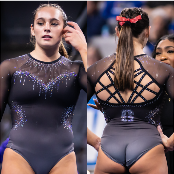
View a video of this leotard here.
 Elizabeth: 8.500
Design 2.5/3, Fabric 1.0/1, Sparkle 0.8/1, School Spirit 0.7/1, Uniqueness 0.8/1, Overall Appearance 2.7/3
I LOVED this when I saw it during floor warmups. The black to gray ombre is subtle and totally my jam. Sometimes the transition in ombre can be harsh, but this flows soooo well. I also like the front design and adore the back. Overall a fantastic leo for Widner’s individual appearance at nationals! I hope the Cardinal gets this design for the whole team for 2024—maybe with some red rhinestones?
 Claire: 8.300
Design 2.5/3, Fabric 0.8/1, Sparkle 1.0/1, School Spirit 0.5/1, Uniqueness 0.8/1, Overall Appearance 2.7/3
This is one of those designs that packs more of a punch in person than it does on film, and it definitely caught the eye in person. This leo is the definition of “greater than the sum of its parts:” The combination of so many subtle elements—from the grey to black ombre to the concentrated sparkles—make a major impact. In fact, the one thing that doesn’t work for me is the super strappy back. It’s out of place in such an otherwise understated design.
 Emily M: 6.200
Design 2.0/3, Fabric 0.6/1, Sparkle 0.5/1, School Spirit 0.6/1, Uniqueness 0.7/1, Overall Appearance 1.8/3
This ombre is so subtle. Too subtle, maybe? It was hard to see clearly on TV, and just looked a little chalky. I do like it in stills, though. I’m a side cutout hater in all cases, and it stands true here, although the sparkle around the cutouts adds some needed interest to the matte look.
 Emily L: 7.200
Design 2.2/3, Fabric 0.7/1, Sparkle 0.8/1, School Spirit 0.7/1, Uniqueness 0.6/1, Overall Appearance 2.2/3
This is cute, it just doesn’t really stand out to me. I didn’t have any strong reactions when I first saw it, and I kind of feel the same looking at it again. The straps on the back save it from being completely boring for me.
 Peri: 8.700
Design 2.7/3, Fabric 1.0/1, Sparkle 0.7/1, School Spirit 0.7/1, Uniqueness 0.8/1, Overall Appearance 2.8/3
The subtle ombre here is what a lot of ombres think they look like. While the back is simple, seeing the block S in silver instead of red is a fun touch – very much looking forward to seeing this on the full team next year.
 Savanna: 8.800
Design 2.7/3, Fabric 0.8/1, Sparkle 0.8/1, School Spirit 0.9/1, Uniqueness 0.8/1, Overall Appearance 2.8/3
WOW, I love this. The sweetheart neckline, the amount of sparkle is just right, I don’t even hate the side cutouts, which is normally a hard no for me. Stanford, give everyone this leo next season please and thank you.
 Christina: 5.300
Design 1.4/3, Fabric 0.4/1, Sparkle 0.7/1, School Spirit 0.5/1, Uniqueness 0.5/1, Overall Appearance 1.8/3
Eh, the plain black is a bit boring. I’m also not a fan of the side mesh or the crazy strappy back (and I do love a unique back design). The sweetheart neckline and super sparkly collar are great though. But overall, a pretty bland leo in my opinion, although it does match Stanford’s usual look.
Florida: 7.529
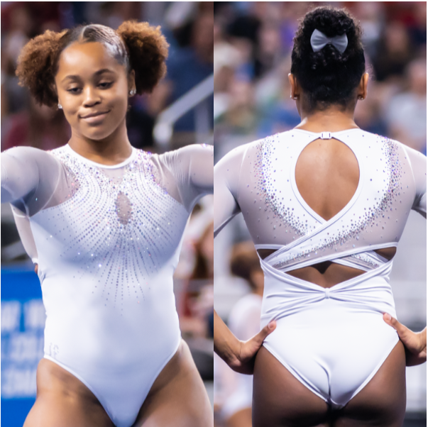
View a video and photos of this leotard here.
 Elizabeth: 7.600
Design 2.4/3, Fabric 0.8/1, Sparkle 0.7/1, School Spirit 0.6/1, Uniqueness 0.7/1, Overall Appearance 0.4/3
This is a great leo! I love this style of back, and the white is really nice. I just wish there were some subtle orange and blue rhinestones thrown in to add a bit of school spirit.
 Claire: 7.200
Design 2.2/3, Fabric 0.7/1, Sparkle 0.9/1, School Spirit 0.5/1, Uniqueness 0.7/1, Overall Appearance 2.2/3
Nothing revolutionary, but it’s a very pretty white leo. The keyhole doesn’t bother me as much as most because it’s echoed on the back. Speaking of, the back is definitely the best part of this design for me, and saves this from being another generic Florida leo.
 Emily M: 6.900
Design 2.0/3, Fabric 0.8/1, Sparkle 0.6/1, School Spirit 0.8/1, Uniqueness 0.7/1, Overall Appearance 2.0/3
This is so pretty. I love that Florida has been incorporating the Leanne Wong-esque bow into its designs this year, and it works really well at the low back. That’s a school spirit element to me, even if a subtle one, as is wearing white at nationals. The back almost looks pearl-encrusted. (“A chocolate praline crunch cake completely covered with pearls. Ah, to be 21 again.” IYKYK). I dislike the keyhole, and agree a little bit more of a colorful punch somewhere would’ve been a nice touch.
 Emily L: 8.700
Design 2.8/3, Fabric 0.9/1, Sparkle 1/1, School Spirit 0.5/1, Uniqueness 0.7/1, Overall Appearance 2.8/3
Maybe I just love white leos, but I’m a big fan of this one! I loved Florida’s leo from last year’s national final, and I love this one almost as much. I have to rate it low in the school spirit category, but I just love the white and I think the back looks really cool.
 Peri: 8.400
Design 2.6/3, Fabric 0.8/1, Sparkle 0.9/1, School Spirit 0.8/1, Uniqueness 0.7/1, Overall Appearance 2.6/3
Along the same lines of how I ranked Michigan’s leo above, the school spirit here comes from that it’s a white leo at nationals instead of school branding. That being said, it’s beautiful, and I wouldn’t be angry if white is adopted as a more recurring color for the gators similar to Brazil and lavender.
 Savanna: 6.400
Design 1.9/3, Fabric 0.7/1, Sparkle 0.6/1, School Spirit 0.3/1, Uniqueness 0.7/1, Overall Appearance 2.2/3
The curse of the white leo continues. In all seriousness, this is beautiful in design, even though I could do without the random backstraps. If I didn’t know it was Florida wearing it, I wouldn’t have known because there’s nothing on there that indicated it was a Florida leo. Give me a sparkly gator somewhere or literally anything with the Florida branding.
 Christina: 7.500
Design 2.4/3, Fabric 0.9/1, Sparkle 0.7/1, School Spirit 0.5/1, Uniqueness 0.5/1, Overall Appearance 2.5/3
I love the back and how the solid white pairs super well with the mesh. I’m not a huge fan of the front and the keyhole, but I do think the sparkles were actually very subtly blue and orange. On the contrary to my colleagues, I do like that it’s not too Florida-branded and I love the simplicity of this white design, but maybe the sparkles should have been more colorful.
LSU (semifinals): 7.500
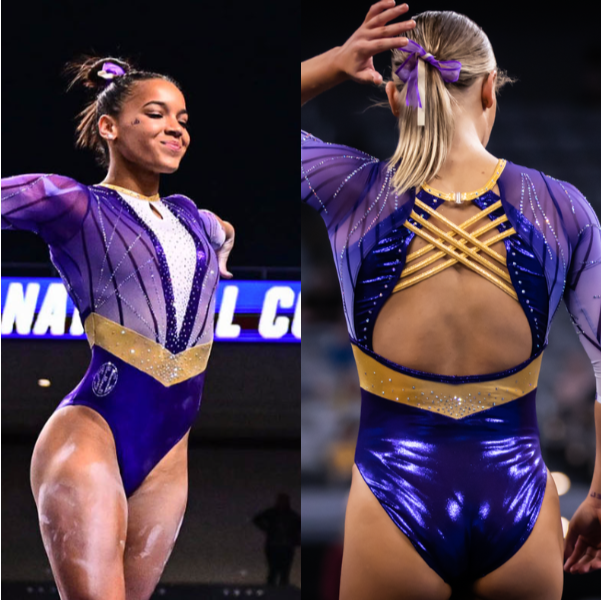
View a video of this leotard here.
 Elizabeth: 7.600
Design 2.0/3, Fabric 0.8/1, Sparkle 0.7/1, School Spirit 0.8/1, Uniqueness 0.8/1, Overall Appearance 2.5/3
This is SO CLOSE to being great! I love literally everything about it except the white and the chest hole. The back is great, the gold accents are great, the sleeve design is great… The white is just out of place. Make it solid purple or continue the sleeve design and this would have been a near-perfect score from me.
 Claire: 7.200
Design 2.0/3, Fabric 0.6/1, Sparkle 0.9/1, School Spirit 0.7/1, Uniqueness 0.7/1, Overall Appearance 2.3/3
Echoing Elizabeth, this was SO CLOSE! The parts of this I love—the phenomenal sleeves, the strappy back, the crystal belt—I really, really love! The white V and inexplicable keyhole look so out of place next to the rest of the design.
 Emily M: 7.600
Design 1.8/3, Fabric 0.8/1, Sparkle 0.8/1, School Spirit 0.8/1, Uniqueness 0.9/1, Overall Appearance 2.5/3
I hate the white V less than everyone else. It looked a little abrupt on TV, but in stills I kind of think it works. I would’ve liked it better with purple crystals, I think, to tie it in more, but I’m not a hater of this one. I’m also anti-keyhole generally, but LSU has done it so often this year that it’s becoming a signature look that leans almost into school spirit. The back is perfect, no notes.
 Emily L: 8.200
Design 2.3/3, Fabric 1/1, Sparkle 1/1, School Spirit 0.8/1, Uniqueness 0.8/1, Overall Appearance 2.3/3
When I first saw this one I hated it, but it definitely grew on me! I feel like there’s a lot going on, but not necessarily in a bad way. The only thing I don’t love is the hole in the chest.
 Peri: 7.900
Design 2.1/3, Fabric 0.8/1, Sparkle 0.8/1, School Spirit 0.9/1, Uniqueness 0.8/1, Overall Appearance 2.5/3
Take out the keyhole, maybe change the white to any of the purples already on the top half, and this would be my new favorite LSU leotard. It’s tricky to balance out using complimentary colors (especially when they’re both shiny), but the gold as fabric accents tying the front and back together work amazingly here.
 Savanna: 7.400
Design 2.2/3, Fabric 0.5/1, Sparkle 0.7/1, School Spirit 0.9/1, Uniqueness 0.8/1, Overall Appearance 2.3/3
Last time I reviewed an LSU leo with a bunch of white on it, I said I didn’t like the sparkles on the white. This isn’t AS much white and would’ve been great…if there wasn’t the keyhole thing on the front. I do LOVE literally everything else about it, but please no more random white in a super solid leotard, LSU.
 Christina: 6.600
Design 2.2/3, Fabric 0.4/1, Sparkle 0.7/1, School Spirit 0.8/1, Uniqueness 0.8/1, Overall Appearance 1.7/3
I loved everything about this until I saw the white fabric on the front. This could have been so good. The slight purple ombré, the gold belt and neckline, and the back are great, but I cannot get over this giant white V-neck.
Oklahoma: 7.129
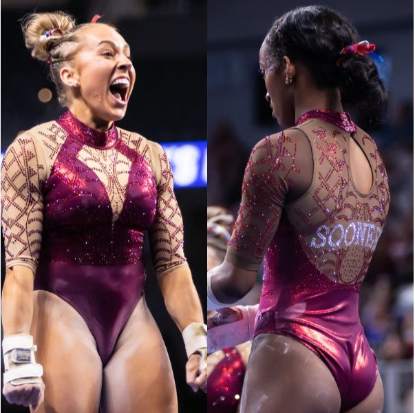
View a video of this leotard here.
 Elizabeth: 7.800
Design 2.3/3, Fabric 0.7/1, Sparkle 0.8/1, School Spirit 0.8/1, Uniqueness 0.7/1, Overall Appearance 2.5/3
I like it! Oklahoma doesn’t do nude mesh often, but when it does, it’s tasteful. This design reminds me of its leo from 2014, which it also wore at a national championships (semifinal). The only thing I’d change here is the neckline/collar. I’d have gone with a simple sweetheart or angular V and done a thin red piping around the neck rather than a full on collar. I do appreciate the red rhinestones used though. That’s a nice touch.
 Claire: 7.300
Design 2.0/3, Fabric 0.7/1, Sparkle 1.0/1, School Spirit 0.8/1, Uniqueness 0.8/1, Overall Appearance 2.0/3
I heard someone in the crowd say, “Yay! They’re finally using cream [one of Oklahoma’s official school colors] in a leo!” which sums up my feelings about the “nude” mesh as a whole. I’m not a fan of the deep V either. All that said, I love the body itself and the crystal designs; switch to a white (or intentionally cream) mesh without the faux plunging neckline, and this would be a knockout.
 Emily M: 4.200
Design 0.9/3, Fabric 0.3/1, Sparkle 0.8/1, School Spirit 0.8/1, Uniqueness 0.9/1, Overall Appearance 0.5/3
Nope. I hate the cut of the neckline. If it were just a deep V in nude without nude sleeves, I think I’d like it, but as-is it’s just too much mesh. I’m also sure it’s comfy but the elbow-length sleeves make just about everyone look like the Hulk. I’m all for emphasizing strength, but I don’t think that cut does it well. Really nothing I like here.
 Emily L: 9.600
Design 3/3, Fabric 1/1, Sparkle 1/1, School Spirit 0.8/1, Uniqueness 0.8/1, Overall Appearance 3/3
Maybe this is another unpopular opinion, but I LOVE this one! I think the nude looks really nice, especially with the darker mesh. I think the neckline looks great, and I’m loving the design on the sleeves.
 Peri: 7.000
Design 2.4/3, Fabric 0.7/1, Sparkle 0.7/1, School Spirit 0.9/1, Uniqueness 0.8/1, Overall Appearance 2.2/3
Spiderwebs upon spiderwebs. The stone patterning entered a new Oklahoma realm for me, being clearly intricate without looking outright uncomfortable to wear. My only gripe with it is that on the majority of the team, the red stones were more legible than the ‘SOONERS’ text.
 Savanna: 7.700
Design 2.1/3, Fabric 0.6/1, Sparkle 1/1, School Spirit 0.9/1, Uniqueness 0.8/1, Overall Appearance 2.3/3
Why does it have to be NUDE? Everything else about it is a win for me. The sleeve design is really fun and even incorporating the amount of red that it did made it stand out more for me. Obviously, the sparkle is a 11/10 if I could rank it that, but I would’ve loved it so much more if it wasn’t nude—even if it isn’t as atrocious as some of the other attempts at nude mesh this season.
 Christina: 6.300
Design 1.5/3, Fabric 0.4/1, Sparkle 1/1, School Spirit 0.8/1, Uniqueness 0.7/1, Overall Appearance 1.9/3
I thought this one would maybe grow on me, but it didn’t. I don’t hate it, but I don’t truly like it either. I’m not a fan of the neckline and collar, and the pattern on the sleeves is just a bit much. The rest of the bodice is nice and I don’t mind the nude mesh so much however.
Penn State (Ava Piedrahita): 6.942
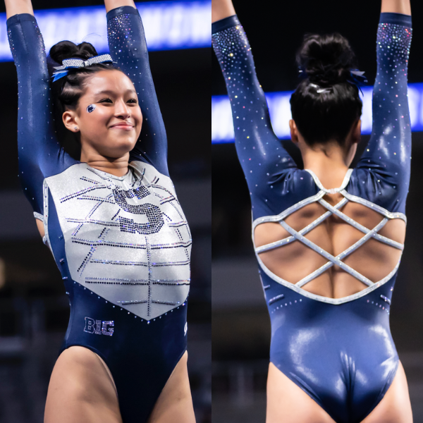
View a video of this leotard here.
 Elizabeth: 7.200
Design 2.0/3, Fabric 0.7/1, Sparkle 0.8/1, School Spirit 0.9/1, Uniqueness 0.8/1, Overall Appearance 2.0/3
This leo was interesting because the silver part on the chest looked pretty different in person. More metallic-y. Overall I like it. It’s such a different look than even the other Penn State leo in this session, which shows Penn state’s range. I also like the use of the block S, which is a bit of a change from what the Nittany Lions typically do for school spirit.
 Claire: 7.800
Design 2.2/3, Fabric 0.7/1, Sparkle 0.9/1, School Spirit 0.8/1, Uniqueness 0.7/1, Overall Appearance 2.5/3
I don’t usually go for mystique fabric, but it really gives the design a cool texture. My main criticism is that the shield (?) the front feels disconnected from the rest of the design. As with Penn State’s other leo from this weekend, the back is perfect.
 Emily M: 7.000
Design 2.1/3, Fabric 0.8/1, Sparkle 0.6/1, School Spirit 0.8/1, Uniqueness 0.7/1, Overall Appearance 2.0/3
This is very solid. The back is lovely, the shade of blue plays really well with the fabric choice, and the white/silver mystique has a really interesting depth. I agree with Chirstina, the spider web effect isn’t my favorite, but otherwise I really enjoy this design!
 Emily L: 8.300
Design 2.7/3, Fabric 0.5/1, Sparkle 1/1, School Spirit 0.8/1, Uniqueness 0.8/1, Overall Appearance 2.5/3
I really like this one! I like the simple “S” in the front of the leo combined with the sparkly spider web pattern that everyone else seems to dislike. I also love the criss-cross back and I think it has the perfect amount of sparkle.
 Peri: 7.500
Design 2.1/3, Fabric 0.7/1, Sparkle 0.8/1, School Spirit 0.9/1, Uniqueness 0.7/1, Overall Appearance 2.3/3
If this is GK’s new and improved play on its earlier design we’ve seen Minnesota use, I’m here for it. The chest armor look is one of my favorite ways to make a leotard with a top-bottom split that doesn’t look like it has underwear, and it’s paired well with the back straps.
 Savanna: 6.500
Design 2.0/3, Fabric 0.3/1, Sparkle 0.6/1, School Spirit 0.8/1, Uniqueness 0.7/1, Overall Appearance 2.1/3
Love the strappy back of this one! The silver is an interesting choice, but it works with the design. I do wish there was a little bit of difference in the types of fabrics used because this kind of looks uncomfortable to me, but the design overall is a win.
 Christina: 4.300
Design 1.0/3, Fabric 0.3/1, Sparkle 0.4/1, School Spirit 0.6/1, Uniqueness 0.7/1, Overall Appearance 1.3/3
I am really not a fan of the spider web front, at all. The back and its straps are lovely, but I can’t get past the front. I wish the fabric wasn’t so solid everywhere either and had a bit more nuances or differences in textures.
UCLA: 6.243
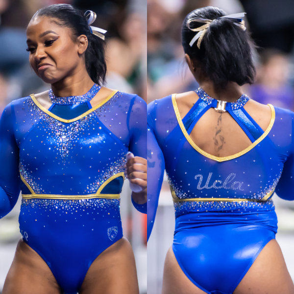
View a video of this leotard here.
 Elizabeth: 6.300
Design 1.7/3, Fabric 0.6/1, Sparkle 0.6/1, School Spirit 0.8/1, Uniqueness 0.8/1, Overall Appearance 1.8/3
Sigh. I hate the top and the side cutouts. If the leo was just the design on top with no side cutouts, it would actually be pretty great because the colors and rhinestone design are good. The top neckline area just ruins things.
 Claire: 6.800
Design 1.5/3, Fabric 0.7/1, Sparkle 1.0/1, School Spirit 0.8/1, Uniqueness 1.0/1, Overall Appearance 1.8/3
This looks like UCLA put its competition leos on over its training leos… I love the gold piping against the blue and the crystals are phenomenal, but the whole overlay thing is confusing (especially with the side cutouts).
 Emily M: 5.600
Design 0.9/3, Fabric 0.9/1, Sparkle 1.0/1, School Spirit 0.9/1, Uniqueness 0.9/1, Overall Appearance 1.0/3
I agree with the general sentiments everyone else mentioned. The shade of blue is excellent, but I just don’t get the top.
 Emily L: 6.200
Design 1.5/3, Fabric 0.4/1, Sparkle 1/1, School Spirit 1/1, Uniqueness 0.8/1, Overall Appearance 1.5/3
I have to agree with Claire, my first reaction was that it looks like there’s a training leo underneath the competition leo. I don’t like the cutouts on the top or on the sides at all. It’s got great sparkle and school spirit, but overall I don’t like how it looks.
 Peri: 6.600
Design 1.8/3, Fabric 0.6/1, Sparkle 0.8/1, School Spirit 0.7/1, Uniqueness 0.7/1, Overall Appearance 2.0/3
Hot take: if this leo were matte, it’d be great. While i’m not averse to the amount of details, they’re muted out by all being mystique. Or – pull an LSU-four-on-the-floor and make the bottom half clearly darker.
 Savanna: 5.600
Design 1.4/3, Fabric 0.5/1, Sparkle 1/1, School Spirit 0.5/1, Uniqueness 0.6/1, Overall Appearance 1.6/3
Sparkle is good. Everything else is…not it for me, personally. Get rid of the side cutouts and the weird random neckline and maybe I would like this better, but it’s not my personal favorite.
 Christina: 6.600
Design 1.7/3, Fabric 0.7/1, Sparkle 1/1, School Spirit 0.8/1, Uniqueness 0.7/1, Overall Appearance 1.7/3
There’s a bit too much going on here. The fake sports bra/solid fabric underneath is a no for me, just like the weird side cutouts. I do like the shade of blue and the gold as well as the sparkles, but I’m really not a fan of everything going on “underneath” the main bodice.
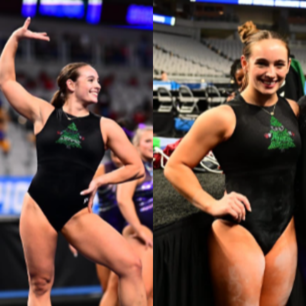
BONUS: Stanford (Chloe Widner’s tank): 9.157
View photos of this leotard here.
 Elizabeth: 11.000
Design 3.0/3, Fabric 1.0/1, Sparkle 1.0/1, School Spirit 2.0/1, Uniqueness 1.0/1, Overall Appearance 3.0/3
Obsessed. I’ve always loved the Stanford tree mascot. It’s so creepy in a cute way haha. Putting it on a training leo is brilliant, and I won’t accept anything less than making this a full competition design in 2024.
 Claire: 9.200
Design 3.0/3, Fabric 1.0/1, Sparkle 0.5/1, School Spirit 1.0/1, Uniqueness 1.0/1, Overall Appearance 2.7/3
Make the Cardinal bigger, angrier, and more sparkly, and this will be the greatest leo in NCAA gym history.
 Emily M: 9.000
Design 3.0/3, Fabric 1.0/1, Sparkle 0/1, School Spirit 1.0/1, Uniqueness 1.0/1, Overall Appearance 3.0/3
YES. Leaning into weird school imagery is my jam. Similar vibes to the Michigan throwback Wolverine head warmups. Add black mesh sleeves, a strappy back, and compete in this. Plus, in its heyday, the Cardinal wore a lot of big tree leos at nationals.
 Emily L: 8.800
Design 3/3, Fabric 1/1, Sparkle 0/1, School Spirit 1/1, Uniqueness 1/1, Overall Appearance 2.8/3
This is so simple and so cute! I love the school spirit, and I have to agree with everyone else and say that I’d love to see some version of this in competition!
 Peri: 11.000
Design 3.0/3, Fabric 1.0/1, Sparkle 1.0/1, School Spirit 1.0/1, Uniqueness 1.0/1, Overall Appearance 4.0/3
It’s no secret I’m terrified of the tree, but making it sparkly is a workaround I’m open to. I’ll give it an 11 out of 10 alongside Elizabeth if a future edition of this leo includes “fear the tree”, and even go for a 12 if the tree makes it onto any of Stanford’s mens or club affiliate designs.
 Savanna: 8.700
Design 2.8/3, Fabric 0.8/1, Sparkle 0.5/1, School Spirit 1/1, Uniqueness 1/1, Overall Appearance 2.6/3
Fear. The. Angry. Tree. Also, does it have boxing gloves on?? Love it.
 Christina: 6.400
Design 2.0/3, Fabric 0.5/1, Sparkle 0.3/1, School Spirit 1/1, Uniqueness 0.8/1, Overall Appearance 1.8/3
Put sleeves on this and slightly more sparkles, and I’m sold.
Fan Poll
Congrats to Centenary for winning the USAG fan poll! Vote for your favorite from NCAA nationals here.
READ THIS NEXT: Leotard Rankings: USAG
Article by Elizabeth Grimsley, Claire Billman, Emily Minehart, Emily Lockard, Peri Goodman, Savanna Whitten and Christina Marmet
Like what you see? Consider donating to support our efforts throughout the year! [wpedon id=”13158″]



One comment