It’s NCAA gymnastics season and the leotards are as sparkly as ever. And with new designs comes your favorite series: Leotard Rankings! Each week we’re analyzing leotard debuts to find our weekly faves. There will be up to three points for design, up to one point each for fabric, sparkle, school spirit and uniqueness, and up to three points for overall appearance. This week Emily L, Alyssa and Izzi are joining our editor-in-chief, Elizabeth, to help judge.
Don’t agree with our ranking? Make your opinion heard by voting in the fan poll at the end of the article each week or voicing your thoughts on social media. And, wondering where the new NCGA and USAG team leos are? Check out our ranking of those leotards the week after each respective national championship at the end of the season.
Kent State: 9.125
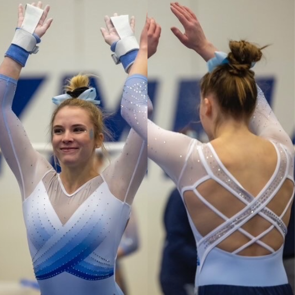
View a video of this leotard here.
 Elizabeth: 9.500
Design 3.0/3, Fabric 1.0/1, Sparkle 1.0/1, School Spirit 0.5/1, Uniqueness 1.0/1, Overall Appearance 3.0/3
WOW, Kent State! This is nearly flawless. In fact, I think my only complaint is that it’s not very…Kent State. But that’s a good thing. I love the shades of blue, the wrap design on the front, and especially the back. Maybe a top 10 leo all time for me.
 Emily L: 9.000
Design 2.5/3, Fabric 1/1, Sparkle 1/1, School Spirit 0.4/1, Uniqueness 1/1, Overall Appearance 3/3
I love this leo! I’m always a fan of light blue leotards, and I especially love this one because of the crosses on the back. Like Elizabeth said, I’m not seeing anything that really makes it unique to Kent State, but it’s still gorgeous.
 Alyssa: 8.800
Design 2.5/3, Fabric 0.8/1, Sparkle 1/1, School Spirit 0.5/1, Uniqueness 1.0/1, Overall Appearance 3.0/3
I love this one. At first glance it looks more North Carolina than Kent State to me with the coloring, but that is not really a bad thing. I am not a huge fan of how the fabric of the straps on the back looks on the gymnasts, but it is overall a top design.
 Izzi: 9.200
Design 3/3, Fabric 1/1, Sparkle 0.8/1, School Spirit 0.4/1, Uniqueness 1/1, Overall Appearance 3/3
This is gorgeous! I’d never guess that it’s a Kent State leo; it feels very UNC to me. I don’t always like sweetheart necklines, but the wrap design makes it feel purposeful and delicate. I’m not obsessed with the back—not every leo needs to have a strappy back—but this one feels thematically appropriate so I like it fine.
Washington: 8.625
View a video of this leotard here.
 Elizabeth: 7.600
Design 2.4/3, Fabric 0.6/1, Sparkle 0.9/1, School Spirit 1.0/1, Uniqueness 1.0/1, Overall Appearance 1.7/3
I’m split on this, so I’ll talk about the positives first: the design based on the library, the angled gold sleeves, the open back, the gold shimmer to the upper body. However, this is a leo I like much more in these stills than I did watching the meet. In action, it looked like a semi-boring purple and black leotard. I wish the upper body fabric had more of a gold shimmer and the sparkle design stuck out more.
 Emily L: 8.000
Design 2.5/3, Fabric 0.5/1, Sparkle 1/1, School Spirit 1/1, Uniqueness 1/1, Overall Appearance 2/3
It’s not my favorite Washington leo, but I do have to say it’s pretty unique, especially knowing the library theme. I think the combination of mesh at the top and shiny purple at the bottom is a little weird, but again I really like how different it is from its other leos.
 Alyssa: 9.200
Design 2.7/3, Fabric 1/1, Sparkle 1/1, School Spirit 1/1, Uniqueness 1/1, Overall Appearance 2.5/3
I love the concept of this leo as a library lover myself. The angled sleeves, the use of the rhinestones, and the shade of purple is all great. The only thing I would have changed is to make the bodice a little bit more gold so it stands out better.
 Izzi: 9.700
Design 2.9/3, Fabric 1/1, Sparkle 1/1, School Spirit 1/1, Uniqueness 1/1, Overall Appearance 2.8/3
I’m absolutely obsessed with this one. At my college, the library was the No. 1 spot to socialize, so I am automatically fond of the idea. I love the scallop-esque pattern it creates at the top and the way the stones continue into the bottom half so the waistline is a little less severe. The angled sleeves are the coolest touch. This will definitely be on my list of favorite leos.
Oregon State: 8.550
View images of this leotard here.
 Elizabeth: 8.900
Design 2.4/3, Fabric 0.9/1, Sparkle 1.0/1, Theme Spirit 1.0/1, Uniqueness 1.0/1, Overall Appearance 2.6/3
This is a leo you either love or hate, and I am on the side of the former. The back straps are a little too circusy for me, but I love the front—and I’m not normally much of a flower girl, but I love the multi-colored rhinestones. Honestly, I don’t know why I was surprised Oregon State pulled out a full pride leo, but here we are. Good job, Beavs!
 Emily L: 7.500
Design 2/3, Fabric 1/1, Sparkle 1/1, Theme Spirit 1/1, Uniqueness 1/1, Overall Appearance 1.5/3
I love how Oregon State took the pride theme and really ran with it. I just love pride leos in general because there’s so much potential. The sparkle is great, but overall this leo is a lot. There’s flowers, there’s a rainbow strappy back, there’s a beaver, there’s a pride flag—it’s just a little bit too much for me. But I love the theme!
 Alyssa: 8.700
Design 2.3/3, Fabric 1/1, Sparkle 1/1, Theme Spirit .9/1, Uniqueness 1/1, Overall Appearance 2.5/3
I love this for a pride leo. I appreciate the flag on the shoulder and the use of color. The pink fabric in the front probably is not for everyone, but I loved that part of the leo during movement even more so than the flowers. The rainbow straps on the back are a little much, but it plays into the theme.
 Izzi: 9.100
Design 2.3/3, Fabric 1/1, Sparkle 1/1, Theme Spirit 1/1, Uniqueness 1/1, Overall Appearance 2.8/3
There were only a handful of out athletes just a few years ago, and now we’re getting multiple pride leos?! Thinking about the young gay kids that look up to these gymnasts brings a tear to my gay eyes. That being said, this is definitely a lot. Somehow I think it works, especially if you don’t look too closely. Upon closer inspection, the random pink chest V and the oddly green sparkle belt look weird, but I’m going to choose to zoom out and enjoy the rainbows.
Penn State: 8.025
View a video of this leotard here.
 Elizabeth: 7.800
Design 2.3/3, Fabric 0.8/1, Sparkle 0.7/1, School Spirit 0.8/1, Uniqueness 1.0/1, Overall Appearance 2.2/3
I feel like a past version of me wouldn’t have liked this, but 2023 me really does. It’s so funky and unique—I’ve never seen anything like it. I think I would have dropped the thin fabric/piping around the middle, but otherwise I’m actually really into this.
 Emily L: 6.700
Design 2/3, Fabric 0.4/1, Sparkle 0.5/1, School Spirit 0.8/1, Uniqueness 1/1, Overall Appearance 2/3
Well this is a lot. From the tie dye up front to the gray strappy back, I feel like there’s a lot to look at. It is uniqu,e though, and I can always appreciate when a team makes the effort to be unique.
 Alyssa: 8.200
Design 2.4/3, Fabric 1/1, Sparkle 0.7/1, School Spirit 0.7/1, Uniqueness 1/1, Overall Appearance 2.4/3
I am a huge fan of marble print in general so I am glad to see Penn State branch out and use the pattern in a leo. I do think that the amount of the pattern is a little bit much. Ideally I would have liked to see the bottom in a solid blue to break it up a bit.
 Izzi: 9.400
Design 2.6/3, Fabric 1/1, Sparkle 1/1, School Spirit 0.9/1, Uniqueness 1/1, Overall Appearance 2.8/3
This is so fresh and fun! The pattern is awesome, and I like the shift to darker blue on the bottom half. The cross piping at the waist feels out of place against the marbling pattern. I like the sparkle waist, though; I think the piping would have been fine with just one line instead of two. I don’t even mind the busy back! The angles really flow with the marble somehow.
West Virginia: 7.600
View a video of this leotard here.
 Elizabeth: 7.400
Design 2.0/3, Fabric 0.8/1, Sparkle 0.8/1, School Spirit 0.8/1, Uniqueness 0.8/1, Overall Appearance 2.2/3
The white to yellow ombre on the chest is absolutely fantastic. I also like the rhinestone design despite it looking a bit like an owl. The yellow around the armpits is a little off-putting in action, but not so much that I’ll dock too many points from the design. Finally, the back is a little wide for me, especially on those with broader shoulders, but overall it’s still good.
 Emily L: 7.600
Design 2/3, Fabric 1/1, Sparkle 1/1, School Spirit 0.8/1, Uniqueness 0.8/1, Overall Appearance 2/3
I love all the sparkles that were used, and I love the cutout combined with the high neck design. The back is a little bit too open for me, but overall I like it! If the back were a little more closed, I’d have it rated a little higher because I love the front.
 Alyssa: 8.100
Design 2.1/3, Fabric 0.8/1, Sparkle 1/1, School Spirit 0.9/1, Uniqueness 1/1, Overall Appearance 2.3/3
I am a sucker for matte ombre, and this leo is no different. The use of rhinestones accentuates the ombre as well. I am not the hugest fan of the design of the upper arms, and I think the back could have been a little less open, but it is a very solid design overall.
 Izzi: 7.300
Design 1.7/3, Fabric 1/1, Sparkle 1/1, School Spirit 0.8/1, Uniqueness 0.7/1, Overall Appearance 2.1/3
The colors and the sparkle design are fabulous. Unfortunately, I can’t stop staring at the dog collar. The back looks like they cut the hole too big, so they had to add the band at the last minute. So close, yet so far away.
Illinois State: 7.5625
View an image of this leotard here and a video here.
 Elizabeth: 8.100
Design 2.5/3, Fabric 0.8/1, Sparkle 0.7/1, School Spirit 0.8/1, Uniqueness 0.8/1, Overall Appearance 2.5/3
Illinois State is knocking it out of the park recently with leos. I love the mostly monochrome look here because it really makes the mascot on the upper arm and the red rhinestones pop.
 Emily L: 7.500
Design 2/3, Fabric 0.8/1, Sparkle 0.5/1, School Spirit 1/1, Uniqueness 0.7/1, Overall Appearance 2.5/3
This one isn’t bad, but it definitely isn’t my favorite. I like the use of the Redbird on the sleeve and Redbirds across the back, but I think they could’ve incorporated some more sparkles on the sleeves to make it pop more. Maybe I just don’t love gray leos, but this one was just a little bit boring to me.
 Alyssa: 9.150
Design 2.75/3, Fabric 1/1, Sparkle 0.75/1, School Spirit 1/1, Uniqueness 0.9/1, Overall Appearance 2.75/3
Illinois State crushed it with this design. I love the use of the mascot on the shoulder as the pop of red against the monochromatic base. I am not a fan of the use of the red rhinestones, I feel like there should have been more commitment either to none or a lot. The body of the leo is fantastic though.
 Izzi: 5.500
Design 1/3, Fabric 0.5/1, Sparkle 0.7/1, School Spirit 1/1, Uniqueness 0.4/1, Overall Appearance 1.9/3
I didn’t expect this leo to be such a hit with other editors! Unfortunately there’s nothing I really like about it. I wish the top design was the whole top, it feels arbitrary that the design cuts off half of the arms. This leo is a great example of an unnecessary open back. It doesn’t go with the design on the front, so it just feels busy to me.
Florida: 7.525
View a video of this leotard here.
 Elizabeth: 8.800
Design 2.7/3, Fabric 0.8/1, Sparkle 0.8/1, School Spirit 0.9/1, Uniqueness 0.9/1, Overall Appearance 2.7/3
I’m in love with this. It’s basically what I’ve been begging Florida for all these years when complaining about every design looking the same. I LOVE the throwback concept, the matte white, the open back, the blue fabric/rhinestone effect and the orange piping. The only thing I think can be improved is the fit on the gymnasts themselves. It’s a bit bunchy.
 Emily L: 6.400
Design 1.5/3, Fabric 1/1, Sparkle 0.7/1, School Spirit 1/1, Uniqueness 0.7/1, Overall Appearance 1.5/3
I know it’s a throwback leo, but I don’t really like it (I’m now realizing I just don’t like throwback leos). What I do appreciate about this one is the open back and the sparkle, though. There isn’t much, but it’s in places that make sense, so I’ll give it that.
 Alyssa: 5.400
Design 1.5/3, Fabric 0.3/1, Sparkle 0.4/1, School Spirit 0.8/1, Uniqueness 0.9/1, Overall Appearance 1.5/3
I appreciate the throwback vibe of this leo, but the execution was not the greatest. The design needed a little bit more for me. I also felt like it did not fit the gymnasts the best, which really distracted from the overall look.
 Izzi: 9.500
Design 2.9/3, Fabric 1/1, Sparkle 1/1, School Spirit 1/1, Uniqueness 1/1, Overall Appearance 2.6/3
I know this is an unpopular opinion, but I loved this throwback leo! It nails the mix of old and new by using the matte white and classic F alongside the extra sparkly blue and modern open back. I also love that Florida’s other color finally makes an appearance with the orange piping. It gives me an Adidas leo vibe, which feels very athletic in contrast to the more delicate leo designs that are popular now.
UC Davis: 6.925
 Elizabeth: 6.700
Design 2.0/3, Fabric 0.8/1, Sparkle 0.7/1, School Spirit 0.7/1, Uniqueness 0.5/1, Overall Appearance 2.0/3
A lot of UC Davis leotards look pretty similar, but most aren’t bad (looking at you, tie leo). I like the lower back on this one, and the white sleeves paired with the blue body is always going to be a classic Aggies look.
 Emily L: 6.900
Design 2/3, Fabric 0.8/1, Sparkle 1/1, School Spirit 0.8/1, Uniqueness 0.3/1, Overall Appearance 2/3
There’s nothing that sticks out as bad about this leo, I just don’t think it’s very unique. I like the sparkles on the sleeves and throughout the whole thing, I just feel like I’ve seen it before.
 Alyssa: 6.800
Design 1.9/3, Fabric 1/1, Sparkle 0.7/1, School Spirit 0.7/1, Uniqueness 0.5/1, Overall Appearance 2.0/3
There is nothing that I really dislike about this leo, but there is also nothing that I love either. I would have liked more commitment to either the solid fabric or the mesh to pair with the blue body, but it is a solid leo overall.
 Izzi: 6.400
Design 2.0/3, Fabric 0.7/1, Sparkle 0.7/1, School Spirit 0.8/1, Uniqueness 0.2/1, Overall Appearance 2.0/3
This is pretty boring, but not offensive. I feel like we’ve seen this stock design/sparkle pattern a lot recently, so I’m getting bored of it, but there’s nothing objectively bad about it.
Iowa: 5.675
View a video of this leotard here.
 Elizabeth: 4.600
Design 1.2/3, Fabric 0.5/1, Sparkle 0.5/1, School Spirit 0.5/1, Uniqueness 0.5/1, Overall Appearance 1.4/3
Iowa, you’re boring me to tears! The back is the best part of this, but the front is so blah. Black is always good, but I feel like this design is similar to one I’ve seen hundreds of times before. For such a fun team, the leos for the most part leave a lot to be desired. Let’s get funky!
 Emily L: 7.500
Design 2.5/3, Fabric 0.8/1, Sparkle 1/1, School Spirit 0.3/1, Uniqueness 0.4/1, Overall Appearance 2.5/3
There’s nothing really wrong with this specific leo, but I think we’re all waiting for Iowa to give us something other than basic black. When I watch Iowa, I can never tell if they’re wearing a new leo or not because they all look so similar. Please give us something new!
 Alyssa: 5.600
Design 2/3, Fabric 0.6/1, Sparkle 0.6/1, School Spirit 0.4/1, Uniqueness 0.5/1, Overall Appearance 1.5/3
This is a pretty basic black leo design. It is fine but not great. The open back is really nice, but as a whole this leo is forgettable. I would love to see Iowa branch out a little bit more.
 Izzi: 5.000
Design 1.3/3, Fabric 0.7/1, Sparkle 0.7/1, School Spirit 0.3/1, Uniqueness 0/1, Overall Appearance 2/3
I am so bored with Iowa’s leos. I really wouldn’t know if the leo you put in front of me was actually new or not because they all look exactly the same and they’re all boring.
Bowling Green: 5.3875
View a video of this leotard here.
 Elizabeth: 5.800
Design 1.5/3, Fabric 0.7/1, Sparkle 0.7/1, School Spirit 0.8/1, Uniqueness 0.6/1, Overall Appearance 1.5/3
Apparently this is a throwback leo. I don’t know if that means it’s new and designed with a throwback vibe or if it’s actually old. It’s fine. Not offensive in any big way. I do have a question though. Is the shape on the side supposed to be Ohio? If so, I like that a lot. If not, what is it? Nevertheless, it needs to be clear one way or another.
 Emily L: 4.400
Design 1/3, Fabric 0.8/1, Sparkle 0.5/1, School Spirit 0.7/1, Uniqueness 0.4/1, Overall Appearance 1/3
I get that it’s a throwback leo, but I still don’t really love it. I think it could’ve used some more sparkles, maybe at the ends of the sleeves, to give it a more modern touch. I also think the back is boring, but again it is a throwback leo, so it makes sense.
 Alyssa: 5.450
Design 1.75/3, Fabric 0.5/1, Sparkle 0.5/1, School Spirit 0.7/1, Uniqueness 0.5/1, Overall Appearance 1.5/3
Since this is a throwback leo, it makes sense that it is a little basic, but I feel like I need something more from it. I agree with Elizabeth though, the shape on the side needs to be more clear.
 Izzi: 5.900
Design 2/3, Fabric 0.3/1, Sparkle 0.3/1, School Spirit 0.8/1, Uniqueness 0.4/1, Overall Appearance 2.1/3
I have to respect a throwback leo, but something about it makes it feel less throwback and more plain. I think it could have used a more explicit throwback vibe, maybe with the matte fabric all around like Florida used this week.
Denver: 5.275
View a video of this leotard here.
 Elizabeth: 5.200
Design 1.2/3, Fabric 0.7/1, Sparkle 0.7/1, School Spirit 0.5/1, Uniqueness 0.9/1, Overall Appearance 1.2/3
Oh Denver… No, thank you. The back is cool enough, but the way it extends to the front is a big absolutely not for me. It reminds me of the early 2000s when we all wore camisoles under our V-necks to appear more modest.
 Emily L: 5.900
Design 1.5/3, Fabric 0.3/1, Sparkle 1/1, School Spirit 0.8/1, Uniqueness 0.8/1, Overall Appearance 1.5/3
Another black leo from Denver. I can appreciate how they tried to spice this one up, but I don’t love the execution. I do like the shoulder cutouts, but what I don’t like is how the upper piece of the leo doesn’t really blend into the middle piece, it looks like an abrupt transition from one fabric to another.
 Alyssa: 5.400
Design 1.4/3, Fabric .6/1, Sparkle .7/1, School Spirit .6/1, Uniqueness .8/1, Overall Appearance 1.3/3
This is just not it. I appreciate the attempt to do something different with an all-black leo, but this is a miss. I just can’t get past the back cutouts going over the top of the shoulders and onto the front.
 Izzi: 4.600
Design 0.7/3, Fabric 0.8/1, Sparkle 0.8/1, School Spirit 0.6/1, Uniqueness 0.9/1, Overall Appearance 0.8/3
This reminds me so much of this horrific UCLA leo. It’s giving…early 2000s mom. There’s not much else I can say.
Fan Poll
Congrats to Oklahoma for winning the Week 3 fan poll! Vote for your favorite from Week 4 here.
READ THIS NEXT: Leotard Rankings: Week 3
Article by Elizabeth Grimsley, Emily Lockard, Alyssa Van Auker and Izzi Baskin
Like what you see? Consider donating to support our efforts throughout the year! [wpedon id=”13158″]

