It’s a popular trend to take ideas from figure skating outfits and award show ball gowns when designing NCAA leotards. But what about rhythmic gymnastics leos? There are a bunch of imaginative designs and concepts that we don’t see in artistic gymnastics but could easily make their way over. After ranking dance leotards, this week our editors chose some unique rhythmic gymnastics designs for us to judge. Which elements do you want to see in future leotard designs in the NCAA?
As a bonus, we chose which team we think would be most likely to wear each leo. Did we get it right?
Score: 8.300
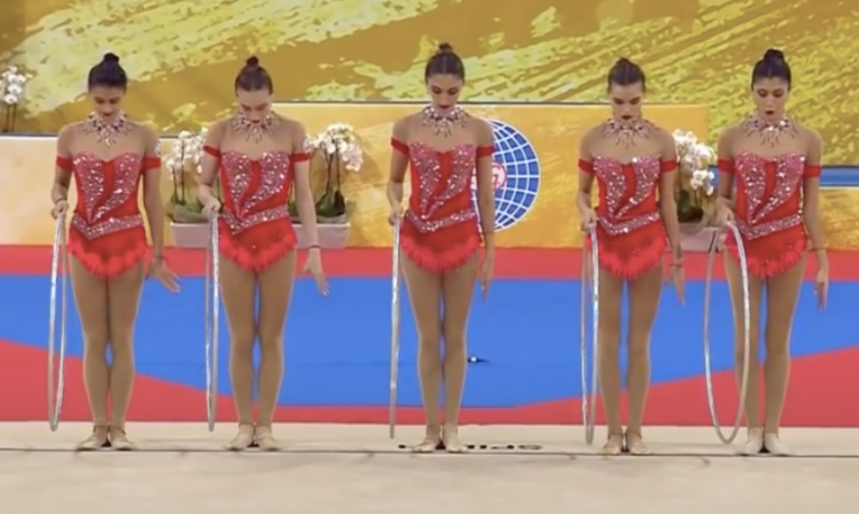
| Judge | Score | Team |
| Elizabeth | 8.8 | Ball State |
| Katherine | 7.4 | Illinois State |
| Mary Emma | 8.0 | Ball State |
| Talitha | 9.0 | Arkansas |
Elizabeth: This is probably the most tame leo on the list. The faux-off-the-shoulder look is quite nice, and I like the color and sparkle design.
Katherine: I like the colors; they mix well together. I would prefer a smoother pattern for the sparkly stripes, but it’s okay.
Mary Emma: I love the shade of red used, but I don’t love the sparkles on the front. Other than that, I don’t have much to say.
Talitha: This is so pretty! I like the colors, the subtle heart shape and even the neck. Great achievement!
Score: 7.950
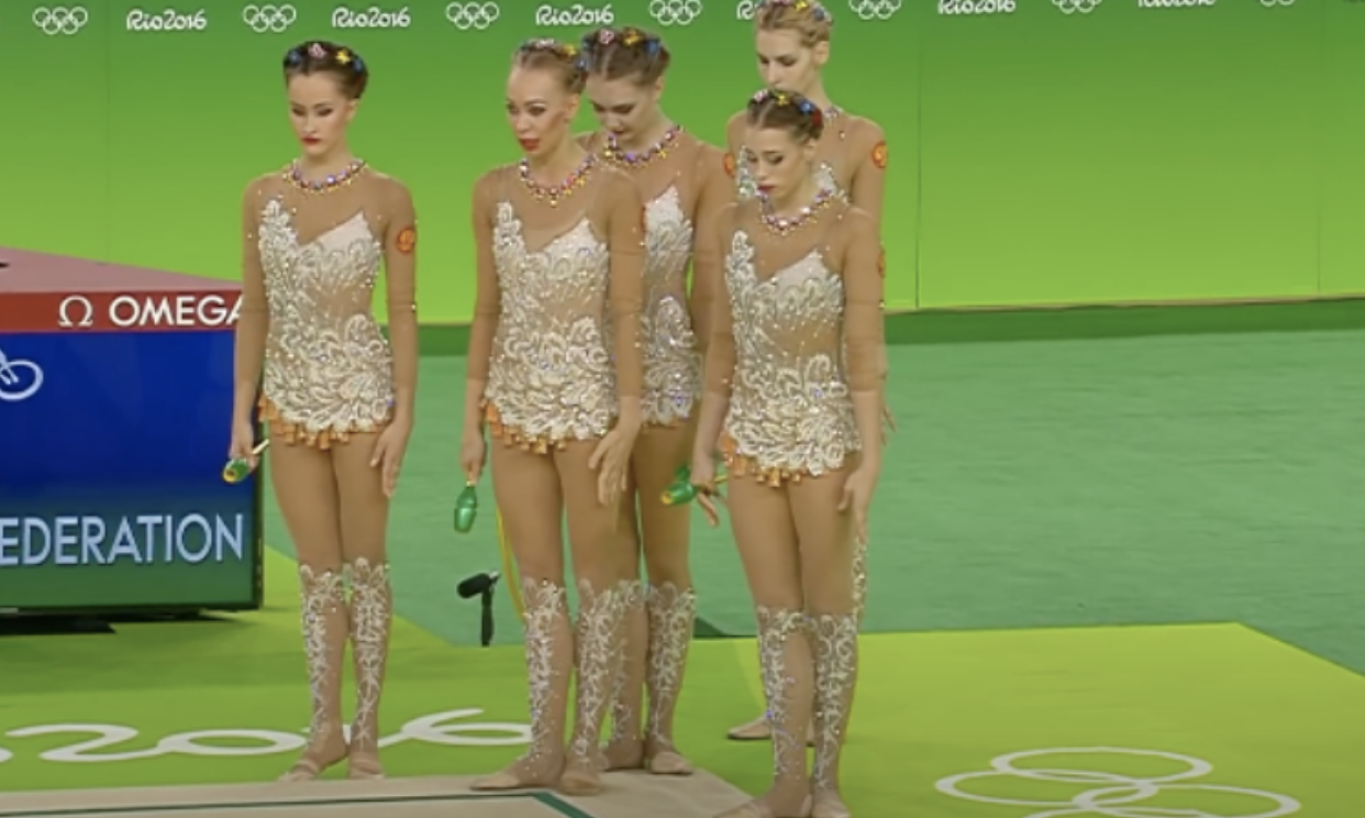
| Judge | Score | Team |
| Elizabeth | 8.1 | Western Michigan |
| Katherine | 7.6 | Iowa |
| Mary Emma | 8.2 | Iowa |
| Talitha | 7.9 | Iowa |
Elizabeth: I actually like this one, but the matching socks are a no from me.
Katherine: It’s a beautiful design and I don’t mind the matching socks. My only issue is the pattern is a little old-fashioned.
Mary Emma: The white design is cool, but what is up with the weird leg warmer/sock like things?
Talitha: The neck and asymmetric chest designs are not my cup of tea, but the white pattern is gorgeous!
Score: 7.825
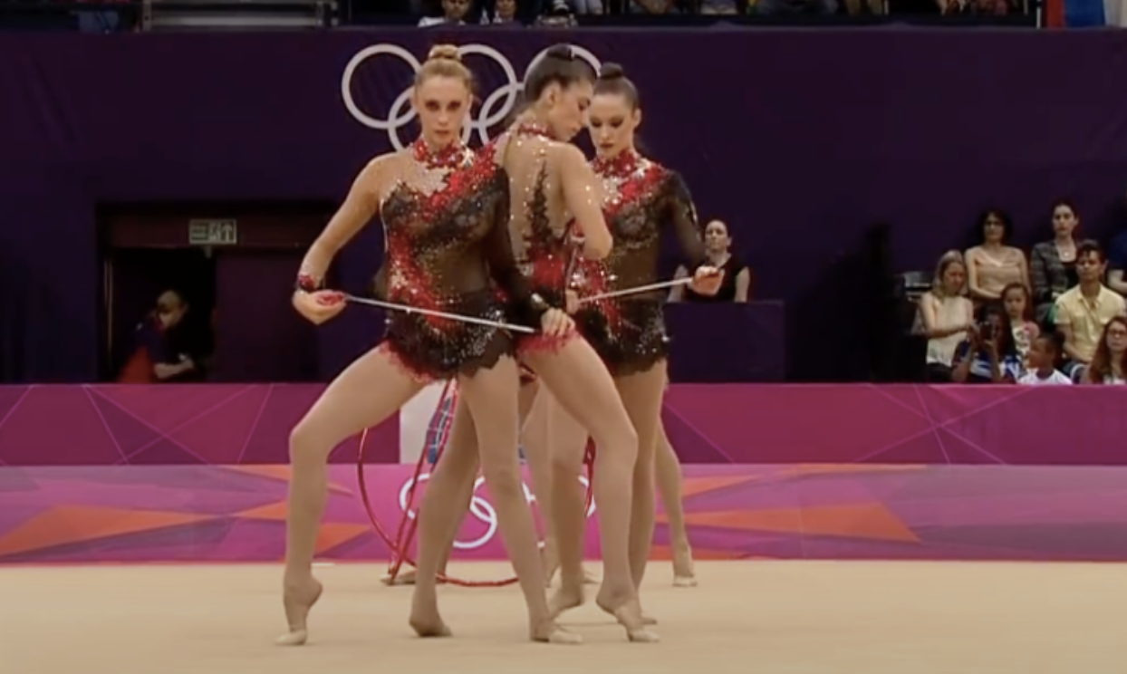
| Judge | Score | Team |
| Elizabeth | 7.1 | Georgia |
| Katherine | 8.9 | Nebraska |
| Mary Emma | 7.5 | Nebraska |
| Talitha | 7.8 | Georgia |
Elizabeth: It’s like a lot of these leos are close to being good but have an element or two that ruins them. I like the overall design ehre, but the little bit of nude on the one hip is meh. It also kind of looks like lingerie.
Katherine: This is absolutely my favorite design on the list. It looks like a costume from a classy cabaret show, and it evokes a very theatrical feel.
Mary Emma: Minus the nude mesh, I like this one. The red and black pair well together.
Talitha: There’s something I don’t much like of the red pattern, and I really dislike the neck, but this is certainly an accomplished design.
Score: 7.775
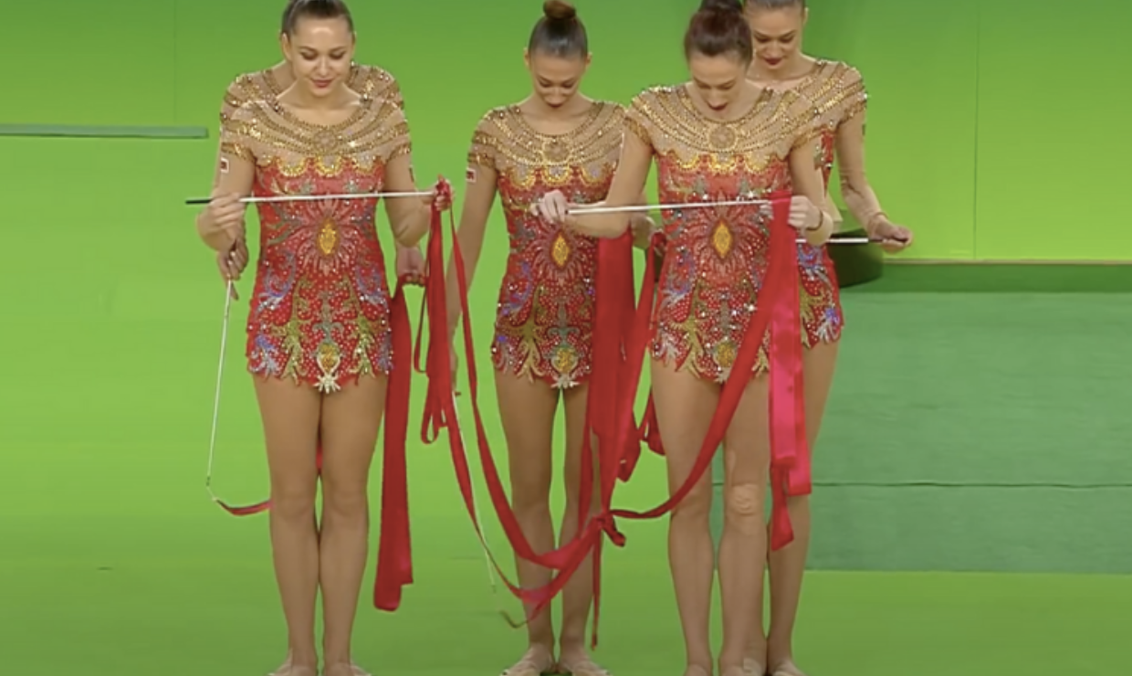
| Judge | Score | Team |
| Elizabeth | 7.3 | Iowa State |
| Katherine | 7.7 | Central Michigan |
| Mary Emma | 8.0 | Oklahoma |
| Talitha | 8.1 | Minnesota |
Elizabeth: I could see Iowa State wearing a leo like this. The mix of gold with red is nice and works well together.
Katherine: I absolutely love the neck design. The rest of it is on the verge of being too busy, but it works. It reminds me of a design on a merry-go-round horse.
Mary Emma: I quite like this one. The gold and red look really good together. I just don’t feel like the design on the front really fits in with the rest of the leo.
Talitha: The neck and shoulder design is very elegant, I love it. I’m not a fan of flowery or very colorful leotards, so the body is not exactly my style, but the overall effect is impressive.
Score: 7.625
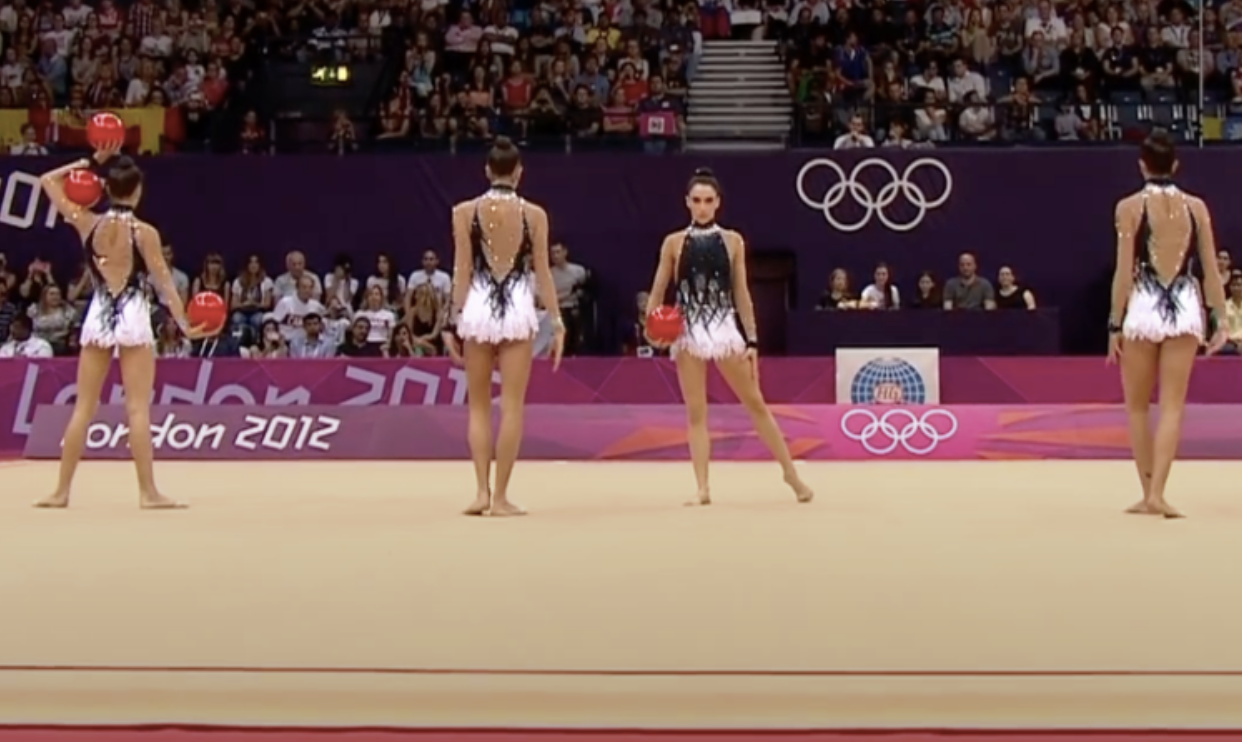
| Judge | Score | Team |
| Elizabeth | 8.7 | Oregon State |
| Katherine | 6.8 | Iowa |
| Mary Emma | 9.0 | Iowa |
| Talitha | 6.0 | Oregon State |
Elizabeth: I think this is by far the best leo of the bunch, but it looks a bit too much like a dress for my liking. The general concept is nice, though.
Katherine: I find this a little boring. It’s just too similar to patterns we’ve seen before. It’s definitely not bad, but it’s nothing new.
Mary Emma: I REALLY like this one. It reminds me of Ashley Wagner’s figure skating dress from her 2012 Black Swan routine.
Talitha: The mesh sleeves put me off, but I like the use of black and white.
Score: 7.175
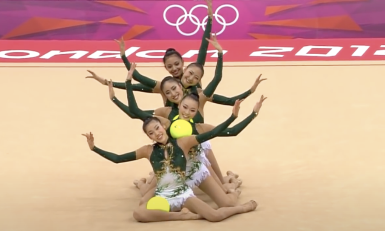
| Judge | Score | Team |
| Elizabeth | 6.8 | Michigan State |
| Katherine | 4.4 | Eastern Michigan |
| Mary Emma | 9.0 | Michigan State |
| Talitha | 8.5 | Michigan State |
Elizabeth: Swap the green and white and I think I’d actually like this. I do like the gold accents and think they work really well on green.
Katherine: I’m not a fan of green in general, and I don’t like the use of it here. The gold on the bodice looks tacky, and the whole thing is costumey in a negative way.
Mary Emma: This one is really nice! The shade of green is pretty, and I think it looks nice paired with the white and the gold accents.
Talitha: I really like this one! The colors work perfectly together, and I’m intrigued by the glove-look of the arm design.
Score: 6.800
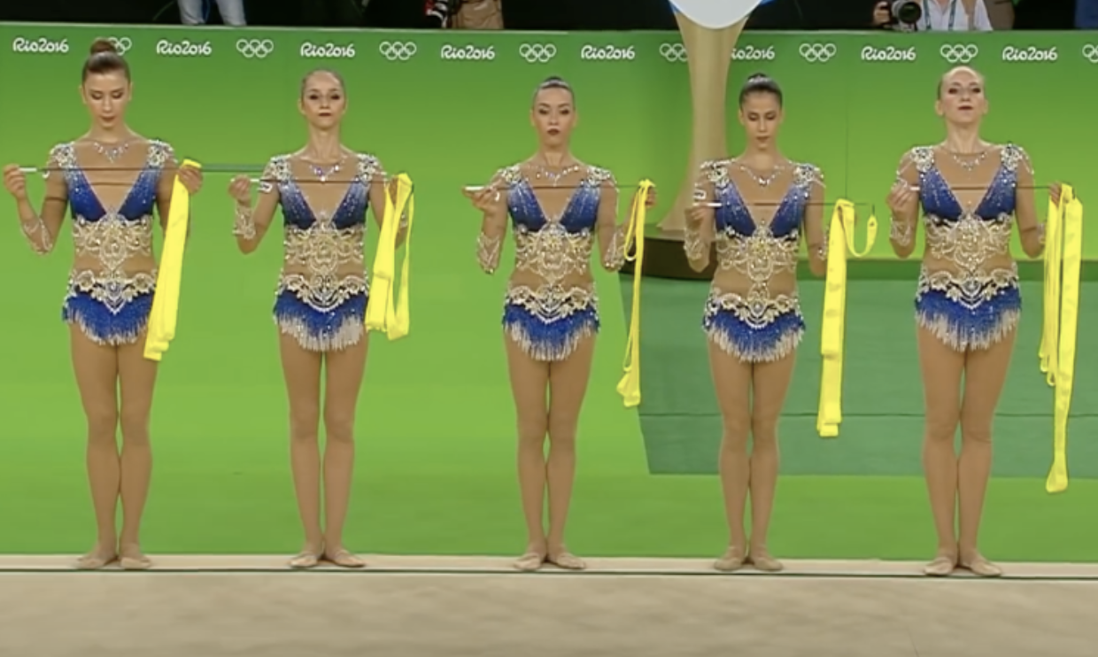
| Judge | Score | Team |
| Elizabeth | 6.4 | California |
| Katherine | 5.8 | Michigan |
| Mary Emma | 7.0 | UCLA |
| Talitha | 8.0 | California |
Elizabeth: This starts to be a nice design, but I don’t like how low the white part near the bottom is. It makes it look like the gymnasts have droopy drawers.
Katherine: For me, it’s kind of odd how there’s no blue in the middle. I do like the design in the middle, but it looks a little disjointed.
Mary Emma: Minus the nude mesh, I like this design. The shade of blue is pretty, and I like the top design.
Talitha: The white/mesh middle body part is not ideal, but I love the neck and shoulder pattern and the shade of blue.
Score: 6.725
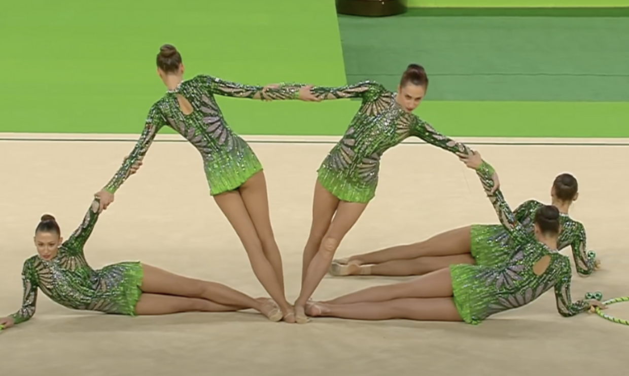
| Judge | Score | Team |
| Elizabeth | 6.5 | Eastern Michigan |
| Katherine | 5.4 | Brockport |
| Mary Emma | 7.5 | Michigan State |
| Talitha | 7.5 | Brockport |
Elizabeth: The colors are nice, but the petal design on the shoulders/hips just looks too much like hands grabbing their bodies.
Katherine: That neon shade is eye-catching in the worst way. Yikes. I kind of like how intricate the pattern is, but the color should be kept in a nightclub on the boardwalk.
Mary Emma: I love the shades of green used, but I don’t love the flower petal design.
Talitha: I really like the overall effect of this leotard. If it were red, I could see Oklahoma pulling it off easily.
Score: 6.650
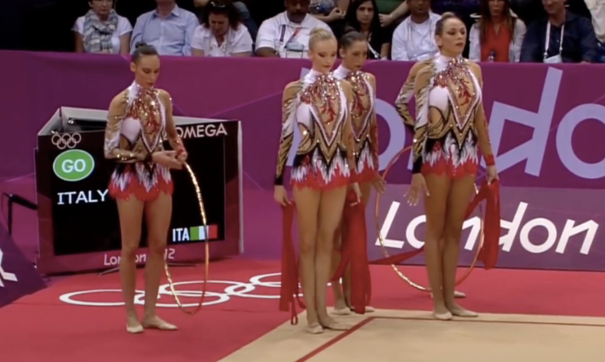
| Judge | Score | Team |
| Elizabeth | 8.3 | Utah |
| Katherine | 8.8 | Nebraska |
| Mary Emma | 5.5 | Nebraska |
| Talitha | 4.0 | Ball State |
Elizabeth: The skirt on this is my favorite part, and I actually, surprisingly don’t hate the neck fluff. I feel like I should hate this leo more than I do, but I think the nice colors are clouding my opinion.
Katherine: Love this pattern! The watercolor design going into the skirt is super pretty, and I adore the colors. I’m also a sucker for a nice, regal high neck.
Mary Emma: The skirt is cool, but I HATE the design on the top. It’s about the worst way you can do nude mesh, honestly.
Talitha: There’s just too much going on for me here. Nope…
Score: 6.525
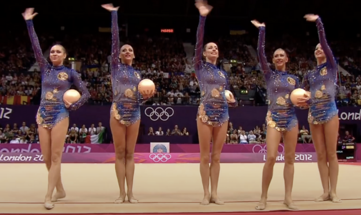
| Judge | Score | Team |
| Elizabeth | 4.6 | George Washington |
| Katherine | 6.0 | West Chester |
| Mary Emma | 6.5 | West Chester |
| Talitha | 9.0 | UCLA |
Elizabeth: The gold blobs are a choice, that’s for sure. Their placement on the design is even more of a choice—one that I don’t agree with. The rest with the purple and blue ombre is actually pretty nice.
Katherine: The blobs totally ruin an otherwise beautiful, classy look. Replace them with more of a stripey design like on the bottom, and we’d be in business. I also love the shade of purple used here.
Mary Emma: I like the ombre effect with the blue to purple, but I’m going to echo everyone else and say those gold blobs are a no.
Talitha: This is my favorite of the bunch. The shades of blue are beautiful and the many golden moons give it a dreamy outlook that I love. It’s gorgeous in motion, too.
Score: 6.250
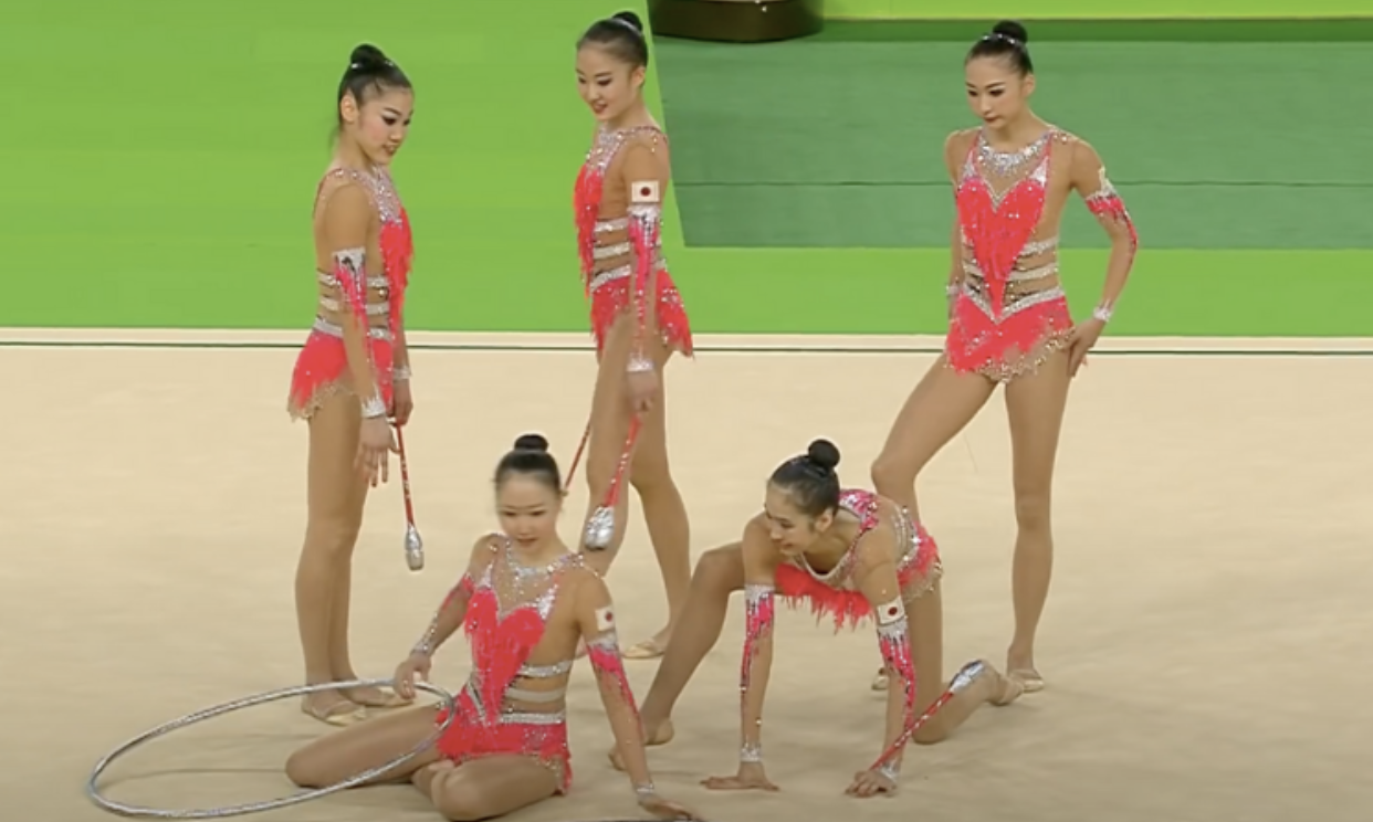
| Judge | Score | Team |
| Elizabeth | 7.5 | Nebraska |
| Katherine | 4.5 | ??? |
| Mary Emma | 7.5 | Auburn |
| Talitha | 5.5 | Oklahoma |
Elizabeth: This one isn’t bad at all. It’s almost normal—as normal as a rhythmic leo can be. I also really like the color.
Katherine: I am really not into this. I hate how there’s so little fabric up top and how it barely covers the straps on the side. The color is fine, but that’s about all I can take.
Mary Emma: I love the coral shade used, but I don’t like the weird straps on the stomach/back.
Talitha: My best friend would love the fluffy pink heart! I’m less of a fan, but I appreciate the originality. Hot pink and silver work well together, who would have imagined that?
Score: 4.625
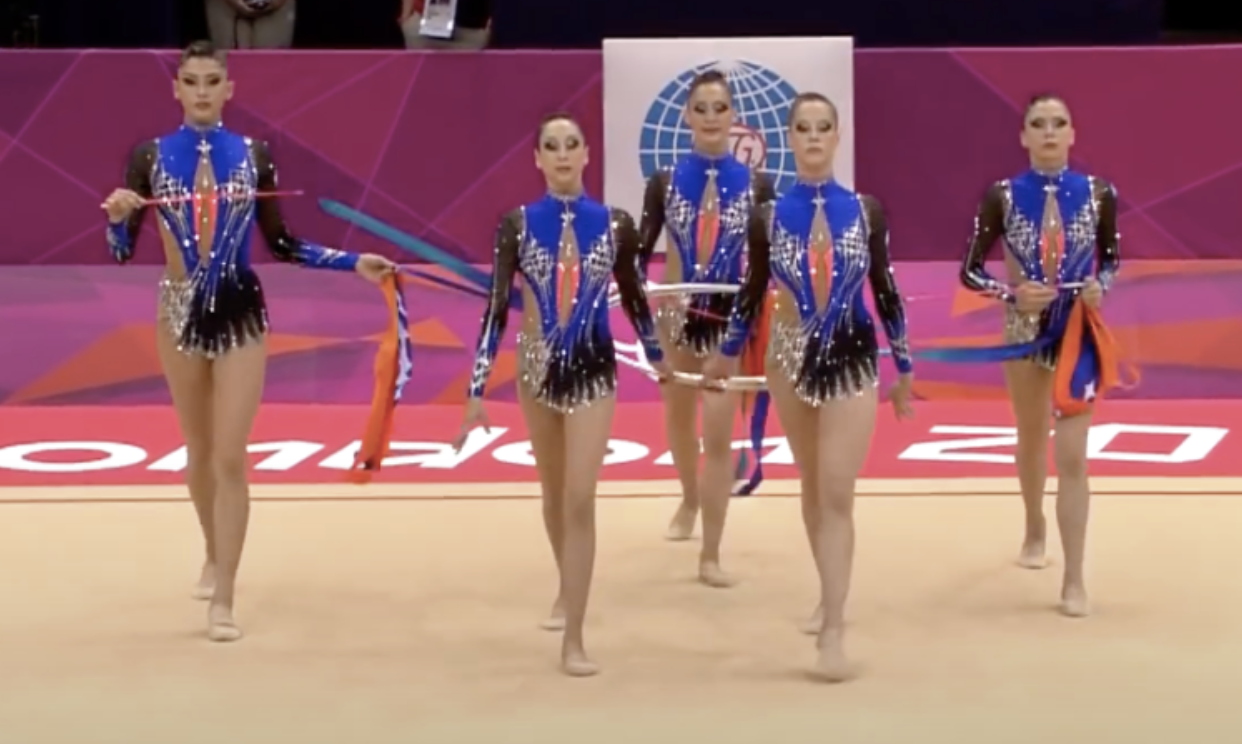
| Judge | Score | Team |
| Elizabeth | 4.2 | Florida |
| Katherine | 5.3 | Florida |
| Mary Emma | 6.0 | Florida |
| Talitha | 3.0 | Florida |
Elizabeth: This is just the kind of highlighter orange and blue and black design that Florida would debut thinking it would be revolutionary and say, “See, we know how to use orange!” yet I’d still not like it.
Katherine: Everything Elizabeth said is so accurate. Plus, the design is too angular and haphazard toward the bottom. I do love the ombre, of course.
Mary Emma: I was initially going to say Boise State for this one, but I read Elizabeth’s response and had to change my answer because it’s too perfect. I like parts of this design, like the shade of blue, but I don’t like how the elements work together.
Talitha: I could also see Florida pull this leotard off, and I could equally see myself hating it!
Score: 4.375
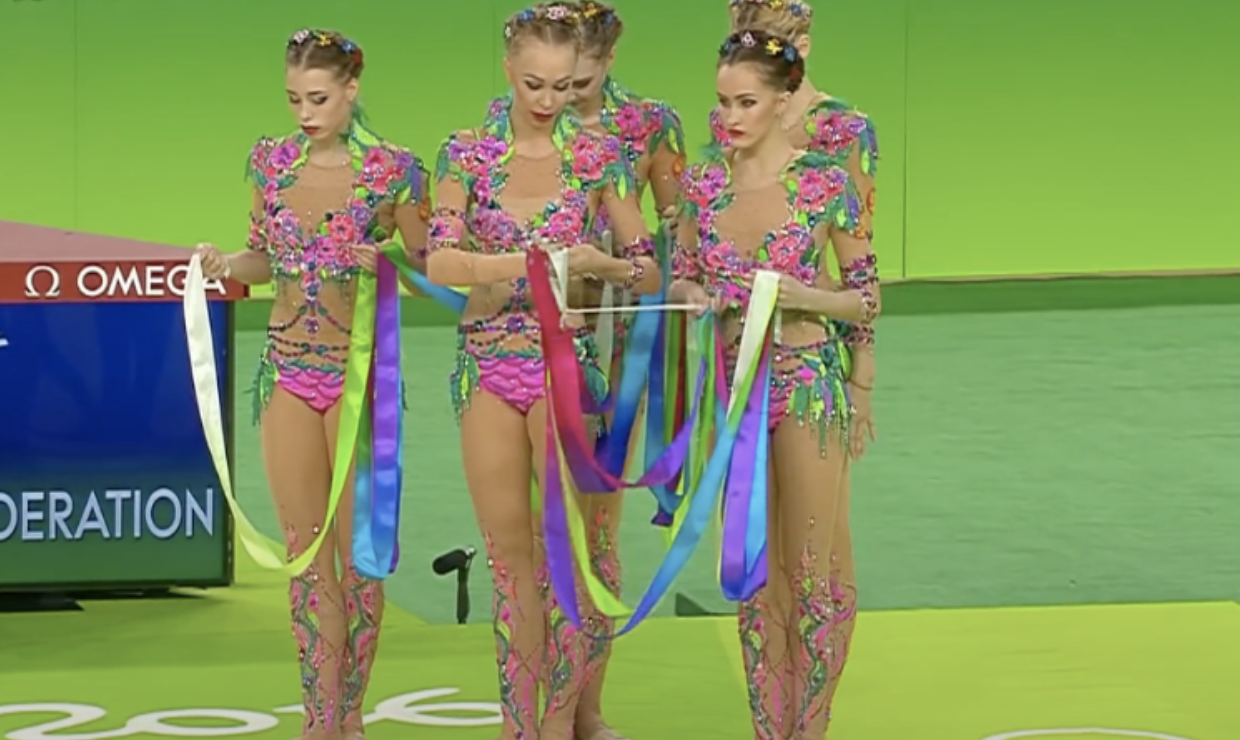
| Judge | Score | Team |
| Elizabeth | 4.2 | George Washington |
| Katherine | 6.3 | UCLA |
| Mary Emma | 2.0 | George Washington |
| Talitha | 5.0 | BYU |
Elizabeth: I really have no words. From the huge shoulder/neck design to the in-your-face colors… I just cannot.
Katherine: It’s not all that different from the Felicia Hano design that took the world by storm. Not a fan of the mid-section or the problematic-as-ever nude mesh, but it’s not awful.
Mary Emma: The colors are fun, but everything else is a huge no. It just doesn’t look flattering at all.
Talitha: I agree that this is not the most flattering leotard, especially in the lower body, and there is too much mesh for my taste, but I must give some points for originality. Also, I like how the hair pins match the leo, I wouldn’t mind seeing it more in artistic gymnastics as well.
Score: 4.350

| Judge | Score | Team |
| Elizabeth | 1.4 | LSU |
| Katherine | 2.0 | LSU |
| Mary Emma | 6.0 | Missouri |
| Talitha | 8.0 | Missouri |
Elizabeth: If D-D Breaux doesn’t have something similar already hanging in her closet, I’ll never do another leo ranking again.
Katherine: Tiger QUEEN. LSU loves its tigers and queen motifs, and mixing in the Mardi Gras colors…I see no better fit.
Mary Emma: At first I just thought this was a weird geometric pattern, but as I looked closer I went, “Is that a TIGER!?” I feel like I should hate this, but I don’t for some reason. I definitely see LSU in this too, but for some reason, my initial thought is that the sleeves reminded me of this one from Missouri.
Talitha: The tiger design is seriously impressive. I’m not a fan of the colors, but I appreciate the creativity.
Score: 4.275
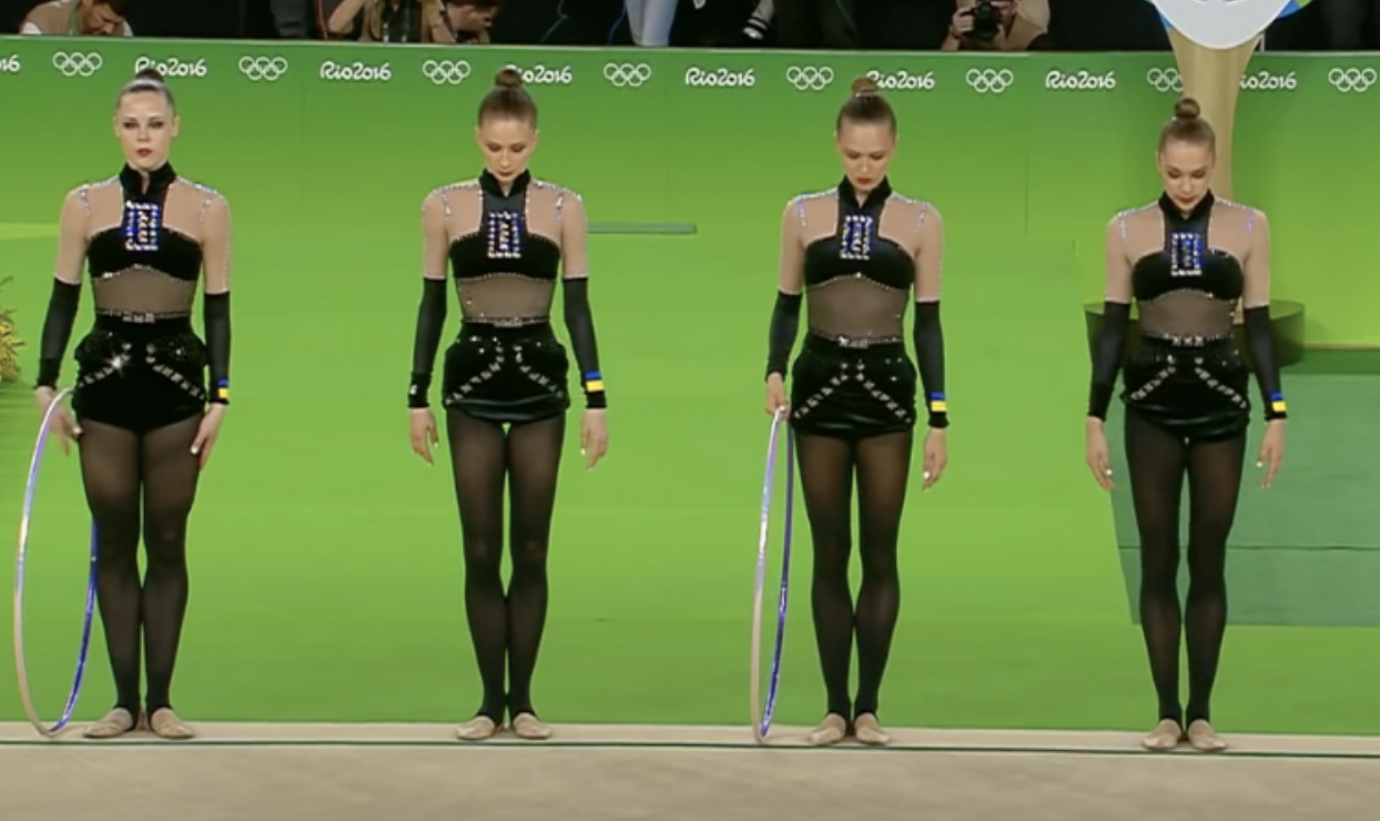
| Judge | Score | Team |
| Elizabeth | 3.1 | Iowa |
| Katherine | 4.0 | Stanford |
| Mary Emma | 6.0 | Iowa |
| Talitha | 4.0 | Stanford |
Elizabeth: Oh wow. This is very dominatrix. It kind of reminds me of a Catalina Ponor leo if we’re being honest.
Katherine: Picture that rectangular box in the chest, but replaced with the Stanford S. I’m not saying I like the design, but I can see it.
Mary Emma: I think I’d like this design more if it weren’t for the weird turtleneck thing and the giant jewels on the chest.
Talitha: I agree with Elizabeth that this leo has a dominator vibe that makes me uncomfortable. And the chest design is plain tacky for me. The only thing that I like is the black mesh middle of the body.
READ THIS NEXT: Leotard Rankings: Elite Leos
Article by the editors of College Gym News
Like what you see? Consider donating to support our efforts throughout the year! [wpedon id=”13158″]




Hello. What about a switching leos edition? I mean, sometimes we see a leo that could be more accurate for other team. I could be fun! Thanks.
Great idea! We’ll definitely consider it.