
Having ranked our top 10 leos for all the big four conference teams, as well as some other popular schools (let us know if we haven’t ranked a team you want to see!), it’s time to look at each individual editor’s top 15 leotards of all time—limited to one leo per school. This week is our SEC editor Katherine!
Have opinions about your favorite leotards of all time? We want to see your top 15! Submit your rankings to us via email at [email protected] and include your name, ranking, links to images and a description for each. Your list just might be featured on the site! Remember, limit one leo per team.
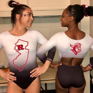
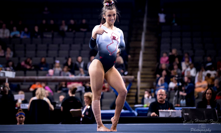
No. 1: Rutgers: This is everything a college leo should be. It captures the essence of the school while looking great doing it. It’s not in your face, but the unique design warrants a second look and maybe the realization that, yes, that IS what New Jersey is shaped like. You heard it here, folks: This leo is EDUCATIONAL. The impact it has!
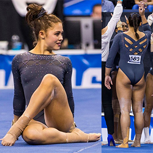
No. 2: UCLA: It’s a simple color, but this muted grey/blue somehow stands out. Except it’s pretty clear how: those sparkles. That triangular pattern, the back… It doesn’t scream UCLA, but it’s so clearly a UCLA design. This looks like it belongs in a window on Rodeo Drive.
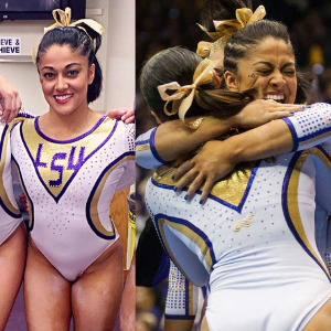
No. 3: LSU: The lettering of LSU is one of the few vintage elements I can tolerate, and it looks awesome here against the white. It’s a modern take on a classic design, and it looks great in motion. This is LSU’s most unique leo, and I implore it to bring it back.
No. 4: Auburn: The original tweet calls this a “chandelier” pattern, but I see it more as Spider Woman webbing. Either way it’s campy, dynamic and really unique. It’s the best combination of glamorous and badass.

No. 8: Florida: A lot of Florida leos tend to look similar, but that is not the case for this one. The light blue color is such a breath of fresh air for the Gators.
No. 6: Utah: Like my UCLA choice, this is a departure from the school’s colors that still stays true to the Utah identity (and in a way that’s respectful to the school’s affiliated Native American tribe). Any leo that can accomplish that is a big win in my book.
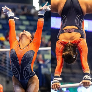
No. 7: Bowling Green: Back in March I wrote that my favorite leotard of 2020 “served Halloween glamour realness,” and I really think that’s still the best way to describe it. It’s the best synthesis of orange and black I’ve seen on a leotard. Plus, the crystals on the neck look like they cost someone’s net worth.
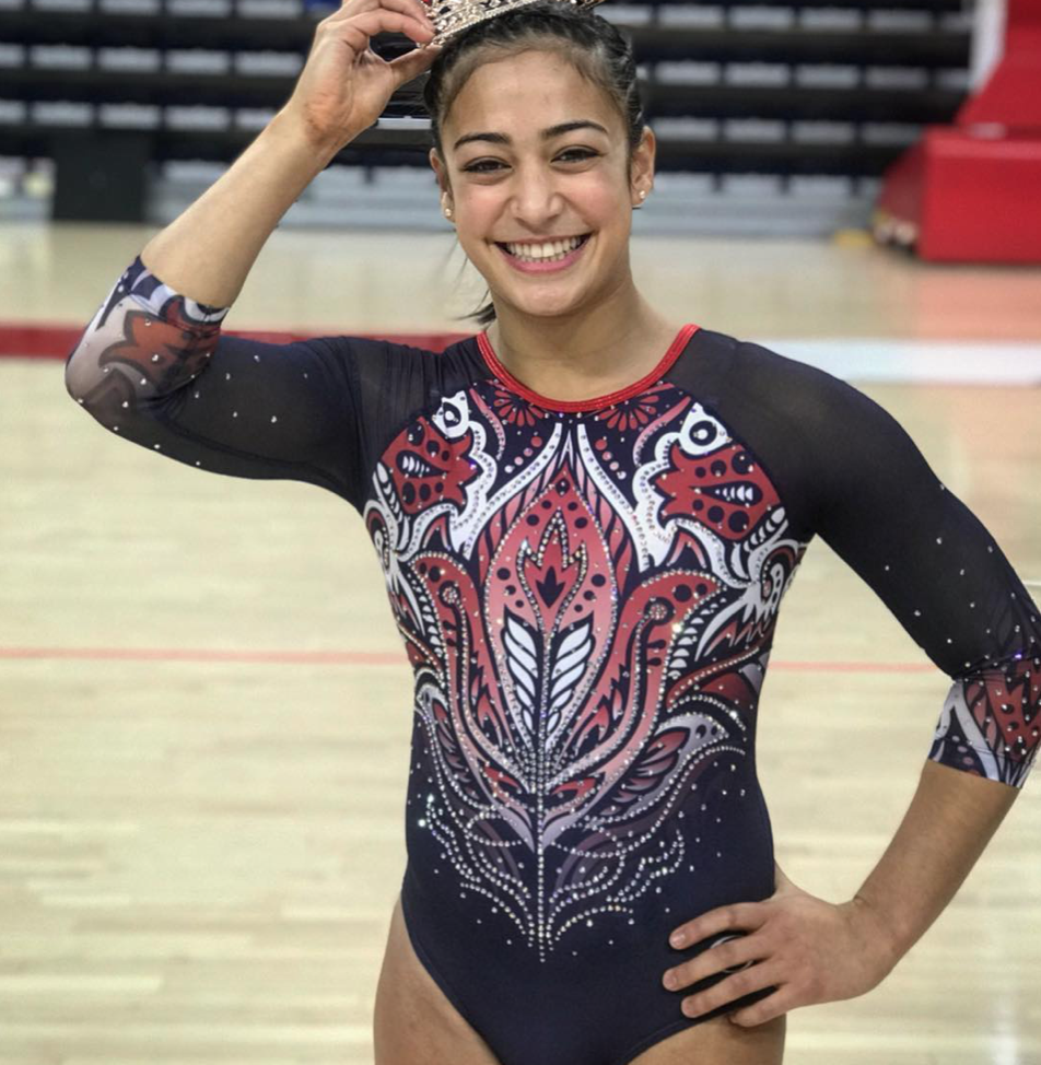
No. 8: Penn: Another dark horse favorite of mine; I love this design so much. Every glance reveals something new. I also like that the red used is slightly lighter than the one in Penn’s colors because it looks even better amidst the white and blue.
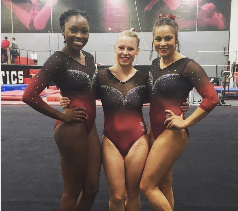
No. 9: Temple: Temple’s recent leotards have (rightfully) gotten a lot of attention, but this slightly older one is my favorite of the teams’. The ombre and V on the chest make for a lovely incorporation of the school’s cherry color. It’s very well executed.
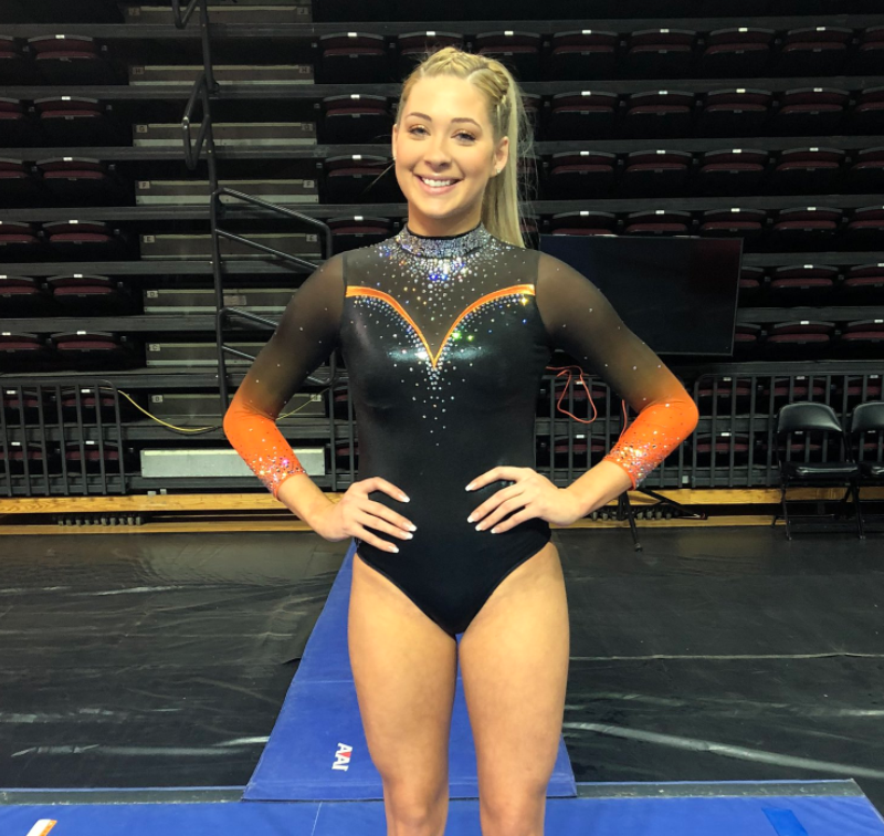
No. 10: Illinois: Because Illinois has so many strong leos, this one only recently stood out to me as a top design. It’s groundbreaking enough for the use of orange, but what makes it iconic for me is the unique elements like the sash on the front. Something about that and the sheer material makes the colors look extra deep and dimensional.
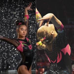
No. 11: Nebraska: I’m waiting to get rotten fruit thrown at me for this one, but it’s my favorite Nebraska leo because it goes where no leo has ever gone. The plunging neckline is so ballsy, and I’m obsessed with the pattern of the sparkles around it; it’s like they’re daring you to look.
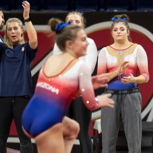
No. 12: Arizona: So many beautiful things happening here. The ombre and cascading sparkles are a winning combination. I also like the lighter shades of the school’s colors that are used and the way they blend into each other. It’s just an overall lovely leo.
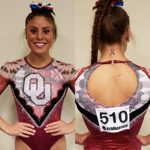
No. 13: Oklahoma: Ditto to what I said about Illinois. This OU leo didn’t always stand out to me, but I ended up picking it as a top design because it’s so different than what other leos do. I don’t know if that pattern is tie dye, camo or watercolor paints, but I’m living for it.
No. 14: Maryland: I love the subtle incorporation of the state flag on the sleeves. It complements the cascading sparkles on the front for a nice contrast of school spirit and overall glamour and class. Maryland has campier leos, but this one covers a lot of bases.
No. 15: BYU: This one rounds out my tops because it just throws away everything you know or think about college gymnastics leotards and goes balls to the wall. I mean, who else is doing it like this?
Article by Katherine Weaver
Like what you see? Consider donating to support our efforts throughout the year! [wpedon id=”13158″]


2 comments
Comments are closed.