
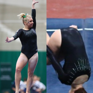
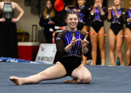
This summer we’re continuing our team-specific throwback leotard rankings. Rather than looking at single meets, we’re taking a trip down memory lane for individual teams, taking into account a wide range of leos from different eras and finding our all-time favorites from a single program, as well as illustrating how designs have changed over the years.
Here’s how it’ll work: Our judges for the week will choose their top 10 and rank them based on their personal preferences. Plus, you’ll get a chance to tell us your thoughts! Did we leave out your all-time fave from the team? Let us know in the comments or on social media.
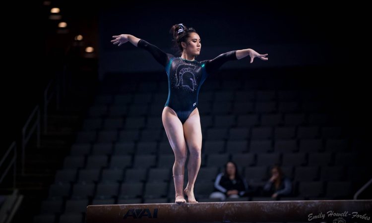
This week, we’re taking on Michigan State with Emily M and Rebecca joining Elizabeth for the rundown.
Elizabeth
No. 1: This may be my favorite leotard of all time. Michigan State really outdid itself. The ombre is absolutely gorgeous, and the sparkle subtle but just enough to pop. I also adore the thick straps on the back. This is essentially a perfect leo.

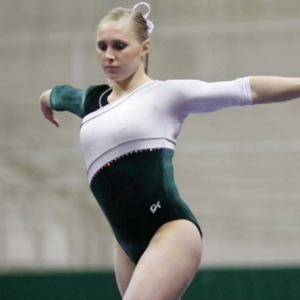
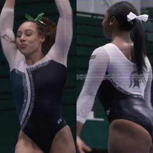
No. 2: After going through all the MSU leos we found, I realized this design is pretty under appreciated. I know some people might complain about the “deep v” neckline, but I think that adds to its charm. I love the shade and shine of the green fabric used; it looks great with the white mesh. I also love the specific use of rhinestones outlining the design, and how that swoop continues onto the back.
No. 3: This is probably a controversial pick, but I love how simple the design is with a few unique elements tying it together. I love how the nude fabric is utilized on the sleeves to make them look like they have an asymmetrical cut. I also like the use of green rhinestones and oval back hole. My one gripe, though, is that I’ve never seen a good, solid pic of this design, and it’s fairly old. I’ve had to pick apart what it looks like with images like this and medium-quality videos.
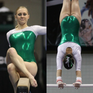
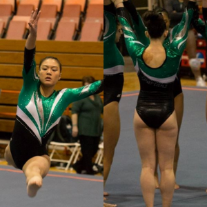
No. 4: This leo is good but gets even better when you see the wide open back. The green is subtle here, but it works and helps accentuate the zig-zaggy inch worm stripes around the shoulders.
No. 5: Emerald green and white is such a good color combination. Plus, the use of shiny fabric for the body just works so well. I wish the neckline was sweetheart versus rounded, but overall it’s a good design.
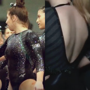
No. 6: While this design could have used a touch of green, I love how elegant it looks. The large diamond on the chest works for some reason, and I love how it flows into the high neck. Add in a back keyhole, and obviously this makes my top 10.
No. 7: It’s a major throwback, but I’m really into this design. Maybe I just like leos that utilize green and white. Either way, the look is athletic and simple yet works with the velvet and minimal sparkles.
No. 8: I wish I could see more of the full design here, but the green mesh sleeves with the white and black (?) diagonal design on the body intrigues me enough for it to make my list.

No. 9: I’m going to start by saying I hate lace in nearly every situation, and this leotard is only on my list for the low back and thick emerald lining for the back neckline. It is not on here for the lace because I really don’t like that part at all. But I’ll take that back any day.
No. 10: Another major throwback, this leotard is great for its fully green matte elements. I also don’t even mind the weird mystique fabric shoulder pad-like design.
I can’t do a Michigan State top 10 without mentioning its 2020 pink leo, which is fantastic. When going through all the Spartans’ old leos for this post, I saw a LOT of very bad, very ugly pink leos the team wore throughout the years, making this one even more impressive. Honestly, most teams’ pink leos aren’t great, but I wouldn’t mind if Michigan State wore this in its regular rotation—not just for pink meets.
Emily M

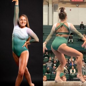
No. 1: Listen, this was HARD. Michigan State has quietly had some of the best NCAA leos for a long time—back into the velvet days. Sometimes things get a little…wild…but these are some of my all-time favorites from any team. Consider one and two essentially tied, really. This is my favorite ombre ever (EVER), so it gets the nNo. 1 slot, but just barely.

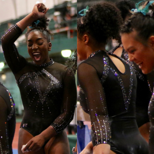
No. 2: Michigan State and black leos, man. A winning combo. This one is all about the detailing. The mesh on the end of the sleeves to make them more geometric. The unique back. The subtle green crystals. I squaked the first time I saw it. If you’re going to do nude mesh, do it this way, to accentuate lines.

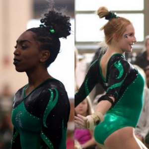
No. 3: Again, black and tiny details. The Greek key pattern! The subtle bits of green! The back!
No. 4: I love a good matte black look. Paired with the ombre in that Spartan head? Yes, a million times yes. This big logo wouldn’t work with a busy look, but here? Perfect.

No. 5: Again, details. The way that white swoop connects around the leo is so unique and so classy.

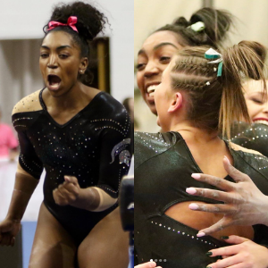
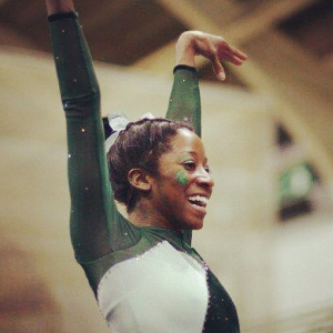
No. 6: I’m normally not a chest hole person, but the way this one echoes the neckline just works for me. Plus, I think this is what the team was wearing for that record-breaking floor rotation at Big Tens a few years back, so I have a lot of positive associations with it.

No. 7: More teams use colorful crystals on solid fabrics challenge. This is so simple but so classy.
No. 8: Some of the Spartans’ old pink leos were rough, if I’m being generous, so this beauty really shocked me. The tricolor ombre and hot pink is *chef’s kiss.* I usually hate pink leos, but this one is so good.

No. 9: Green velvet with green mesh sleeves are you kidding!? So old school and so perfect.

No. 10: I have a bizarre affinity for early aughts leos with the teeny script school name across the chest. This neckline is a little tube-topy, but that shade of green makes it.
Rebecca

No. 1: Black has always featured heavily in Michigan State’s aesthetics, and this one is a winner for me. So glamorous without being boring.
No. 2: I’m the polar opposite of Elizabeth in that I think lace is amazing in almost every situation. This one ticks all the boxes for me. It’s black-forward, simple and elegant.

No. 3: This one is nice, but I’m not PASSIONATE about it like a lot of people are. The ombre is very attractive, but I find something about the construction quite unflattering.
No. 4: There’s nothing overly fancy going on here, but it’s working for me. I like the white mesh and how the pattern continues cleanly onto the back.

No. 5: Trying to make things that are not cardigans look like cardigans is so ’00s, and it’s delightful.
No. 6: This looks like one of those low-priority elite leotards that you’d see a national team wear at Pacific Rims or something but definitely not to worlds. In a good way. I like it.
No. 7: Count me in on the fully velvet body with sparse sparkles.
No. 8: This fountain pen nib design made the rounds in NCAA for a while, but I like it best in green. Using silver prominently makes this one a winner.

No. 9: This is another stock design, but it’s a good one. These days MSU is very architecturally ambitious with leotards, which sometimes works and sometimes doesn’t. It’s good to see some simplicity in the old ones.
No. 10: Clearly very basic but very pretty. The little sparkle stripes on the sleeves echoing the body pattern are a nice touch and keep it from being too boring.
READ THIS NEXT: Throwback Leotard Rankings: Iowa State
Article by Elizabeth Grimsley, Emily Minehart and Rebecca Scally
Like what you see? Consider donating to support our efforts throughout the year! [wpedon id=”13158″]


One comment