
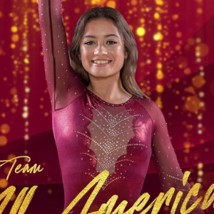
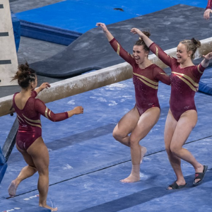
This summer we’re continuing our team-specific throwback leotard rankings. Rather than looking at single meets, we’re taking a trip down memory lane for individual teams, taking into account a wide range of leos from different eras and finding our all-time favorites from a single program, as well as illustrating how designs have changed over the years.
Here’s how it’ll work: Our judges for the week will choose their top 10 and rank them based on their personal preferences. Plus, you’ll get a chance to tell us your thoughts! Did we leave out your all-time fave from the team? Let us know in the comments or on social media.
This week, we’re taking on Iowa State with Claire and Tara joining Elizabeth for the rundown.
Elizabeth

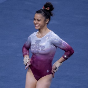
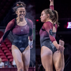
No. 1: It’s a true shock that my favorite leo is the full ombre. The white looks really nice in gradient with the crimson, and the large Iowa State rhinestone logo isn’t overwhelming.

No. 2: I’ve always loved when Iowa State uses this crimson/gold shiny fabric in its designs. More teams should utilize it to combine their school colors into one fabric. I love this leo for the mini-v neckline and open back in particular.

No. 3: You know by now that I’m a sucker for most leos that have a big white element. I love how it’s subtle on the front and a feature on the back. I don’t care for the gold cuff and neckline piping—it just seems like an afterthought to add school spirit—but overall this is a good leo.
No. 4: More shiny crimson/gold fabric plus the mostly black body works for me. I also like the subtle side design.
No. 5: Even more shiny fabric means Elizabeth likey. I also enjoy the scalloped neckline made out of rhinestones.

No. 6: i think the yellow chest design is supposed to mimic motorcycle handlebars? But I see seaweed. Anyway, I like this leo, and it’s only below the others because I don’t like the inverted V neckline as much.

No. 7: You pretty much can’t go wrong with a mostly crimson leo like this. I like the mesh paired with the scalloped neckline—I just wish that shiny fabric was used instead. I guess that would make it too much like the other one, though, huh?
No. 8: While I don’t love the bright red color used in Iowa State throwback designs, this leo as a whole is a good one. The blocky/geometric design is A+, and you know how I feel about white.

No. 9: My love of ombre trumps the unfortunate backpack design around the shoulders/armpits in this design. I can look past the thick black straps though for the lovely crimson to black gradient.

No. 10: I know most of my fellow editors don’t care for nude mesh, but I like it, especially when it matches the gymnasts’ skintones well. I like the design here, too; it has a regal quality, and the back hole is nice as well.
Claire

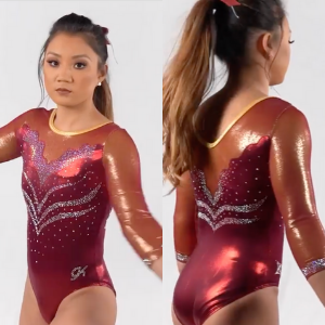
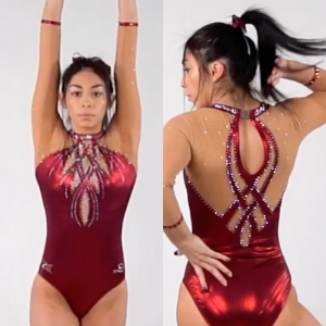
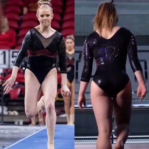
No. 1: Quarantine life must be getting to me, because this leo with nude mesh sleeves and chest cutouts is hands down my top pick. Every detail is impeccable, from the crystal details to the wrist piping, but the woven back steals the show.
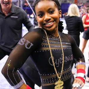
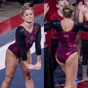
No. 2: Black mesh sleeves are a dime a dozen, but the red piping and embellishments make them far more interesting than most. Similarly, the shallow V neckline paired with the inverted V bodice is a cool and unusual combination. With that giant crystal Iowa State logo as a finishing touch, they’ve elevated a stock leo to something memorable and unique.
No. 3: Iowa State put its own spin on this design by using red fabric with gold undertones on the shoulders, and I love it. It really pops on video.

No. 4: The combination of black fabric/mesh and crystals makes the the sleeves and chest look like liquid—a very cool effect. Also, the crystal Cyclone on the back is excellent; I wish they’d incorporate that more often! I’d have ranked this higher if the belt was a little less orangey-red and went all the way around.
No. 5: The woven diamond around the neckline is so pretty, and the rainfall of crystals amps up the wow factor. I also love the subtle gold piping around the neck and wrists. I’m not crazy about the amount of white on the back, but the rest of the design makes up for it.
No. 6: This isn’t a particularly cohesive design, but I love the combination of maroon, black and gold. I’m especially glad to see the red with gold undertones used again!
No. 7: The maroon and white ombre here is a gorgeous combination. I’m glad they leaned into the simplicity with the rest of the design and let the ombre stand out. I just wish they’d made the Iowa State logo more colorful; the clear crystals get kind of lost against the white.

No. 8: You know I love a super simple, athletic throwback leo, and it doesn’t get much more Soviet-era fabulous than this. Pairing it with a white scrunchie is the correct choice.
No. 9: This is a leo that’s popular with other teams, but I really appreciate the Cyclones’ ability to take a stock design and make it their own. (Maybe it’s just me, but the cutouts give me a tornado vibe.) I’m not sure whether that’s actually a gold underlay under the cutouts or if it’s just lighting, but it looks good.

No. 10: I’m not entirely sure I *like* this leo, but it definitely keeps me interested. The black straps and elbow patches are so weird, but I don’t hate them?
Tara

No. 1: The full-body ombre on this one is stunning. Logos on the chest can be hit or miss, but it’s not bad on this one.
No. 2: I really enjoy the combination of the red with the nude mesh. I’m not always a fan of nude mesh, but it works quite well here. It’s elegant and the elements complement each other nicely.
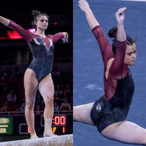
No. 3: This is a pretty standard design, but I really like how it’s done here. The gunmetal body combined with the red fabric on the top half is gorgeous. I also enjoy the criss-cross straps that extend from the V and how those thin straps continue on the back.
No. 4: Did someone say ombre? This is great. The crimson to black ombre is lovely and it has just the right amount of sparkle. I don’t mind the backpack straps either; they almost seem like they add needed contrast and definition.
No. 5: I like the combination of black and crimson in general, so this is a win. I enjoy the criss cross crimson on the shoulders. The sparkle logo on the front is subtle without being overbearing; it actually is quite nice in this case.

No. 6: Yep, you guessed it, more crimson and black. The shimmery fabric on top makes this stand out, and I really enjoy how gold is incorporated on the top. It’s not easy to do gold well, but Iowa State nailed it with this one.
No. 7: The front is the star of this design. I love the elegance of the black combined with the crimson band. The cartoon-y Cyclone on the back isn’t my favorite, but it’s not bad.
No. 8: This is another one I like the elegance of. The mesh cutout on the chest isn’t my favorite, but for some reason it doesn’t bother me as much as I feel like it should. It’s simple, but it works, and the sparkles on the chest seal the deal.

No. 9: When I first saw this, I didn’t love it, but the more I look at it, the more I like it. The simple sparkle design on the front is nice, and the combination of shimmery fabric and normal fabric on the arms and sides work well. The side “flame” design has grown on me, too.
No. 10: I like the athletic look of this one. The gold ribbon is a nice touch, and I like how it continues on the back.
READ THIS NEXT: Throwback Leo Rankings: Kentucky
Article by Elizabeth Grimsley, Claire Billman and Tara Graeve
Like what you see? Consider donating to support our efforts throughout the year! [wpedon id=”13158″]


One comment
Comments are closed.