
This summer we’re continuing our team-specific throwback leotard rankings. Rather than looking at single meets, we’re taking a trip down memory lane for individual teams, taking into account a wide range of leos from different eras and finding our all-time favorites from a single program, as well as illustrating how designs have changed over the years.
Here’s how it’ll work: Our judges for the week will choose their top 10 and rank them based on their personal preferences. Plus, you’ll get a chance to tell us your thoughts! Did we leave out your all-time fave from the team? Let us know in the comments or on social media.
This week, we’re taking on Maryland with Emily M and Jenna joining Elizabeth for the rundown.
Elizabeth

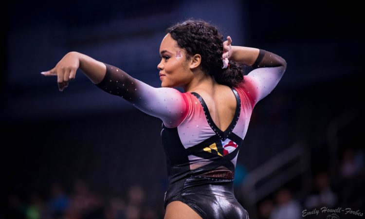
No. 1: This is a GOOD leo. There’s no question about it. The ombre plus the criss-cross back plus the front sparkly design and the hidden Maryland Flag is just *chef’s kiss.*
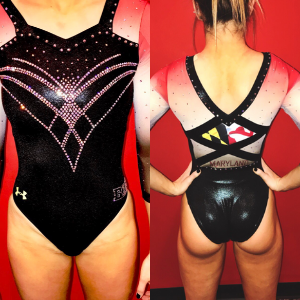
No. 2: You’ll notice on my list there’s a LOT of Maryland pride leos. It’s just such a unique and fun thing, and this one is my favorite of the lot. The all-black with a pop of Maryland flag design si perfect, and I LOVE how the flag is portrayed on the sleeves—incredibly creative.

No. 3: Again, Maryland knocks it out of the park when it comes to creative ways or showing the flag on a leo. Plus, I love a good design done in rhinestones.

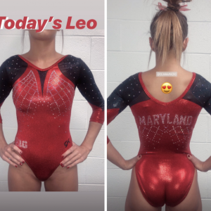
No. 4: Do I sound like a broken record yet? This leo would be pretty boring if it were just plain red, but that Maryland flag back band ties the whole thing together.

No. 5: Three great colors with a simple design and white as a prominent color will almost always get the stamp of approval from me.

No. 6: I don’t love the way the ombre is done here, but it’s still a good design with a sweetheart neckline so I can’t fault it too much.
No. 7: With any other design this leo would be a huge no, but at this point you know I’ll make exceptions for that flag.

No. 8: Maryland is a team with a small core of REALLY good leos that falls off pretty drastically after a certain point. This is one of the last of the good ones. It’s fine, but nothing I’m writing home about.

No. 9: While the design reminds me more of a Minnesota leo, I appreciate the simplicity of it and the minimal use of yellow.

No. 10: While not terrible, this leo isn’t an all-time fave, but I can appreciate the use of white and that it doesn’t go completely overboard with any one element.
Emily M

No. 1: This one is a beaut. One of my favorites from anyone in 2020. It’s so classy while also being intricate and full of spirit. Props, Terps!
No. 2: I love this all-red look. The flag back strap and in your face sparkles take it over the top.

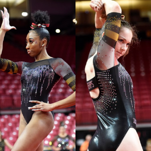
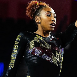
No. 3: Black leos check a lot of boxes for me, and the sparkle flag cascading across the front makes this look extra special. Can you tell I love the Maryland flag looks yet?

No. 4: This one is a little subdued for the Terps, but the sweetheart neckline and black and red combo makes it a winner.

No. 5: The cut on the front of this one is a little funky to me, but I love the peek of the flag and the tricolor ombre sleeves.

No. 6: The colors here are a little in your face for me, but if this doesn’t scream Maryland to you, you’re wrong. I appreciate a team owning its look.

No. 7: This faux deep V situation throws me off, but I love the incorporation of the checkered bit of the flag into the crystal pattern. Like I said, Maryland owns its look.

No. 8: I’m not into the black strap situation, but the rest of the neckline and the red on white are excellent. I also appreciate the teeny nod to the flag under the midback “MARYLAND” a good deal.

No. 9: Those velvet sleeves!

No. 10: I hate this leotard, but I love it for Maryland. Does that make sense? It’s too much and the colors don’t work for me, but every time the Terps wear it, I think “Yep, there’s Maryland.”
Jenna

No. 1: There will be many leos on my list that feature the Maryland flag because no other school embraces its weirdness quite like Maryland. That’s a good thing. This leo in particular features the flag in a really nice way.

No. 14: Maryland: I love the subtle incorporation of the state flag on the sleeves. It complements the cascading sparkles on the front for a nice contrast of school spirit and overall glamour and class. Maryland has campier leos, but this one covers a lot of bases.
No. 3: I love the black body, the ombre sleeves and the flag detail on the back, but I’m a little thrown off by the misalignment between the shoulder and the sleeves.

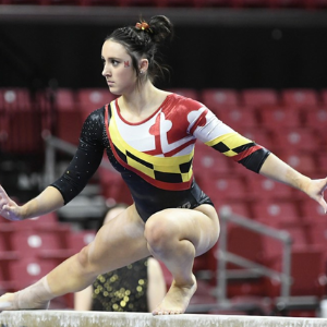
No. 4: This is a simple and classy design, but I really dig the paint-like lines down the front of the torso that set it apart from similar leos.
No. 5: Another simple and classy leo from the Terps. I find myself missing the state flag, though!

No. 6: The front of this leo is a bit boring, but it’s saved by—you guessed it!—the state flag on the back.
No. 7: Embedding the state flag using crystals is a daring move, and I can’t say I disapprove in this leo.
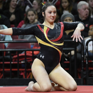
No. 8: The swirl design on this leo is similar to a lot of other teams’ designs but that’s not a bad thing—it’s a good way to highlight Maryland’s colors against the black torso.

No. 9: The sleeve design on this leo is a little reminiscent of bacon, but I can’t say I dislike it in this case!

No. 10: This is reminiscent of a stock design we see a lot, but the double V neck sets it apart.
Article by Elizabeth Grimsley, Emily Minehart and Jenna King
Like what you see? Consider donating to support our efforts throughout the year! [wpedon id=”13158″]


One comment