
This summer we’re continuing our team-specific throwback leotard rankings. Rather than looking at single meets, we’re taking a trip down memory lane for individual teams, taking into account a wide range of leos from different eras and finding our all-time favorites from a single program, as well as illustrating how designs have changed over the years.
Here’s how it’ll work: Our judges for the week will choose their top 10 and rank them based on their personal preferences. Plus, you’ll get a chance to tell us your thoughts! Did we leave out your all-time fave from the team? Let us know in the comments or on social media.
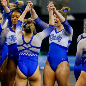
This week, we’re taking on Kentucky with Katherine and Christina joining Elizabeth for the rundown.
Elizabeth
No. 1: This is one of my favorite leos out of all the teams let alone just Kentucky. The White to blue ombre is perfection and the rhinestone design on top ties everything together in just the right way. Obsessed.
No. 2: This leo is so classy and has a shape that is flattering on everyone. I love the high neck paired with the matte fabric. I feel like on paper this wouldn’t look that great but it really stands out as a real-life design.
No. 3: I will always love this kind of back (see my Arkansas rankings from last summer). I love the criss-cross design with the mesh. I do wish there was a logo or team name on the front since it’s kind of boring, but the back makes up for it.

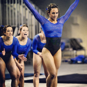
No. 4: This leo is serving up some velvet realness! I love it, and the shade of blue really pops on the otherwise dark design. It just looks great—and I normally don’t go for the belted look.

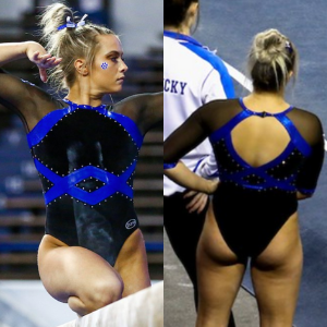
No. 5: I call this the race car leo because of the checkered design on the back, which I know is an ode to the basketball team (right?), but I can’t help but think of racing. Anyway, I like it; the blue and white work well together, and I like the font of the Kentucky on the chest. Plus, the back is really nice as well.

No. 6: I’ll admit I’d never seen this leotard before today, and I weirdly love it? The design is very trendy despite being more than a few years old, with the crop design. However, it also is a bit of a throwback with the matte and limited sparkles.
No. 7: I love nearly all ombre, but I don’t care for the color combo of black and blue as much as some others. Nevertheless, this is a good, simple leo with a unique back, so it makes my list.
No. 8: There are some elements of this design that I would change, but overall it’s a good one. I like the silver/gunmetal shades used and of course the ombre on the chest and back.
No. 9: Sometimes you just need a good throwback, simple blue leo with white sleeves, and this design is just that. It’s classy and looks good on everyone. It’s nothing special but still gets the job done.
No. 10: Oregon State has a similar design in white that I don’t like as much as this one. The shade of blue is really nice, and I like the funky use of mesh on the one arm and part of the other. It’s unique, and that’s why I like it.
Katherine

No. 1: There’s so many interesting elements that come together here against the odds. I LOVE the Kentucky font; it’s a kitschy, modern take on a vintage trend. Also, the checkered band is a subtle but effective use of school spirit. This design was a risk that paid off.

No. 2: The front of this beauty is truly to die for! I love how the criss cross looks overlayed with the ombre, and the different colored sparkles are a subtle but unique touch. Aesthetically, this is nearly perfect.

No. 3: Given the gymternet’s collective love of white leos, I’m not sure how this one slipped under the radar. It’s such a simple but elegant look! The sparkles are very pretty, and the blue edges give it an interesting structure.
No. 4: Another fabulous front. That sparkle design is so ambitious! It looks like something you would see as an accent in a royal palace. I also like the light blue and white color scheme; it’s very ethereal.

No. 5: Kentucky doesn’t often embrace lace, which is a shame if this is the standard with that material. The upper body looks absolutely amazing. The sparkles definitely weren’t necessary to enhance the design, but that doesn’t mean they weren’t welcome either!
No. 6: Another example of seemingly disparate elements coming together quite nicely. Weirdly, I think the band in the middle is my favorite one; the design on it is interesting, as are the sparkles above it.
No. 7: This is very dramatic. I look at this leo and think, “They’re here to work.” I think it’s the black, which like lace, we don’t see too often from Kentucky nowadays. I also love the criss cross on the chest.
No. 8: Finally I can say something about the back of a leotard…love this diamond design! The whole thing is very “angular,” which works well.
No. 9: The blue on the upper half of this is so shimmery and pretty. This design might be higher on my list if the sparkles/overall excitement didn’t just stop below the shoelace chest design, which I also love.
No. 10: DITTO to this one re: the bottom half. The upper half features a pretty sparkle pattern I usually love on other leos, so it’s a shame the rest had to be comparatively dull.
Christina

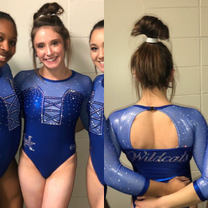
No. 1: This is such a gorgeous and classy design, and it looks flattering on everybody. I love the design on the front and back, the matte shades and the mesh sleeves. The open back with the straps is also perfect. A stunning look.

No. 8: Kentucky: I actually had a somewhat hard time deciding between this leo and a couple others for Kentucky because I love the way the Wildcats utilize blue in their designs , but the ombre combined with the lighter blue sealed it for me. I also love the subtle touch of blue on the black mesh sleeves as well.

No. 6: Kentucky: I love the blue to white ombre look, as well as the rhinestone pattern on both the front and the back.
No. 4: I think I’m in the minority in the CGN team who likes lace on leos, so here I am. I can’t really tell if this one is real or lace-like fabric (I’m pretty sure it’s the latter), but I really love this look overall. It’s so elegant, and I love the sparkly borders and neckline here.

No. 5: Another elegant look from Kentucky that I love. The back is beautiful, and it’s honestly my favorite part of this leo. The design on the front is simple in and of itself, but it works here with the more intricate back.

No. 6: I am obsessed with the front of this leo. The sweetheart neckline, the sparkly swirls and the faux-belt across—it’s all so gorgeous! I also love the crossing straps on the back and the slightly ombré sleeves. The only thing bugging me is the weird ombré on the upper chest as well as across the back, and this leo probably would have been my first choice without it, but I love this look anyways.

No. 7: White leos are hard to get right, but I really like this one. The blue collar lining as well as the blue around the cuffs gives it all a nice pop as well.
No. 8: Love the velvety look! I’m usually not a fan of the darker leos from Kentucky, but this one has to be my favorite. The shade of blue works so well, and I love the interesting belt going across the entire bodice as well as the open back.
No. 9: I quite like the old school, cheerleader-like look with this one. I enjoy the color scheme, the font used for Kentucky, as well as the checkered stripe and the straps on the back. I do wish the solid white on the front blended better with the sleeves and the rest of the leo, but it’s a fun look overall.

No. 10: Like Elizabeth, I didn’t remember this one, but I quite like the old school feel of it. The design on the upper body is beautiful, as well as the shade of blue used. And if the black lower-half is velvet, then it’s truly a great look.
READ THIS NEXT: Leotard Rankings: LIU Design Contest
Article by Elizabeth Grimsley, Katherine Weaver and Christina Marmet
Like what you see? Consider donating to support our efforts throughout the year! [wpedon id=”13158″]


