
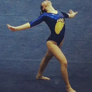
This summer we’re trying a little something new when it comes to our throwback leotard rankings. Rather than looking at single meets, we’ve decided to take a trip down memory lane for specific teams, taking into account a wide range of leos from different eras and finding our all-time favorites from a single program, as well as illustrating how designs have changed over the years.
Here’s how it’ll work: Our judges for the week will choose their top 10 and rank them based on their personal preferences. Plus, you’ll get a chance to tell us your thoughts! Did we leave out your all-time fave from the team? Let us know in the comments or on social media.
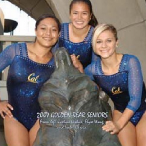
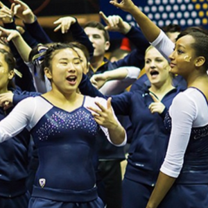
This week, we’re taking on California with Claire and Brandis joining Editor in Chief Elizabeth for the rundown.
Elizabeth
No. 1: I LOVE when teams use shiny silver or gold. Paired with white and navy and this just works for me.
No. 2: This is my No. 2 almost entirely because of the thick back straps. I love them so much and wish more teams used that design element in their leos.

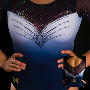
No. 3: Sweetheart with ombre and mega-sparkles? Another phenomenal leo for Cal. It’s really killed it with all the new UA leos lately.

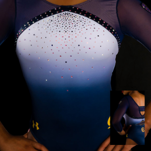
No. 4: It’s simple, but the semi-sweetheart is great paired with the white to blue ombre and mesh sleeves.
No. 5: The back on this leo sold it for me. I love how clever Cal is about incorporating those “mandatory” brand guideline elements into its designs.
No. 6: This leo is super similar to my No. 5, which means it makes sense it falls right after it. I don’t prefer it quite as much because of the more muted color palette.
No. 7: I love how the sparkles define the back design on this leo. It’s otherwise pretty simple but the back pops.
No. 8: It’s an older leo but a good one. I always love white sleeves, and they work really well with the sweetheart neckline here.
No. 9: Another back design I’m really into. The mix of mesh and horizontal stripes is great, and I also like the script Cal on the chest.

No. 10: I’m never a fan of the inverted neckline; I just don’t think it’s flattering. But this leo makes my list because the ombre is still great, and the back is unique.
Brandis

No. 1: It’s so simple yet absolutely stunning. The shades of blue in the ombre are so elegant, the neckline and wristband rhinestones are beautiful and the touches of yellow compliment it all perfectly.

No. 2: It’s fitting that my love of ombre highly influenced a lot of my picks. The white on the sleeves contrasts the dark blue torso so well, and I love how yellow is subtly woven in on the straps on the back.

No. 3: Ombre mesh? I’m here for it. The rhinestone design moves well with the ombre on the body, and I like how it’s the reverse of the sleeve ombre. How many times can I say ombre?
No. 4: It’s a bit obnoxious, but I’m ok with that. The shade of blue is pretty, and you can’t say it doesn’t scream Cal.

No. 5: I think this leo goes a bit overboard with the rhinestones on the black and bands, but without that it’s on par with my first two picks.

No. 6: The simplicity of the front contrasts well with the design of the back. I also love how the quartets of rhinestone lines emerging from the logo gives the leo some movement.
No. 7: It’s pretty simple overall, but the metallic-y texture throughout the leo adds some good depth to the simplicity.
No. 8: While it doesn’t scream California, it’s different and I like it. The double white stripes are bold and the white peeking out of the back straps is original.

No. 9: I wish there were some more colors or shades of blue, but the X pattern in rhinestones on the front is lovely.
No. 10: It’s nothing too special, but it’s a classy leo and you can’t go wrong by wearing it.
Claire
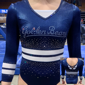
No. 1: Having an ombré bodice is a fun departure from the ubiquitous ombré sleeve (for the record, I love ombré sleeves, and I’m totally OK with their ubiquity). They did it right by putting the white up top. The mesh and sparkles looks like the most gorgeous night sky imaginable, and the yellow piping around the wrists adds just the right pop of color. Also, the golden rhinestone Cal logo is fabulous. That needs to be on every single one of their leos for now and evermore.
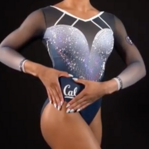
No. 2: Mixing ombrés is a bold choice, but they nailed it! Also, the rhinestone shield on the chest elevates the overall look without being gaudy. That white piping paired with the open back is so simple, but dramatic. I know I’m contradicting my own rule about continuing design elements on front and back, but I just don’t like the piping on the shoulders and chest… If that weren’t there, this would probably be my top pick.
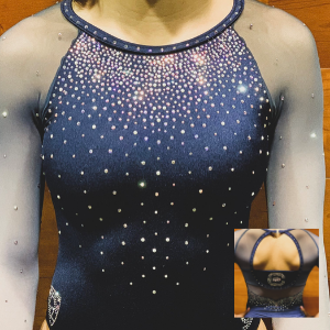
No. 3: Seriously, Cal has mastered the art of the ombré bodice. Generally, I don’t like inverted necklines (I’m sure there’s a technical fashion term, but I don’t know what it is), but the curve makes it work. The back is phenomenal; the diamond keyhole with the school colors is so cool and unique. Plus, the fantastic gold rhinestone C and bear is back! Love it.

No. 4: There’s a lot I like about this one: Excellent use of sparkles and the sporty white stripes around the bodice are great (especially since they carry over to the wrists—great detail!). The extra white fabric under the back and neckline just isn’t necessary. Take that out, and these would be a home run!

No. 5: I love these sleeves so much. Big, white piping is absolutely the way to my heart. I also really like that they used gold for the “Cal” logo. Sidenote: “Berkeley blue” is great, but please, please, please use gold and yellow more often.
No. 6: To paraphrase Tim Daggett, this is Gymnastics Leo Piping 101, folks! If you’re going to go this simple, those details really matter. Also, the minimalist sparkles are used to great effect and add so much movement and definition. The only thing I don’t like about this one is the white band that stops at the hip. The other one continues to the back, why doesn’t this?

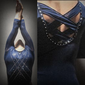
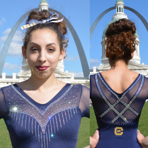
No. 7: This is one of the best backs I’ve ever seen. The rhinestone criss-crossing straps over mesh is so unusual, and pairing with the low scoop back on the bodice is impossibly elegant. I like the front (especially the deep sweetheart neckline), but it doesn’t quite measure up to that incredible back. I also wish they’d incorporated the yellow details around the wrists throughout the rest of the leo, because they’re pretty great!

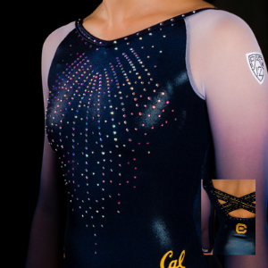
No. 8: Like so many Cal leos, this one is good and *almost* great. The angular neckline and opening in back are fabulous and unique, as are the mesh vents in back. The rhinestone embellishments are excellent (especially that big, sparkly “Cal”). If the sleeves were sparklier or mesh or ombré or SOMETHING to make them stand out from the bodice, this would be an absolute knockout.
No. 9: Honestly, this looks more BYU than Cal, but I like it. The rhinestones on the sleeves look like badass bracers, which I am definitely here for even if they don’t really match the bodice. I really like the rhinestone outline on the torso; it adds a lot of depth for such a small detail. Finally, the criss-cross back is really fun yet functional (it CAN be done).
No. 10: Obviously, this is very simple, but it’s clean, pretty and well-executed. I think it looks better on film than in photos; it’s seriously gorgeous in motion without being a distraction. The shield on the chest elevates the sweetheart neckline, giving it extra drama and flair. Echoing its V shape to separate the mesh and bodice in the back is a great touch.
Article by Elizabeth Grimsley, Claire Billman and Brandis Heffner
Like what you see? Consider donating to support our efforts throughout the year! [wpedon id=”13158″]


Love these! Is there any way you can make all the leos in contention for the leo panel available so that we could also judge them ourselves?
That’s a great idea! We will see about doing something for the readers to participate as well!