
This summer we’re trying a little something new when it comes to our throwback leotard rankings. Rather than looking at single meets, we’ve decided to take a trip down memory lane for specific teams, taking into account a wide range of leos from different eras and finding our all-time favorites from a single program, as well as illustrating how designs have changed over the years.
Here’s how it’ll work: Our judges for the week will choose their top 10 and rank them based on their personal preferences. Plus, you’ll get a chance to tell us your thoughts! Did we leave out your all-time fave from the team? Let us know in the comments or on social media.
This week, we’re taking on LSU with Katherine and Christina joining Editor in Chief Elizabeth for the rundown.
Elizabeth

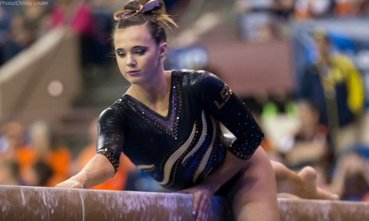
No. 1: I feel like this is a super underrated leo. I couldn’t find any definitive pics of it until I stumbled upon it in Christy’s album. But it is hands down my No. 1. I have a thing about neckline mesh, for lack of a better term—I just love it, especially in a fun color like this. Add to that a mostly black body with school colored accents, and you’re golden. Wear this again and more, LSU.
No. 2: You know from the Washington rankings that I love purple and white, so this leo checks all the boxes for me. It’s a pretty simple leo, but the design elements it does incorporate, it incorporates well.

No. 3: I do not like white leos, but there’s something about this one that I am obsessed with. It’s very throwback with the matte white with minimal gold and purple piping and details. There’s also the fact that LSU has only worn this maybe twice. What’s with the Tigers wearing their best leos only a couple times?
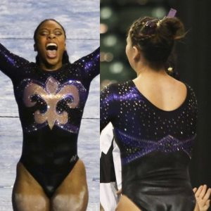
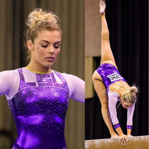
No. 4: I categorize this leo in with most of its newer ones where there are big solid swatches of gold and purple material, which I do not typically care for. However, this design specifically doesn’t go overboard, so I tend to like it more than some of the others.

No. 5: I don’t love the straight neckline here, but the other design elements—the amount of sparkles, the lower back, the rhinestone design—make up for it. I also remember thinking at nationals when LSU debuted it that it was very un-LSU-like, which I think is why I like it.
No. 6: A big reason why this leo makes my list is because it’s executed well. I think if the thinner, more see-through mesh had been used, it wouldn’t have looked as good. But with this design, it looks like one piece, like an evening gown, and it really works for me.
No. 7: I wanted to throw one classic Louisiana leo on my list, and this is my favorite of the four or five we found to consider. I love the shimmery material used with the fleur-de-lis and the fact that it’s the focal point of the design.
No. 8: I feel like I’m saying this a lot, but I don’t know why I like this leo so much. I think it’s because the design and how the gold pulls all the other elements together is flattering on the gymnasts wearing it. It could have very easily been “HERE’S MY BELLY BUTTON,” but I don’t get that vibe at all.
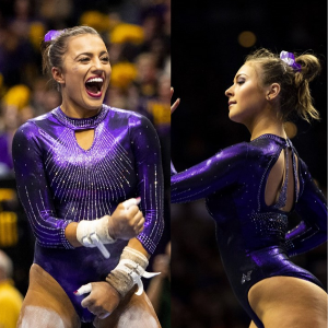
No. 9: Take out the weird sternum keyhole and this leo would jump about four places in my rankings because of the shade of purple used and the back design alone.

No. 10: I know I’m in the minority when I say this, but I like nude mesh, especially when it’s this shade that matches the gymnasts’ skintones better than the classic color (something to match every skin tone would be better but we can’t have all things in life). I also just like the combination of purple and gold and think it works well here.
Katherine

No. 1: It’s hard to think of other words for this than “pretty.” The color scheme and style are so light and airy; it’s a departure from a lot of darker-toned LSU leos, but I’ve always loved it.
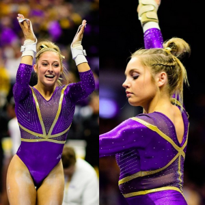
No. 2: This design perfectly captures the regal-meets-badass vibe that LSU is all about. The high neck and golden chest piece look like they could be worn by a female superhero.

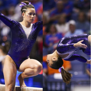
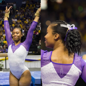
No. 3: LSU: The lettering of LSU is one of the few vintage elements I can tolerate, and it looks awesome here against the white. It’s a modern take on a classic design, and it looks great in motion. This is LSU’s most unique leo and I implore them to bring it back.
No. 4: Ashleigh went IN on the rhinestones for this one, but I love how detailed and intricate it is. I’m sure it would look great under the lights.
No. 5: This is very similar to my No. 2, and I love it almost as much. While I love the sleeves and overall rhinestone design, I think I prefer it with the darker color scheme like in No. 2, hence the lower position.

No. 6: I like the transparent dark material on this, and the sparkles are beautiful on the front. The back is unexpected compared to the front, but it looks great too.

No. 7: I like when schools draw on regional spirit in addition to school spirit. The fleur-de-lis is a great element to include,and I like the way that it’s positioned atop a slightly lighter purple.

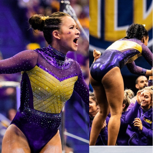
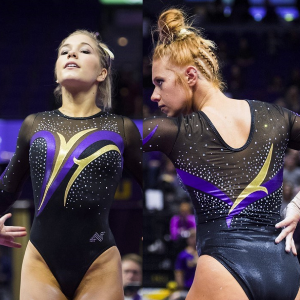
No. 8: Gold, purple and black isn’t my favorite color scheme of LSU’s, but this is the design that incorporates those colors the best. The geometric pattern is cool.
No. 9: I’m here for the single nude sleeve, especially with the “LSU” as a hidden bonus. I like also like that the gold could be interpreted as vines, flames or tiger stripes.
No. 10: This was a nice use of the tiger stripes motif. The use of different shades of purple is effective, and the sparkles are light but just enough to make it stand out.
Christina

No. 1: Love, love, love. My favorite LSU leo. This is absolutely gorgeous and so elegant. There is nothing I dislike about this one. The open back is just the cherry on top.

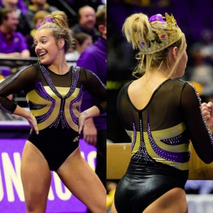
No. 2: When I knew I was ranking LSU’s leos, my mind went straight to this Mardi Gras one, and it just had to be near the top. I really love it; it’s so unique to the team and embodies the spirit of not only the school but of the whole state.
No. 3: I’ve always loved this one mostly for the shade of purple used. It’s delightful. I also do love the white bodice, and the design is quite flattering and beautiful.

No. 4: This one is fairly reminiscent of my first pick in terms shades and coloring, but I love it so much as well. The deep-V in the front and this shade of deep purple have got to be my favorite things. The keyhole in the back and the amount of sparkles are also great.
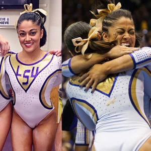
No. 3: LSU: The lettering of LSU is one of the few vintage elements I can tolerate, and it looks awesome here against the white. It’s a modern take on a classic design, and it looks great in motion. This is LSU’s most unique leo, and I implore it to bring it back.
No. 6: This one was quite neat, although it took a while for the “LSU” across the upper chest to grow on me—but it works. Again, I quite like this shade of purple and the golden criss-cross straps on the back are excellent.
No. 7: This one reminds me of mermaid scales, so automatically it had to make my list. The golden belt is beautiful, and I quite like the golden V in the back as well.
No. 8: While I wish this one had a tad of gold somewhere, I love the elegant look of it. The simplicity of the bodice is very pleasing, and I like that the back is mostly white with the sparkly V down the middle.
No. 9: About every team had this design back then, but I have always loved LSU’s version the most, clearly because of the color scheme.
No. 10: A fairly simple design, but it works well here and I find it quite elegant and flattering on everyone, particularly with the neckline the swirls create. It has all-in-all the perfect balance of an all-black bodice with touches of purple and gold
Article by Elizabeth Grimsley, Katherine Weaver and Christina Marmet
Like what you see? Consider donating to support our efforts throughout the year! [wpedon id=”13158″]


