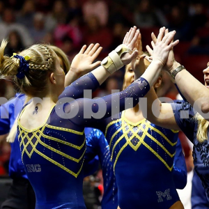
This summer we’re trying a little something new when it comes to our throwback leotard rankings. Rather than looking at single meets, we’ve decided to take a trip down memory lane for specific teams, taking into account a wide range of leos from different eras and finding our all-time favorites from a single program, as well as illustrating how designs have changed over the years.
Here’s how it’ll work: Our judges for the week will choose their top 10 and rank them based on their personal preferences. Plus, you’ll get a chance to tell us your thoughts! Did we leave out your all-time fave from the team? Let us know in the comments or on social media.
This week, we’re taking on Michigan with Emily M and Kalley joining Editor in Chief Elizabeth for the rundown.
Elizabeth
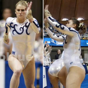
No. 1: You all know by this point I’m a sucker for white on a leo, and this one is no exception. I love the athletic nature of the design, the matte white and the almost-throwback vibe.

No. 2: Pointy sweetheart neckline, yellow ombre and a design with rhinestones? You had me at pointy. But seriously, this is a huge winner for me.

No. 3: More white, more athletic designs (Adidas-esque) and good shades of yellow. Michigan could easily go so wrong with maize and blue but rarely does, and I appreciate that.

No. 4: This design is similar to that of a lot of other teams, however it sets itself apart with subtle differences. The shade of blue is also really nice and goes well with the yellow.

No. 5: I mean it was a new leo with velvet in the year 2019. Do I need to say more? If you answered yes, then I’ll also tell you I liked the shimmery silvery blue fabric used on the top too.
No. 6: I definitely don’t remember liking this leo when it first debuted. I remember thinking it was too busy. But it’s grown on me. I like how it’s very clearly Michigan, and added a little pizzazz with the arm material and sparkles to what would be an otherwise somewhat boring leo.
No. 7: Shimmery gold/yellow arms? Yes please. That’s literally the reason this leo made my list. I could have been a straight neckline with a giant hole in the middle (two design elements I hate), and I still probably would have chosen it.
No. 8: I like this leo not so much for the design itself but for how that design looks on the gymnast. It’s very flattering and the rhinestones accent just enough without going overboard.

No. 9: Every time I look at this leo, I’m a little surprised I like it. It’s not something I would normally go for, and I can’t exactly pinpoint why I like it. I just do.

No. 10: Similar to the Auburn leo I included in my top 10 two weeks ago, I like this leo for the sweetheart neckline and yellow accents. Add in ombre and it’s a true win.
Emily M

No. 1: Favorite favorite favorite. I remember when Brianna Brown showed up in this as an individual at nationals I almost fell out of my chair trying to pause and screenshot it so I could immediately share it in our CGN Slack. It’s so unique. The starburst is so bright against the black. It’s everything.

No. 2: I got to see this one in person when it debuted at the 2018 Big Ten champs and let me tell you, that yellow SHINES in a dark arena against all the deep colors in the Big Ten. It’s truly stunning in person.

No. 1: The Wolverines’ newest crop of leos clearly does it for me, this is another 2018 one. Let’s not talk about regionala, but whooo this leo looks downright classy on everyone. I also love Bev Plocki shirking what (I think?) is a rule about having the GK logo on the hip across from the B1G logo. She’s like, nah, we’re Michigan, we do it our own way bye.
No. 4: OK, here’s an older one. I love a sweetheart neckline, and I’m very into the two-tone blue look here. It’s simple but elegant.
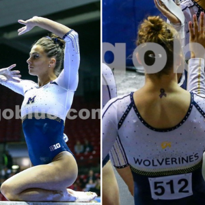
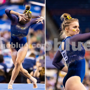
No. 5: One thing I will always appreciate about Michigan is it’s refusal to say goodbye to Mystique fabric. Is it out of style? Yep. Do the Wolverines still wear this leo? Yep. Also, that back!

No. 6:I don’t love this leo in and of itself; I’ve never been a square neckline fan. But if you said, “Emily, picture a Michigan leo,” this is the one that would be in my head.

No. 7: This is, I believe, Michigan’s only ombre look. I so appreciate that Plocki took the trend and made it fit her team’s look. It’s so very Michigan.
No. 8: I get why we don’t see more all white leos. I’m a woman who used to wear leos, I really really get it. But man do I love one when it works. I think those swirlies are velvet, by the way.
No. 9: I really like this one. It’s only so low because I can’t get over that stomach mesh. But it’s so throwbacky in a quiet way. The velvet! The mystique! The keyhole!
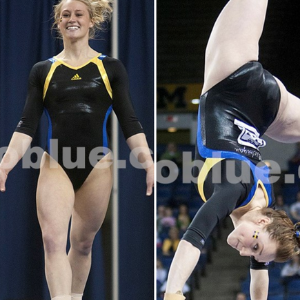
No. 10: OK, this one is weird, I know, but my favorite project with Michigan leos is finding the hiding “M”. Yes, they usually include the Block M or “Michigan” somewhere, but I mean the “M” hiding in the design. This is a prime example. So subtle, and so on brand. Also, does anyone else miss the super-athletic Adidas leos? I loved them!
Kalley

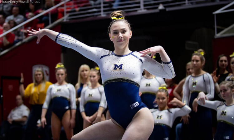
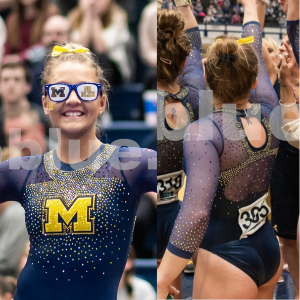
No. 1: I absolutely love everything about this leo. It’s understated while still being unique, it utilizes white in a way that other schools should take note of, and it is flattering on every person who wears it. I love the sleeves and the simple M on the chest as well. A+ all around on this one, Michigan.

No. 2: This is just straight up beautiful. I love the sweetheart neckline, the crystals and the diamond cut out on the torso. The sheer sleeves and higher collar also add an element of drama that is unique for the typical Michigan leo.
No. 7: Michigan: Yellow is another color that teams tend to shy away from, but the yellow ombre sleeves in this Michigan leo are done so well and not something we see very often.

No. 4:I absolutely love this shade of blue and the metallic yellow sleeves. The deep V cut pattern in the front isn’t my favorite, but everything else about this is beautiful. I’m guessing this leo is a stunner in person.
No. 5: I went back and forth on this leo, because it isn’t typically my style. But the more I looked at it, the more I appreciated its uniqueness. It’s a fun leo, and I can’t think of another team with a similar design.
No. 6: Are we noticing a pattern here? Look at those pretty white sleeves. I love the simplicity of this one. The stripes on the shoulders are subtle but fun, the M on the chest is small but surrounded by crystals. It is simple and fun at the same time.
No. 7:I love the bright pop of yellow on the sleeve of this leo mixed with the blue ombre. I could maybe do without that swirl pattern, but the combination of the colors is pretty and fun.
No. 8: The design of this one is really unique and flattering. The navy and yellow and sheer patterns really compliment each other well on this design, and it is flattering on everyone who wears it. The crystals are beautiful, and I can only imagine how pretty this one is in person.
No. 9: I couldn’t decide how I felt about the stripes on this leo, but ultimately I think it works really well. The pop of yellow against the blue is pretty, and the design is unique.
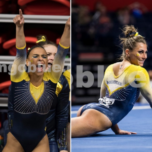
No. 10: This is just a classic Michigan leo, and sometimes classic is best. Nothing fancy, just straight up navy with yellow accents and a nice sparkly M on the front.
Article by Elizabeth Grimsley, Emily Minehart and Kalley Leer
Like what you see? Consider donating to support our efforts throughout the year! [wpedon id=”13158″]