
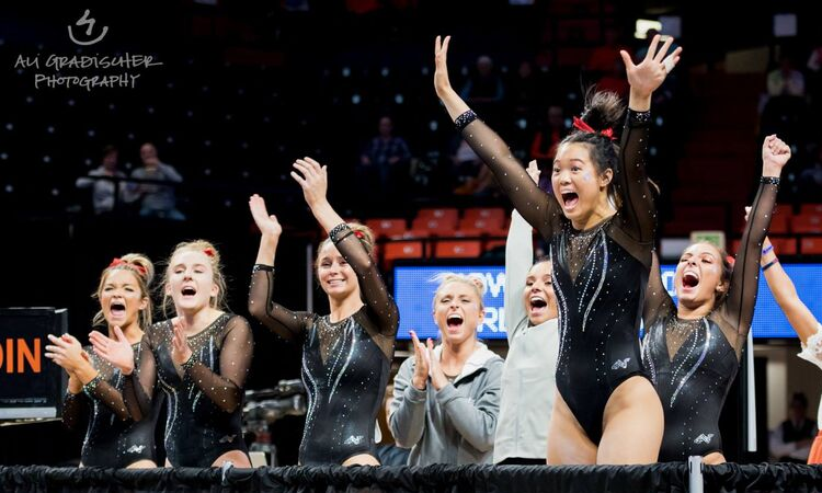
This summer we’re trying a little something new when it comes to our throwback leotard rankings. Rather than looking at single meets, we’ve decided to take a trip down memory lane for specific teams, taking into account a wide range of leos from different eras and finding our all-time favorites from a single program, as well as illustrating how designs have changed over the years.
Here’s how it’ll work: Our judges for the week will choose their top 10 and rank them based on their personal preferences. Plus, you’ll get a chance to tell us your thoughts! Did we leave out your all-time fave from the team? Let us know in the comments or on social media.
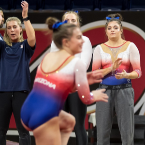
This week, we’re taking on Arizona with Senior Editor Brandis and MPSF Editor Claire joining Editor in Chief Elizabeth for the rundown.
Elizabeth

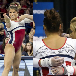
No. 1: I just love this leo so much. The matte material, the red stripes reflecting the Arizona flag, the white, the low back. All of it is fantastic.
No. 12: Arizona: So many beautiful things happening here. The ombre and cascading sparkles are a winning combination. I also like the lighter shades of the school’s colors that are used and the way that they blend into each other. It’s just an overall lovely leo.

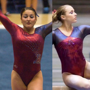
No. 3: Red and blue shiny ombre paired with a unique back? You had me at red and blue.

No. 4: No matter what team wears this design, I like it, but the shades of red and blue used here are *chef’s kiss* perfection and so athletic.
No. 5: I’m going to take some liberties and combine two leos into one ranking spot because they’re both really similar and I found it impossible to choose one over the other. I love the shade of red and especially the shimmy, gold-like blue. Plus, the logo is incorporated so well on each.

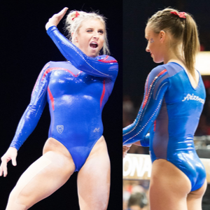
No. 6: Sooo… Can Team USA wear this one, too? It’s so great, and I’m realizing Arizona leos over the years are quietly amazing.
No. 7: Have I mentioned Arizona leos are super underrated? I’m only sorry I didn’t discover just how much I love them before. I mean, don’t get me wrong there were some that were super questionable, but it’s working with some great colors.
No. 8: Great design, great fabric, great color… Overall a great leo.
No. 9: I wish I could see the back of this one, but from what I can tell, I like it a lot. The design looks great on the gymnasts and is very flattering.

No. 10: This one’s a little more unusual, but I like the geometric underlying design with the more ribbony blue on top.
Brandis

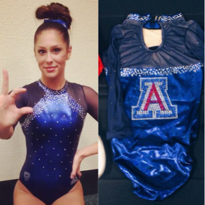
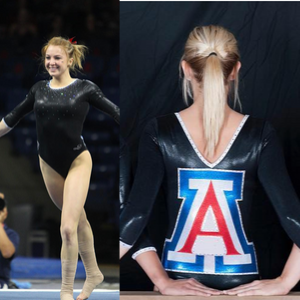
No. 1: It’s so simple but so elegant. The rhinestone “A” is stunning and the white contrasts the blue and red so well while still giving the leo plenty of school spirit. Easily my favorite.

No. 12: Arizona: So many beautiful things happening here. The ombre and cascading sparkles are a winning combination. I also like the lighter shades of the school’s colors that are used and the way they blend into each other. It’s just an overall lovely leo.
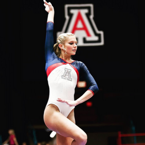
No. 3: Not only does this leo scream school spirit, the design also nods to the state flag (swapping white for yellow of course)! I also love how they bring the blue up for the neckline too; it’s such a gorgeous shade of blue.
No. 4: Yes, yes, yes to the sparkly logo on the side with the sunburst rhinestones emerging from it. I’m not the biggest fan of the silver near the neckline and throughout the sleeves, but the torso of this leo is stunning enough to distract me from it.
No. 5:The top half and bottom half of this leo almost function differently, but I like it. The way the blue breaks up the white and red sections is creative and so are the rhinestone Wildcat eyes stretching across the back.
No. 6:It’s a pretty simple design with the front being solid black with some rhinestones, but the logo on the back is so obnoxious and I love it. You can’t miss the school spirit with this one, and the white neckline and ends of the sleeves are a subtle but needed touch.
No. 7: I wish the white from the design on the front carried through to the back, but the vertical lines of rhinestones down the torso are the saving grace for this leo. Arizona has such a nice logo, too, and I like how prominently featured it is on the chest.

No. 8: I’m not 100 percent sure what the design on the leo is (the outline of a cactus?), but I don’t hate it. The abrupt transition from red to white is giving me some retro vibes, too, in a good way.
No. 9: I am obsessed with this shade of blue! I wish there was some white weaved in somewhere, but its a simple and elegant look.

No. 10: Mesh isn’t usually a winner for me, but it works on this one. The shade of red works well with the blue and the design is unique with just the right amount of rhinestones.
Claire
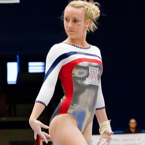
No. 1: What a clean, chic leo! The blue and red stripes against white are a classic combo, while the metallic silver body and sparkly “A” add a modern twist to this retro design. Finally, the blue piping and crystal accents are the perfect finishing touch.

No. 2: I love how they’ve implemented the Arizona state flag here. The crystals in the white and blue up the glamour factor without sacrificing its athleticism. I really appreciate that the red carries through to the back.

No. 3: My favorite part of this design is how the colors seem to be radiating from the “A.” I also really like the cascade of crystals against the blue bodice; it’s sparkly without being gaudy. If the back and sleeves were just a little more interesting, this might have been my top choice.

No. 4: I hesitate to even call this a retro leo… It’s straight up mod! It looks so fabulous from the side, and the sequined Wildcat eyes in back are hilarious. I love Arizona’s willingness to commit to a theme.

No. 5: Arizona really has this retro thing nailed! Take away the crystals, and this picture could be straight out of the 1984 Olympics. Again, the red piping is the finishing touch that makes this such an impeccable throwback.

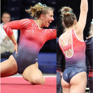
No. 6: I have to admit, I initially thought Courtney Cowles’ kinesio tape was part of the design and thought, “That’s really cool!” Even with plain mesh sleeves, this is still a really fresh, unique design. I’m not crazy about the red side cutouts (maybe would have been better in white?), but a great look overall.
No. 7: This is a really interesting concept, very reminiscent of Matisse. I can’t decide if I actually like it, but I definitely appreciate that it’s bold, unique and well-executed. The use of the different colored crystals is subtle but makes a big impact.

No. 8: This is the mullet of leos: business in the front, party in the back! Unlike the mullet, however, the back is the best part here. The keyhole, mesh and sparkles are great on their own, but that over-the-top crystal “A” is fantastic!

No. 9: Simple and sweet! I love the use of crystal accents to really define the color blocks, and that liquidy material is a nice touch. Would like the other sleeve to be white to make it a little more distinctly Arizona. And of course, the blue piping at the wrist is a great little detail.
No. 10: I really dig the claw marks. I like the ombre bodice but would have preferred bolder colors… If I could combine the sleeves from this leo with the ombre from Elizabeth’s No. 2, it’d be flawless!
Honorable Mention: This doesn’t say “Arizona” even a little bit, but it’s a really gorgeous generic black leo!
Article by Elizabeth Grimsley, Brandis Heffner and Claire Billman
Like what you see? Consider donating to support our efforts throughout the year! [wpedon id=”13158″]


