
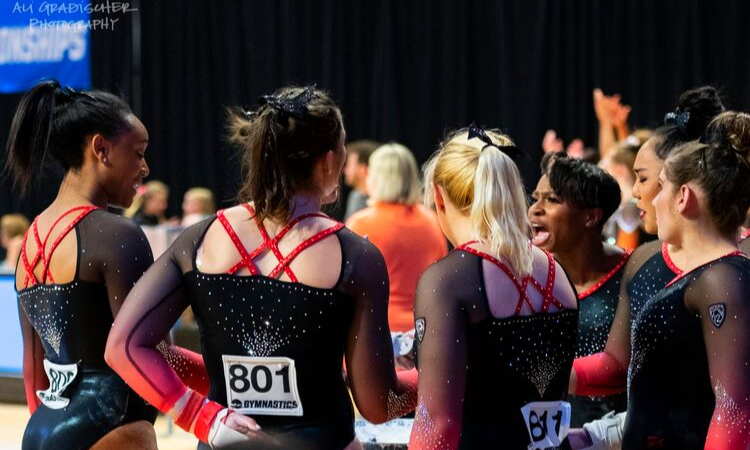
This summer we’re trying a little something new when it comes to our throwback leotard rankings. Rather than looking at single meets, we’ve decided to take a trip down memory lane for specific teams, taking into account a wide range of leos from different eras and finding our all-time favorites from a single program, as well as illustrating how designs have changed over the years.
Here’s how it’ll work: Our judges for the week will choose their top 10 and rank them based on their personal preferences. Plus, you’ll get a chance to tell us your thoughts! Did we leave out your all-time fave from the team? Let us know in the comments or on social media.
This week, we’re taking on Stanford with Senior Editor Brandis and MPSF Claire joining Editor in Chief Elizabeth for the rundown.
Elizabeth

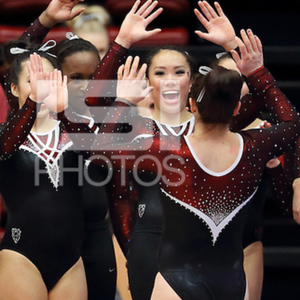
No. 1: This is almost a perfect leotard to me. It has every feature I love in a design, including a sweetheart neckline, ombre and red and black. All that’s missing is a funky back, and it would be my favorite of all time.
No. 2: Another great ombre leo. I love the shade of red used—it really pops against the black—and the multi-strap back.

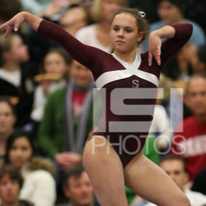
No. 3: A rather simple red and black leo for the most part that’s executed well and elevated to new heights with the unique back with thicker black straps.

No. 4: I love the cleverness of this leo and how the design and rhinestones on the side make the Stanford tree (don’t worry, it took someone telling me it was a tree to see it, too).

No. 5: It’s a design many other teams have used, but I love the deep red used here. Stanford doesn’t limit itself to one shade of red in its leos, and that’s something I appreciate.
No. 6: The shimmery fabric on the chest and arms is what sticks this leo in my top three. I love the qualify it gives off paired with the jagged V neckline.
No. 7: I’ve never seen a good picture of this leo. In fact, I don’t think I’ve ever seen it aside from this particular video. But from what I can tell, I like it.
No. 8: I don’t typically love the crop top sweater look around the armpits like this leo has, but I do like the berry color used, and the shimmery V on the chest.
No. 9: I’m always into a leo that uses an exorbitant amount of rhinestones to create a design in and of itself.
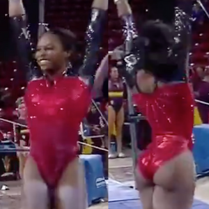
No. 10: It’s not perfectly executed, but who can say no to a leo that gives off major superhero vibes?
Brandis

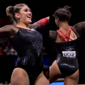
No. 1: This shade of red is so vibrant that I just can’t look away! The black ombre on the sleeves makes the red pop even more, and the subtle rhinestones all over the torso just takes this leo to another level.

No. 2: This leo is just so elegant! The different shades of red and the slight ombre to white on the chest paired with a generous use of rhinestones makes this an easy choice for me.
No. 3: The way the white stands out amongst the black and dark hues of red throughout the leo is gorgeous. I’m also a fan of how the torso is left alone to make the sparkly sleeves stand out.

No. 4: It’s not the flashiest leo, but I love the intricacy of how the red and black come together to make the outline of the tree. A super creative way to give this leo tons of school spirit!

No. 5: I really like this design, and especially how it carries onto the sometimes-forgotten sleeves. The red and the black work super well together, but I would’ve toned it down on the rhinestones just a bit.

No. 6: I picked this leo for another Pac-12 team, and I’m picking it again for Stanford too. I’m a big fan of the horizontal design and how the mesh stripes and the rhinestone stripes don’t quite match up. I think it gives the leo a little personality. The rhinestone bands on the wrists are a nice touch, too.

No. 7: My favorite of the Stanford leos of the old days. The design is simple but eye-catching and I love the asymmetry of it as well.

No. 8: Another good classic Stanford leo! The all black torso makes the red “S” logo really stand out, and I like the red bands around the wrist too to bring in a little bit more color and school spirit!

No. 9:Very similar to the above leo, but with just a switch in color scheme. I like the Wonder Woman-esque bands on the sleeves, but I don’t really like the silver. I think white would’ve been better in my eyes.

No. 10:I’m a sucker for ombre, and this red to black on the sleeves fits the bill. I don’t love the design of the open back, but the intricacy of the rhinestone design on the front makes up for it.
Claire
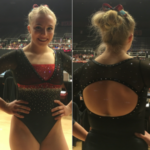
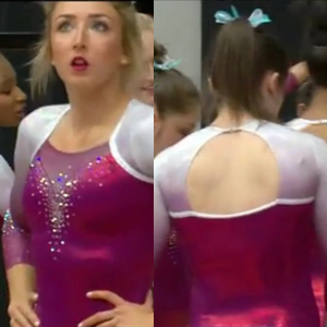
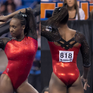
No. 1: It’s so fancy and glamorous. I love it! Layering a bolero over the red band brings the perfect little pop of drama while the sparkles emphasizing the empire waist add definition and depth (love how that element is mirrored in the sleeves). Also, the open back manages to look striking without being unflattering or impractical. Great leo!

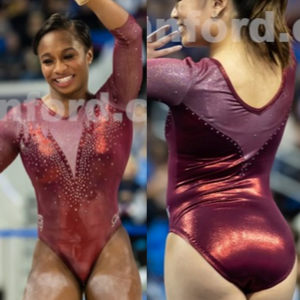
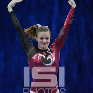
No. 2: I love the big, heavy sparkles making the flame design, especially when paired with the smattering of little sparkles on the sleeves. Stanford were smart to pair all that glitz with a simple maroon and black body.

No. 3: This bodice is gorgeous: The feathered part at the top is a fun twist on a standard deep V. Having the shoulders and sleeves be a lighter, sparklier shade of the body material is a welcome change for those of us with mesh fatigue, and the neck piping is a lovely touch. This might be my first pick if the back were a little more interesting.

No. 4: Love, love, love! Asymmetric leos are tricky to pull off, but Stanford did it well. I particularly like how the design continues from the bodice to the arm. While the cut and colors are pretty retro, the fabric and organic (versus geometric) design pull it back into the Naughts.

No. 5: This is an absolutely fantastic use of crystal accents! Amazing how they elevate a simple (dare I say, even boring?) red and black leotard to something dramatic and memorable.
No. 6:Those white bands are striking against the deep red sleeves and body. Seriously, it takes guts to go this simple! My only complaint? That crystal ‘S’ looks really sloppy on such a clean, elegant leo. The logo in crystals or even the same white fabric would’ve been a much better choice.

No. 7: I know this look isn’t particularly groundbreaking, but there’s a reason why so many teams choose it: It’s really pretty! The sweetheart neckline is so flattering, and the ombré sleeves amp up the drama. I really like the variation of crystal colors and the simple red piping around the neckline; those little details make all the difference.

No. 8: Let me start out by saying I’m not a fan of the white criss-crossy thing under the neck. It looks like an Art Deco sternum, and I just don’t like it. Other than that, I looove this leo, especially the back. The sweetheart “backline” echoing the neckline is such a unique touch. I’d love to see that more often! The sleeves—which I think are black mesh with a red liner—look amazing and provide the perfect backdrop for all of those pretty sparkles.
No. 9: This is an interesting riff on the ubiquitous silver swirls of the late ‘00s/early ‘10s. The mesh cutouts (or are they foil overlays?) on the arm and chest keep it from being just like everyone else’s leos. Though I have to say, the crystal game is pretty weak. You either have to really commit to crystals (see my second and fifth picks) or skip them altogether (see my fourth pick). These just look like an afterthought.
No. 10: The back is far and away the best part about this leo. I absolutely love the interwoven straps and that they’re actually functional (if those straps go, the sleeves go!). I just wish the front were half as interesting…
Article by Elizabeth Grimsley, Brandis Heffner and Claire Billman
Like what you see? Consider donating to support our efforts throughout the year! [wpedon id=”13158″]


