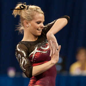
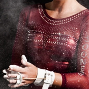
This summer we’re trying a little something new when it comes to our throwback leotard rankings. Rather than looking at single meets, we’ve decided to take a trip down memory lane for specific teams, taking into account a wide range of leos from different eras and finding our all-time favorites from a single program, as well as illustrating how designs have changed over the years.
Here’s how it’ll work: Our judges for the week will choose their top 10 and rank them based on their personal preferences. Plus, you’ll get a chance to tell us your thoughts! Did we leave out your all-time fave from the team? Let us know in the comments or on social media.
This week, we’re taking on Oklahoma with our Big 12 and MRGC senior editor Tara and MPSF editor Claire joining Editor in Chief Elizabeth for the rundown.
Elizabeth
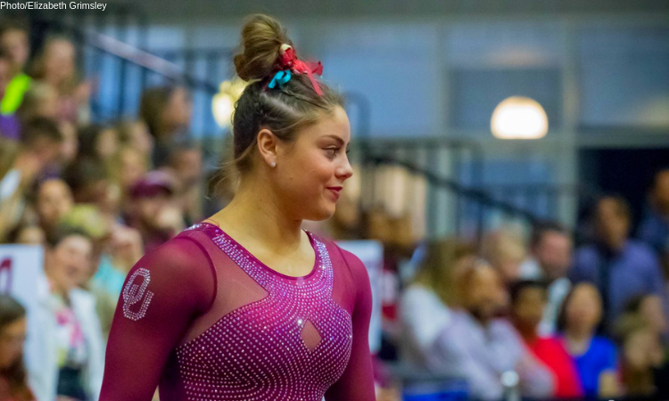
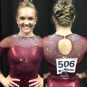
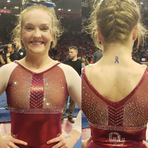
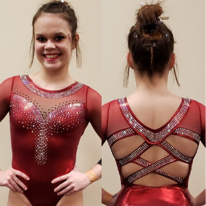
No. 1: This is my favorite leotard of all time. Yes, really. It’s just pure perfection. I love the color, the amount and design of the rhinestones, the ombre sleeves and especially the intricate open back. If I had this leotard, I’d wear it every day to work, at home and to sleep, and never take it off.
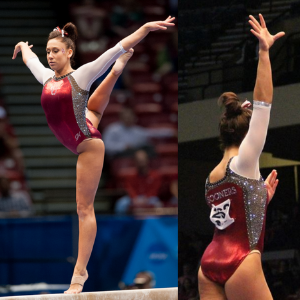
No. 2: This leo is a dream. Literally, it feels like I dreamed of it being an actual thing sometimes because Taylor Spears was the only gymnast fortunate enough to wear it, and it only happened once. I’ve since learned that’s due to it being a sample the Sooners received and that was never “mass-produced” for a full team to wear. The incredible amount of sparkles on the sides is what does it for me. That paired with the crimson body, white mesh sleeves and black neckline puts it just the smallest hair below first for me.
No. 3: I love the use of white matte on leos, and that’s exactly the selling point on this one for me. That element paired with the front design with crimson and ombre sleeves is just *chef’s kiss* perfection. To be honest, Oklahoma could wear my top three leos for the rest of time, and I wouldn’t complain.
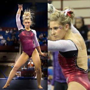
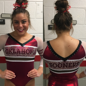
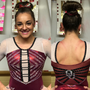
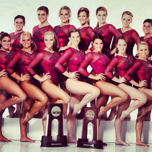
No. 4: The selling point on this leo for me is the black accents. Oklahoma doesn’t incorporate that feature enough, and I wish it would. I love the classic crimson body-white-mesh-sleeves look that’s elevated by the black. I also really like the appearance of the faux-wide open back.
No. 5: During the season that this leo debuted, I got extremely tired of it because the Sooners wore it for every home meet, which was a cool idea in theory but the execution was lacking. However, being a few years removed from seeing it three or four times in one go has made me realize that I really do like the design. It’s very athletic looking, while still being blinged-out Oklahoma-style.
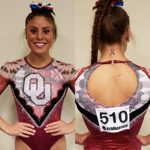
No. 6: As with a lot of OU leos, I have an anecdote to start. Since I moved to Texas, the Sooners wore this design to TWU both of the times they competed there, which was frustrating to someone who wanted a new design to photograph. Alas, I can’t let that cloud my judgement. I love the crimson, rhinestone design and of course the open back. This is also one of those designs that looks even better in person due to the sheer amount of blinding sparkle.
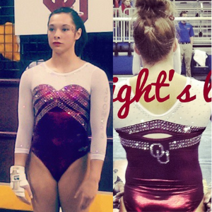
No. 7: I think of classic Oklahoma leo design as crimson body with white mesh sleeves, and this is my favorite of that bunch of leos. I like the sweetheart paired with the more angular rhinestone design, plus the small faux hole in the back design.
No. 8: I typically don’t like straight-across necklines, but appreciate this one despite that because of the descending sparkles elevating the leo as a whole. That plus the ombre sleeves puts it in my top 10. P.S. Anyone else see the Monster Energy logo every time they look at this leo? Now you can’t unsee it. You’re welcome.
No. 9: Another crimson and white leo with black accents makes my list. I don’t lovethe black ladder/necktie design on the front, but I do love the ombre sleeves and black design on the back enough to forget about the less desirable aspects.
No. 13: Oklahoma: Ditto to what I said about Illinois. This OU leo didn’t always stand out to me, but I ended up picking it as a top design because it’s so different than what other leos do. I don’t know if that pattern is tie dye, camo or watercolor paints, but I’m living for it.
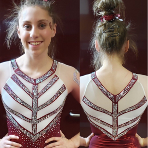
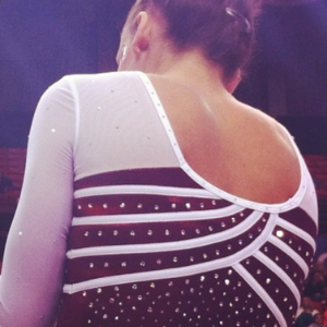
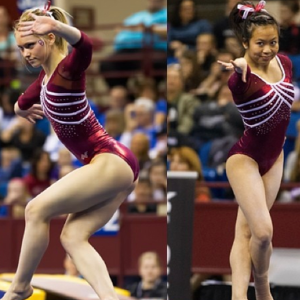
Honorable Mention: I didn’t want to leave without at least mentioning another fave or mine that I just couldn’t make fit in my top 10. I love this classic design for its simplicity and its athletic nature. The stripes make me think Adidas of old, and the crimson body and white mesh sleeves are a perfect tribute to classic OU leos of the early-to-mid 2010s.
Tara
No. 1: I love this! It’s simple but elegant. The ombre sleeves are the perfect amount of ombre, the little “OU” on the arm isn’t too much and the back is to die for. If I could fall in love with a leo, this might be it.
No. 2: This is another favorite of mine. I love the geometric-style line design that goes across the chest. The white works well with the crimson on it, and the sparkle placement is ever-so-intentional and not over the top. The ombre sleeves are a cherry on top!
No. 3: This is probably my most controversial pick, but I honestly love it so much. Any more of the geometric design would make me go crazy, but I love how sparingly it’s used to add pizazz to the front and arms. The shape and placement of it is just perfect, and the accentuating sparkles seal the deal.
No. 4: I love how elegant this is. It’s a great example of how to use sparkles as a main design element without also going completely over the top. The back is my favorite part of this—I love the balance of mesh to non-mesh, the keyhole and the little “OU” below it all.
No. 5: I love this. It’s clean and simple with just a little bit of oomph. The simple design across the chest is one of my favorites; it’s not too over the top, but it’s a lovely design overall. Nothing too crazy—just a simple, appealing, linear design. I also love how the white sleeves contrast the body.
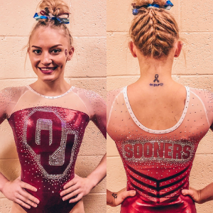
No. 6: My only complaint about this is how large the “OU” is on the front. I love the concept of outlining it in sparkles, but it’s just a tad too big for my liking. I love everything else about it, from the ombre sleeves to the little V of lines on the bottom of the back.
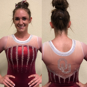
No. 7: This is a classic design but a good one. I enjoy how the sparkles come down in a burst-like pattern from the neckline—probably my favorite part of this design. The mesh sleeves give it just a little more elegance that I enjoy.
No. 8: I love the athletic look of this! The stripes are a classic, Adidas-like look that’s done very nicely. OU had a very similar leo that was all crimson, but I really like how the white sleeves complement the body design and give it more contrast.
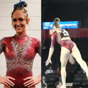
No. 9: This is another solid crimson and white leo for the Sooners. I’ve always loved the criss-cross sparkle design, and I love the sparkle cuff on the sleeve and the “Sooners” down one sleeve..
No. 10: My favorite part of this is the open back and how the sparkles continue around the neck to the back with a touch of sparkly “Sooners” underneath. The front is clean but has pizazz; I actually like the sparkle design, too. It’s simple, clean and an overall win.
Claire
No. 1: Hands down, this is Oklahoma’s best leotard. It reminds me of a really fancy football (I mean that in the best possible way). The crystal and mesh boat neck complements the jeweled sweetheart bodice perfectly, the ombré sleeves are subtle yet dramatic, and the back is just fabulous! THIS is how you do open back; THIS is how you do cutouts. The bands of crystals carrying over to the front really ties the whole thing together. It’s still a pretty busy leotard, but the design is beautifully intentional and cohesive instead of messy.
No. 2: Oklahoma leos have a tendency to live and die by the motto “more is more,” but this one is impeccably restrained. No camo mesh, no competing cutouts, just a gorgeous burst of white sparkle dripping into the red bodice and sleeves.
No. 3: So. Many. Crystals. I have a feeling those sparkly armored panels don’t feel so great to compete in but they look amazing—almost holographic! They really stand out next to the unfussy red body and OU logo. I especially love the juxtaposition of the sweet, simple white mesh sleeves with the badass studded dog collar piping around the neck and shoulders.
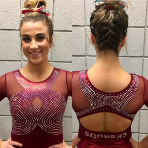
No. 4: Those evenly-spaced crystal waves look like they’re rearranging themselves around the little diamond cutout, which I think is very Oklahoma—maintaining order and perfection in the face of would-be chaos. I would’ve liked a little more *something* in the sleeves for balance—maybe crystal cuffs to match the neckline—but I still like the concept as a whole. I’ll never be too upset by a restrained Sooners’ leo!
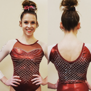
No. 5: They did a great job of focusing on one major design element and keeping the rest relatively clean. The rhinestone lattice against the deep red bodice is stunning, and the crystals outlining the sweetheart neckline and sleeves are the perfect finishing touch. Meanwhile, the plain red mesh and piping around the neck provides just the right definition (crystals would’ve been too much).
No. 6: This is essentially a bedazzled 1970s Eastern Bloc leo, so obviously I’m going to love it! While I do like the white sleeve version, the red sleeves bump up the drama and make the crystal ‘SOONERS’ really pop.
No. 7: This is some high intensity sparkle, and I dig it! The heavy crystal embellishment on the cuffs provide a much-needed visual counterpoint to that bonkers supernova around the neckline. The only drawback for me is the mesh shoulders and chest, which feels like an afterthought and doesn’t add anything.
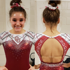
No. 8: The black and red criss-crossing looks so striking against the white mesh. The angular sweetheart neckline is an interesting variation; not my favorite, but it works well with the whole geometric vibe. I really don’t like the ‘BOOMER SOONER’ around the open back as it clashes with the overall aesthetic, but the red crystal OU logos against the white are killer!
No. 9: The sleeves sold me on this one. Black mesh sleeves paired with a red foil is always an acceptable leo design as far as I’m concerned, but the metallic swirls—while admittedly a little dated—really amp up the wow factor. We’re used to seeing either graphic mesh or crystal on sleeves, so this is a fun departure.
No. 10: Though pretty tame by Sooners’ standards, there are plenty of eye-catching elements to this leo. The notch in the neckline is really unique and all the crystal variations feel dynamic and fresh. This leo would probably rank higher on my list if not for that inexplicable armpit-to-hip mesh cutout…
Article by Elizabeth Grimsley, Tara Graeve and Claire Billman
Like what you see? Consider donating to support our efforts throughout the year! [wpedon id=”13158″]

