
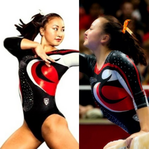
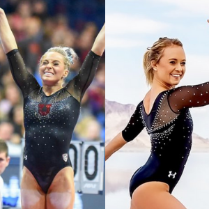
This summer we’re trying a little something new when it comes to our throwback leotard rankings. Rather than looking at single meets, we’ve decided to take a trip down memory lane for specific teams, taking into account a wide range of leos from different eras and finding our all-time favorites from a single program, as well as illustrating how designs have changed over the years.
Here’s how it’ll work: Our judges for the week will choose their top 10 and rank them based on their personal preferences. Plus, you’ll get a chance to tell us your thoughts! Did we leave out your all-time fave from the team? Let us know in the comments or on social media.
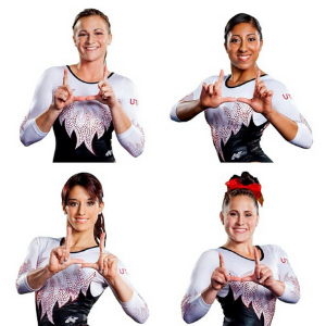
This week, we’re taking on Utah with senior Pac-12 editor Brandis and MPSF editor Claire joining Editor in Chief Elizabeth for the rundown.
Elizabeth
No. 1: I went back and forth a lot to find my No. 1 Utah leo, going between not just two but three or four. I decided on this one because I love the subtle ombre, the shade of red used in that ombre, the shiny fabric and the sparkle design on the front.

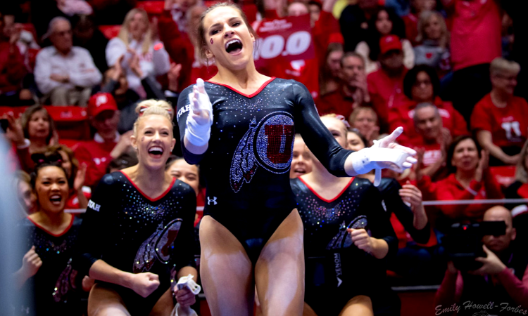
No. 2: For a while, Utah was in a pattern of most of its leos looking pretty similar. While this is a classic black leo, Utah breaks out of its shell with the design, bringing in an exorbitant use of rhinestones and a neat back.
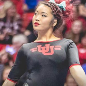
No. 3: I really love the simplicity of this throwback leo—the matte fabric, the simple UU logo and especially the shorter-than-normal sleeves. It’s just so retro; I love it.

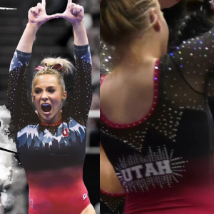
No. 4: The mountain leo is up there for me because of its uniqueness. Utah and mountains go hand in hand, and I love how it’s portrayed on this design. I do wish the idea was executed a bit better so it didn’t look quite as screen-printed on, but it’s still a solid leo overall.

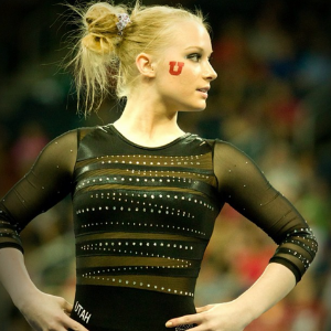
No. 5: I don’t remember liking this leo that much when it was first debuted, but when looking through all the designs, I decided it’s up there in my top five. I like the use of this logo vs. the plain block U, and I also like the simplicity of the all-black design with red neckline and cuffs.

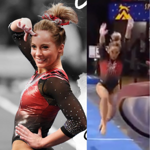
No. 6: I love the bold red look with black to ombre sleeves, plus the sheer amount of silver sparkles used not only on the body but the sleeves as well. This would have been even higher on my list had it not had a straight-across design at the neckline and instead been a V or a sweetheart or something similar.
No. 7: The ombre is my favorite part of this leo, closely followed by the sparkle design on the top. The shades used in the ombre are similar to the top leo on my list, making this a win for sure.

No. 8: This design was in the first round of Utah UA leos after its big apparel deal. My complaint with that era was that all the leos pretty much looked the same—black body, white shiny sleeves, red accents—and I’m glad it’s branched out since then. I like this design in particular because of the red being on the sleeves in that sort of veiny design.
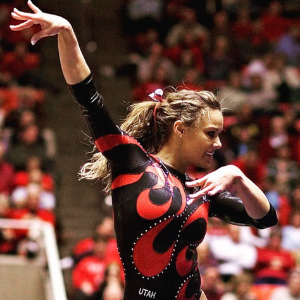
No. 9: I like to think of this as one of the original flamey designs, a style that’s pretty popular now. I like this one for the large amount of white, as well as the majority of the design being done with rhinestones rather than fabric.
No. 6: Utah: Like my UCLA choice, this is a departure from the school’s colors that still stays true to the Utah identity (and in a way that’s respectful to the school’s affiliated Native American tribe). Any leo that can accomplish that is a big win in my book.
Brandis

No. 1: The design is stunning and unique while also paying homage to Utah and Salt Lake City. The colors all work so well together and the skyline silhouette cast onto the mountains is lovely to look at.

No. 2: I’m a big fan of Utah using the black leos, mostly because the red and white look so good on it. The red design here is so vibrant outlined by the white, and the rhinestones are a nice touch without being too much.
No. 3: The Utah logo on the side is stunning and I like how the rhinestones start from the top stop to make way for it. Also, I’ve noticed a trend in my top three with the bright red neckline. Clearly, I love it.
No. 4: The only red leo that made my list gets on there thanks to my love of ombre. I like how the transition from red to black not only happens at the bottom of the leo and the sleeves, but there’s also some black up top too.
No. 5: My favorite part about this leo is that the horizontal mesh cutouts and rhinestones don’t match up. It adds a lot of character to this leo that would otherwise suffer from being just black and mesh.

No. 6: I like the use of the flames design to be the transition from white to black. The matching red rhinestones do great to make the switch less drastic while also bringing in that classic Utah red.
No. 7: The sunburst is one of my favorite designs and this is easily Utah’s best leo featuring it. I like the red “veins” down the length of the sleeves as well as how the white from the sleeves goes onto the neckline and into the black torso.

No. 8: The movement in the design instantly draws my eyes in. I like the rhinestones being a part of the swirl, but some more throughout the whole leo could’ve added even more appeal and taken it to the next level.
No. 9: I love how the ribbon design flows diagonally across the leo and intertwines a stripe of rhinestones as well. Like my previous pick, I think some more rhinestones could’ve gone a long way.
No. 10: Like many of my picks before it, I love how the white and the black contrast each other on this leo. My favorite part is how deep down on the leo the white continues, but I wish they used just a bit more red in the design overall.
Claire
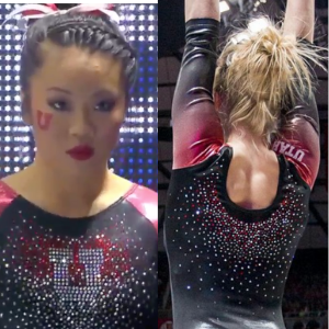
No. 1: The Skyline Leo is one of my all-time favorites from any team (believe me, I’m as surprised as you are). I generally don’t care for graphics on leos but everything about this design is flawless and well-executed, from the red lower bodice melting into the Salt Lake City silhouette to the detail of the snow-capped mountains surrounded by a sparkly mesh sky and especially the mountain detailing around the sleeves. Everything about this one is so good!
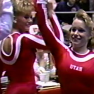
No. 2: Throwing it back to the Missy Marlowe years. The design is shockingly restrained for this era (I’m looking at you, 1991 Kim Zmeskal…), and the leo works because of its clean simplicity. The neck and keyhole back with the combination big and small white piping proves leotards don’t have to be bedazzled to be eye-catching!
No. 3: So, so glamorous! I love the confetti-like explosion of red and white sparkles overlaying that deep mesh V on the bodice, and the rhinestone cuffs and collar add the perfect burst of drama. Add a skirt and you could wear this to the Oscars (or keep it as is and wear it to the Grammys).

No. 4: Another example of “less is more.” The red and white starbursts around the neckline and wrist add a nice touch of bling without being overwhelming. The Red Rocks also had a version with only white sparkles that, while still pretty, just didn’t have the same flair.

No. 5: By now, you may have noticed a pattern emerging: I like simple black leos with some sort of striking detail up top, and this might just be the ultimate exemplar. The mesh and rhinestone detailing around the neckline couldn’t be any lovelier, and the wet-looking material of the sleeves and body keeps this from being just another “boring black” leo.
No. 6: Layering contrasting colors and textures can be risky, but they’ve pulled it off. The red zigzag and piping really pop! While I’m not typically a fan of midriff mesh, this actually enhances the overall design. Also, the three-quarter length sleeves add just the right amount of extra sparkle without veering into the gaudy.

No. 7: The different-sized red rhinestones take this from 1992 Unified team to pure Utah: functional and unfussy but with just enough thoughtful details to hold your interest.
No. 8: I picked this one for all my fellow gymnerds over 30 who spent their angsty teen years blasting Elliott Smith’s “Figure 8” and the White Stripes’ “DeStijl” (Google the album covers, and you’ll understand). The swirls are a fun departure from the usual stripes, and the single swoosh of sparkle is just enough.
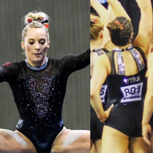
No. 9: I love how the only red is the big, sparkly U jumping out at you. For me, the best part about this one is its back. I’m not sure whether or not they intentionally turned the scoop neckline into another U, but they did, and it’s really gorgeous.

No. 10: I actually found another red one I like! The elaborate ombré sleeves stand out really nicely against the plain red body. I especially like that they’re double ombré, fading from black at the wrists to red and back to black at the shoulders.
Honorable Mention: I love the front of this leo. I love the back of this leo. However, I do not love the front and back of this leo together. They aren’t even the same shade of red… Come on!
Article by Elizabeth Grimsley, Claire Billman and Brandis Heffner
Like what you see? Consider donating to support our efforts throughout the year! [wpedon id=”13158″]


