
This summer we’re trying a little something new when it comes to our throwback leotard rankings. Rather than looking at single meets, we’ve decided to take a trip down memory lane for specific teams, taking into account a wide range of leos from different eras and finding our all-time favorites from a single program, as well as illustrating how designs have changed over the years.
Here’s how it’ll work: Our judges for the week will choose their top 10 and rank them based on their personal preferences. Plus, you’ll get a chance to tell us your thoughts! Did we leave our your all-time fave from the team? Let us know in the comments or on social media.
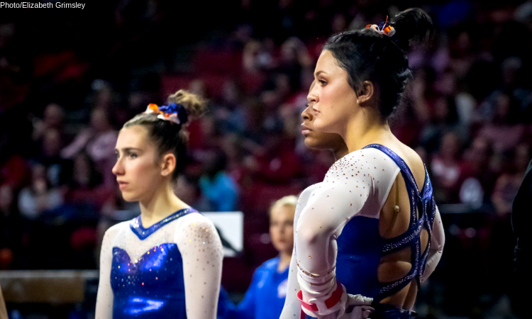
This week, we’re taking on Florida with Emily M, our managing editor, and Katherine, our SEC senior editor, joining Editor in Chief Elizabeth for the rundown.
Elizabeth

No. 1: Potentially an unconventional pick, but I LOVE the simplicity, the shiny orange and the big blocks of white. Florida, if you wear this as a throwback at some point, I will love you forever. Also, this version of the same design but in blue is also a fave.

No. 8: Florida: A lot of Florida leos tend to look similar, but that is not the case for this one. The light blue color is such a breath of fresh air for the Gators.

No. 3: Florida never fully got on the ombre train, but this one proves that it needs to. I love this black to blue gradient, as well as the angular neckline. It’s just so great. Why don’t you wear this more??

No. 4: The sheer amount of sparkle on this leo is what puts it so high on my list. It’s fabulously extra, and paired with the blue and black it looks so great.
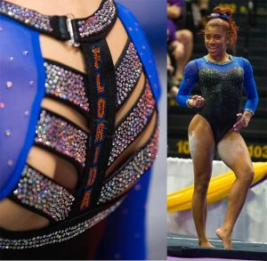
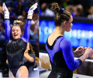
No. 5: The back is what seals the deal on this one for me. I remember when we judged it this season I didn’t rate it super high, but my opinions have changed. I love the unique design paired with the school spirit, plus the simple yet classic front.

No. 6: What I like most about this leo is the shade of blue used, as well as the simplicity, the silver and white accents and the square shape of the back neckline.
No. 7: I tend to like Florida’s blue with black leos more than its blue with white ones. I enjoy this one because of the design on the front as well as the thicker neckline in particular.

No. 8: This leo is so simple, but it takes me back to a time where Florida leos didn’t all look the same. It pairs some of my favorite leo elements with a sweetheart neckline, good placement of sparkles and mesh white sleeves. I’m hoping for an updated version with ombre sleeves in the future.

No. 9: I typically wouldn’t like this leo or the design, but the mesh with sparkles on top is what does it for me. I also really like the “Gators” down the sleeve. It’s pretty off-brand for Florida, so maybe that’s what makes me like it too; it’s not the same-old same-old.

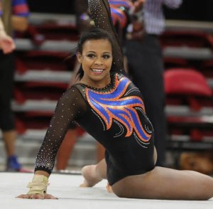
No. 10: I went with full-on school spirit for my last choice in my top 10. A normal single-tone Gator logo in rhinestones probably wouldn’t have done it for me, but the fact that it’s in full color with greens, oranges and blues puts it over the top and fully accounts for the otherwise all=black leo with orange lining.
Honorable Mentions: Like normal, I couldn’t just pick 10. These honorable mentions have an element or two that I adore but the leo as a whole isn’t an overall win, making them not quite fit into my top 10. This one for its back. This one for its back and gator skin design. And this one for its serious throwback vibes.
Emily M

No. 1: So blue. So regal. So shiny.

No. 2: This is such an old-school ‘80s throwback, and I am HERE for it.

No. 3: If you’re going to do a deep V, you better do it with this much pizzaz.

No. 4: That ombre though. I love the blue/black Florida looks.

No. 5: I know it’s a weird pick, but matte black forever.

No. 6: All black everything.

No. 7: It’s all about that back!

No. 8: It’s so simple, but with that back it just works!

No. 9: Oooh, that sparkley Gator.

No. 10: Not the best-executed orange leo, but it’s an entirely orange leo! A million bonus points and try again, please!
Katherine

No. 5: Florida: This is the only Florida leo I’m really passionate about. The color is everything; it’s a simple design, but the bright blue makes it truly striking. The sparkles going down the chest are perfection. I don’t see a flaw.
No. 2: Florida isn’t the only school with blue and orange as its colors, but the way the two are interposed with black here gives this leo a distinctly Florida look. I really like the design, especially the sleeves. Super cute!

No. 3: Another lovely mix of blue, orange and black. You don’t usually see the sides of the leo as a place for a cool design, but this leo does just that, and the orange accent looks great there. The orange sparkles on the neckline are also really pretty.

No. 4: Here’s that pretty light blue again. It’s like I have a type or something! I really like the subtlety of the stripes on the front; any thicker and I definitely wouldn’t have liked it as much. Also love the ombre sleeves—always a favorite design of mine!

No. 5: Love the different hues of blue and indigo here, and the design on the front is so gorgeous—so many different patterns of beading, but it totally works.

No. 6: These sleeves are so cool! I seriously love seeing something shiny and sparkly that isn’t just the typical tiny rhinestones. This would have been ranked higher, but the rest of the leo is just too bland in comparison, and there’s something off about the shade of blue, but I can’t place what it is.

No. 7: I didn’t love this at first glance, but something about the black and orange grew on me (similar to why I liked my No. 2 pick). I also like the black material that makes up the body; the “UF” looks great against it.

No. 8: I’m ranking this light blue leo the lowest because of the slightly weird neckline where it goes into the white. There’s only so much you can do with blue and white, though, and I give it points for a unique design there.

No. 9: This pick will definitely draw some raised eyebrows, but I’m really here for it; it’s hard to say why! It reminds me of this Nebraska leo (which was also pretty controversial). I liked that one too because of the artistic incorporation of the “nude” mesh with the rest of the colors, which I feel is also really evident here. The sparkles seal the deal.

No. 10: At least one of the orange leos had to make the list because that’s my favorite underrated leo color. I would love to put this one higher, but I think the design could have been done a little better (how about some more sparkles like the other looks?).
Article by Elizabeth Grimsley, Emily Minehart and Katherine Weaver
Like what you see? Consider donating to support our efforts throughout the year! [wpedon id=”13158″]


