Teams saved the best for last with many of these new leos debuted by teams wrapping up their season. The criteria is the same as always: up to three points for design; two points for fabric and sparkle; two points for school spirit; and three points for overall appearance. This week’s guest judges are our Big 12 and MRGC editor Tara and our EAGL and ECAC editor Mary Emma.
Temple: 8.767
https://twitter.com/TUWG/status/1113912081877749762
| Design | Fabric/
Sparkle |
School
Spirit |
Overall
Appearance |
Total | |
| Elizabeth | 2.4/3 | 1.7/2 | 1.9/2 | 2.5/3 | 8.5/10 |
| Tara | 2.5/3 | 1.8/2 | 1.9/2 | 2.6/3 | 8.8/10 |
| Mary Emma | 2.7/3 | 1.7/2 | 2.0/2 | 2.6/3 | 9.0/10 |
Elizabeth: Temple always does a really good job incorporating school spirit in unique ways! The diamond pattern is utilized well here, and the red accents made the design pop. I also love the black body with black mesh sleeves concept. Plus, it looks really great on.
Tara: LOVE! It’s super unique, but like the other new Temple leos, it’s gorgeous! I really appreciate Temple doing something different with the sparkle pattern that actually looks good, which is a win. Plus, the “T” on the back and accents of red are nice ways of incorporating school spirit that also go well with the overall design.
Mary Emma: This is gorgeous! I’ve really been loving Temple’s new leos this year. I really like the sparkles, and the “T” on the back fits in well and doesn’t look tacky.
California: 8.600
Brand new sparkles for the Second Round.#NCAAGym #LeoWatch pic.twitter.com/FApdp62pCc
— Cal Gymnastics (@CalWGym) April 5, 2019
| Design | Fabric/
Sparkle |
School
Spirit |
Overall
Appearance |
Total | |
| Elizabeth | 2.6/3 | 1.8/2 | 1.7/2 | 2.7/3 | 8.8/10 |
| Tara | 2.5/3 | 1.8/2 | 1.7/2 | 2.6/3 | 8.6/10 |
| Mary Emma | 2.4/3 | 1.8/2 | 1.6/2 | 2.6/3 | 8.4/10 |
Elizabeth: I think this is my favorite Cal leo. It’s gorgeous and looked amazing in action. The ombre is great, the darker look overall is great and the bold white accents are especially great. An overall win for me here.
Tara: This is another gorgeous Cal leo! The Golden Bears have really been on a great leotard game the past two seasons, and this is no different. I’ll never not love the navy to white ombre, and it has the right amount of sparkle. I, like Mary Emma, also don’t love the white stripes on top, but that’s about all I don’t love about this.
Mary Emma: This is pretty. Of course, I love the ombre on both the sleeves and the body, and the sparkles are nice. The only thing I don’t love is the stripes on top, but that’s really my only complaint. Overall, this one is a win!
Auburn (Friday): 8.467
https://twitter.com/auburngym/status/1114241461036429312?s=21
| Design | Fabric/
Sparkle |
School
Spirit |
Overall
Appearance |
Total | |
| Elizabeth | 2.5/3 | 1.7/2 | 1.7/2 | 2.6/3 | 8.5/10 |
| Tara | 2.4/3 | 1.7/2 | 1.6/2 | 2.7/3 | 8.4/10 |
| Mary Emma | 2.4/3 | 2.0/2 | 1.5/2 | 2.6/3 | 8.5/10 |
Elizabeth: Ooo, yes! The feather design is great and really plays up the “War Eagle” mascot in a great way. I love the white top ombre-d into navy and with orange accents. This is so elegant and classy overall, and one of my favorite Auburn leos of all time—I think because it downplays an unfavorable color combo.
Tara: Love! I appreciate how Auburn is trying different ways to make its colors look good together on a leo without being too overpowering. I love the ombre body, and pairing the design with white makes the blue and orange feathers look amazing. It’s a win for Auburn.
Mary Emma: I really like this one. This is really nice and different from most of Auburn’s other leos. I absolutely love the ombre body and the sleeves are so pretty with just the right amount of sparkle.
Stanford: 8.400
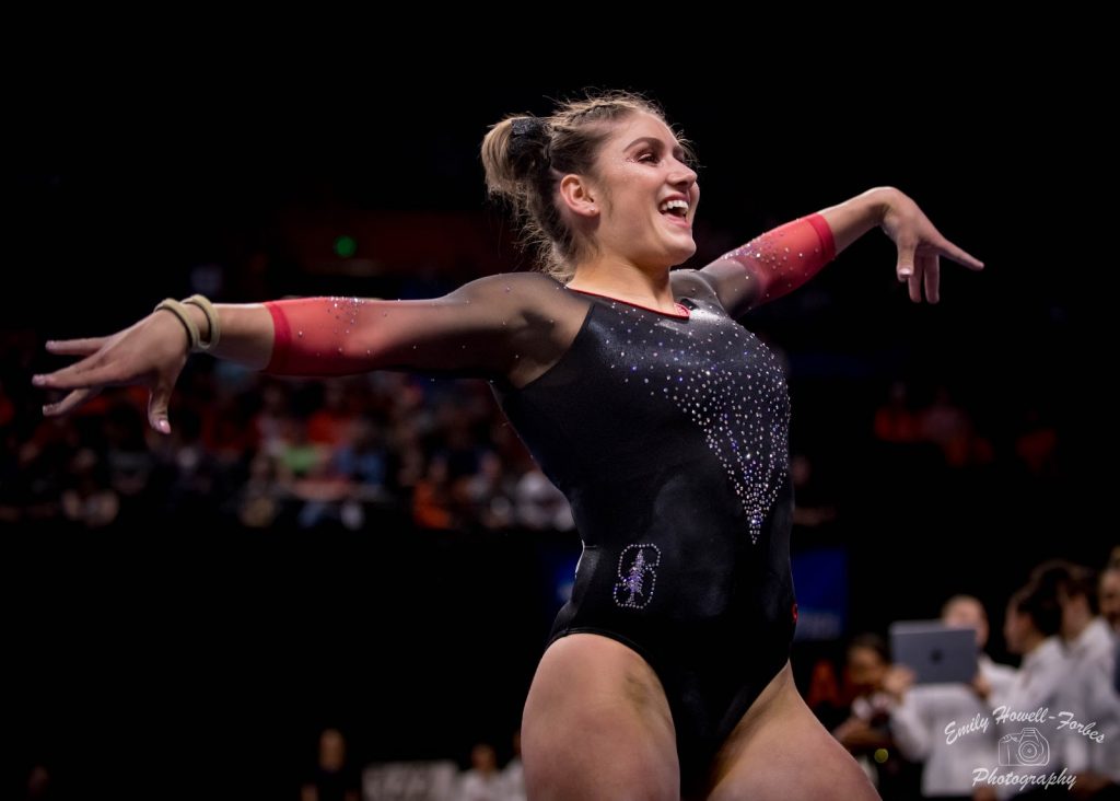
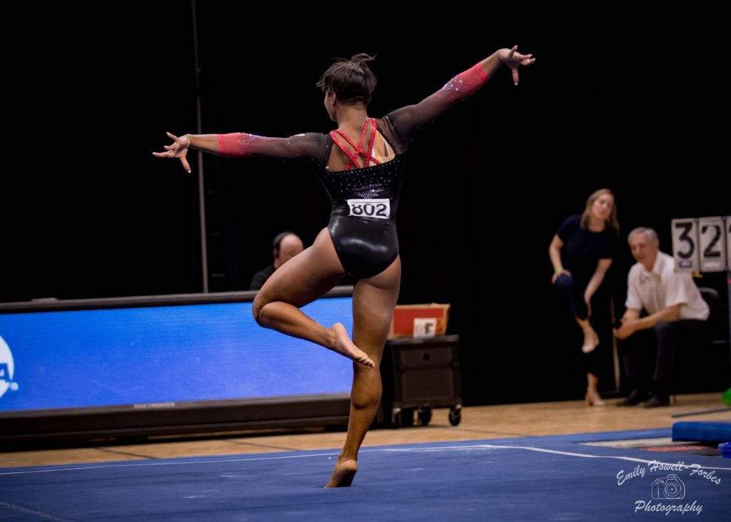
| Design | Fabric/
Sparkle |
School
Spirit |
Overall
Appearance |
Total | |
| Elizabeth | 2.5/3 | 1.7/2 | 1.7/2 | 2.6/3 | 8.5/10 |
| Tara | 2.5/3 | 1.7/2 | 1.6/2 | 2.5/3 | 8.3/10 |
| Mary Emma | 2.7/3 | 1.7/2 | 1.5/2 | 2.5/3 | 8.4/10 |
Elizabeth: This is great! I don’t like it quite as much as the all red with ombre sleeves it has, but this is another really nice design. The back straps are awesome, the sleeves are gorgeous of course, and the front design isn’t bad at all!
Tara: This is nice! I enjoy the ombre on the sleeves paired with the black body. I love the front rhinestone design, and the addition of the Stanford logo on the hip is a nice touch. I enjoy the strappy back as well.
Mary Emma: This is pretty! It looks very similar to the new Nebraska leos, with the ombre sleeves and the elegant body. I have to say I like this one a little bit more though because I prefer the strappy back.
George Washington: 8.167
🚨NEW LEO ALERT🚨#RaiseHigh | #AllTeam pic.twitter.com/SO23Kqgu3x
— GW Gymnastics (@GW_Gymnastics) April 5, 2019
| Design | Fabric/
Sparkle |
School
Spirit |
Overall
Appearance |
Total | |
| Elizabeth | 2.4/3 | 1.7/2 | 1.8/2 | 2.5/3 | 8.4/10 |
| Tara | 2.3/3 | 1.7/2 | 1.9/2 | 2.4/3 | 8.3/10 |
| Mary Emma | 2.2/3 | 1.8/2 | 2.0/2 | 1.8/3 | 7.8/10 |
Elizabeth: One of the best GW leos! And it didn’t even leave out my favorite aspect, a sparkly George Washington head! I love the use of the pale gold with the navy, and the design is really nice too.
Tara: GW figured out how to leo! I really like this, and it’s hands down one of its best leos. Usually GW leos are too over the top and busy for my liking, but this is not. I enjoy the ombre and touch of sparkles. And obviously including George Washington on the arm is amazing for school spirit.
Mary Emma: Oh hey, a George Washington leo that isn’t over the top! I really like this one. I love how shiny it is, and the sparkles are really nice. I don’t particularly like the shade of gold on the arms, but other than that, this is solid!
Nebraska: 8.233
https://www.instagram.com/p/Bv4wiUvHduI/?utm_source=ig_share_sheet&igshid=wyz4u5ybu6qv
| Design | Fabric/
Sparkle |
School
Spirit |
Overall
Appearance |
Total | |
| Elizabeth | 2.4/3 | 1.4/2 | 1.6/2 | 2.4/3 | 7.8/10 |
| Tara | 2.6/3 | 1.9/2 | 1.7/2 | 2.7/3 | 8.9/10 |
| Mary Emma | 2.5/3 | 1.7/2 | 1.5/2 | 2.3/3 | 8.0/10 |
Elizabeth: A number of teams have this style of back now, and I think it’s my favorite. It just works so well with the gymnasts’ muscular shoulders and backs. Despite its funkiness, this leo is pretty unlike Nebraska’s normal designs and is almost more tame than usual. I love it all the same though.
Tara: I love this! I love the design on the front, the ombre sleeves are gorgeous, and I really enjoy the back of this as well! I especially like how the rhinestones accentuate the back cutout. It has just the right amount of sparkle and the “N” on the sleeves gives it a little more school spirit.
Mary Emma: This is nice! I love the ombre sleeves, of course, and it looks very elegant. I haven’t been a fan of a lot of new Nebraska leos lately, but I really like this one.
West Virginia: 8.000
https://twitter.com/wvugymnastics/status/1114277383211769856?s=21
| Design | Fabric/
Sparkle |
School
Spirit |
Overall
Appearance |
Total | |
| Elizabeth | 2.2/3 | 1.7/2 | 1.8/2 | 2.3/3 | 8.0/10 |
| Tara | 1.9/3 | 1.4/2 | 1.7/2 | 1.7/3 | 6.7/10 |
| Mary Emma | 2.6/3 | 2.0/2 | 2.0/2 | 2.7/3 | 9.3/10 |
Elizabeth: I like this a lot! The gold bands give it an athletic yet throwback look, and the WVs make it burst with school spirit. I also really like the fabric and coloring used on the top and how it is kind of shimmery and kind of ombre-y?
Tara: I don’t love this, but I don’t hate it either. It’s solid and way better than the original throwback leo. I love the ombre—you really can’t go wrong with navy and white. The gold accent stripes are nice, but I wish the “WV” was incorporated better. It just seems off for the design. And why is it needed on the front AND the back? A+ for school spirit though.
Mary Emma: LOVE THIS! First off, It’s based on a throwback leo, which I love. I wish more teams did updated throwbacks like this. I love the blue to white ombre top with just the right amount of sparkle, and I like the way the “WV” is incorporated into the stripes.
Michigan: 7.800
Stuck dismount for Lauren Farley and she is super excited. That is a 9.875 to lead our rotation. #GoBlue pic.twitter.com/JVsidQPZ4T
— Michigan Women’s Gymnastics (@UMichWGym) April 6, 2019
| Design | Fabric/
Sparkle |
School
Spirit |
Overall
Appearance |
Total | |
| Elizabeth | 2.2/3 | 1.5/2 | 1.7/2 | 2.3/3 | 7.7/10 |
| Tara | 2.4/3 | 1.6/2 | 1.8/2 | 2.4/3 | 8.2/10 |
| Mary Emma | 2.3/3 | 1.3/2 | 1.8/2 | 2.1/3 | 7.5/10 |
Elizabeth: I liked this overall, and think it’s cool that one of the field hockey players helped design it! The way the mesh part wraps around is clever, and I like the yellow accents as well. In general, there’s nothing revolutionary going on, but that’s not a bad thing either.
Tara: I really like this! I like the yellow accent stripes; it’s a great way to incorporate maize into the leo. I think what I really enjoy about this is how the stripes run diagonal–it’s just really appealing to my eyes. The balance of mesh and non-mesh is great and the sparkles are lovely. Overall a win for Michigan!
Mary Emma: This is pretty. I don’t love it as much as some of Michigan’s other leos, but it’s not bad by any means. I don’t love the mesh cutouts (as we all know) but other than that, this is a really pretty design. The maize accents are a really nice touch.
Alabama: 7.733
We're rolling into the #NCAAGymnastics Championships round two at the Ann Arbor Regional in style with a new leo!!!#EarnIt #LegacyOfChampions #RollTide pic.twitter.com/BTKBrgwjbF
— Alabama Gymnastics (@BamaGymnastics) April 5, 2019
| Design | Fabric/
Sparkle |
School
Spirit |
Overall
Appearance |
Total | |
| Elizabeth | 2.4/3 | 1.9/2 | 1.5/2 | 2.5/3 | 8.3/10 |
| Tara | 1.7/3 | 1.6/2 | 1.4/2 | 1.8/3 | 6.5/10 |
| Mary Emma | 2.6/3 | 1.8/2 | 1.3/2 | 2.7/3 | 8.4/10 |
Elizabeth: I am into this! I looove the shiny silver fabric used, and the design really works. This is so different than Alabama normally wears, but I think I’m obsessed. The white arms are also a great addition.
Tara: I’m not a huge fan of this. It’s OK but not my favorite of all time. I appreciate the “Bama” on the back. It’s not an inherently bad leo. There’s just something about it that I can’t pinpoint that makes me not absolutely love it.
Mary Emma: This is really pretty! It’s completely different from anything else that Alabama has, and I love that. The silver body with the white arms and red and white swirls meshes together really well. I got to see it in person, and it looks even better than the pictures.
Georgia: 7.633
198.050. What a night. pic.twitter.com/Kj927DzQuI
— Georgia Gymnastics (@UGAGymnastics) April 7, 2019
| Design | Fabric/
Sparkle |
School
Spirit |
Overall
Appearance |
Total | |
| Elizabeth | 2.3/3 | 1.6/2 | 1.5/2 | 2.5/3 | 7.9/10 |
| Tara | 2.3/3 | 1.6/2 | 1.4/2 | 2.3/3 | 7.6/10 |
| Mary Emma | 2.2/3 | 1.6/2 | 1.3/2 | 2.3/3 | 7.4/10 |
Elizabeth: This is great! It’s very dominatrix, and I especially love the back. The front isn’t my favorite. Maybe if it wasn’t a choker style I would like it more. However, I do really appreciate the fact that it’s obvious the open back is supportive enough because of all the straps since they obviously aren’t wearing a bra. The perfect leo for a blackout.
Tara: I like this. The black is really elegant and it has the right amount of sparkle. The front is fine; the deep V isn’t always my favorite but it works in this case. But the real star of the show is the intricate back, which I love! I just wish it had something on it that screamed “Georgia” to me besides the tiny logo on the sleeve.
Mary Emma: This one’s fine. It’s kind of plain, so I don’t really have much to criticize, but nothing really stands out either. My favorite part is definitely the rhinestone accent around the neck and the front.
Kent State: 7.500
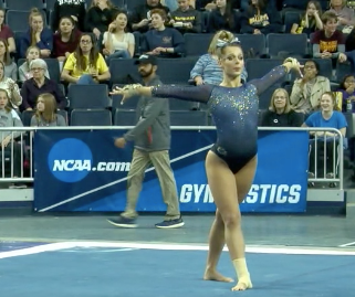
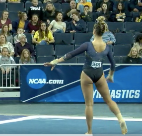
| Design | Fabric/
Sparkle |
School
Spirit |
Overall
Appearance |
Total | |
| Elizabeth | 2.4/3 | 1.6/2 | 1.4/2 | 2.5/3 | 7.9/10 |
| Tara | 1.7/3 | 1.2/2 | 1.3/2 | 1.7/3 | 5.9/10 |
| Mary Emma | 2.5/3 | 2.0/2 | 1.7/2 | 2.5/3 | 8.7/10 |
Elizabeth: This is pretty simple, but I think that’s what I like about it. The shade of blue is muted yet nice, and I love that yellow was used as an accent color in the sparkles to bring in more school spirit. Plus a sweetheart neckline is my favorite.
Tara: I think I’d like this better if I had a better look at it. I like the concept and including yellow/gold rhinestones is a nice touch. I think it’s just a little too simple for me.
Mary Emma: I really like this one! The blue is really pretty, and I love the ombre effect between the top and the bottom. Also, the gold rhinestones are a really nice touch!
Iowa State: 7.267
https://www.instagram.com/p/Bv4gxLCnc4W/?utm_source=ig_web_options_share_sheet
| Design | Fabric/
Sparkle |
School
Spirit |
Overall
Appearance |
Total | |
| Elizabeth | 1.8/3 | 1.4/2 | 1.6/2 | 1.9/3 | 6.7/10 |
| Tara | 2.0/3 | 1.8/2 | 1.3/2 | 2.5/3 | 7.6/10 |
| Mary Emma | 2.3/3 | 1.7/2 | 1.0/2 | 2.5/3 | 7.5/10 |
Elizabeth: This is fine. It’s a good design overall, but there’s nothing special or unique about it. The shade of red used it really lovely though.
Tara: I like this! It’s simple yet classy, and the balance of mesh and non-mesh is good. The sparkles are a nice touch and the Iowa State rhinestone logo on the back is a good representation of school spirit. I think I like the back more than the front—the shape of the mesh cutout isn’t my favorite—but it also looks good in motion so I can’t gripe too much. Overall a nice leo for the Cyclones.
Mary Emma: This is nice! I love the shade of red and the sparkles. It looks very elegant. I’m not a huge fan of the mesh cutout, and it could use a bit more school spirit, but other than that this is a win.
UCLA: 7.266
https://twitter.com/uclagymnastics/status/1114673873851691010
| Design | Fabric/
Sparkle |
School
Spirit |
Overall
Appearance |
Total | |
| Elizabeth | 2.0/3 | 1.8/2 | 1.5/2 | 2.3/3 | 7.6/10 |
| Tara | 1.8/3 | 1.0/2 | 1.3/2 | 1.5/3 | 5.6/10 |
| Mary Emma | 2.5/3 | 1.8/2 | 1.6/2 | 2.7/3 | 8.6/10 |
Elizabeth: I prefer this colorway to the Super Six leo from last year. The ombre is really nice, and I love that UCLA (finally) utilized its actual school color. I still don’t care for the weird faux medal-like design on the neckline, but you can’t always get what you want.
Tara: The thought was right with this leo. I love the design, but I don’t love the execution. For me, there’s not enough contrast with either sparkles or colors in the design to make it interesting. It’d be better if it was blue to a different color ombre instead of blue to lighter blue to make it pop more. I much prefer the other similar design that UCLA has. I do love the crossy back though.
Mary Emma: This one is basically identical to the one from Super Six last year, but with a different color combo. I have to say, I like this one more! The shade is very UCLA, and I love that’s it’s simple, yet elegant.
Iowa: 7.100
New look, same mentality #StandOut pic.twitter.com/PiHTWtRN5C
— Iowa Gymnastics (@IowaGymnastics) April 4, 2019
| Design | Fabric/
Sparkle |
School
Spirit |
Overall
Appearance |
Total | |
| Elizabeth | 1.9/3 | 1.5/2 | 1.6/2 | 2.0/3 | 7.0/10 |
| Tara | 1.9/3 | 1.4/2 | 1.8/2 | 2.0/3 | 7.1/10 |
| Mary Emma | 2.3/3 | 1.3/2 | 1.8/2 | 1.8/3 | 7.2/10 |
Elizabeth: I like this overall. I’m pleased with the trend of Iowa using black with white accents rather than black with nude (although I’m a fan of nude mesh unlike some of my peers). However, the weird holes continue on the back, and that’s not my thing…
Tara: This is another solid Iowa leo. I like the trend of using black, and this is done quite nicely. But it is similar to many other Iowa leos. I wouldn’t want to try to incorporate Iowa’s colors into a a leo, so I’m glad that it’s been going the all black route. I like the white criss cross and the sparkle accents that show spirit despite having no actual yellow in the leo.
Mary Emma: This is fine. It’s not a bad design or anything, but pretty much every Iowa leo looks similar, and there’s nothing really special about this one that stands out from the rest. I do love the white criss cross stripes on the front, and it does have a lot of school spirit.
Auburn (Saturday): 6.700
Sweet Stixteen ➡️ New leo
We're debuting our ribbon leos for tonight's Regional Final! ✨#LeoWatch | #WarEagle pic.twitter.com/86hCcY6rUn
— Auburn Gymnastics (@AuburnGym) April 6, 2019
| Design | Fabric/
Sparkle |
School
Spirit |
Overall
Appearance |
Total | |
| Elizabeth | 1.8/3 | 1.3/2 | 1.5/2 | 1.9/3 | 6.5/10 |
| Tara | 1.9/3 | 1.5/2 | 1.7/2 | 2.0/3 | 7.1/10 |
| Mary Emma | 1.5/3 | 1.5/2 | 1.8/2 | 1.7/3 | 6.5/10 |
Elizabeth: This is fine. It’s more similar to a lot of other Auburn leos than the one it wore on Friday, but it’s not a bad design. I like the back holes in particular, especially how they’re almost a part of the fabric, if that makes sense. The front is fine, but kind of a plain ribbon design.
Tara: This is solid. I like the incorporation of orange in the rhinestones—it’s more subtle. I think the back is my favorite part of this, but the front isn’t bad either.
Mary Emma: This one’s just OK. The front just has too much going on for me, and I don’t really like the cutouts in the back. The colors of the fabric and the rhinestones are really pretty though!
Oklahoma (Saturday): 6.533
https://twitter.com/OU_WGymnastics/status/1114657115249967110
| Design | Fabric/
Sparkle |
School
Spirit |
Overall
Appearance |
Total | |
| Elizabeth | 2.0/3 | 1.2/2 | 1.8/2 | 2.1/3 | 7.1/10 |
| Tara | 2.1/3 | 1.3/2 | 1.5/2 | 2.3/3 | 7.2/10 |
| Mary Emma | 1.4/3 | 1.3/2 | 1.2/2 | 1.4/3 | 5.3/10 |
Elizabeth: I really like this! The zebra to Friday’s giraffe. The stripes design is actually my favorite aspect. It looks great on and is placed in a way that’s flattering to the gymnasts. Take away the weird neck fabric parts, and this would have scored well into the 9s for me.
Tara: This has grown on me! Like Elizabeth, I don’t love the weird neck fabric. The stripes are almost too much (I might make the arms a little less bold), but I enjoy them. The addition of “Sooners” flows into the design nicely and it has just the right amount of sparkle.
Mary Emma: Well, I like this one better than the one from Friday. I do appreciate how unique OU’s leos are, but this one is just too wild for my liking. Again, the shade of red is pretty, as well as the sparkles, but it’s just too much for me personally.
Oklahoma (Friday): 6.300
https://twitter.com/OU_WGymnastics/status/1114297799934345217
| Design | Fabric/
Sparkle |
School
Spirit |
Overall
Appearance |
Total | |
| Elizabeth | 1.3/3 | 1.3/2 | 1.6/2 | 1.4/3 | 5.6/10 |
| Tara | 2.6/3 | 1.8/2 | 1.7/2 | 2.7/3 | 8.8/10 |
| Mary Emma | 1.2/3 | 1.3/2 | 1.0/2 | 1.0/3 | 4.5/10 |
Elizabeth: I of course like this. Not as much as the Saturday leo, but I’m always here for a funky design. My beef though is with the obvious misuse of sports bra in the back. I have a theory that something happened to some of the clear, no-show bras they were supposed to wear, so they all had to wear the black one to fit regulations. So that pretty much ruined the whole thing for me. Take that away, and my score would absolutely skyrocket up into at least the 8s.
Tara: I like this a lot! The front is absolutely stunning and well balanced between design and plain crimson. It’s very Oklahoma, but I think it’s one of my favorites of the recent Oklahoma leos. I don’t love the back, but the front makes up for it.
Mary Emma: First off, I would like to know what drugs the leo designer was on because wow. This is…something. I don’t really understand Oklahoma’s obsession with the spiderweb pattern (pretty sure it was on the last leo I judged too), and the cutouts are super weird. I love the shade of red and the sparkles, so I guess that’s something?
READ THIS NEXT: Leotard Rankings: Week 12
Article by Elizabeth Grimsley, Tara Graeve and Mary Emma Burton
Like what you see? Consider donating to support our efforts throughout the year! [wpedon id=”13158″]



One comment