We’re bringing back throwback leo rankings this offseason to tide you over until 2019 arrives! The criteria is the same as always: up to three points for design; two points for fabric, sparkle, etc.; and two points for school spirit; three points for overall appearance. Guest judges this week will be Alicia, our EAGL and ECAC editor and Christina, our Pac-12 editor. The meet? Feast your eyes on the women’s and men’s fashion trends of 1984 nationals: part I | part II.
Women
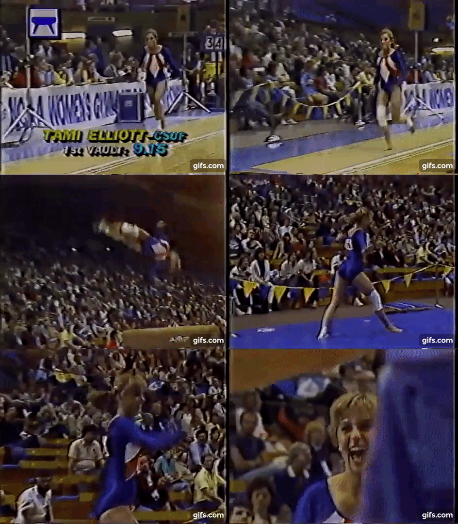
UCLA Women No. 2: 8.333

| Design | Fabric/
Sparkle |
School
Spirit |
Overall
Appearance |
Total | |
| Elizabeth | 2.3/3 | 1.5/2 | 1.8/2 | 2.4/3 | 8.0/10 |
| Alicia | 2.5/3 | 1.5/2 | 1.9/2 | 2.6/3 | 8.5/10 |
| Christina | 2.5/3 | 1.5/2 | 1.9/2 | 2.6/3 | 8.5/10 |
Elizabeth: I’m loving this. The vertical design isn’t not-flattering and the peek of yellow under the arms and on the sides is a fun touch. Bring it back, UCLA!
Alicia: I am obsessed with this and absolutely need UCLA to bring it back ASAP. The touch of yellow is so nice, especially since we rarely see UCLA with any yellow touches nowadays.
Christina: I was trying to decide what I thought of it when she lifted her arms. I saw the gold band, and I said, “Ooooh!” I quite like this look. I even wish there was more yellow—maybe along the border of the white design—but all in all this is probably one of my favorites of this meet.
Utah Women: 8.167

| Design | Fabric/
Sparkle |
School
Spirit |
Overall
Appearance |
Total | |
| Elizabeth | 2.6/3 | 1.6/2 | 1.4/2 | 2.7/3 | 8.3/10 |
| Alicia | 2.5/3 | 1.7/2 | 1.3/2 | 2.8/3 | 8.3/10 |
| Christina | 2.4/3 | 1.6/2 | 1.4/2 | 2.5/3 | 7.9/10 |
Elizabeth: I actually really really like this and wouldn’t be mad at all at a 2019 iteration. The color is gorg and the design athletic and flattering. My favorite parts are the white sides and V. My only gripe is it doesn’t scream Utah.
Alicia: I kind of love this? I probably would have ranked this higher if the arms didn’t have those weird cutouts, as I feel like it cuts the gymnast strangely.
Christina: This is decent. I am not a fan of the red bands on the sleeves, but I do like the V design on the bodice and the use of white and red on the entire leo. The design is very flattering as well. All in all, it’s a good look.
Cal State Fullerton Women: 8.100

| Design | Fabric/
Sparkle |
School
Spirit |
Overall
Appearance |
Total | |
| Elizabeth | 2.5/3 | 1.6/2 | 1.7/2 | 2.6/3 | 8.4/10 |
| Alicia | 2.5/3 | 1.8/2 | 1.8/2 | 2.5/3 | 8.6/10 |
| Christina | 2.0/3 | 1.4/2 | 1.7/2 | 2.2/3 | 7.3/10 |
Elizabeth: RIP Cal State Fullerton. I’m loving this almost America/Wonder Woman design (because it looks red in the pic and not orange like I’m assuming it was because blue and orange are Fullerton’s colors). It’s athletic and flattering. I just wish the design continued onto the back as well.
Alicia: Oh, this is fantastic! The shade of blue is everything, and I love that it incorporates all of Fullerton’s colors. I agree that my only issue is I wish the design continued onto the back, but this leo is BEAUTIFUL.
Christina: I feel like we’ve seen more or less this design recently. It’s OK; I don’t find it super flattering, but it does give a sort of athletic look. I wish there was more happening on the back, but points for incorporating the school’s colors.
Arizona State Women: 6.833

| Design | Fabric/
Sparkle |
School
Spirit |
Overall
Appearance |
Total | |
| Elizabeth | 1.8/3 | 1.4/2 | 1.5/2 | 1.9/3 | 6.6/10 |
| Alicia | 2.0/3 | 1.5/2 | 1.3/2 | 2.2/3 | 7.0/10 |
| Christina | 2.0/3 | 1.5/2 | 1.3/2 | 2.1/3 | 6.9/10 |
Elizabeth: This isn’t bad, but I think there’s a bit too much white for my taste. Maybe if the V started higher, it would be a bit better. I also wish there was a bit of yellow to add some school spirit, but overall it’s not a bad leo.
Alicia: I don’t mind this! I love that the piping has the red color as it breaks up what could have been a very boring white top. The white arrow in the middle between the reds seems awkward, and if it were to become a 2019 iteration, I’d love to see some ombre.
Christina: This is a bit similar to Utah’s, but I am not a fan of all this white at the top of the bodice. The V design is nice, but it’s not as flattering as it could have been. The red and white colors are nice, but I do wish for some gold or yellow in there.
Alabama Women: 6.533

| Design | Fabric/
Sparkle |
School
Spirit |
Overall
Appearance |
Total | |
| Elizabeth | 1.7/3 | 1.2/2 | 1.3/2 | 1.8/3 | 6.0/10 |
| Alicia | 2.0/3 | 1.8/2 | 1.7/2 | 2.0/3 | 7.5/10 |
| Christina | 1.7/3 | 1.1/2 | 1.5/2 | 1.8/3 | 6.1/10 |
Elizabeth: It’s weird seeing Alabama in RED. The design isn’t bad, but the leo is a bit too simple for me. I honestly like the warm up jacket better.
Alicia: I’m pretty into this and would love to see a 2019 iteration. I do wish the stripes on the front were a smidge larger, but compared to many leos of this time, it incorporated school colors in a more unique way than just blocks or triangles. Plus, I love the color!
Christina: This is very red for Alabama. The design is OK, although it’s a bit simple, and I don’t find it very flattering. A decent look overall.
Oregon State Women: 6.433

| Design | Fabric/
Sparkle |
School
Spirit |
Overall
Appearance |
Total | |
| Elizabeth | 2.0/3 | 1.6/2 | 1.4/2 | 2.1/3 | 7.1/10 |
| Alicia | 2.0/3 | 1.4/2 | 1.0/2 | 1.9/3 | 6.3/10 |
| Christina | 2.1/3 | 1.4/2 | 0.4/2 | 2.0/3 | 5.9/10 |
Elizabeth: I like the direction this was going in, but wish the blue in the stripes was black instead to go more with Oregon State’s colors. Otherwise, this is a pretty solid design.
Alicia: I want to like this a lot more than I do. The stripes are very cool, but I don’t feel it breaks up enough of the white leo. I wish the colors had been on some of the piping as well. Plus, if I didn’t know this was Oregon State, I wouldn’t have guessed! I wish there was a bit more school spirit.
Christina: There is about zero school spirit on this one, and I would have never guessed it was Oregon State. The overall design is, however, nice and fairly modern for its time.
Florida Women: 6.133

| Design | Fabric/
Sparkle |
School
Spirit |
Overall
Appearance |
Total | |
| Elizabeth | 1.7/3 | 1.5/2 | 1.8/2 | 1.8/3 | 6.8/10 |
| Alicia | 1.5/3 | 1.5/2 | 1.9/2 | 1.8/3 | 6.7/10 |
| Christina | 1.0/3 | 1.0/2 | 1.9/2 | 1.0/3 | 4.9/10 |
Elizabeth: Oh man. I nearly screamed. The design, the Florida logo, the colors—it’s all so retro. And it does make me wish Florida did some real orange and blue leos nowadays.
Alicia: All this needed was a literal Gator on the logo and it would have been the most school spirited leo in NCAA history. The retro UF logo is giving me life, and I love the shade of blue used. I wish the orange was incorporated in a different way because it kind of feels like a Karate belt.
Christina: Oh no, no, no. That orange band across the entire leo is just…no. I guess this is going for the whole cheerleader look, but, no. I guess, however, that school spirit is on point here, and I do like the neckline. But goodness this leo is just hideous.
UCLA Women: 4.533

| Design | Fabric/
Sparkle |
School
Spirit |
Overall
Appearance |
Total | |
| Elizabeth | 1.5/3 | 0.8/2 | 1.3/2 | 1.2/3 | 4.8/10 |
| Alicia | 1.5/3 | 0.8/2 | 1.1/2 | 1.2/3 | 4.6/10 |
| Christina | 1.4/3 | 0.6/2 | 1.2/2 | 1.0/3 | 4.2/10 |
Elizabeth: This leo… My favorite part (read: the worst part) is the zipper on the back that’s absolutely necessary due to the turtleneck. I also love (read: throw up in my mouth a little) at the fabric because it kind of makes it look like a neoprene bodysuit. The colors and design aren’t bad?
Alicia: It’s nice to know that even in the ‘80s UCLA was all about the show in their leos, navy included. On the flip side, it’s strange to see that in the ‘80s UCLA was using turtlenecks rather than an open back. The material is…unique, and we don’t ever need to see it brought back. I think I would have enjoyed this more without a turtleneck.
Christina: Oh my goodness can this be any more ‘80s? It’s shiny, has ridiculous deep-V cuts in the front, a turtleneck and a zipper on the back? Of course. The shade of blue is a little too neon for my taste, but overall I’m just really not a fan of this one.
Utah Women No. 2: 2.933

| Design | Fabric/
Sparkle |
School
Spirit |
Overall
Appearance |
Total | |
| Elizabeth | 0.7/3 | 1.0/2 | 1.2/2 | 1.0/3 | 3.9/10 |
| Alicia | 0.5/3 | 1.0/2 | 1.0/2 | 1.0/3 | 3.5/10 |
| Christina | 0.3/3 | 0.6/2 | 0.3/2 | 0.5/3 | 1.4/10 |
Elizabeth: I literally have no words for this. Some leos are bad in a good way, but this is just bad. The almost plaid design, the color combo, the ruching on the front, the random red… It’s all so terribly terrible.
Alicia: This is a choice that Utah made. I don’t believe this was the right choice to make. It’s absolutely ‘80s but…why? What does this have to do with Utah? This is your grandmother’s kitchen tablecloth.
Christina: Oh my god this is horrendous. I thought I had seen the worst with Florida, but I guess not. This is just…. Who did this and why? This doesn’t even scream Utah. Just, no.
Men
UCLA Men: 8.133

| Design | Fabric/
Sparkle |
School
Spirit |
Overall
Appearance |
Total | |
| Elizabeth | 2.1/3 | 1.5/2 | 1.8/2 | 2.3/3 | 7.7/10 |
| Alicia | 2.5/3 | 1.7/2 | 1.8/2 | 2.5/3 | 8.5/10 |
| Christina | 2.4/3 | 1.5/2 | 1.9/2 | 2.4/3 | 8.2/10 |
Elizabeth: We’ve said it so many times that we sound like broken records, but the blue color is gorgeous and UCLA needs to use it for everything ever. I also like the block letters on the front and the simplicity of the design as a whole.
Alicia: This color is stunning and the biggest reason I’m rating this so high—it’s refreshing to see UCLA in its tried and true blue. Love the usage of last names on the back and UCLA on the front.
Christina: I looooooove this shade of blue. I wish the women would use it more. Just like Nebraska, I like the use of last names on the back, and UCLA in golden letters on the front.
Penn State Men: 7.333

| Design | Fabric/
Sparkle |
School
Spirit |
Overall
Appearance |
Total | |
| Elizabeth | 2.0/3 | 1.5/2 | 1.7/2 | 2.1/3 | 7.3/10 |
| Alicia | 2.0/3 | 1.8/2 | 1.8/2 | 2.3/3 | 7.9/10 |
| Christina | 1.7/3 | 1.6/2 | 1.8/2 | 1.7/3 | 6.8/10 |
Elizabeth: I didn’t know the shorts could get even shorter. I’ve always liked the blocky-style Penn State arrangement on the front here and think they should bring it back for more leos present day.
Alicia: I actually really love this! The short shorts are so quintessential ‘80s that I can’t NOT appreciate them. The color is nice, and the block letters are a good touch, making the front a little less one-dimensional.
Christina: I think my eyes rolled out of their sockets when I saw the shorts. I guess it fits the ‘80s but wow. The overall design is OK; nothing too special, but it works for men I guess.
Nebraska Men: 7.033

| Design | Fabric/
Sparkle |
School
Spirit |
Overall
Appearance |
Total | |
| Elizabeth | 2.0/3 | 1.5/2 | 1.7/2 | 2.2/3 | 7.4/10 |
| Alicia | 2.0/3 | 1.3/2 | 1.5/2 | 2.2/3 | 7.0/10 |
| Christina | 1.8/3 | 1.2/2 | 1.7/2 | 2.0/3 | 6.7/10 |
Elizabeth: Oh short shorts of the ‘80s. I like how Nebraska is vertical down the front and have always enjoyed the use of last names on the back (sans numbers, please). But my favorite part is the striped tube socks.
Alicia: Everything about this is exactly why the ‘80s are my decade of choice. I agree with Elizabeth that I like the usage of the names on the back, and those tube socks make this. This isn’t as outrageous as I’m sure many ‘80s leos were, but the short shorts and tube socks truly make this legendary.
Christina: The use of the last names on the back is so ‘80s, and I love it. I also do like the “Nebraska” spelled down vertically on the front. The tube socks and the teeny shorts are…well… It’s the ‘80s.
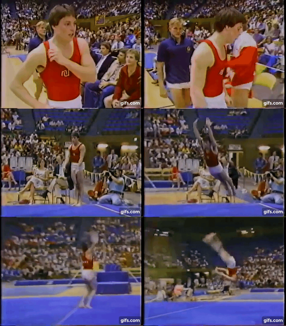
Northern Illinois Men: 6.500

| Design | Fabric/
Sparkle |
School
Spirit |
Overall
Appearance |
Total | |
| Elizabeth | 1.9/3 | 1.5/2 | 1.6/2 | 2.0/3 | 7.0/10 |
| Alicia | 1.7/3 | 1.4/2 | 1.2/2 | 1.8/3 | 6.1/10 |
| Christina | 1.8/3 | 1.5/2 | 1.3/2 | 1.8/3 | 6.4/10 |
Elizabeth: I really like the creative little NIU logo on the front here but without the introduction of the gymnast, I would have had no idea it was Northern Illinois (RIP men’s team).
Alicia: Sometimes less is more, but in this case I don’t really understand the logo. I know it’s NIU, but it also kind of looks like a snake. Great color, though.
Christina: Again, shorts! Oy. The logo on the front is so tiny, and I wish it were bigger as it just looks odd right now and I’m not even sure what it’s supposed to be. The colors are nice, and I like the gold and red colors.
SJSU Men: 6.467

| Design | Fabric/
Sparkle |
School
Spirit |
Overall
Appearance |
Total | |
| Elizabeth | 1.8/3 | 1.5/2 | 1.5/2 | 1.9/3 | 6.7/10 |
| Alicia | 1.5/3 | 1.5/2 | 1.7/2 | 1.8/3 | 6.5/10 |
| Christina | 1.5/3 | 1.5/2 | 1.5/2 | 1.7/3 | 6.2/10 |
Elizabeth: This is fine, but I don’t understand what the front logo is trying to be. Maybe a Spartan’s trident or something? The bottom line is I shouldn’t have to try hard to understand a design. The blue color is nice, though, and RIP SJSU men’s team.
Alicia: Completely forgot about SJSU’s men’s team, so this is a nice reminder! I have to agree with everything Elizabeth said. It’s a nice leo—and I love that color blue—but I’m trying to figure out what the logo is, which is distracting.
Christina: OK, last names are definitely a trend this year. I sound like a broken record, but I like it. I like the shade of deep blue, but the logo on the front (or whatever it is) is too small and looks like a weird blob.
Illinois Men: 6.200

| Design | Fabric/
Sparkle |
School
Spirit |
Overall
Appearance |
Total | |
| Elizabeth | 1.7/3 | 1.5/2 | 1.7/2 | 1.8/3 | 6.7/10 |
| Alicia | 1.5/3 | 1.3/2 | 1.5/2 | 1.6/3 | 5.9/10 |
| Christina | 1.3/3 | 1.5/2 | 1.5/2 | 1.7/3 | 6.0/10 |
Elizabeth: Ahh the old Illinois chief logo… It’s definitely in an odd position on that leo and facing and odd direction. Either that or the guy needs slightly smaller pecs.
Alicia: This is a bit underwhelming. For a leo, the logo is in a weird place right over the pec, and I don’t like how the name on the back is in a different color than the logo.
Christina: I don’t understand the trend of tiny logos in 1984, and this one is just weirdly placed. Nipple shiny logo is a no. I do really like the colors used, but this logo just bugs me so much.


